Helvetimart
BRANDING
The client
Helvetimart is a specialty market in Lausanne, Switzerland offering a wide variety of regional food products.
keywords
Market/ Switzerland/ Branding/ Graphic Design/ Packaging
the objective
Helvetimart has a wide variety of regional products, so the project should contain this broad range through a special and culturally interesting experience for its visitors.
the solution
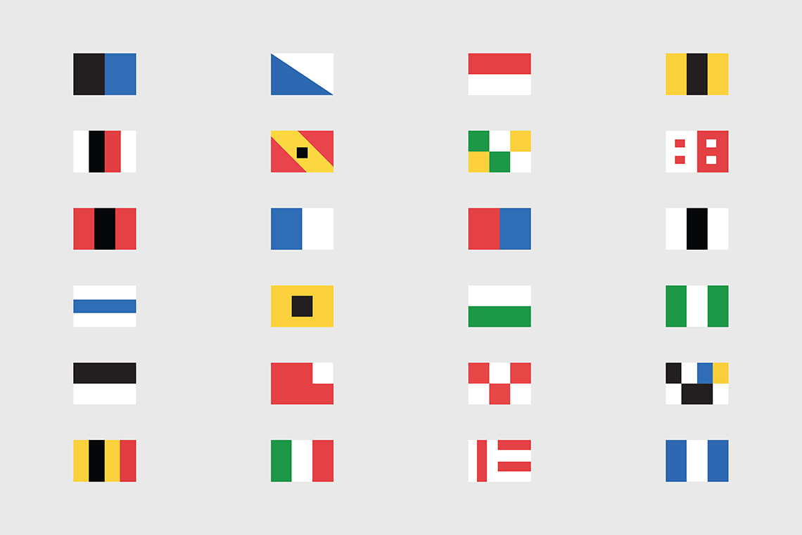
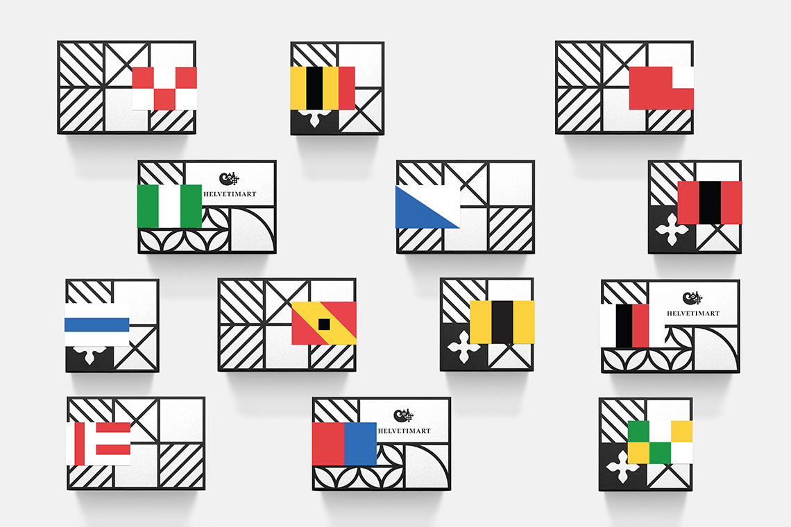
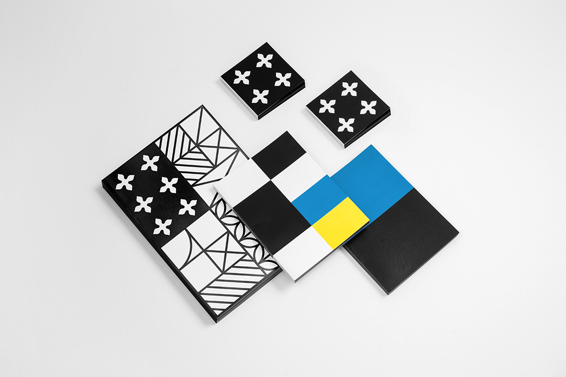
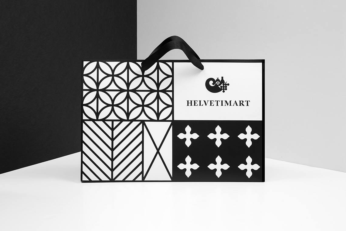
We created a nomenclature system based on the states’ coat of arms, allowing us to establish a distinction across the different sections in the market. We simplified these flags to create a homogeneous language, using representative elements and colors to develop the labels for the brand’s products and the signage within the store to ease its navigation.
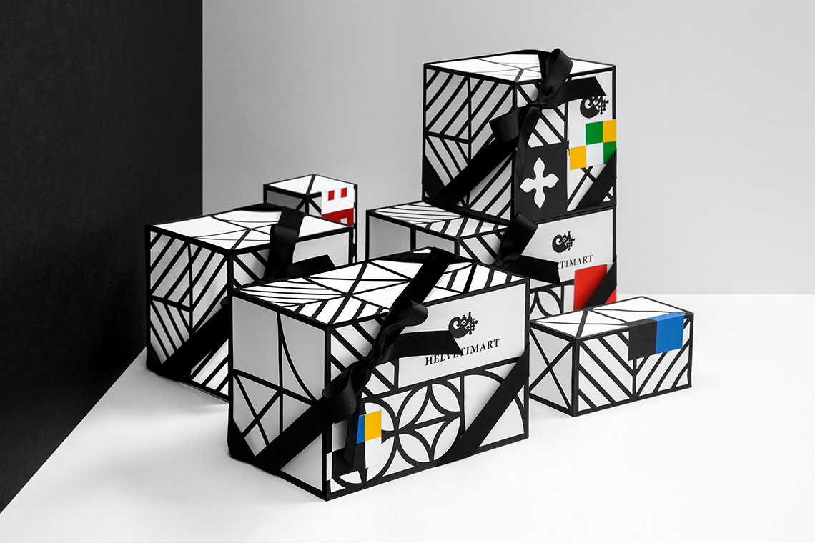
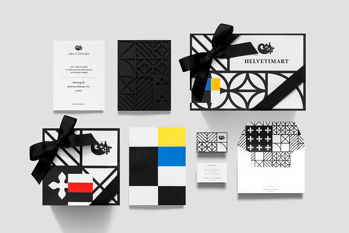
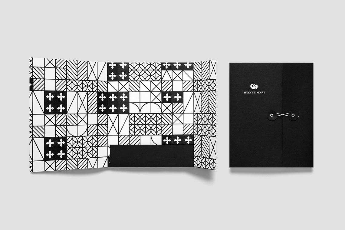
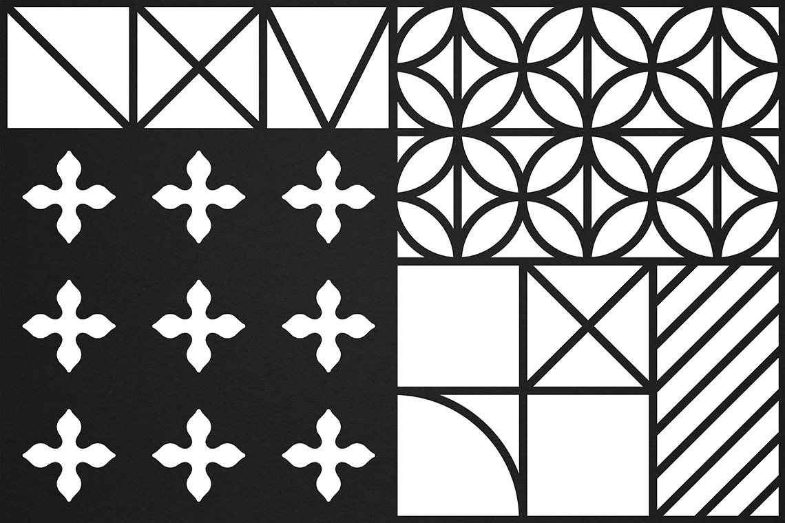
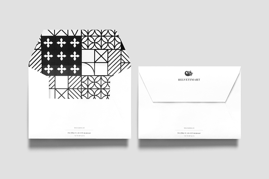
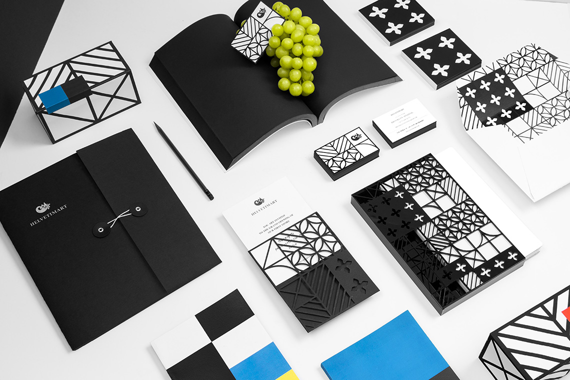
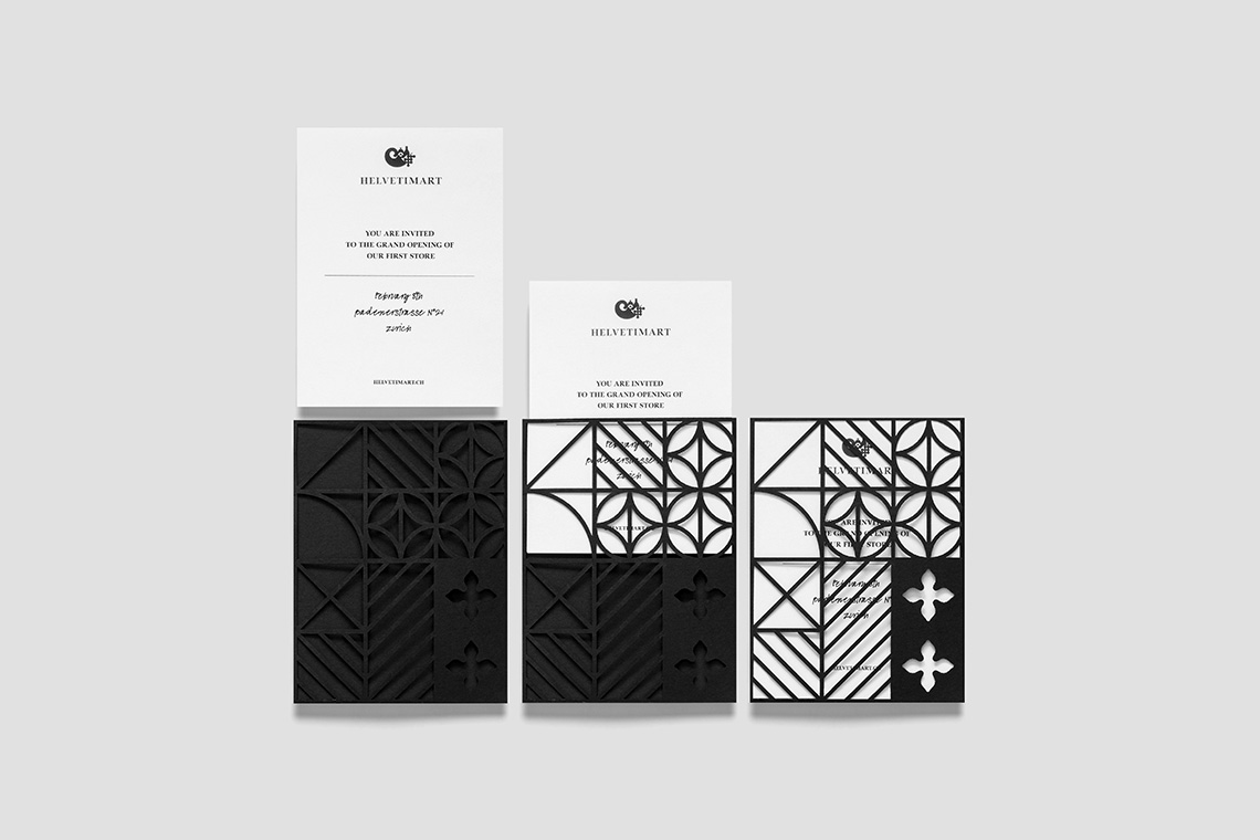
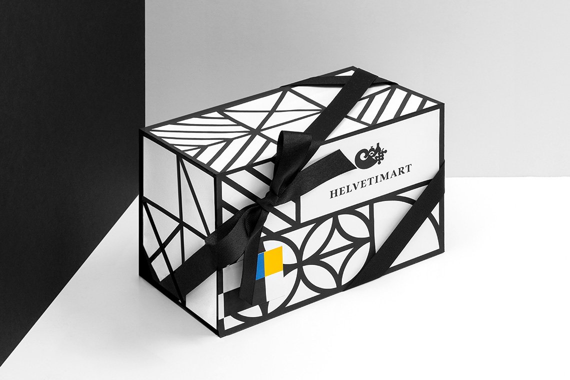
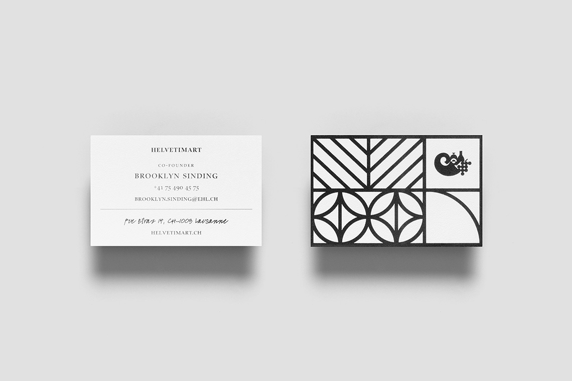
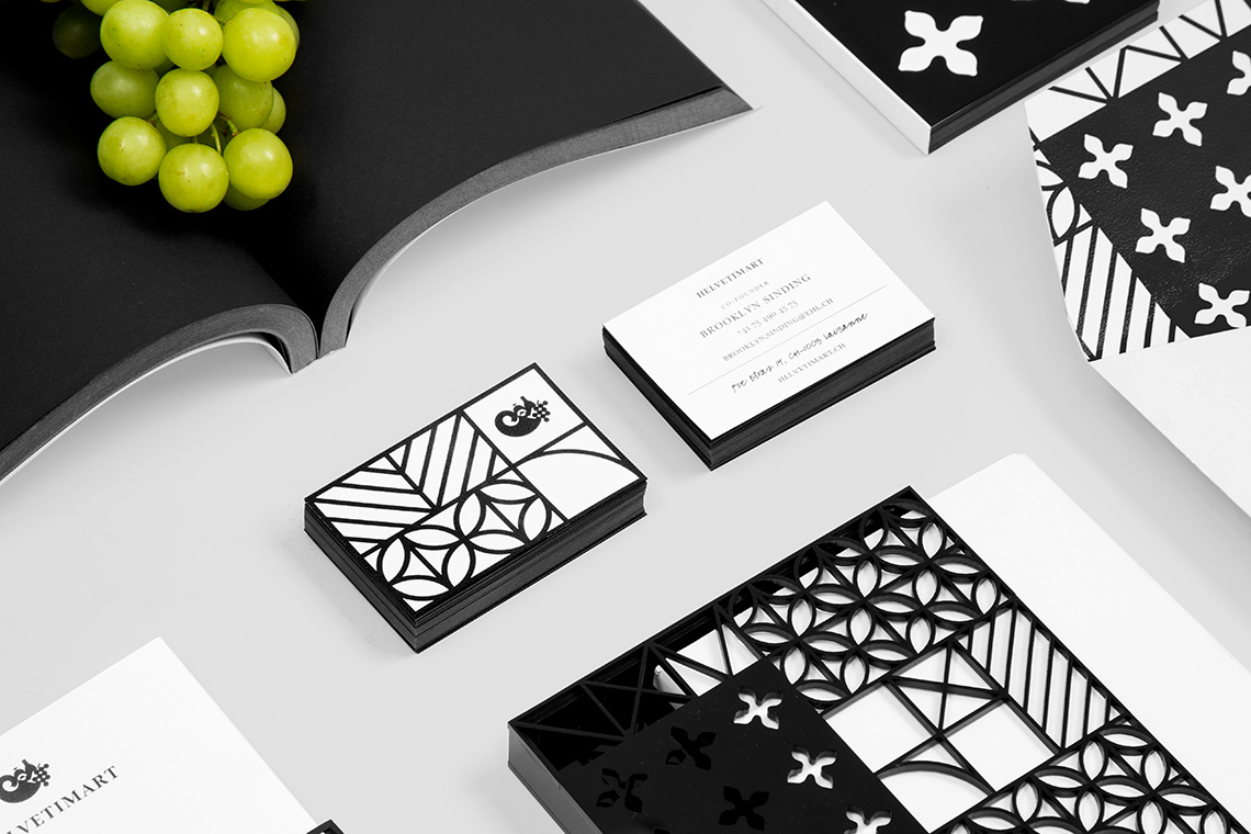
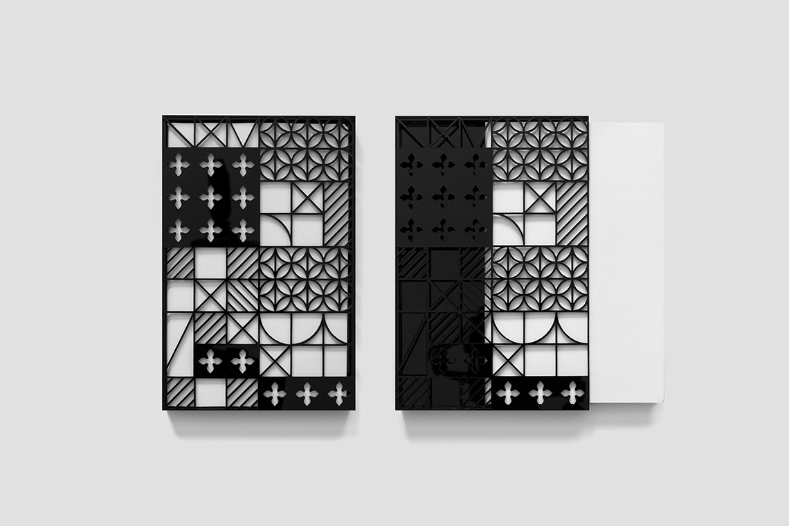
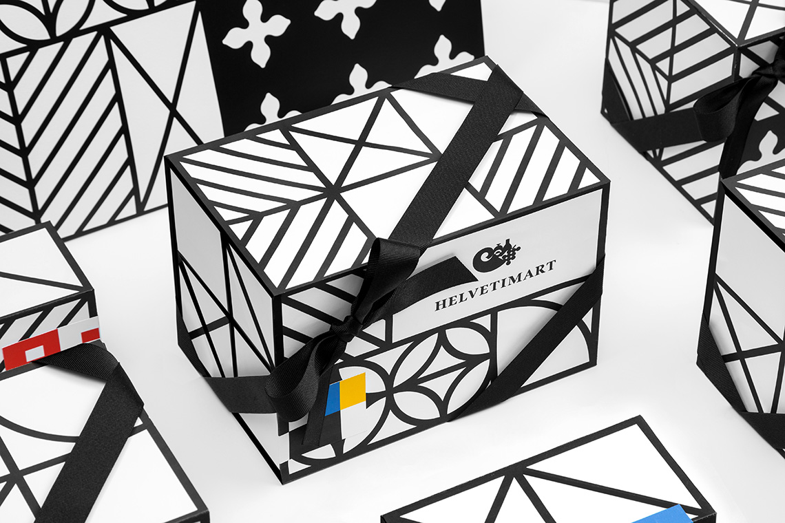
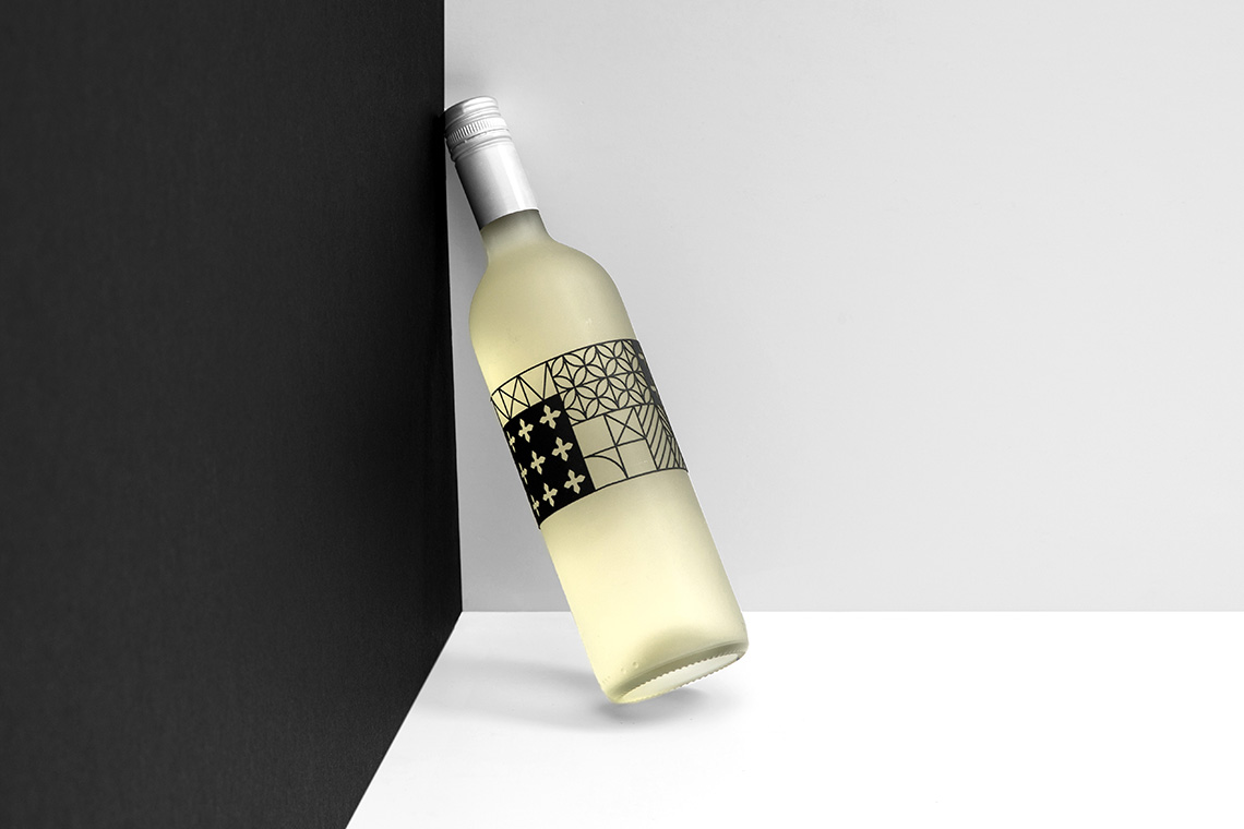
The naming for the market is inspired by the term “Helvetia”, the national personification of Switzerland, and was used to give the store an attractive and cozy feel. The ease to understand and pronounce the store’s name in different languages was also taken into consideration. Helvetimart’s cornucopia icon, better known as the horn of plenty, is a symbol of abundance used as a reference to the wide variety of products that are found in the market. The Swiss culture’s folklore and antique architecture served as inspiration for the clean and geometric patterns. These patterns work as Helvetimart’s iconic graphic resources and are used throughout the brand’s packaging and other applications, achieving the unity of the brand as a whole. — (A)
The Swiss culture’s folklore and antique architecture served as inspiration.
