Orson
ARCHITECTURE
The client
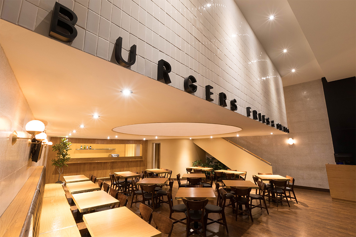
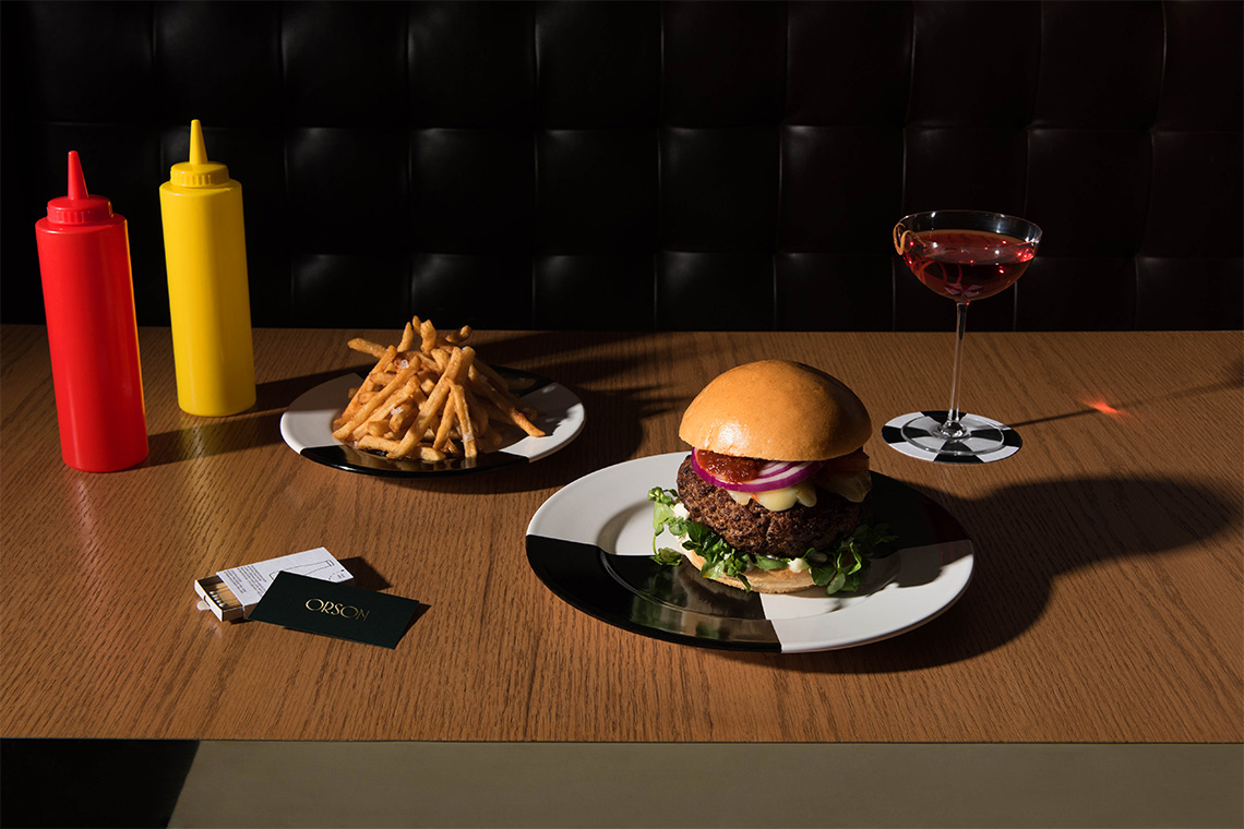
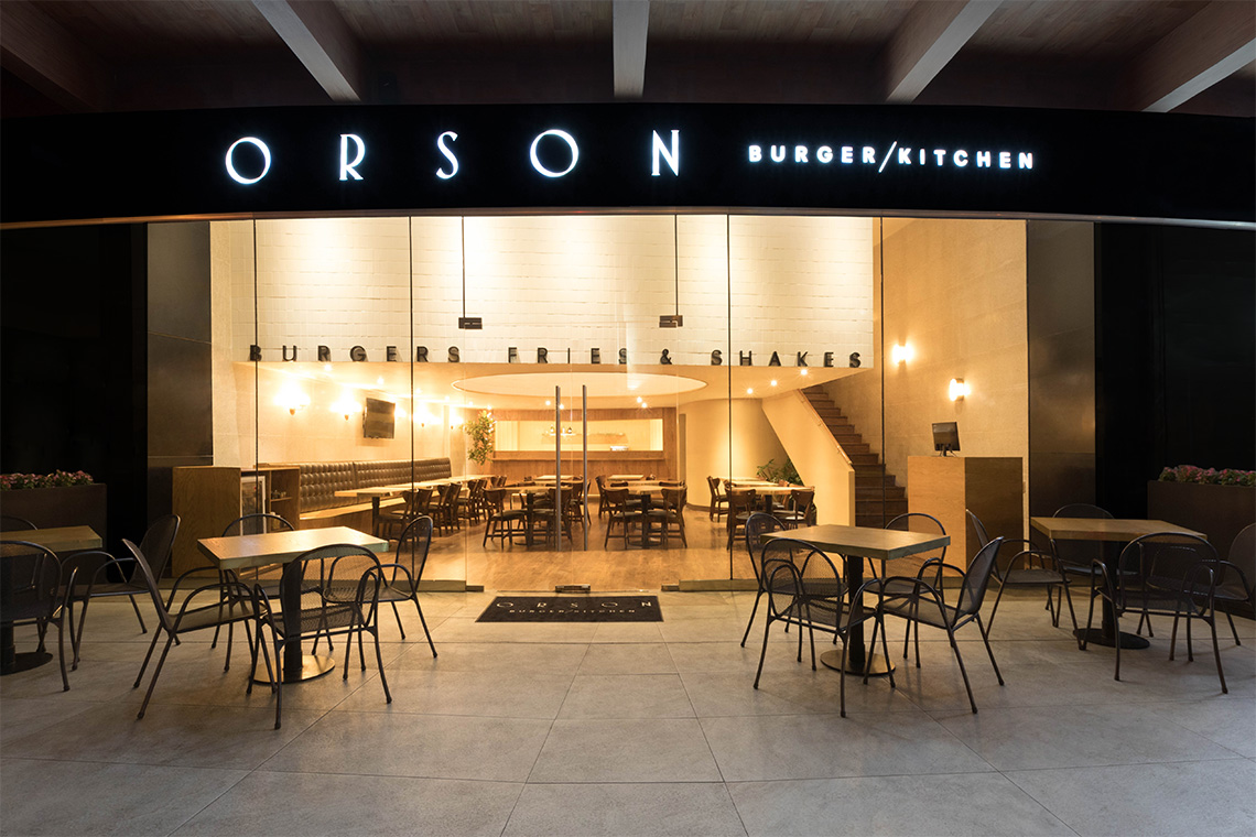
Orson Burger Kitchen is a hamburger restaurant whose menu differentiates itself by praising this popular American style dish in hand with a good selection of wines and milk shakes.
keywords
Restaurant/ Mexico/ Branding/ Interior Design/ Packaging
the objective
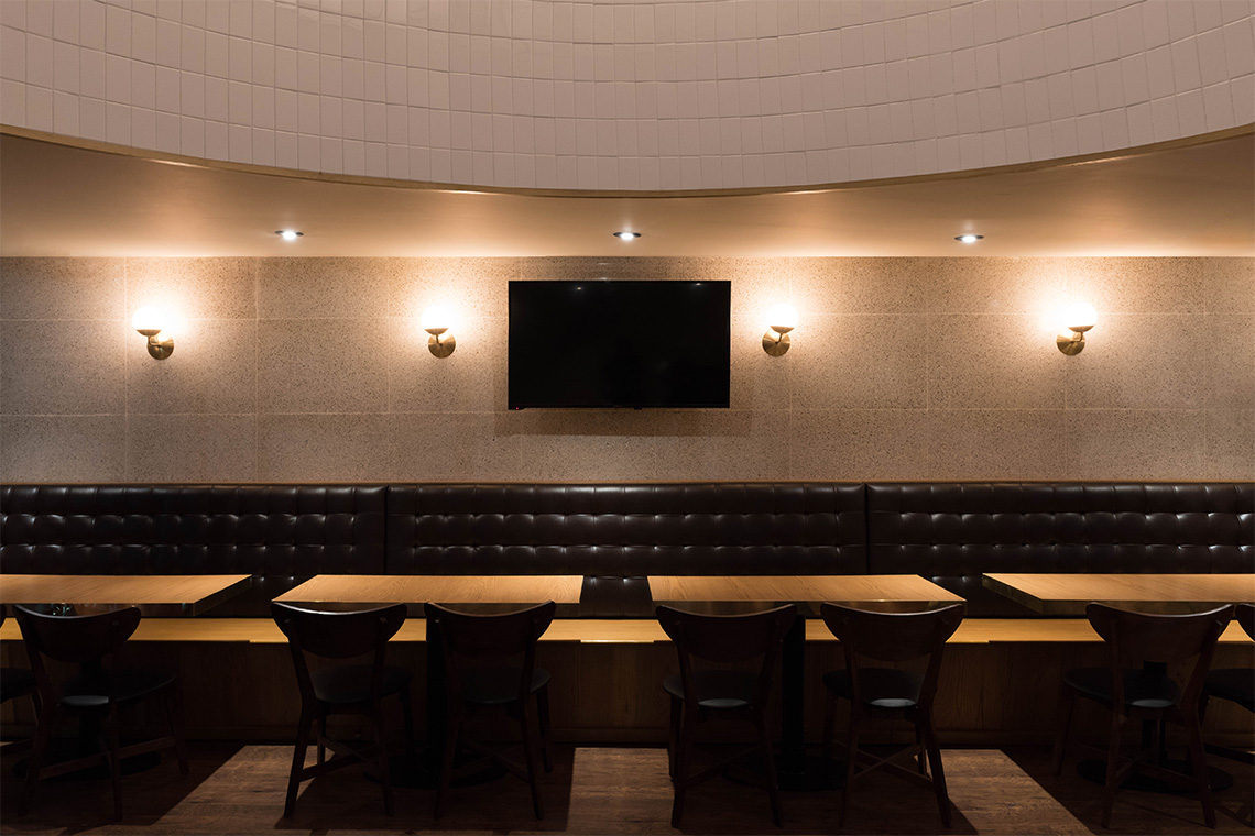
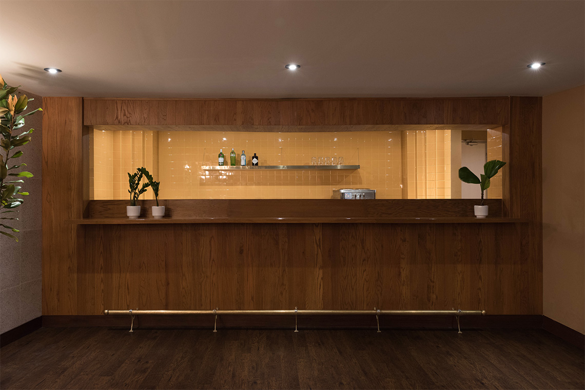
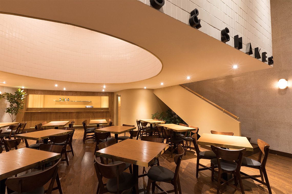
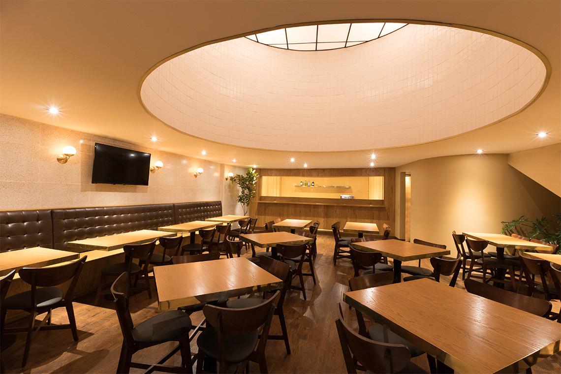
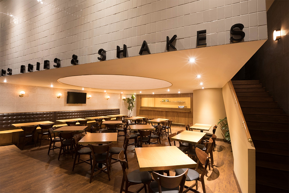
Create a unique and warm space that transports people into another time and environment and invites them to enjoy their menu.
the solution
The conceptualisation and design are inspired by a combination of the Diner style from the 1920's and 1930's around the acclaimed work of artist Edward Hopper. — (A)
The 1920's and 1930's around the acclaimed work of artist Edward Hopper.
Orson
BRANDING
the objective
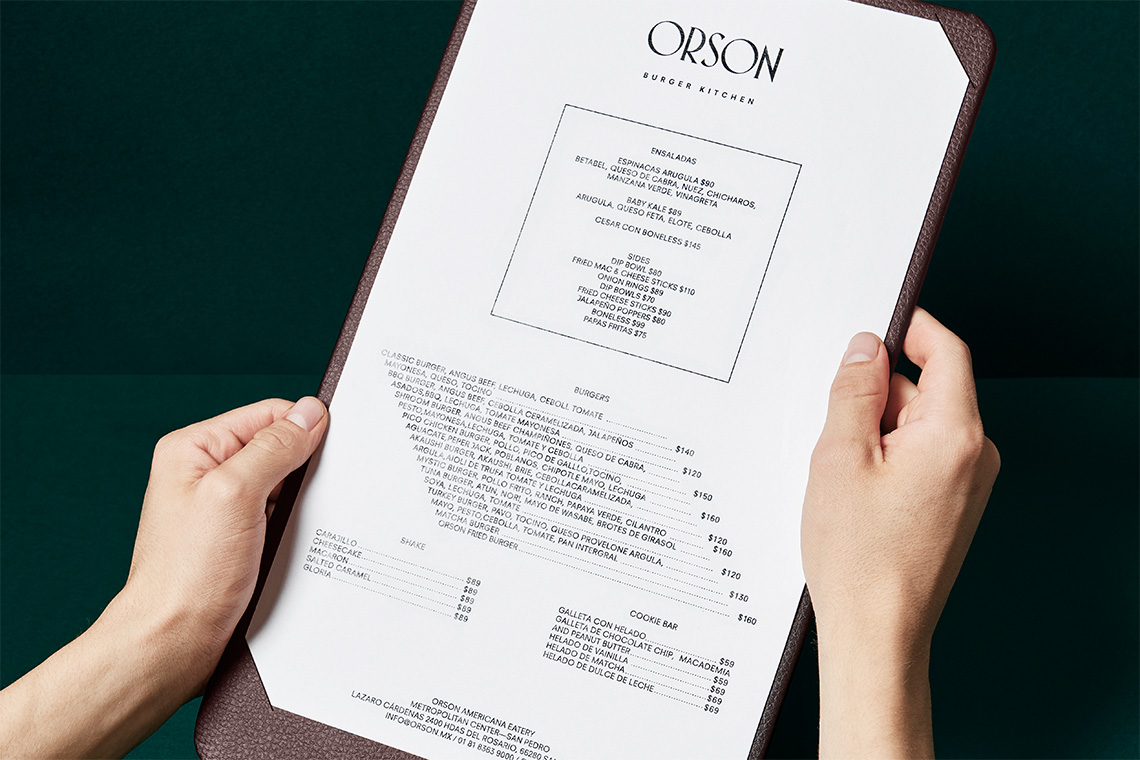
Create a brand experience that invites guests to enjoy traditional American cuisine through a unique and memorable place.
the solution
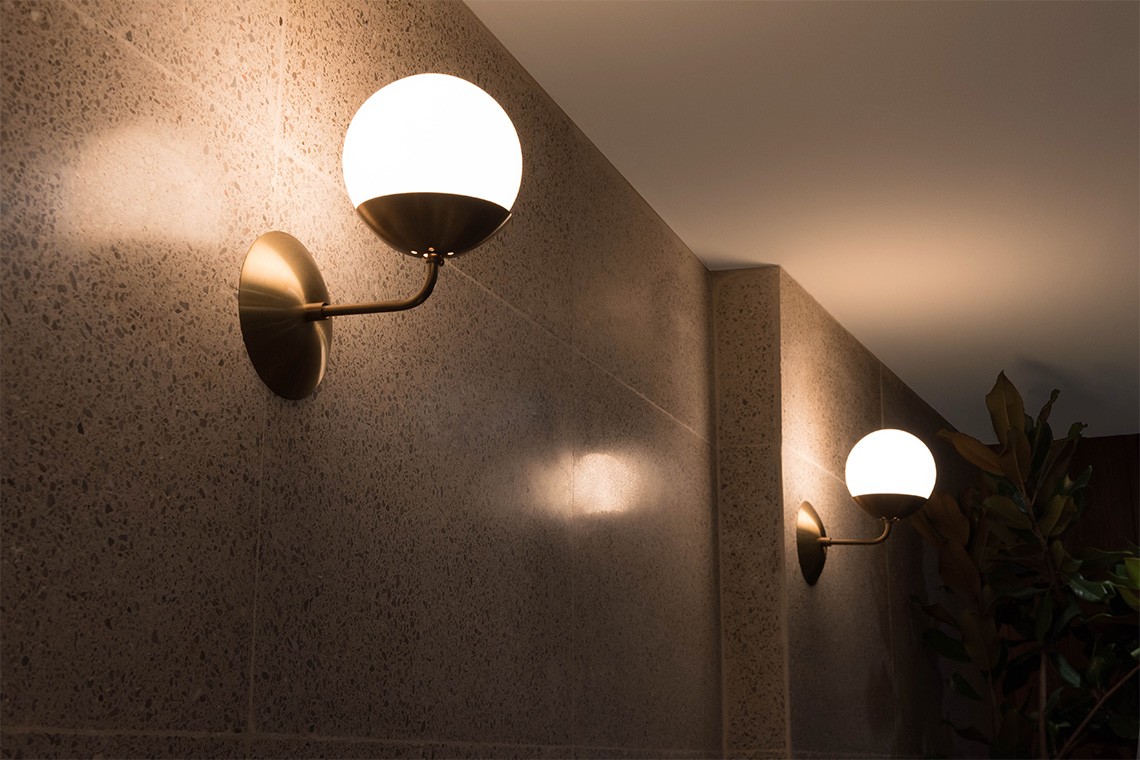
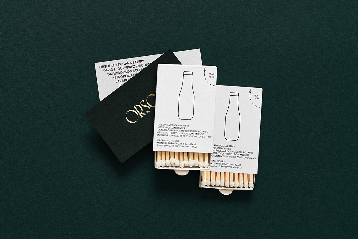
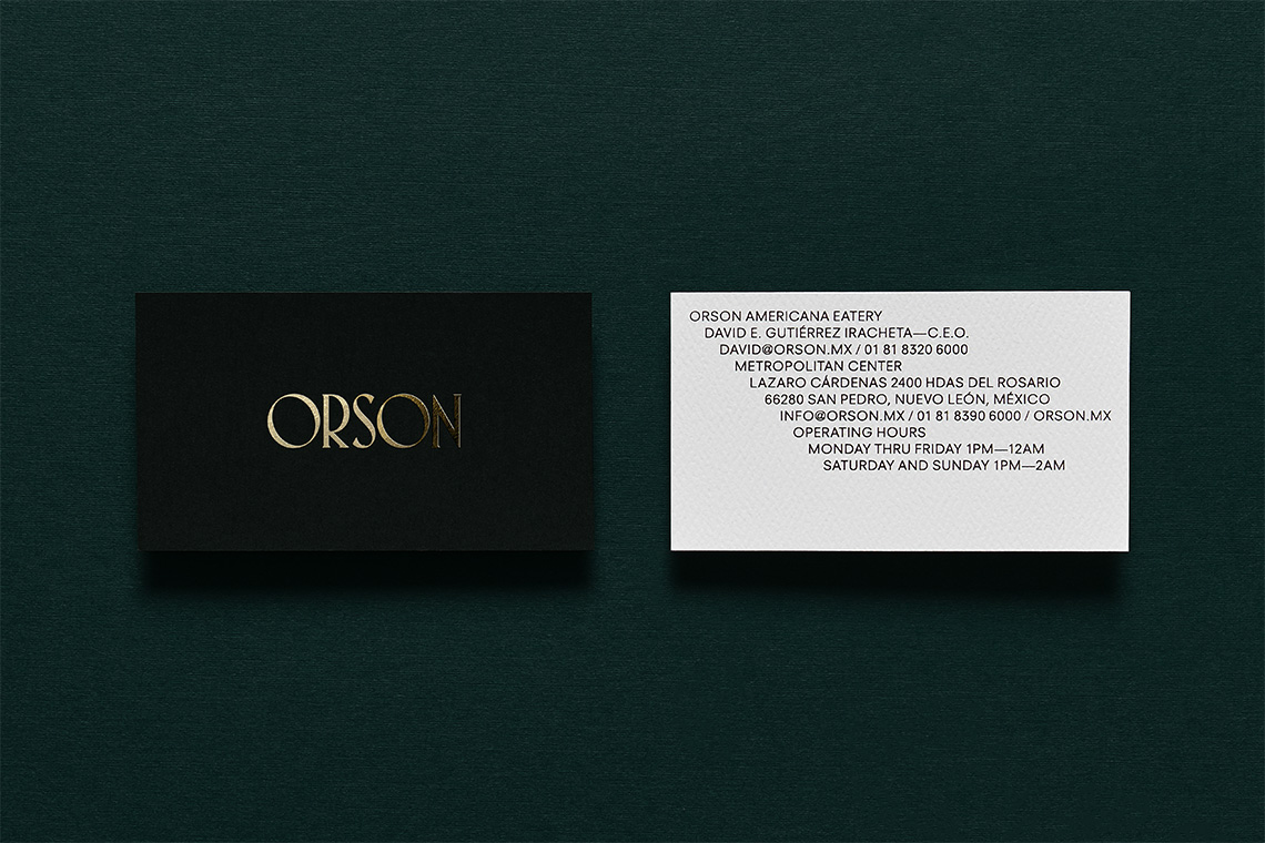
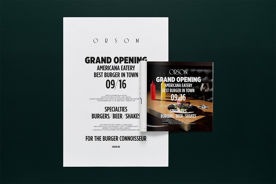
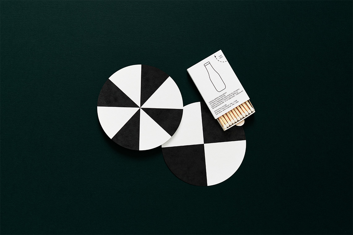
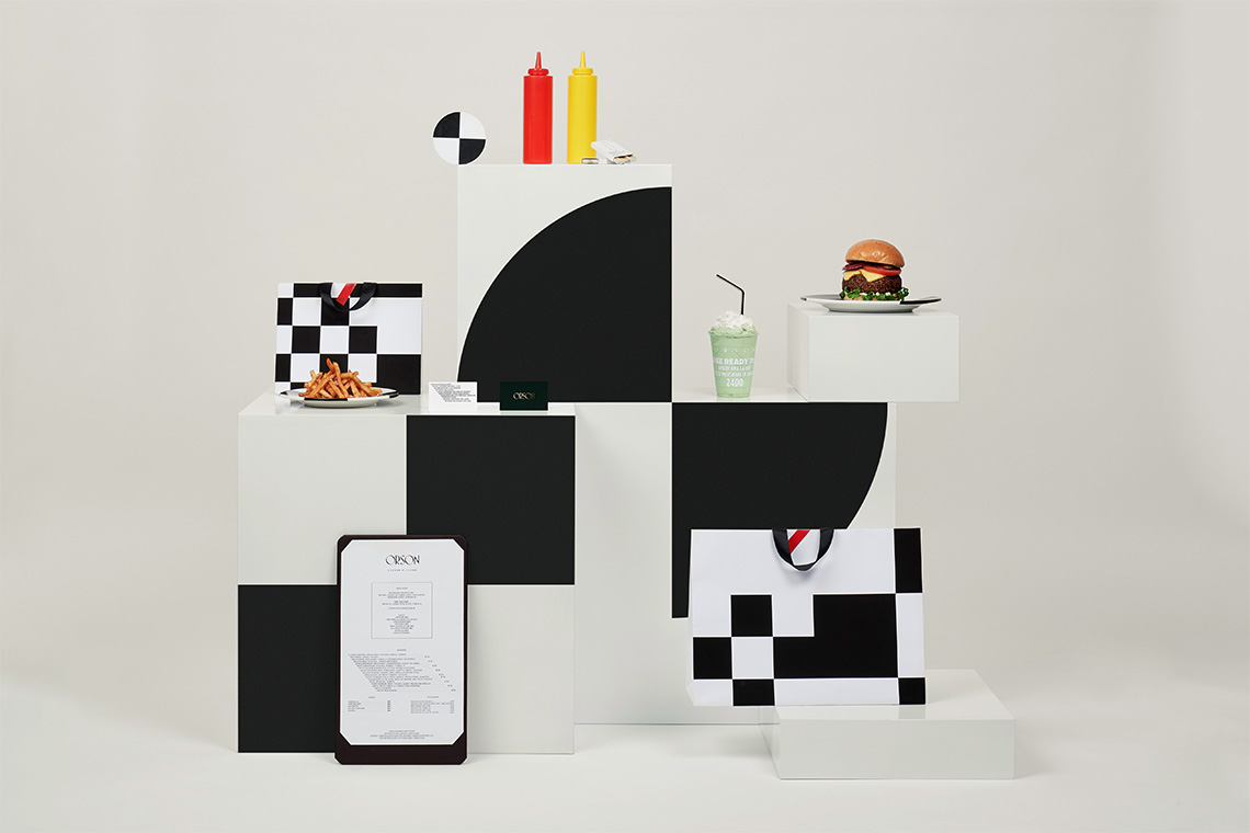
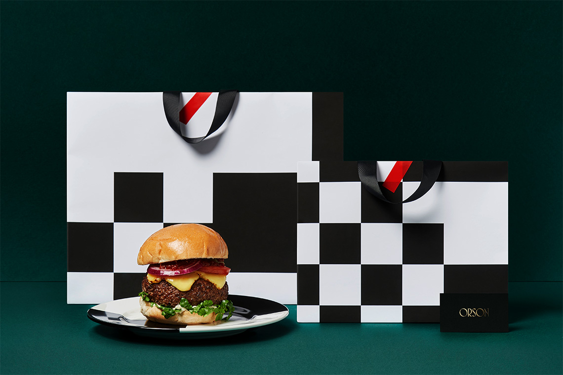
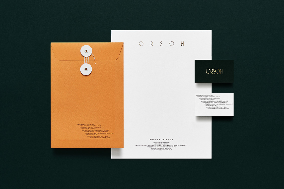
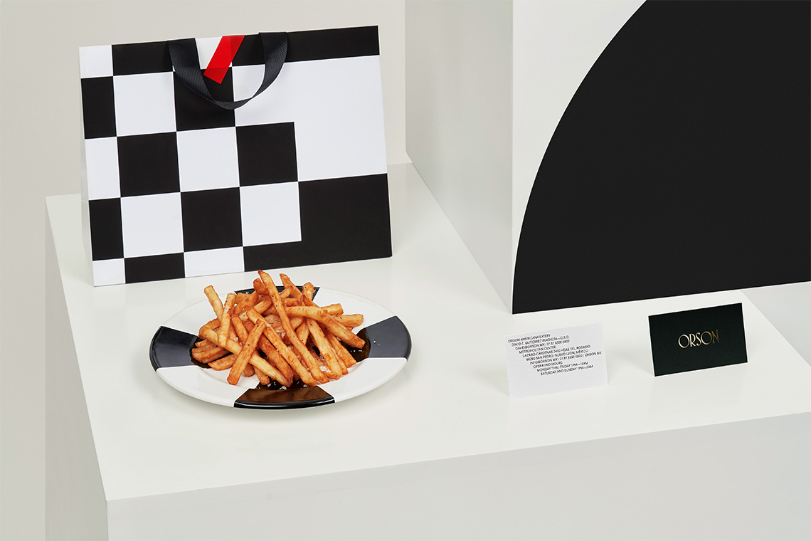
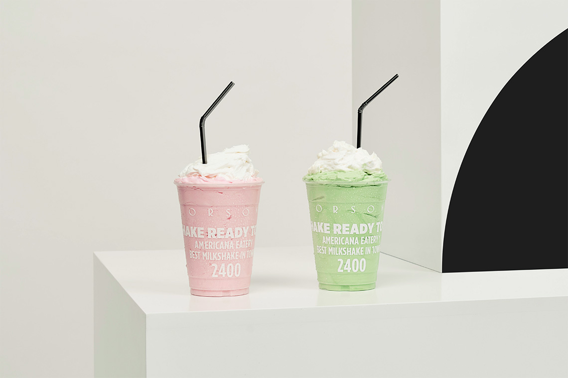
The graphical identity is consistent with the proposed architectonic style employing dark and contrasting colors. The typographical system is responsible for the modern touch to the brand. The logo is custom made and its expression is based around the Art-deco style in the same manner as the restaurant's furniture and architectural detail — (A)
Inspired by a combination of the Diner style and the work of artist Edward Hopper.
