Grauforz
ARCHITECTURE
The client
Grauforz is an expanding Mexican company specialised in buying, selling and distributing steel by-products on a global level. Their reach includes operations in five countries on different continents including North America, Asia & Europe.
keywords
Acero /America /Asia /Europe /Mexico /Architecture /Branding /Interior Design/ Signage
the objective
Their first contact with Anagrama, was made with the intention to formalize their brand communication and brand experience.
the solution
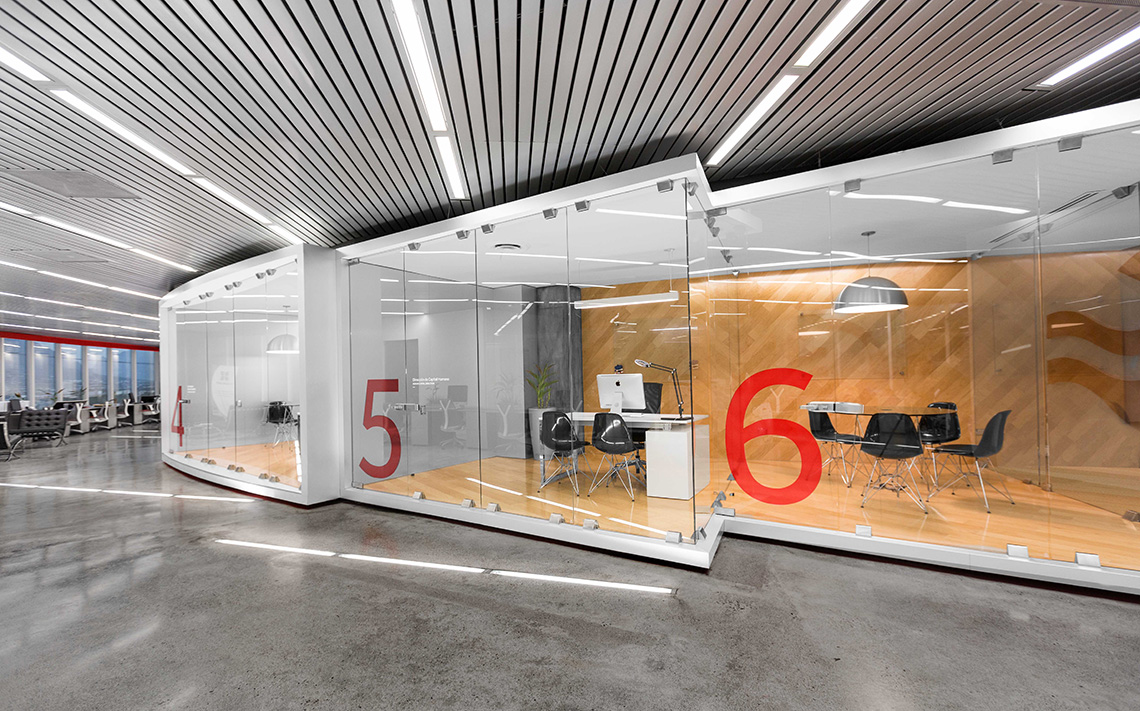
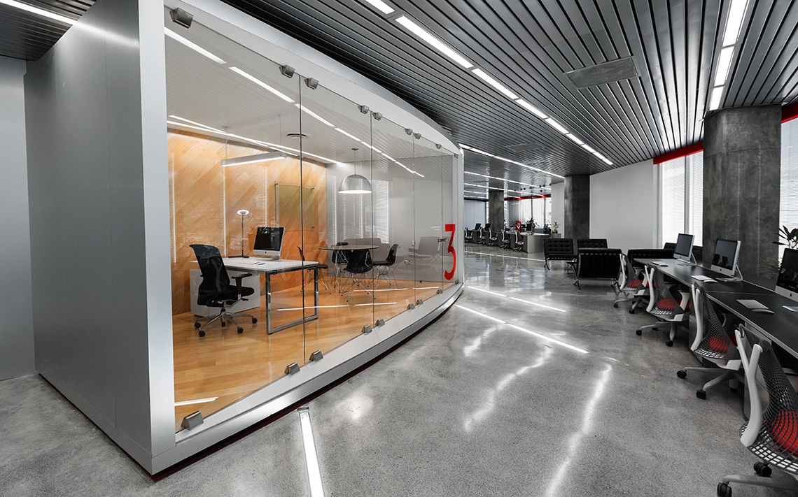
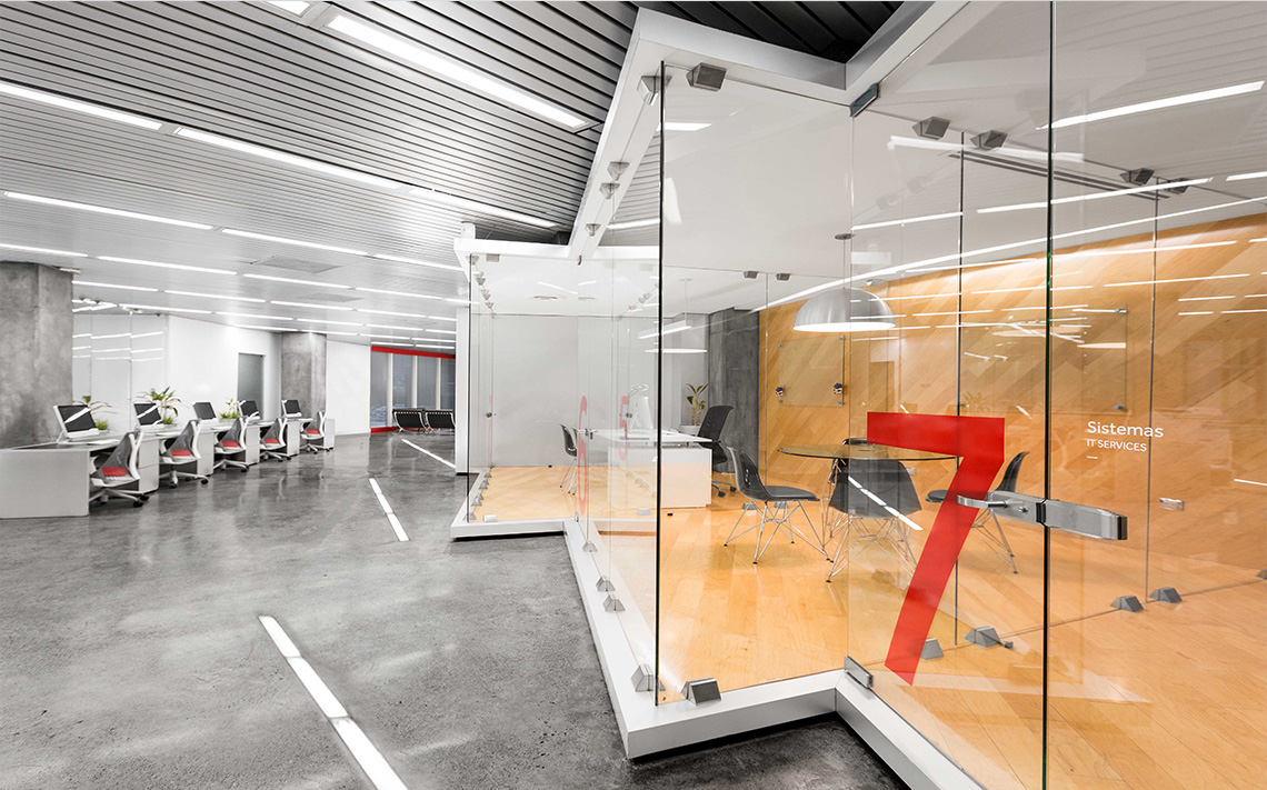
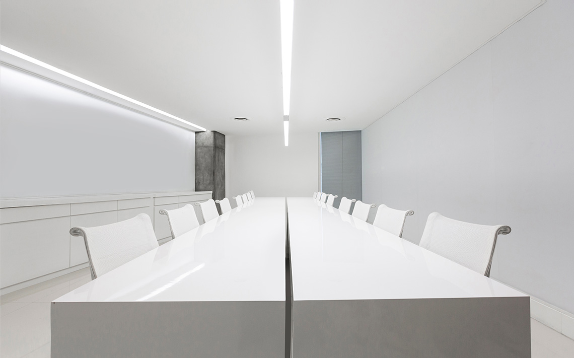
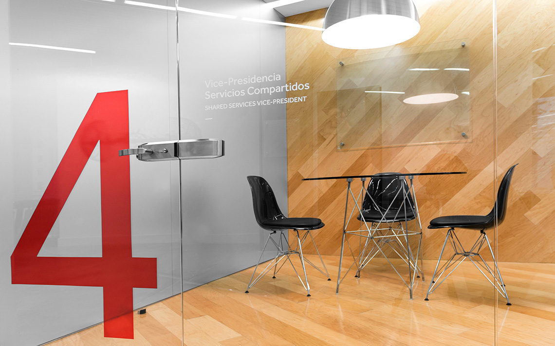
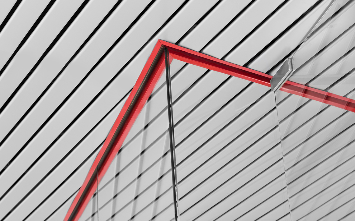
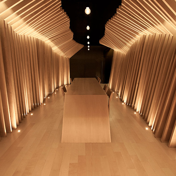
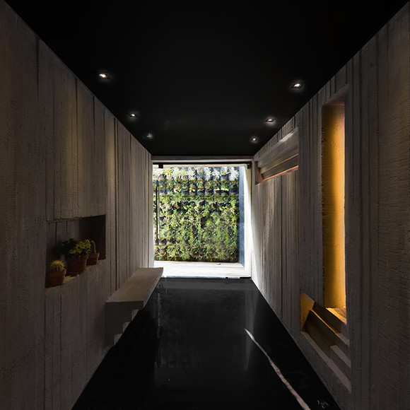
For the interiors, we developed a project where we applied steel and wooden elements. By using steel, we were able to be consistent with the products sold by the company. We were also able to communicate strength with a modern feel. Some elements like wood added a warm human touch making spaces feel more cozy. The interiors project was complemented with typographic interventions allowing the brand to be communicated to the inside of the company and staff with feelings of belonging, loyalty and formality.
By the end of the project, we can appreciate how Grauforz is able to position itself as a world-class company. — (A)
By using steel, we were able to be consistent with the products sold by the company.
Grauforz
BRANDING
the objective
Their first contact with Anagrama, was made with the intention to formalize their brand communication and brand experience.
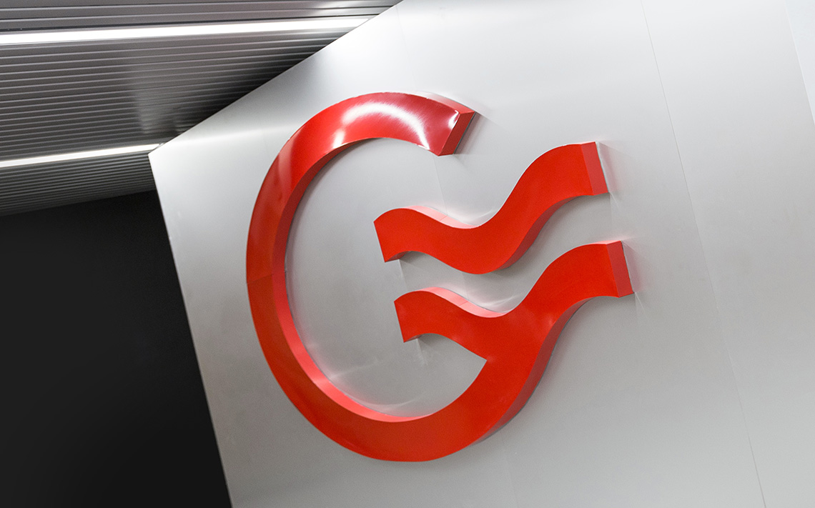
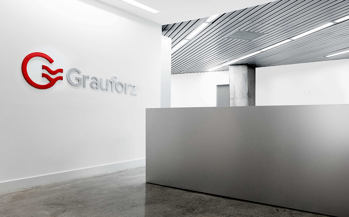
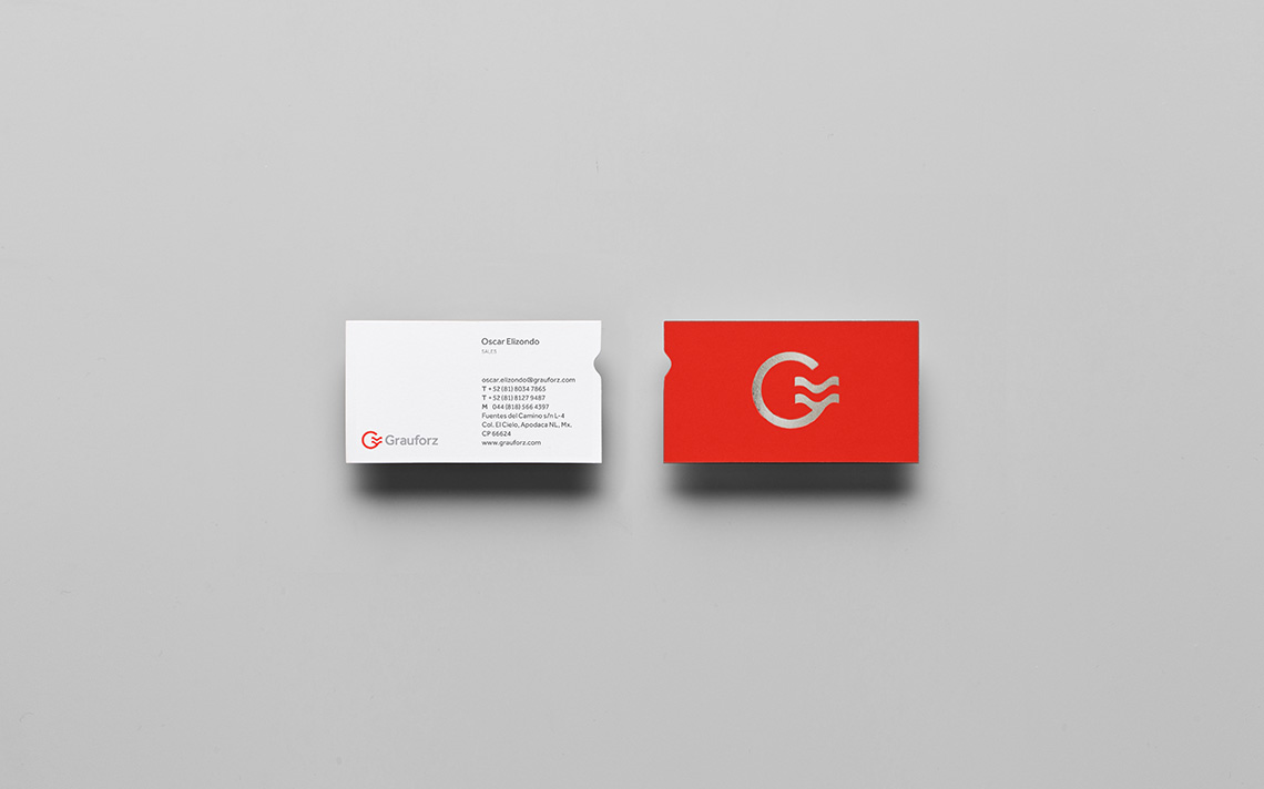
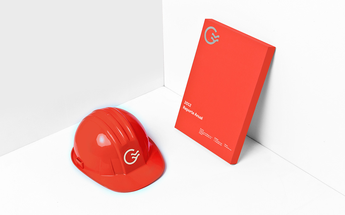
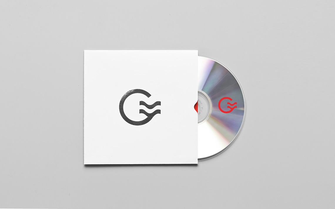
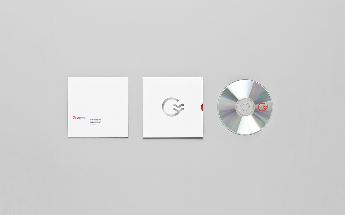
Our analysis culminated in a re-branding process where we decided to conserve original colors and the brand's original concept. Their original logo consisted in an abstraction of the letters G & F. While looking for a way to correctly communicate their efforts to modernize the brand keeping it fresh and eternal at the same time, we chose a sans-serif typography.
the solution
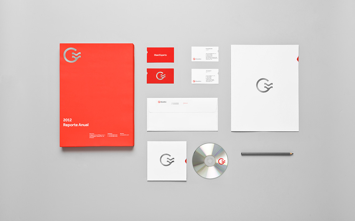
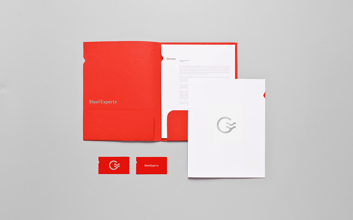
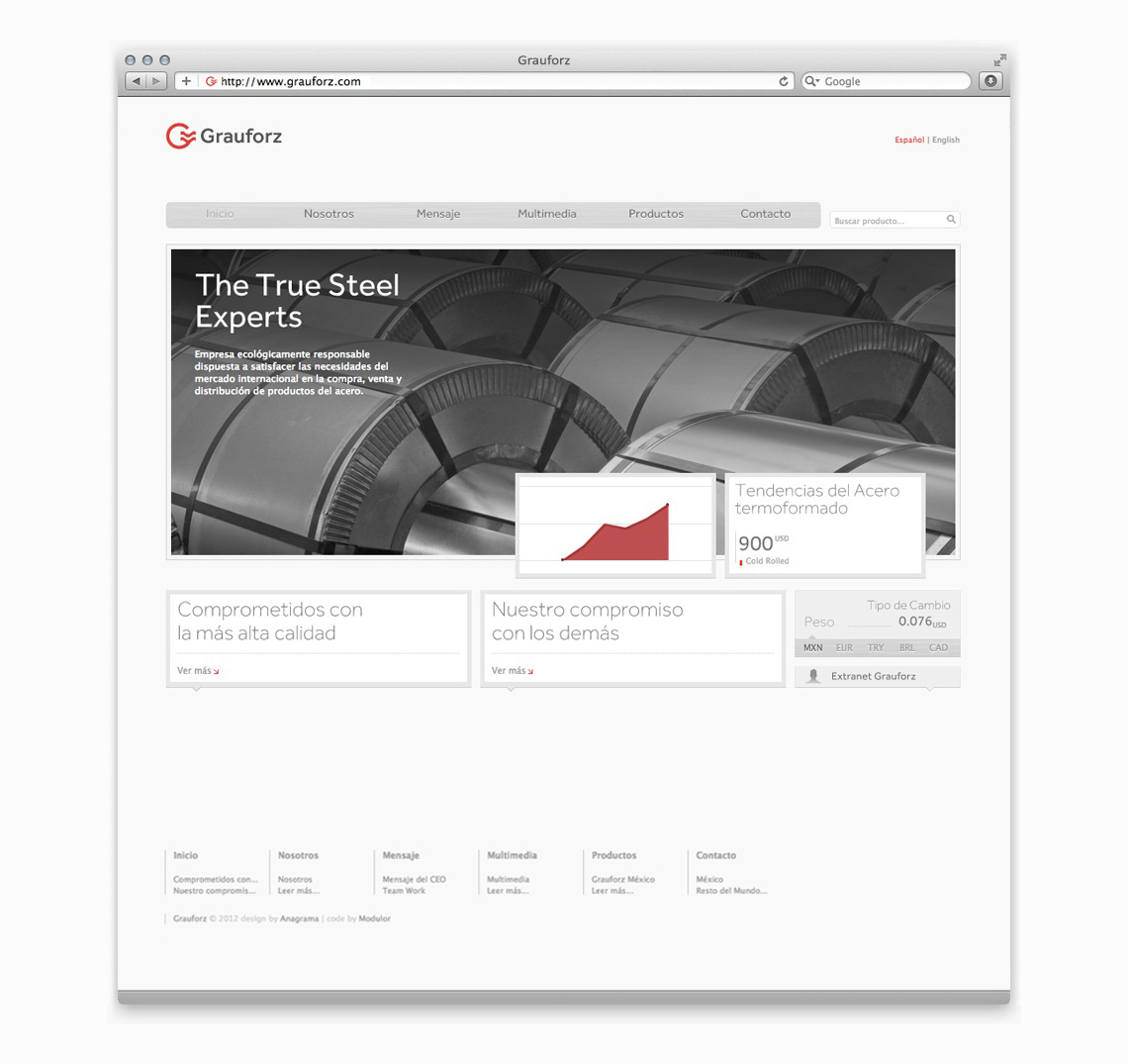
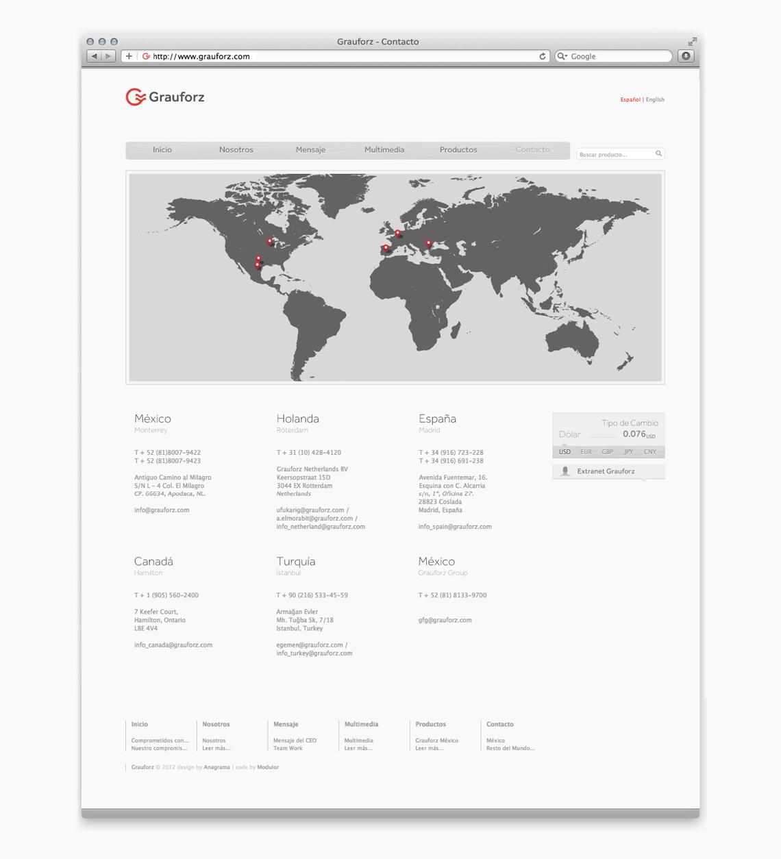
Our focus on considering all contact points between the company and their clients culminated in a project where we intervened their logotype, stationery, corporative communications, website as well as interior architecture for their offices. Due to the fact that many of their clients are located in other countries, we also were in charge of the design and development of a web based tool for sales management and follow-up. For the interiors, we developed a project where we applied steel and wooden elements. By using steel, we were able to be consistent with the products sold by the company. We were also able to communicate strength with a modern feel. Some elements like wood added a warm human touch making spaces feel more cozy. The interiors project was complemented with typographic interventions allowing the brand to be communicated to the inside of the company and staff with feelings of belonging, loyalty and formality.
By the end of the project, we can appreciate how Grauforz is able to position itself as a world-class company. — (A)
By using steel, we were able to be consistent with the products sold by the company.
