Winter Milk
ARCHITECTURE
The client
Winter Milk is an ice cream shop characterized by its wide variety of fresh lactose based products, hand crafted with one hundred percent natural ingredients. Ice cream cones, popsicles, milk shakes, frappes, and desserts stand out from their menu. Currently, Winter Milk owns 16 locations.
keywords
Ice Cream/ Mexico/ Branding/ Packaging/ Interior Design
the objective
To design a interior design that is able to portray an atmosphere and experience suitable for enjoying and sharing an ice cream the traditional way with its family and friends.
the solution
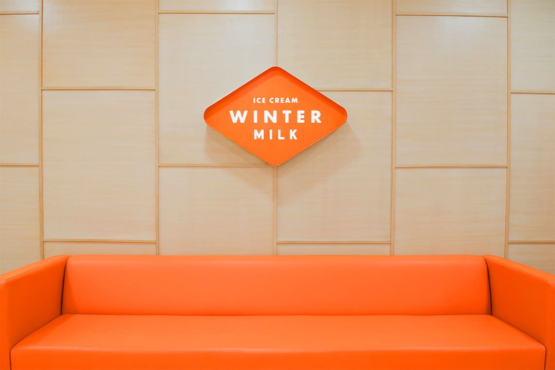
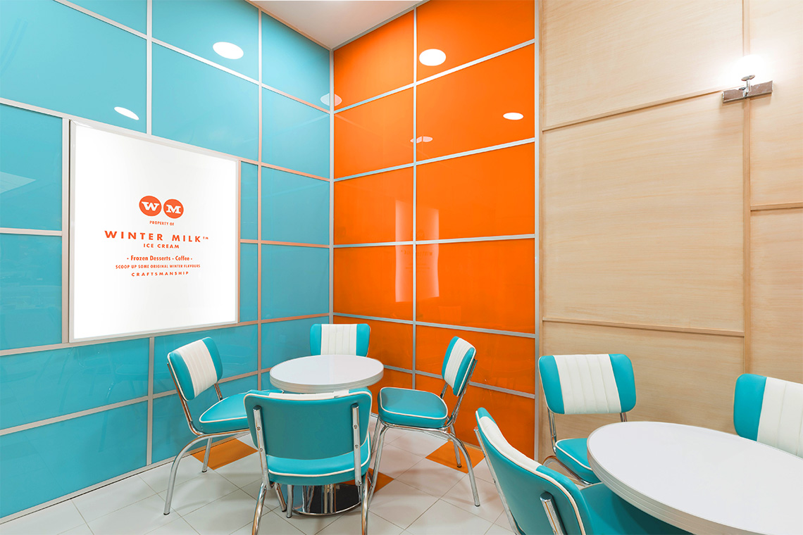
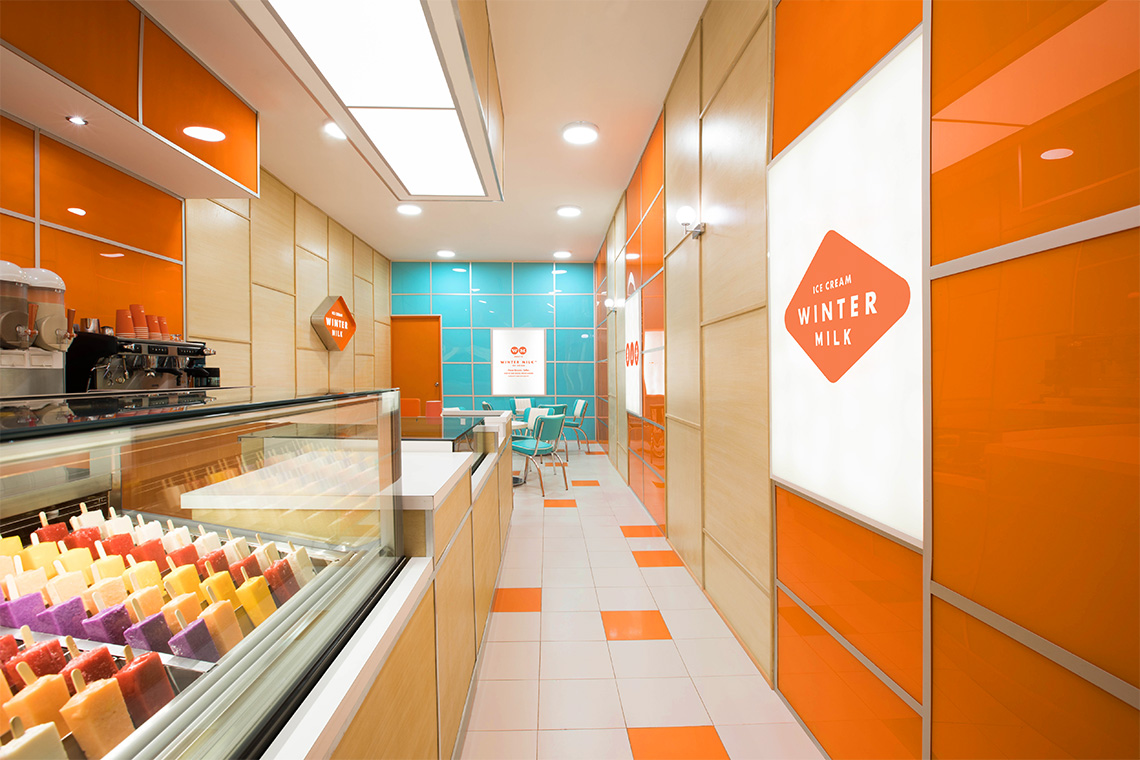
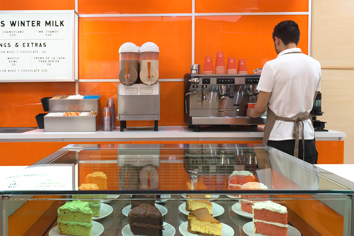
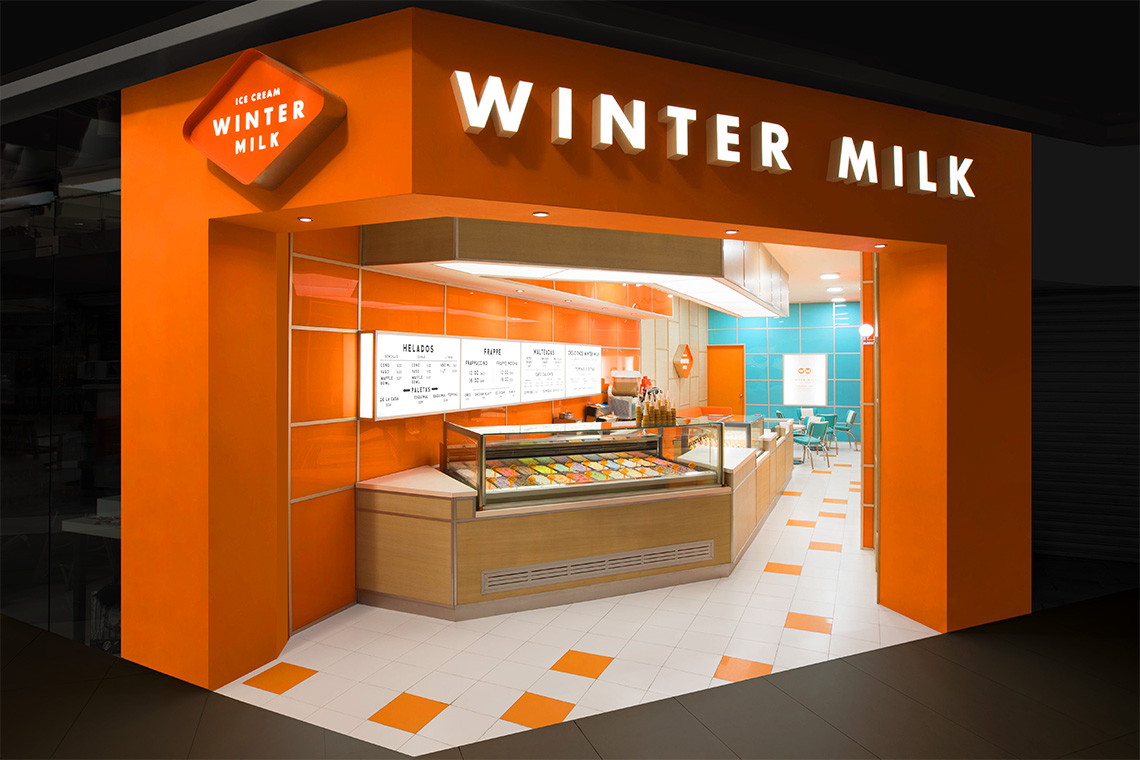
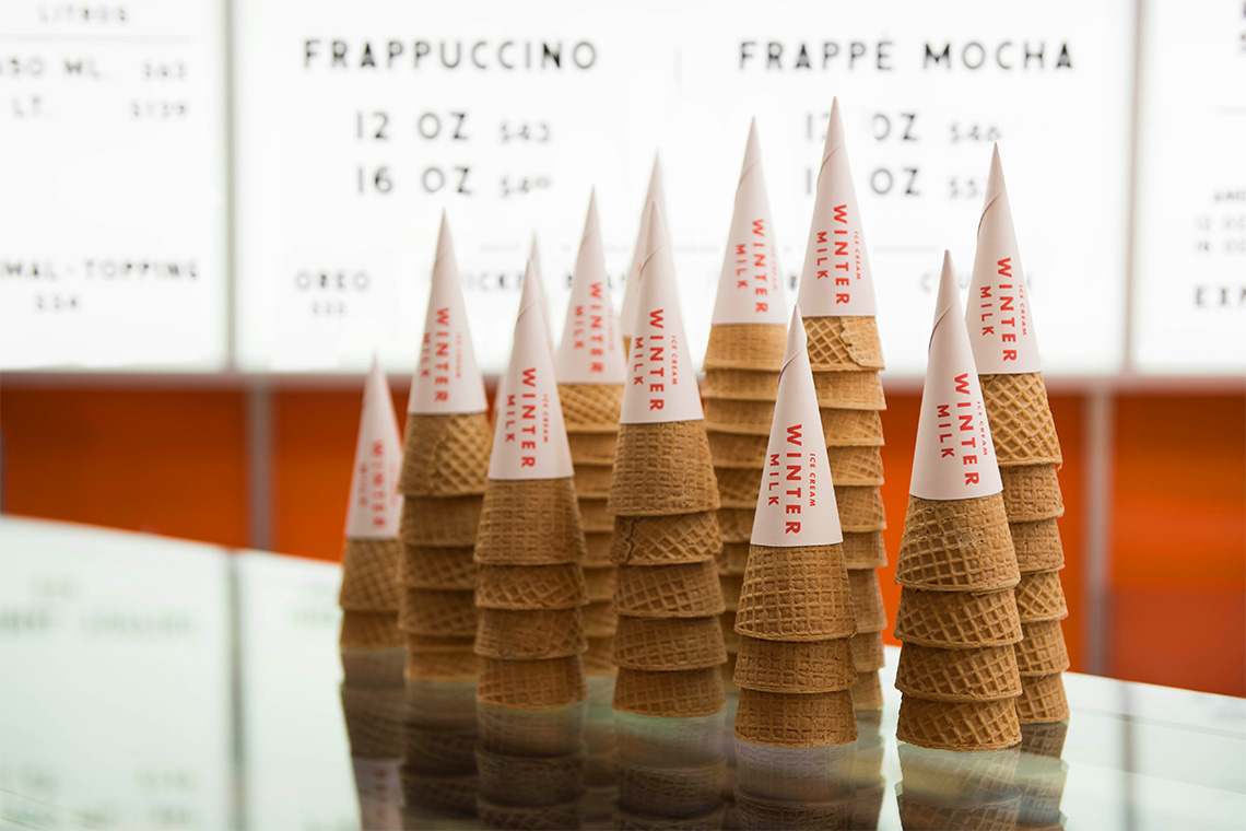
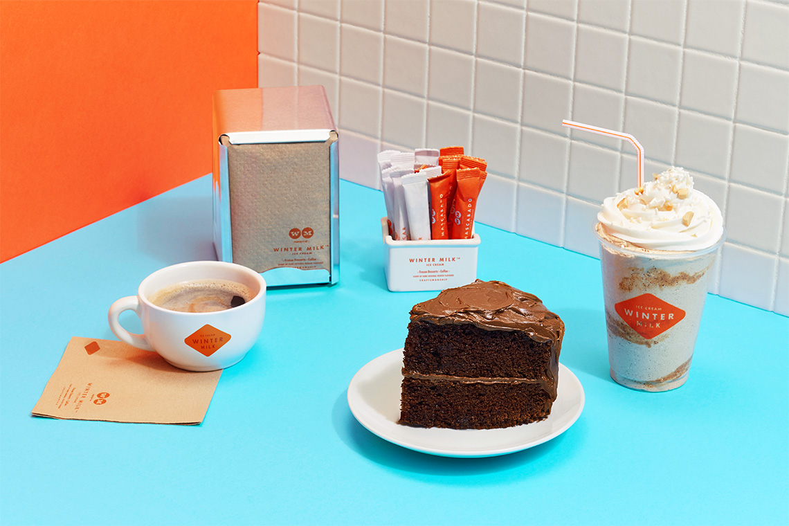
The concept for this shop suggests an atmosphere and experience suitable for enjoying and sharing an ice cream the traditional way with its family and friends. The interior design and tones are inspired by Wes Anderson's style. — (A)
The interior design and tones are inspired by Wes Anderson's style
Winter Milk
BRANDING
the objective
Design a brand system that highlights in an original way the freshness and quality attributes of their products.
the solution
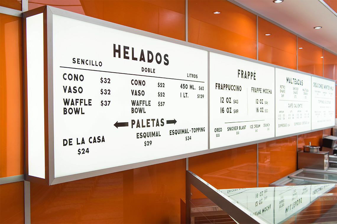
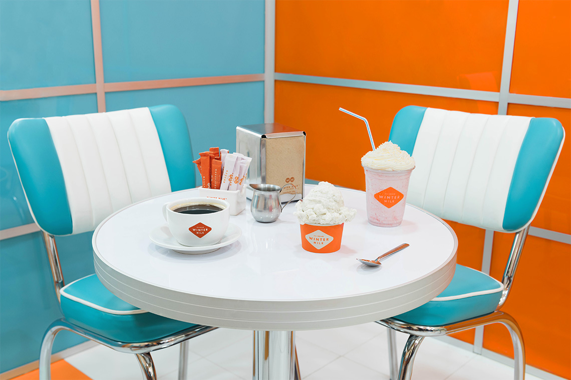
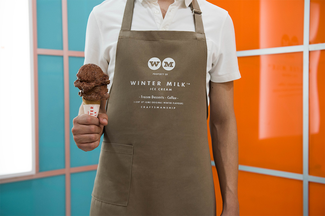
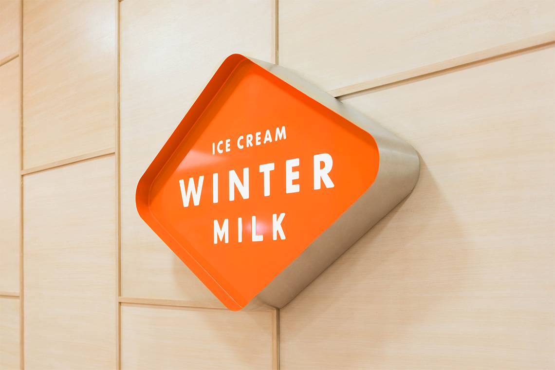
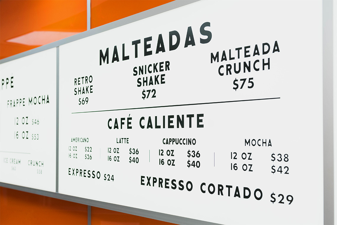
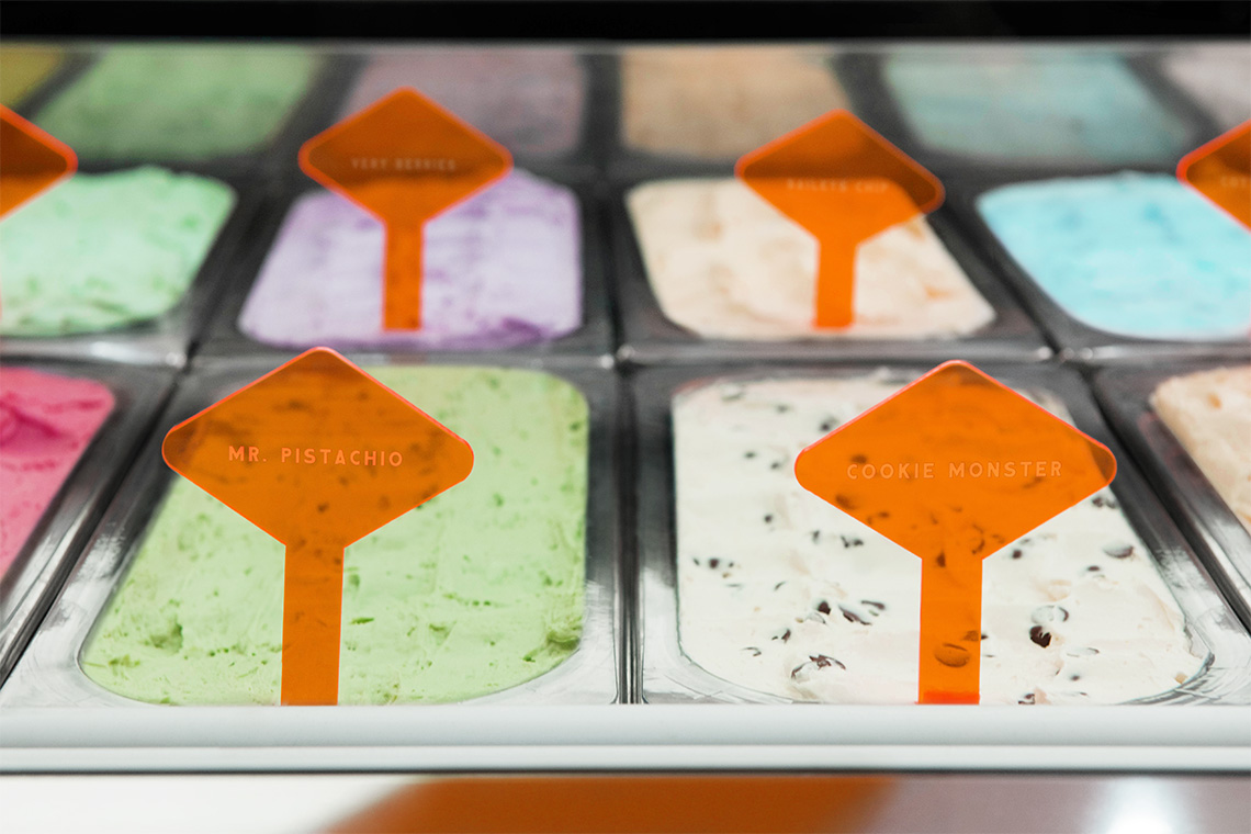
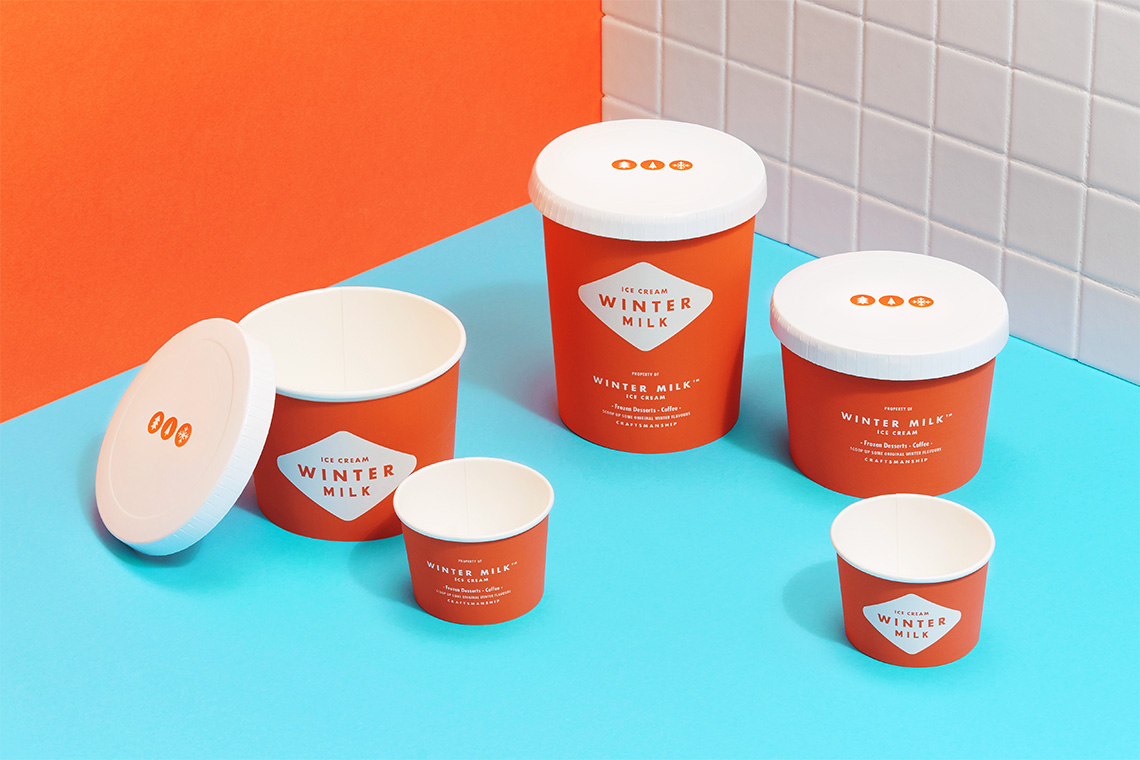
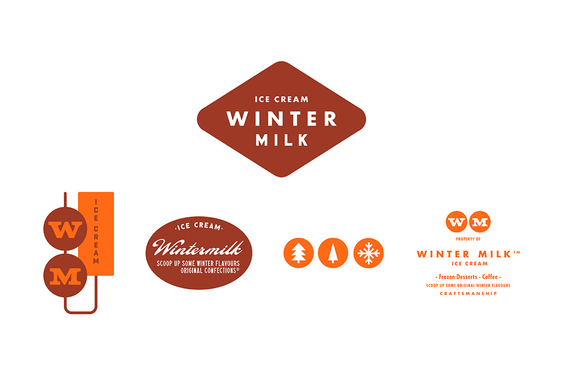
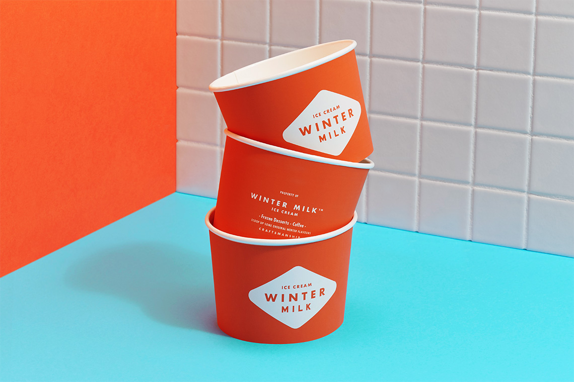
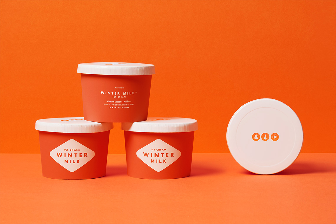
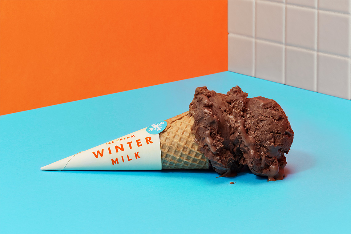
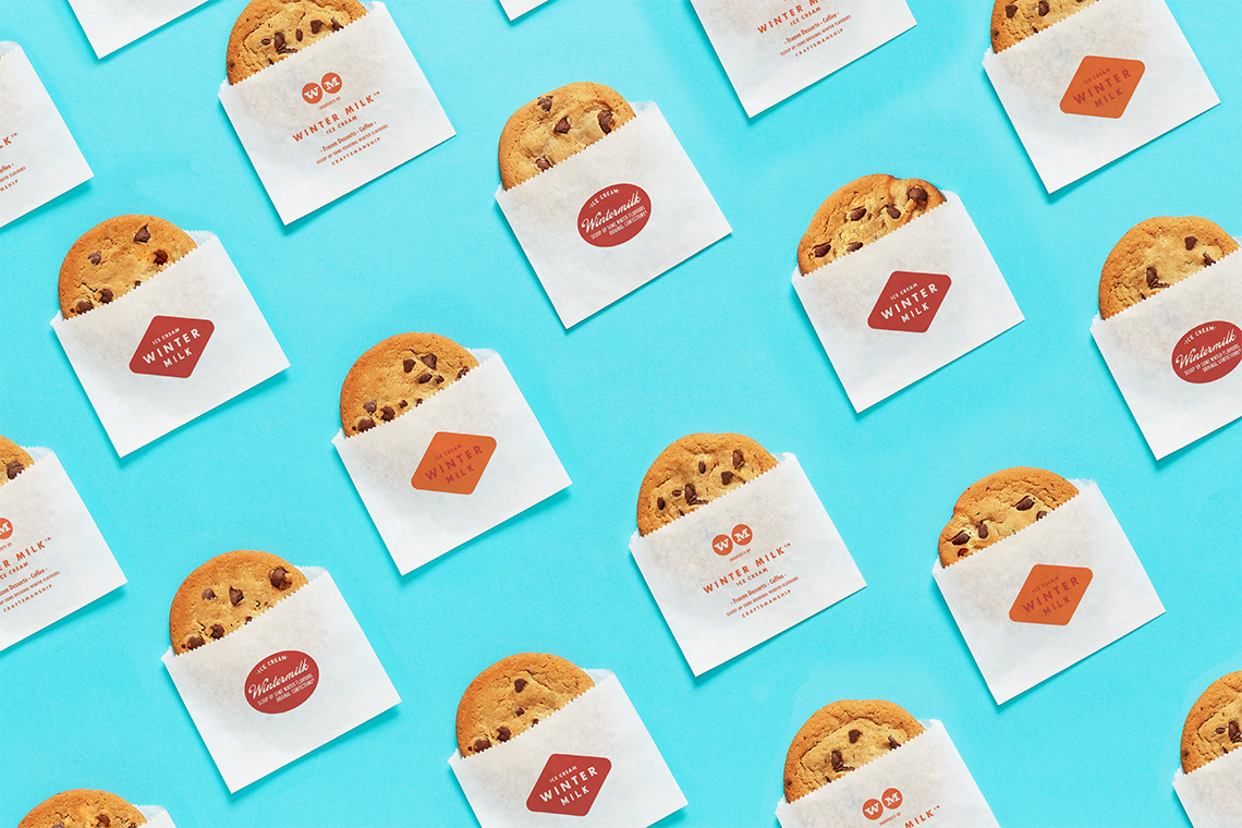
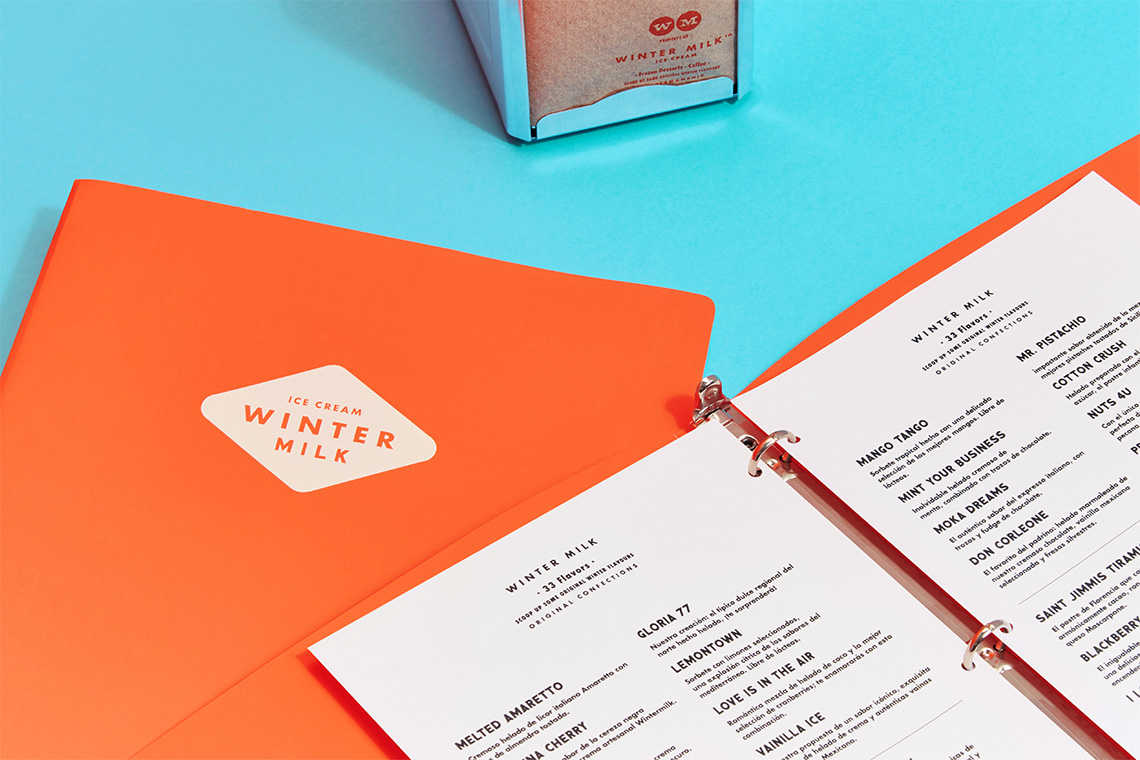
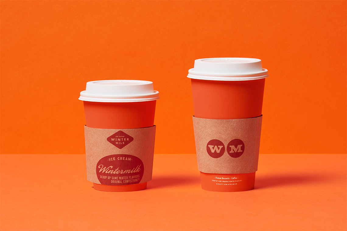
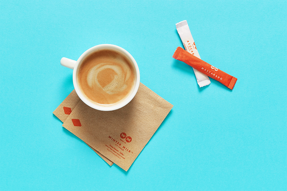
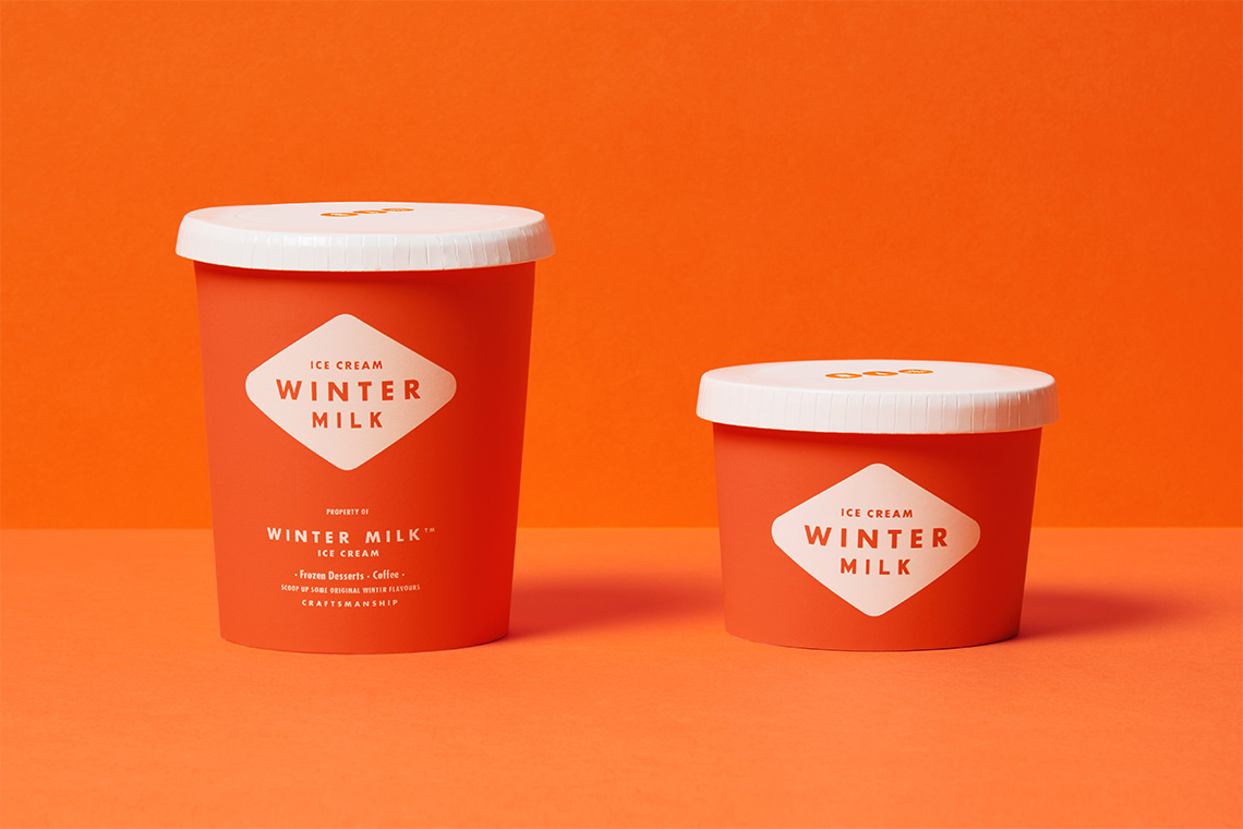
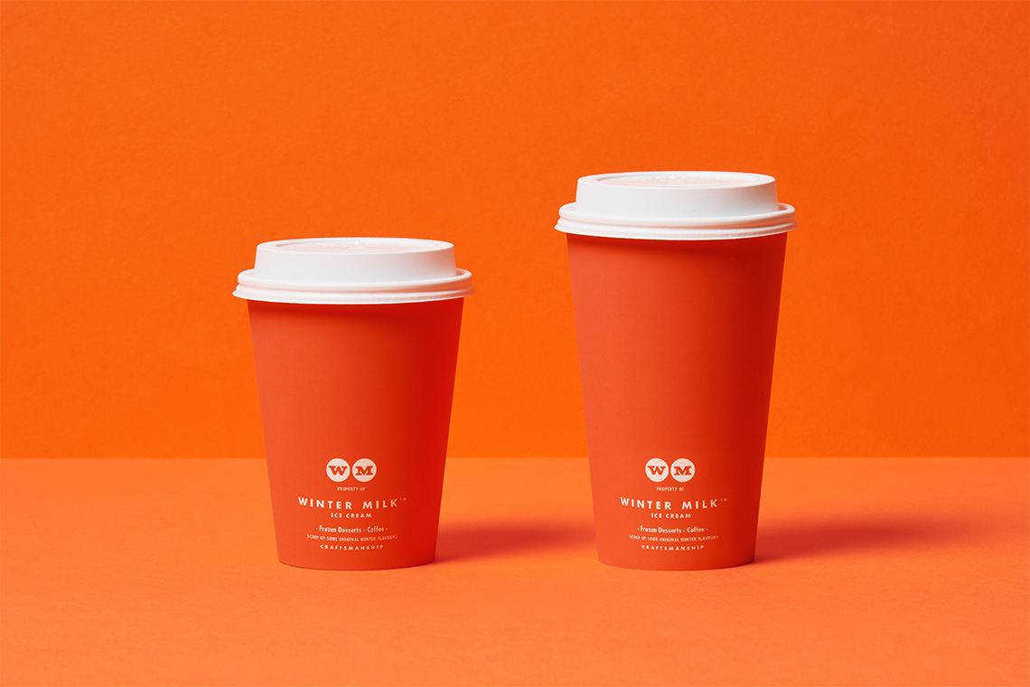
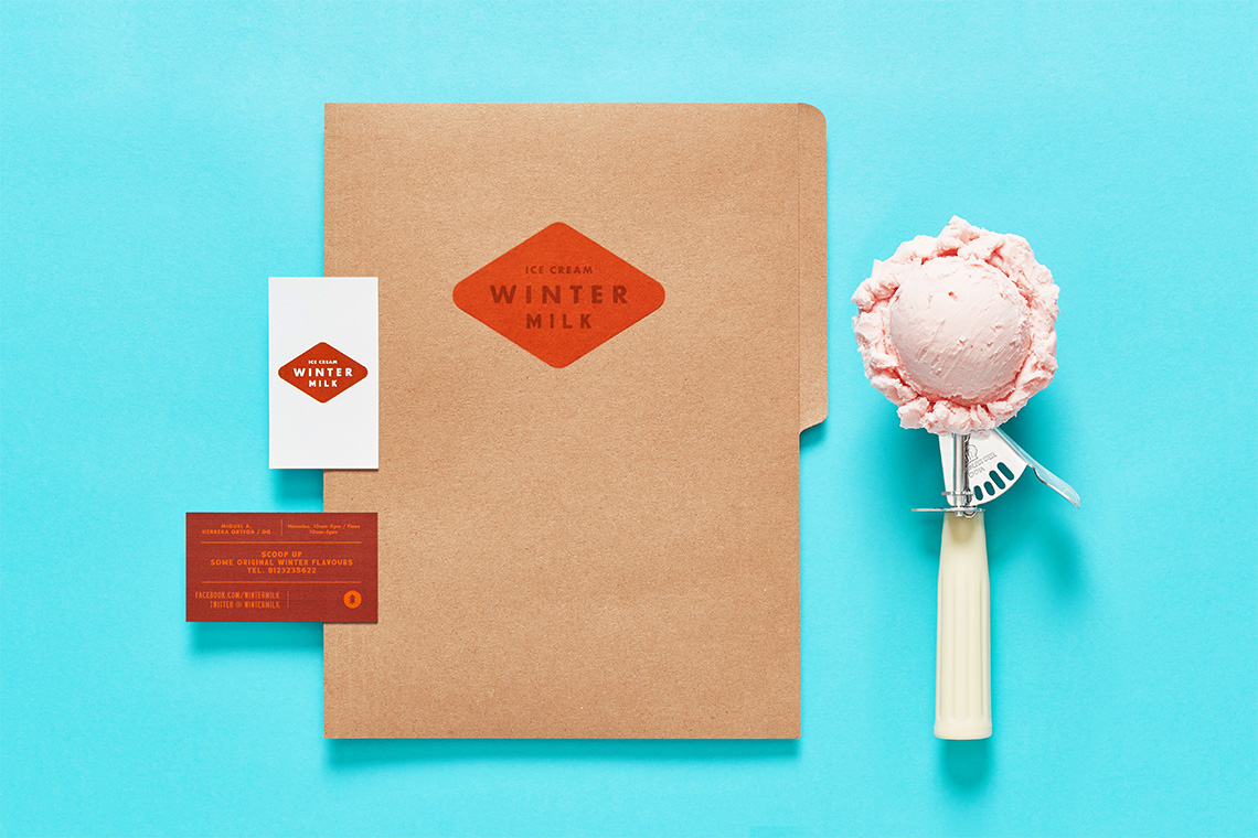
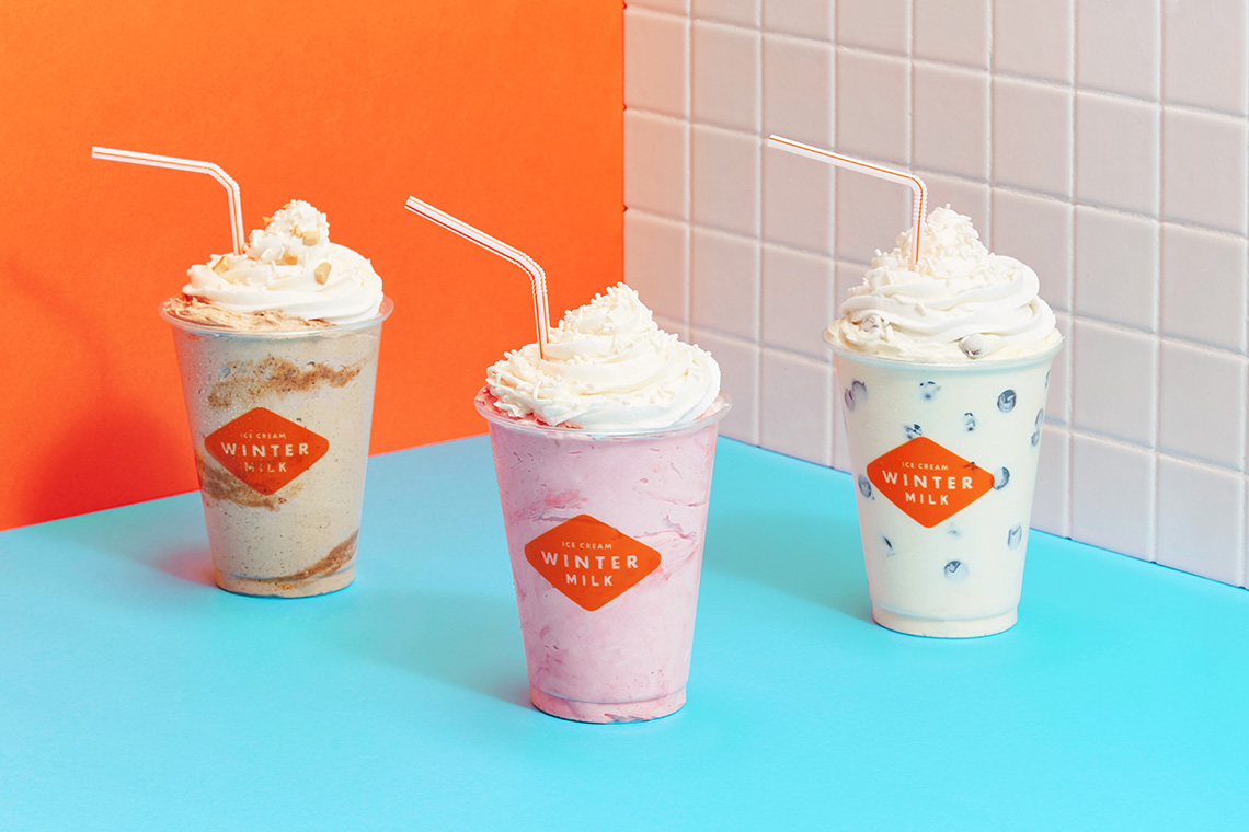
The concept for this shop suggests an atmosphere and experience suitable for enjoying and sharing an ice cream the traditional way with its family and friends. The graphic identity centers on employing different typographies acknowledging the graphical hand-made labeling and signs at cafeterias from the 60's. The result comprises a compendium of custom made logos for the brand collateral and store interiors. The color palette reflects a combination of warm oranges and fresh blues. The orange gradation references the emblematic traditional color of the Dutch monarchy while the blues resemble the winter and cold climates. The interior design and tones are inspired by Wes Anderson's style. — (A)
The interior design and tones are inspired by Wes Anderson's style.
