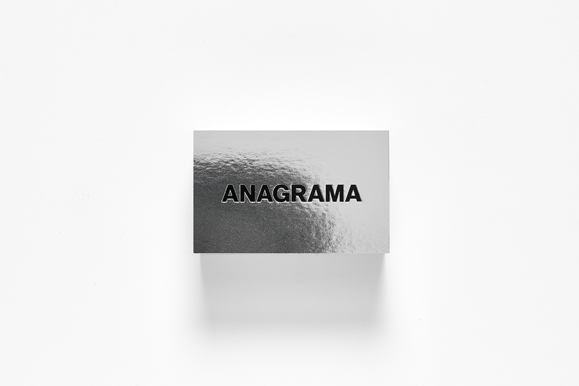
A good business card is so much more than a good first impression.
We see it as a very specific and decisive moment on every business encounter.
As such, our last year’s redesign provided the best opportunity to rethink ours in a more concise and clearer style.
Black is our color by choice and mixed with silver we created a clean, fresh and modern contrast.
The text was all centered and uppercased, emphasizing strength on the typographic display.
For this unique stationary set we explored new printing techniques as well as novel finishing details.


