Redberry
ARCHITECTURE
The client
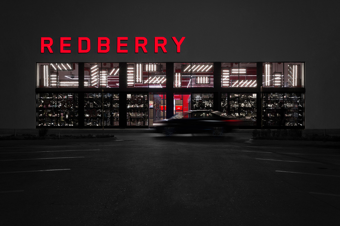
Redberry is a shoe store looking to adopt the typical American footwear retailer outlet store vibe. The idea of the store is to introduce the American concept of providing branded footwear at affordable prices for the general public.
keywords
Shoe store /Mexico /Branding /Graphic Design /Interior Design
the objective
Develop a comfortable, approachable and wide space to explore the products variety of the brand through a family environment.
the solution
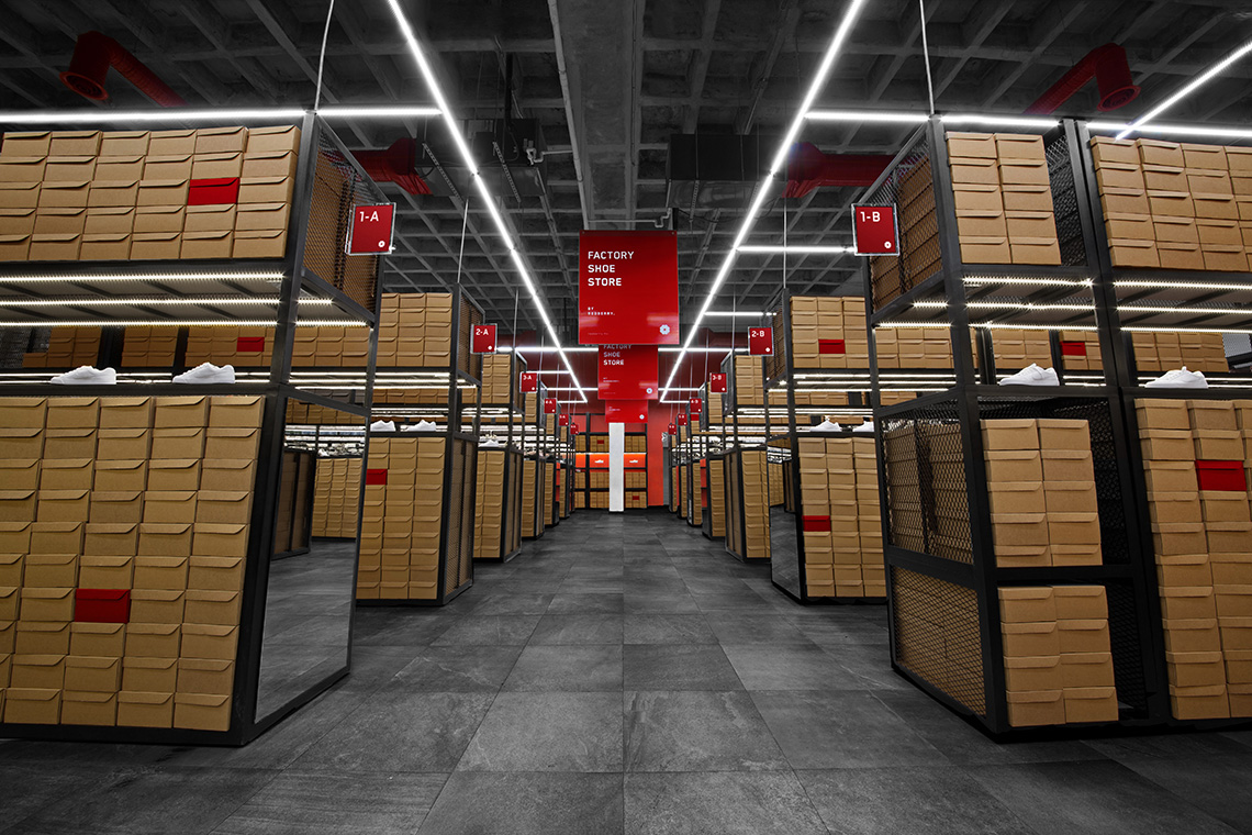
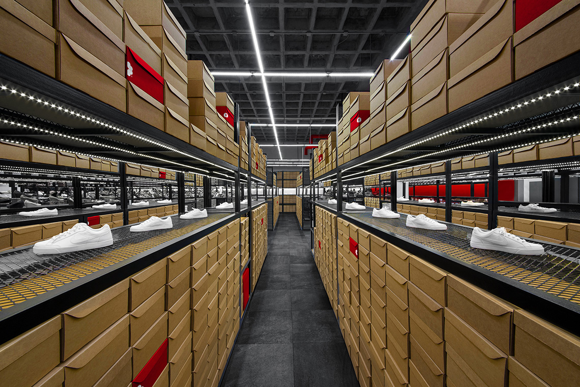
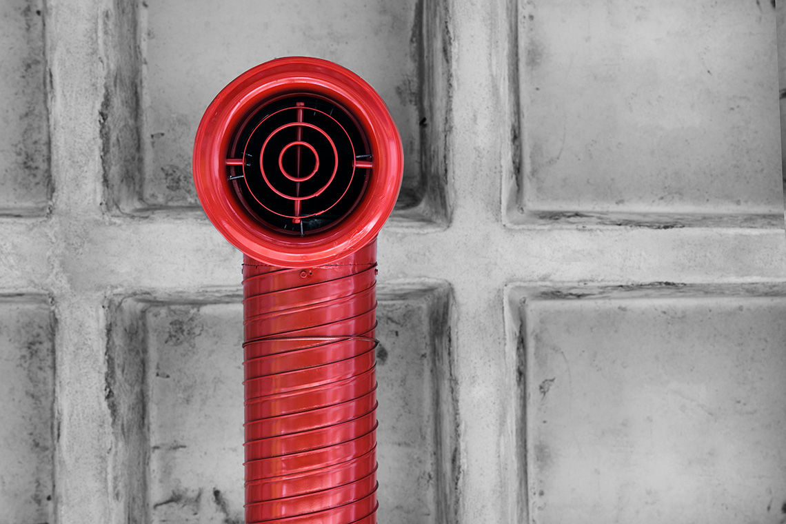
Following this concept, our interior design proposal uses industrial materials, such as metal and concrete, to immerse the consumer in a factory-like setting with a modern twist that comes from the brand's look and feel. The use of raw finishes in the interior design, such as the gridded metal shelves, increases the brands industrial feel and rounds it up perfectly. — (A)
Our interior design proposal immerse the consumer in a factory-like setting.
Redberry
BRANDING
the objective
Develop a graphic identity with a familiar, fun and friendly style that transmits fashion and adjusted to their clients needs.
the solution
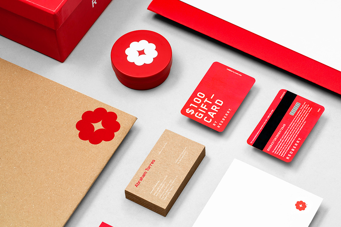
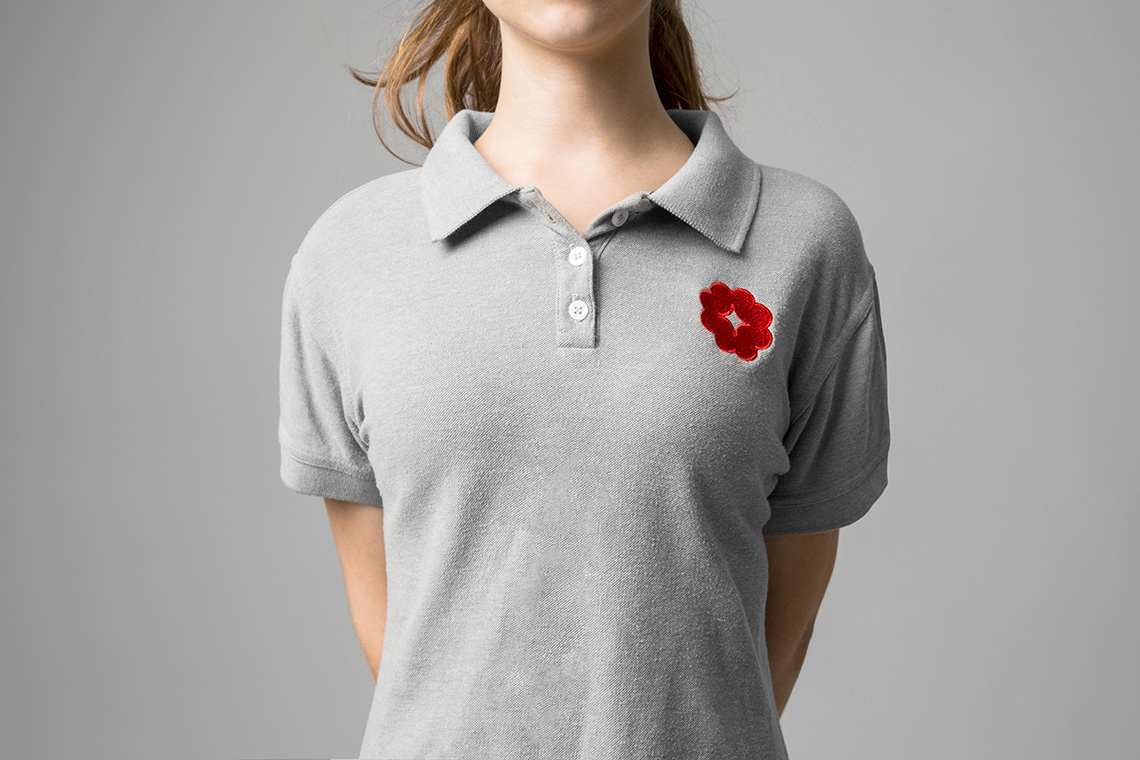
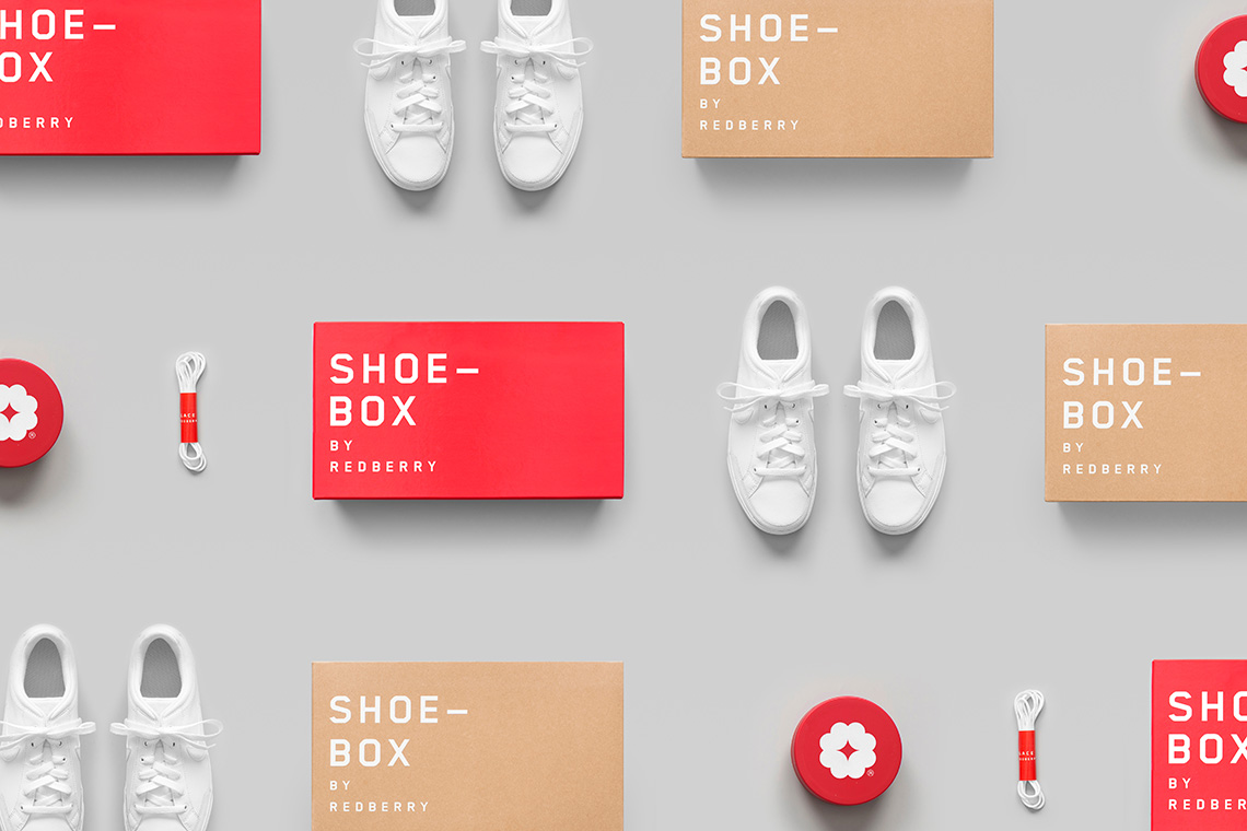
Our branding proposal takes off from the store's name, Redberry. So we designed an iconic logo based on the simplification of a raspberry's unique shape. On the other hand, the typographic style and the main single-color selection within the identity act as the contributing factor that defines the brand with an industrial / modern style.
Following this concept, our interior design proposal uses industrial materials, such as metal and concrete, to immerse the consumer in a factory-like setting with a modern twist that comes from the brand's look and feel. The use of raw finishes in the interior design, such as the gridded metal shelves, increases the brands industrial feel and rounds it up perfectly. — (A)
Immerse the consumer in a factory-like setting with a modern twist
