Qleaners
BRANDING
The client
Qleaners is a company offering high-end laundry and dry cleaning services in Santiago de Chile. This company distinguishes itself for offering a service with peculiar characteristics in this industry: Dry cleaning employing organic products with a systematic approach to process selection according to the garment's material type.
keywords
Laundry/ Dry Cleaning/ Chile/ Graphic Design/ Branding/ Packaging
the objective
Create a brand identity that effectively communicates the service and specialized treatment of a traditional industry such as laundry and dry cleaning.
the solution
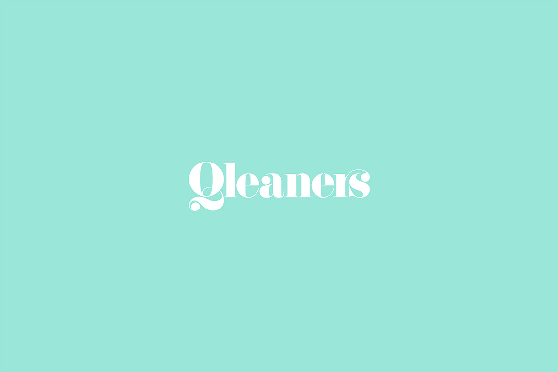
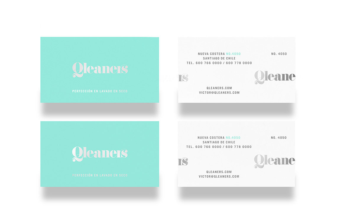
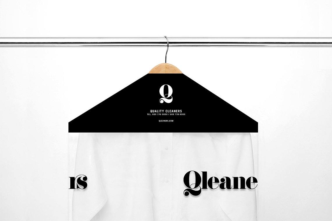
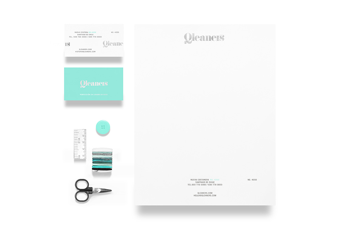
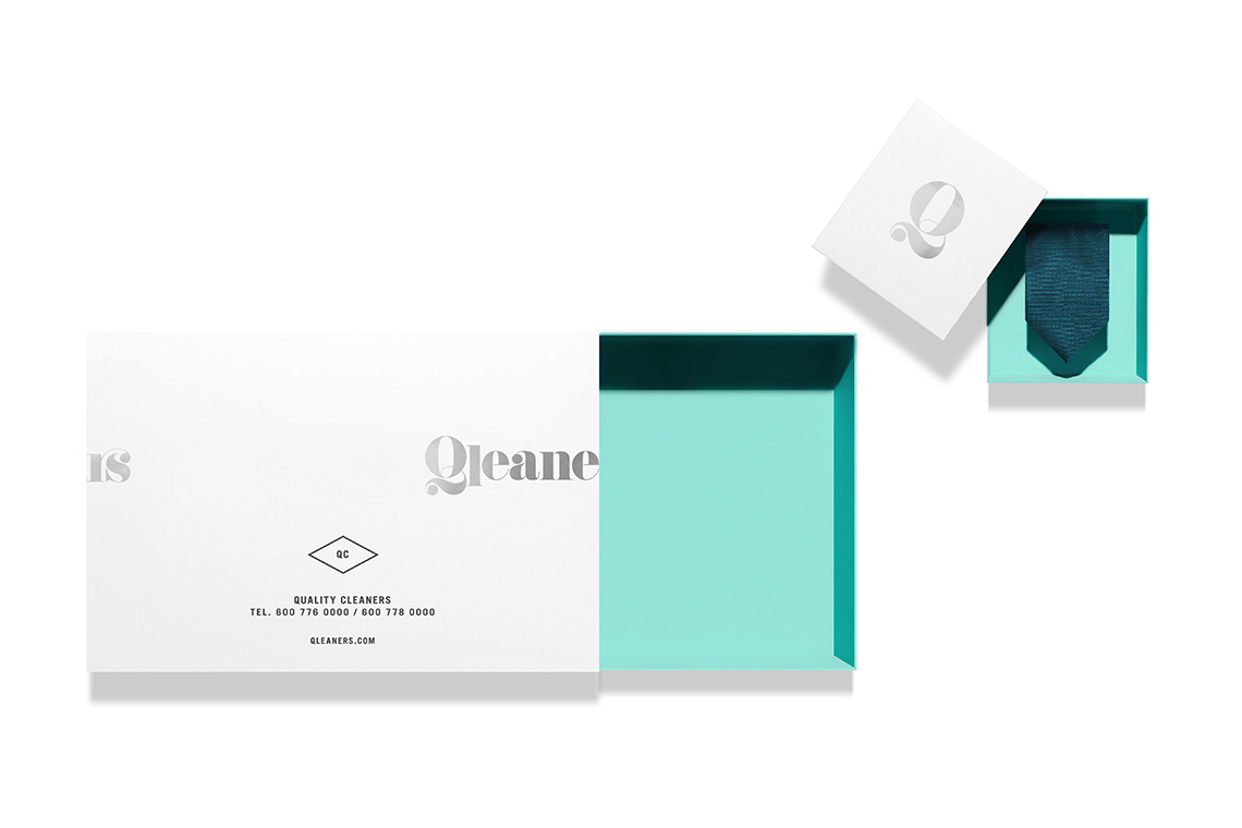
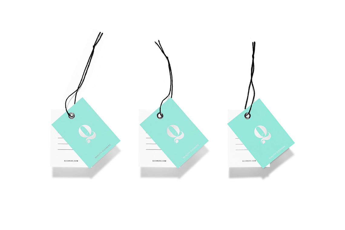
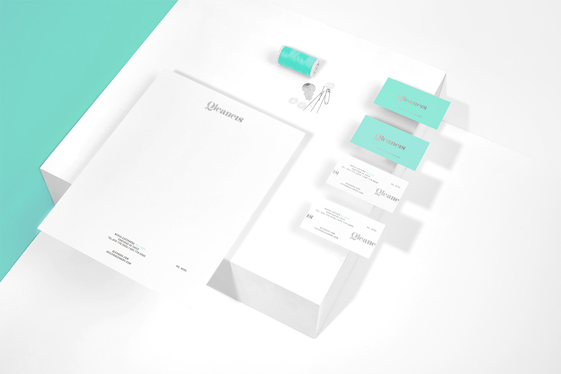
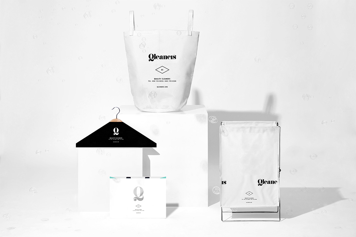
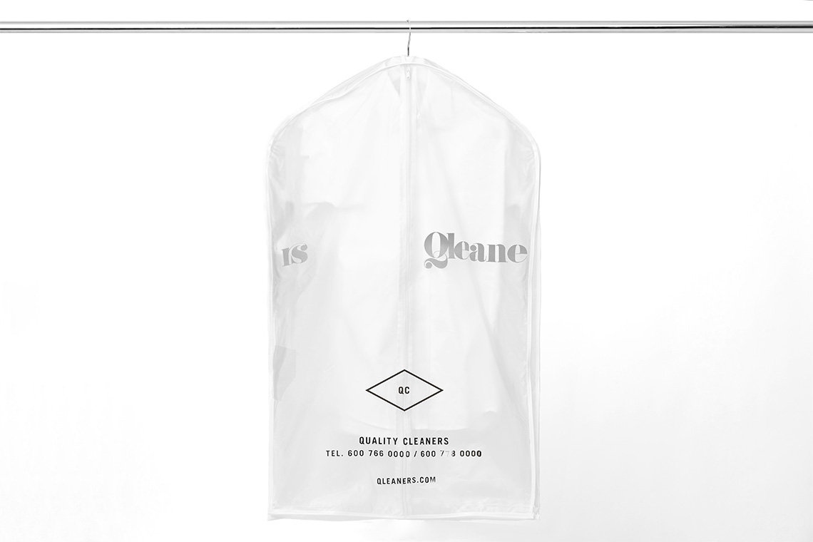
The corporate identity's guiding concept is inspired by classic fashion brands. The custom logo serif typeface can't be missed, as it simulates organic shapes like the ones created by moving water. Adding to the organic brand behavior, strokes with thick beginnings and thin endings are employed. The secondary typography is characterized by a condensed style contributing to a modern balance in contrast with the classic logotype tone. The dynamic typographic dispositions respond to the sizes of spaces and materials in the brand collateral.
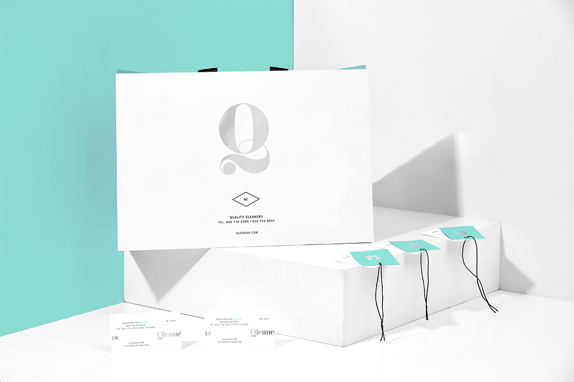
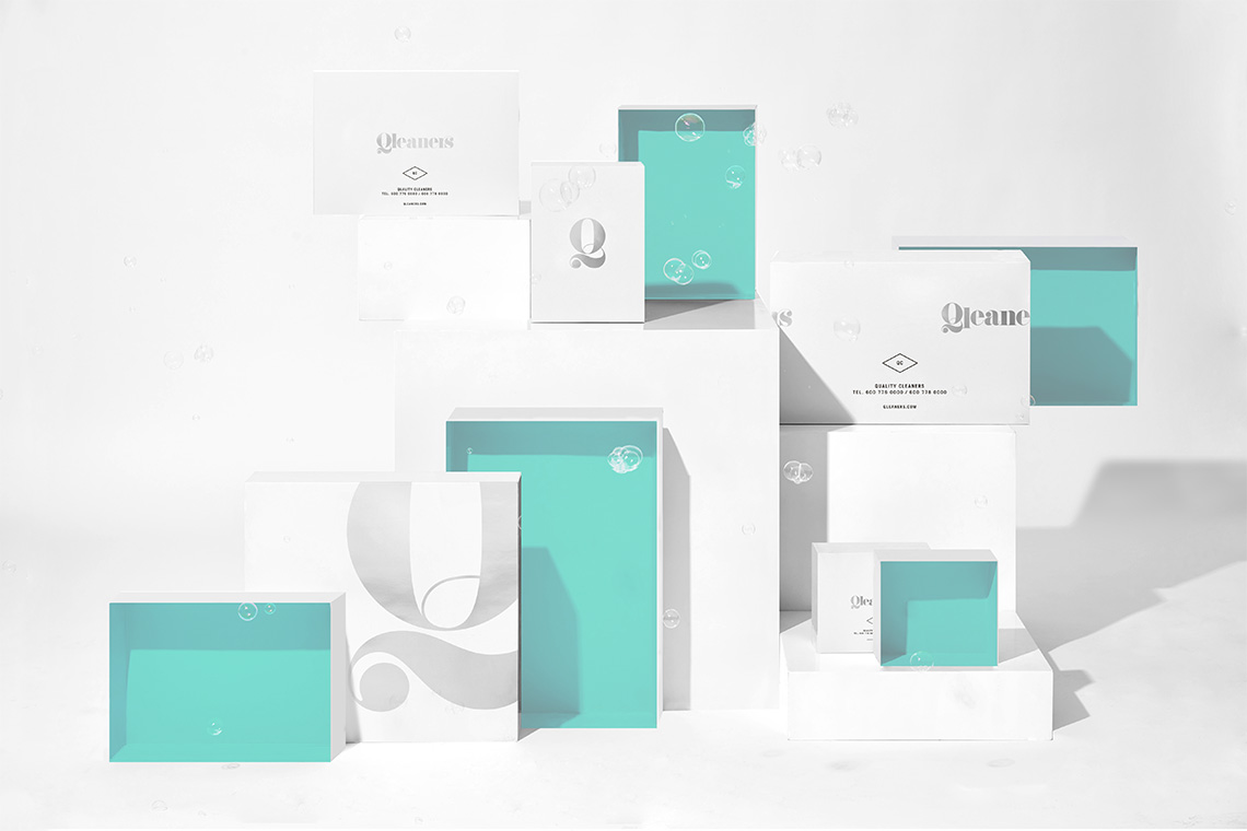
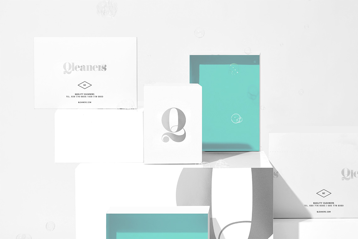
The color palette varies in the ranges of green and blue behaving consistently with the ??'cleanliness' and 'freshness' brand values. These green and blue tones co-exist with white spaces and black elements that are characteristic in the high-end fashion industry. — (A)
The logo simulates organic shapes like the ones created by moving water
