Sphynx
BRANDING
The client
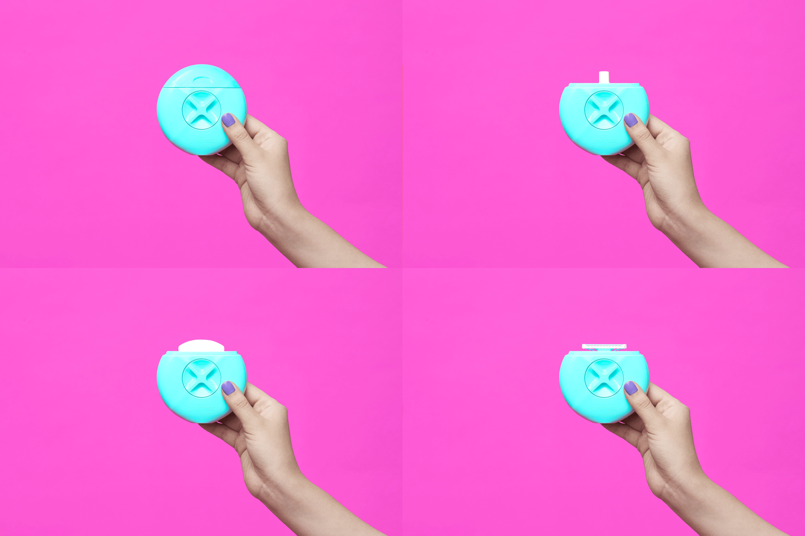
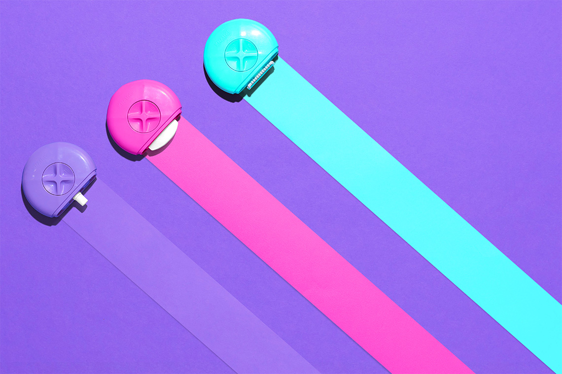
Sphynx is a product that seeks facilitating the shift on perception of traditional and complicated beauty routines. It comprises a shaving device with a simple mechanism that can be set in one of four positions for its use: The first unveils a rechargeable water spray that helps refresh the skin before shaving. The second one includes a moisturizing soap made from shea butter to moisturize the skin. The third shows the razors employed for shaving. The fourth and last position stores a piece of soap.
keywords
Beauty/ Graphic Design/ Branding/ Packaging
the objective
To represent, in a simple and concise way, the main product's objective: Shaving supported by a friendly & accessible visual language.
the solution
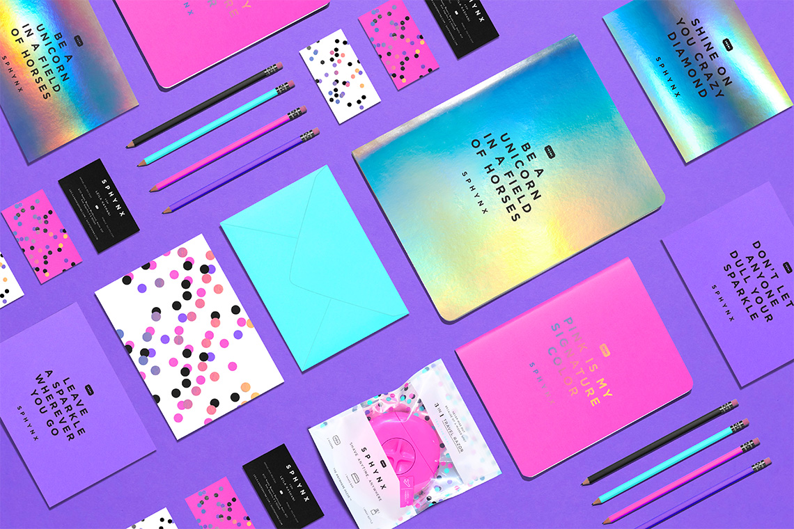
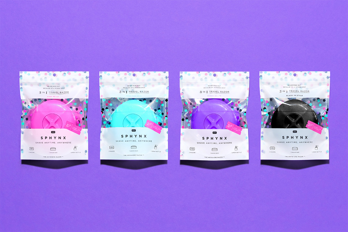
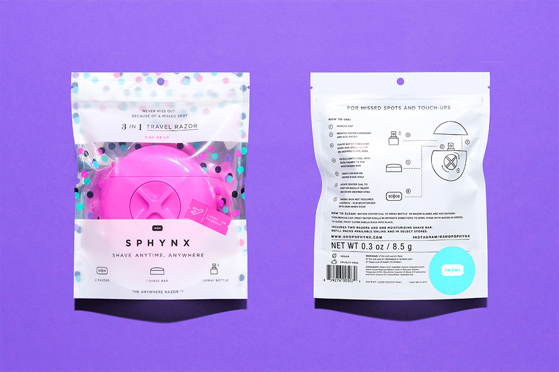
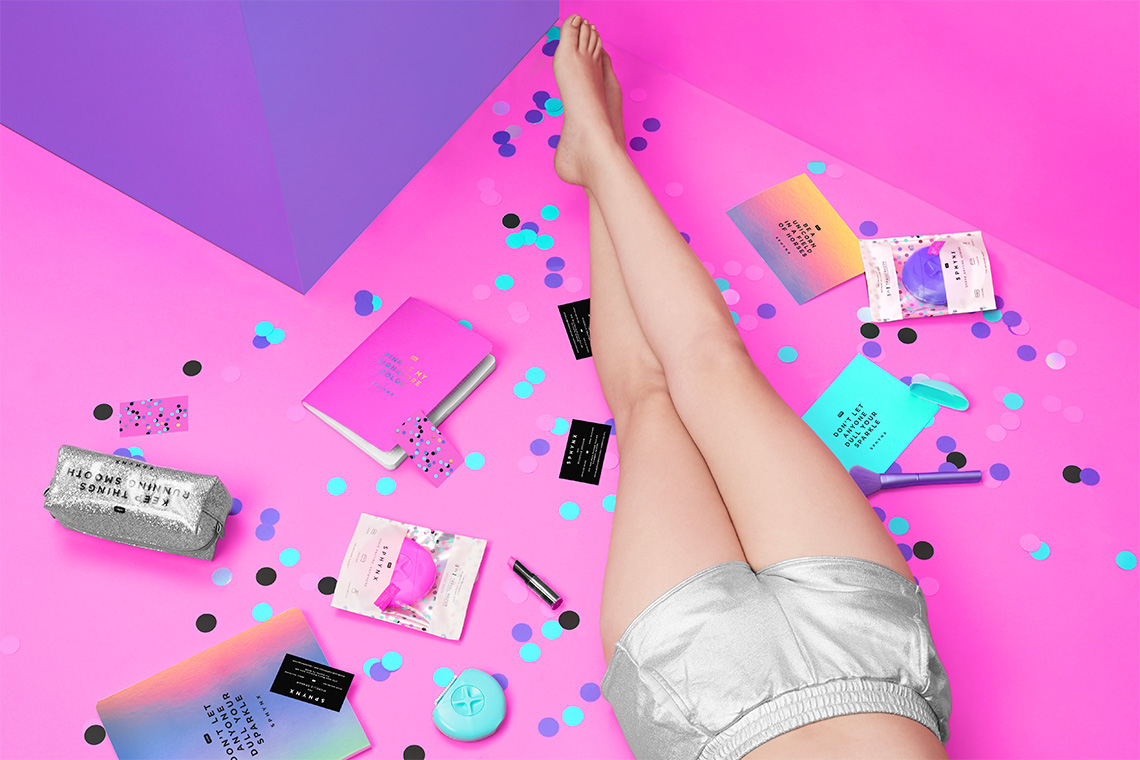
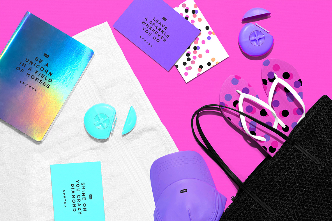
The packaging stands out for its shape and intense color palette praising the energy and joviality of the brand.
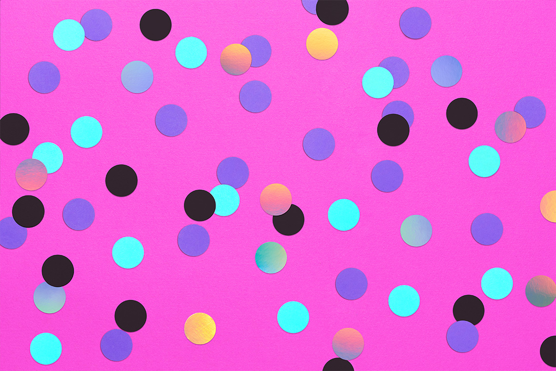
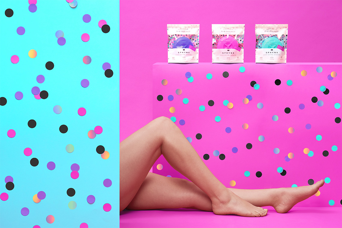
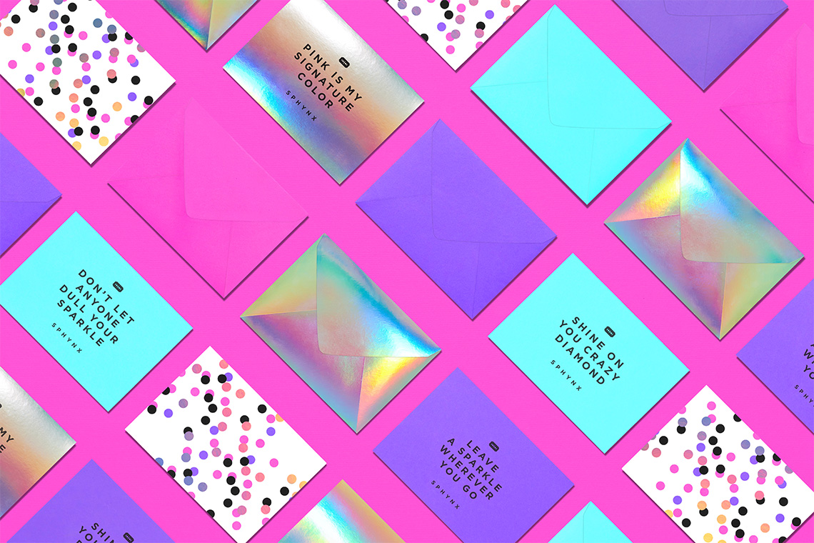
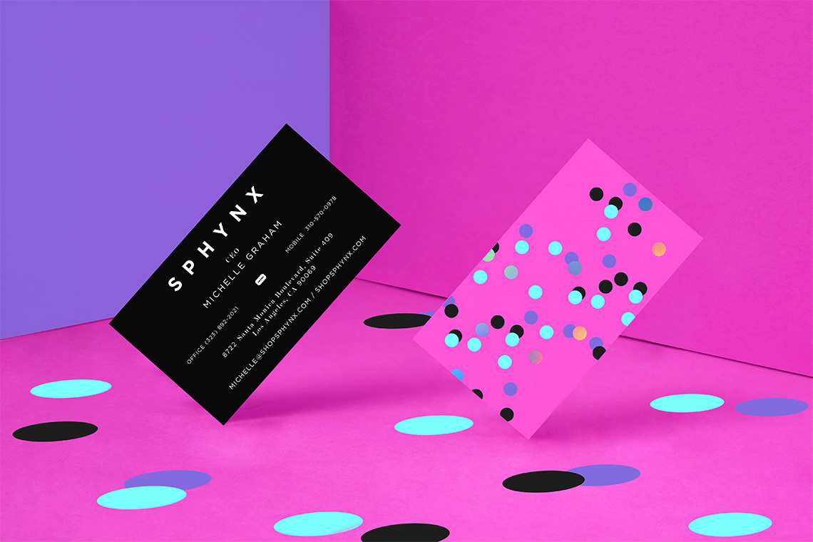
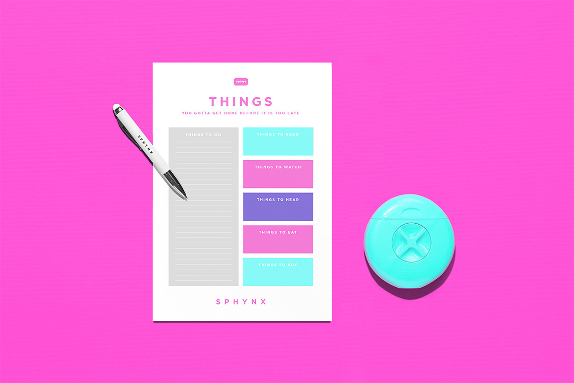
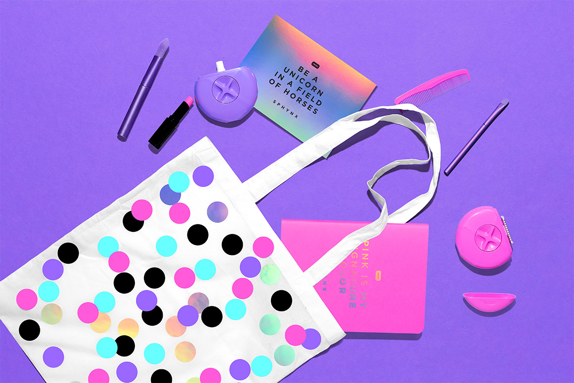
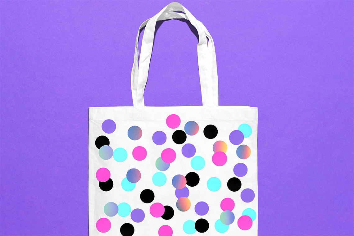
The brand pattern is inspired by circular polka dots that create a relaxed but dynamic texture complementing the brand's graphic communication. Gotham typography was selected for its geometric, readable and timeless style to accompany Sphynx's typographical provisions, complementing the modern tone of voice required by the brand. — (A)
Packaging stands out for its color palette praising the energy and joviality of the brand.
