Odabashian
BRANDING
The client
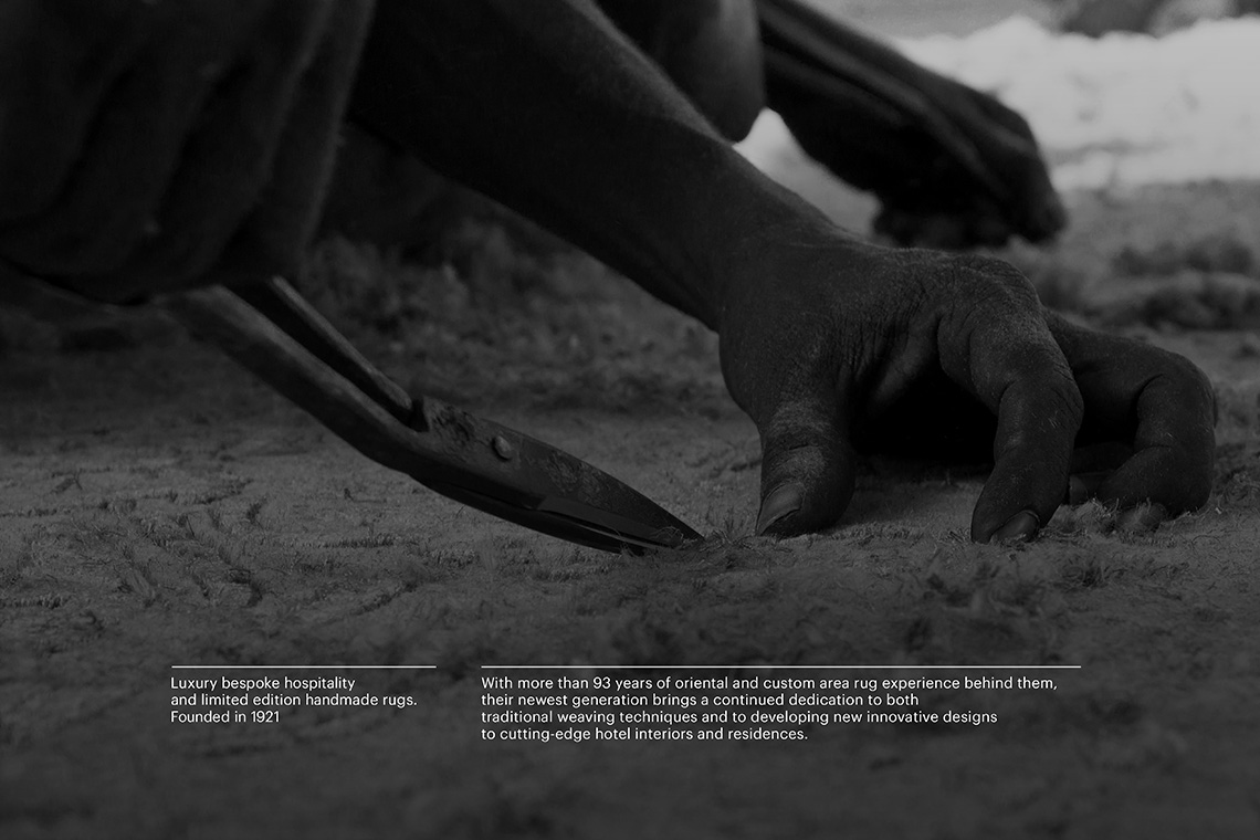
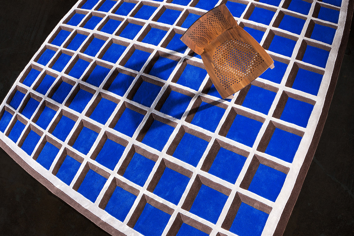
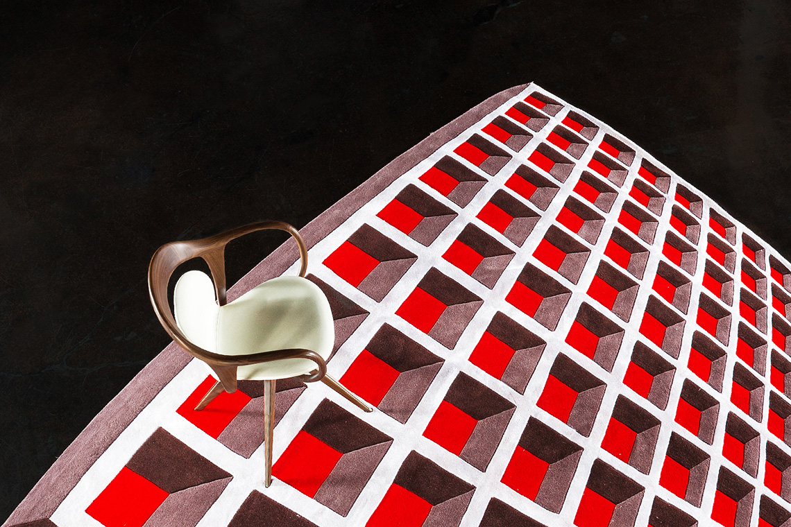
Odabashian is a company dedicated to the design and creation of custom hand-woven rugs made by expert craftsmen in India, Turkey, Pakistan, and Nepal. Their products have been acquired by presidents, dignataries and museums along their 93 years of experience in the oriental rug market. With offices in Mexico City, Miami and Hong Kong, Odabashian has also been author of important collaborations with prestigious architects and interior designers. In the process of developing innovative and transcendental designs, the new Odabashian generation establishes a continuous dedication on traditional and innovative weaving techniques.
keywords
Craftsmanship/ Branding/ Graphic design/ Icon design/ Interaction design/ UI/ UX/ Web design
the objective
To create a re-branding proposal that captures the authentic simplicity of their work through a modern approach.
the solution
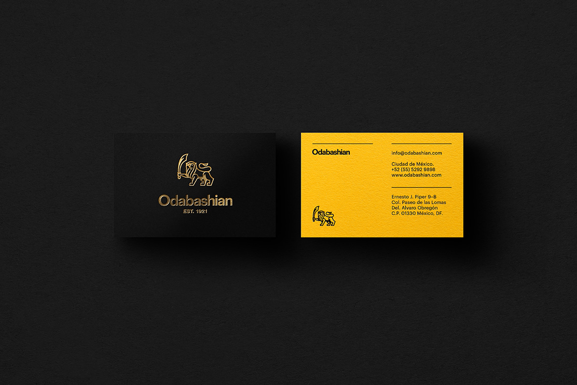
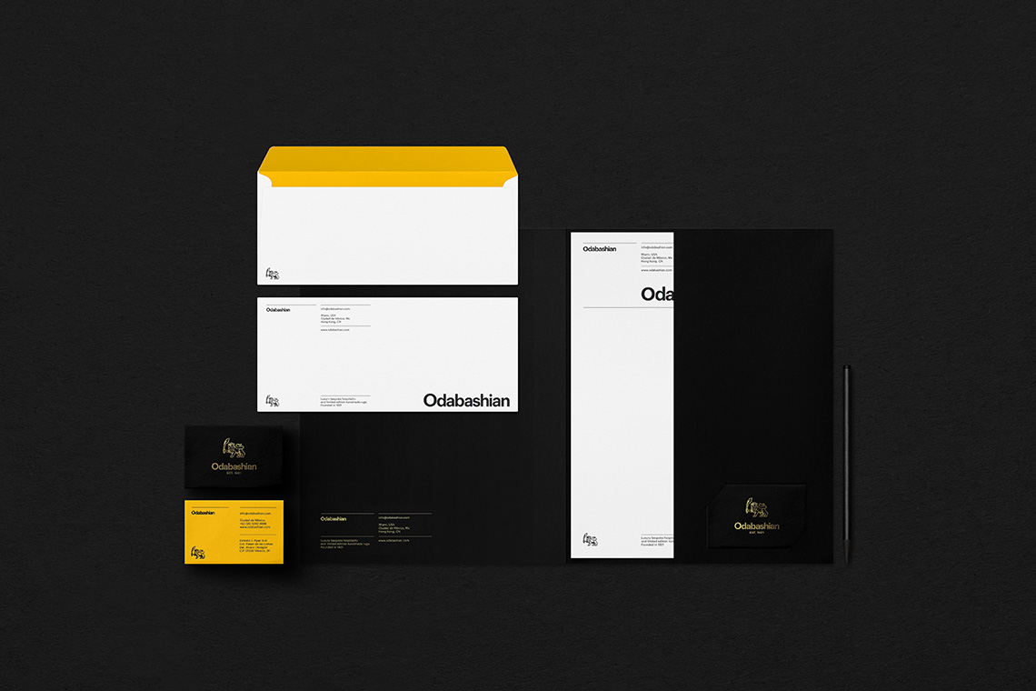
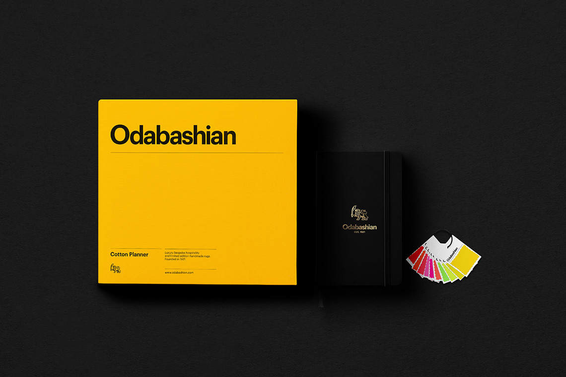
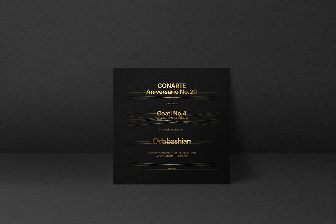
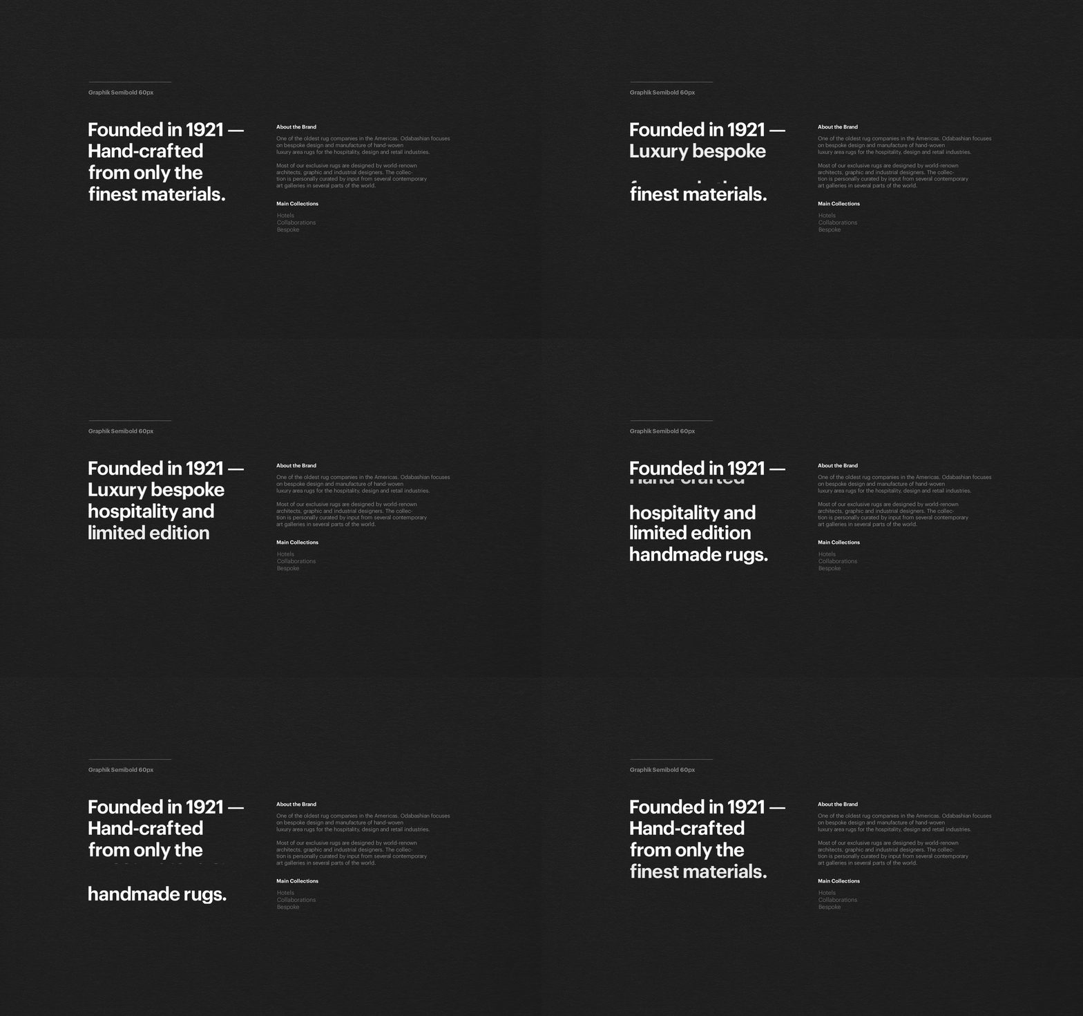
The brand shows an ordered visual unity exalting a hierarchical reticulated system. The use of a sans-serif typography presents information precisely and clearly, accompanied by a color palette responding to their historical traditions. The icon symbolises a progressive evolution perfecting and modernising its trace in tune with the brand’s legacy.
— (A)
The icon symbolises a progressive evolution in tune with the brand’s legacy.
Odabashian
Interactive
the objective
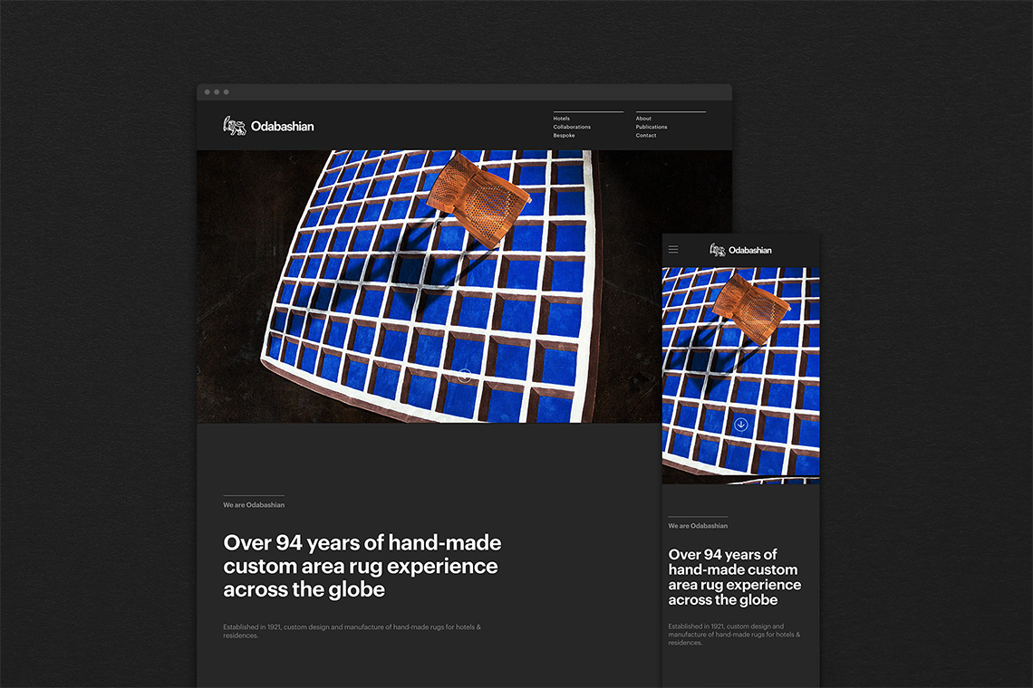
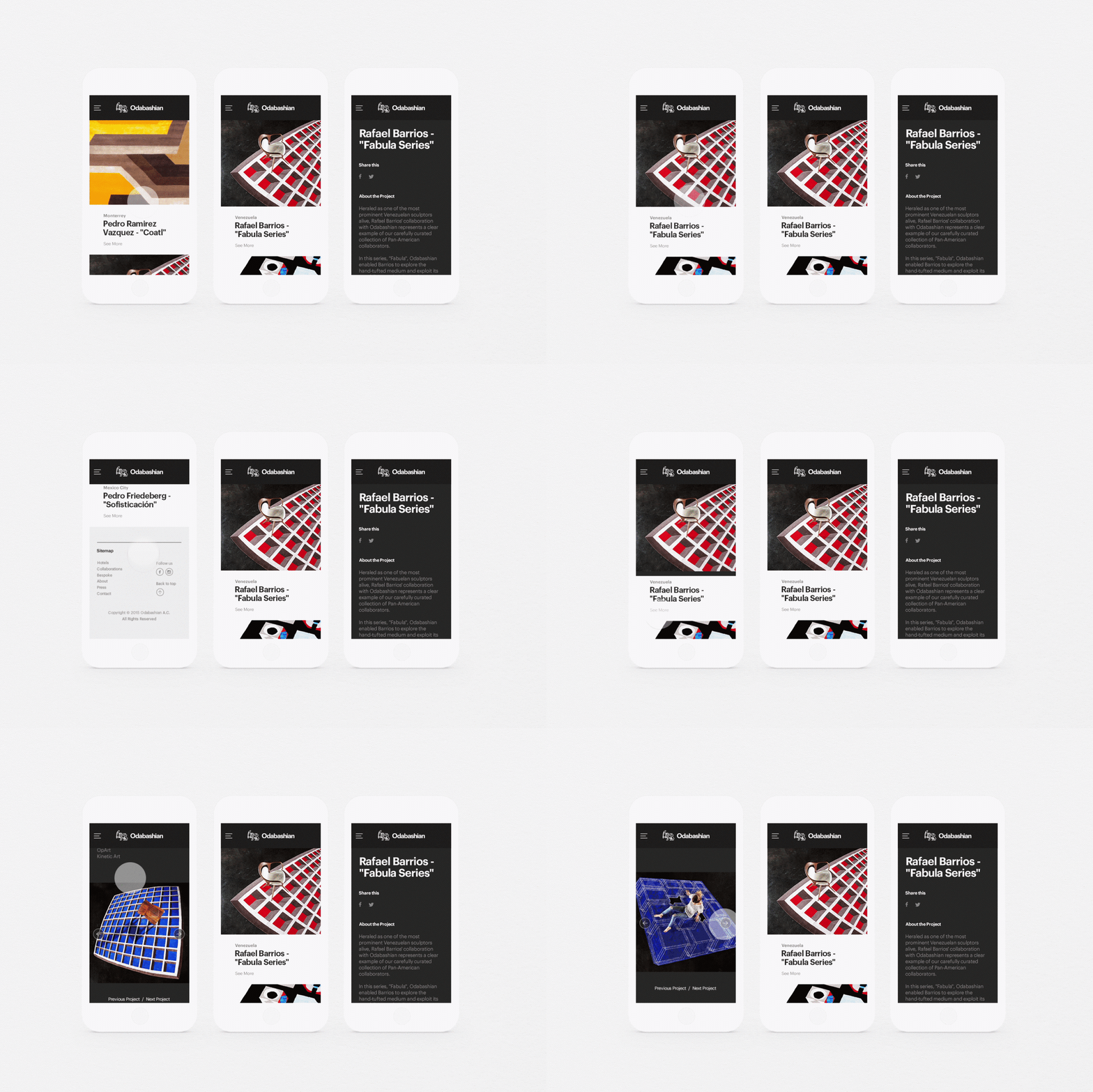
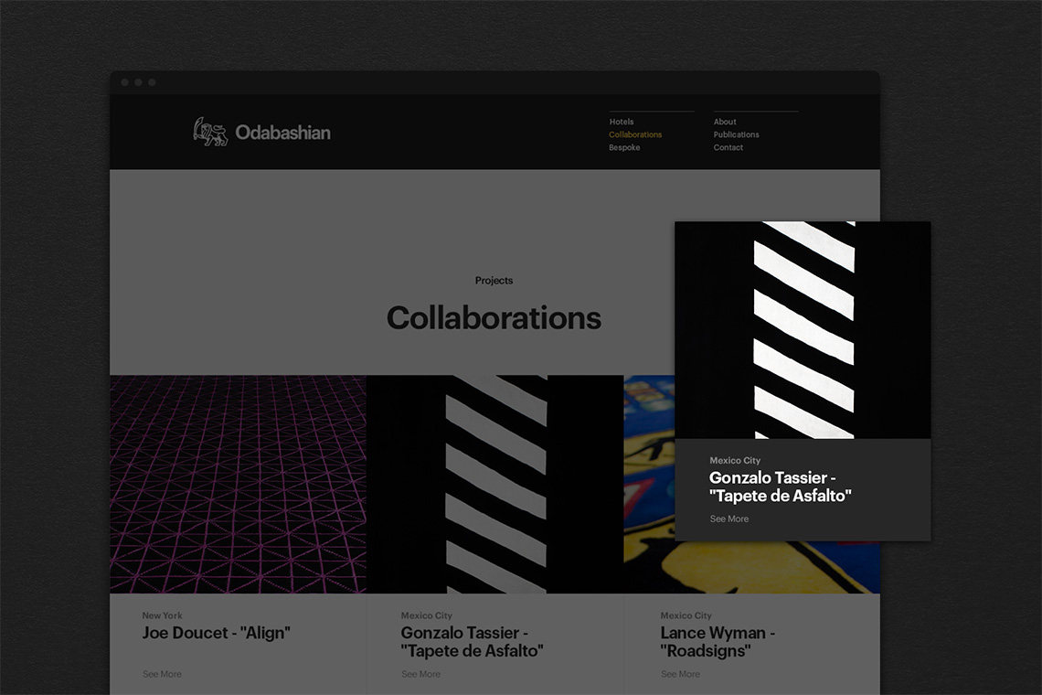
The objective focused on develop an online portfolio to showcase their unique rug projects.
the solution
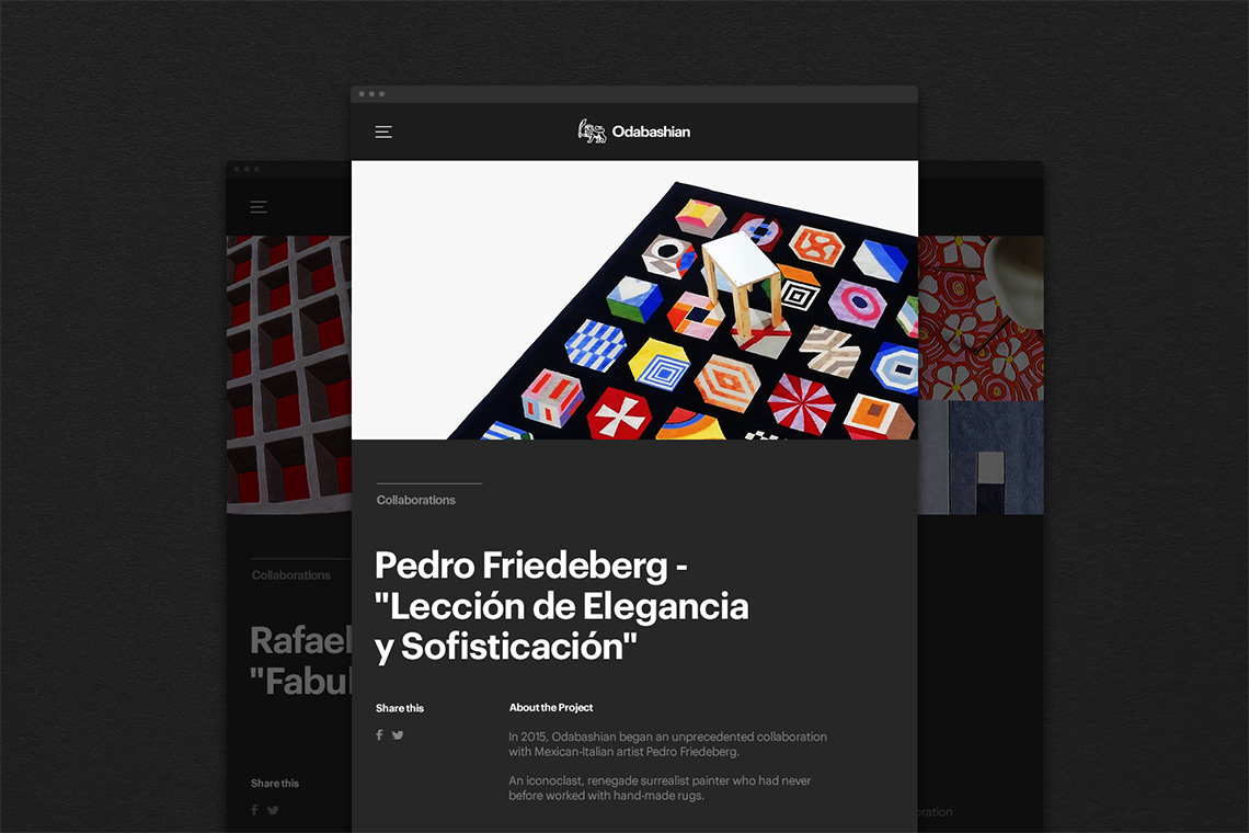
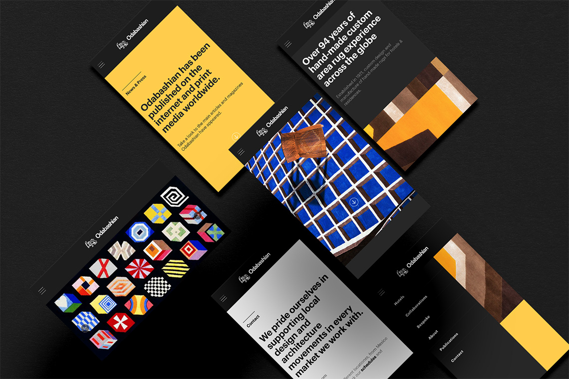
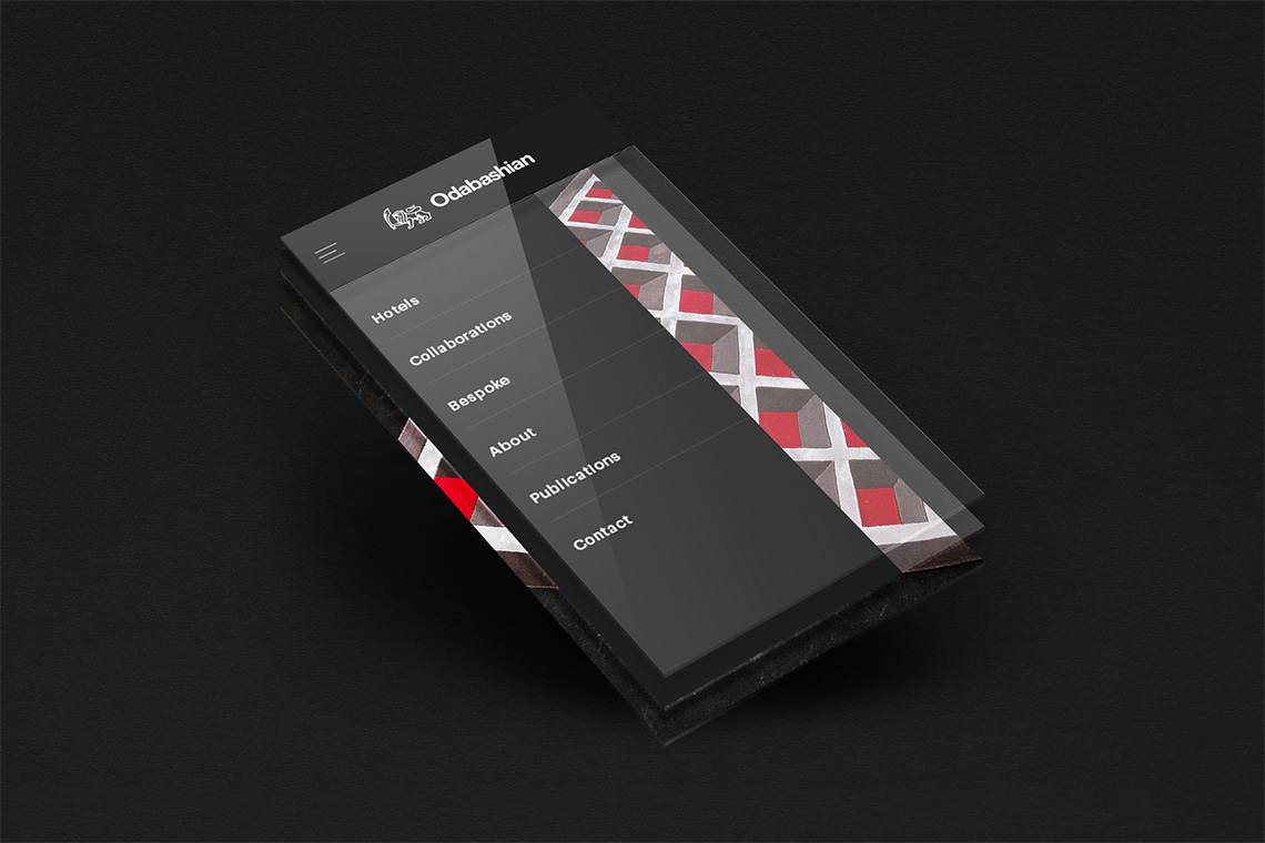
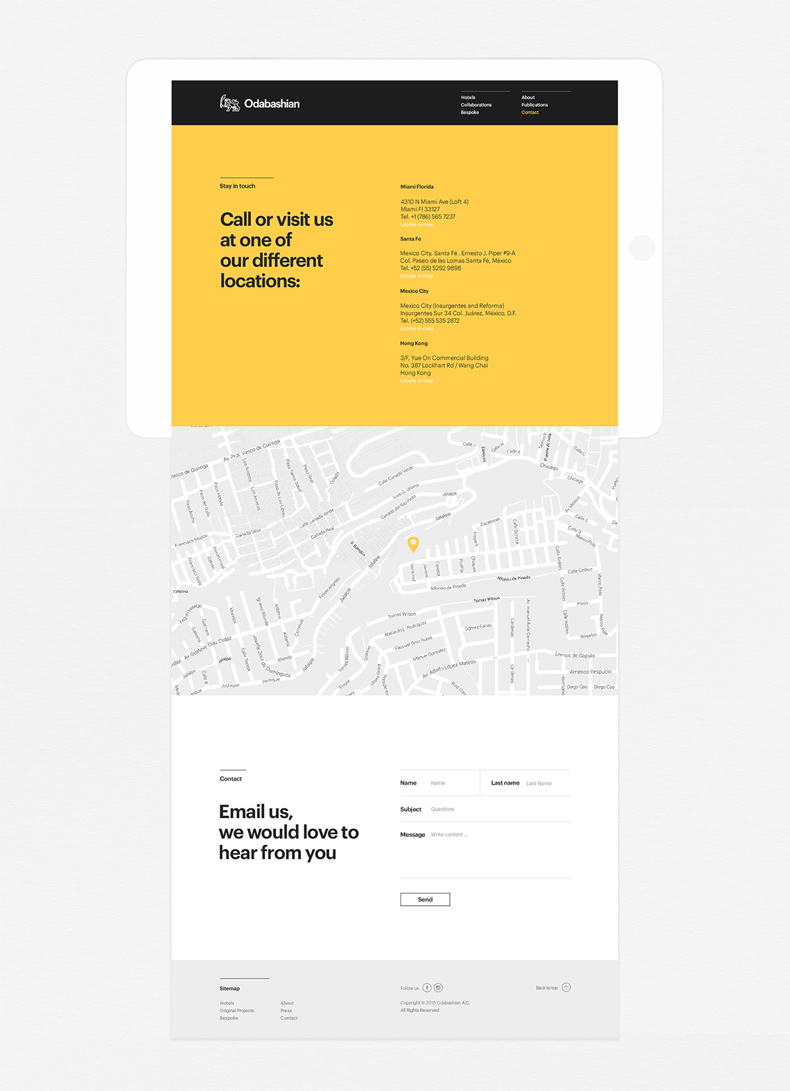
To develop and source hand-made rugs, Odabashian collaborates with world-renown design firms, architects and industrial designers. We designed an interactive platform grounded on their three main principals: bespoke, hotels and collaborations. We employed a graphic language committed to the minimal elements of style such as typography and content layout based on the brand's behaviour Swiss System. — (A)
Typography and content layout based on the brand's behaviour Swiss System
