Montelena
ARCHITECTURE
The client
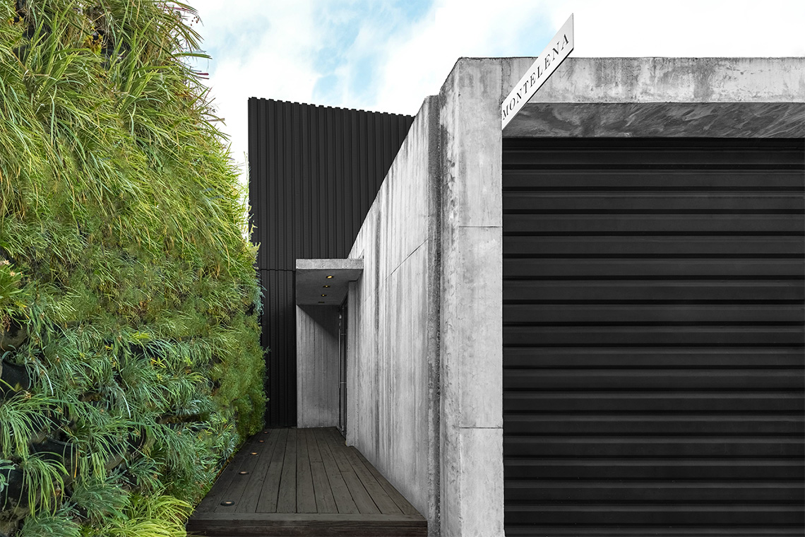
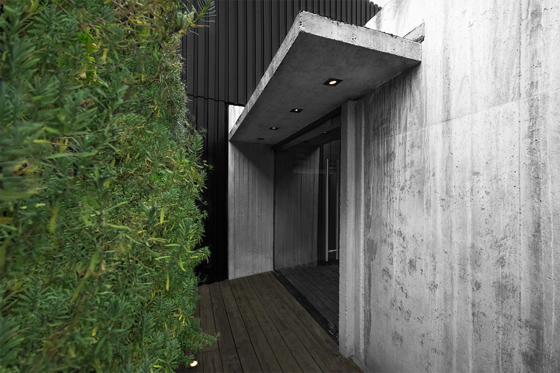
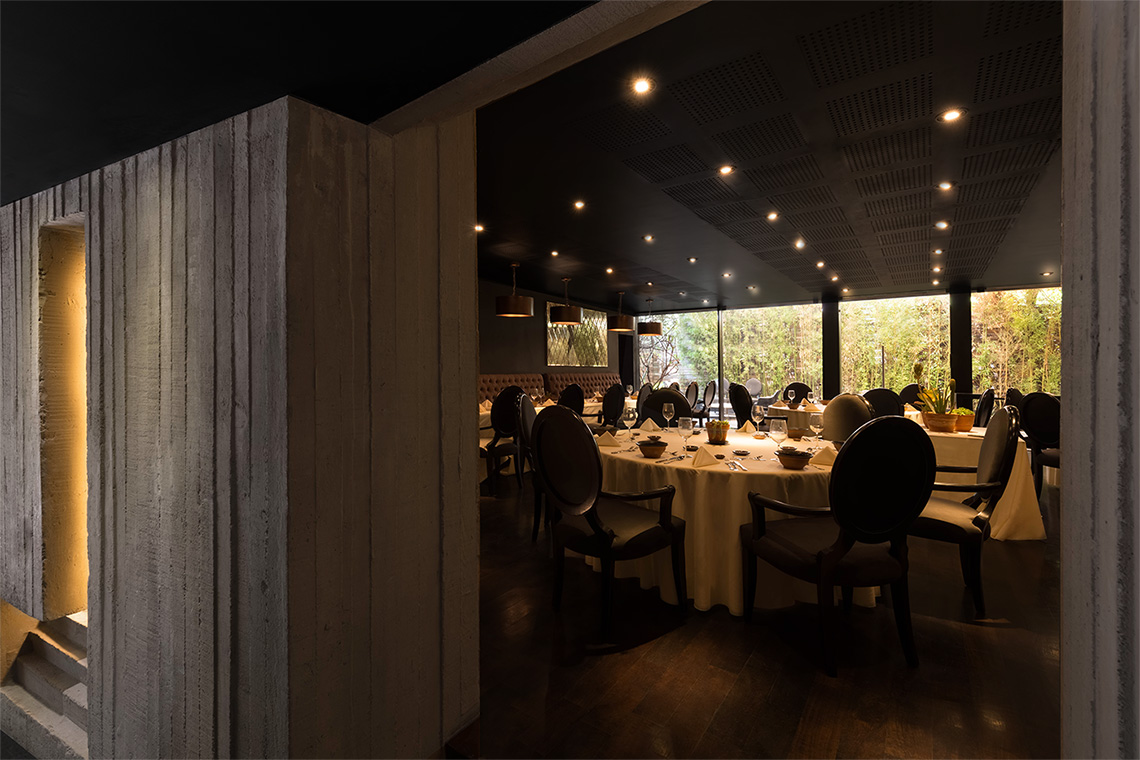
Montelena, represents a space designed for food tastings & exclusive gatherings. Montelena's main access was conceived as Chef Alberto Sentíes' secret.
keywords
Restaurant/ Gastronomy/ Mexico/ Arquitectura/ Diseño de Interior
the objective
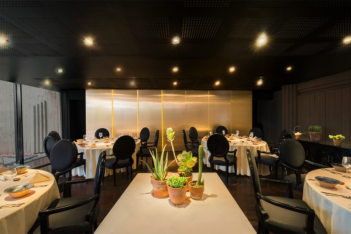
Create a cozy and intimate atmosphere for visitors, and create an atmosphere that enhances the culinary appreciation.
the solution
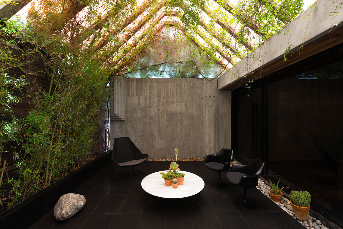
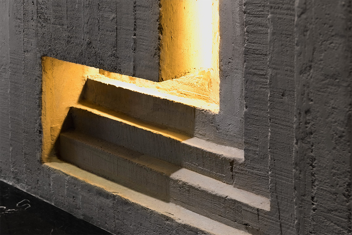
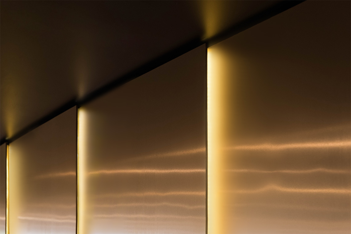
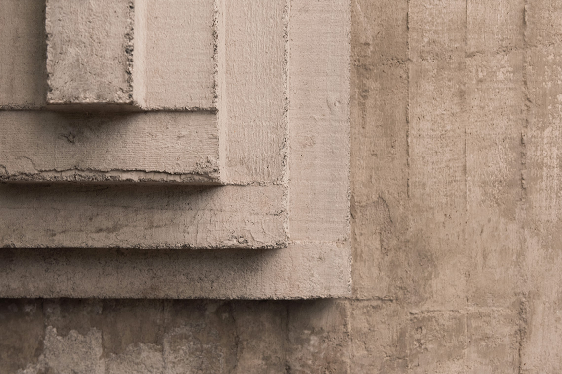
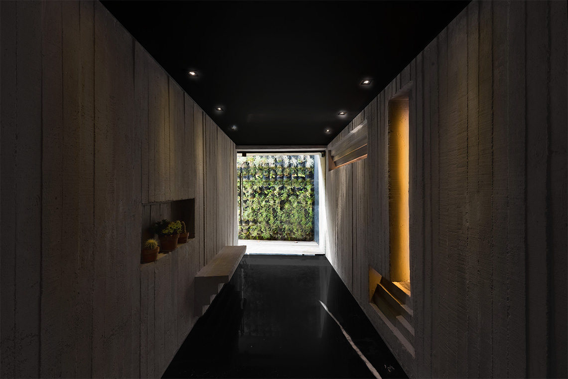
The architectural & interior design project, just like the brand, are inspired by the work of the Italian architect Scarpa, one of the most enigmatical architects of the 20th century, influenced by artisanal architecture styles. The visitor experience commences after crossing the almost hidden door at the end of the hallway. Its distributor and main room are embraced by a warm lighting tone that creates a cozy and intimate atmosphere. The space displays a combination of modern finishes including steel, aluminum and marble attaining a contrast with the spontaneousness of natural materials such as stone and clay. The use of plants as natural objects feeds a fresh accent to the spaces accomplishing an atmosphere of comfort and exclusivity for the guests. — (A)
Inspired by the work of the Italian architect Scarpa.
Montelena
BRANDING
the objective
To design a brand identity that reflects the spontaneousness, uniqueness and mystery of Sentíes' kitchen.
the solution
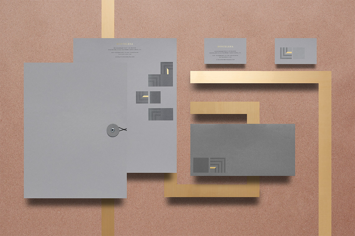
The brand identity design for this project is inspired by the work of the Italian architect Scarpa, one of the most enigmatic architects of the 20th century, and was influenced by artisanal architecture styles.
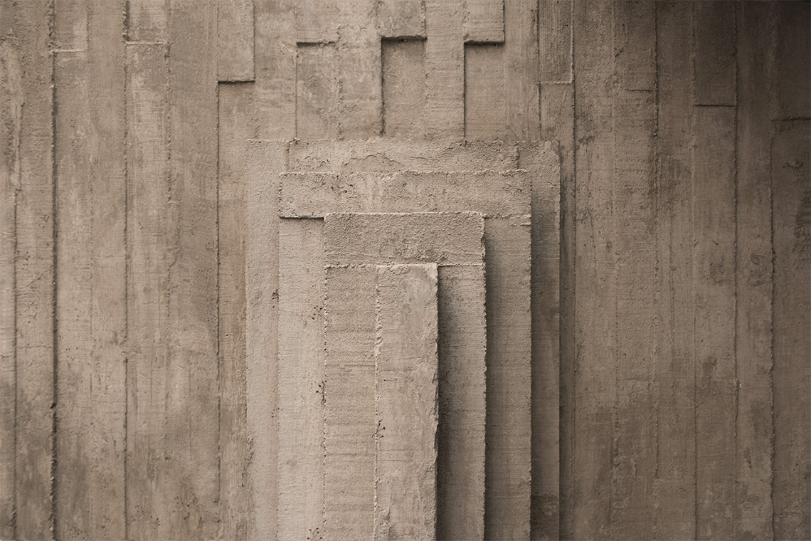
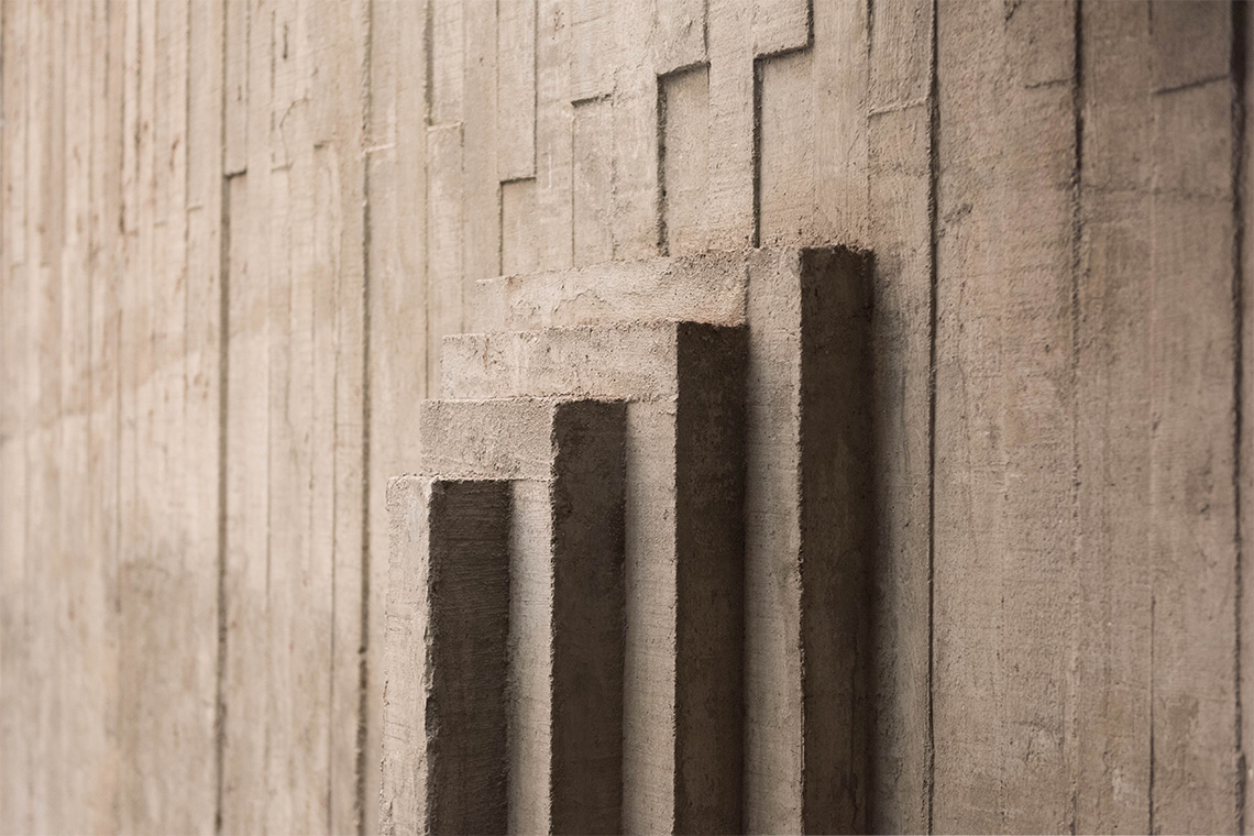
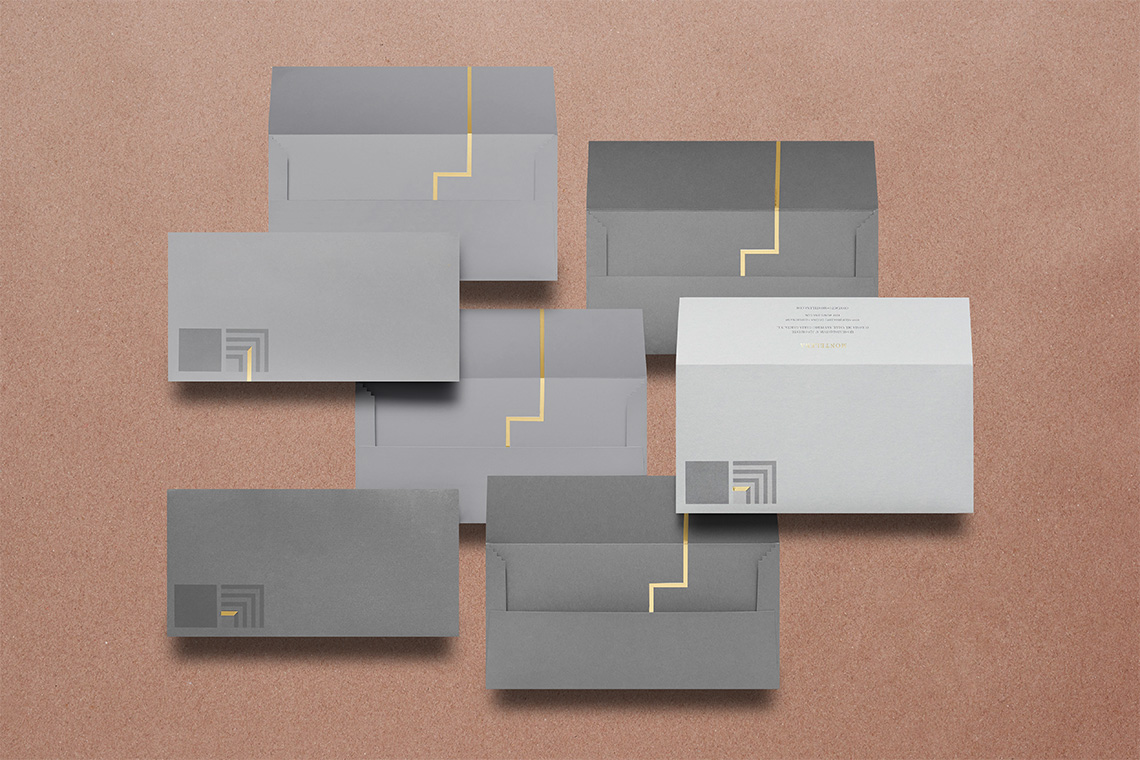
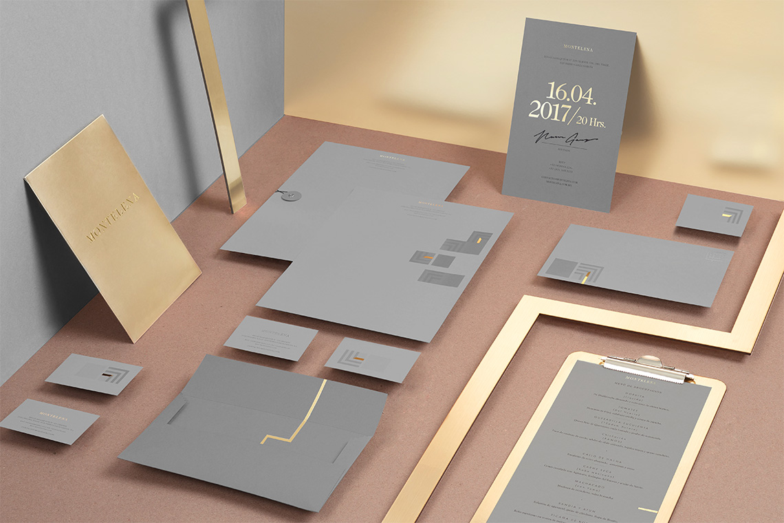
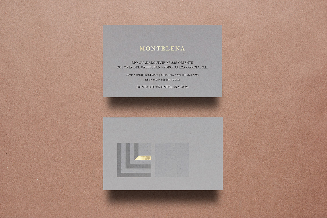
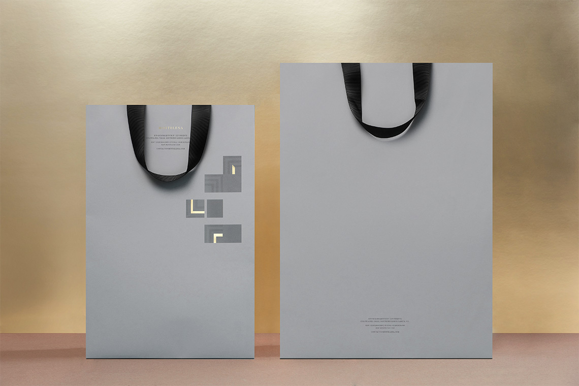
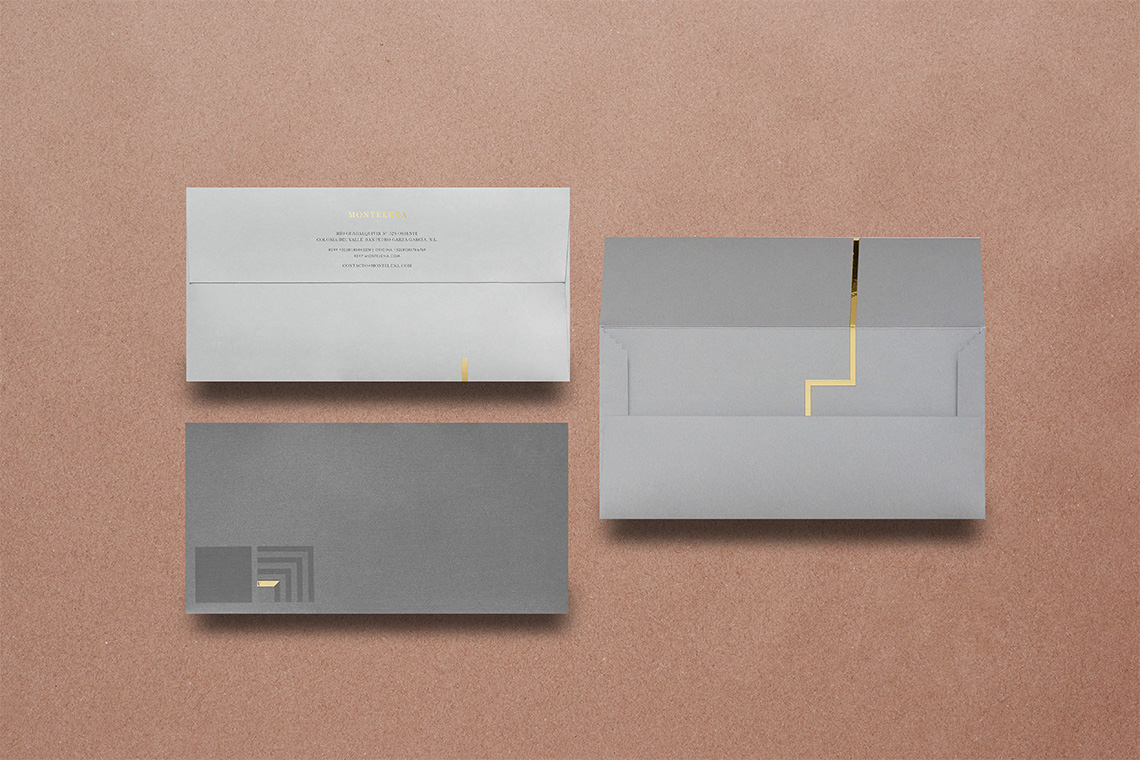
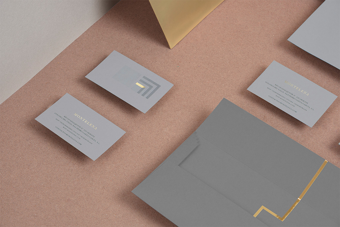
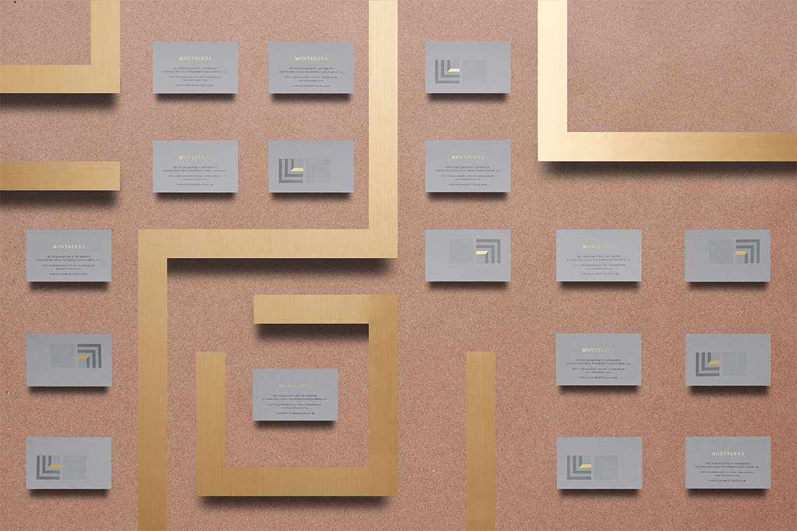
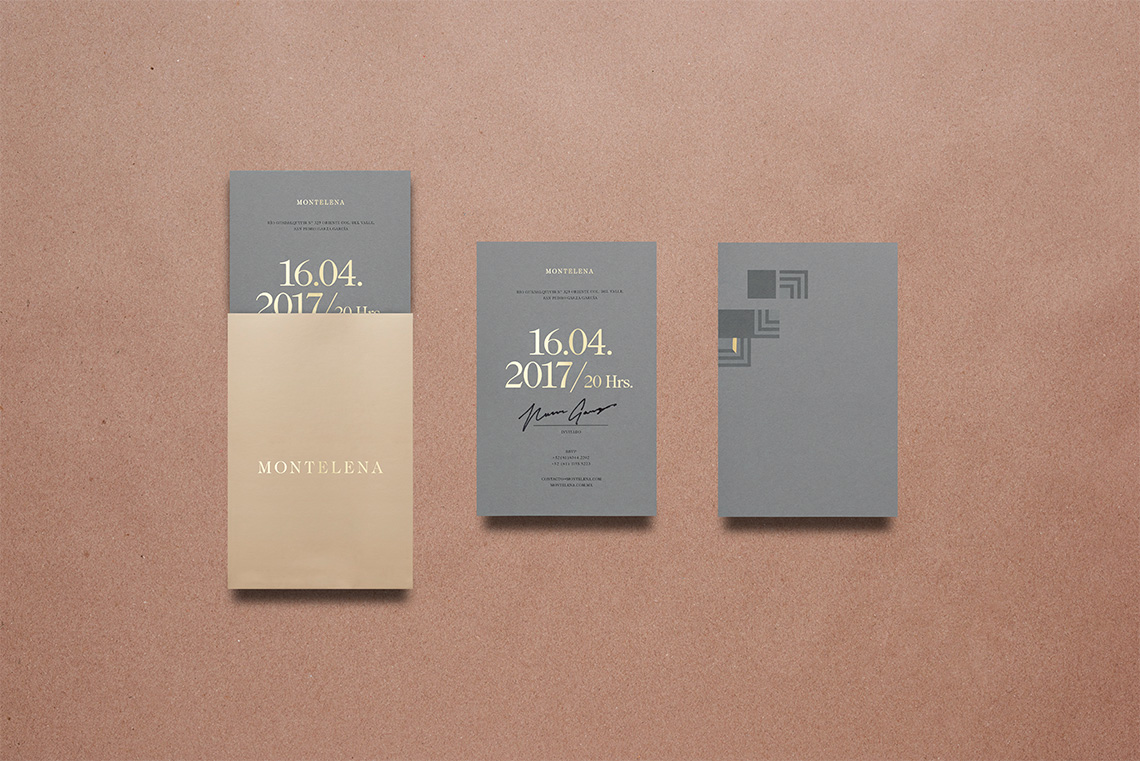
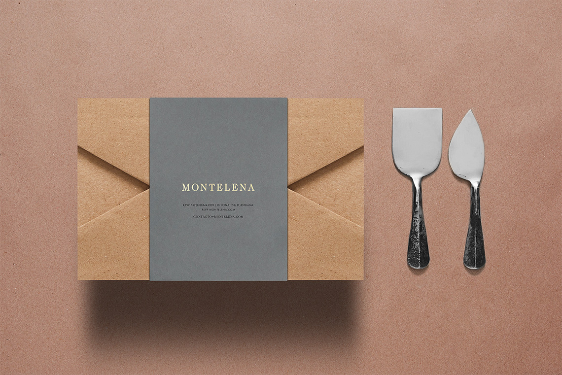
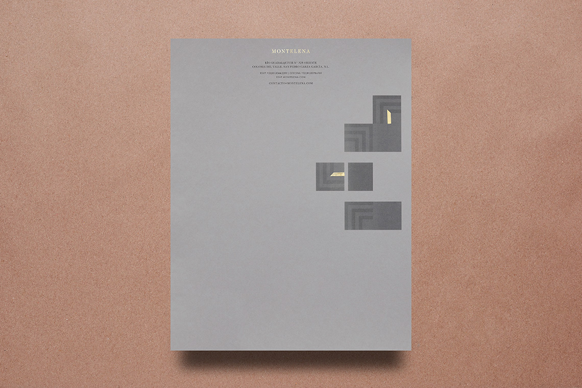
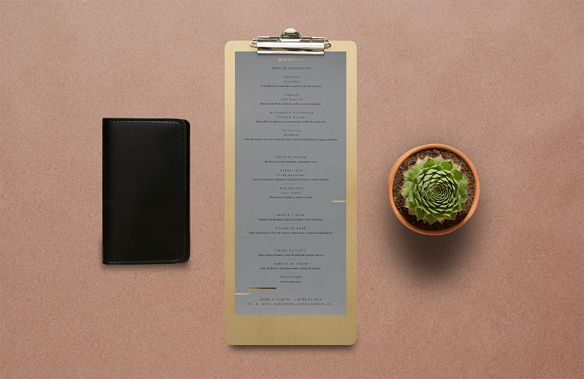
As part of the identity, we designed geometric patterns that contour labyrinths in the many diverse brand applications reminding us about the spontaneousness and mystery of Sentíes' kitchen. The color palette employs gray tones simulating handmade materials such as stone, contrasting with the brightness and strength of the metallic gold tones.
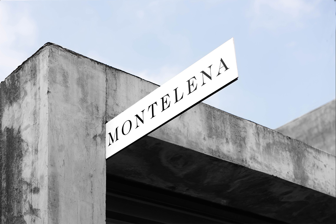
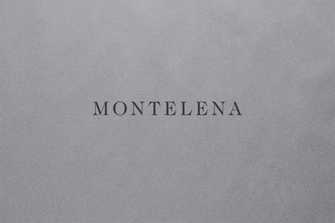
The logo typography is presented in Caslon, a classic serif acknowledged for its balance, giving an elegant tone to the project. The reticles are centered together with Futura Book, adding a modern touch to the compositions. — (A)
Labyrinths reminding us about the spontaneity and mystery of Sentie's kitchen.
