Manos de Cacao
BRANDING
The client
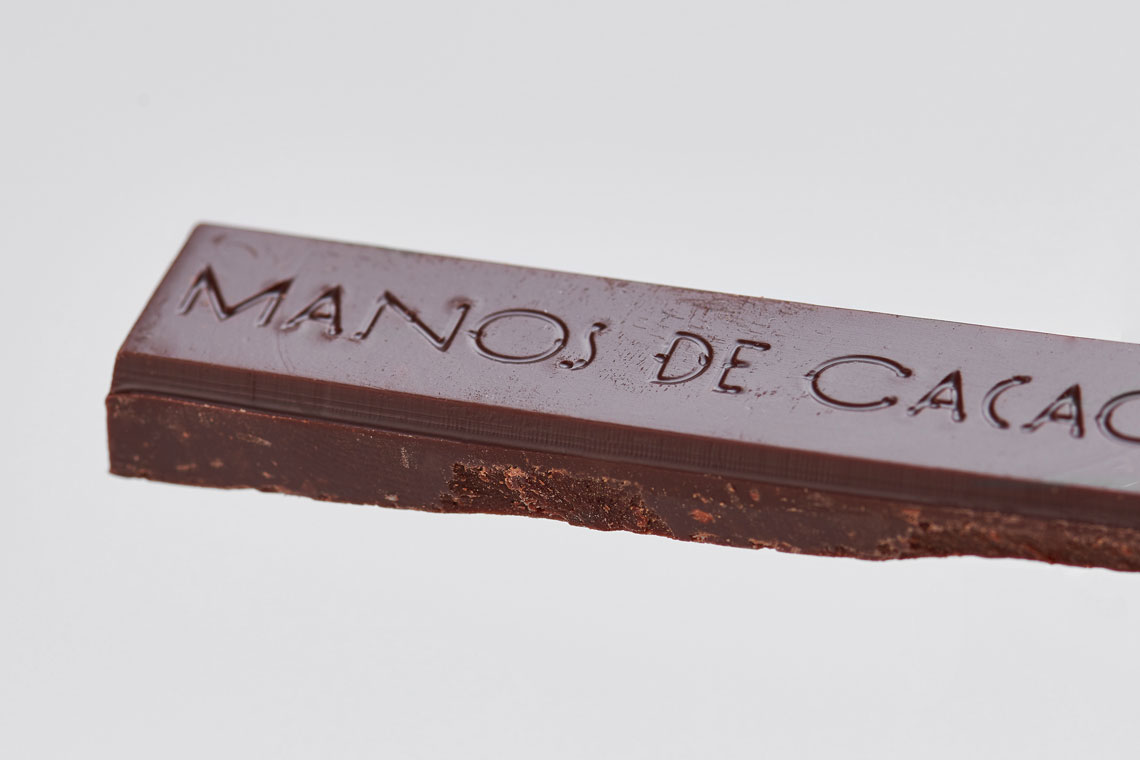
Manos de Cacao is a true bean-to-bar chocolate brand specialized in every aspect of the process it entails. They oversee the cacao's careful selection, cooking, husking, all the way to its grinding.
keywords
Cacao / Branding / Icon Design / Logo Design / Chocolate
the objective
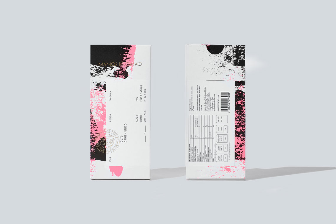
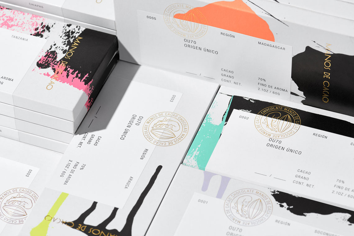
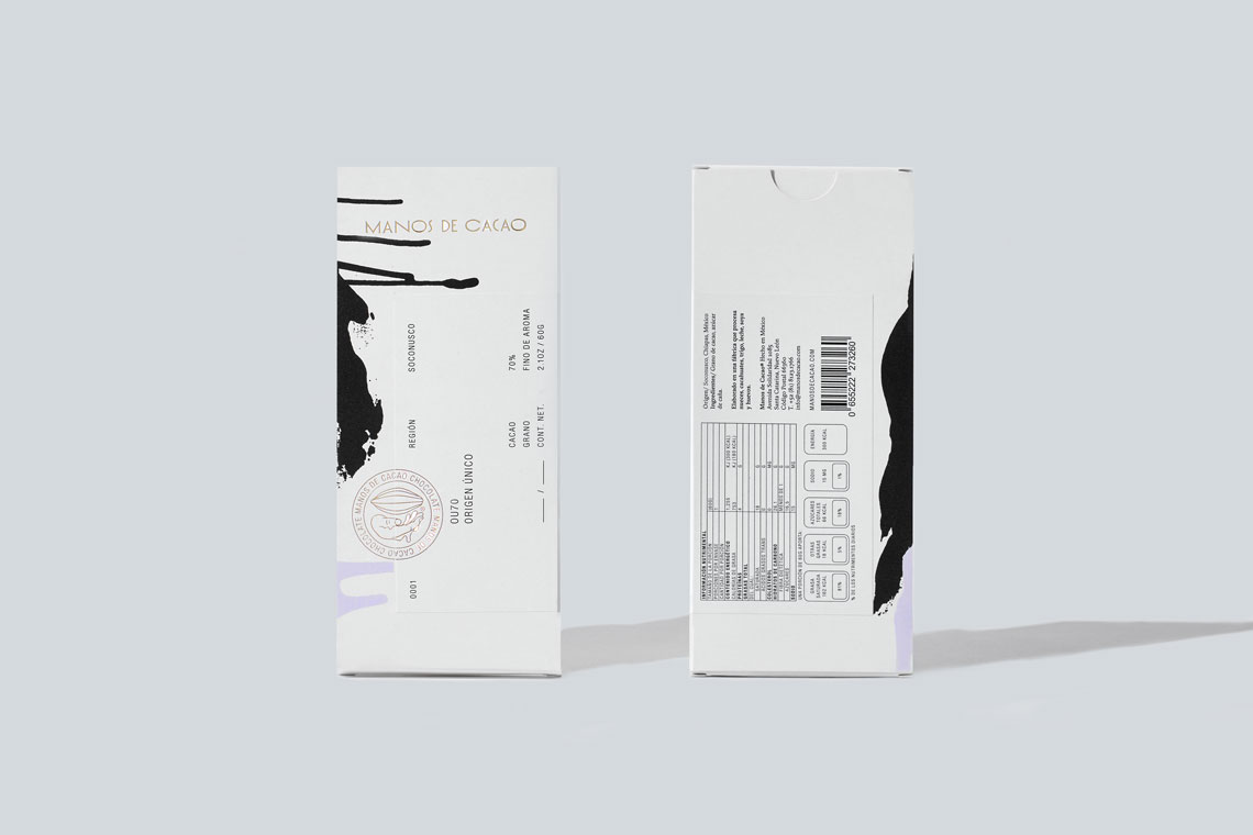
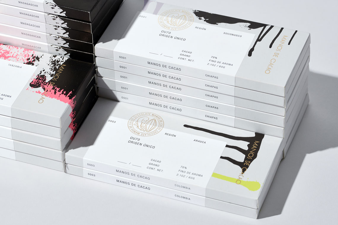
To build a brand identity that portrays an organic visual undertone while allowing each product to stand on their own.
the solution
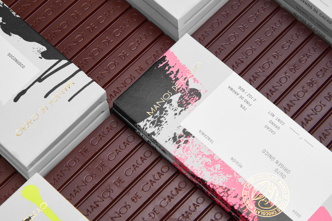
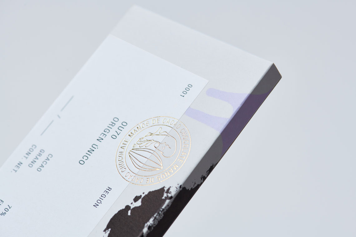
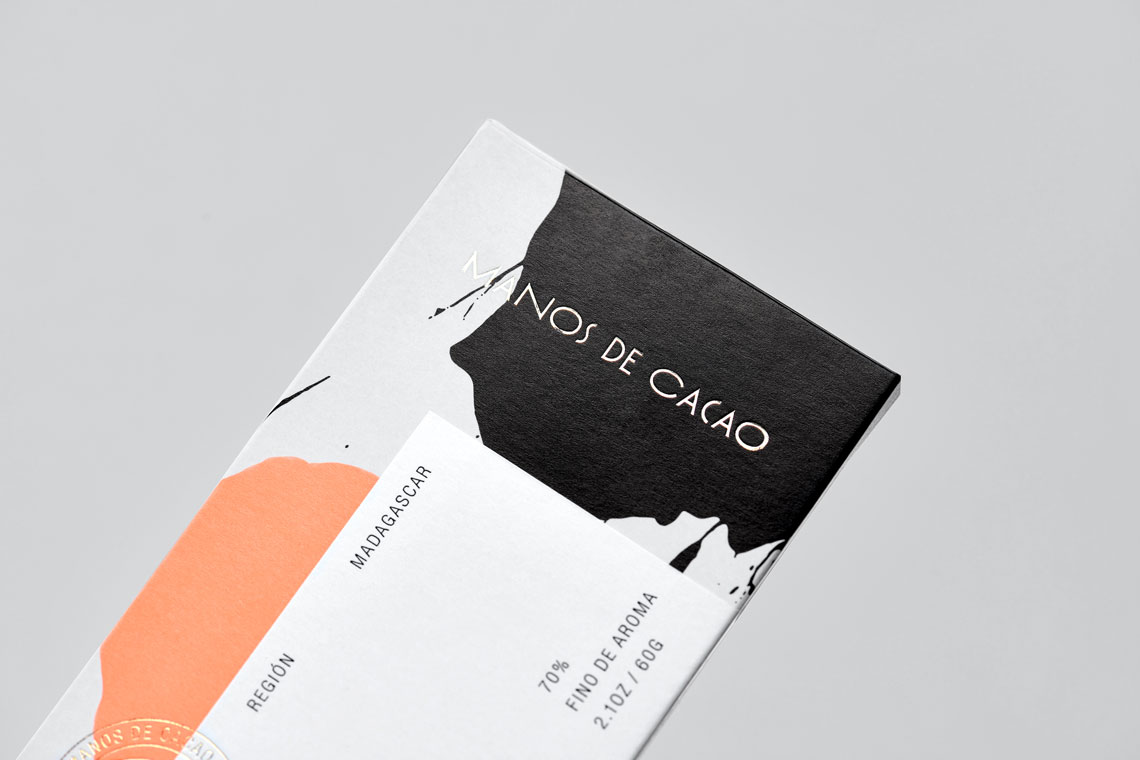
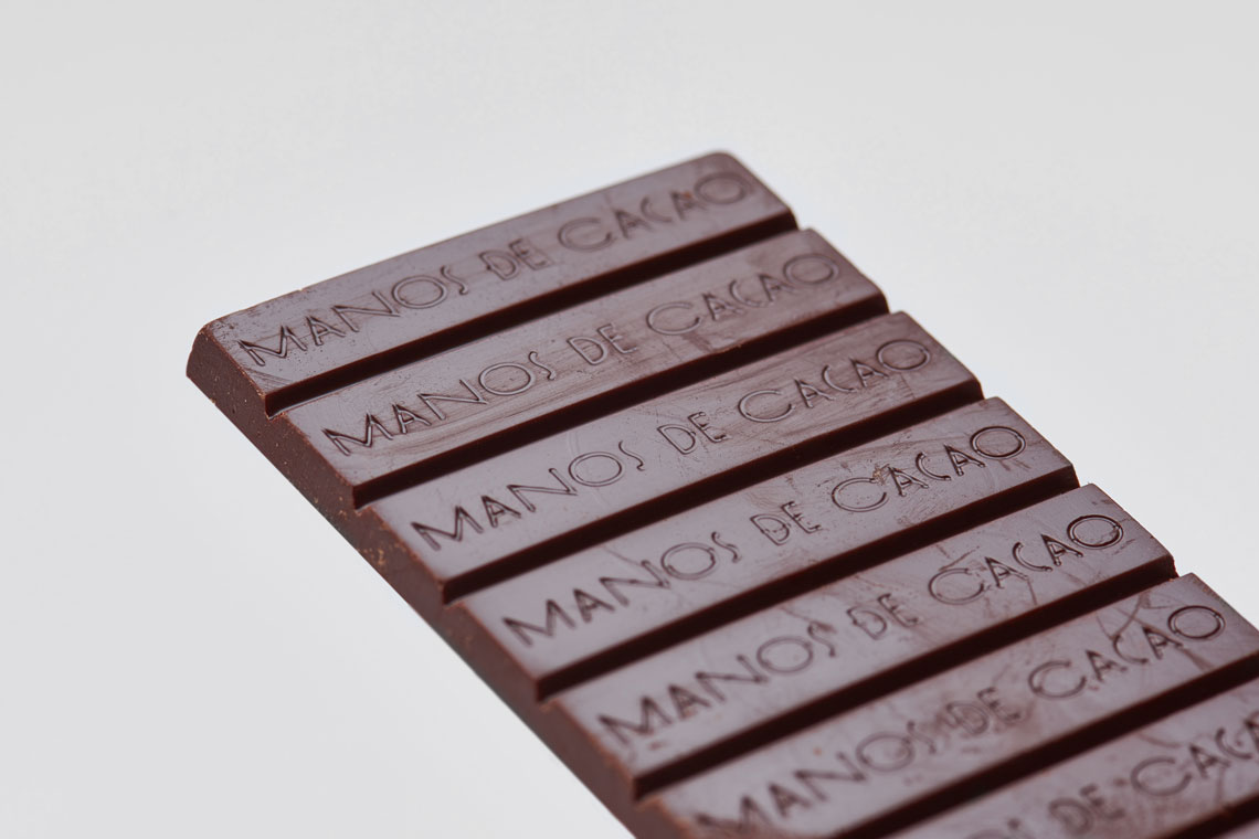
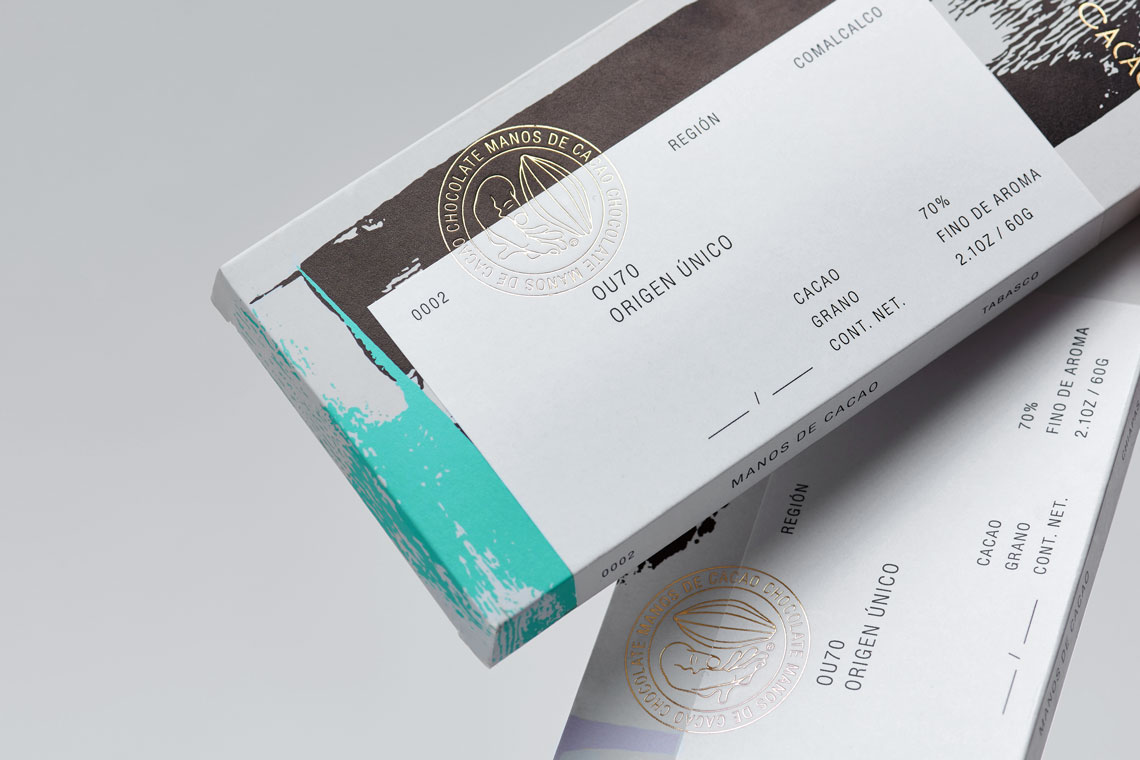
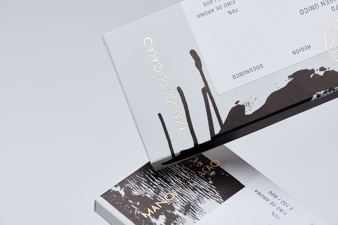
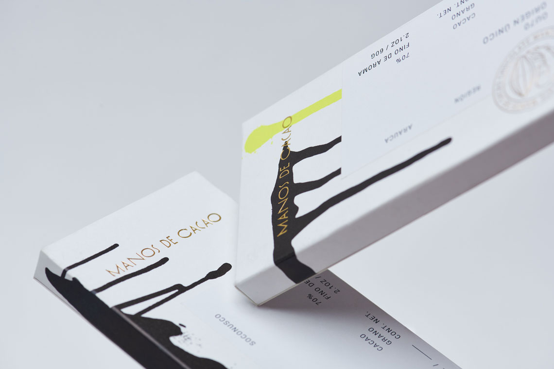
The wordmark works as a distinctive element on its own, while at the same time allowing the main motifs and colors to be the focal point of the overall composition.
The Icon displays a strong emphasis on the hand element. The story of Manos de Cacao is strongly related to every process within the chocolate life cycle. From the cultivator, all the way to the packager, every hand counts.
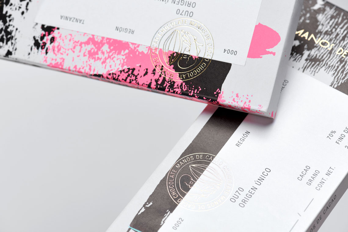
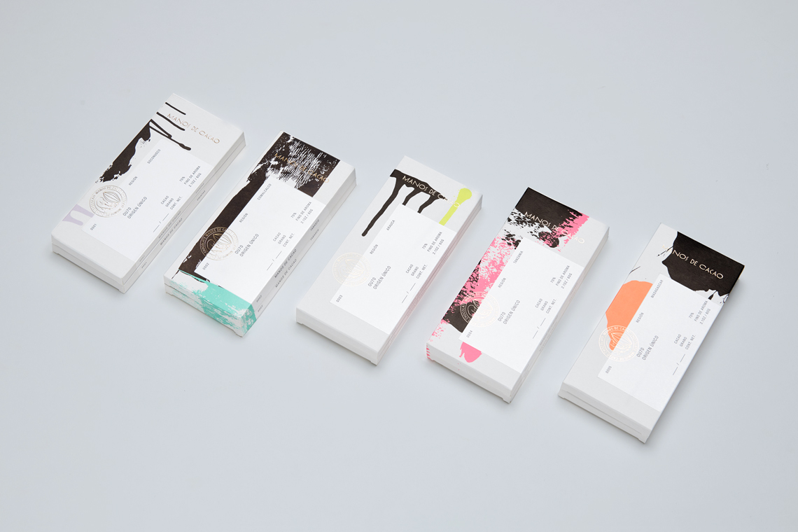
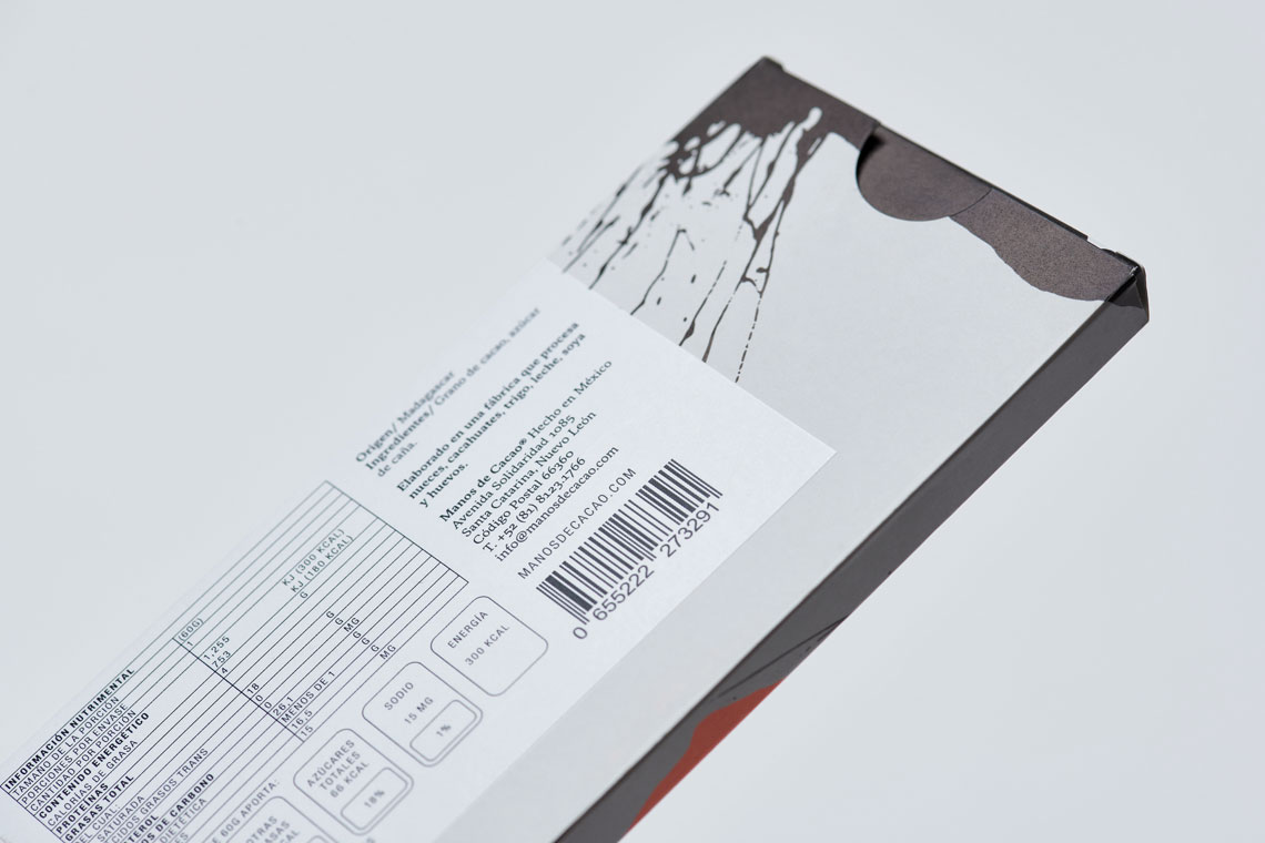
This is also asserted in the special design each chocolate bar has, depending on its regional origin. — (A)
The story of Manos de Cacao is strongly related to every process within the chocolate life cycle. From the cultivator, all the way to the packager, every hand count.
