Bodega Los Cedros
BRANDING
The client
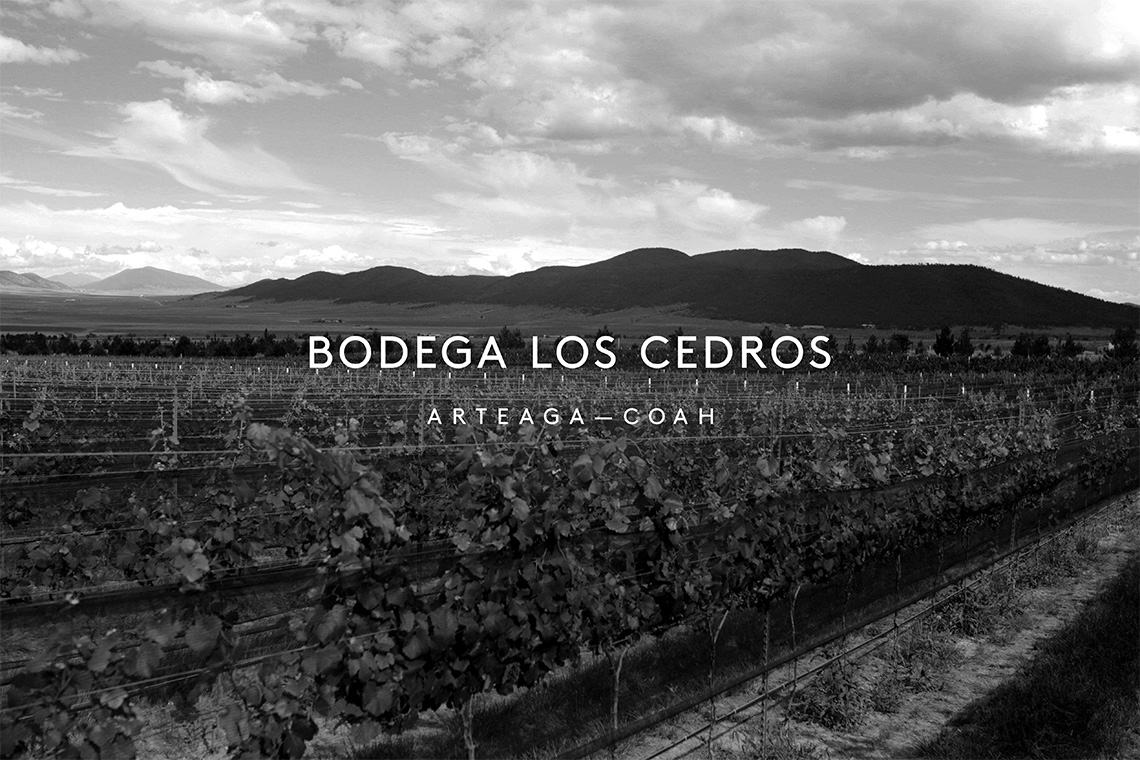
Bodega Los Cedros, represents a Mexican vineyard located in the mountains of Arteaga, Coahuila dedicated to the wine harvest since 2012. It originated motivated by the passion and dream of a family to produce high quality wines within a magical place, more than 100 years old named "El Cedrito."
keywords
Wine/ Mexico/ Branding/ Product Design/ UI/ UX
the objective
The brand wanted to refresh its identity by representing the essential characteristics of the production of the product itself, as the particular geographic altitude, climate, flora and fauna of the region where it's made in a modern and timeless graphic form.
the solution
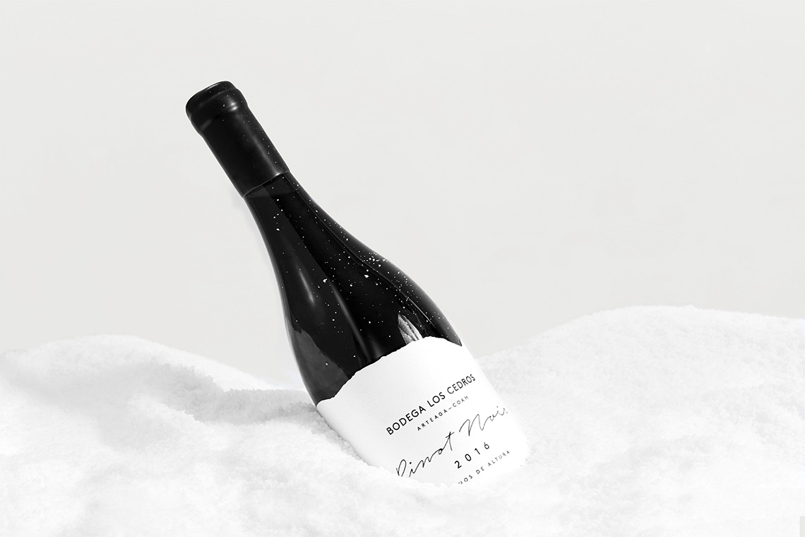
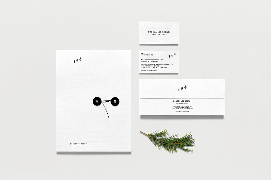
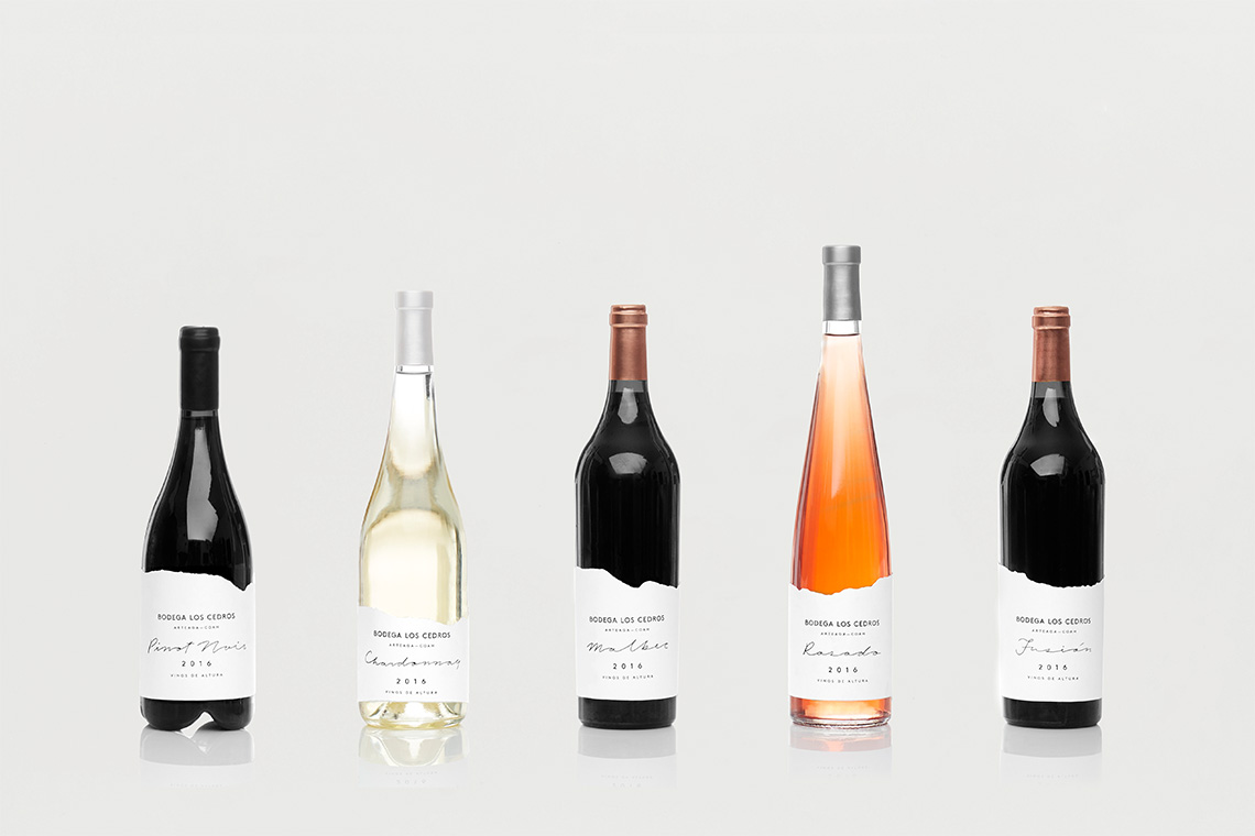
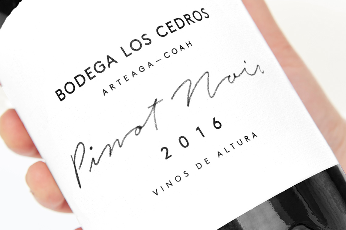
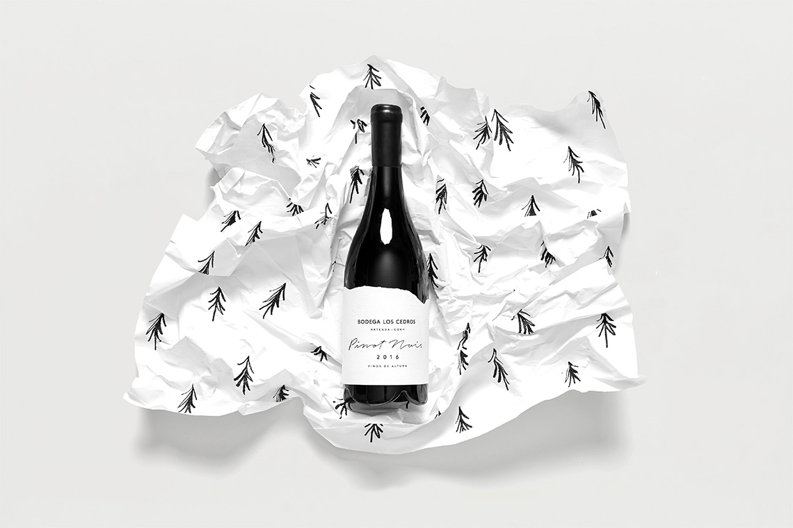
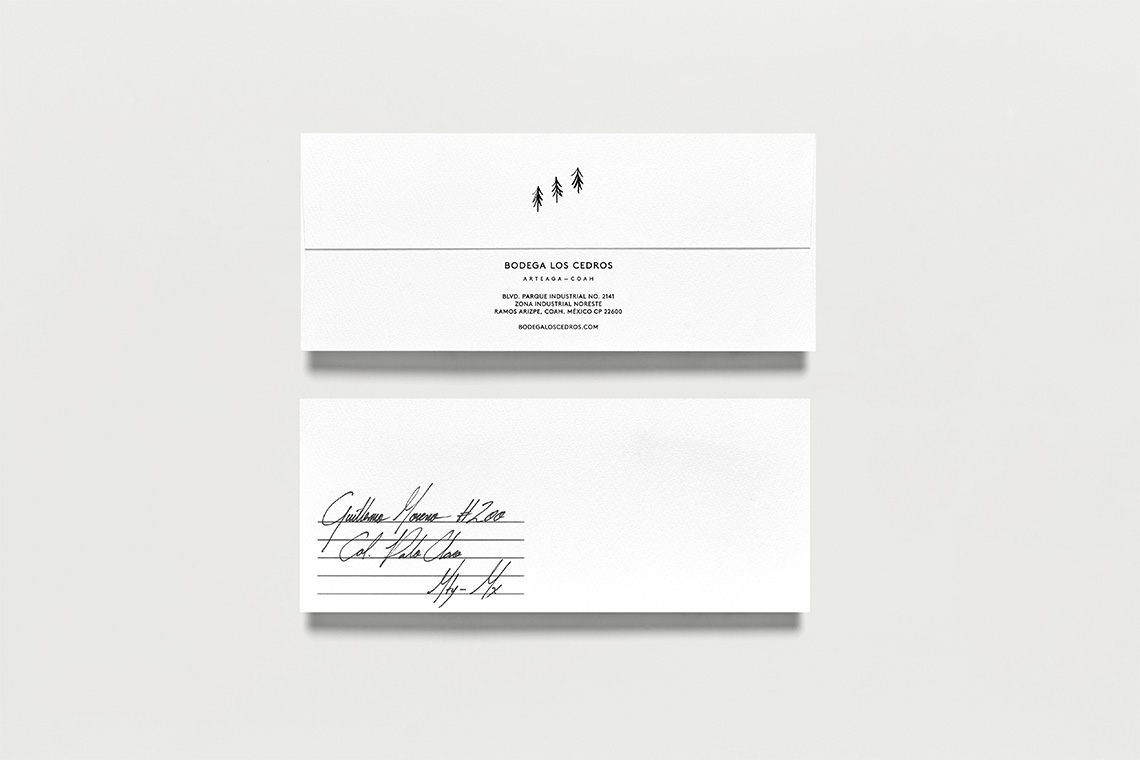
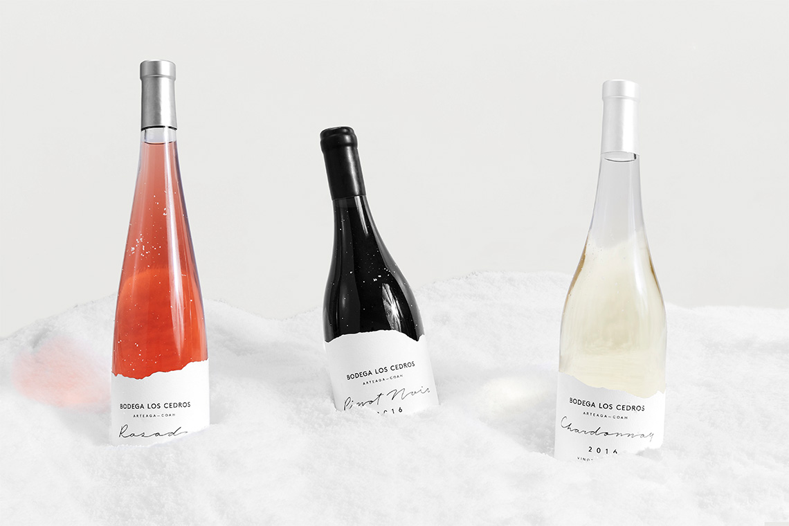
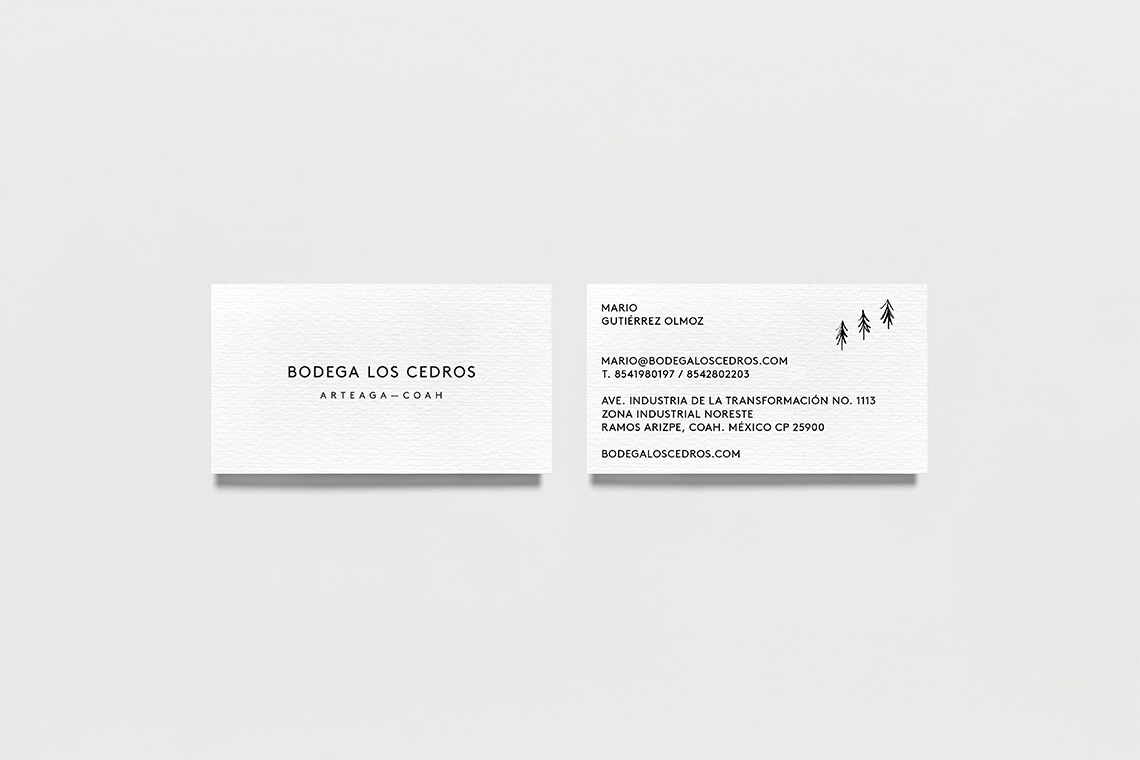
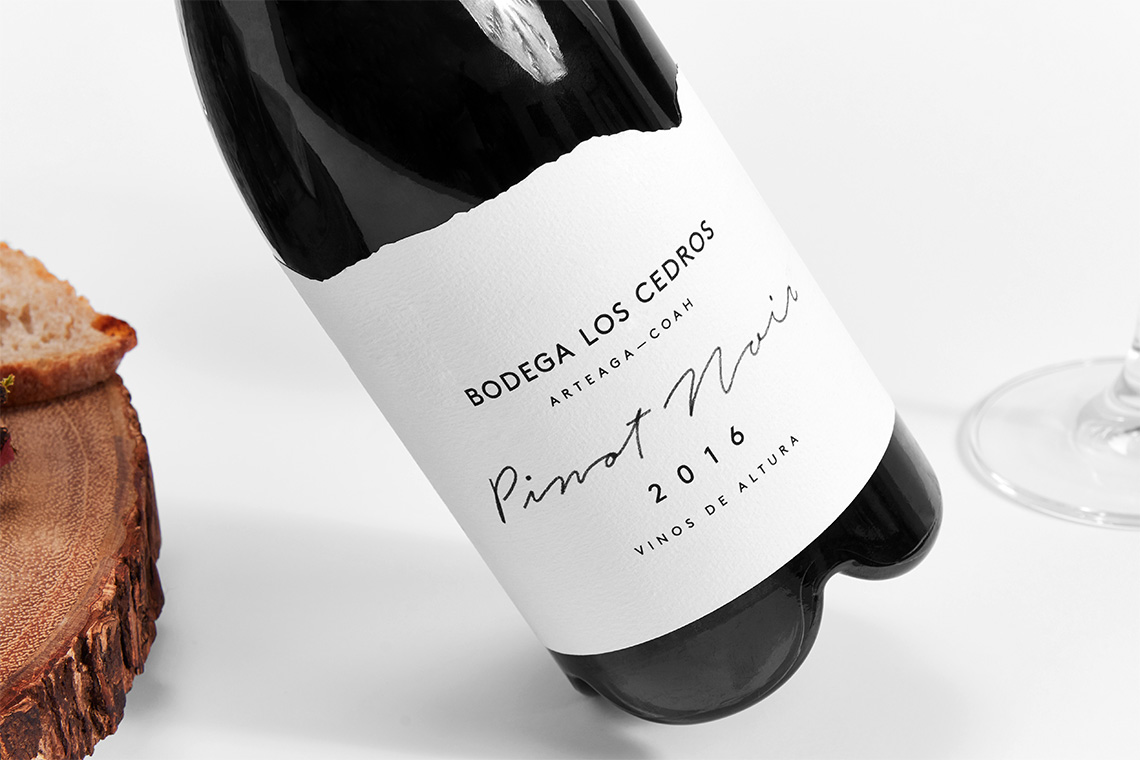
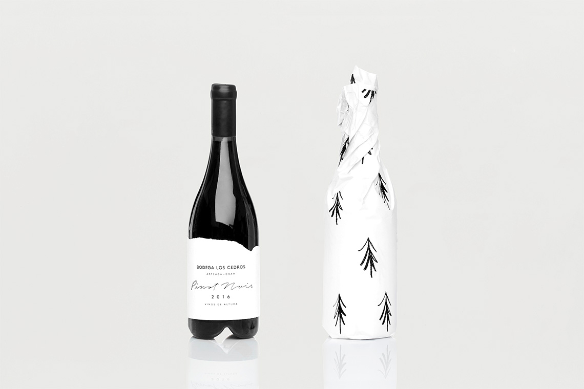
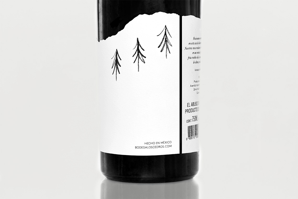
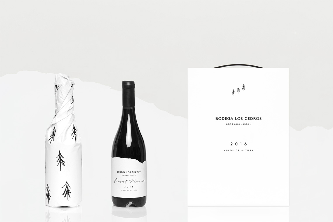
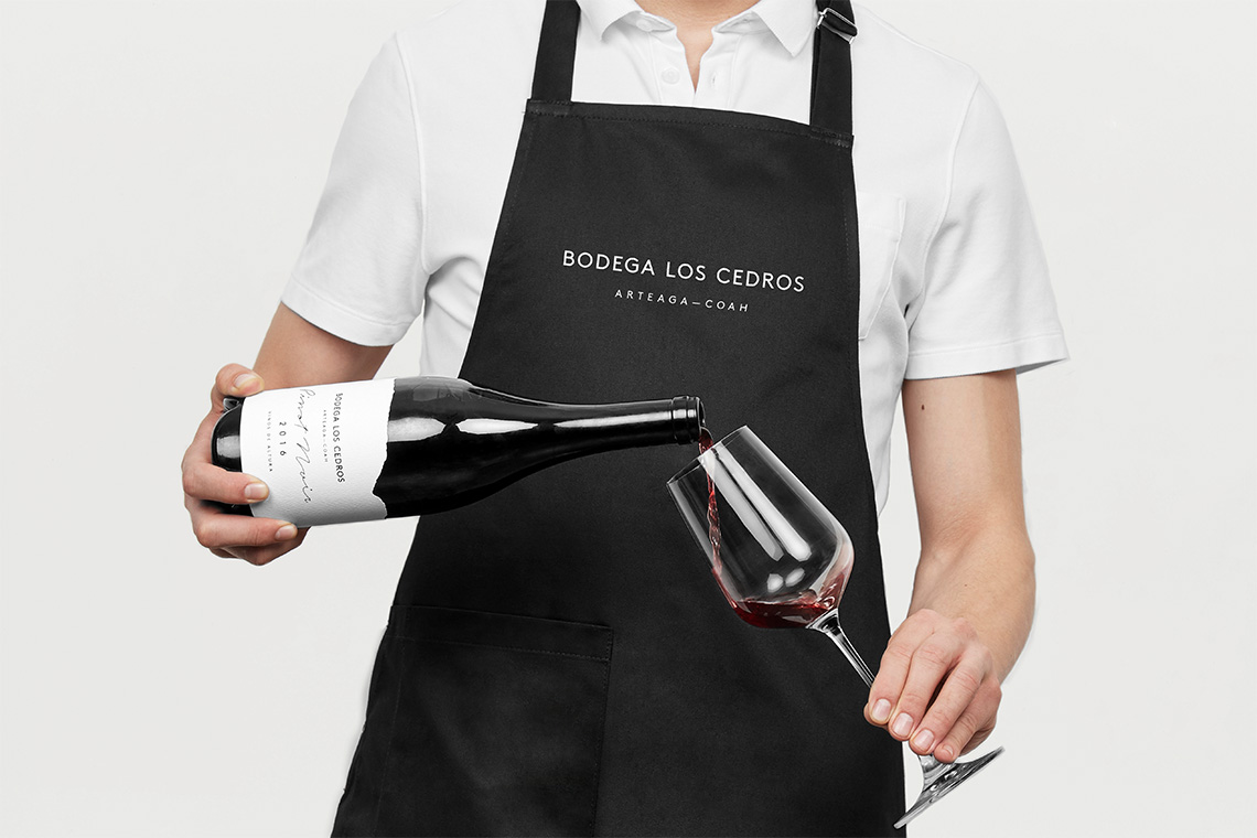
Based on the geographical location of the mountains where the vineyard is located, our brand solution highlights characteristic components of the area such as: climate, altitude, flora and fauna. The logo employs 3 pine trees as the brand's distinctive icon. The wine label and die-line mimic cloud shapes. The sans serif typographic selection adds modernity while the script gesture preserves a more organic touch, accomplishing this way, a brand's contrast between simplicity and elegance.
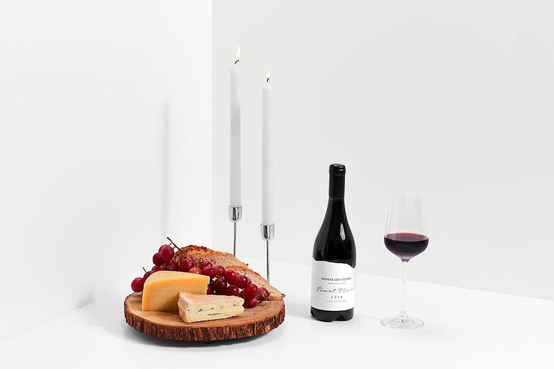
We included a neutral color selection highlighting diverse wine color tones and accentuating the contrast between bottle and label. The packaging composition recalls the landscapes around "El Cedrito" winery. — (A)
The packaging composition recalls the landscapes around "El Cedrito" winery.
Bodega Los Cedros
Interactive
the objective
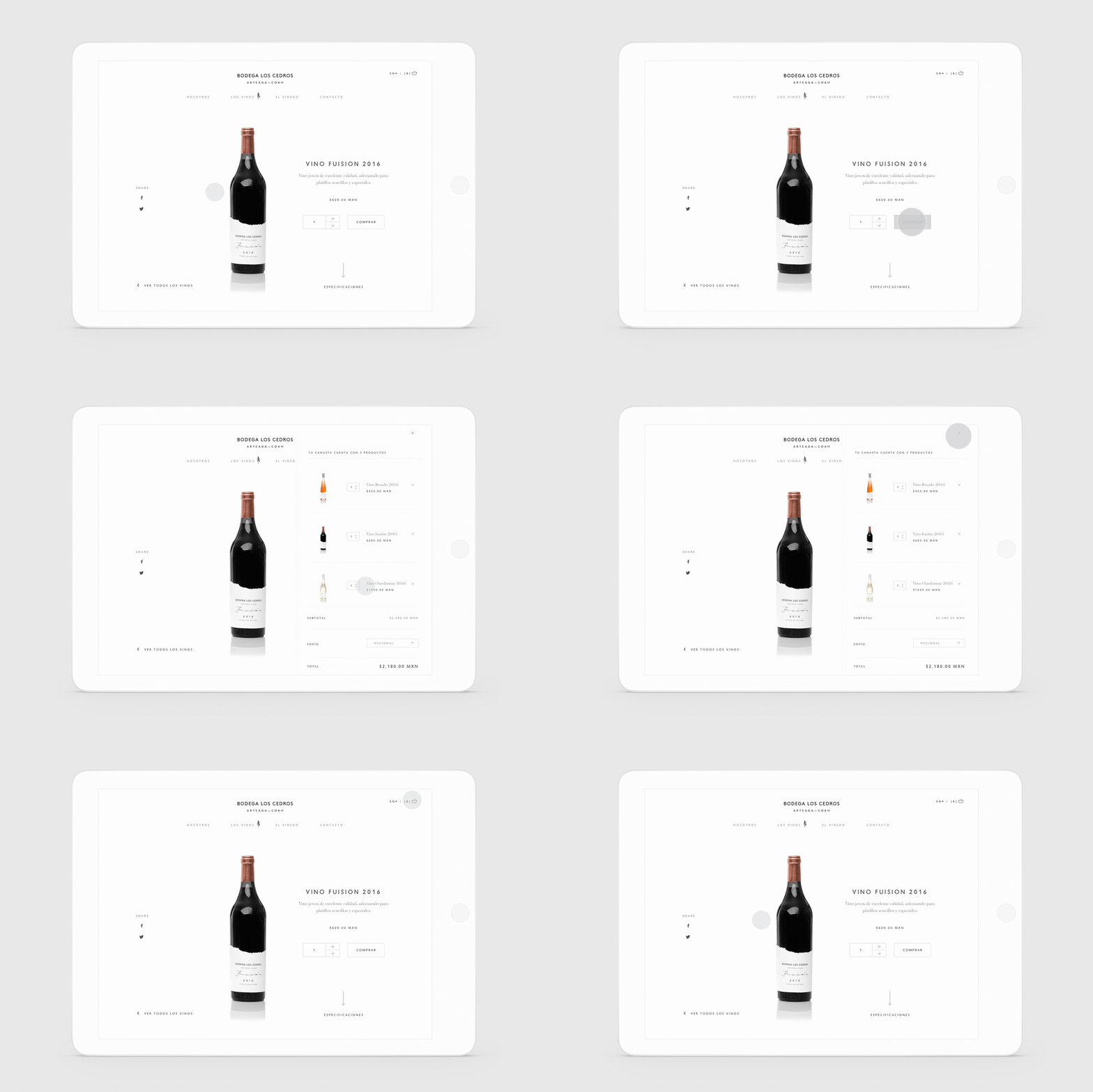
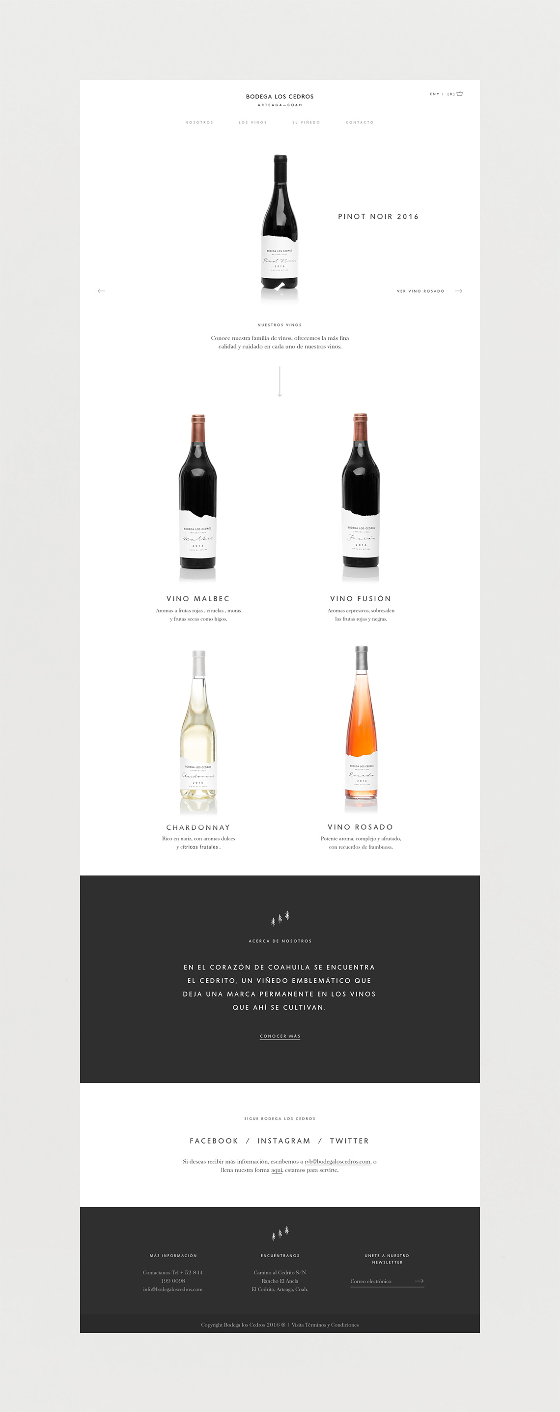
Present through a clean and simple frame the origin, purity and quality of the product collection of the winery.
the solution
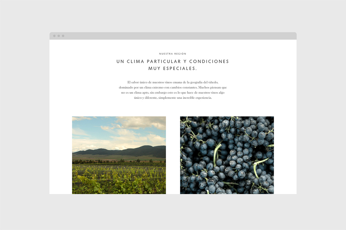
We developed a simple web page that assigned a special space to each product to highlight its attributes and characteristics,
— (A)
The sans serif adds modernity while the script gesture preserves a more organic touch.
