Bokeria
BRANDING
The client
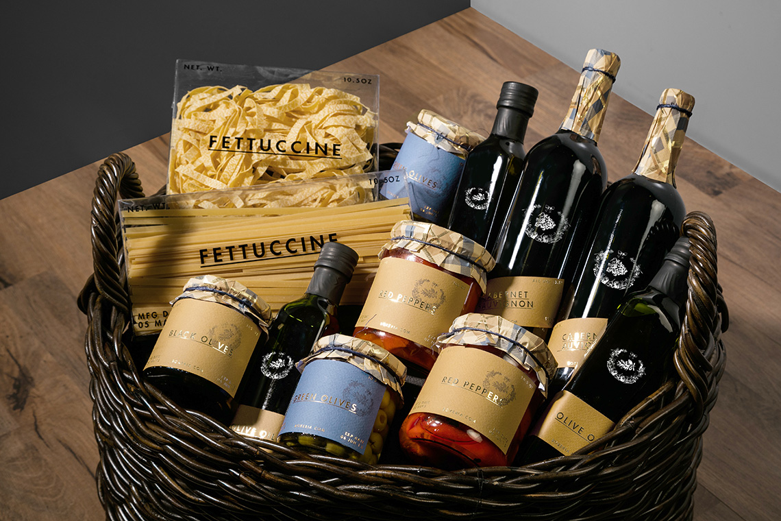
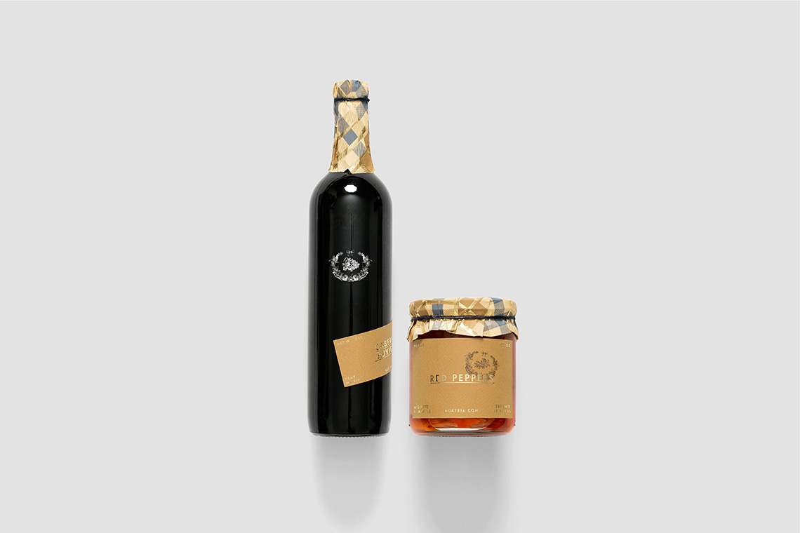
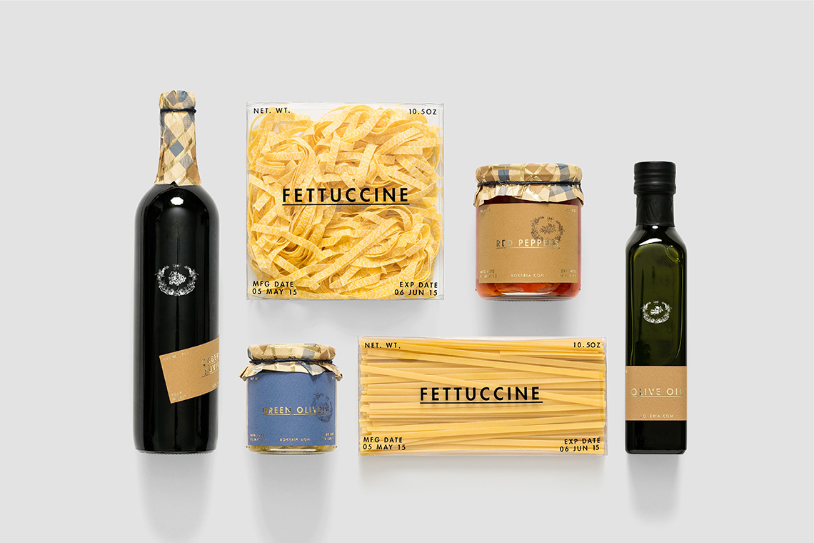
Bokeria is a restaurant inspired in Mediterranean cuisine in the city of Split, Croatia. The restaurant is known for serving high quality dishes and top wine selection to visitors, resulting in an experience similar to being at home. Bokeria offers its own product line, each elaborated inside their kitchen with the flavours that distinguish them. The restaurant is directed to tourists who are looking for good meal and a comfortable and unique place with a homelike mood.
keywords
Restaurant/ Croatia/ Branding/ Packaging/ Menu
the objective
Develop a graphic identity that reflects the culinary concept of Bokeria cuisine through a memorable and unique context
the solution
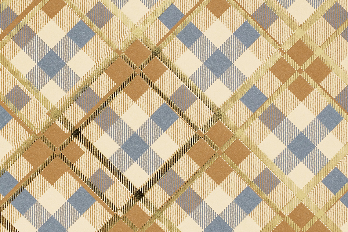
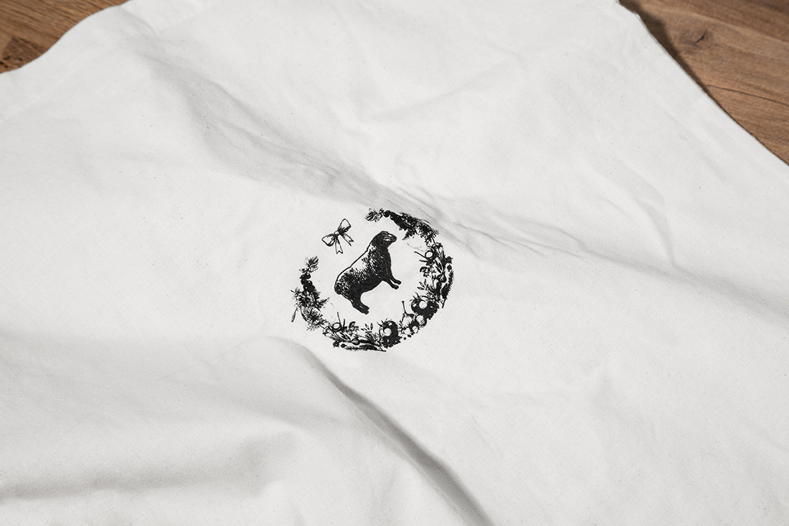
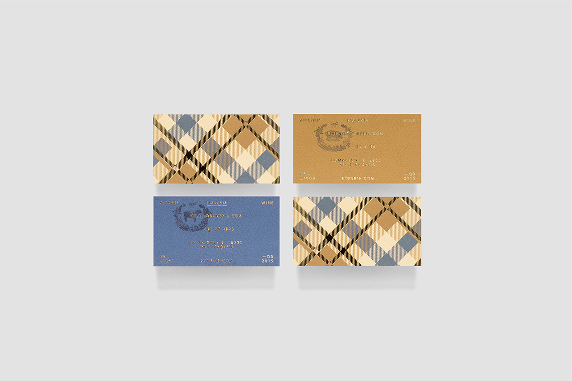
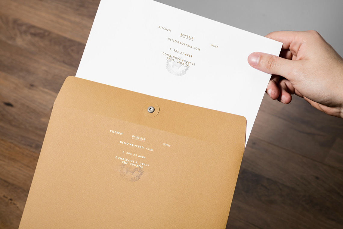
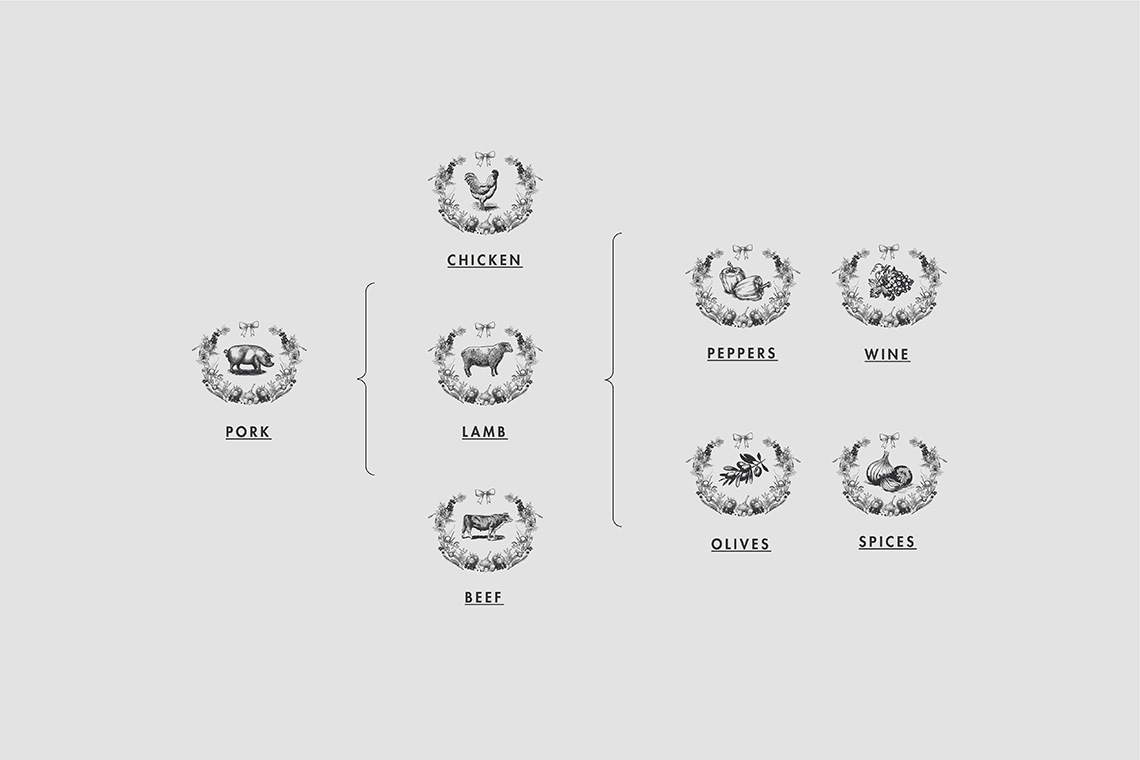
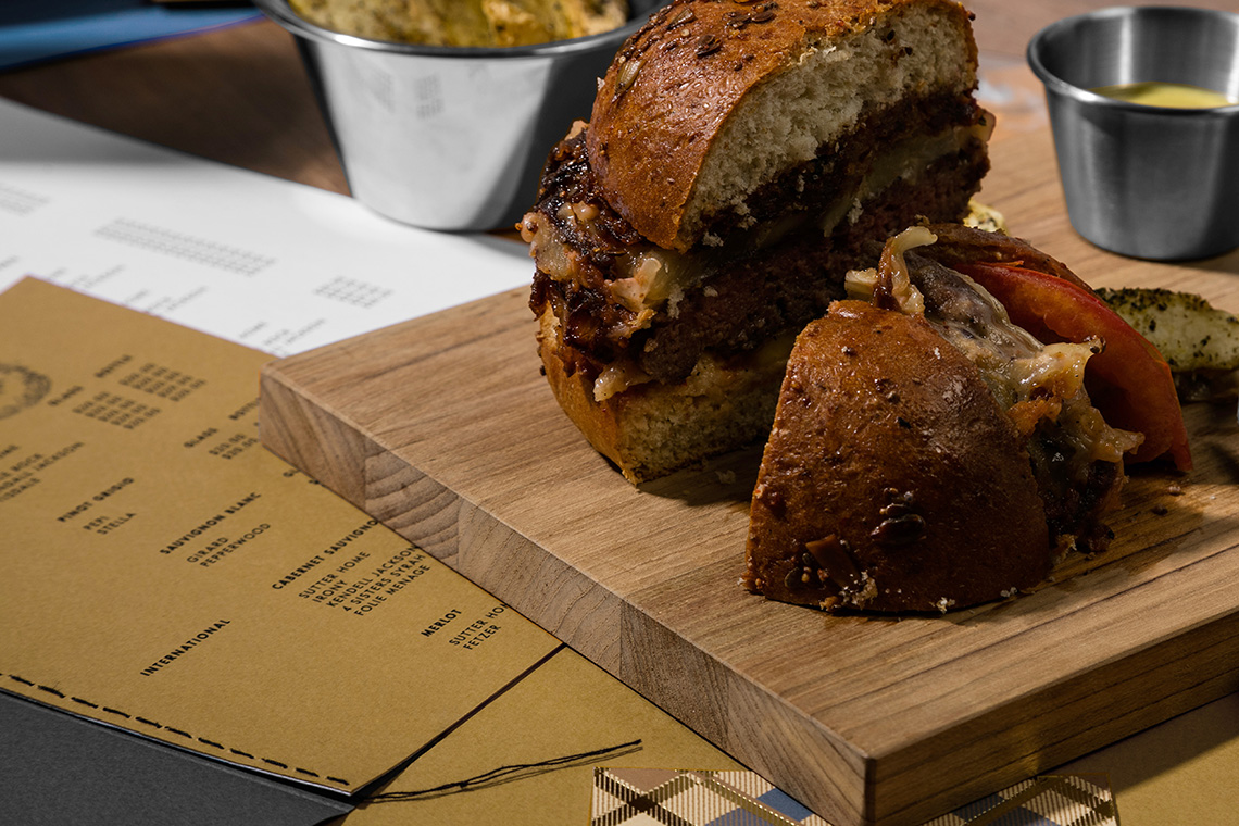
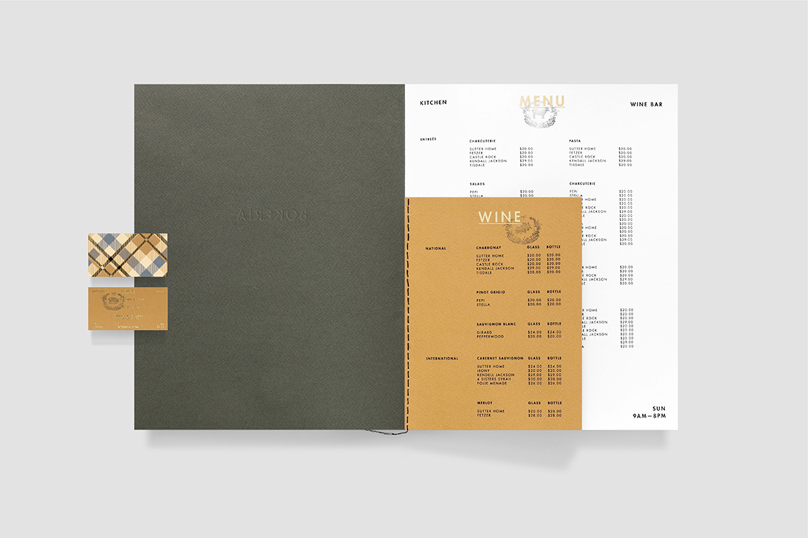
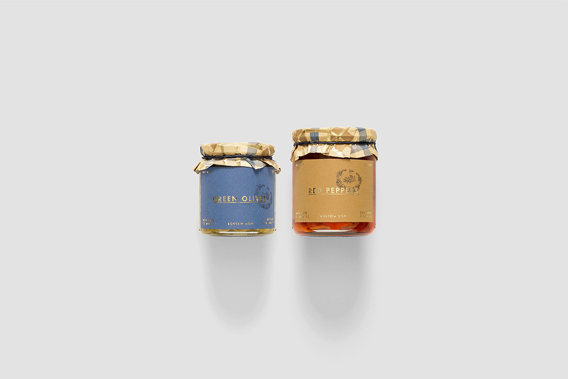
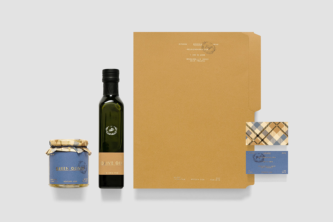
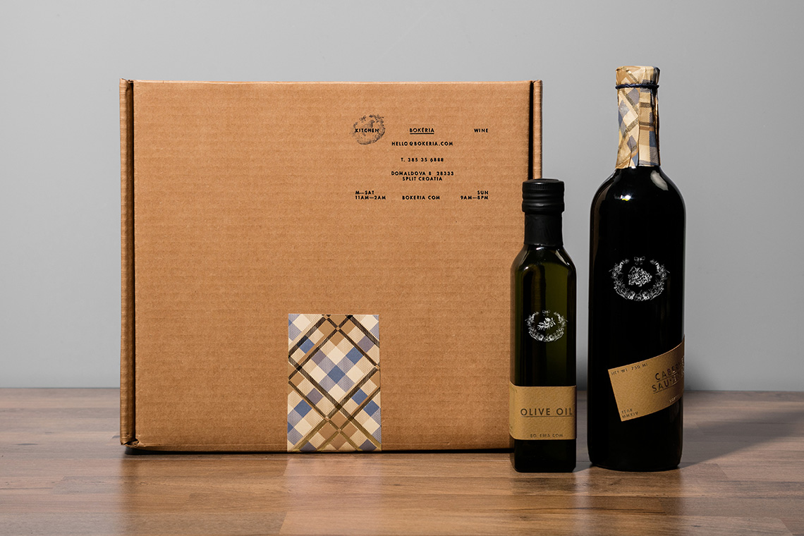
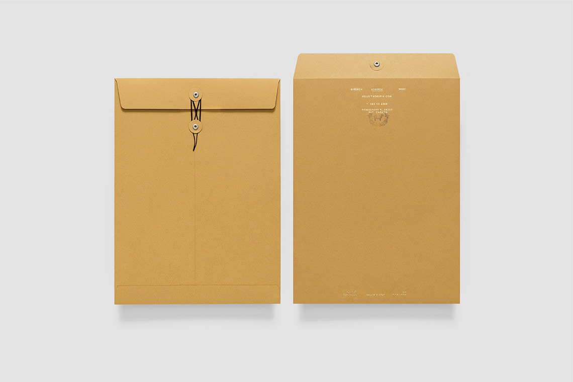
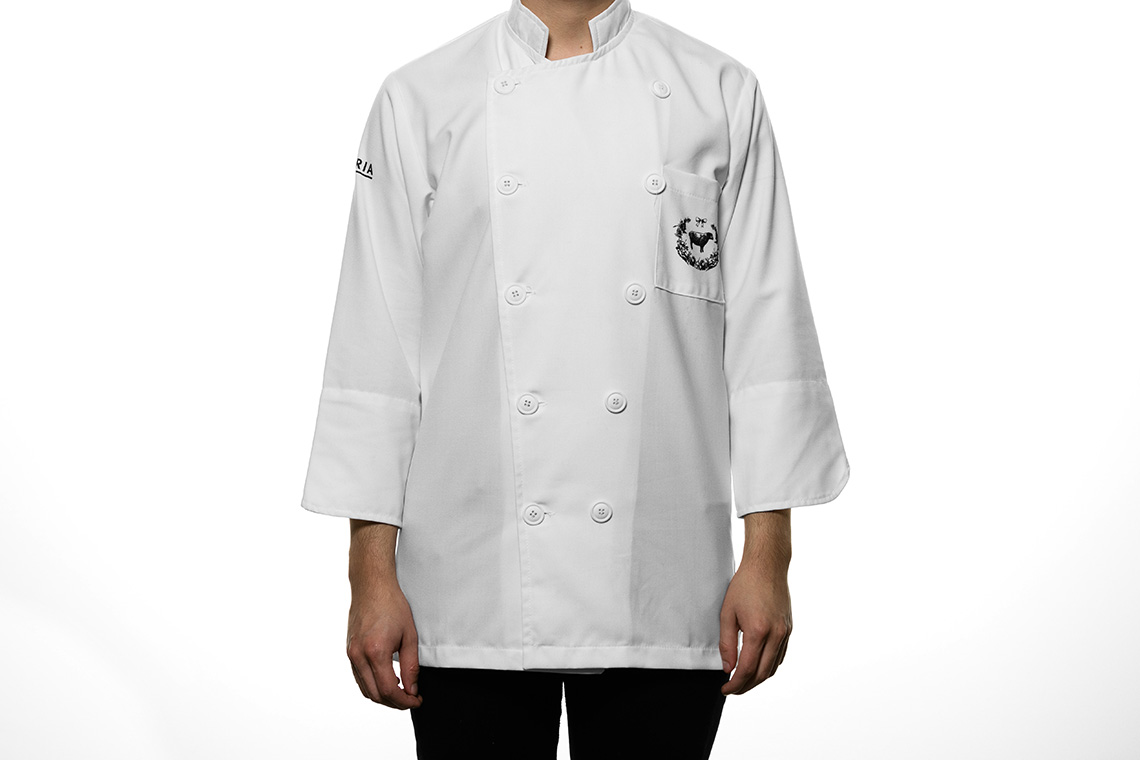
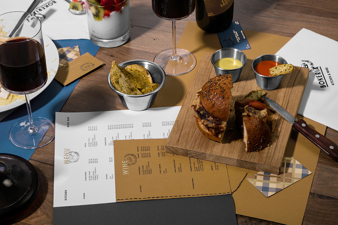
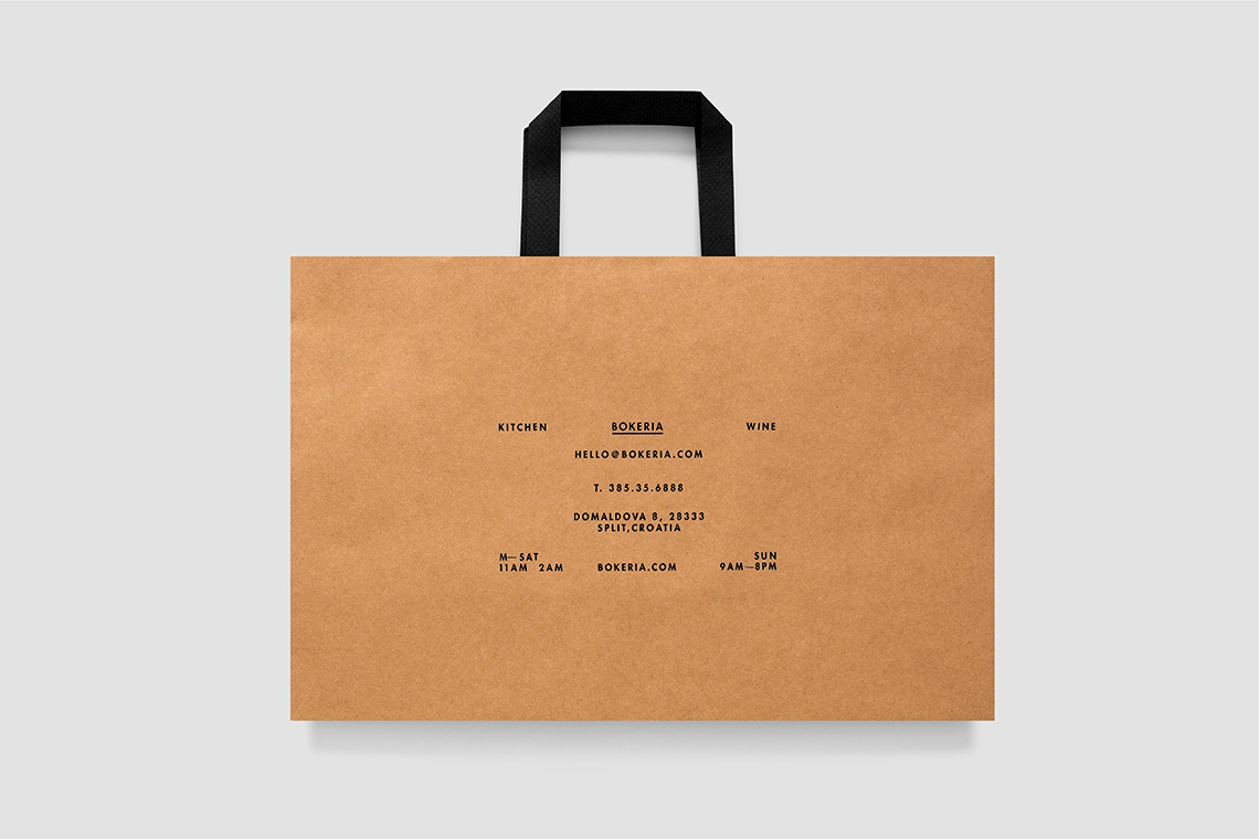
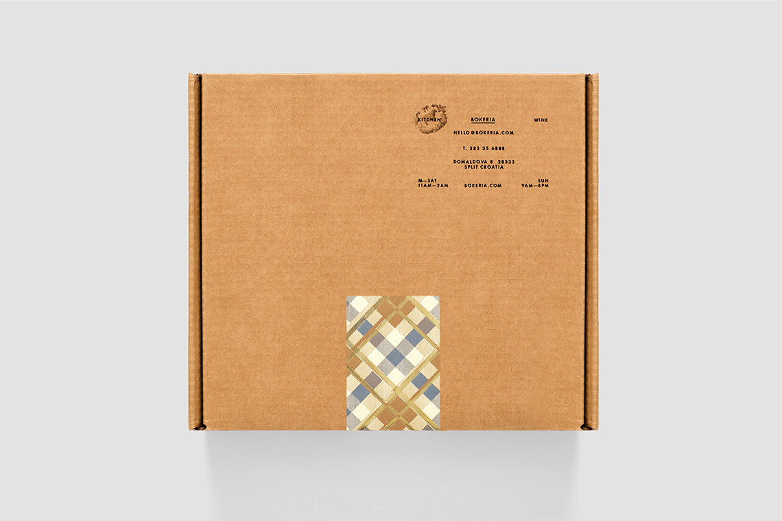
We created an identity system where the brand reflects its singularity across different elements. We designed a typographic logo that reflects the modern and trendsetting culinary concept while a series of stamps complement and unify the different variety of meats and flavours, while always maintaining the brand’s sincere and classic feel. The color palette is based on warm tones such as brown, yellow, gold, and they contrast against the colder tones such as the blue to keep the balance between freshness and quality. The pattern that complements the brand applications was designed to remind us of family home-cooked meals.
The brand’s system offers an integral brand experience, where the enjoyment of food, good wine, love of travelling, and spending time together meet at the same place. — (A)
A brand where the enjoyment of food, good wine and love of travelling meet at the same place.
