Violeta
BRANDING
The client
Violeta is a traditional Argentinian bakery located in the well-off neighborhood of Las Lomas de San Isidro in the outskirts of Buenos Aires. Named after its founder, Violeta creates beautiful, hand-crafted bread, cakes and pastries. With more than 30 years in the hearts of the people of Buenos Aires, Violeta now plans to start up franchises in Miami, Florida.
keywords
Bakery /Argentina /Branding /Graphic Design /Packaging
the objective
Design Violeta's new identity with the mission to communicate quality and sophistication without losing approachability.
the solution
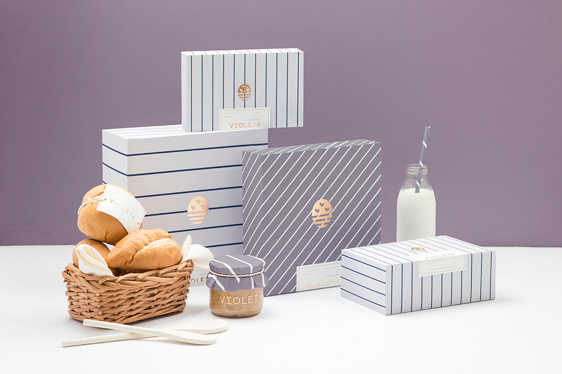
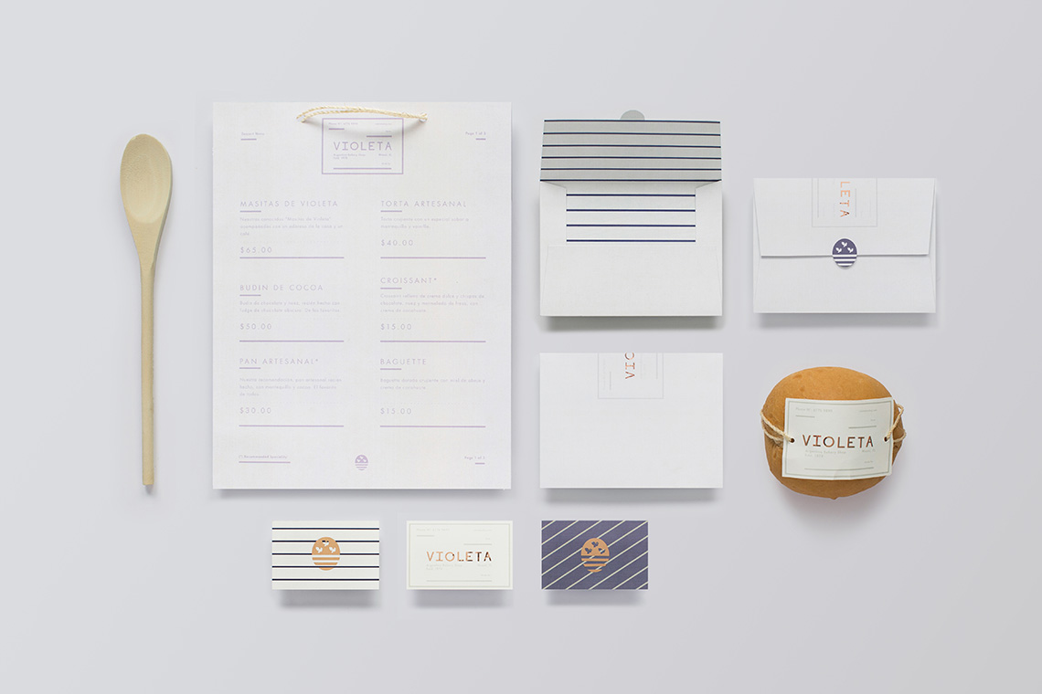
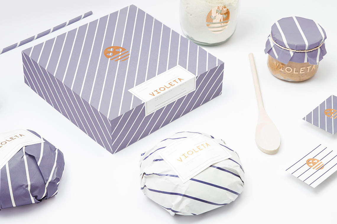
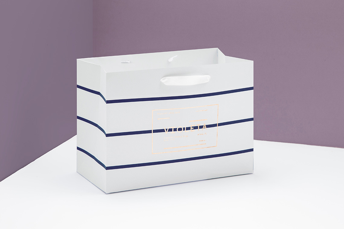
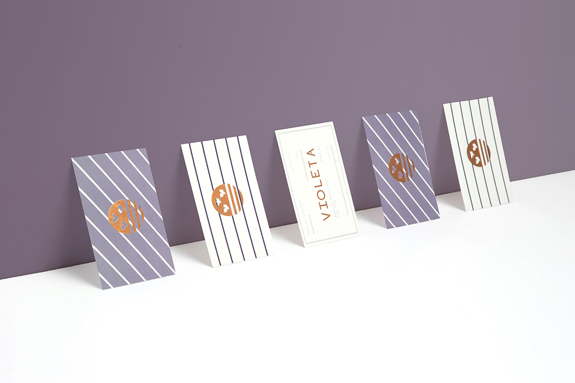
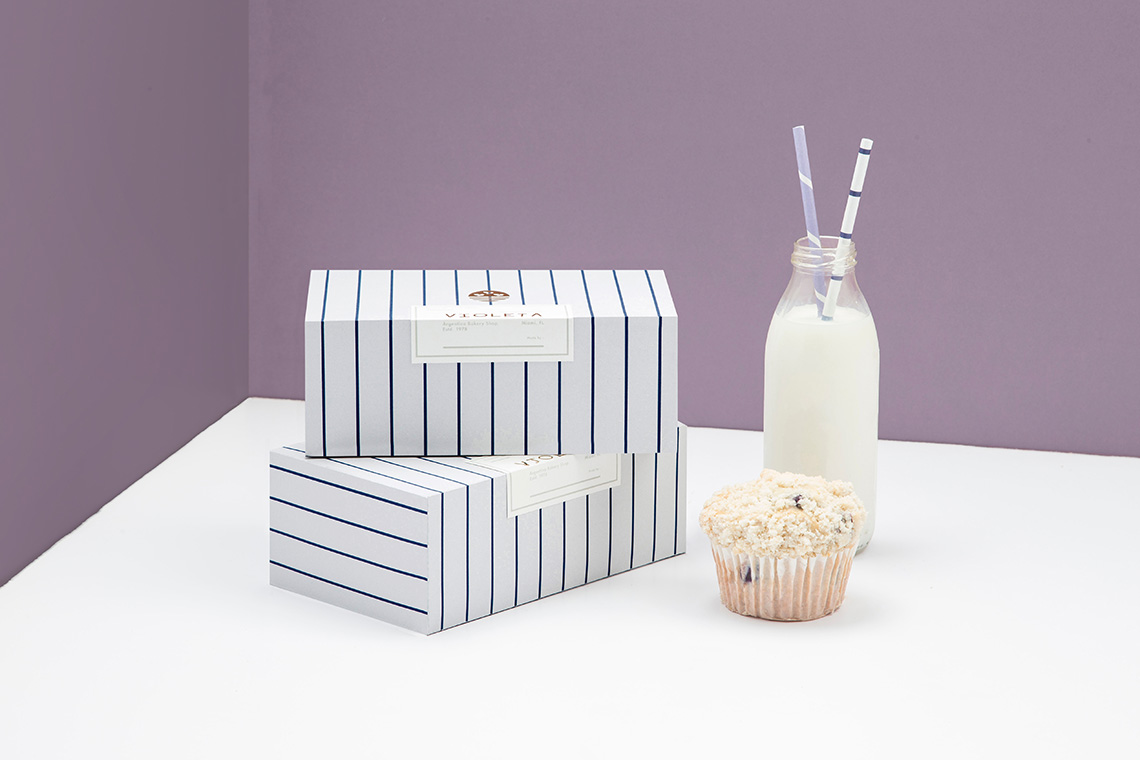
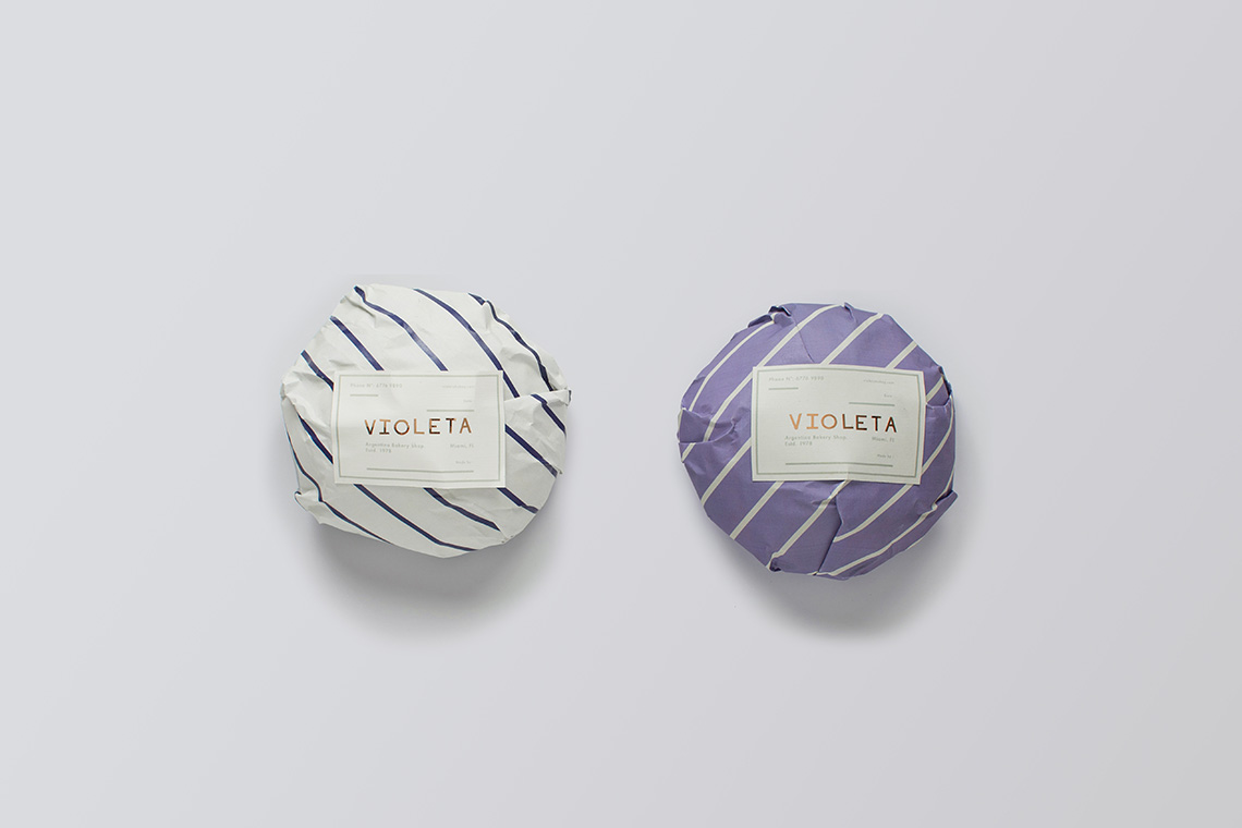
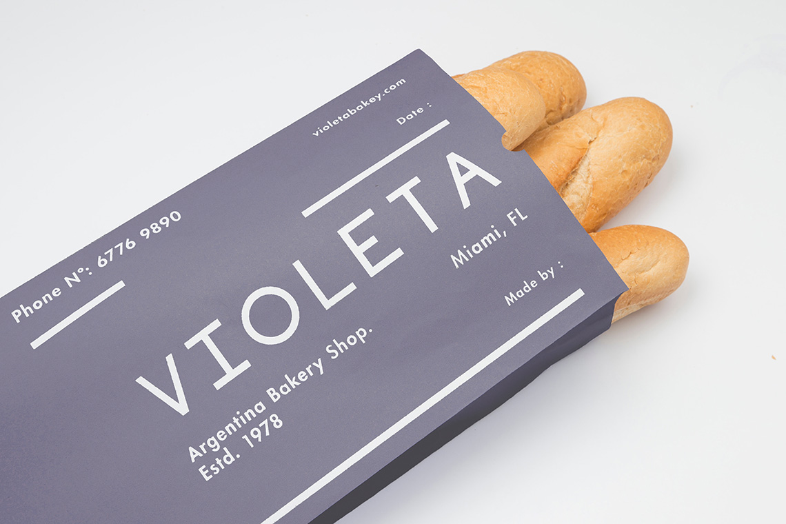
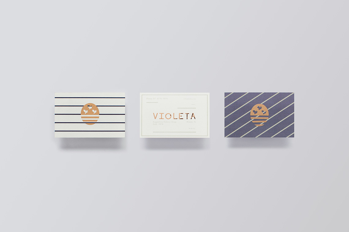
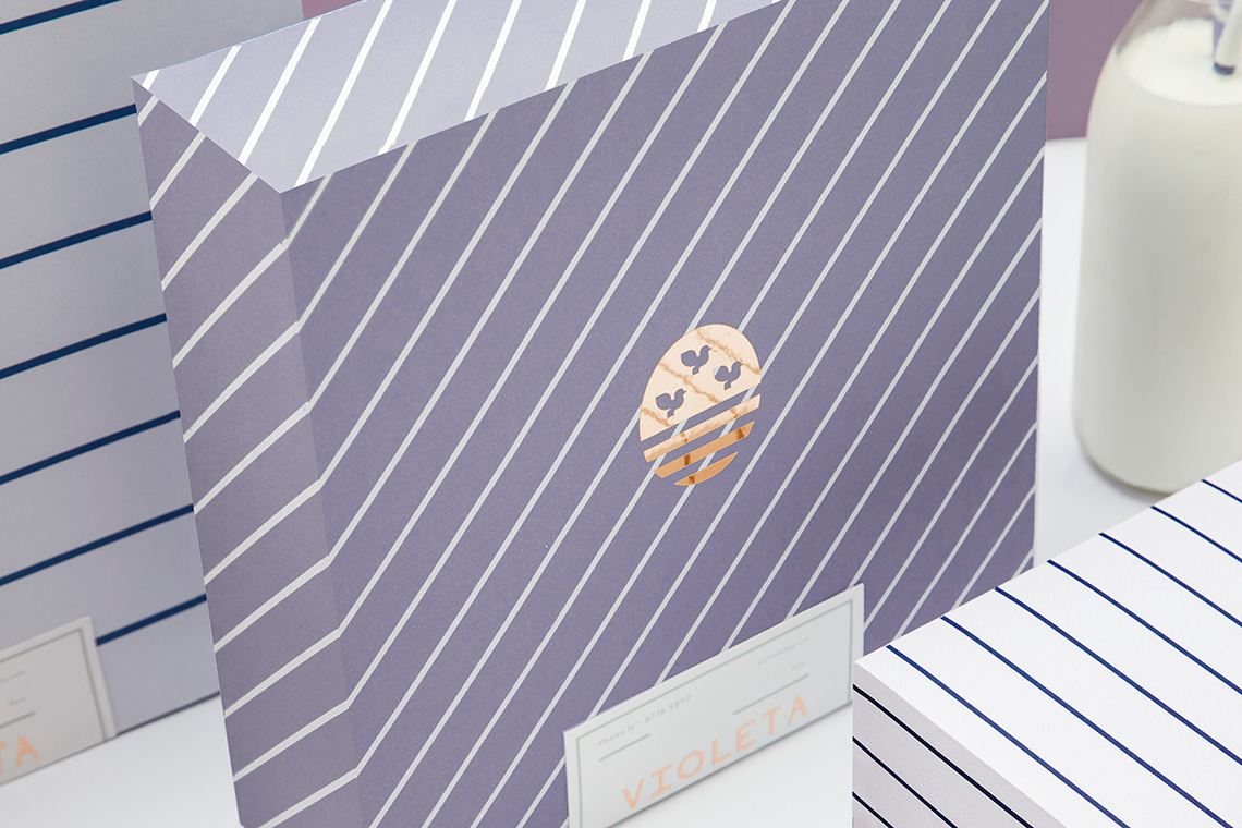
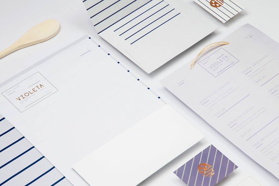
Our proposal draws inspiration from Buenos Aires' coat of arms: an oval with two ships sailing over Rio de la Plata and a dove flying above them. We multiplied the dove by three in celebration of Violeta's three decades of fantastic bread. We kept the lines depicting the Rio de la Plata and used them not only in the icon, but all over the brand in four different patterned textures. We chose violet to match the naming and to keep the brand fresh and feminine. The copper foil is not only a nod towards Violeta's excellence, but it also refers to the toasty color of bread right after it leaves the oven. — (A)
Our proposal draws inspiration from Buenos Aires' coat of arms
