Scielo
BRANDING
The client
Scielo is Rivero González' newest product; a robust red wine, targeted mostly to young adults, hence its moderate price.
keywords
Wine /Mexico /Branding /Label /Graphic Design /Icon design
the objective
Develop a modern brand that communicates the characteristics of the product.
the solution
In the global wine market, young people are taking more and more importance, therefore, our challenge was to design the sub-brand's identity in a way that it would create an emotional bond with this new generation of wine enthusiasts in a practical and honest way.
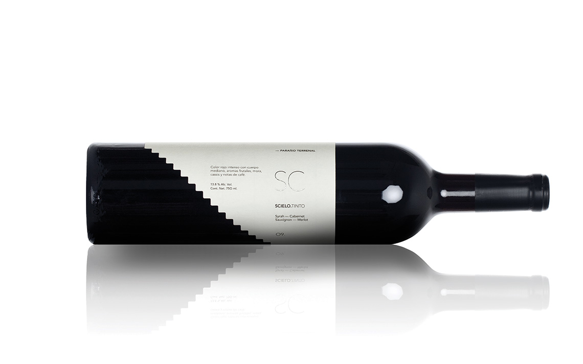
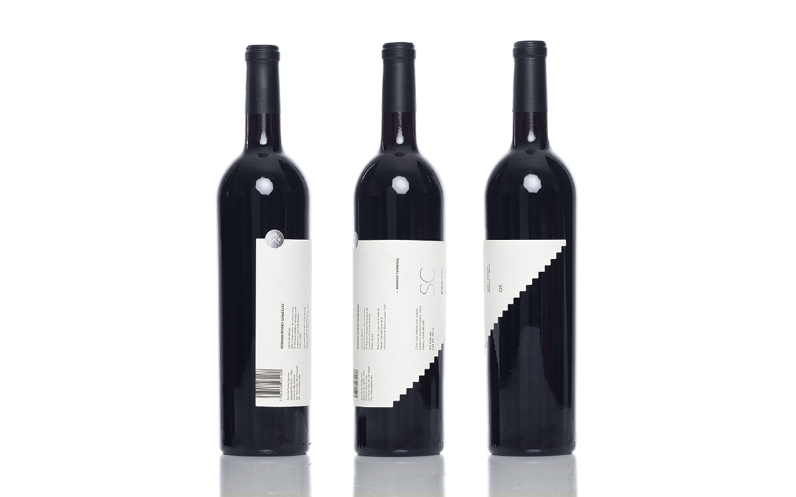
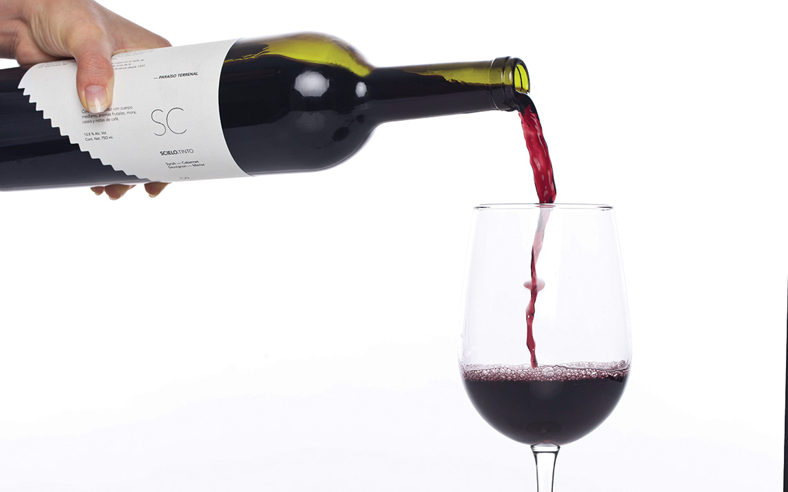
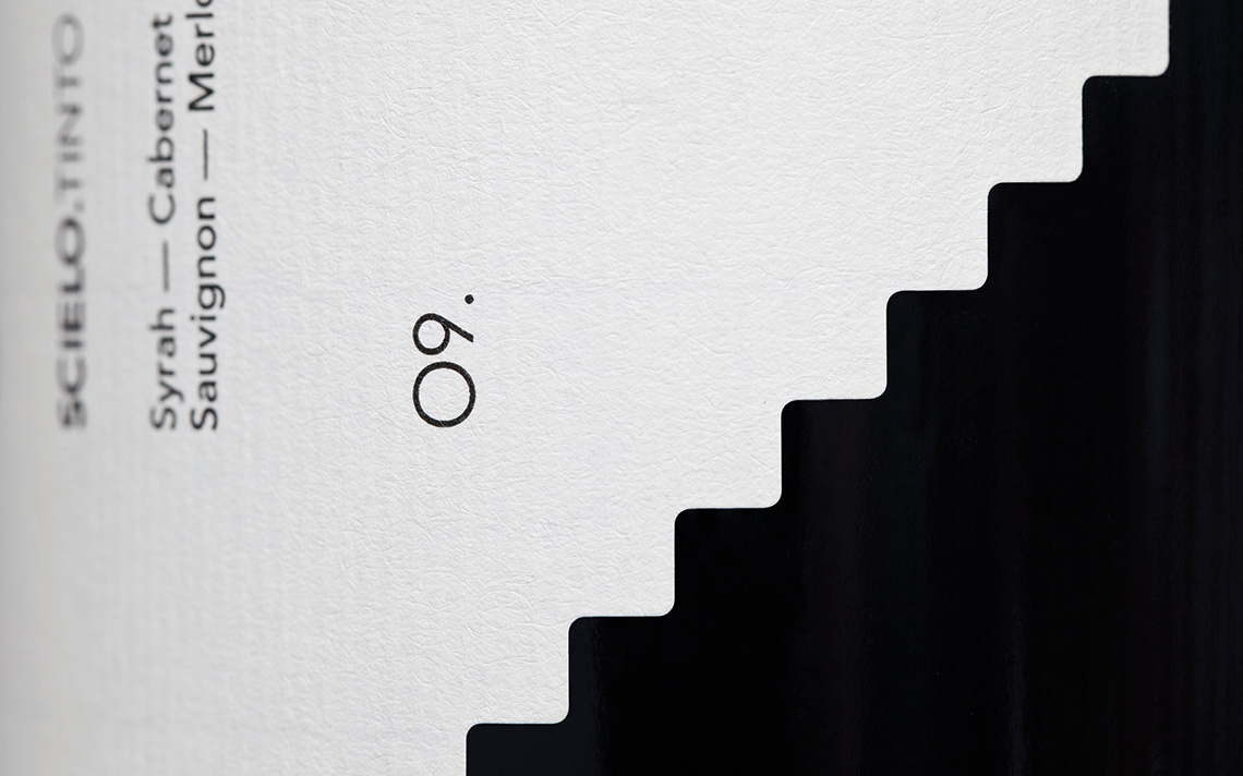
The modern packaging communicates the harvest's specifications in a very detailed way. Scielo comes from the spanish word "Heaven", based on this concept, the cotton paper's die-cut in the shape of a stair, and the texts are set in a vertical position.
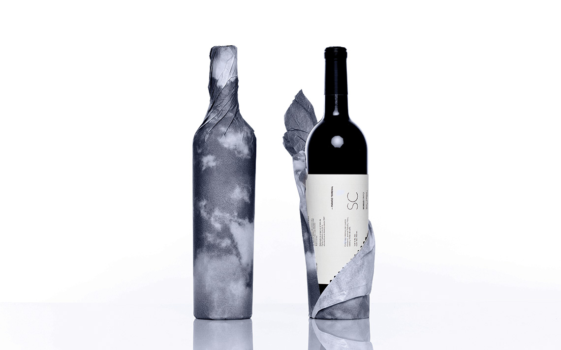
Detail such as the silver foil and the printed wrapping, give the wine a contemporary feel, while the round seal with an abstraction of the Rivero González' logotype links Scielo to the winery. — (A)
The cotton paper's die-cut in the shape of a stair to heaven.
