Satchels
BRANDING
The client
Satchels Coffee Roasters is an independent local coffee brand based on a tradition of work and care in taste.
The brand was inspired by travel, with the idea of sharing what we do best: an extraordinary coffee from start to finish, seeking fair practices throughout the commercial chain.
keywords
Logo design / Packaging design / Coffee / Stationary
the objective
Create a brand and name complementing the quality of the product and service, working as an added value compared to its competitors. The brand must embody the essence and spirit of the business.
the solution
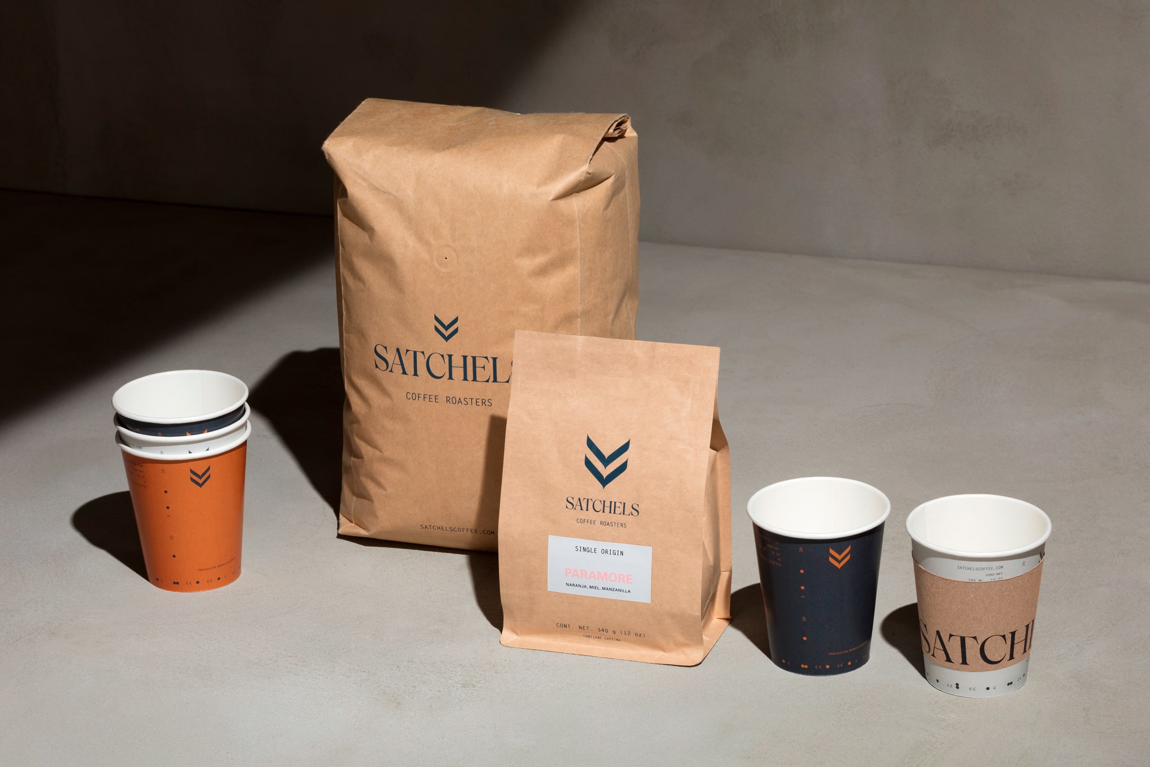
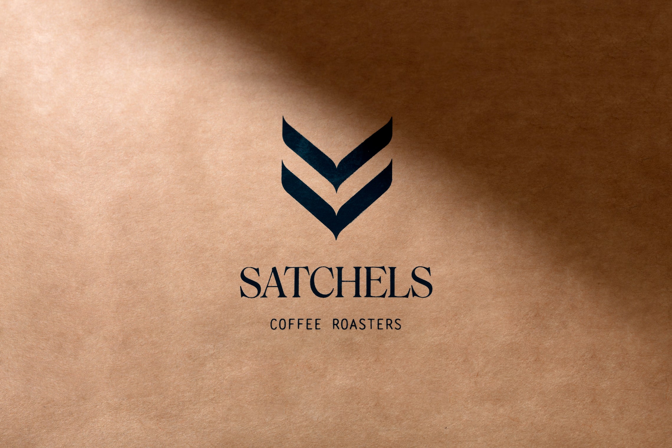
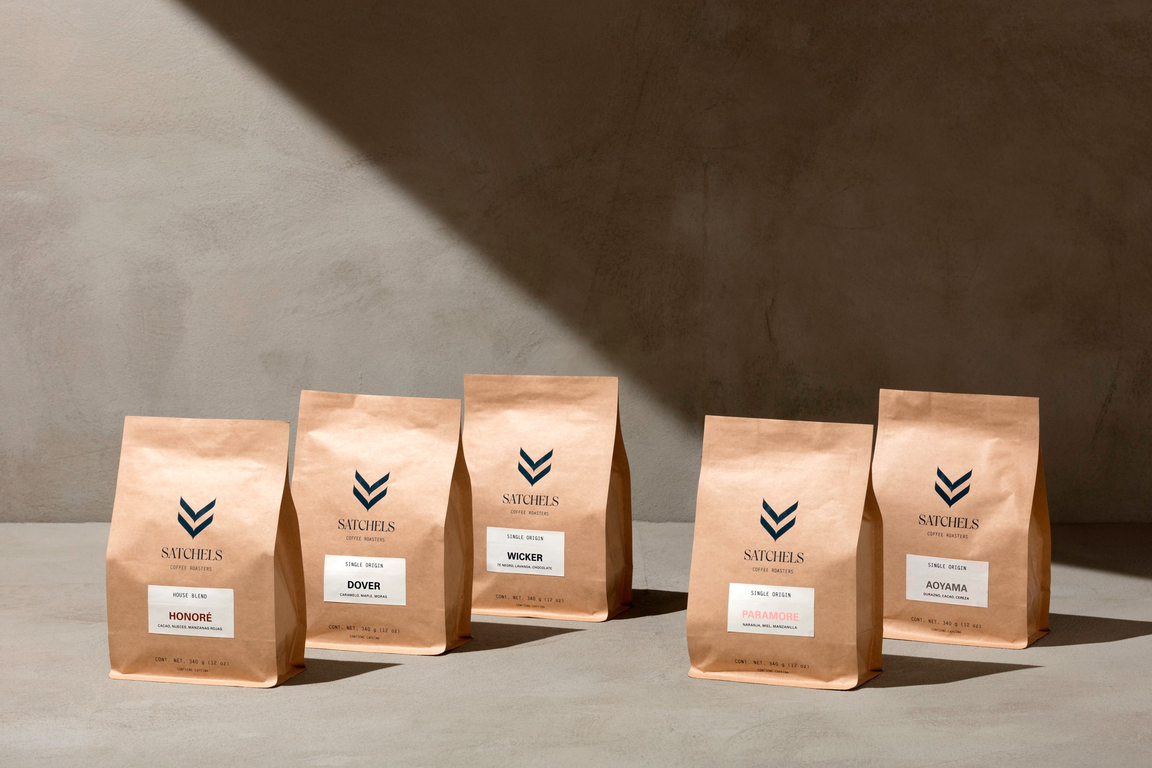
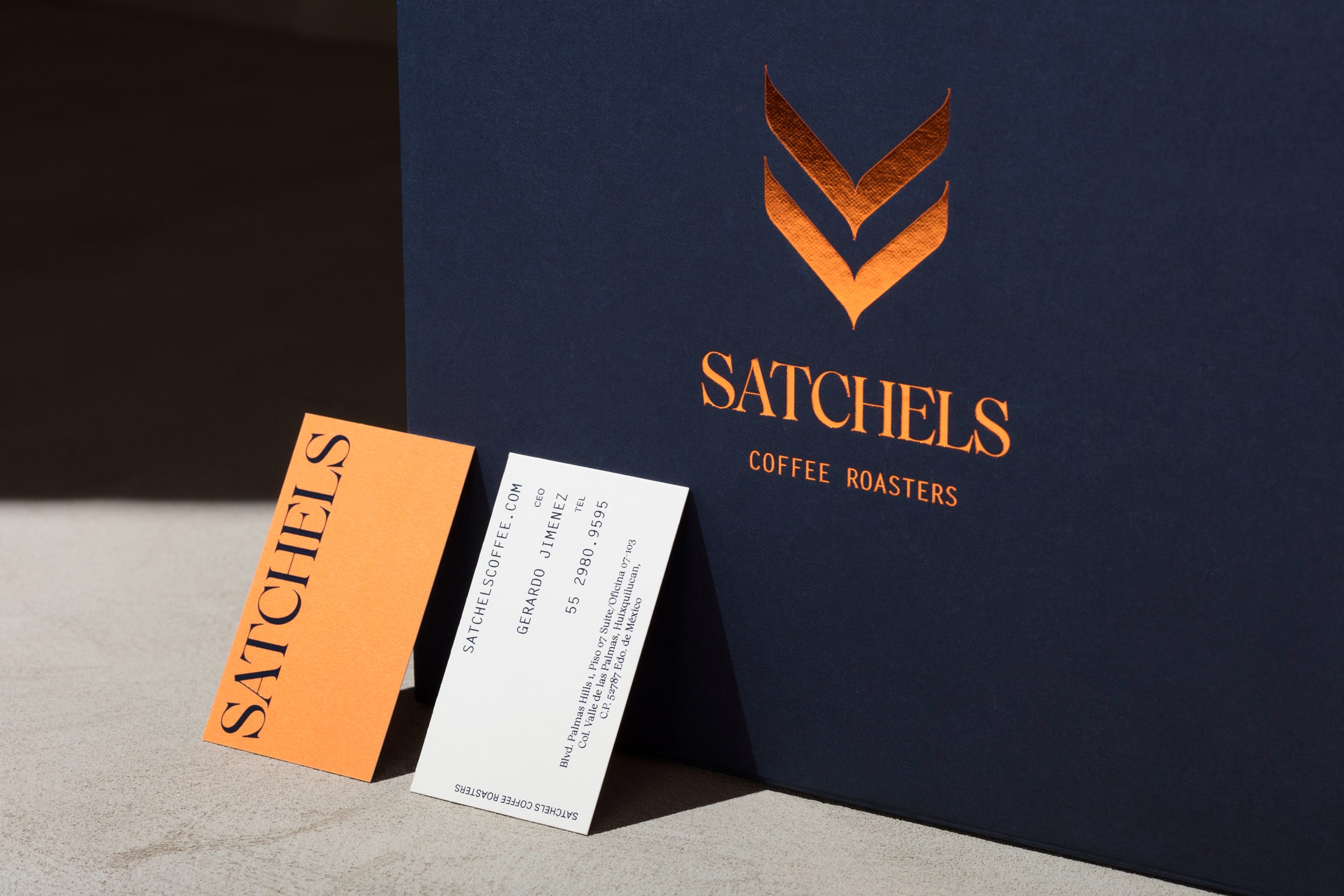
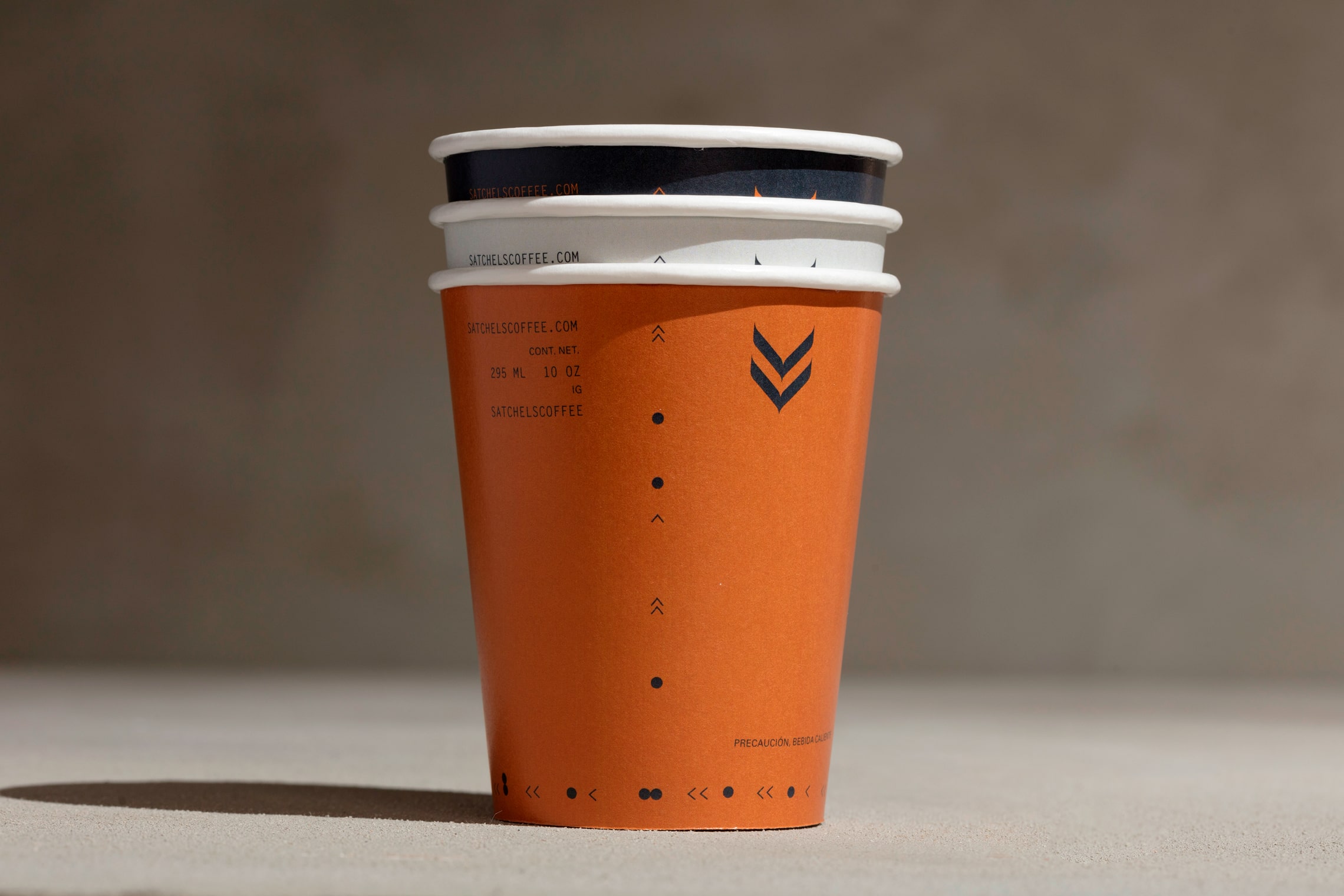
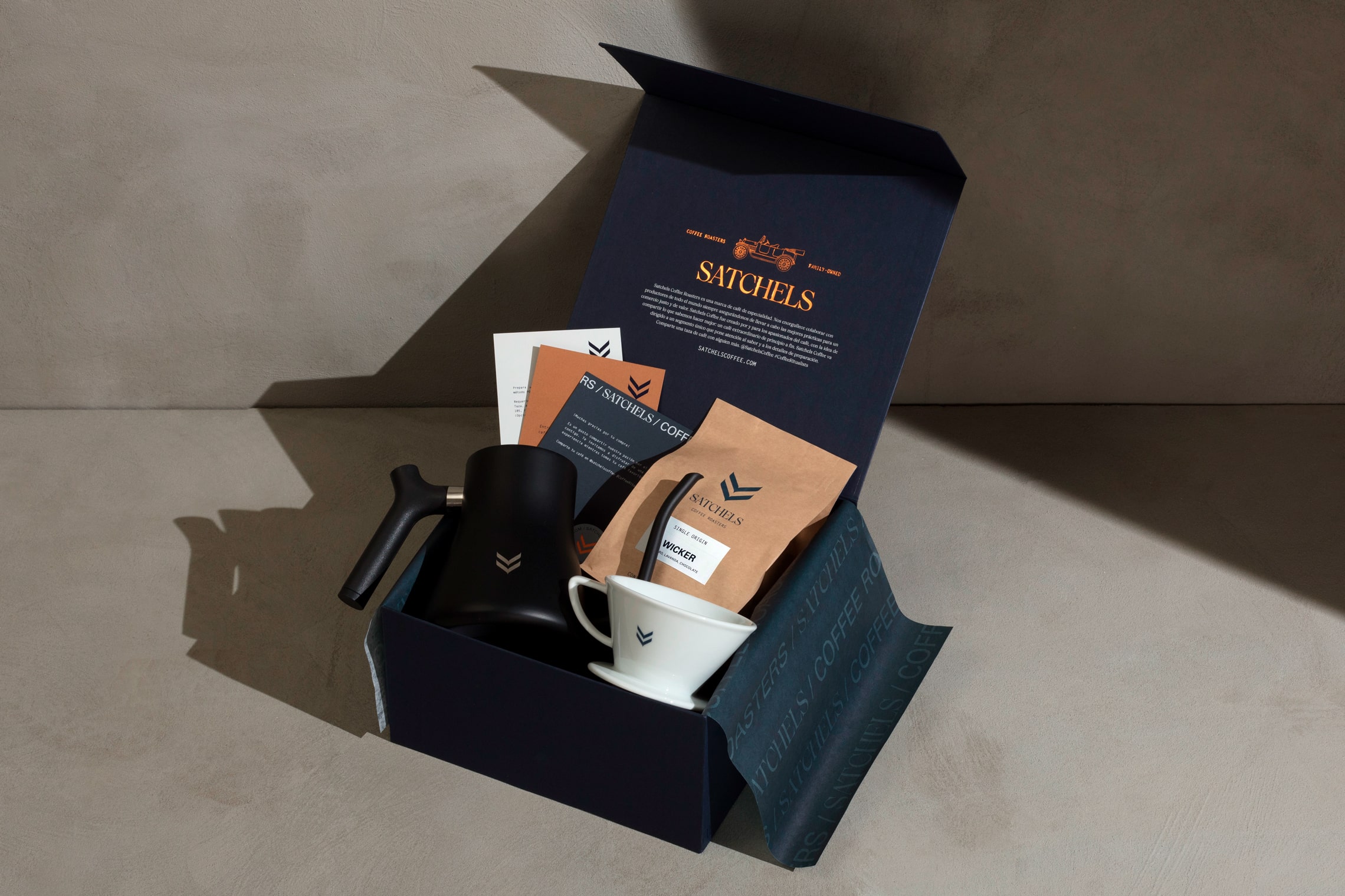
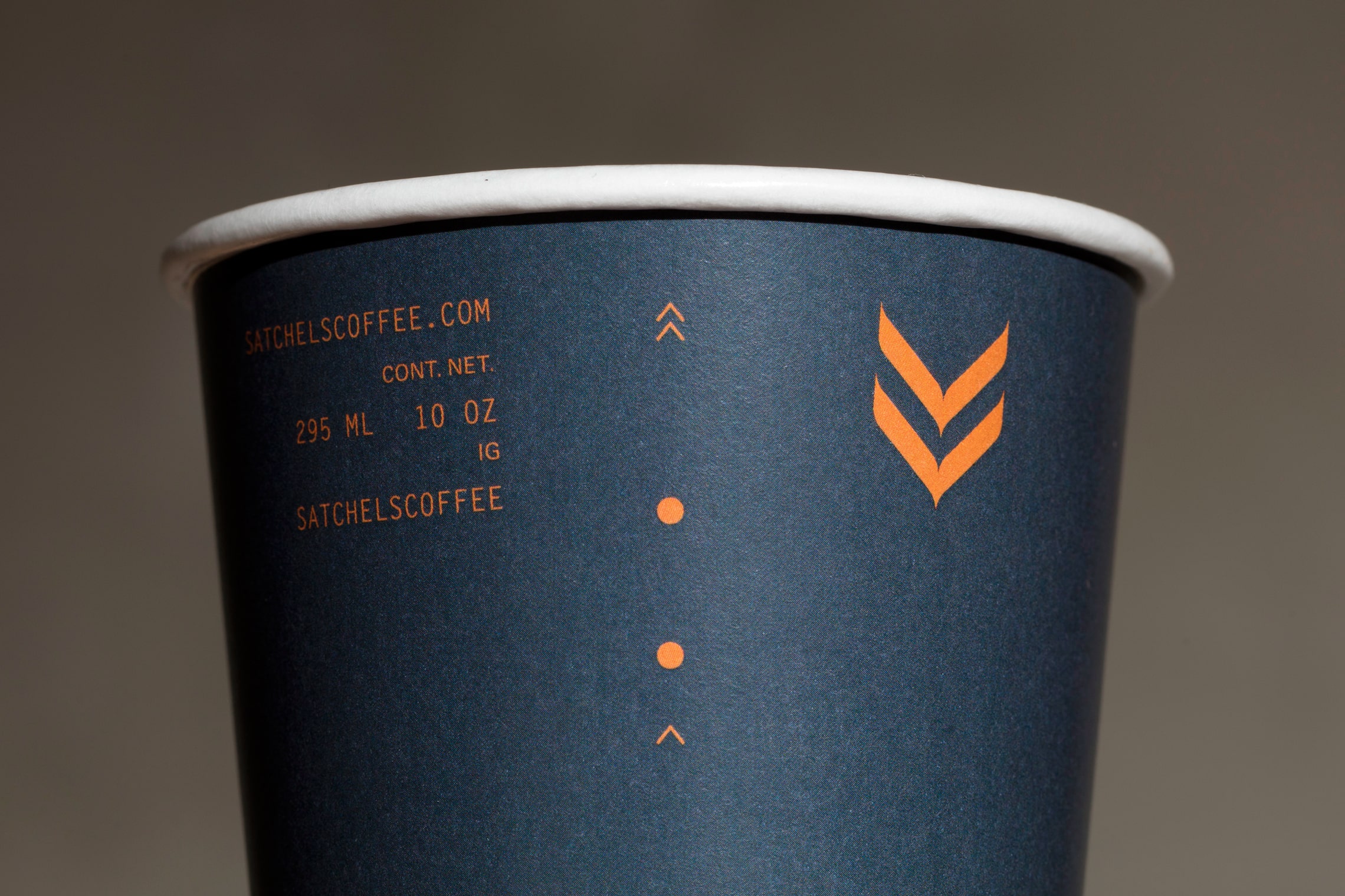
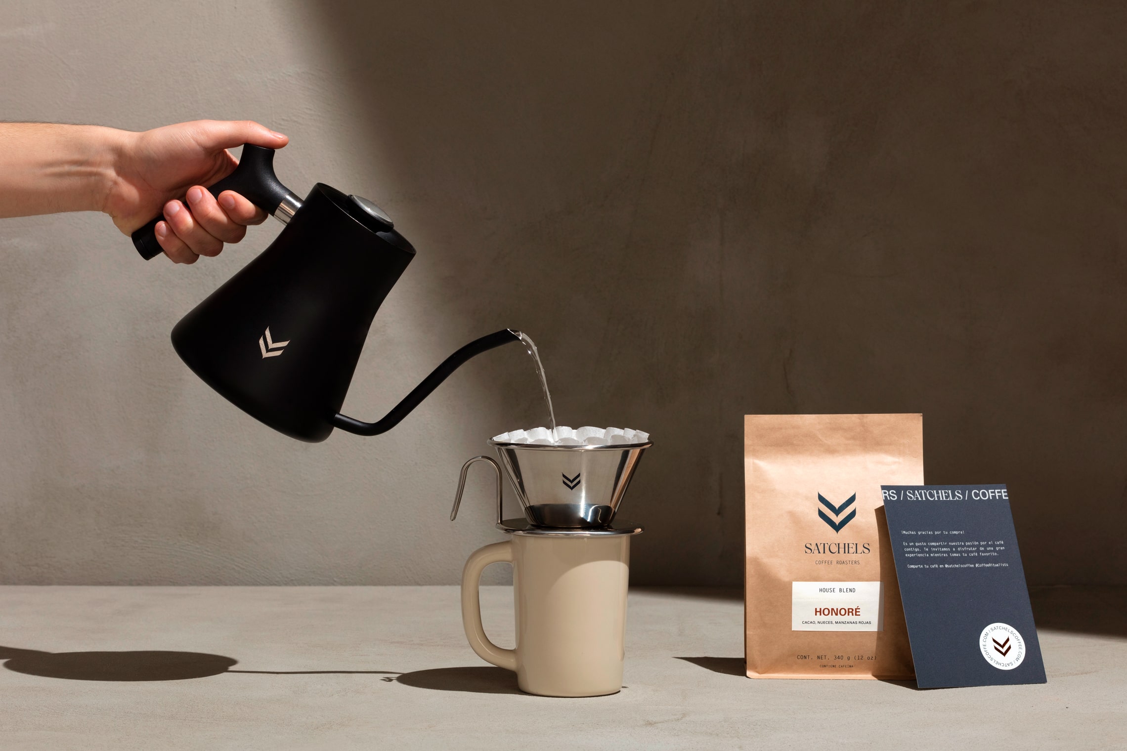
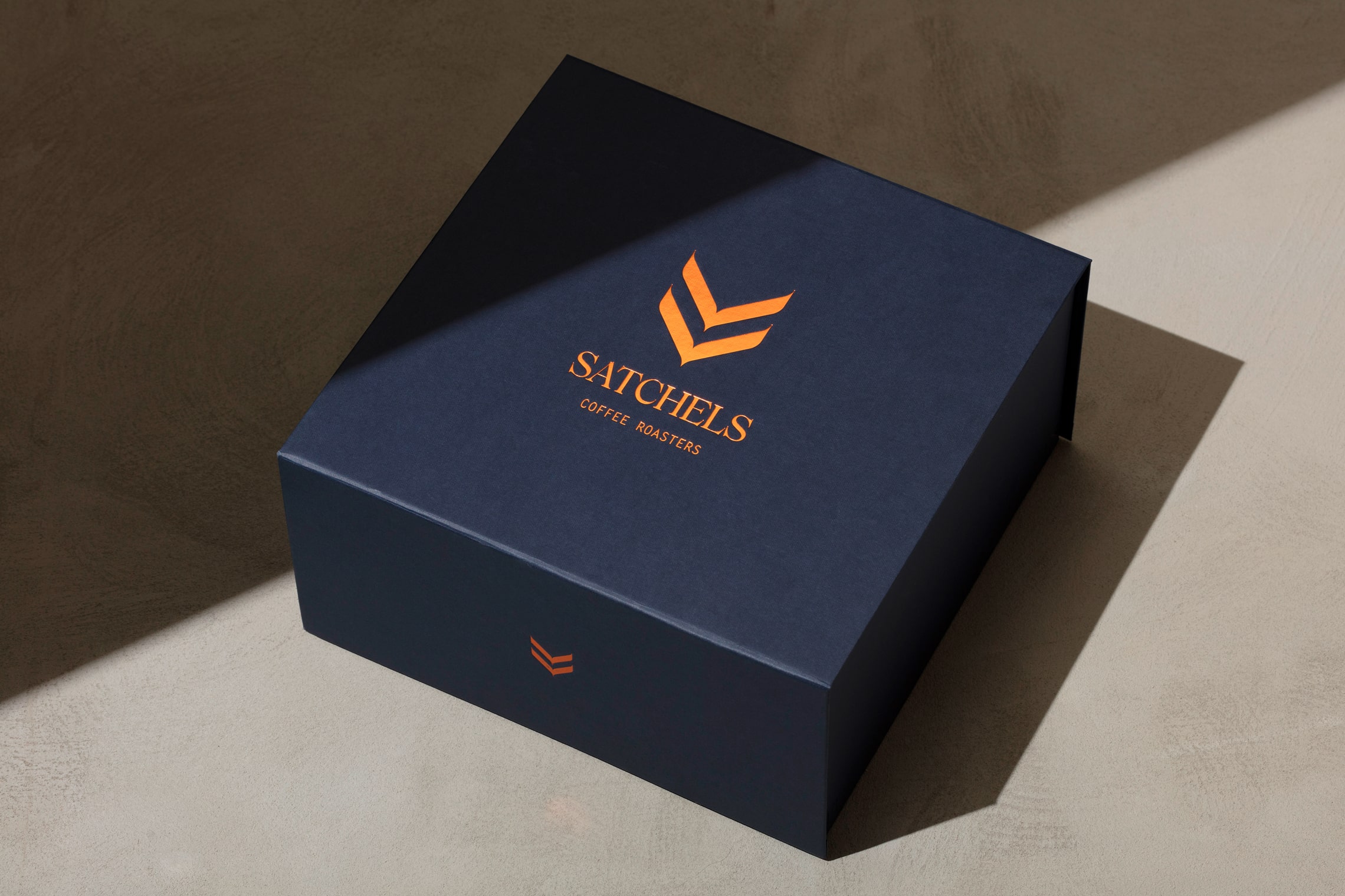
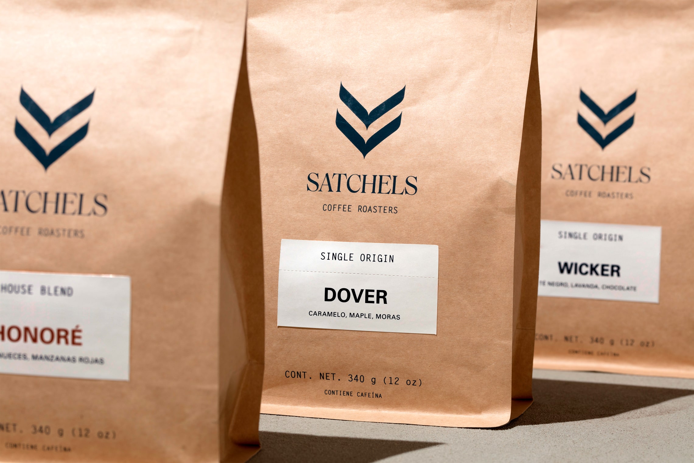
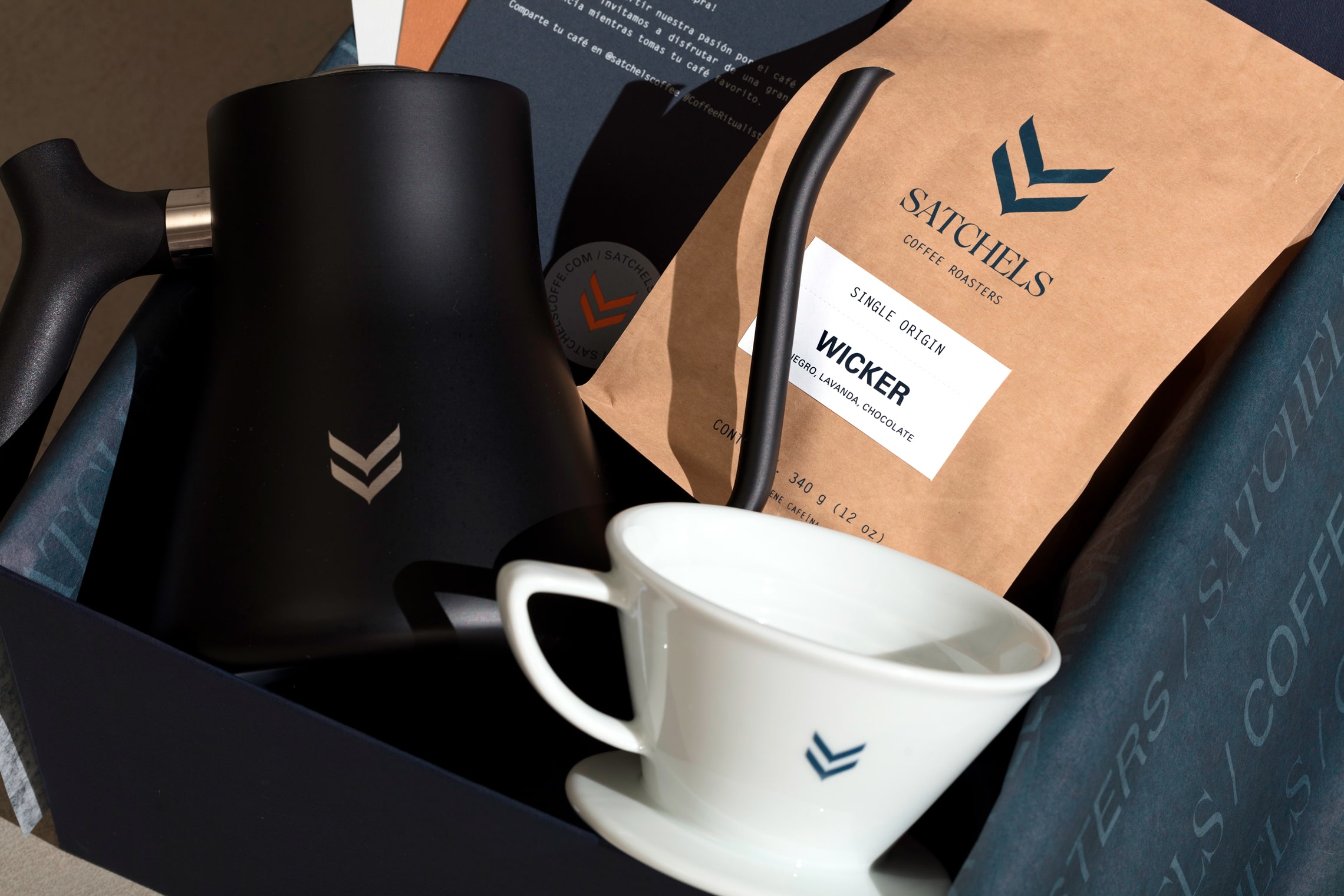
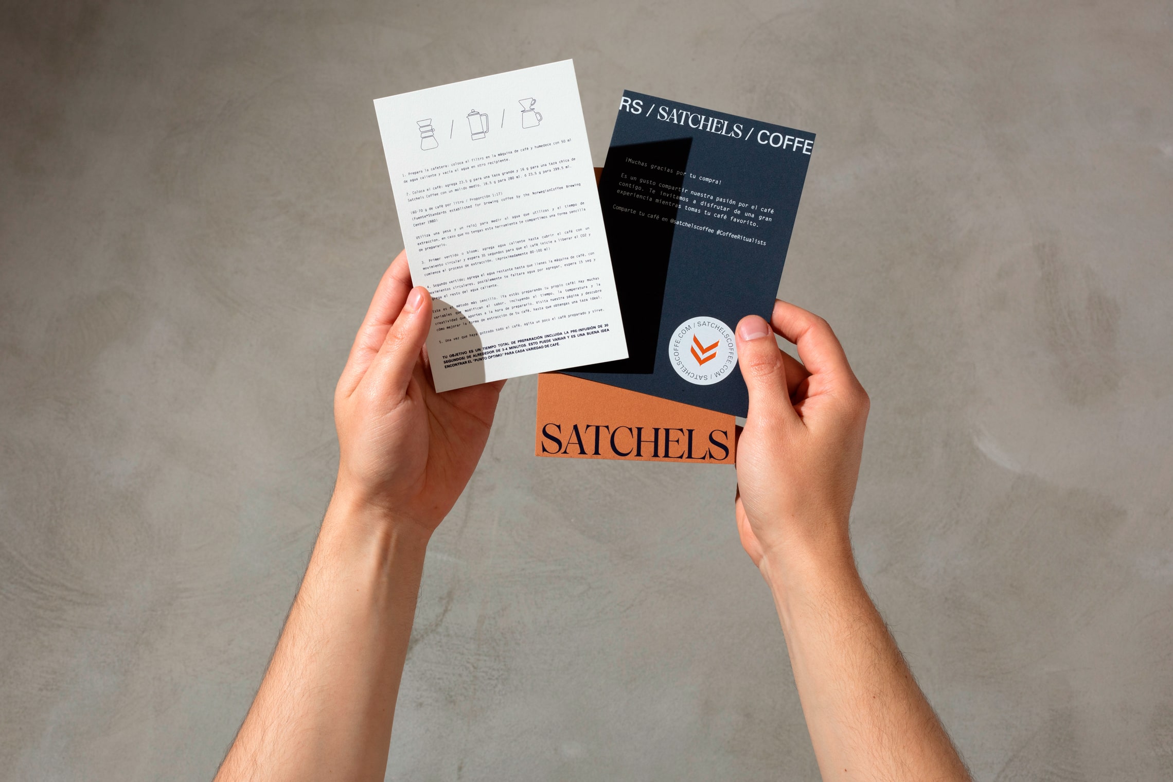
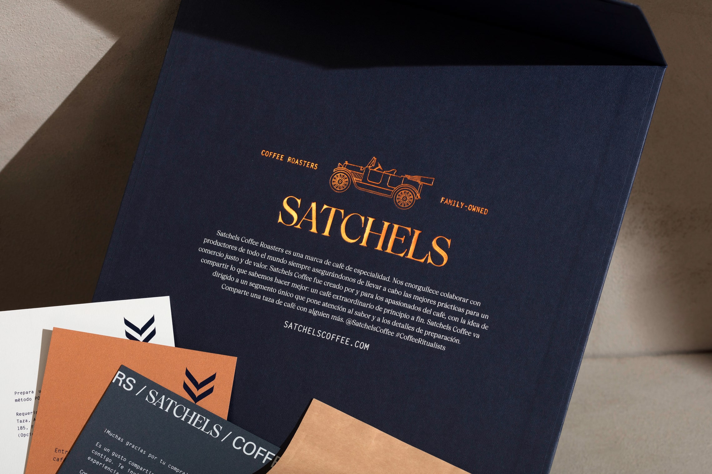
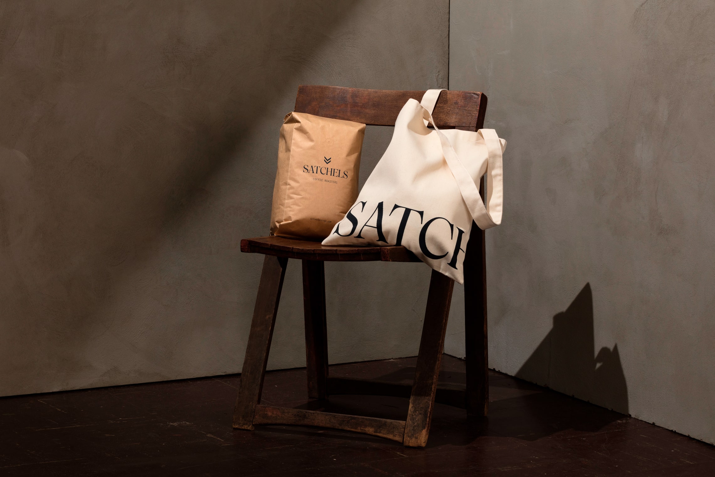
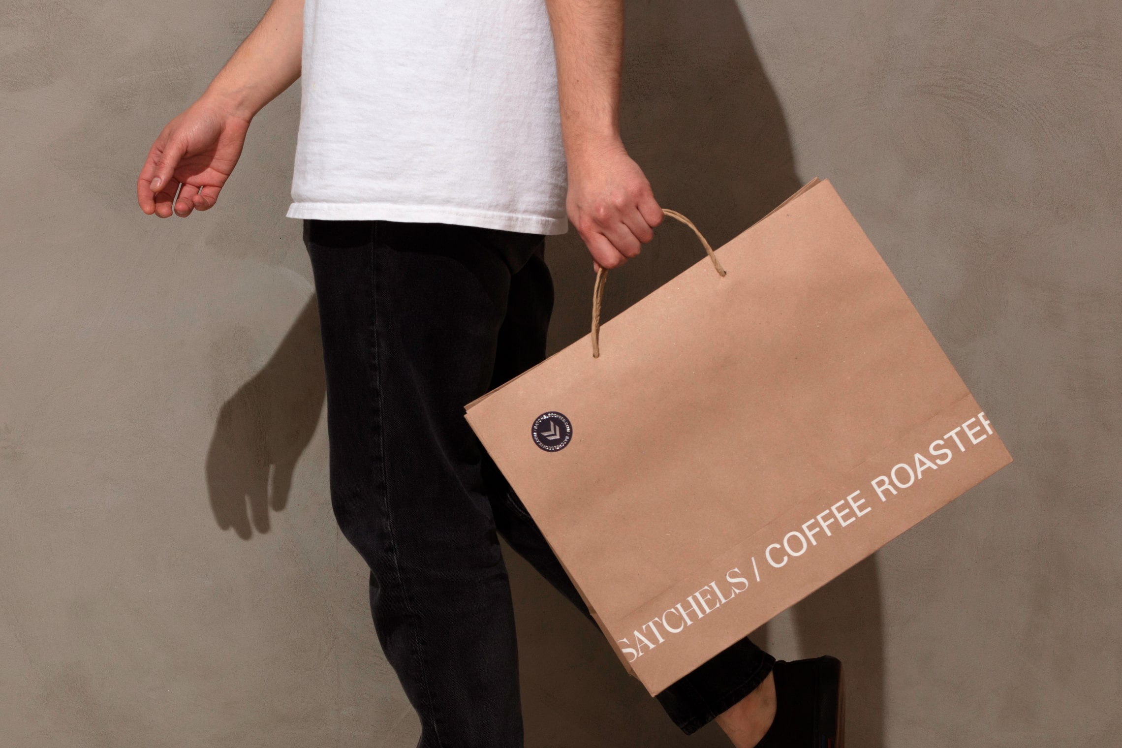
The name Satchels originates from the classic English suitcase employed for travel. The typographic style and arrangements are inspired by travel elements, such as train tickets and passports, referencing the pattern that is applied in the packaging. The icon represents an abstraction of the coffee filtration system, adding to the elegance of the brand. The color palette is inspired by the facades of classic English cafes where natural materials and sober colors are used. In the packaging, the information is concrete and institutional, making the product the focal element. — (A)
