Kindo
ARCHITECTURE
The client
Kindo is an exclusive boutique for kids’ clothing and accessories in San Pedro Garza Garcia, Mexico. The store offers a wide selection of trendsetting and original clothing items for children.
keywords
Fashion/ Kids/ Branding/ Interior Design/ Packaging
the objective
The store’s interior aims at complementing the experience for adults as well as children.
the solution
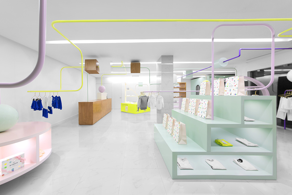
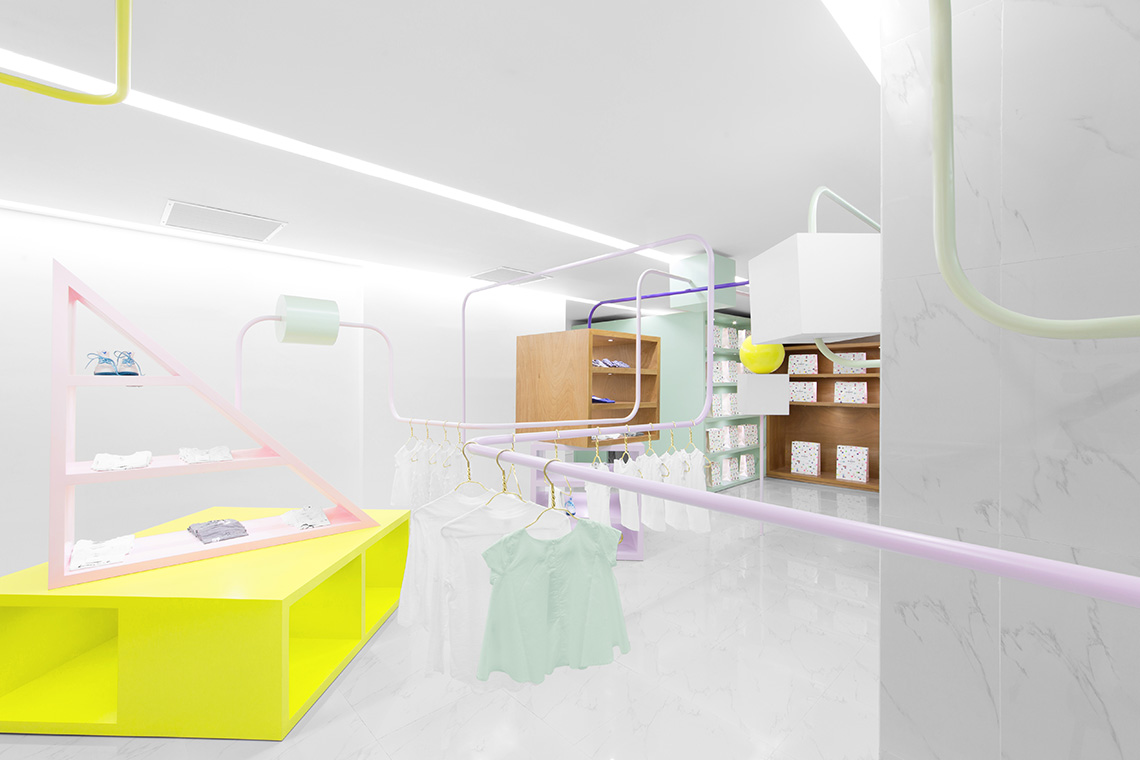
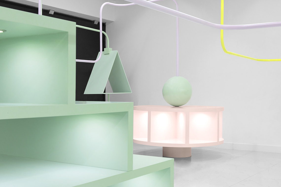
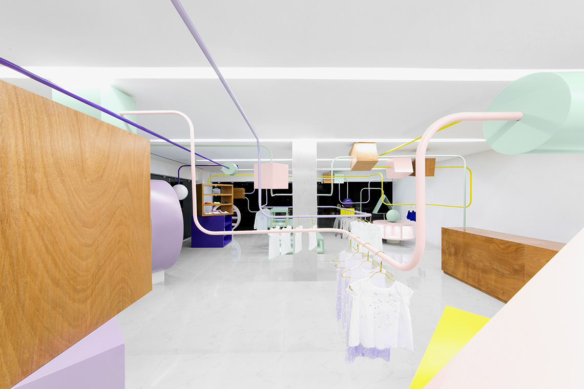
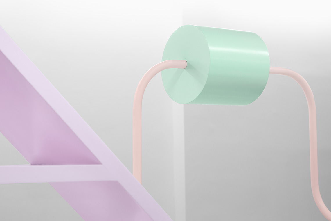
The store’s interior aims at complementing the experience for adults as well as children. It creates a dynamic space where each of the bead maze’s attributes are used for the products’ exhibition. The tubes function as display stands for clothing and the beads are used to exhibit an array of accessories. The interior achieves its function as a unique space that perfectly complements the brand’s style. — (A)
A space where each of the bead maze’s attributes are used for the products’ exhibition.
Kindo
BRANDING
the objective
Create an atmosphere that invites children and adults to enjoy the experience of buying clothes and fashion accessories.
the solution
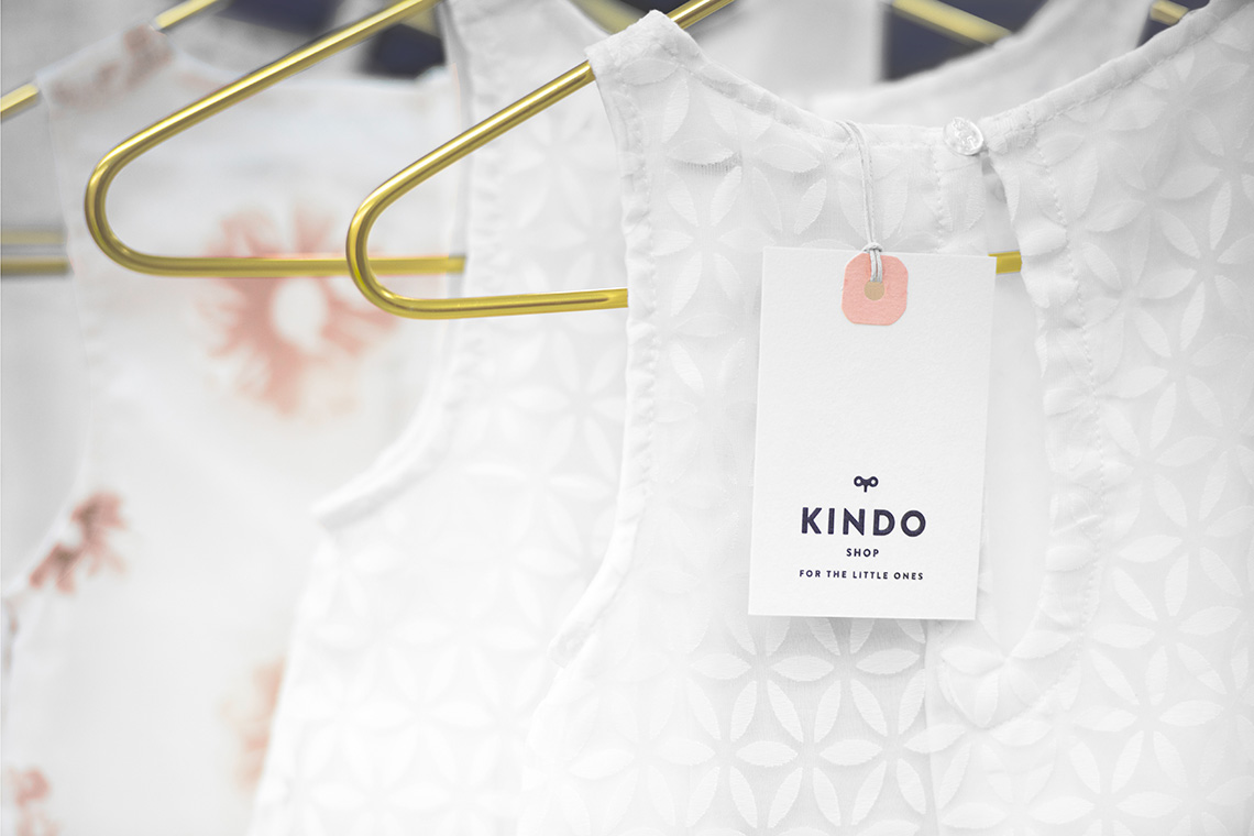
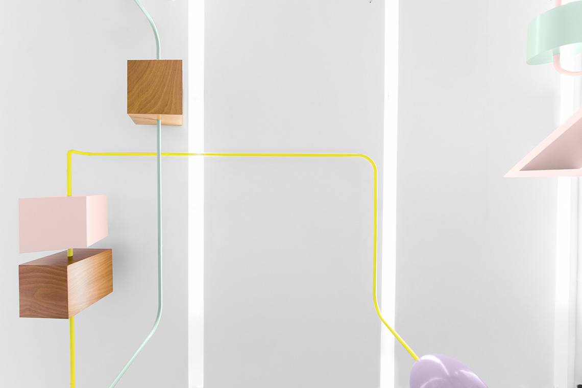
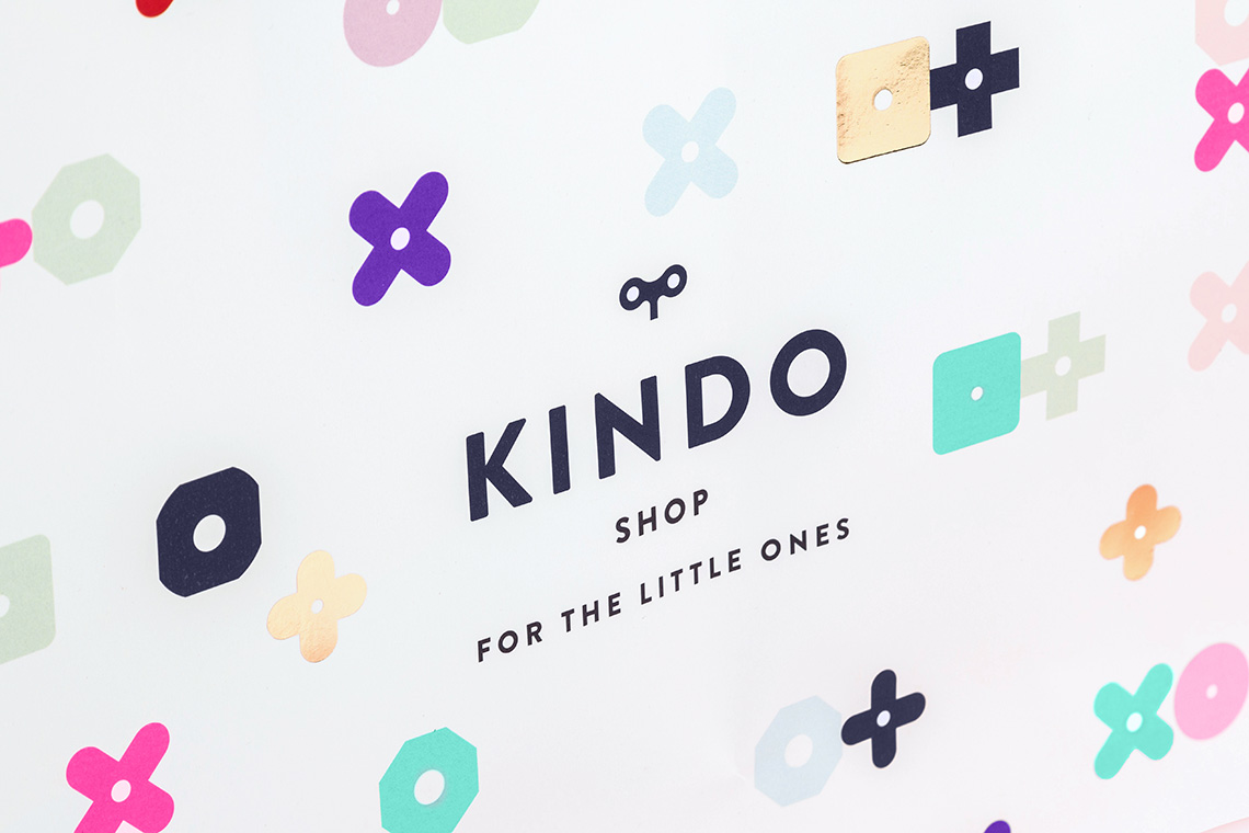
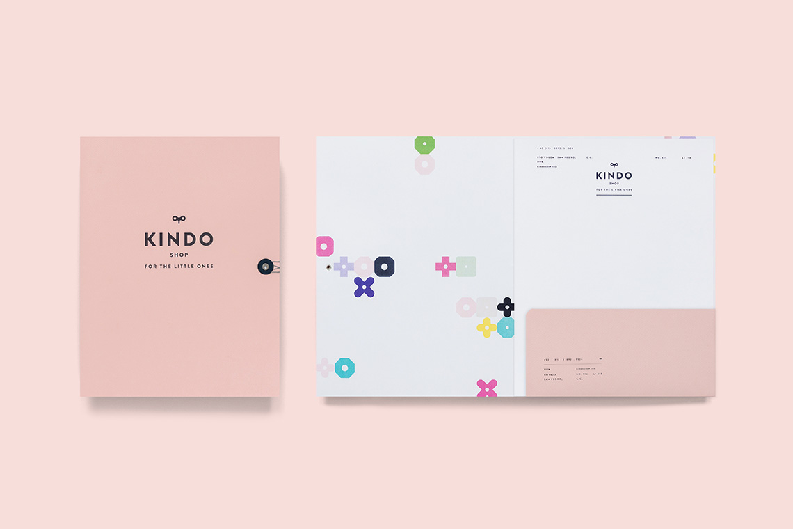
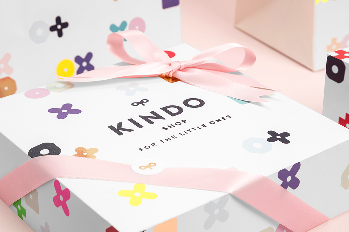
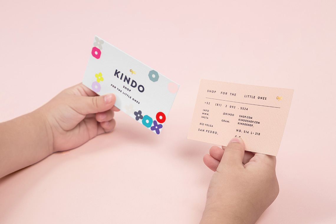
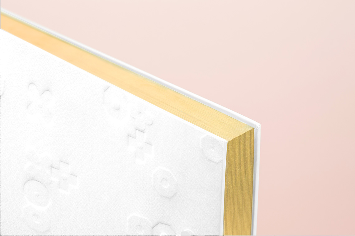
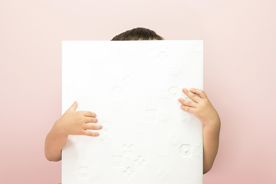
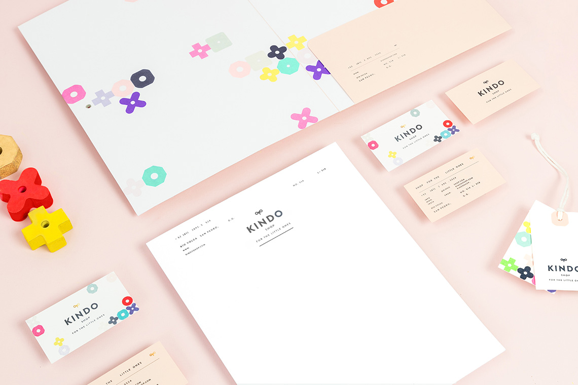
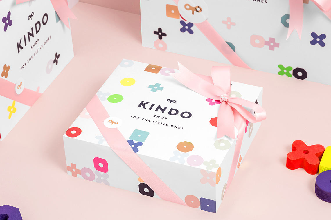
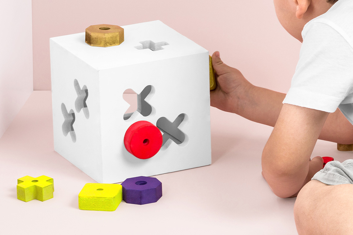
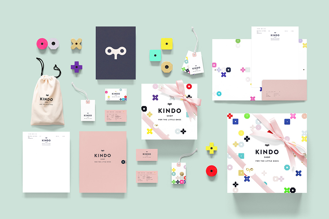
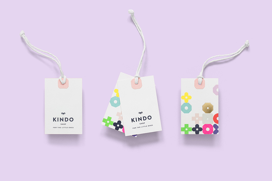
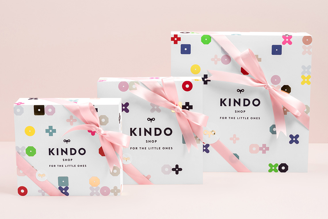
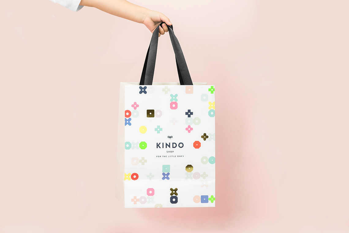
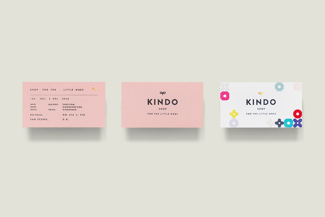
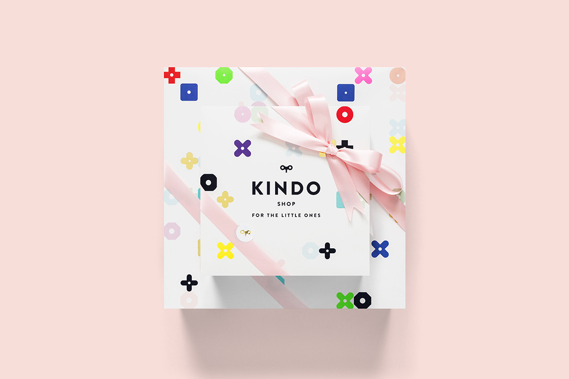
The brand is inspired by a didactic bead maze made up of geometric shapes, and uses simple figures as its base, creating an adaptation with a fun twist. Kindo’s color palette attempts to reflect a child’s personality, using a wide range of pastel and neon colors. The icon represents the mix of the classic and the new that make up the brand. — (A)
The brand is inspired by a didactic bead maze made up of geometric shapes
