Groundzero
BRANDING
The client
Groundzero is a high-end nail spa located in Kuwait focused on offering a new beauty concept: a nail salon/bar hybrid experience.
keywords
Branding / Nail Spa / Stationary
the objective
To develop a brand visual experience that brings Goundzero to the top of the nail spa game.
the solution
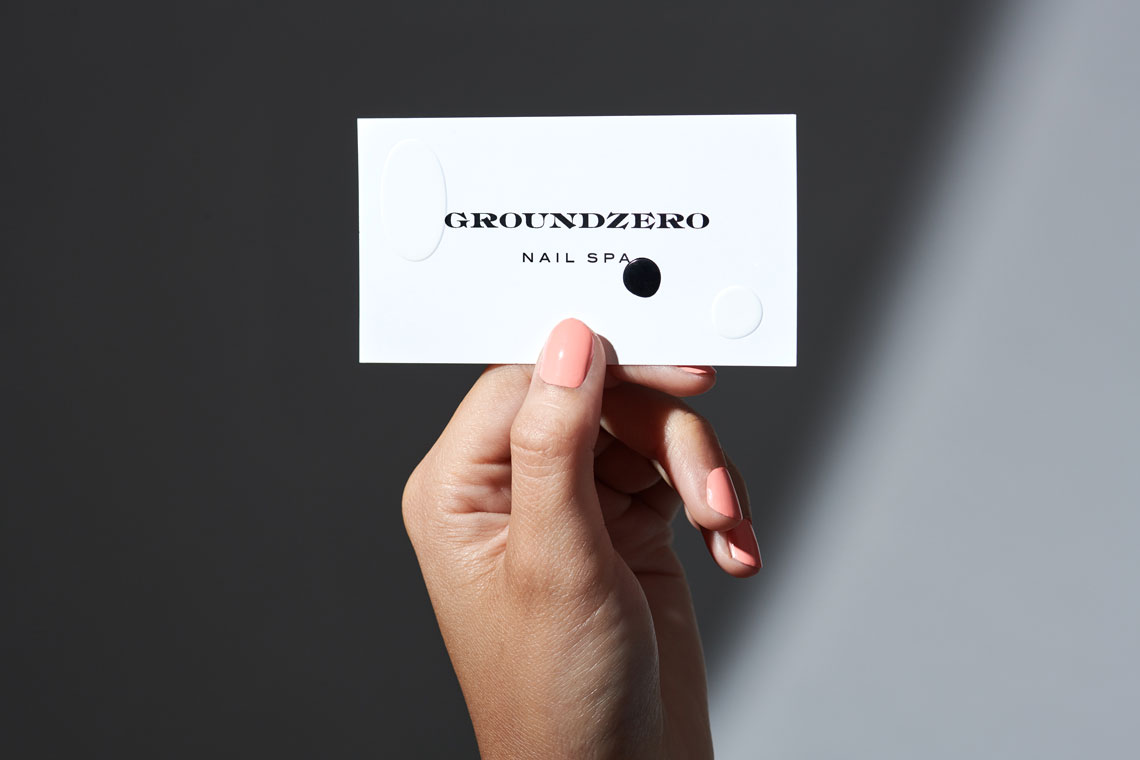
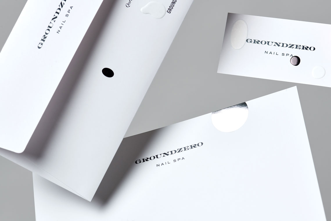
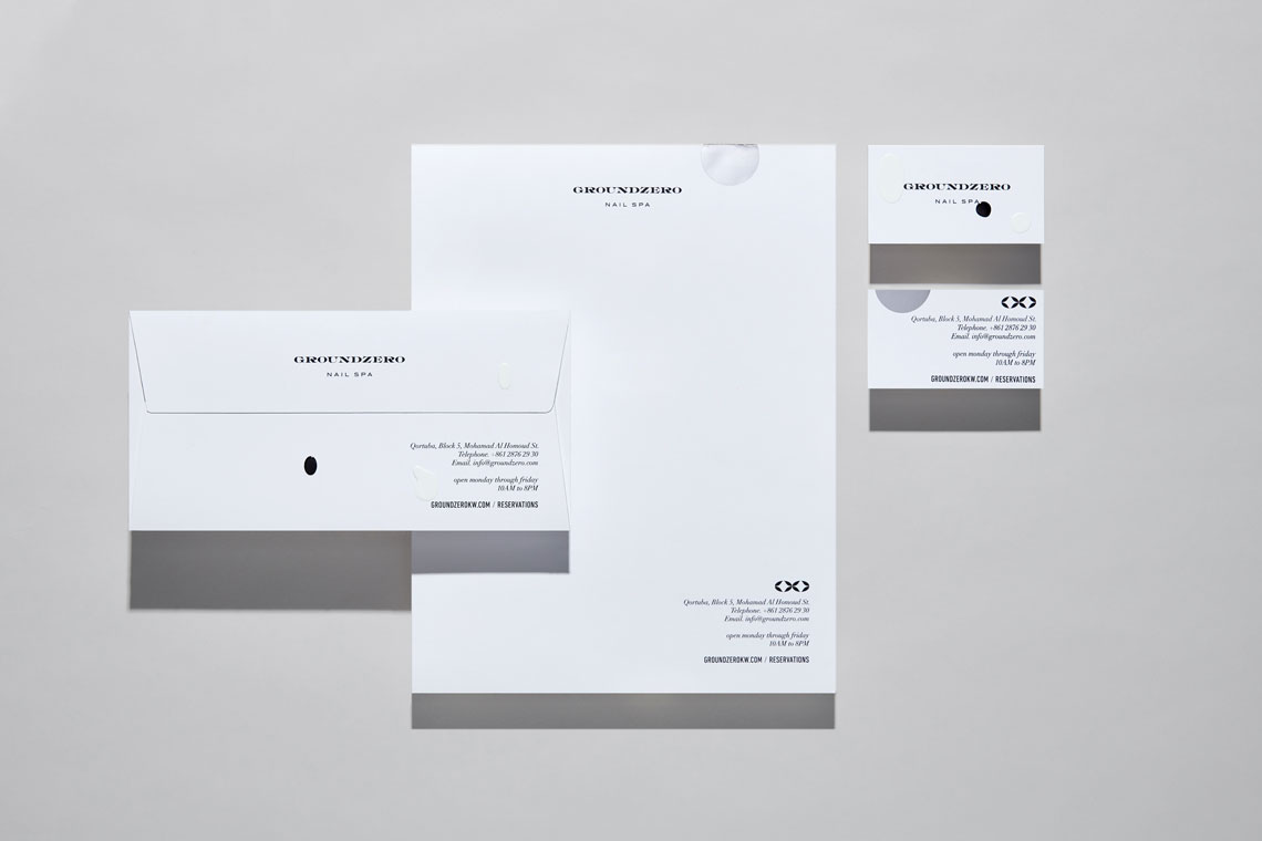
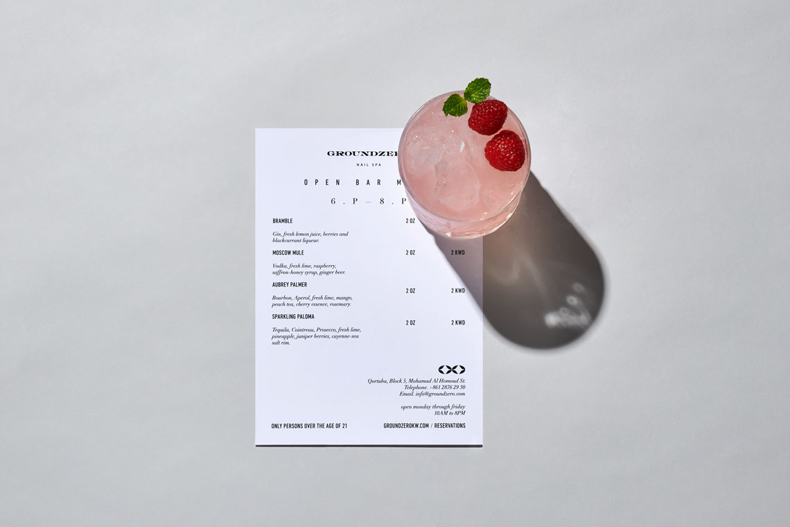
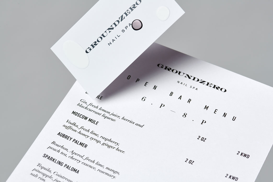
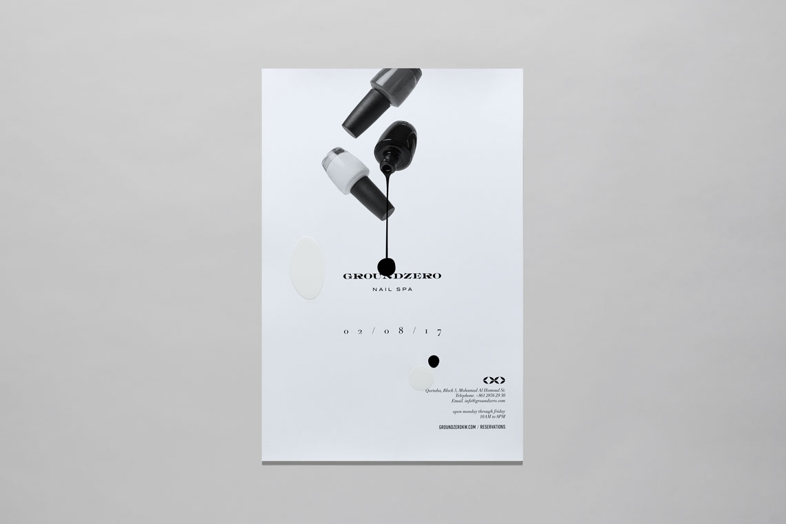
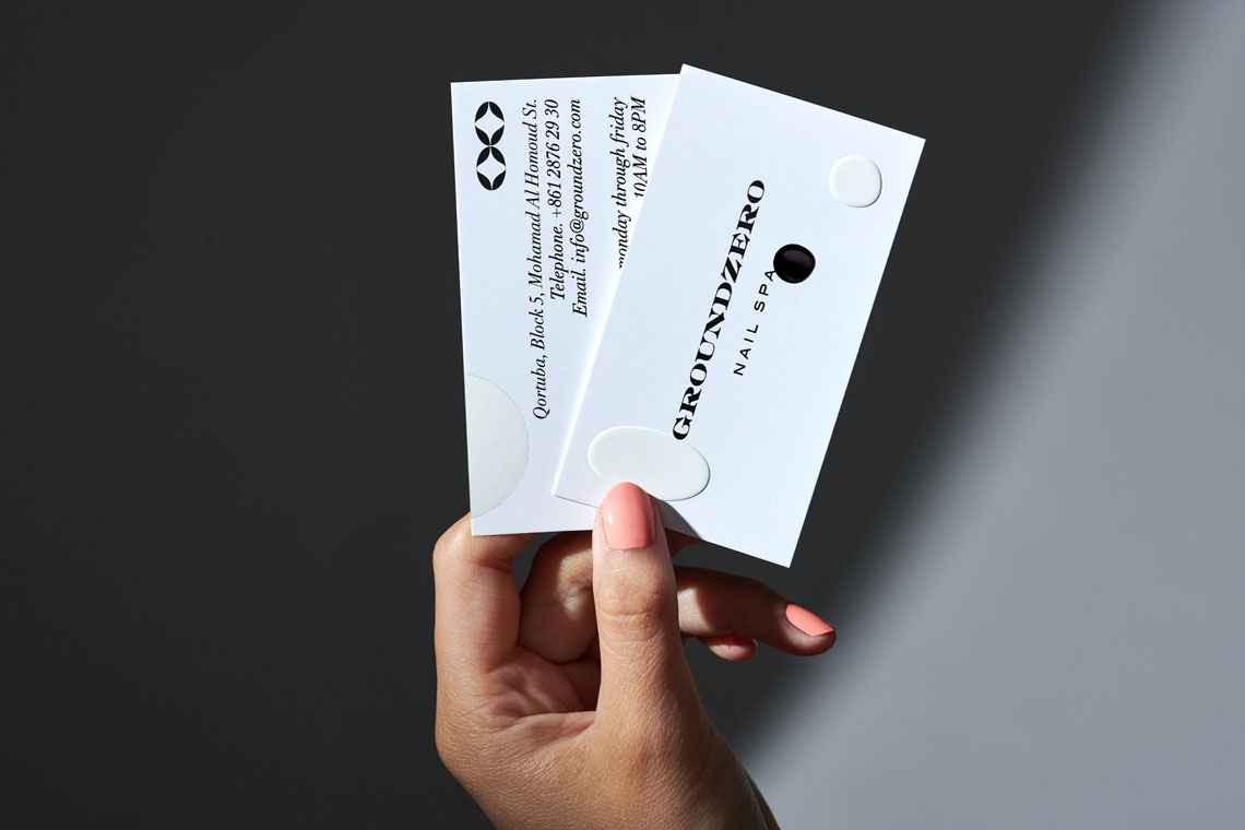
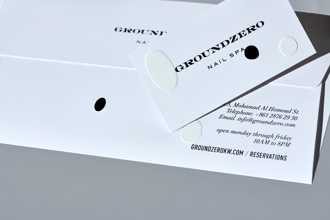
We've managed to develop a grand brand personality through a simple and timeless approach.
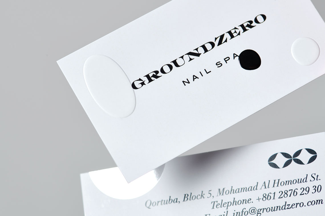
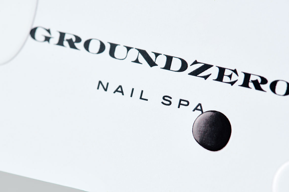
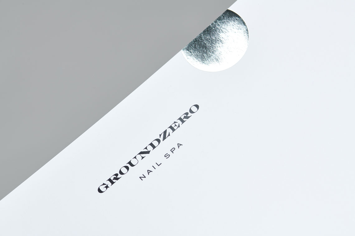
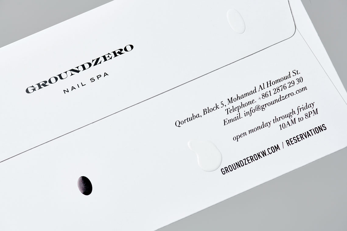
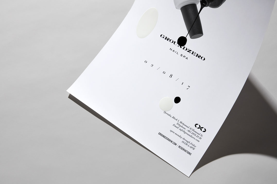
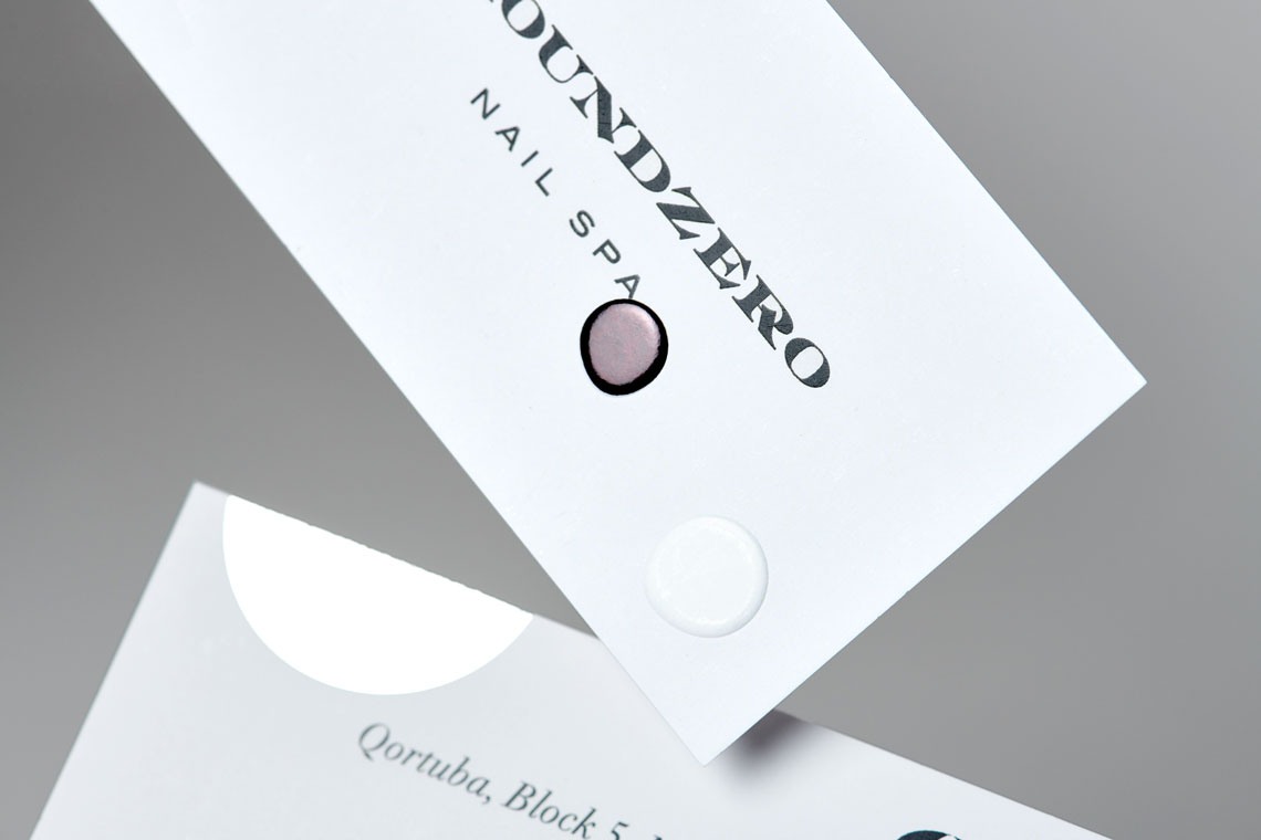
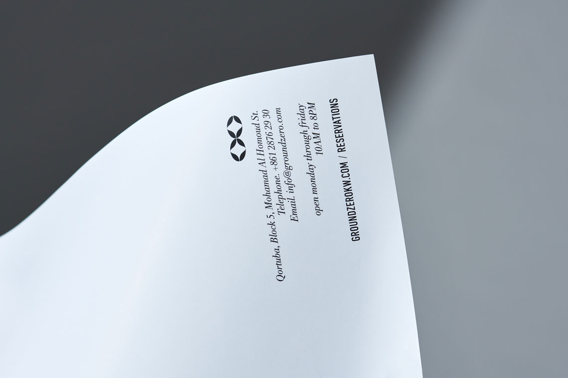
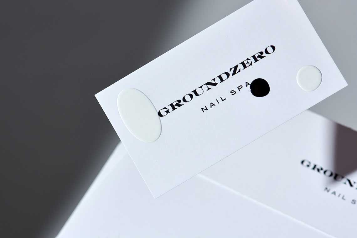
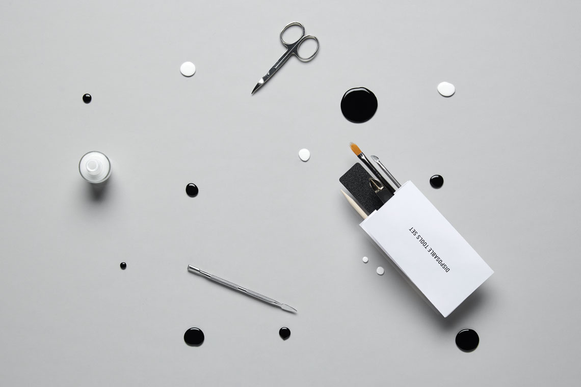
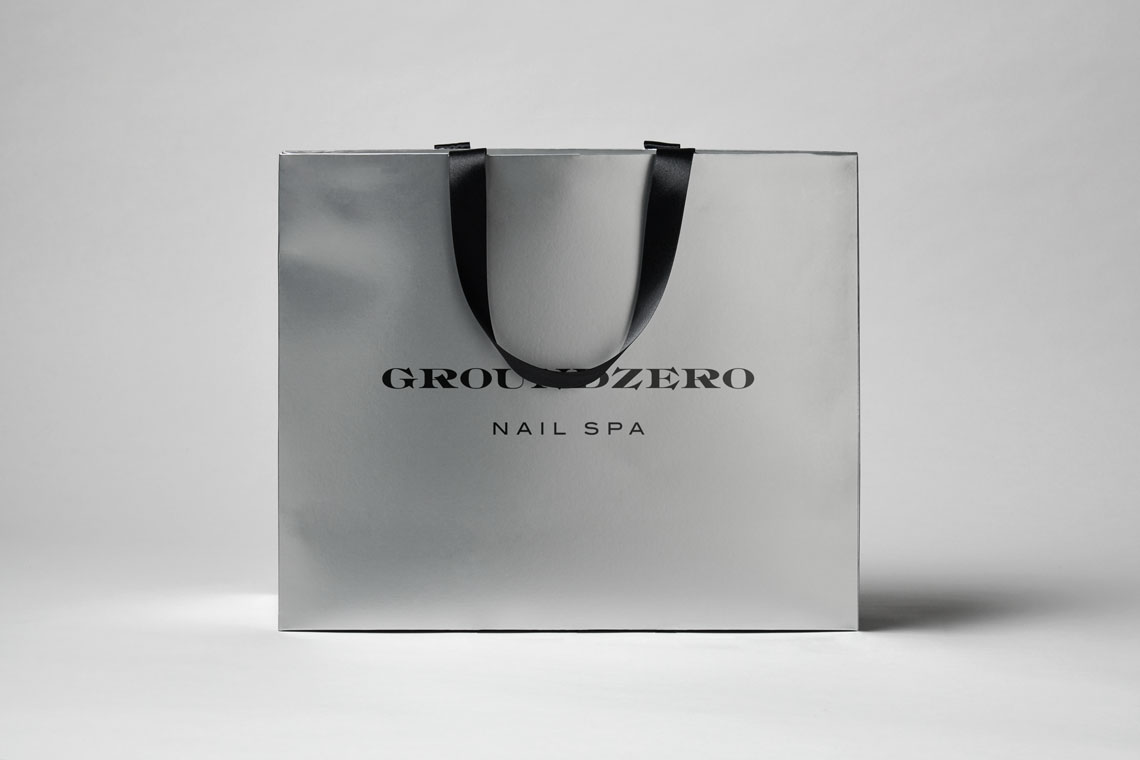
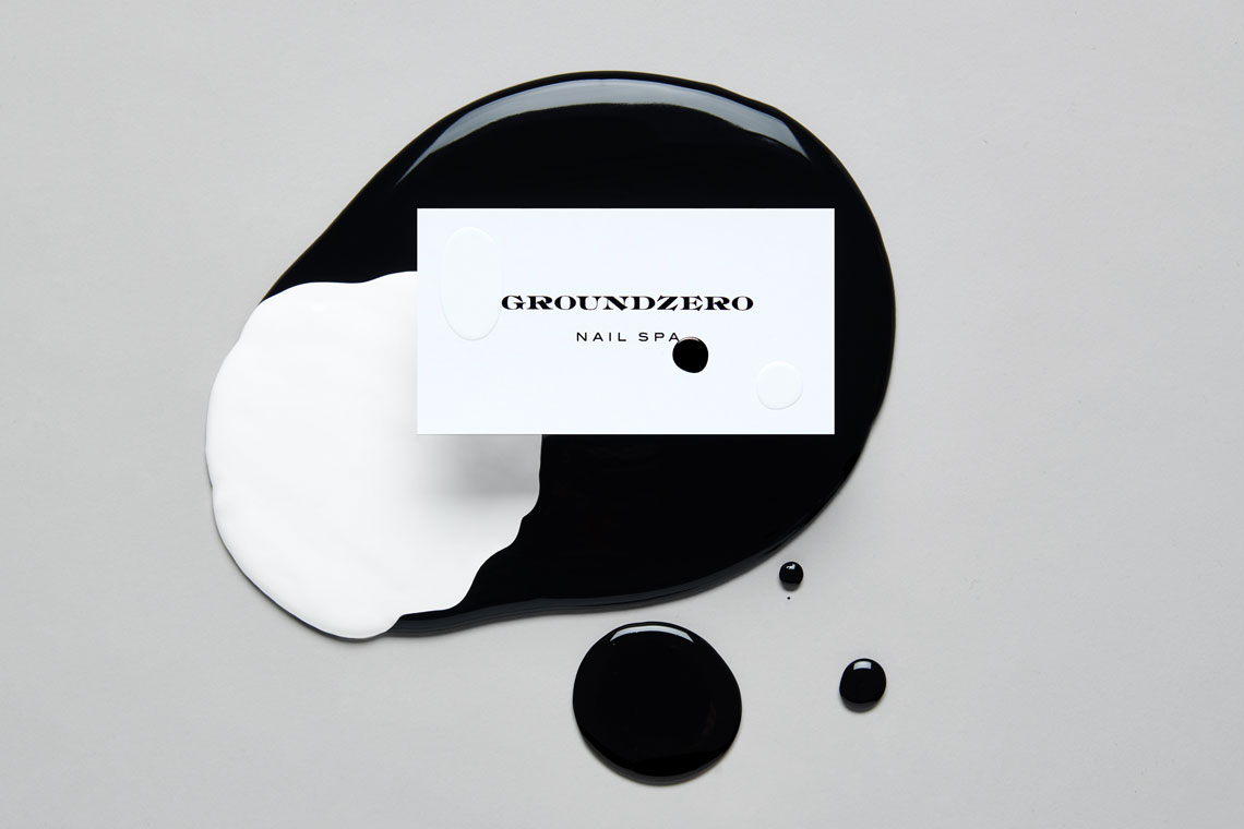
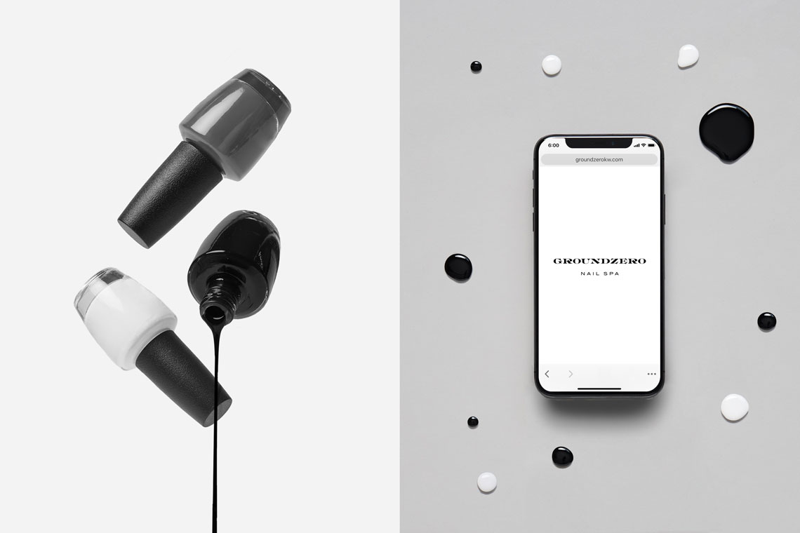
An elegant blend and balance of black and white sets the tone for the whole brand character. We used Old Style Bold from an 1800's Boston Type Foundry Specimen as the main framework to develop the logo. — (A)
An elegant blend and balance of black and white sets the tone for the whole brand character.
Groundzero
Interactive
the objective
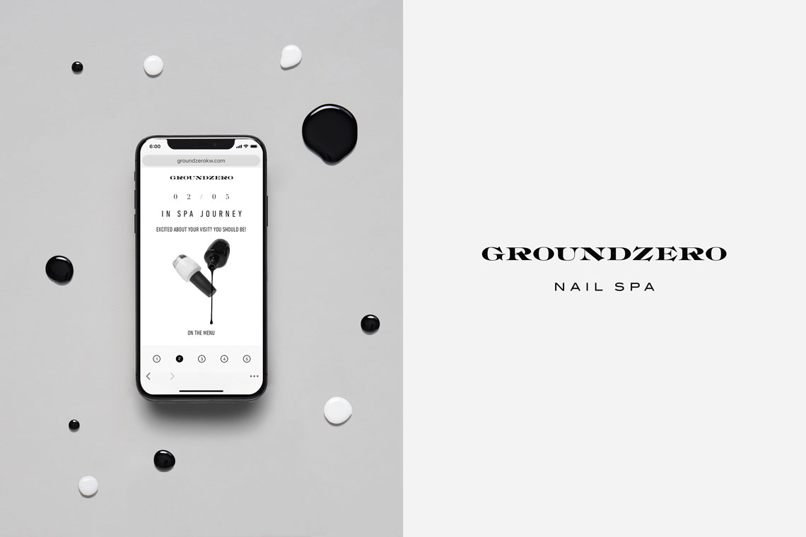
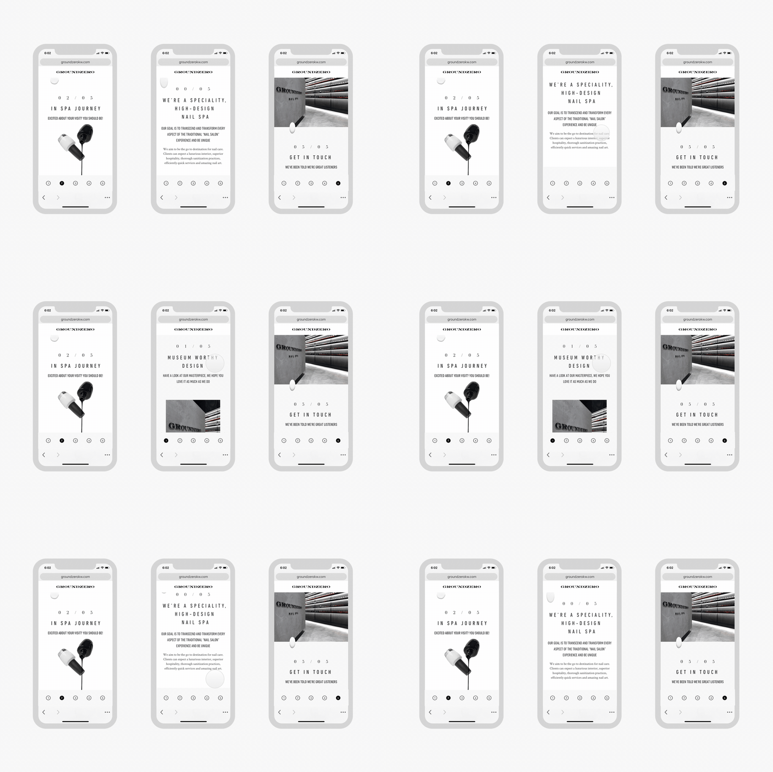
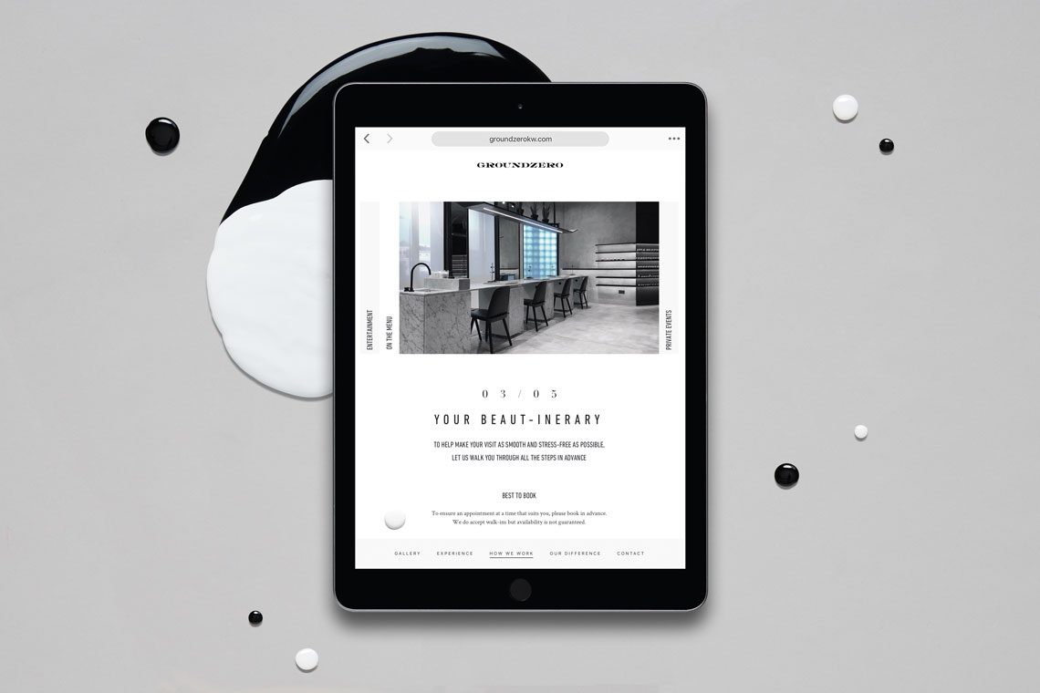
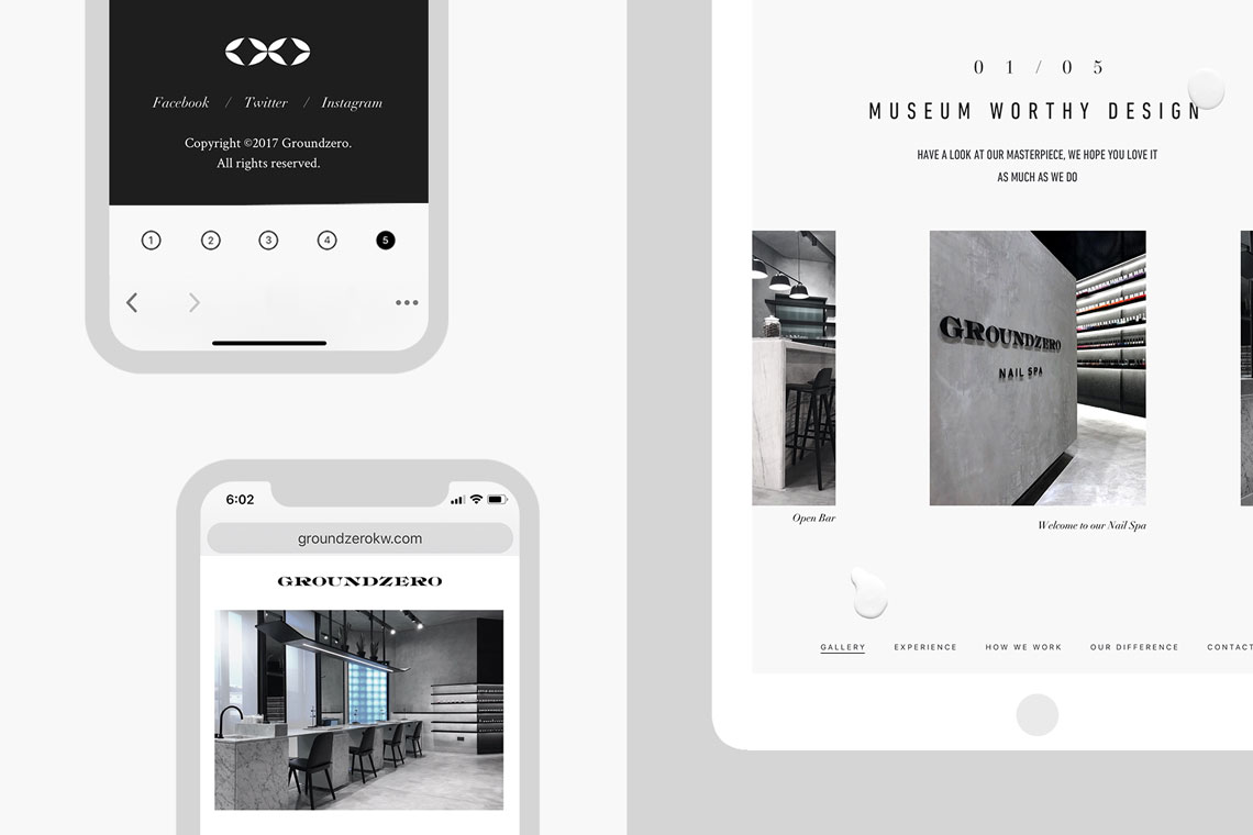
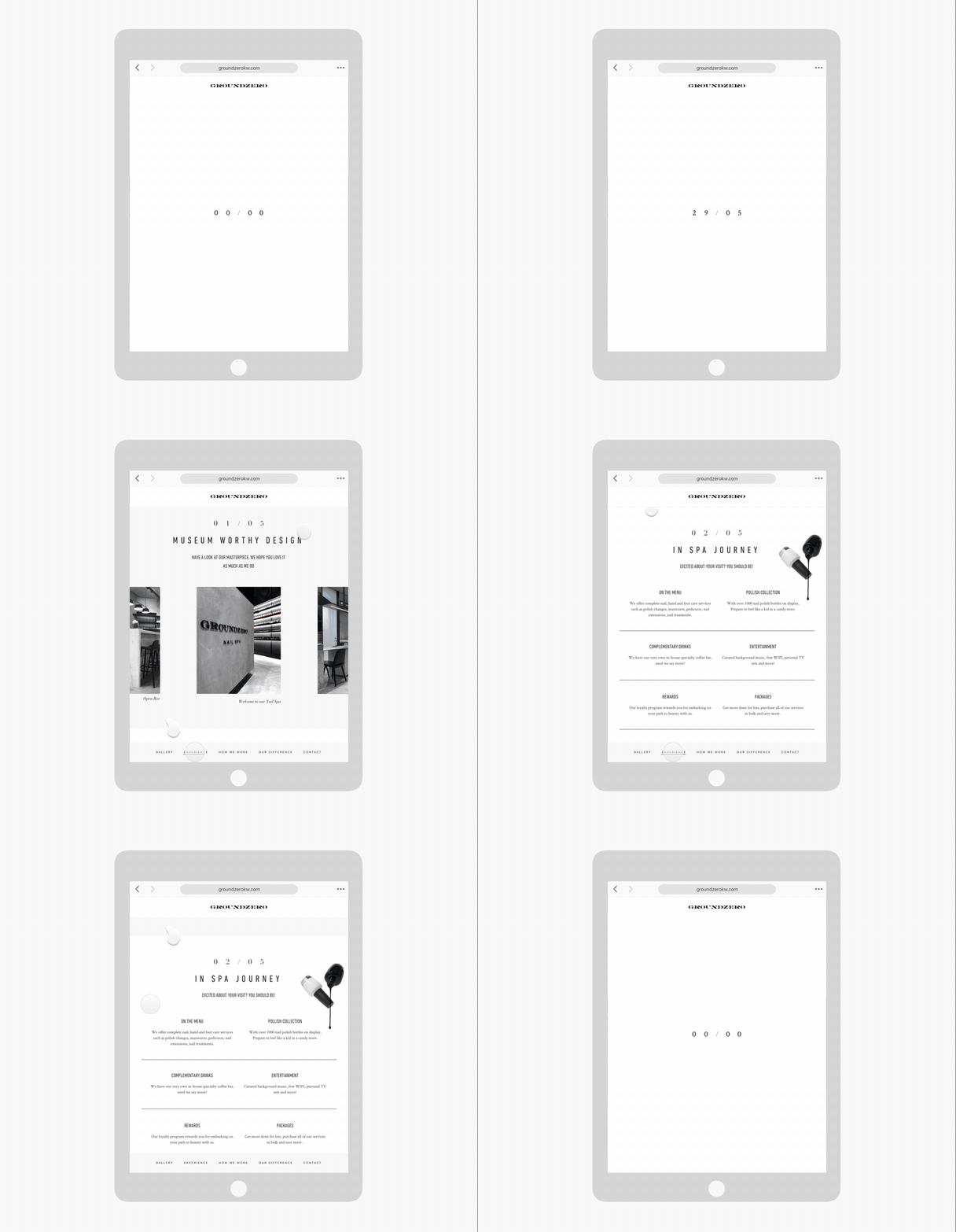
We created a digital identity aligned with the brand development portraying its brand values. Our work showcases the importance of displaying Groundzero' services with a simple layout in a clear and user-friendly solution. Our work grants special attention to their hygiene and sanitizing practices as well as their process transparency.
the solution
For this project we worked on UI/UX development, front-end and back-end. Black and whites predominant in the color palette distinguish the brand identity and render a clean, sharp, organized and legible layout. The typographical system is conformed primarily by Din Next Lt condensed for titles and Crimson for body text. We also employed Didot Linotype feeding contrast and elegance to the identity. Details added to the layout like nail polish spills add strength to the brand's personality. — (A)
Our work showcases the importance of displaying Groundzero' services with a simple layout in a clear and user-friendly solution.
