Cara de Vaca
ARCHITECTURE
The client
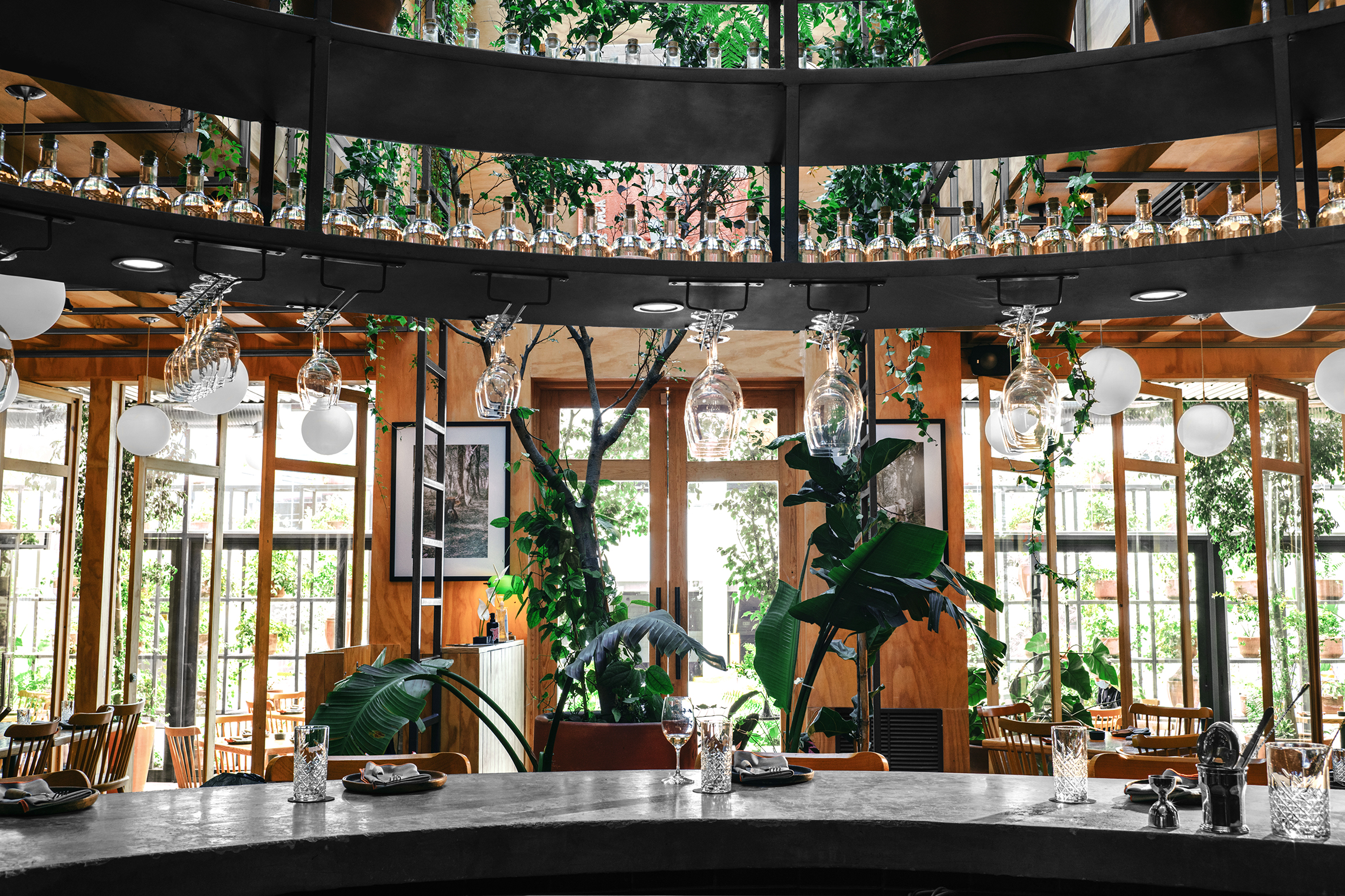
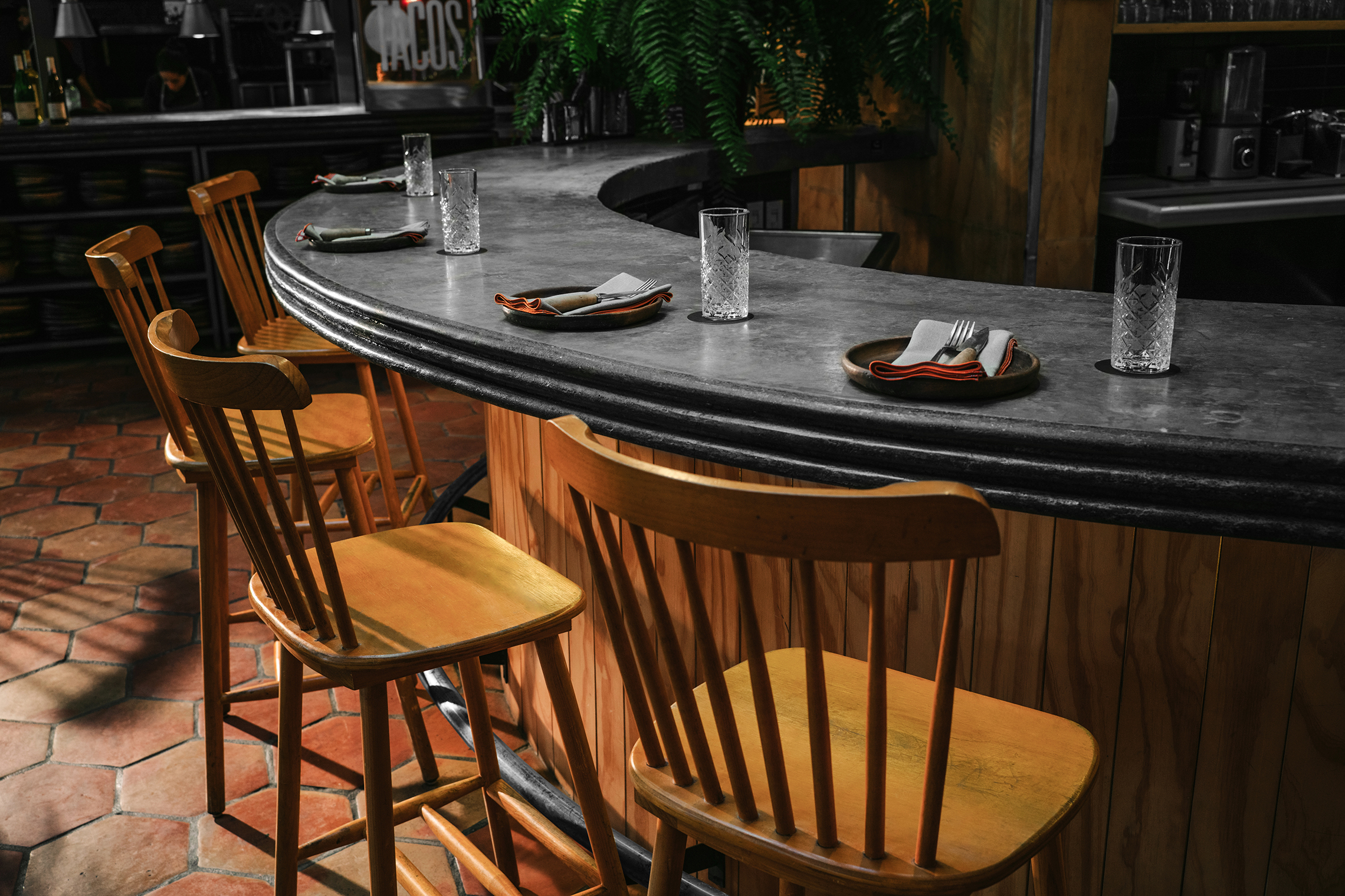
Cara de Vaca celebrates fire cooking, natural wine and classic drinks. Located in Monterrey, Nuevo León, the warm illuminated place filled with plants presents Chuy Villarreal’s regional inspired cuisine, an evolution of the Regiomontana bbq. Natural wines and Mexican distillates unite on the spectacular central bar.
keywords
Restaurant / Mexico / Regional Cuisine / Branding / Popular Culture
the objective
Create a physical space around a menu designed to ensure that food becomes the center of attention. The space should help develop an experience where everyone participates in the ritual of sitting down to eat in a physical environment that is perceived as an escape from the city. This escape must maintain the Monterrey essence, capturing its warmth and character from the kitchen to the table.
the solution
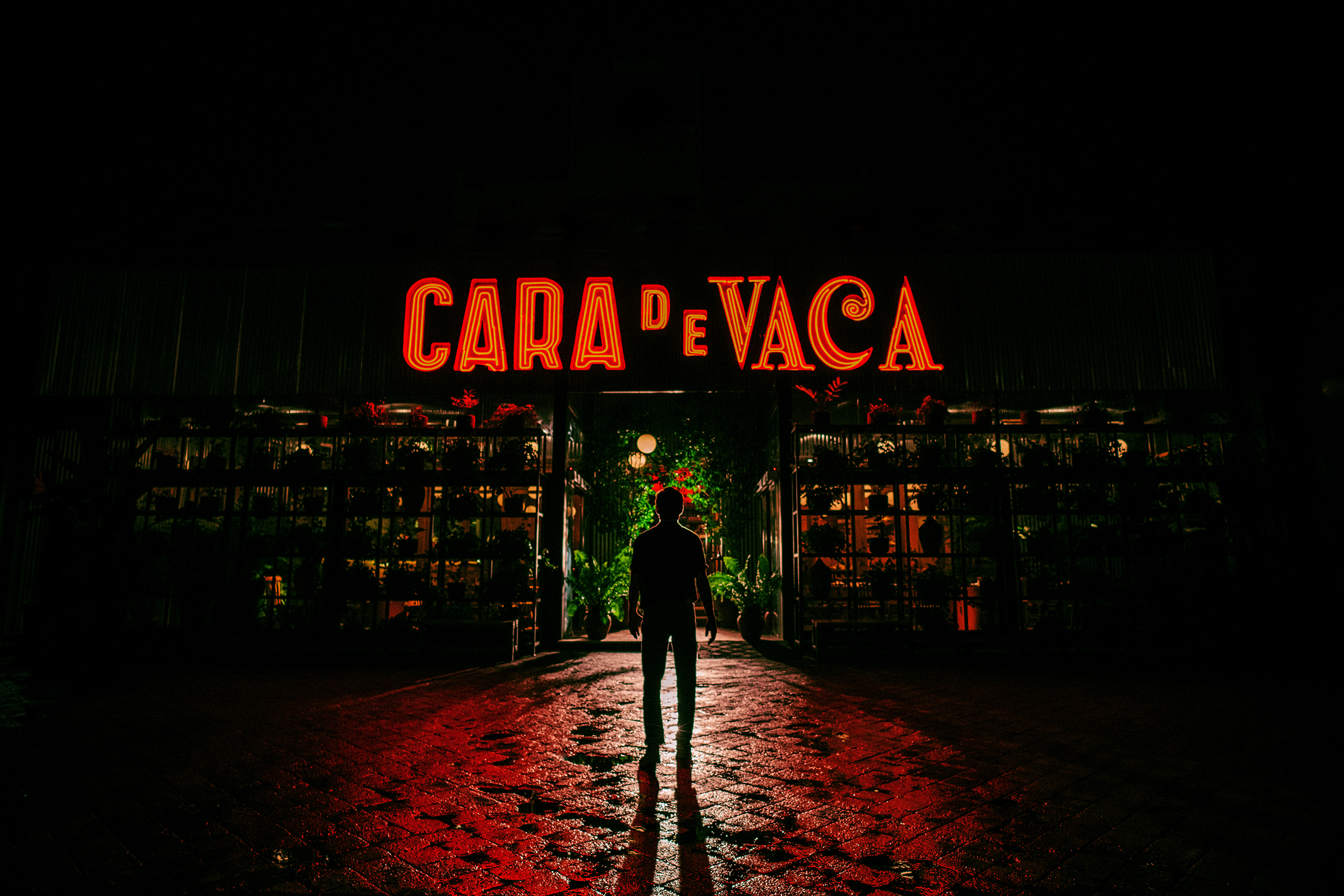
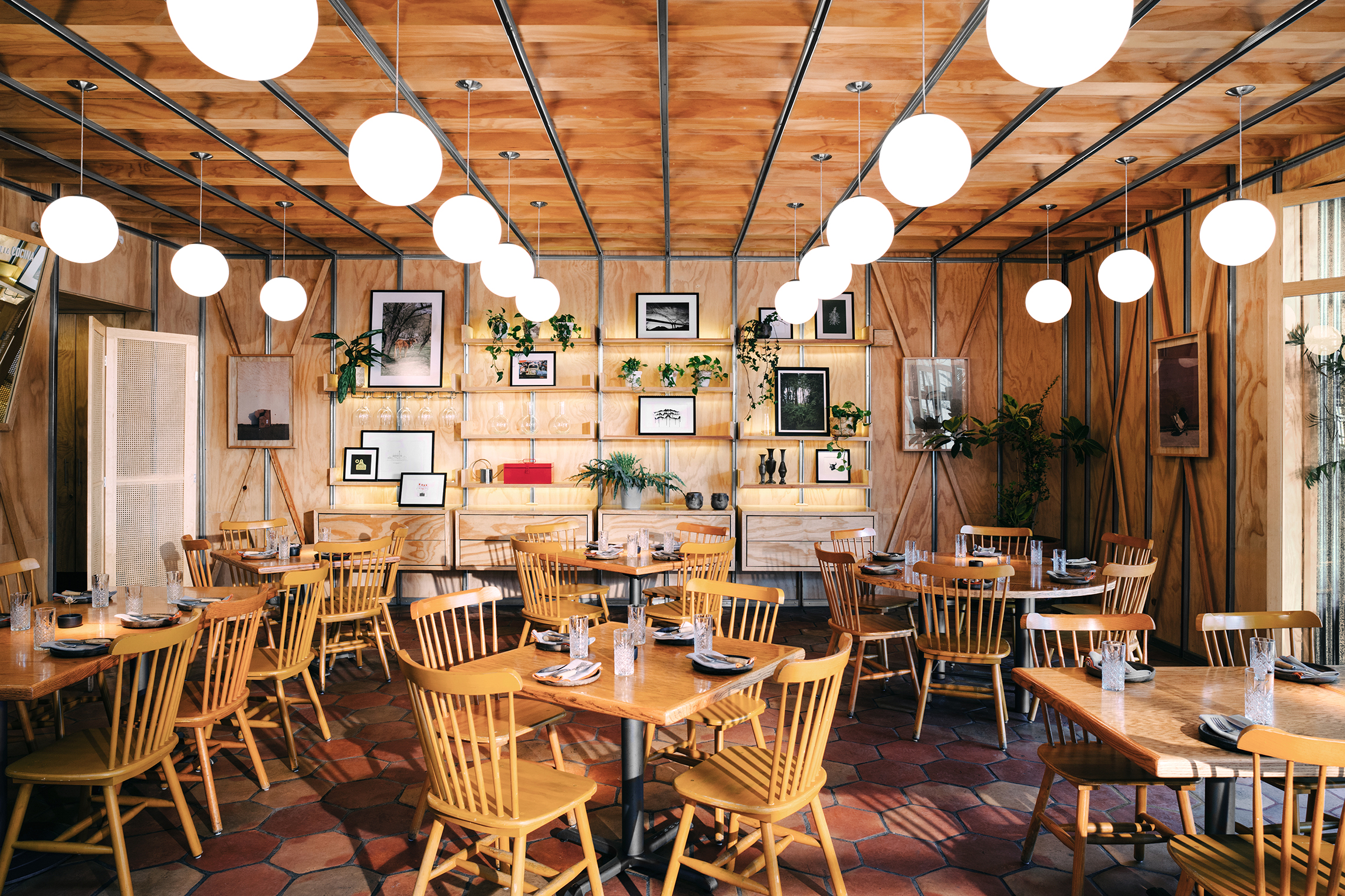
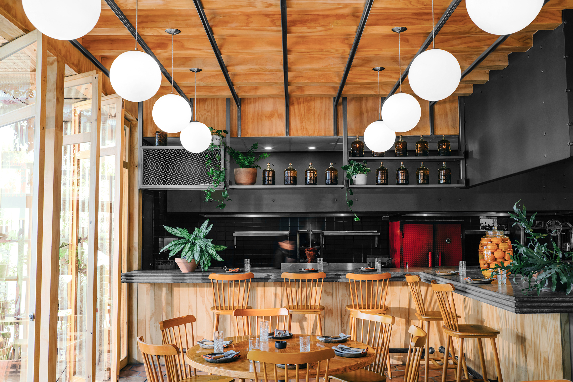
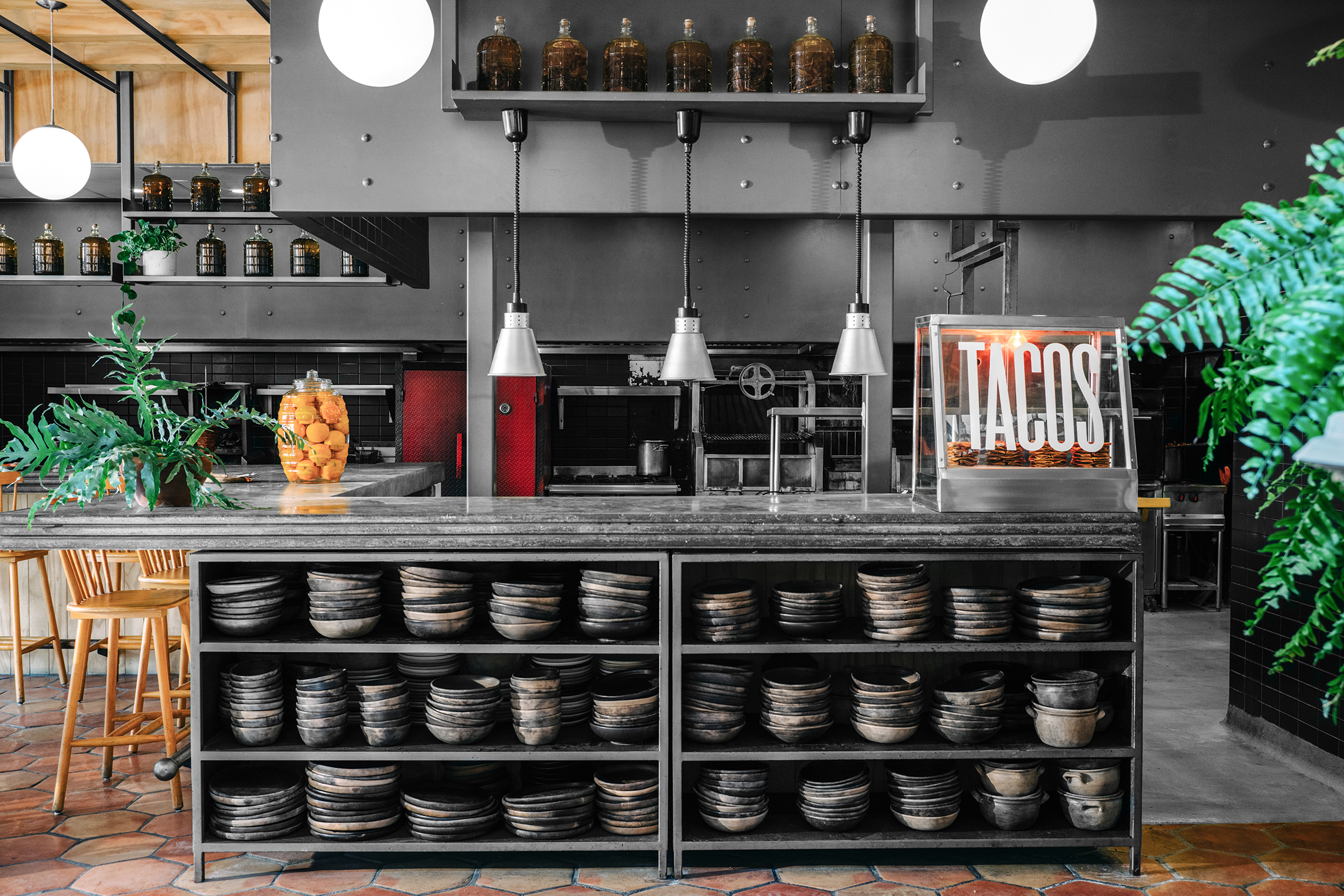
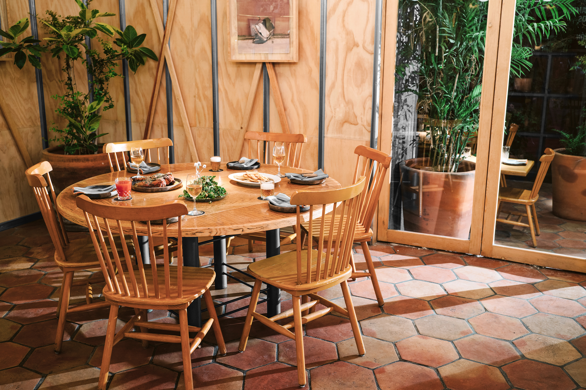
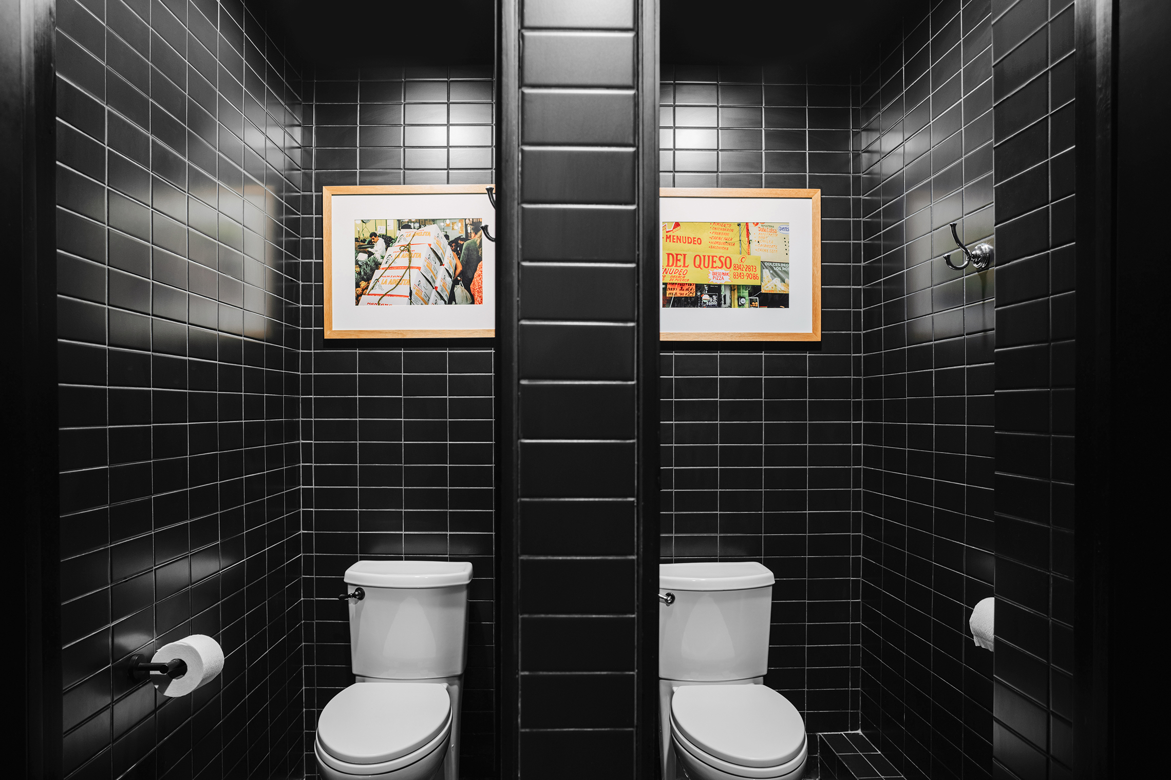
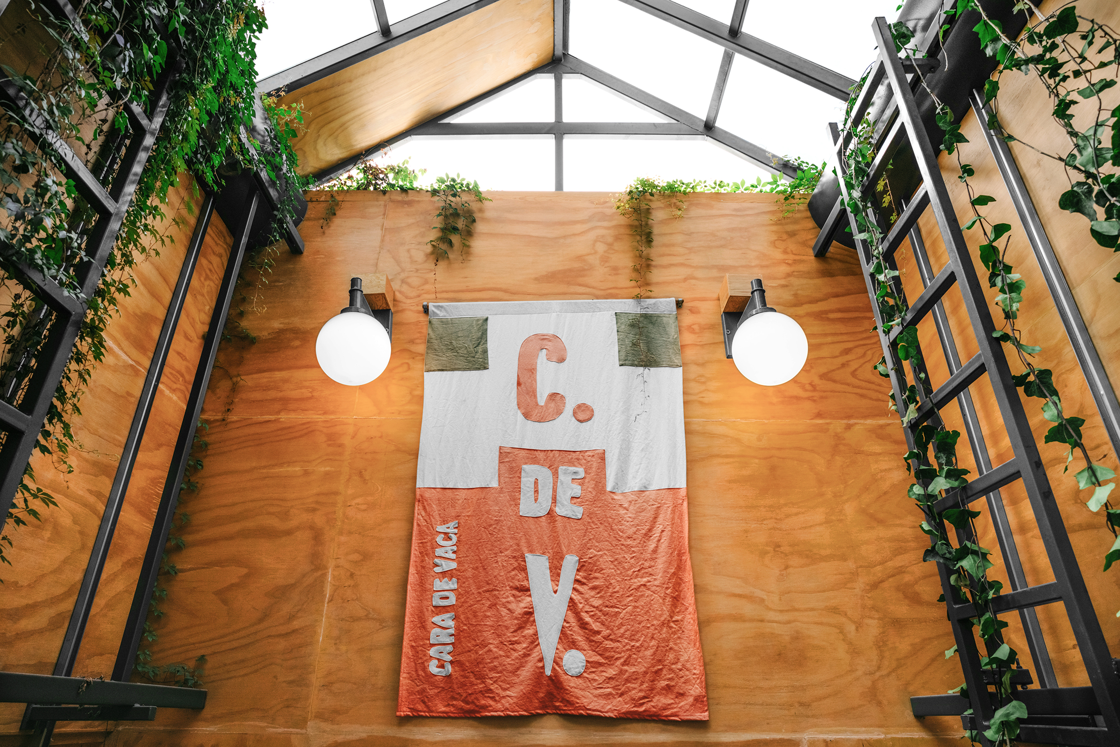
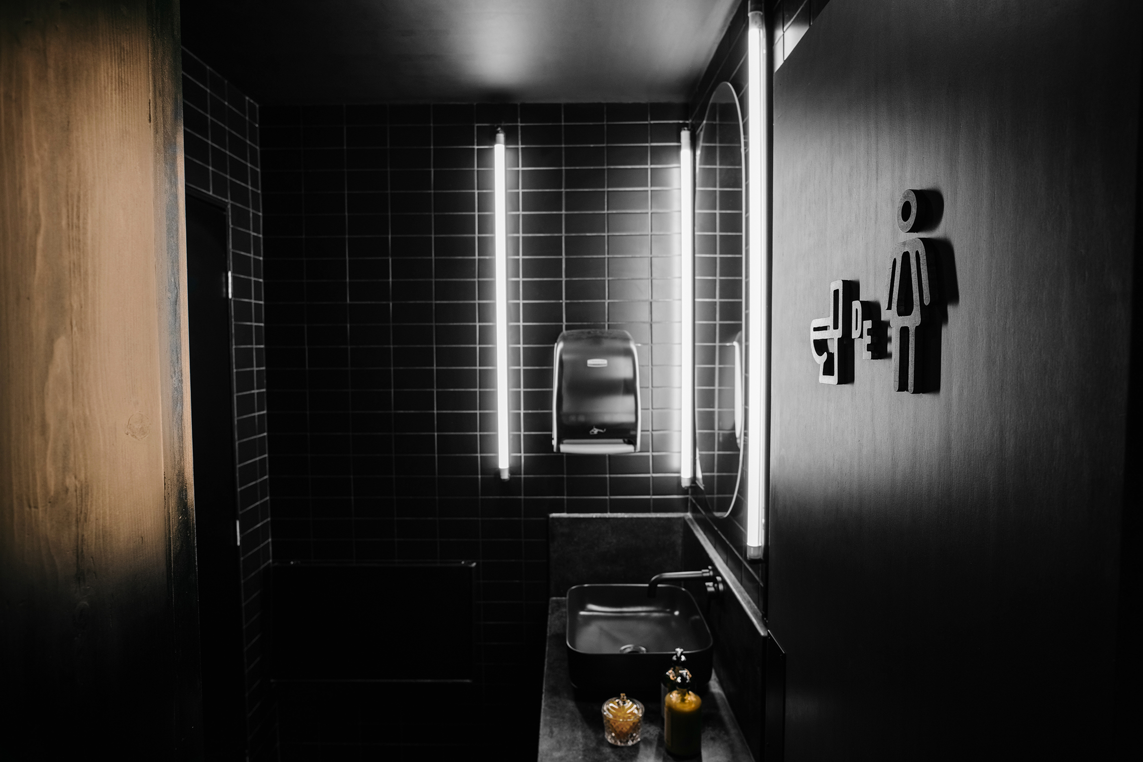
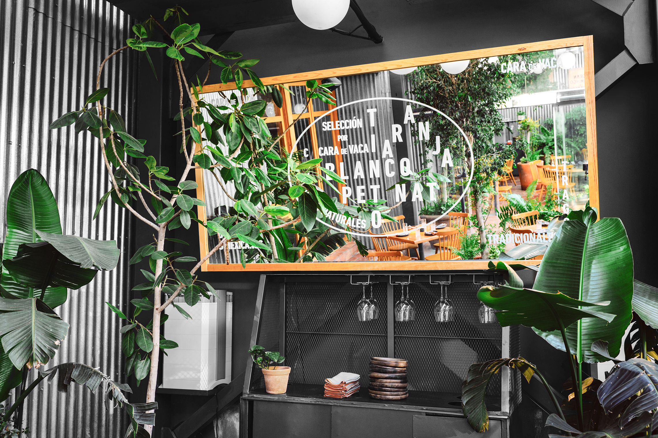
The inspiration for Cara de Vaca's space comes from Japanese shops, greenhouses and the Scandinavian design style. Its interior distribution is dominated by wood and metal structures supported by brand elements on walls and mirrors with which a nostalgic feeling is achieved referring us to the typical city markets. If you arrive at the place at night, the exterior lighting, with neon tubes, reminds us of typical Mexican Northeastern restaurants.
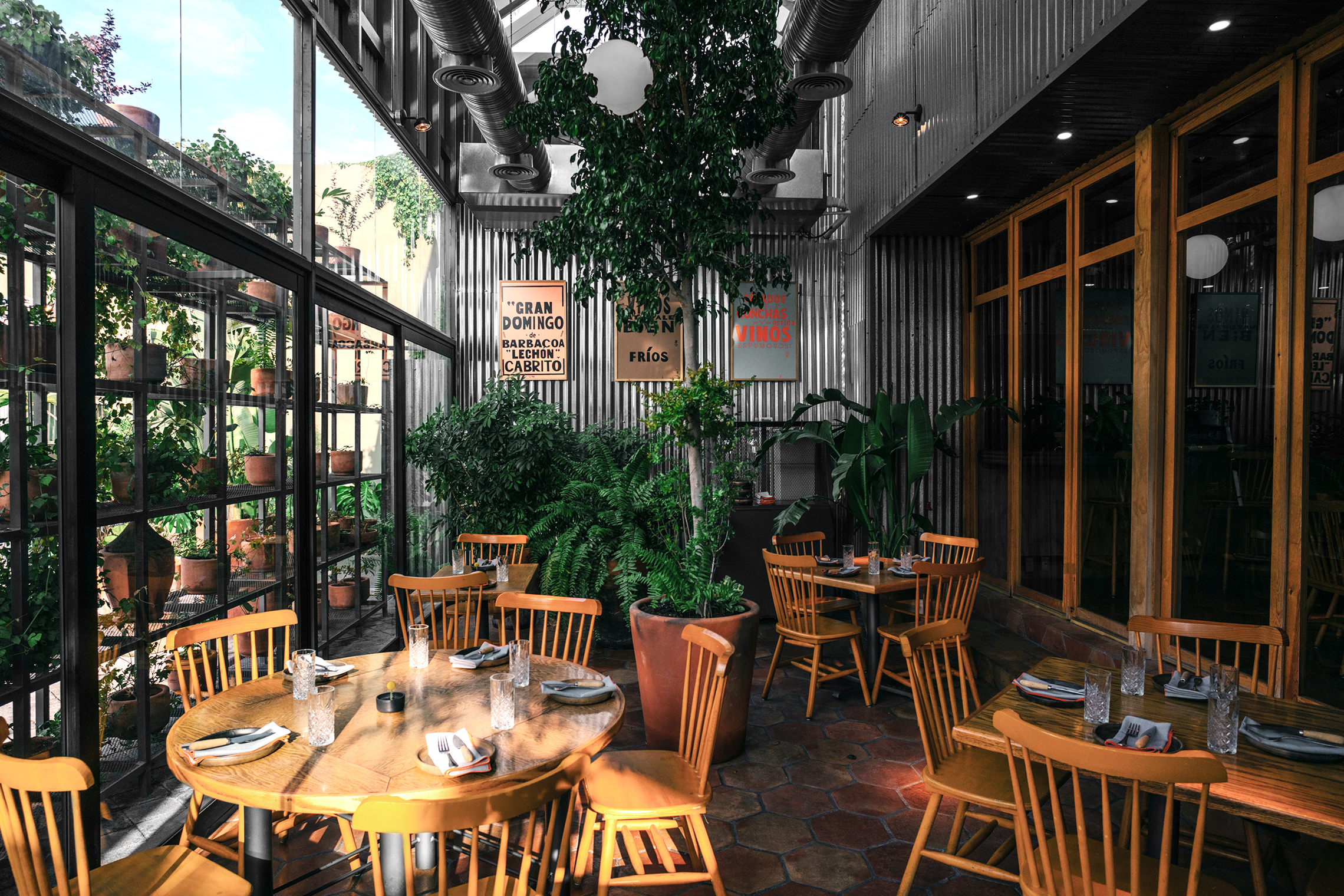
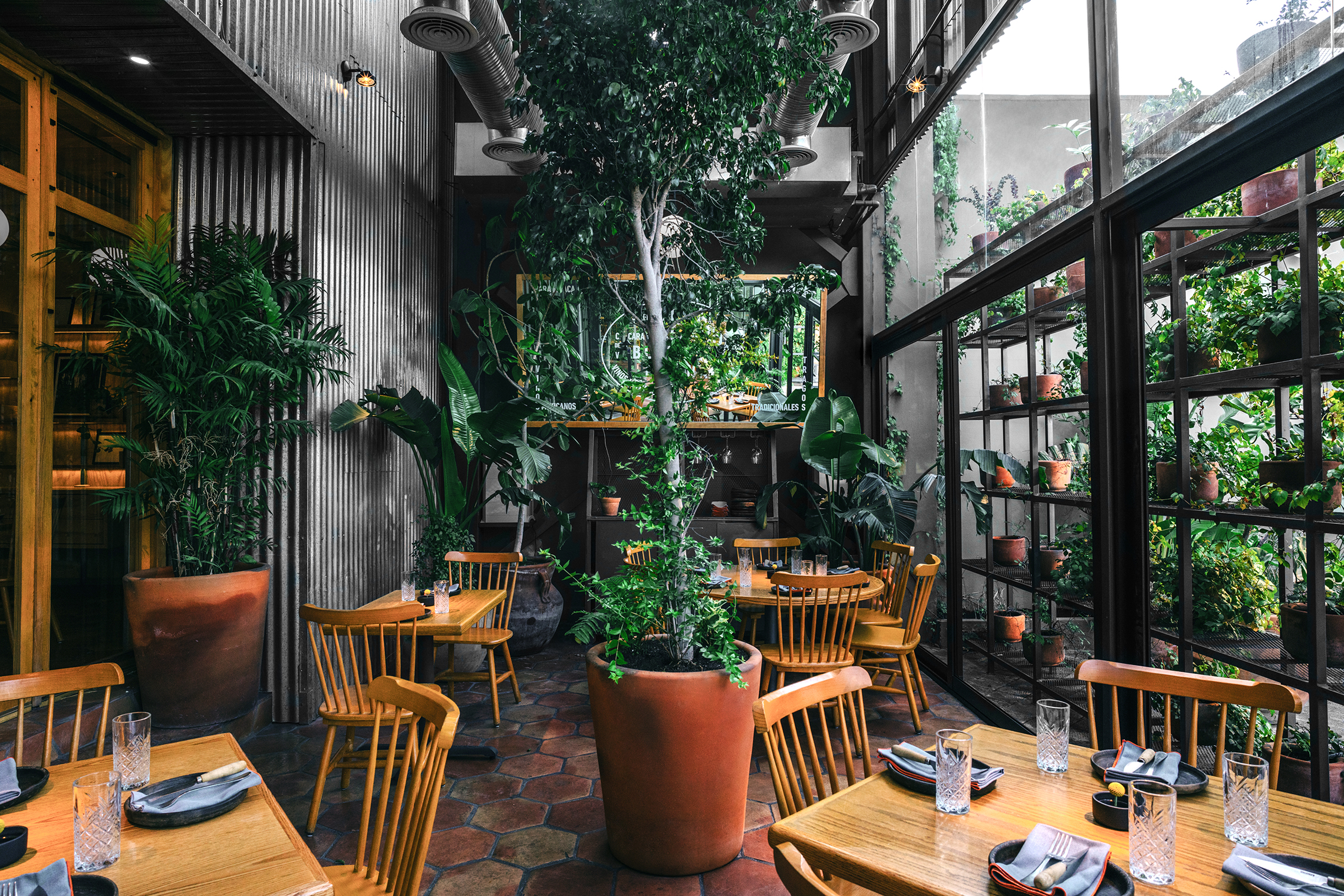
Upon entering, you first find a terrace, which, although not exposed to the city views, maintains an open theme with a warm atmosphere connecting with the main area through a corridor that ends at the main bar.
The open kitchen allows you to find out what happens there, referring to street food stalls and reminding you of that experience of being close to the preparation of your food.
The interior skylights provide natural lighting accompanied by a variety of plants that provide a feeling of warmth and spaciousness to the place.
— (A)
The inspiration for Cara de Vaca's space comes from Japanese shops, greenhouses and the Scandinavian design style.
Cara de Vaca
BRANDING
the objective
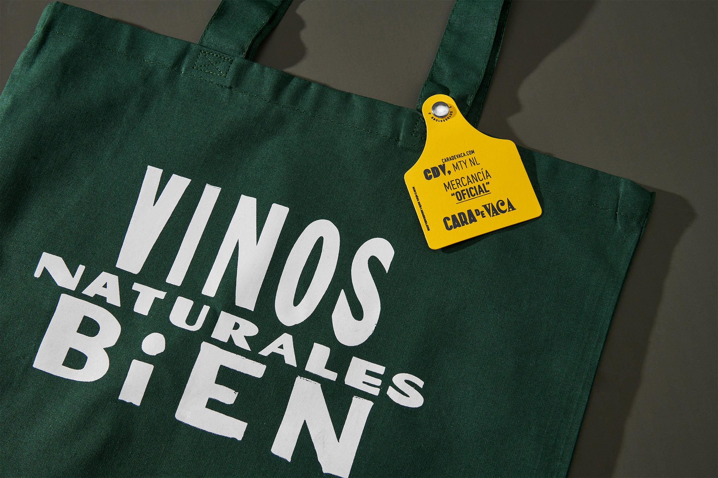
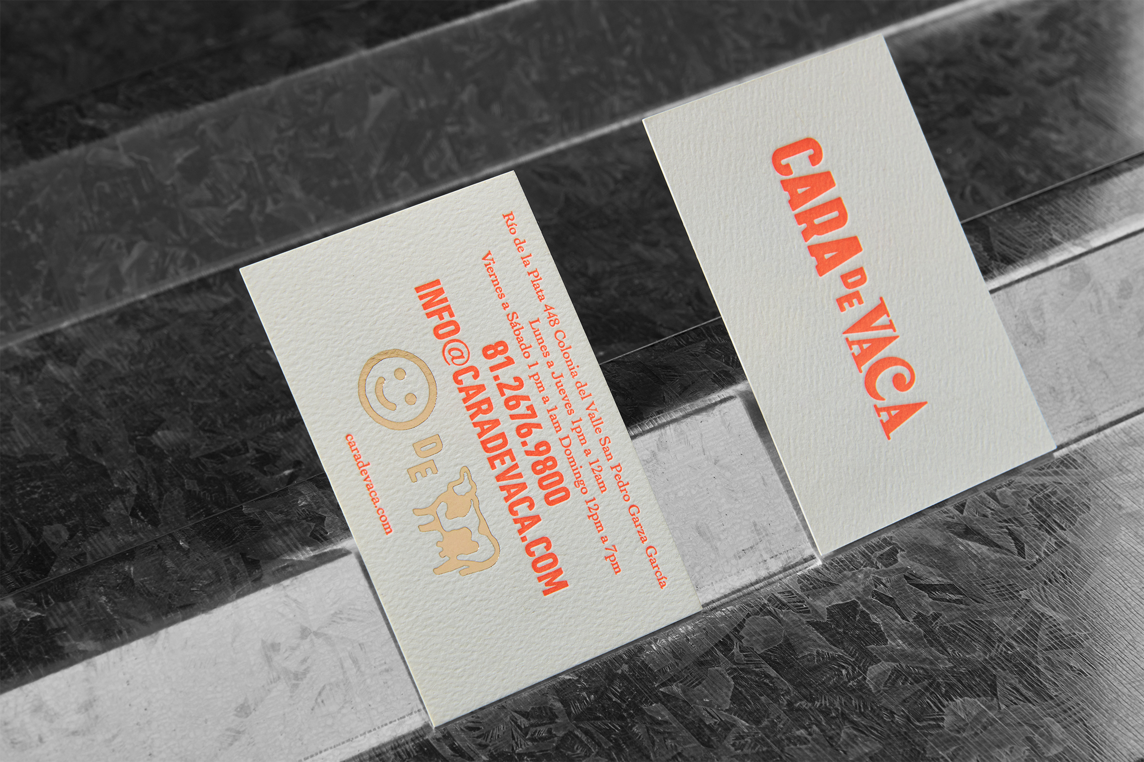
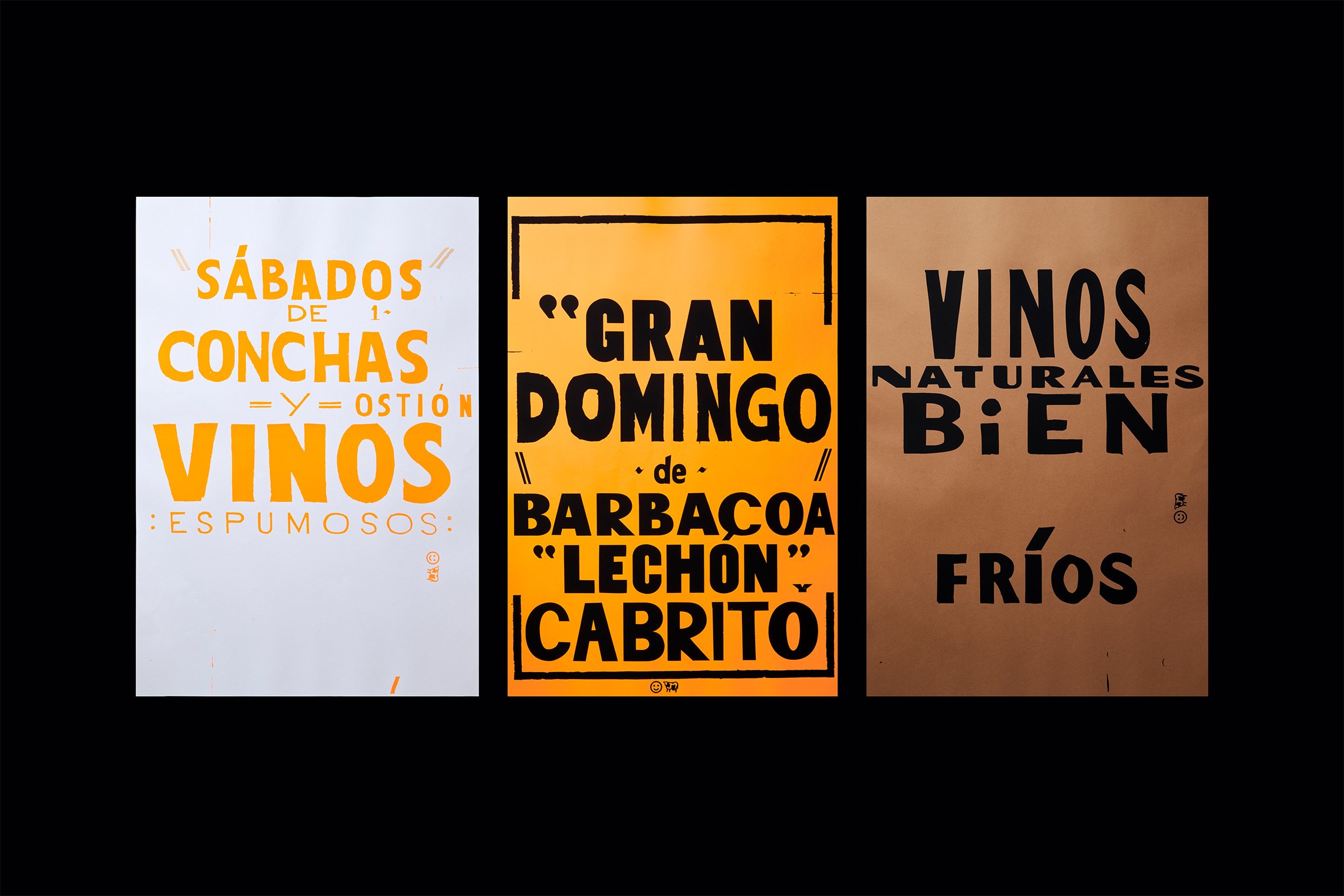
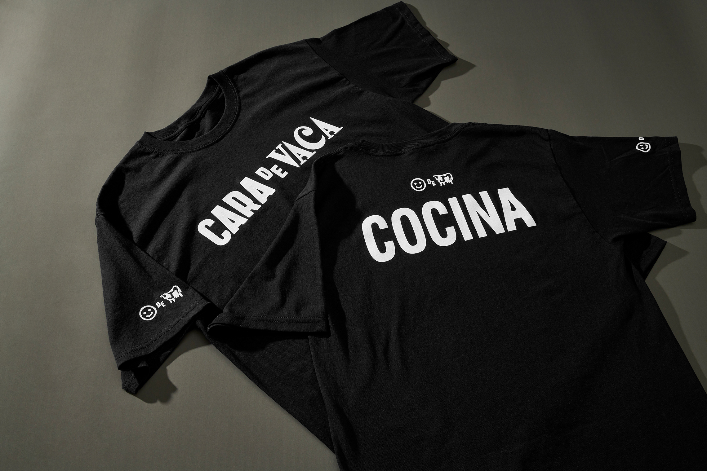
Develop a graphic identity and website that harmoniously guides the Mexican gastronomic proposal and restaurant experience. We seek to capture the lighthearted spirit of Monterrey's popular culture through the brand's typography, phrases and winks.
the solution
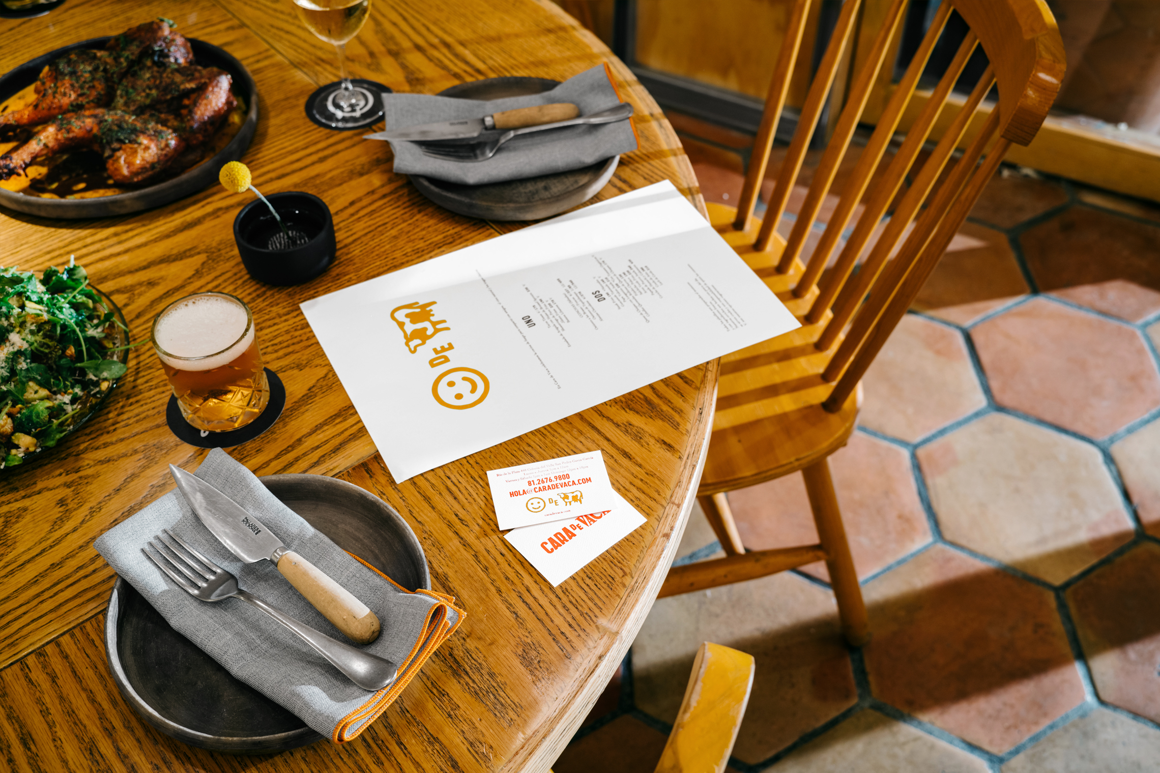
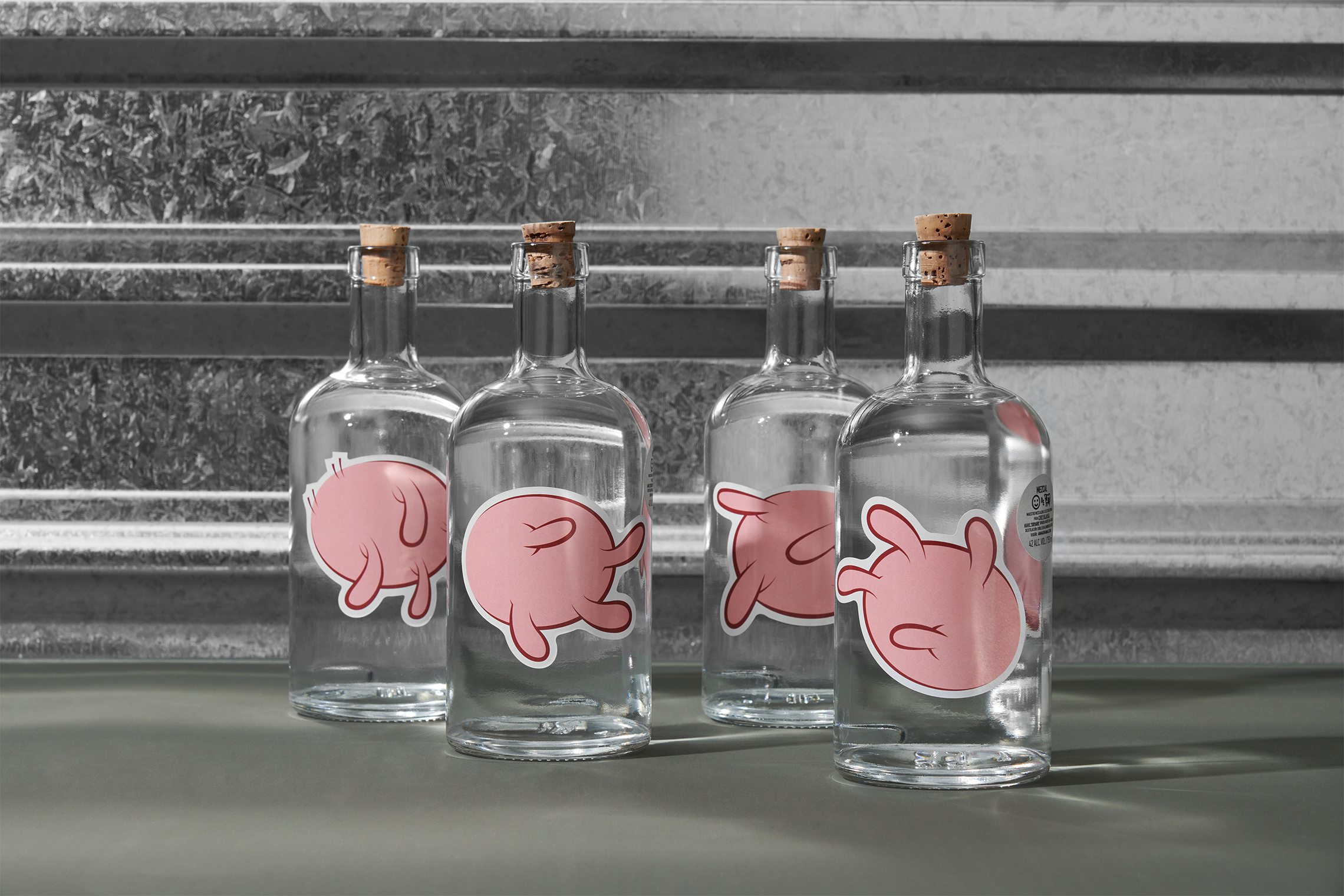
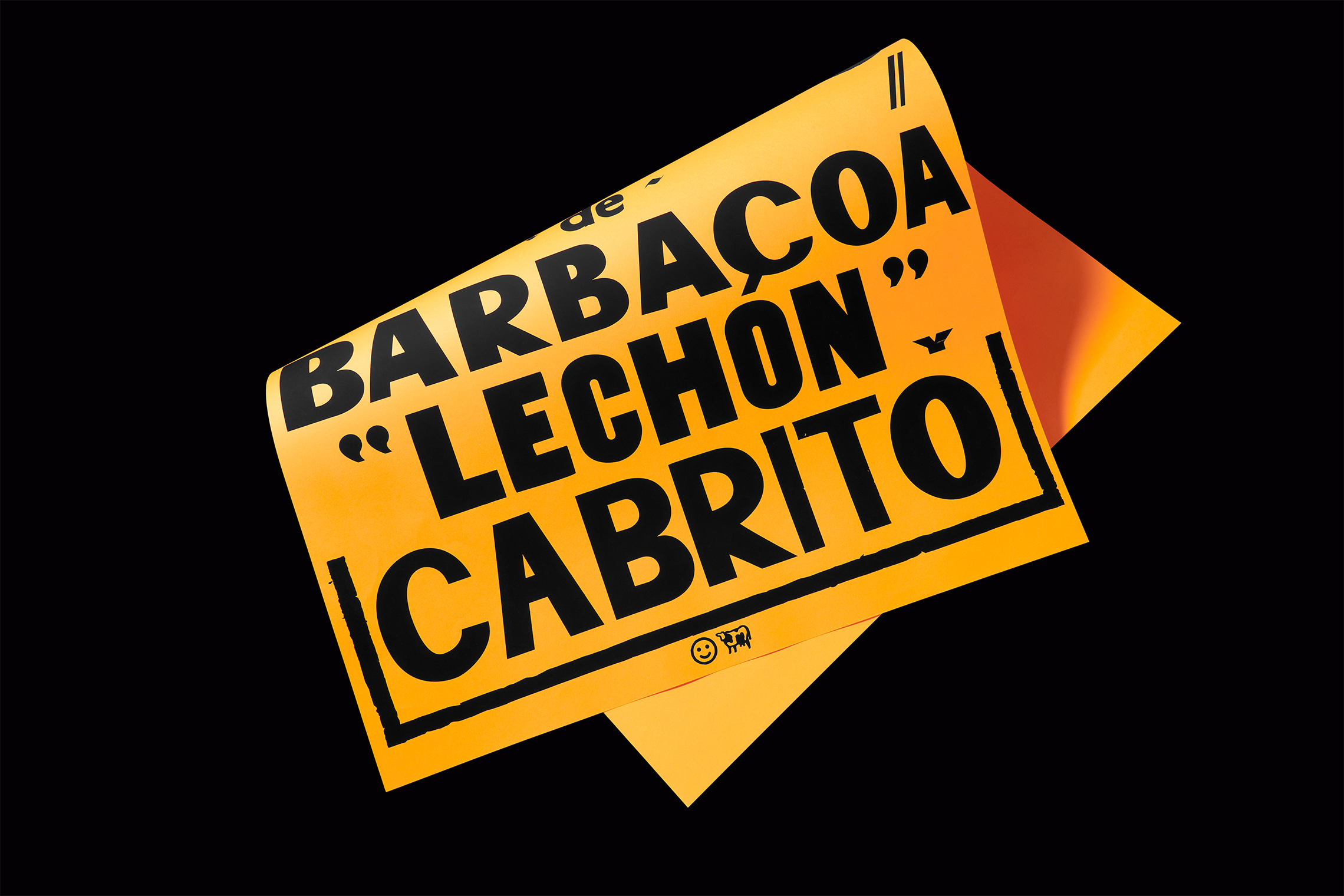
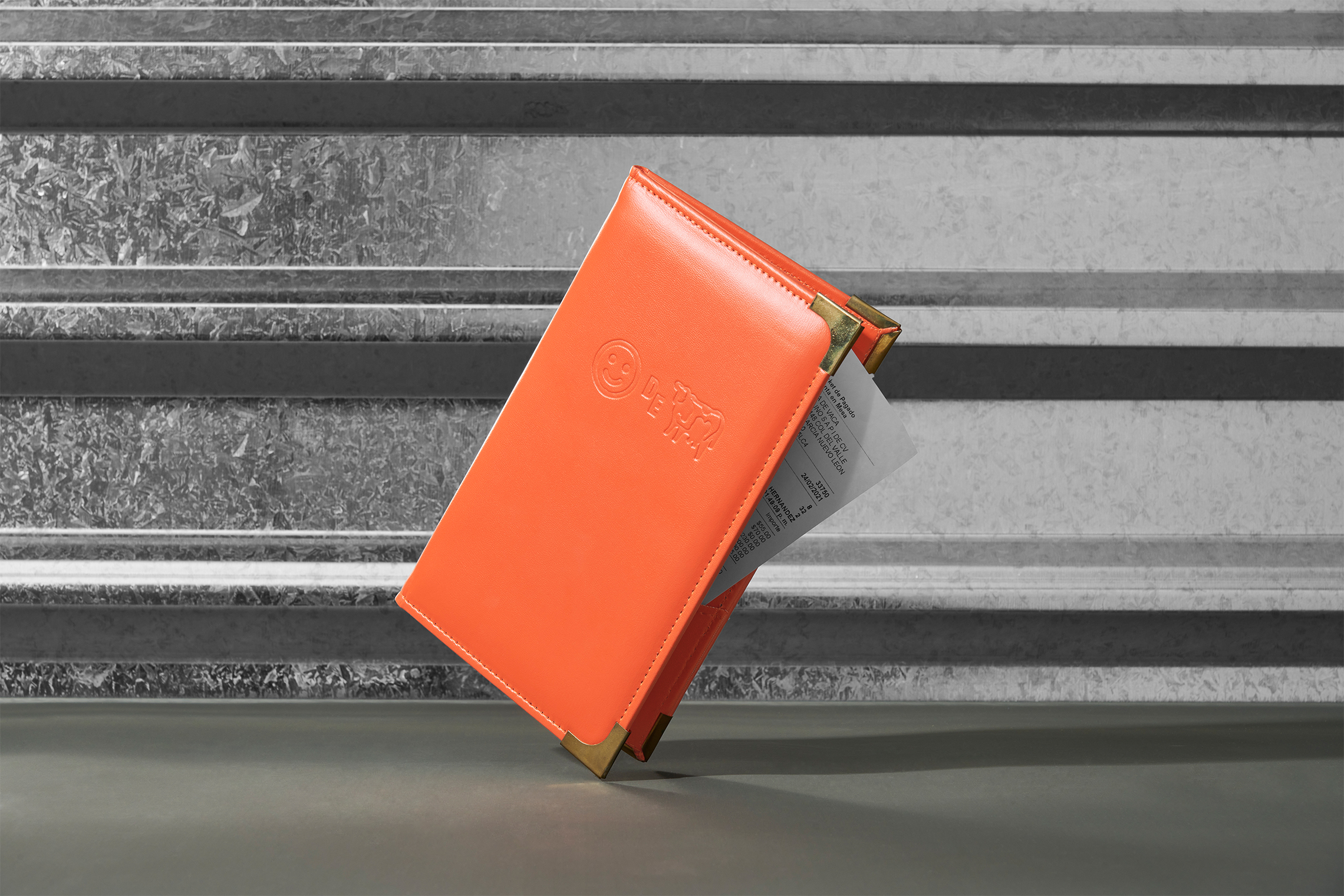
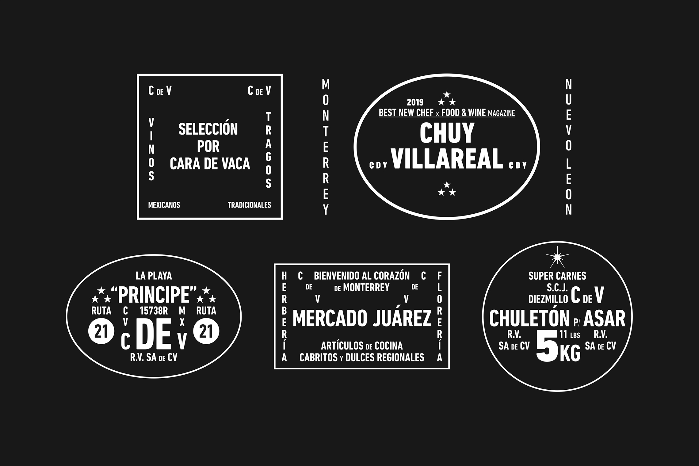
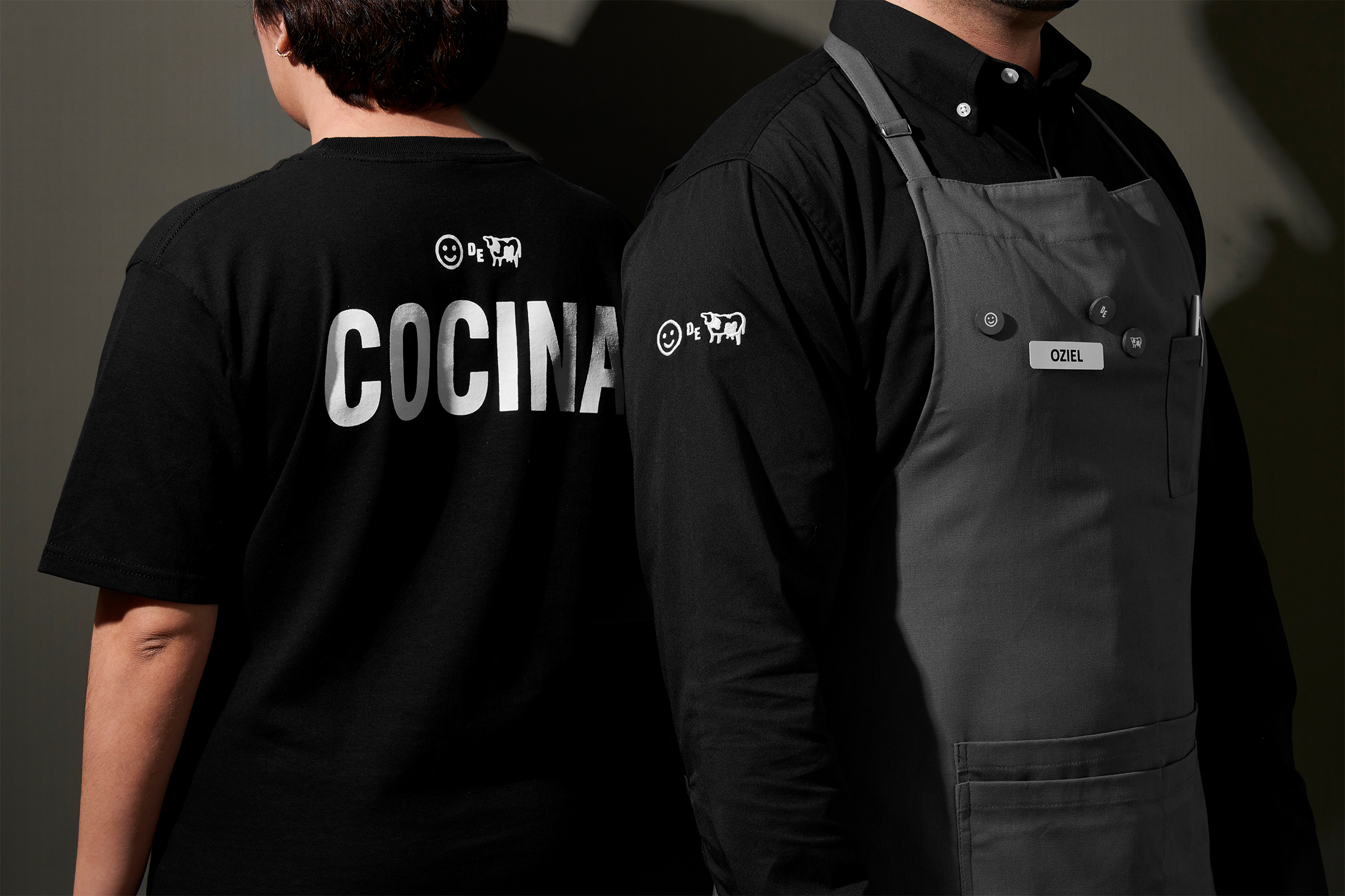
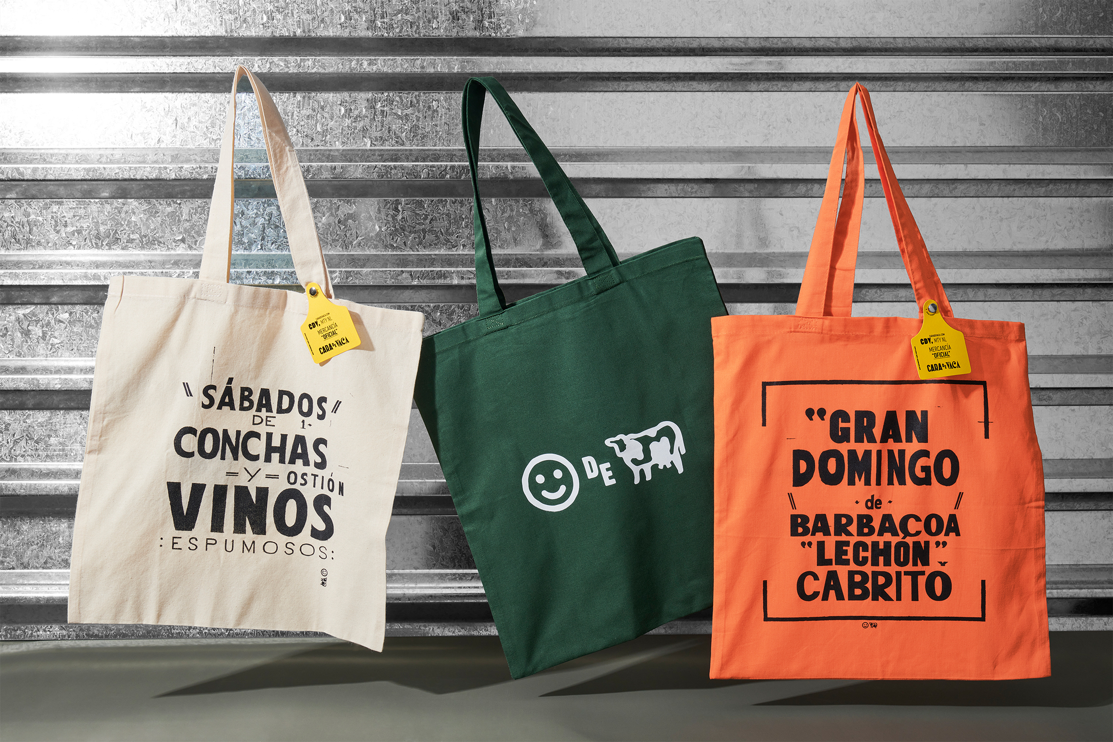
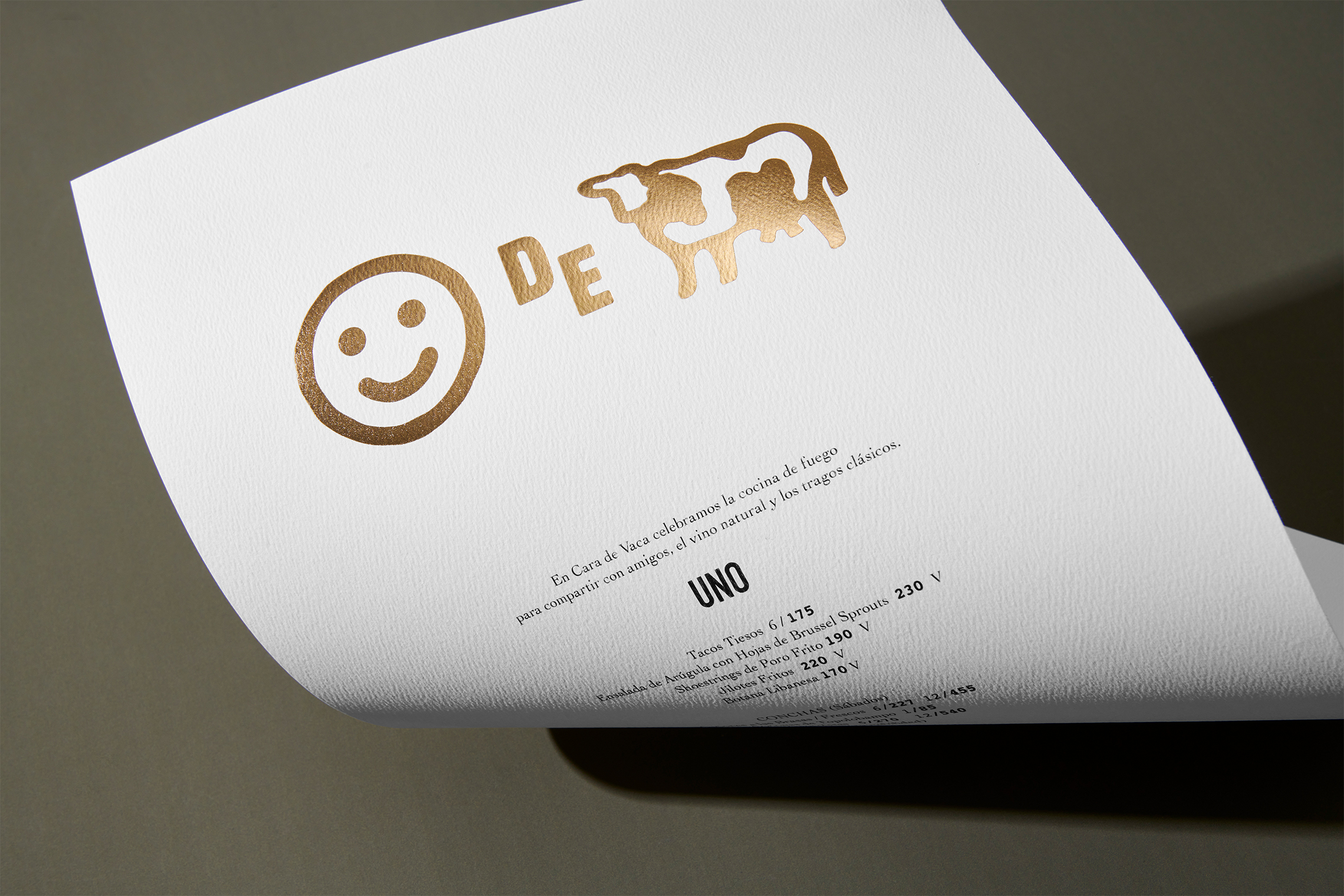
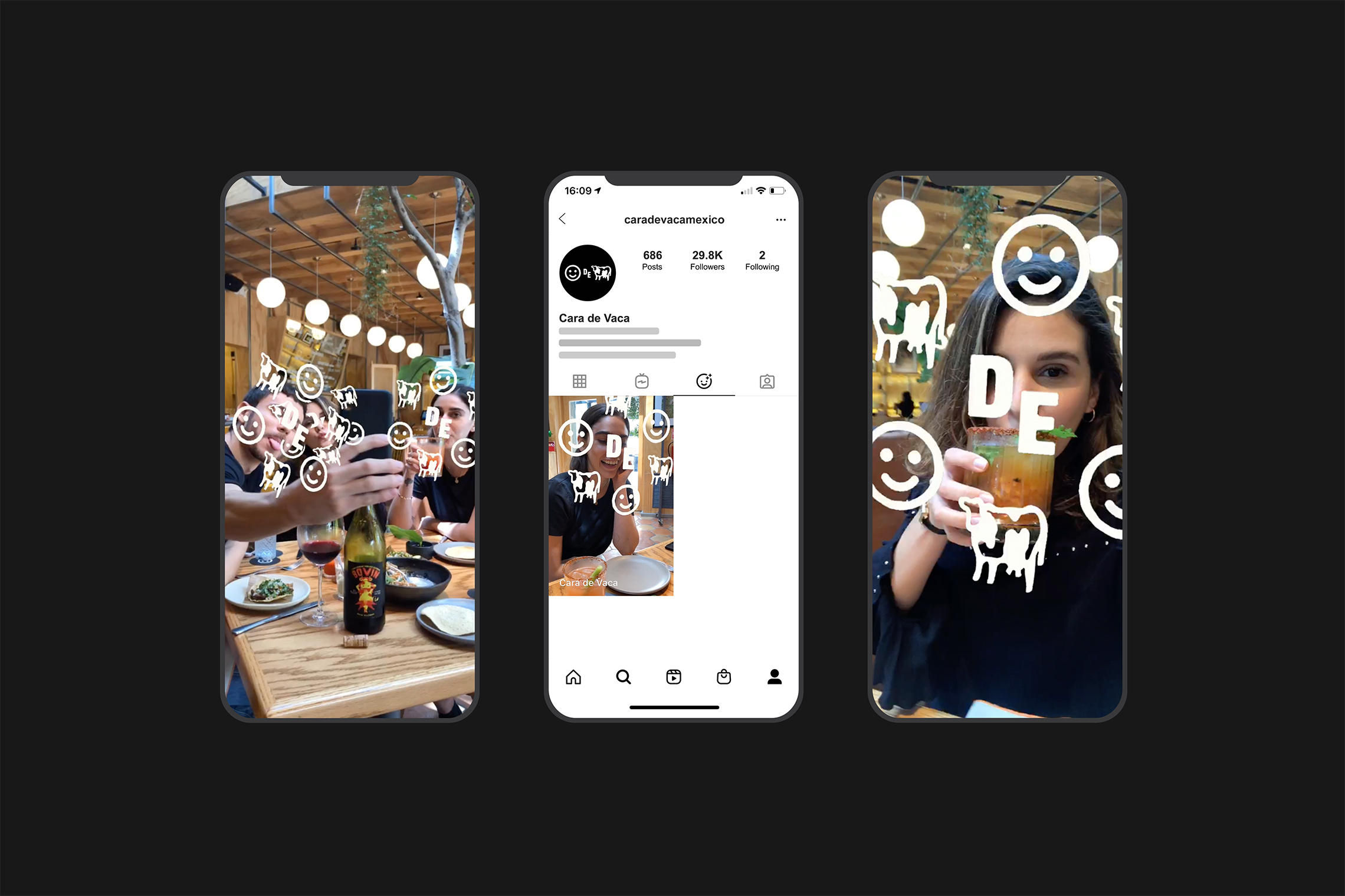
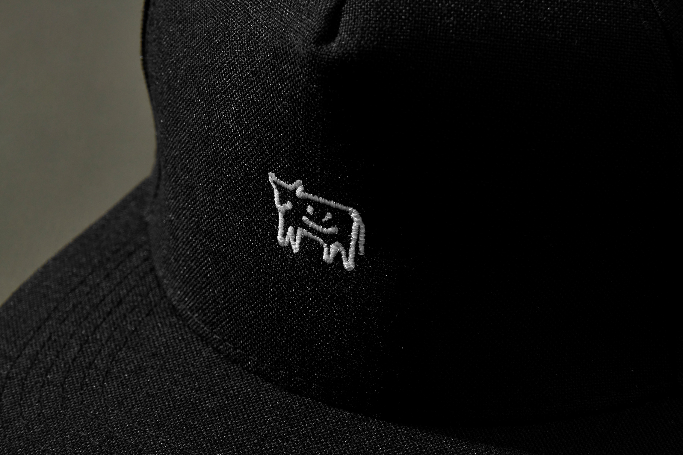
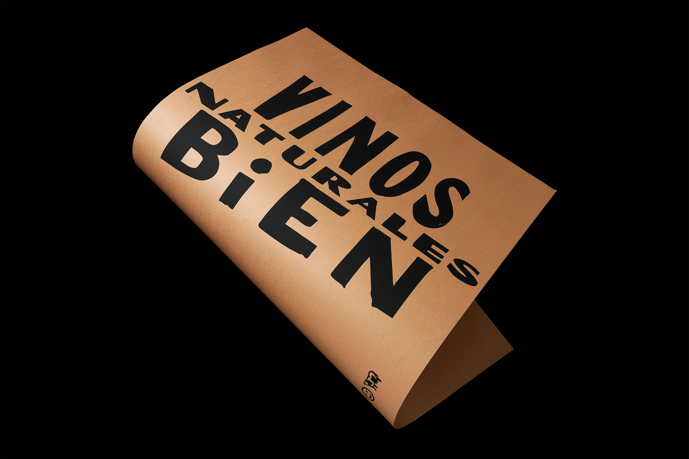
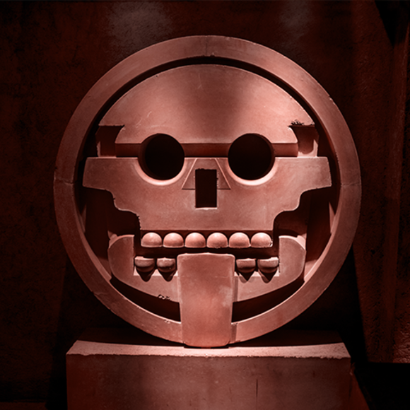
We created a logo by mixing fonts inspired by business signs in downtown Monterrey in which owners make their own posters and advertising pieces. The icon was designed to be easily replicated with emojis, thus, becoming more user-friendly.
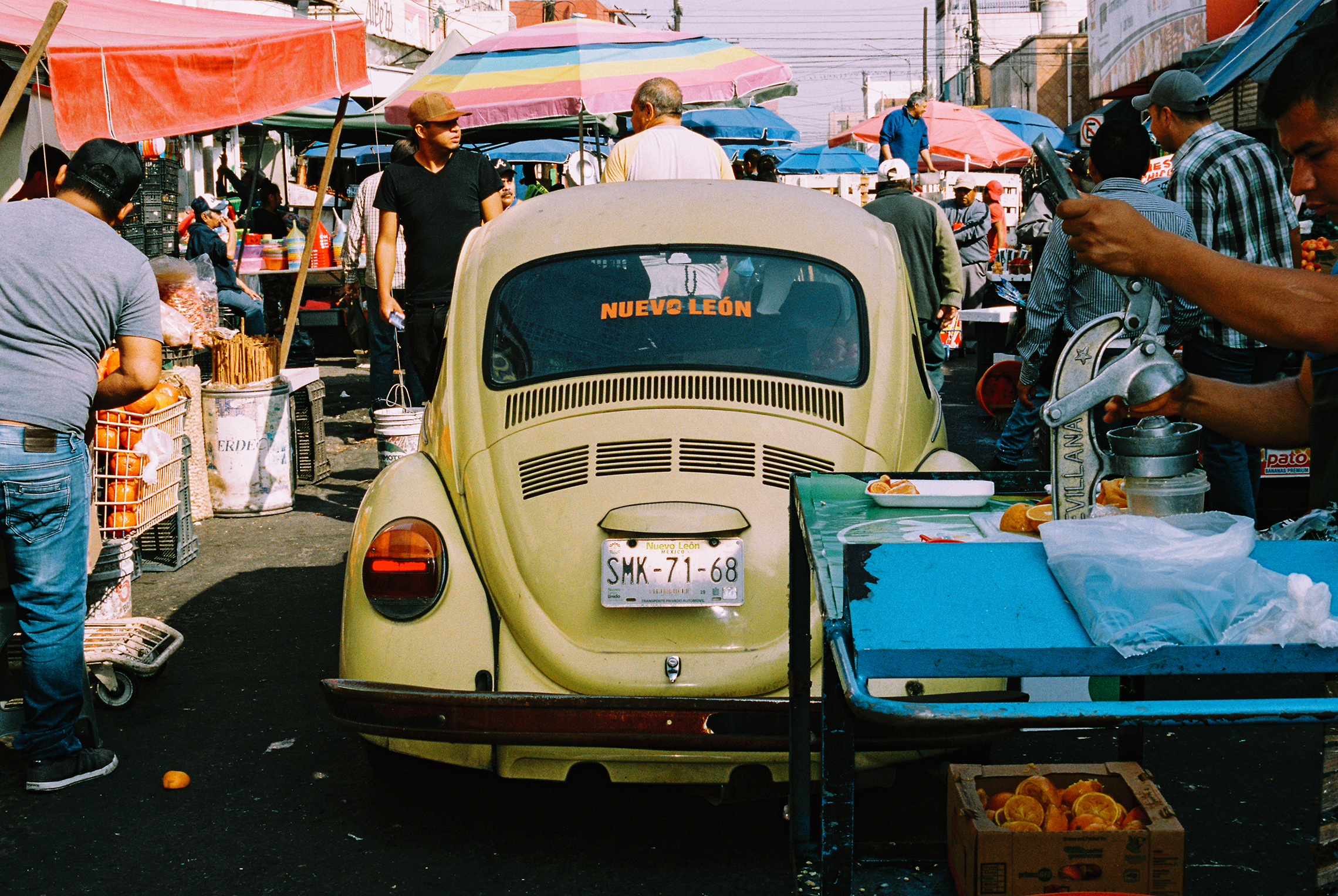
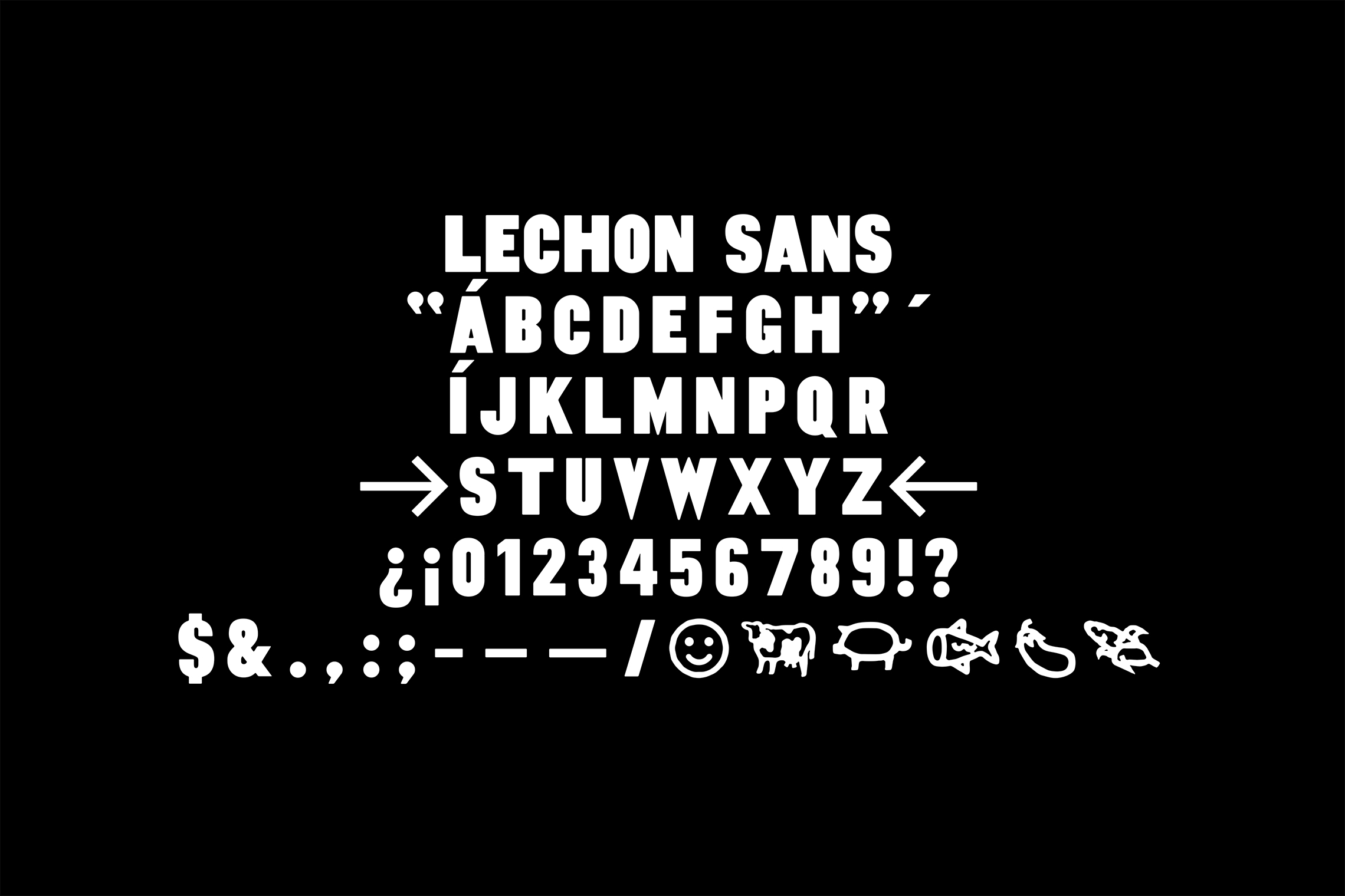
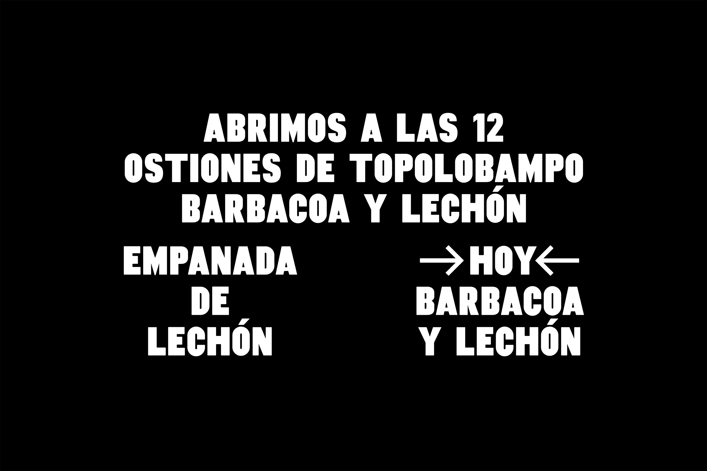
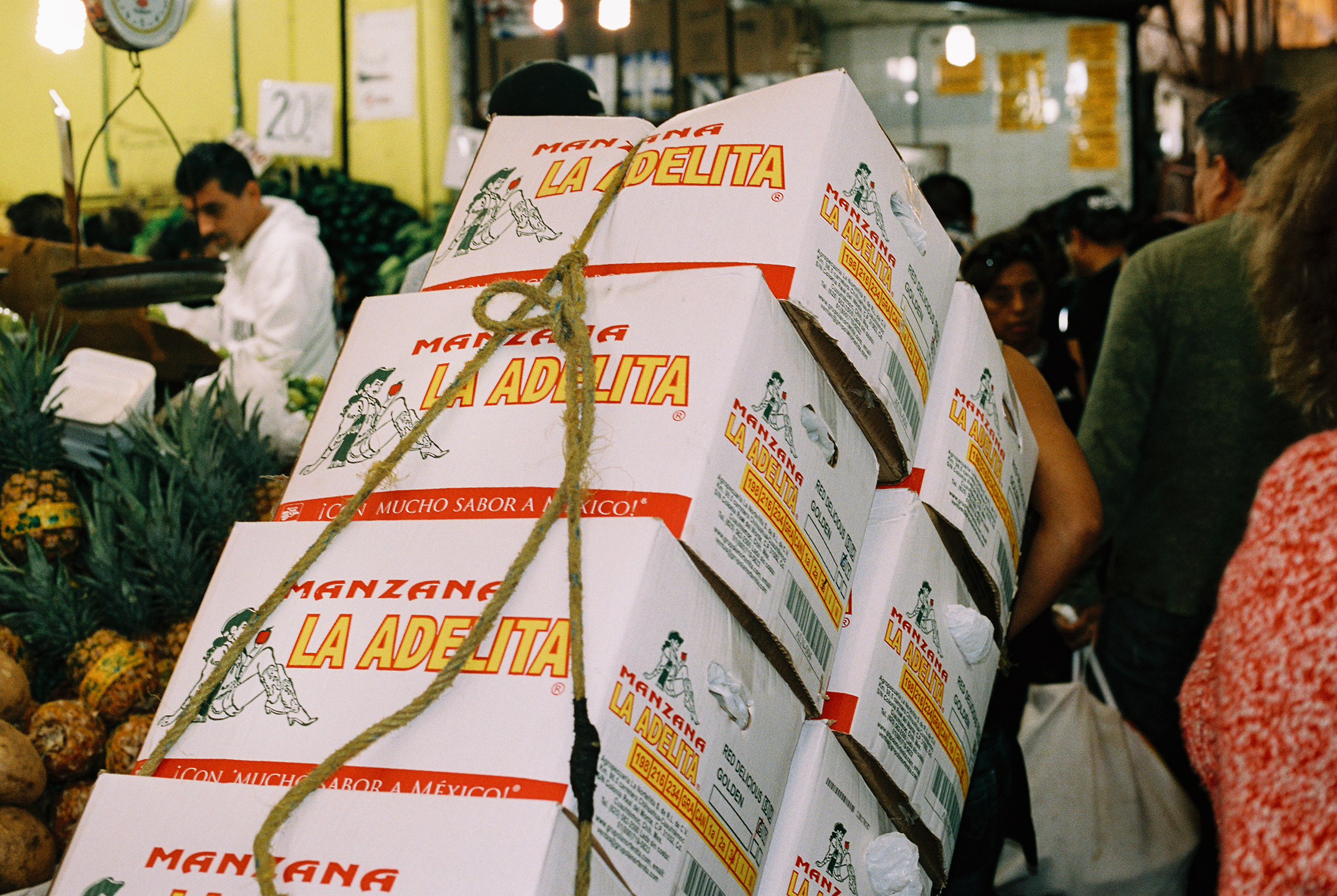
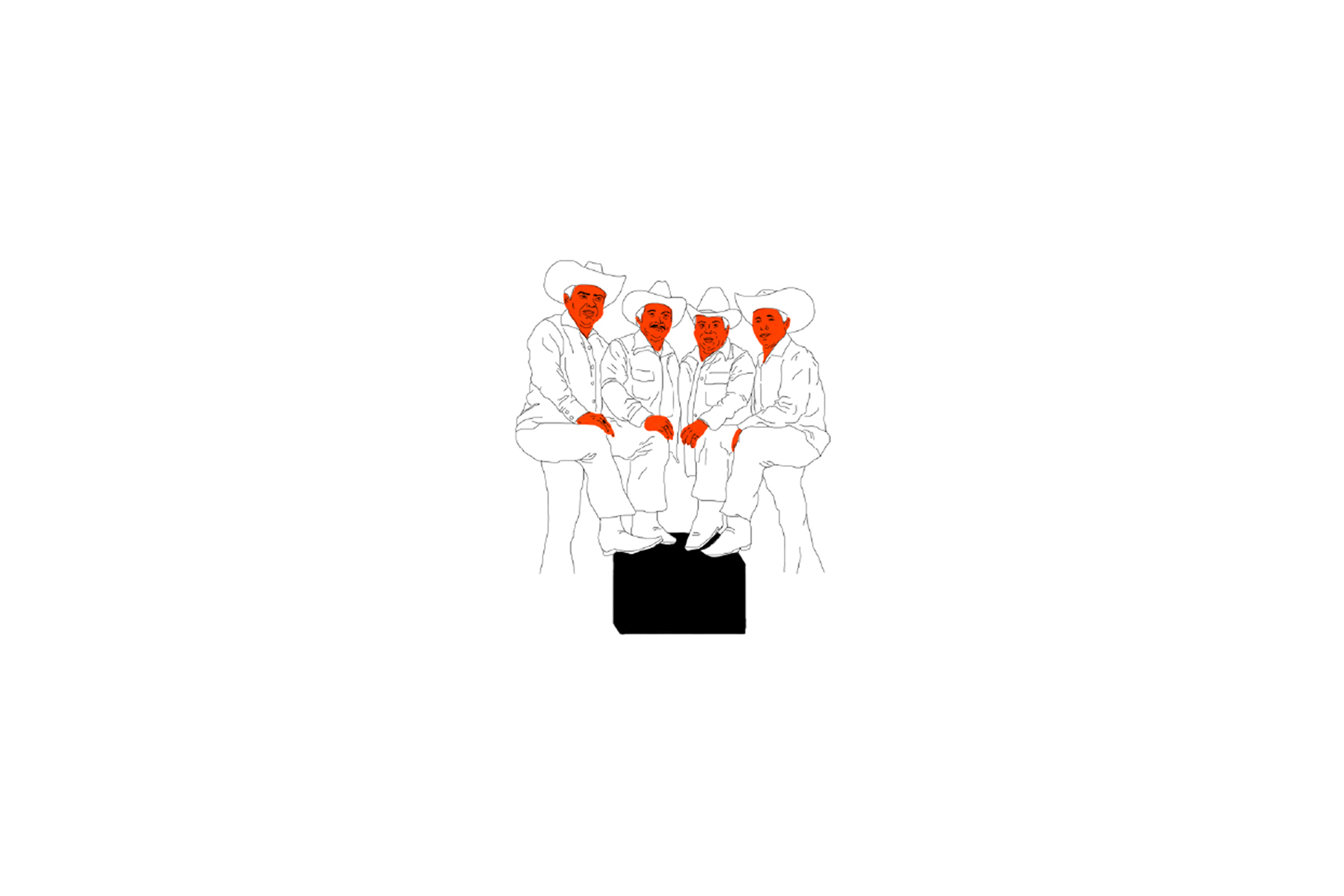
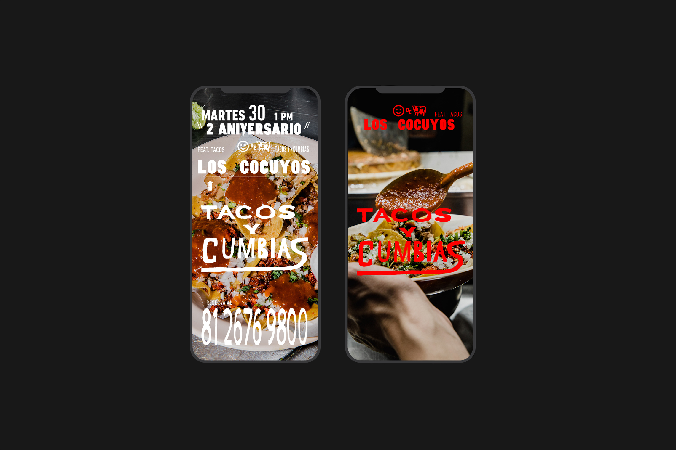
We created a typeface originating from the need to make lockups for social media while highlighting specific words. Lechón Sans is based on the same logo inspiration and includes symbols that accompany the essence of this typeface. The lockups are inspired by the Mercado Juárez, in downtown Monterrey, where photographs were taken to decorate the place interiors, accompanied by illustrations made to reflect popular culture.
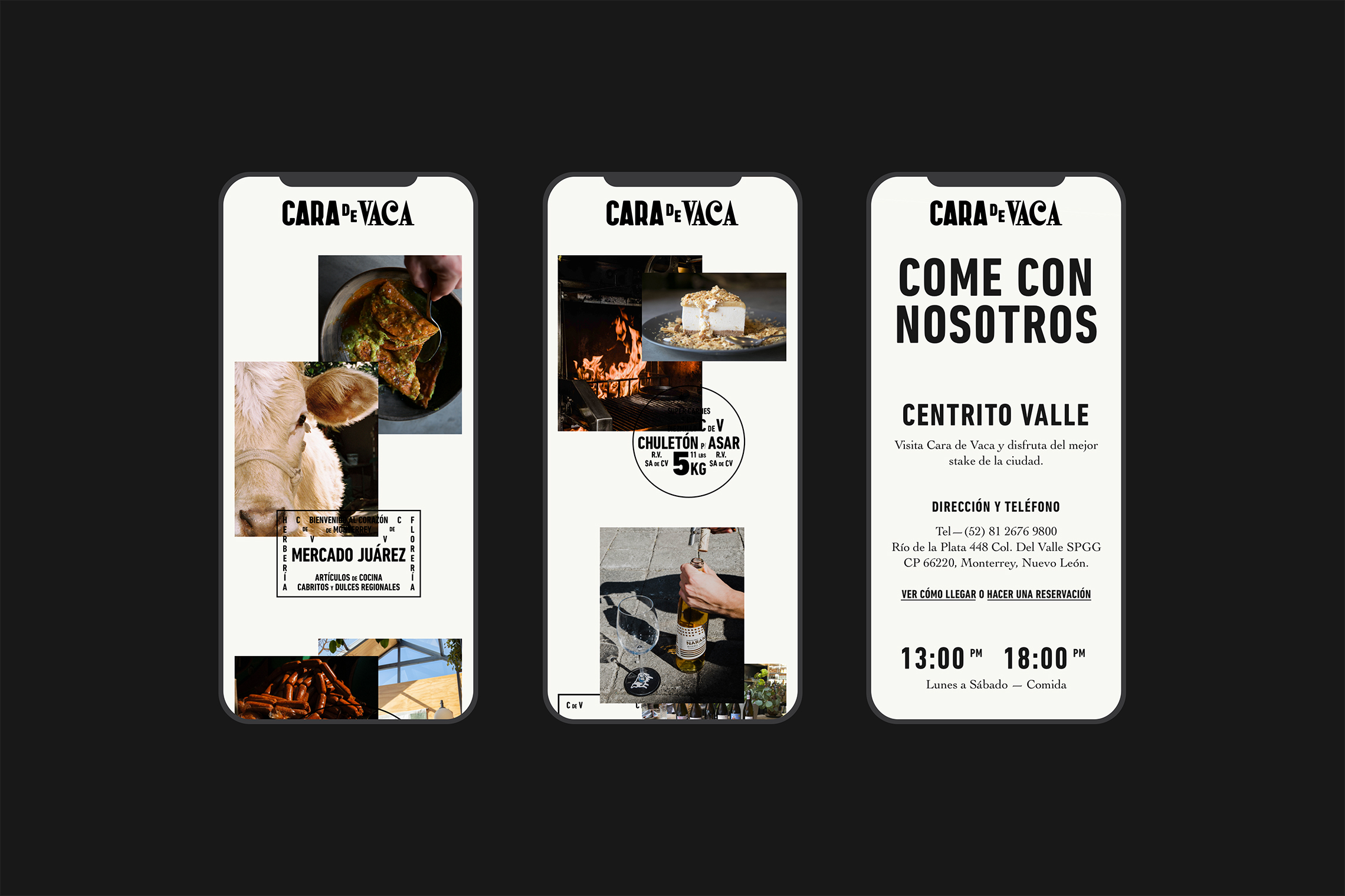
On the project’s website we transmit the brand's personality, considering the attention that this site should provide to its visitors, including a reservation call-to-action, menu photos and place location. These details stand out in the simplicity of the website. — (A)
