Xoclad
BRANDING
The client
Xoclad is a high-end pastry and confectionery shop located in the Mayan Riviera.
keywords
Pastry /Chocolate /Boutique /Mexico /Branding /Graphic Design /Packaging
the objective
In a place bustling with tourist activity, Xoclad needed to communicate the area's strong Mayan culture in a classy way that could never be called cliché or tacky.
the solution
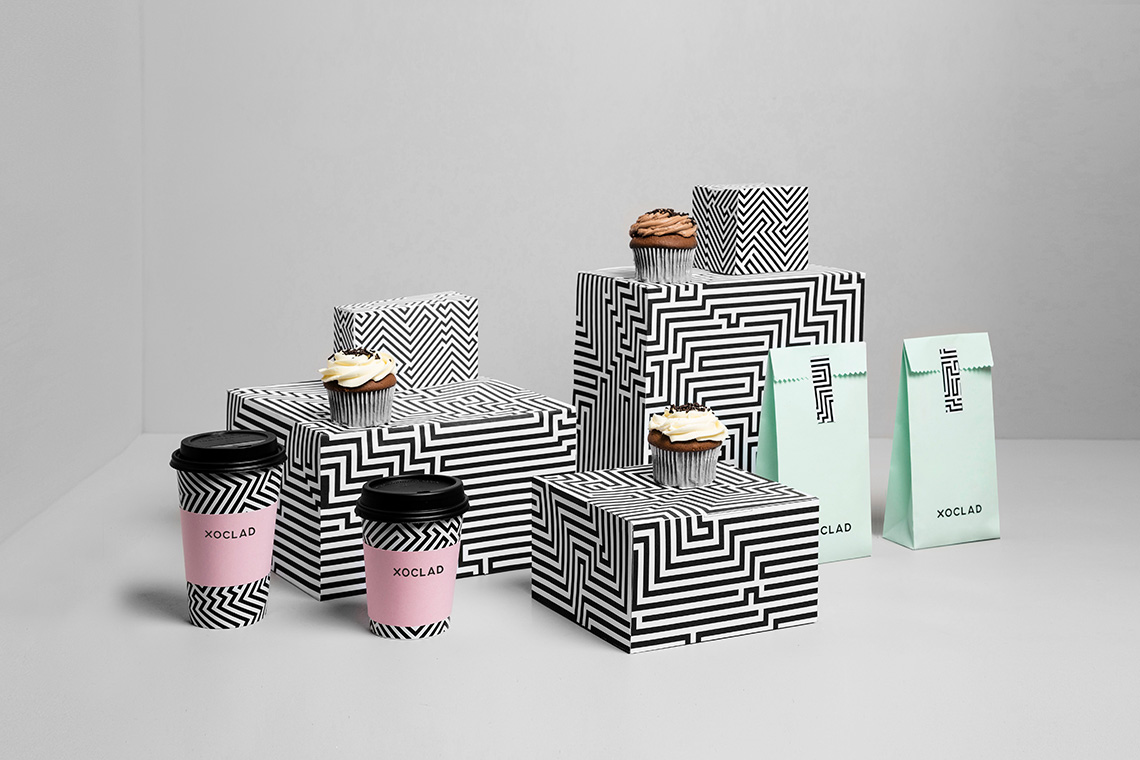
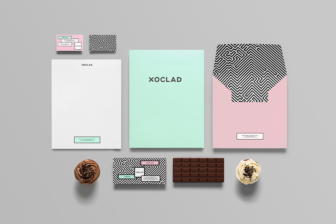
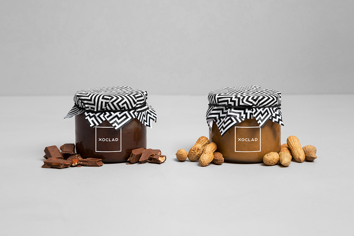
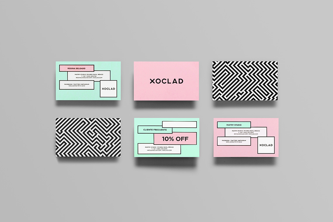
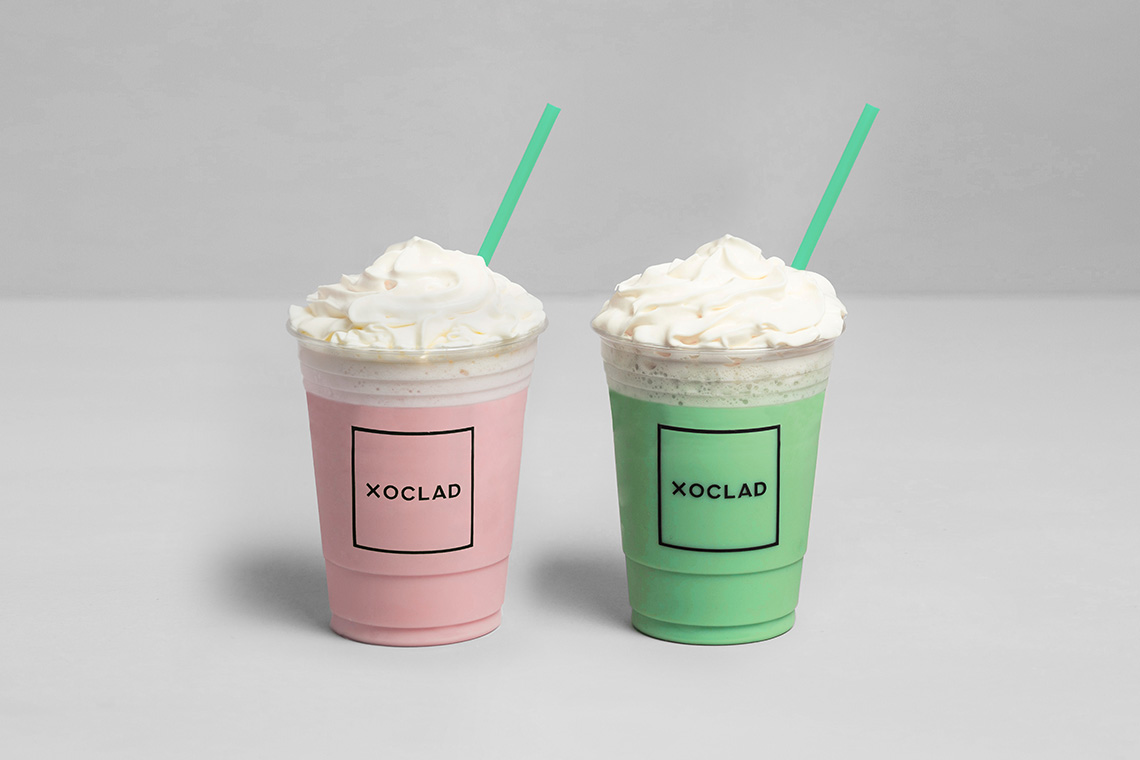
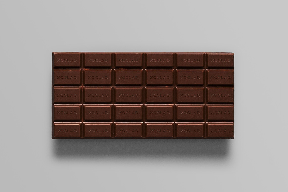
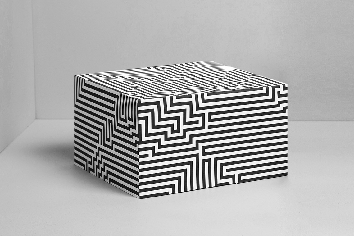
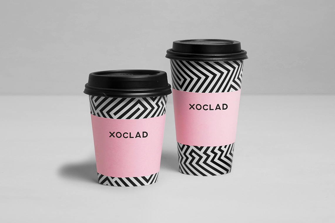
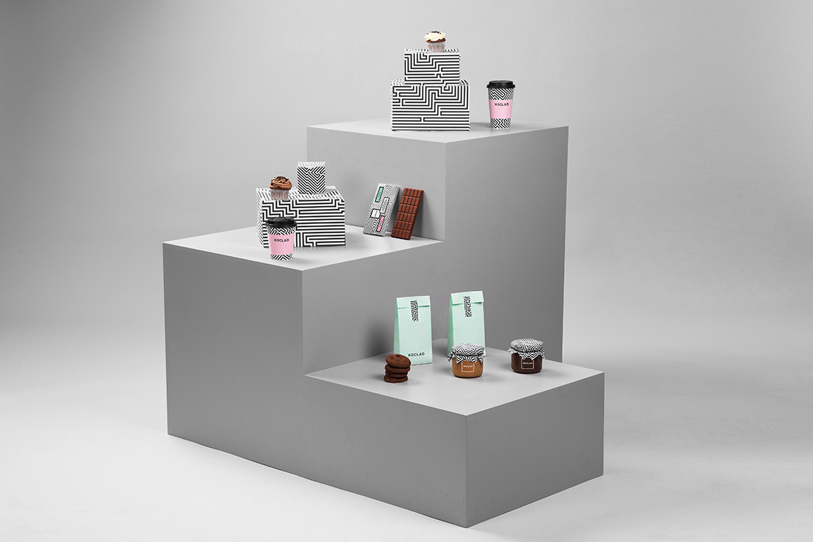
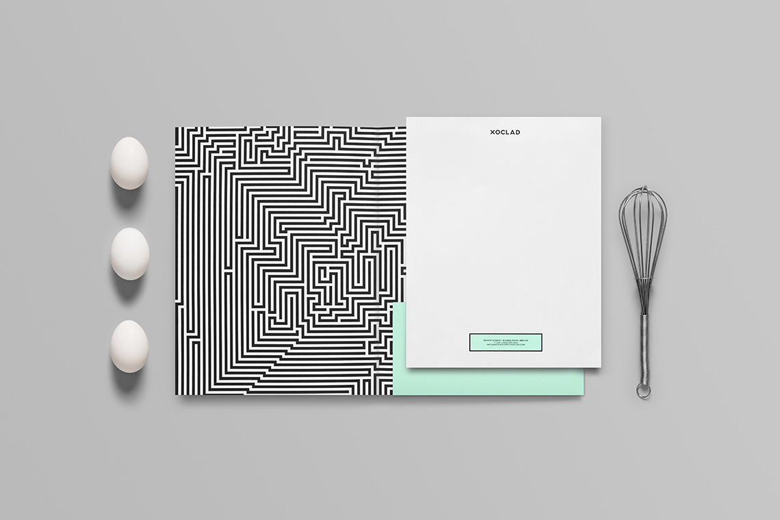
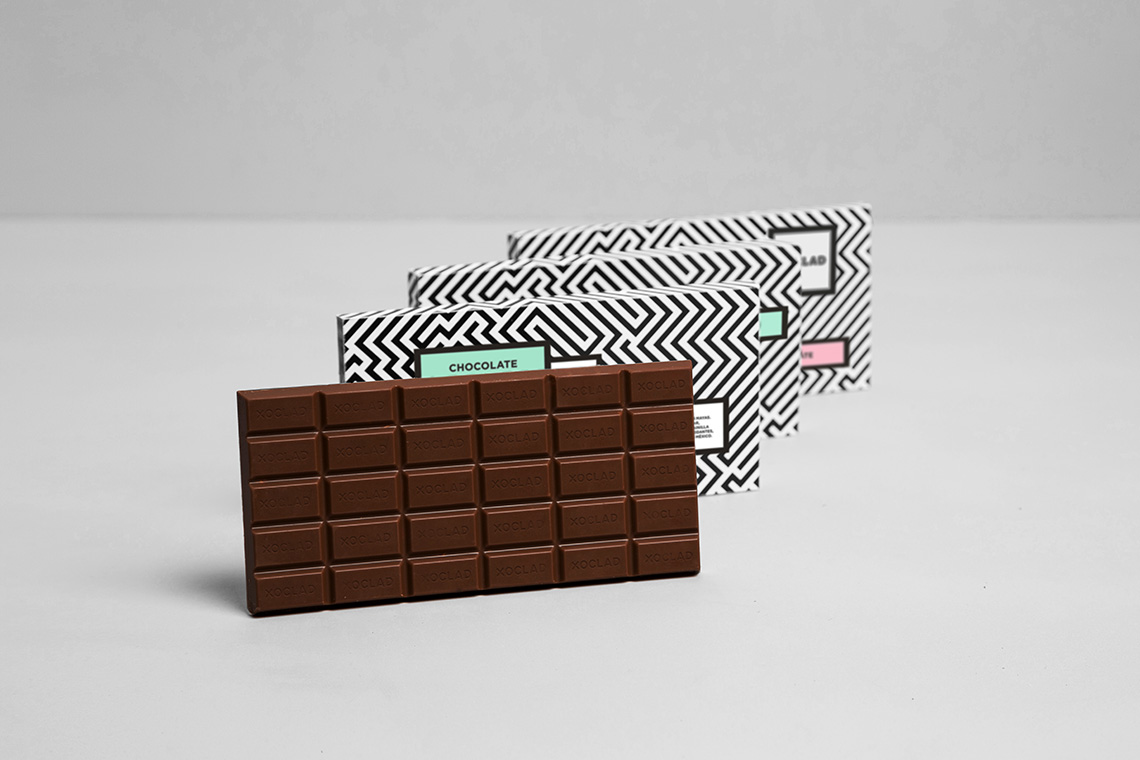
First, we gave its name a visual and phonetic pre-hispanic feeling that also conveyed one of the shop's prime products: chocolate. Then we designed a labyrinth-like pattern reminiscent of antique mayan art and architecture ornamentation. The color palette consigns the brand with a sober, clean feeling that makes it modern and sweet. — (A)
The color palette consigns the brand with a sober, clean feeling that makes it modern and sweet.
