Sofia
BRANDING
The client
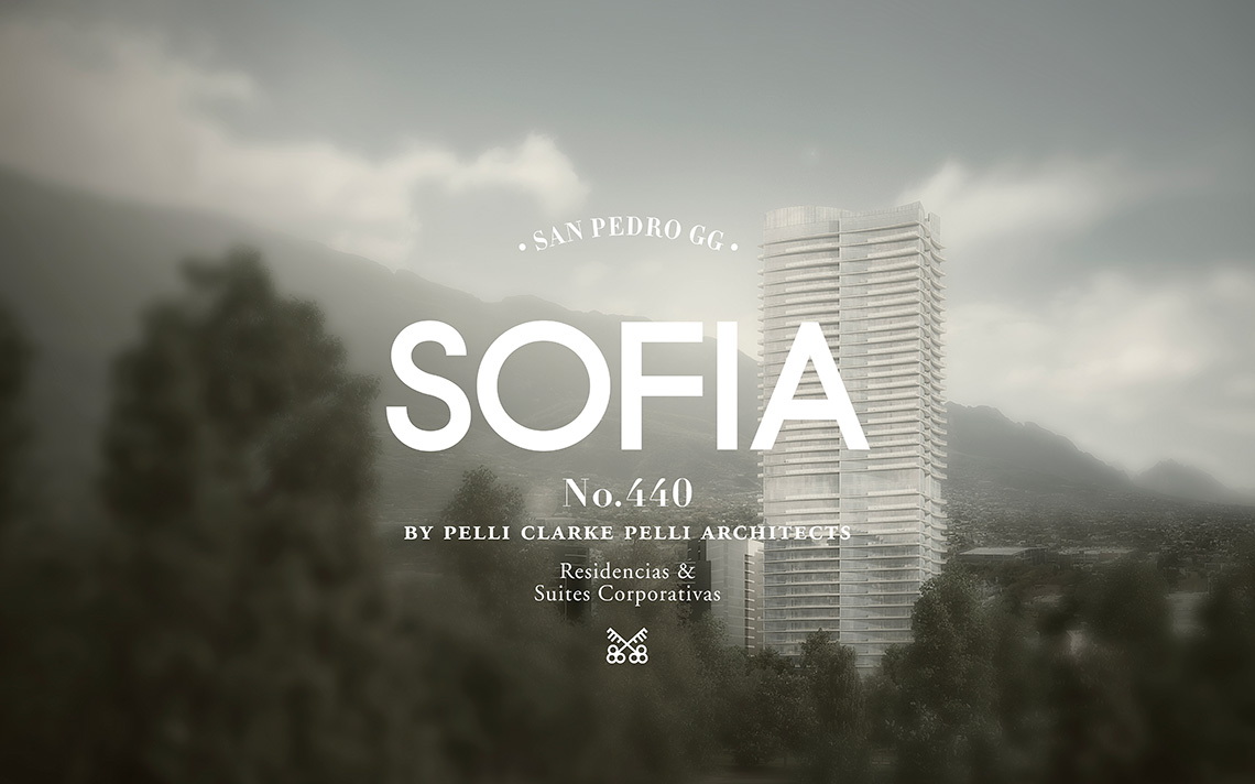
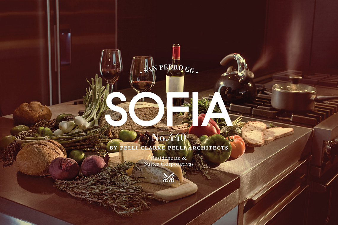
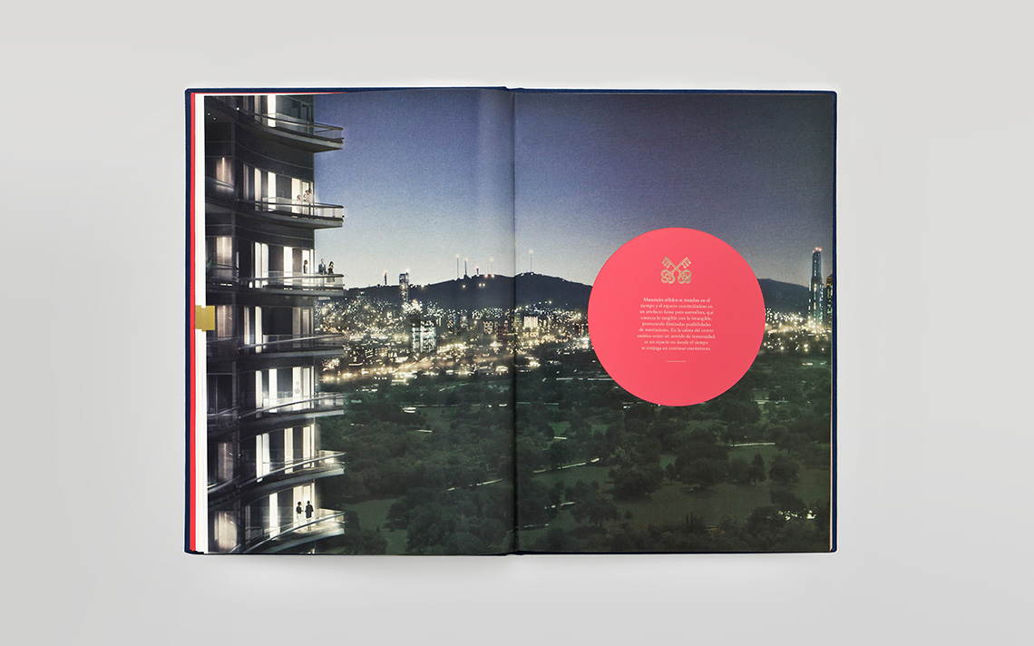
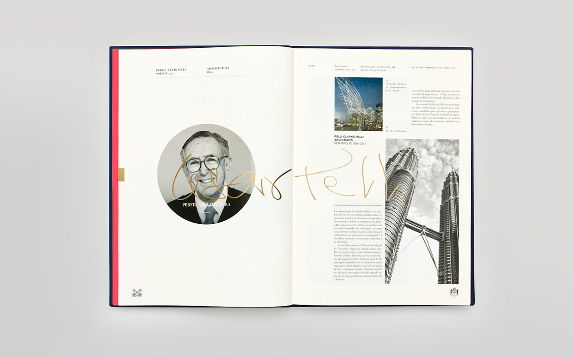
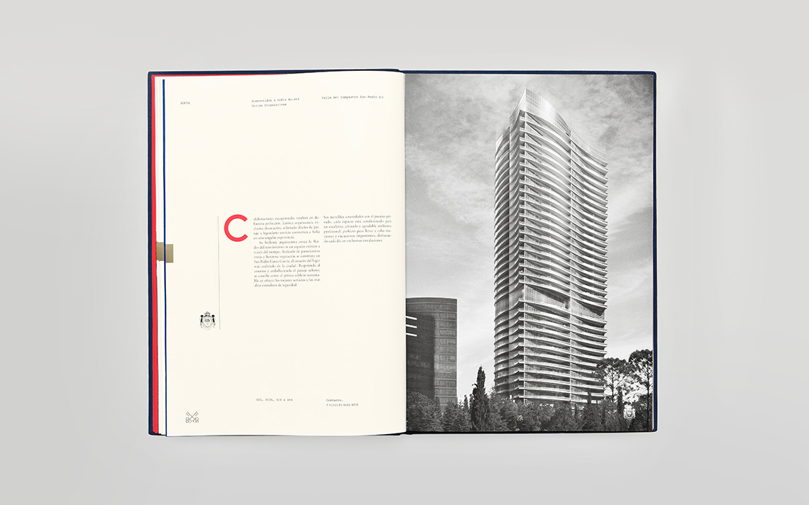
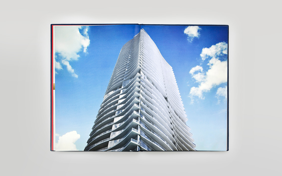
Sofia is a building designed by architect Cesar Pelli for One Development Group. Located in San Pedro, Mexico, this building not only was designed by an internationally renowned architect, it also has the most generous specifications in every aspect: from automated appliances, to Leed certifications.
keywords
Real Estate /Mexico /Branding /Editorial Design /Graphic Design
the objective
Develop a graphic identity system that communicate the sophistication and exclusiveness of the project to its potential buyers and inhabitants.
the solution
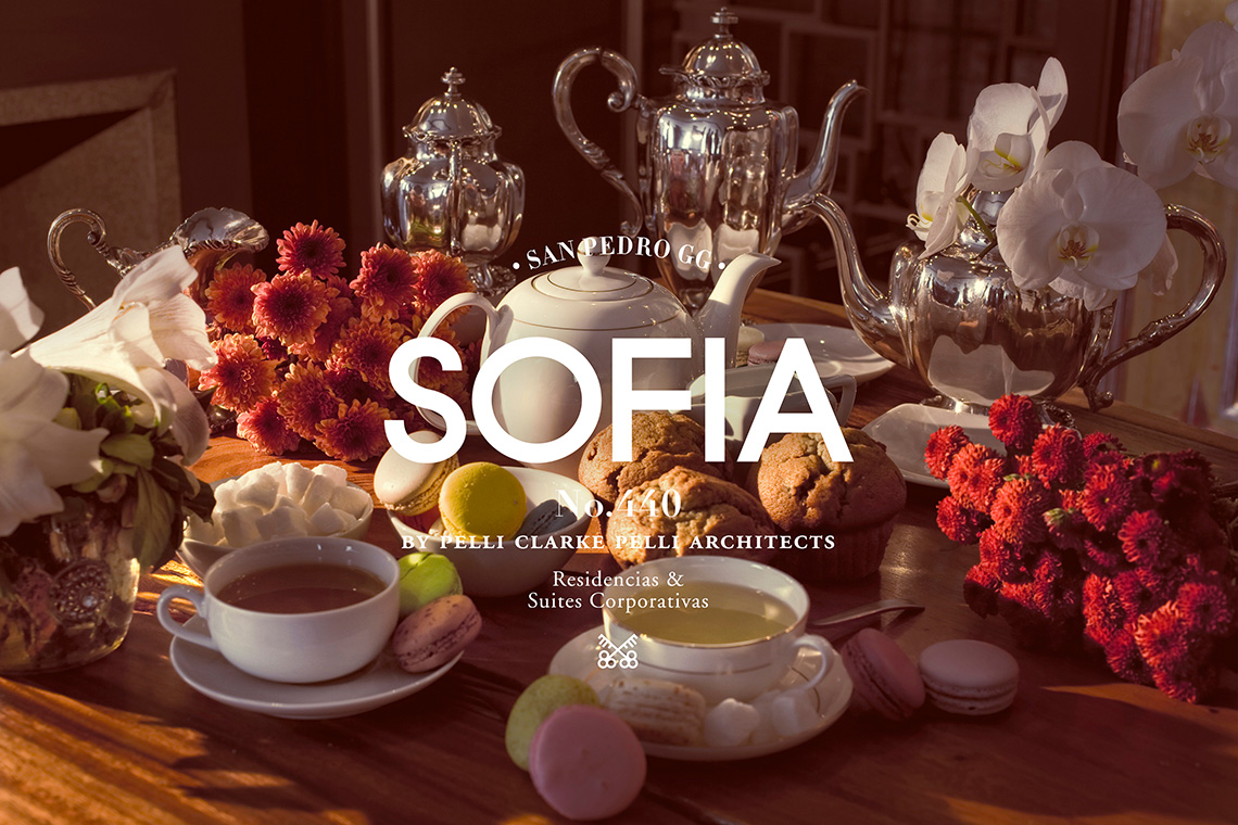
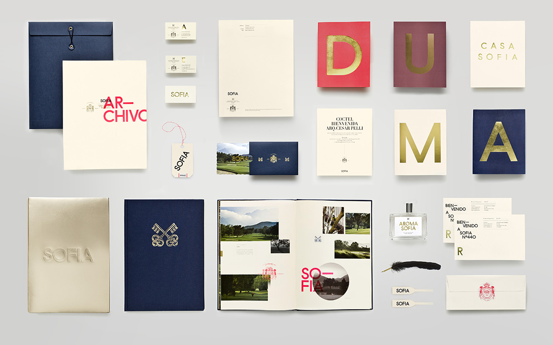
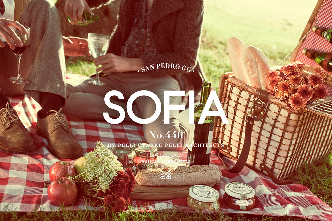
Therefore we created an identity that was the exact opposite of what we usually see for this kind of project.
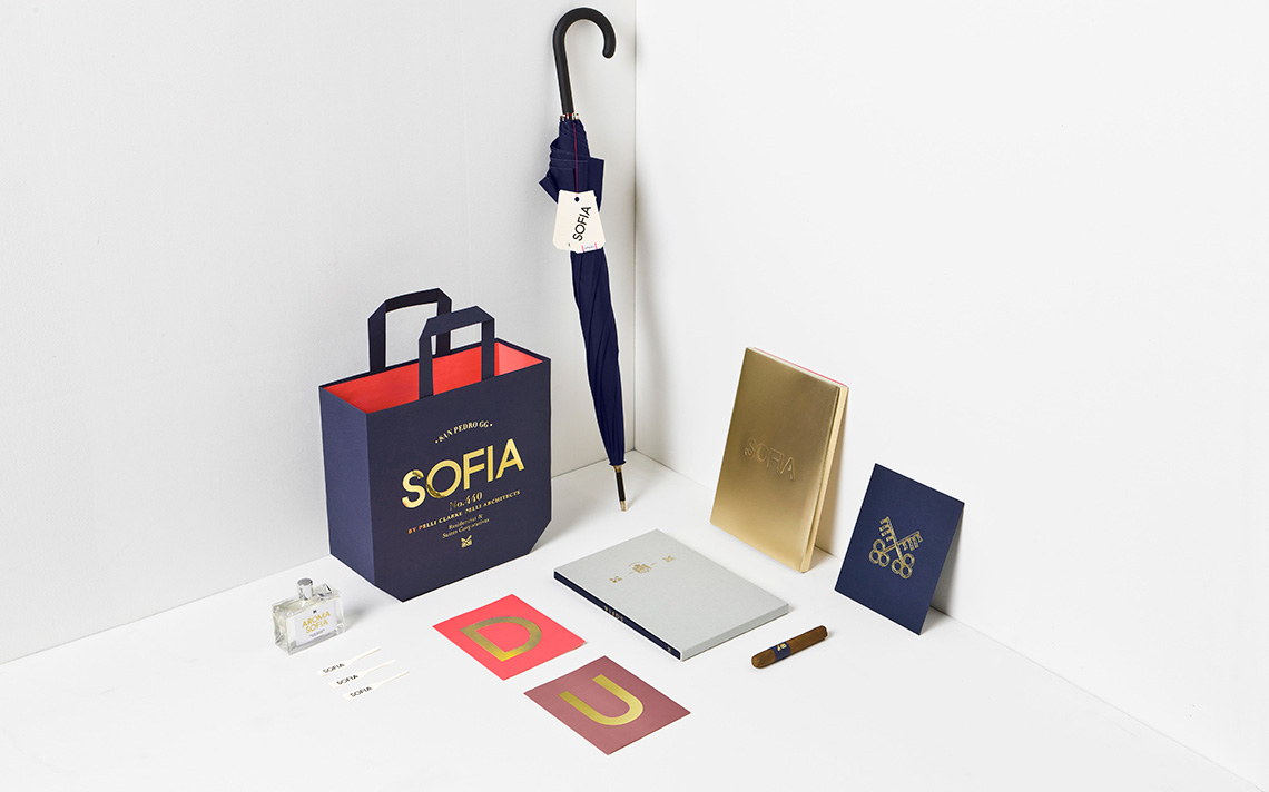
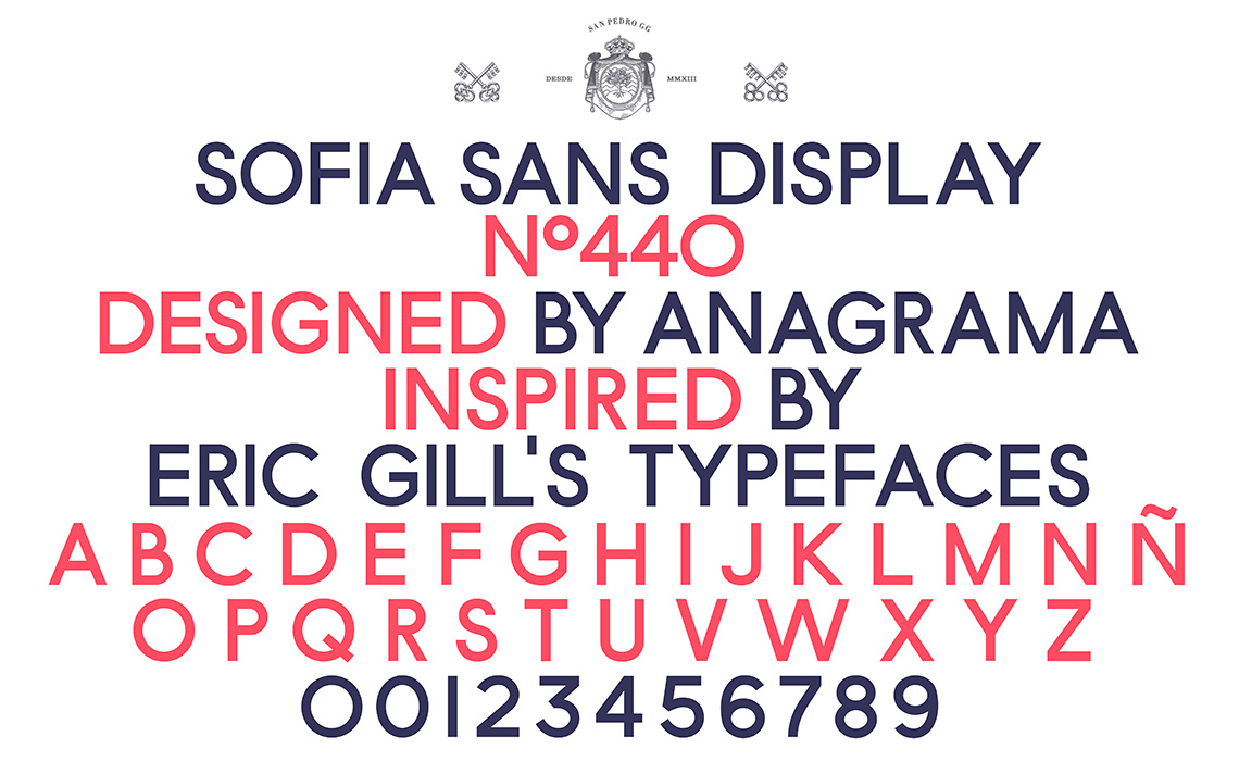
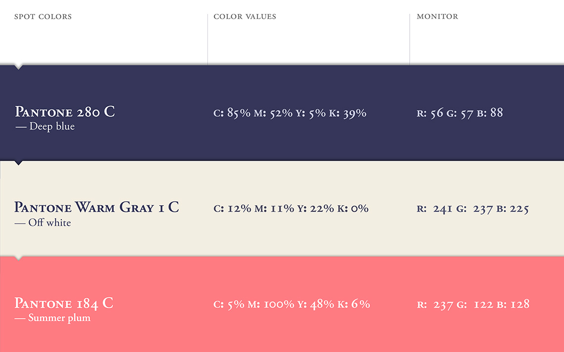
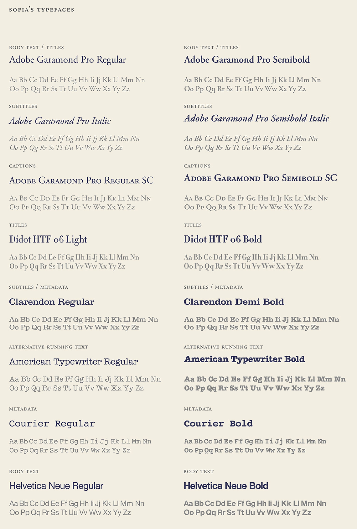
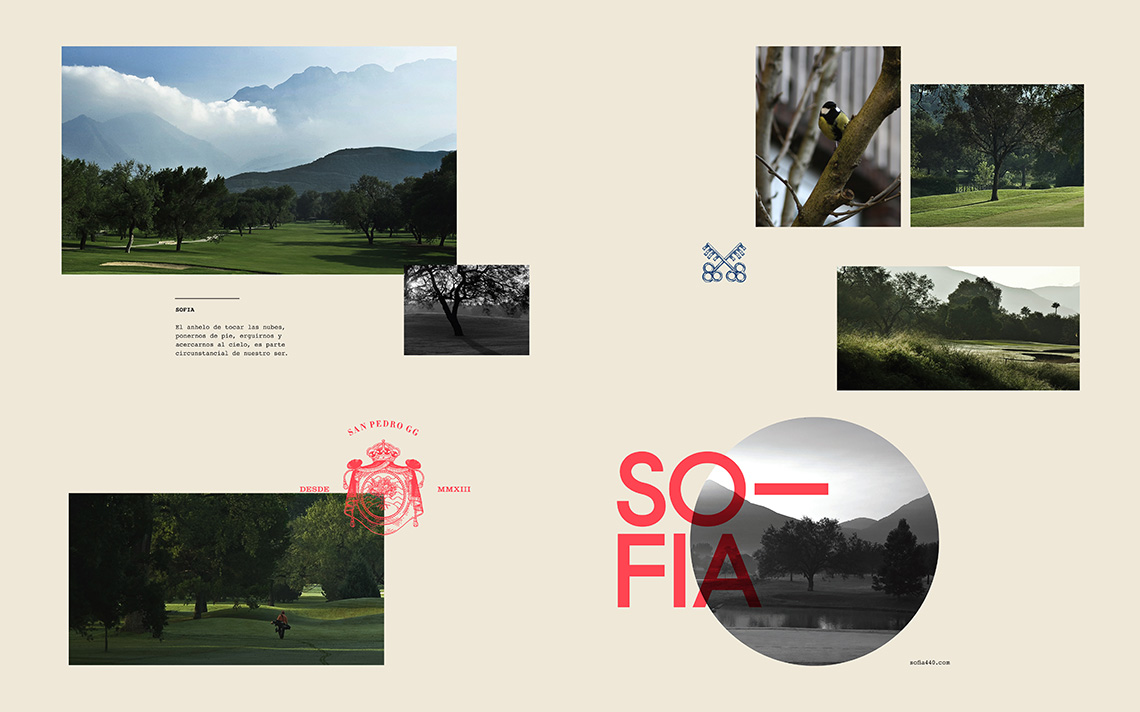
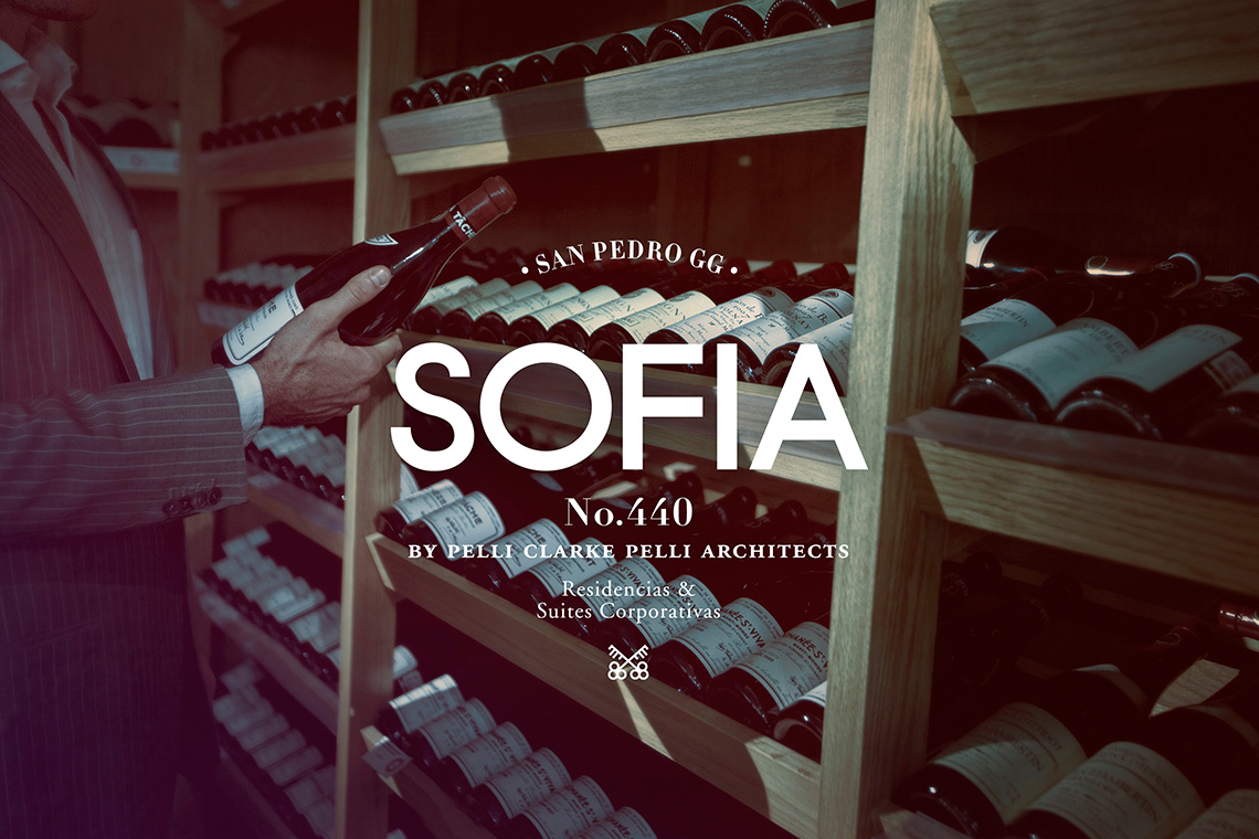
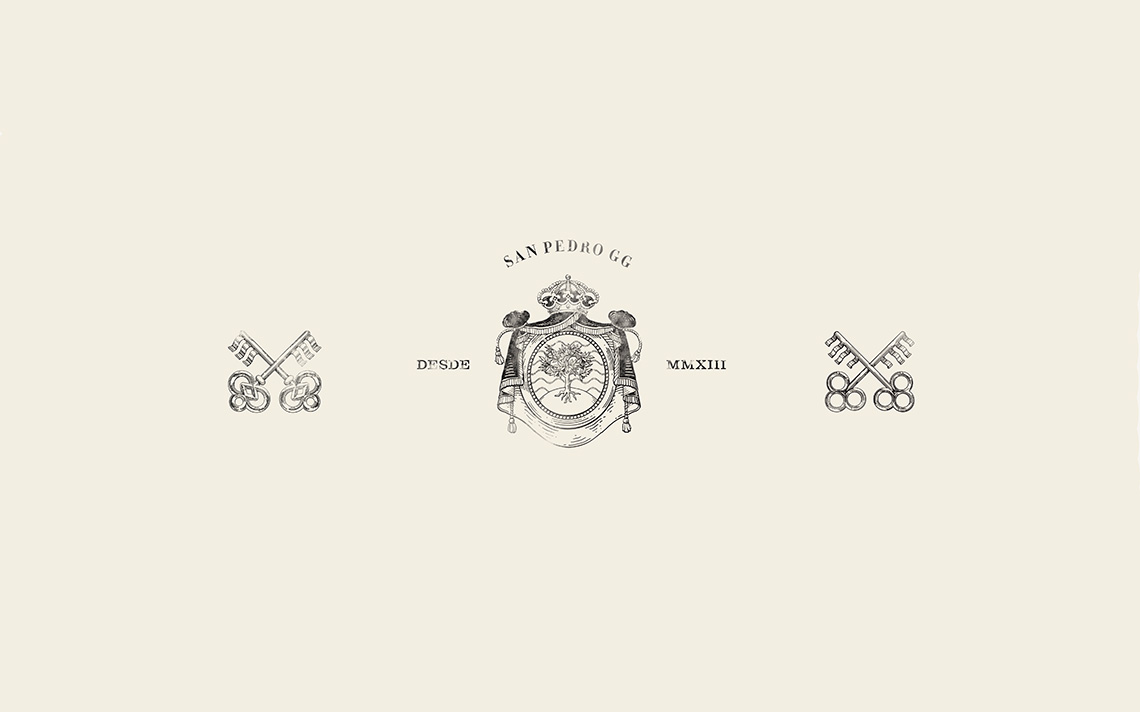
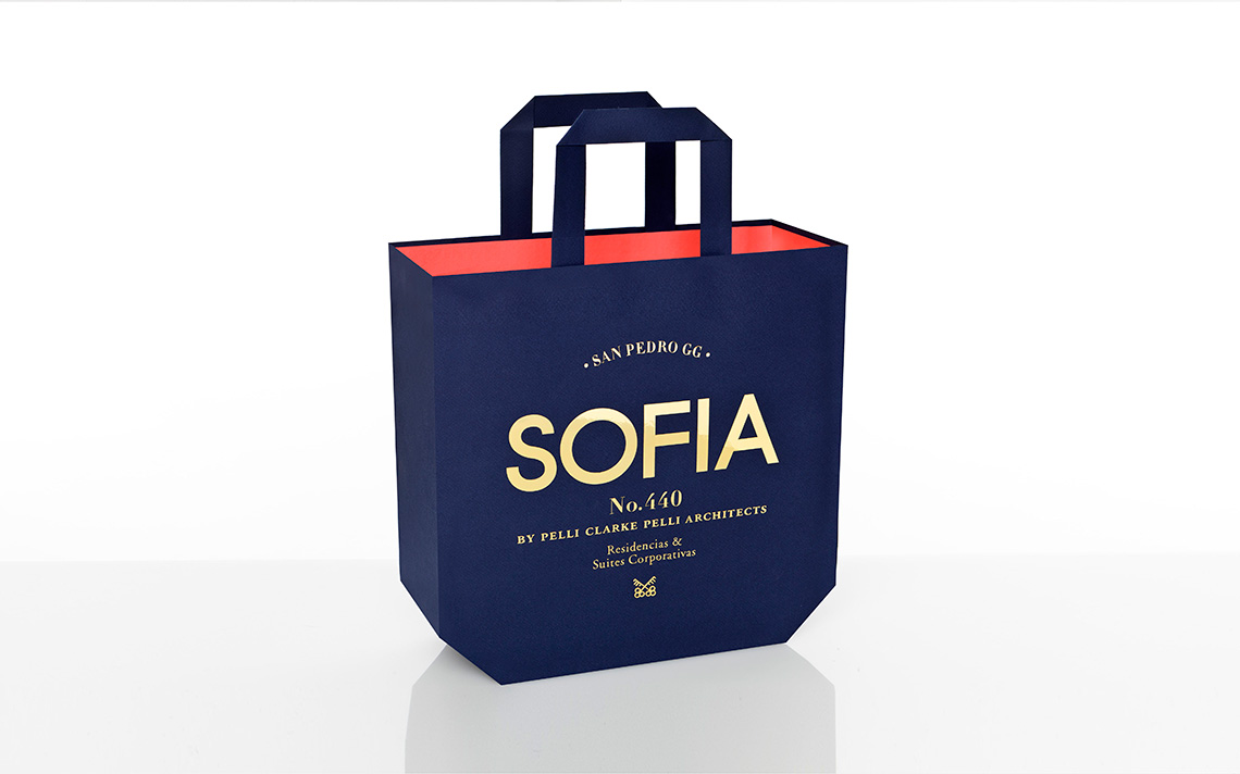
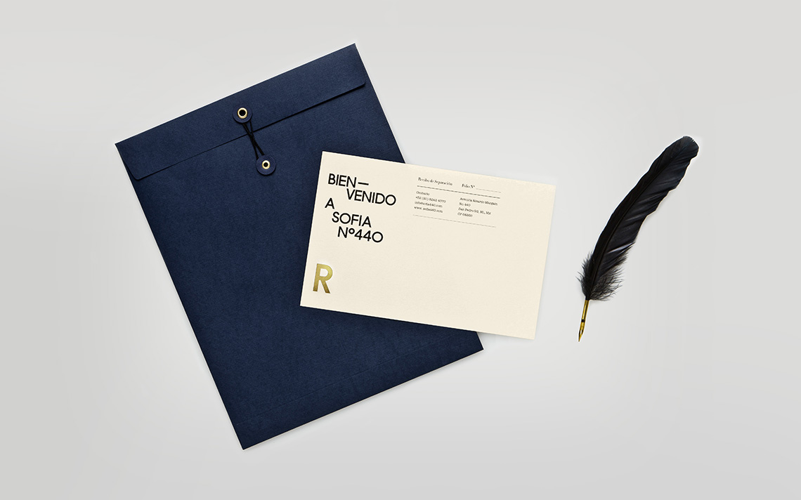
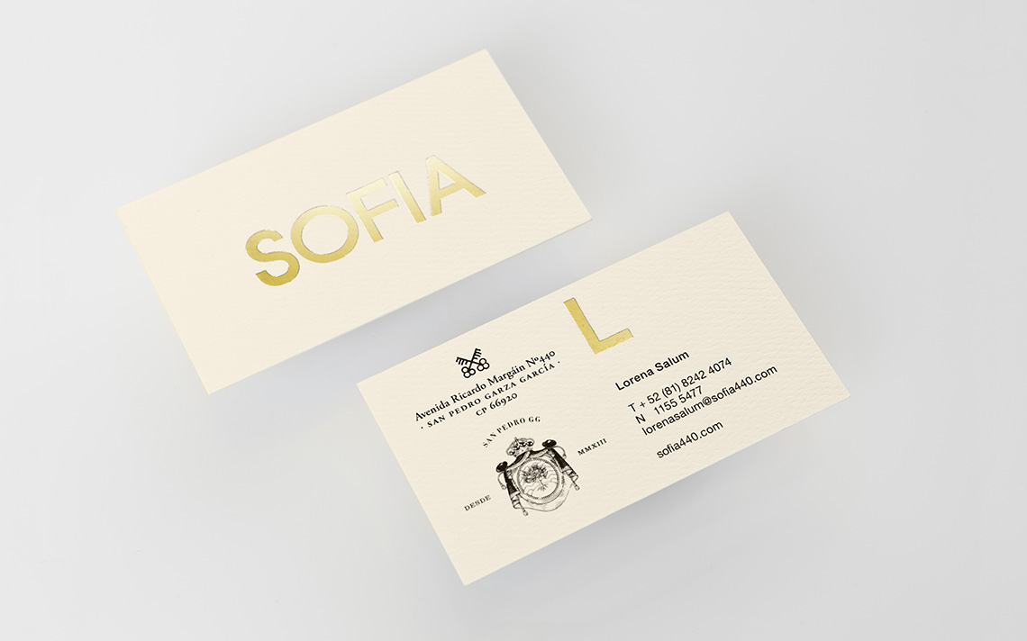
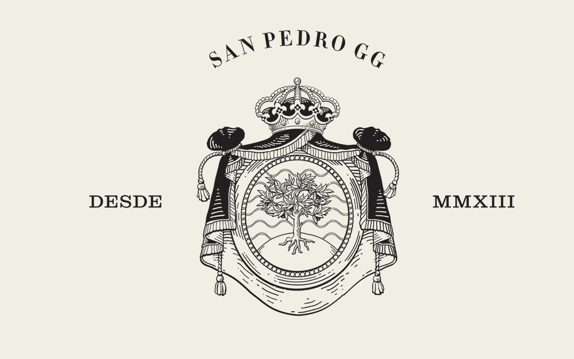
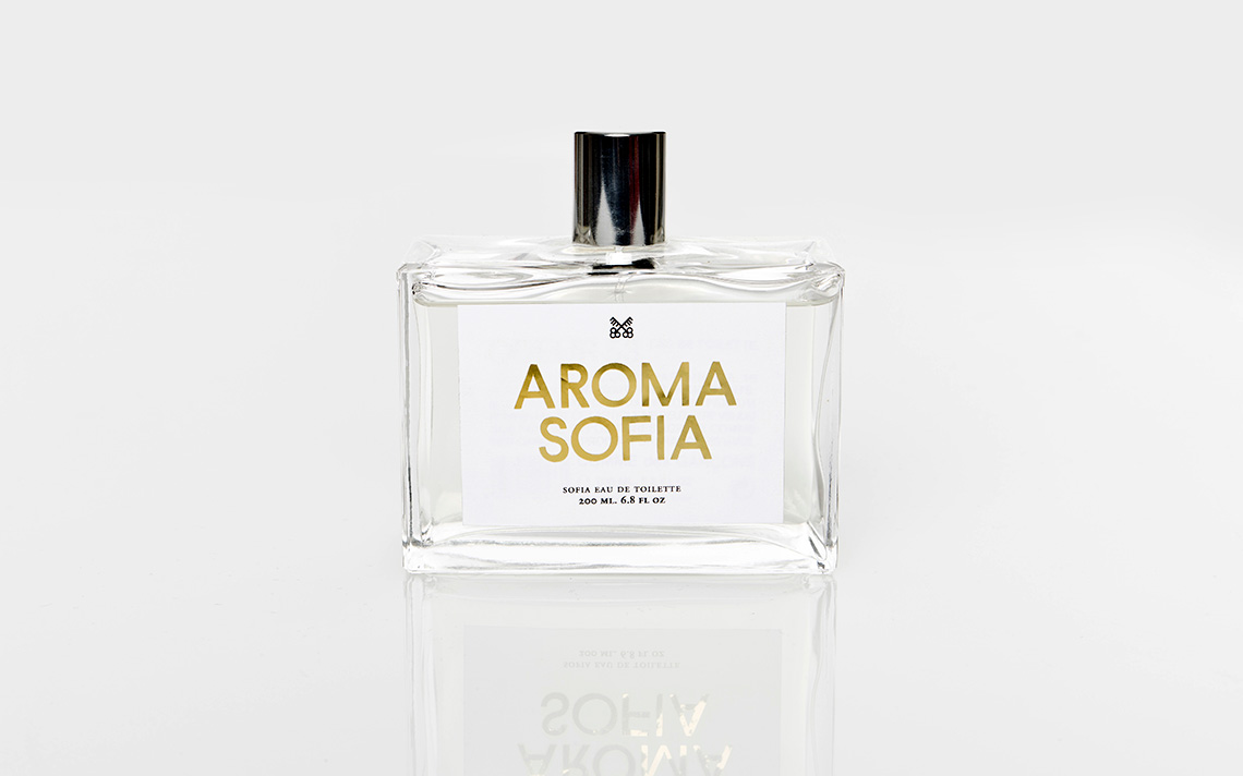
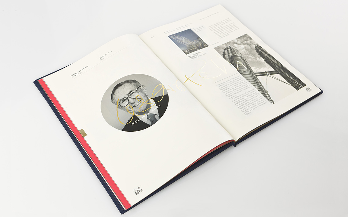
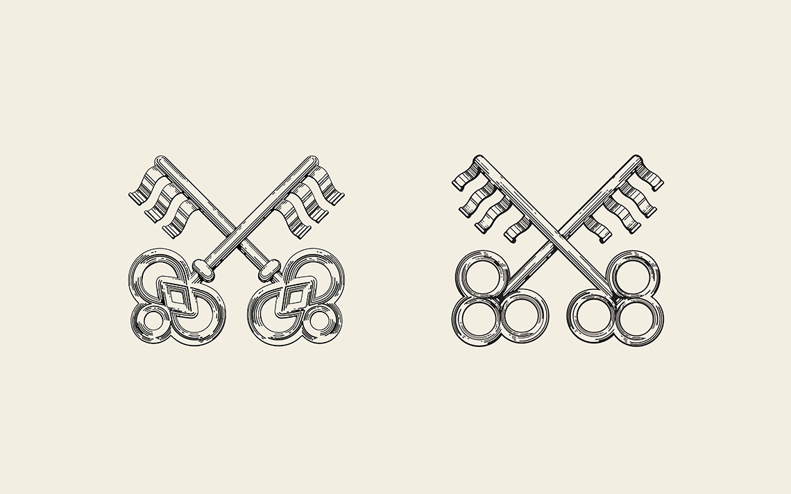
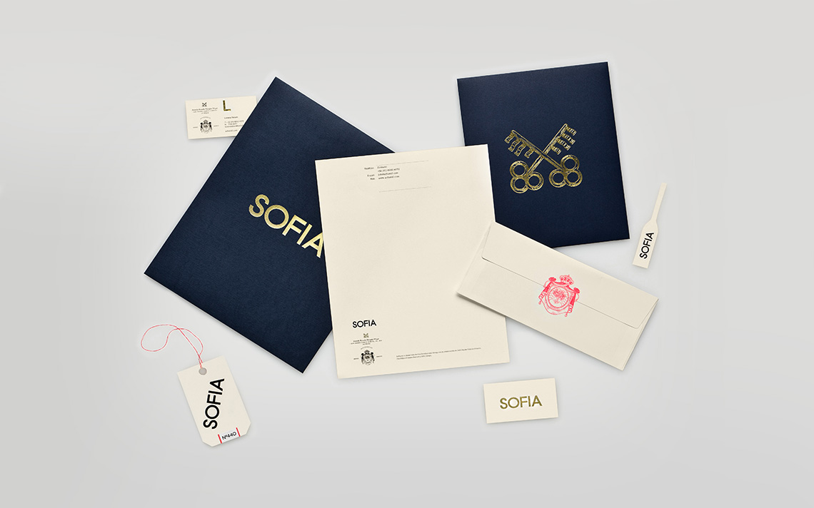
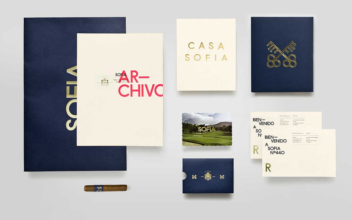
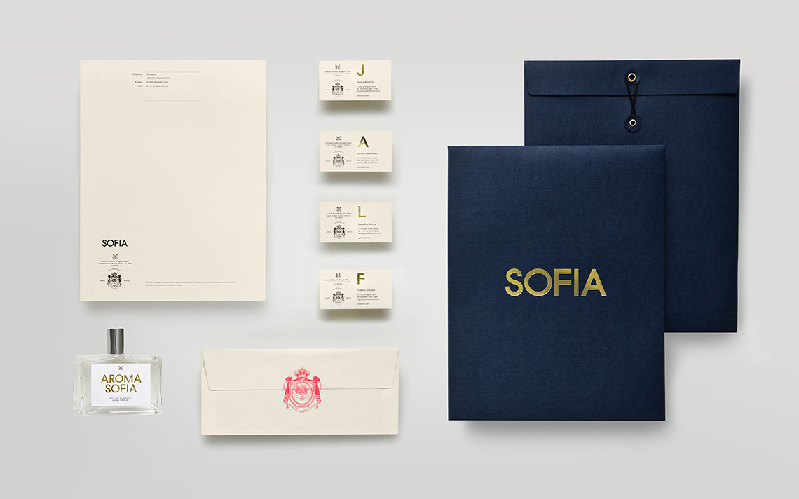
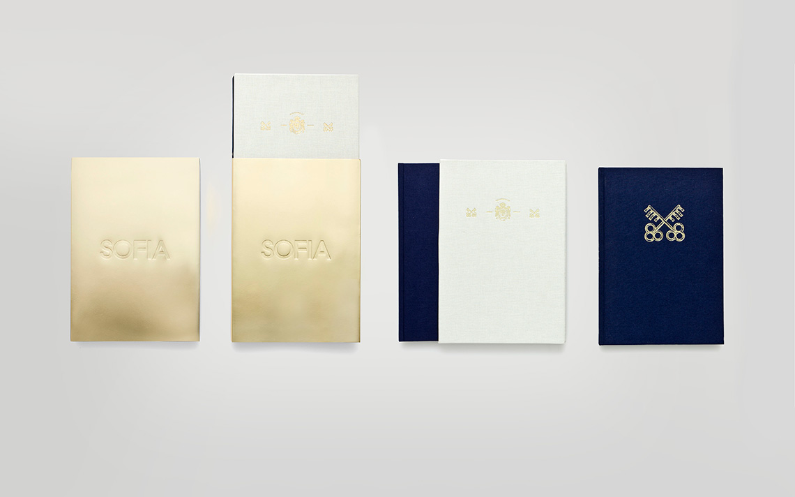
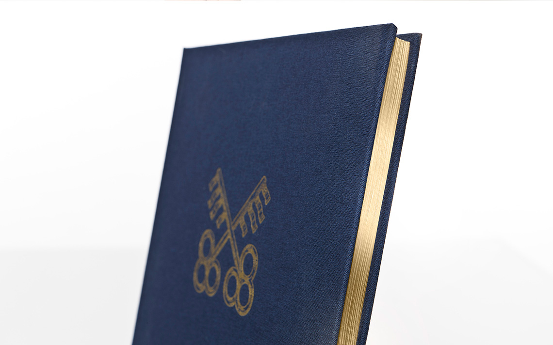
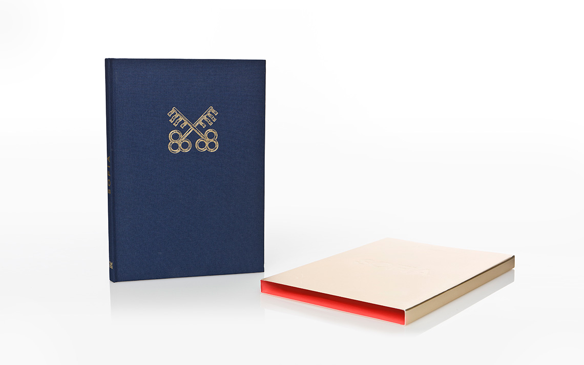
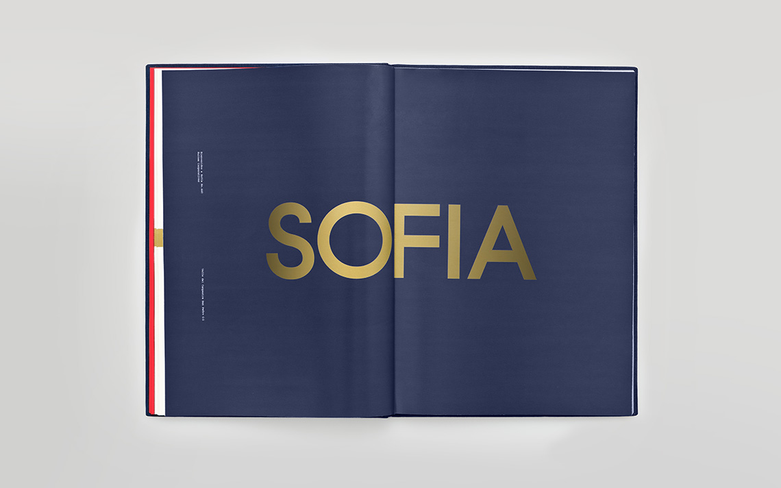
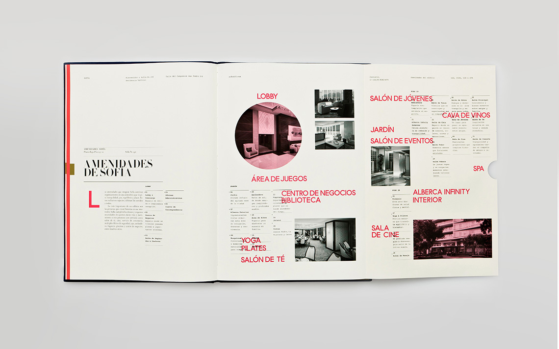
Sofia's identity is formed by three very important axes: Logotype: the keys and the coat of arms are inspired by San Pedro's coat of arms. Typography: we developed a custom typeface designed especially for Sofia, it is inspired by British san serifs. Layout: the text and information arrangement is inspired by the typographical treatment used before grids were popularised by the swiss grid system.
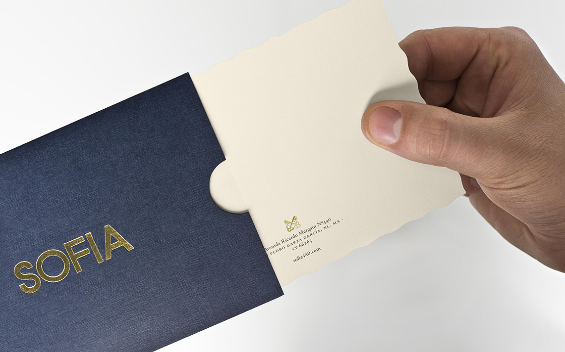
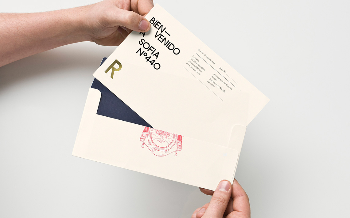
Both the attention to detail and the brand's elements convey the greatness of Sofia's architectural project. — (A)
The brand's elements convey the greatness of Sofia's architectural project.
