Greengrass
BRANDING
The client
GreenGrass is a salad shop seeking to change the cultural perception of vegetable-based food in Mexico. They promote the belief that eating is a conscious action, part of a process that nourishes way beyond the physical body.
keywords
Branding / Restaurant / Packaging / México
the objective
Redesign, update and create a —a visual strategy— for GreenGrass brand that changes the —negative— perception that people have about —healthy food—, reflecting how passionate they are about the quality of each ingredient and keeping in mind the motto “we all desire to become the best version of ourselves” not only in a healthy way of thinking, but also on our emotional well-being and lifestyle.
the solution
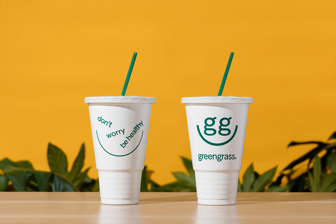
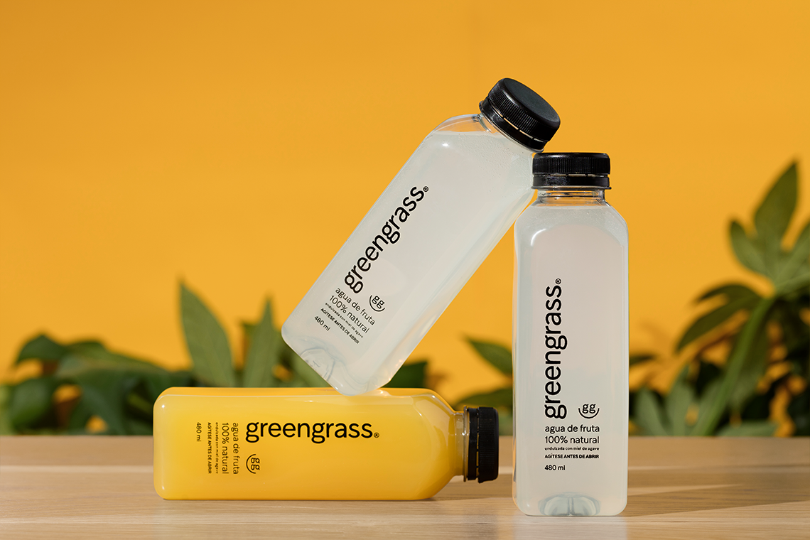
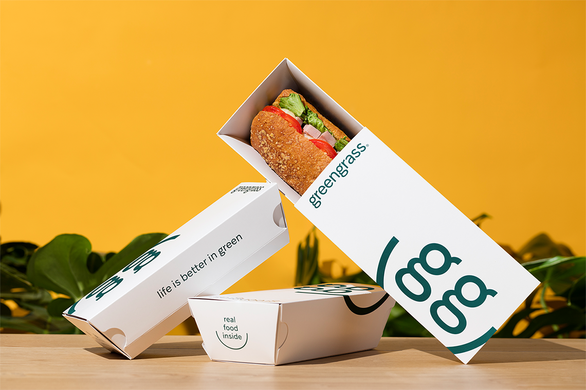
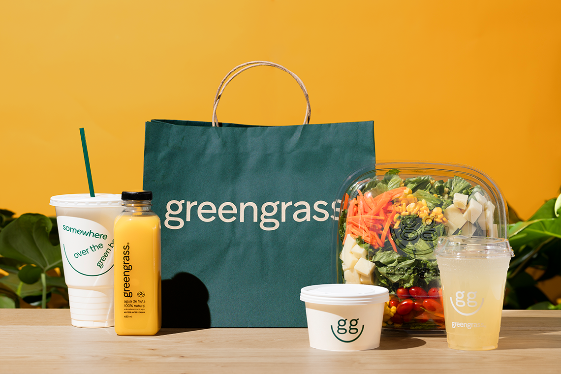
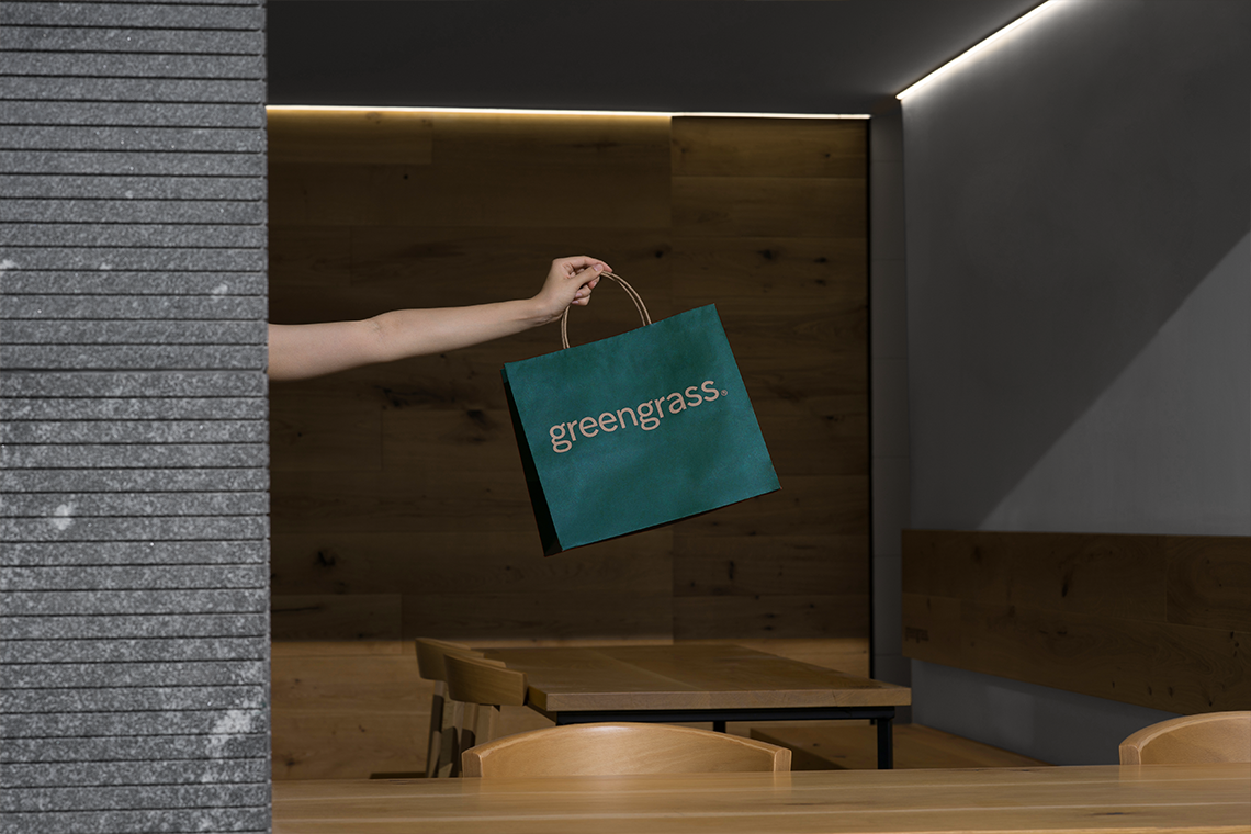
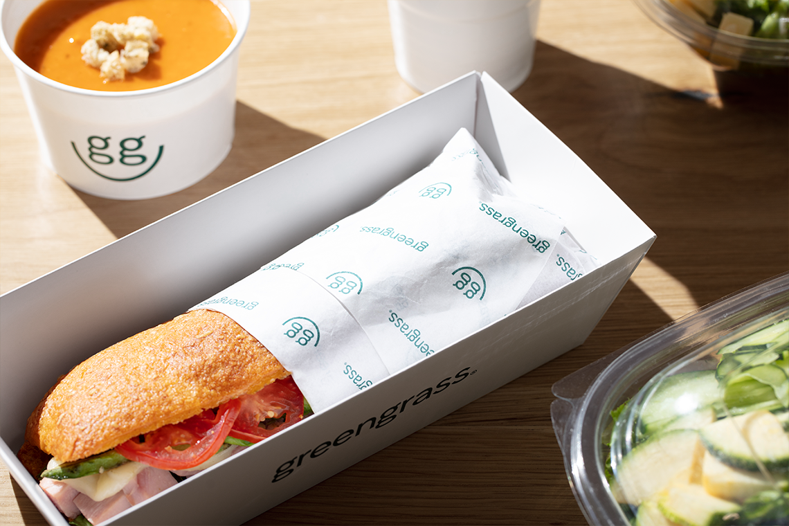
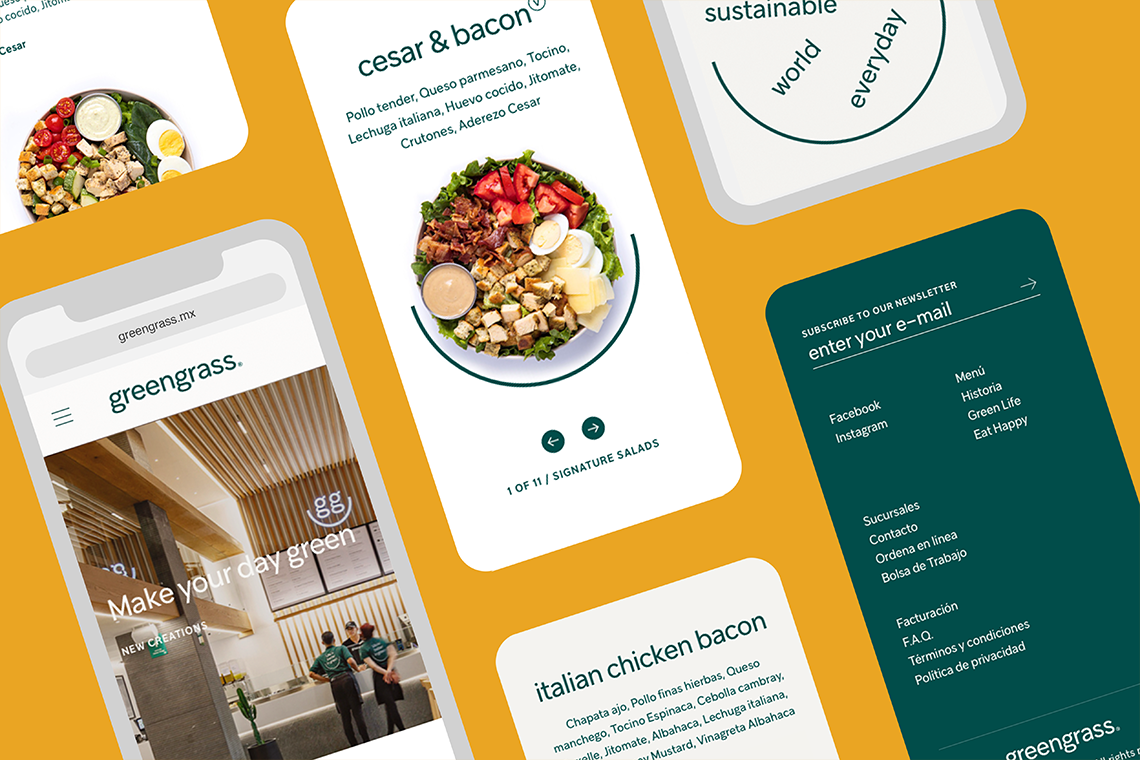
For the GreenGrass redesign, we developed an evolving logo that reinforces the brand values and manages to convey a relaxed and approachable personality.
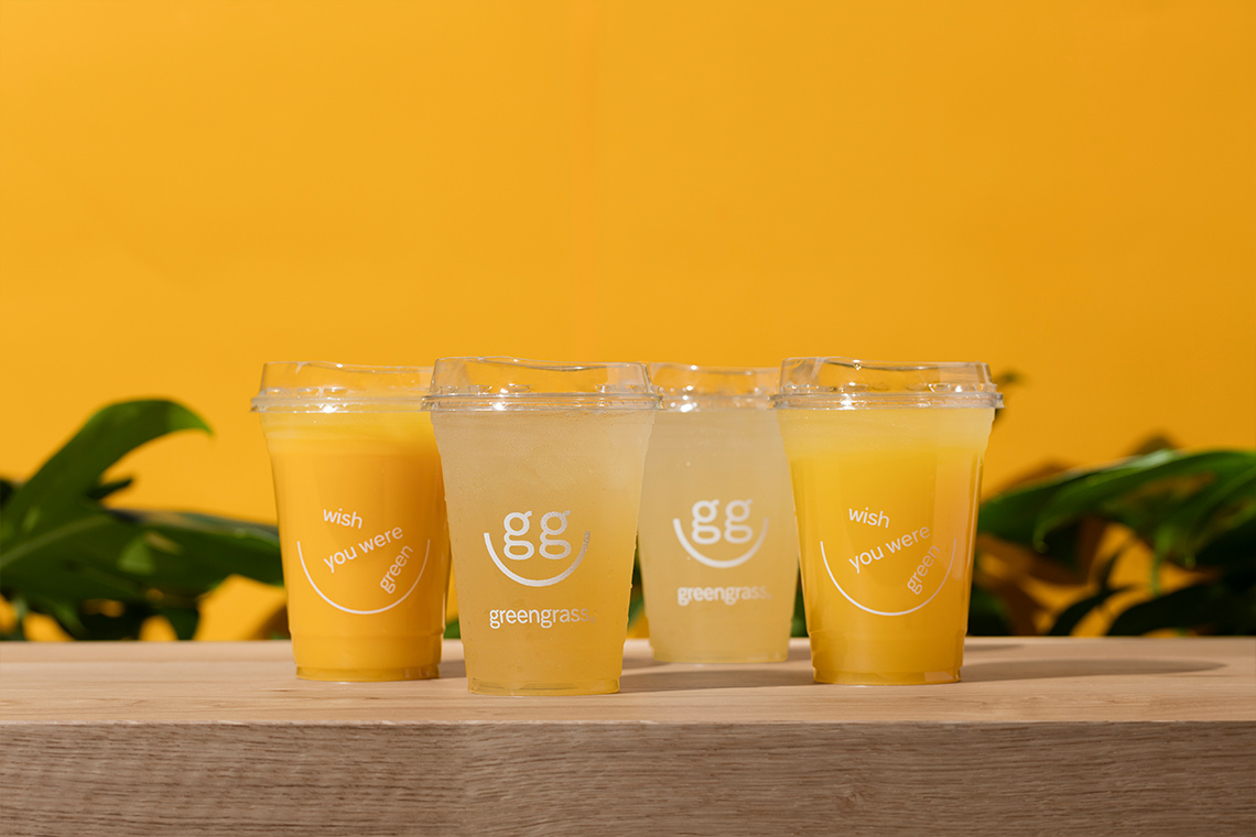
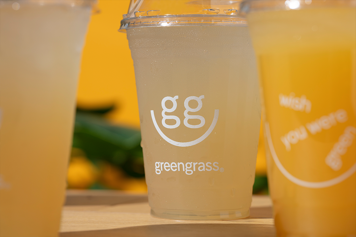
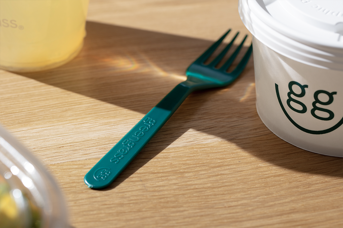
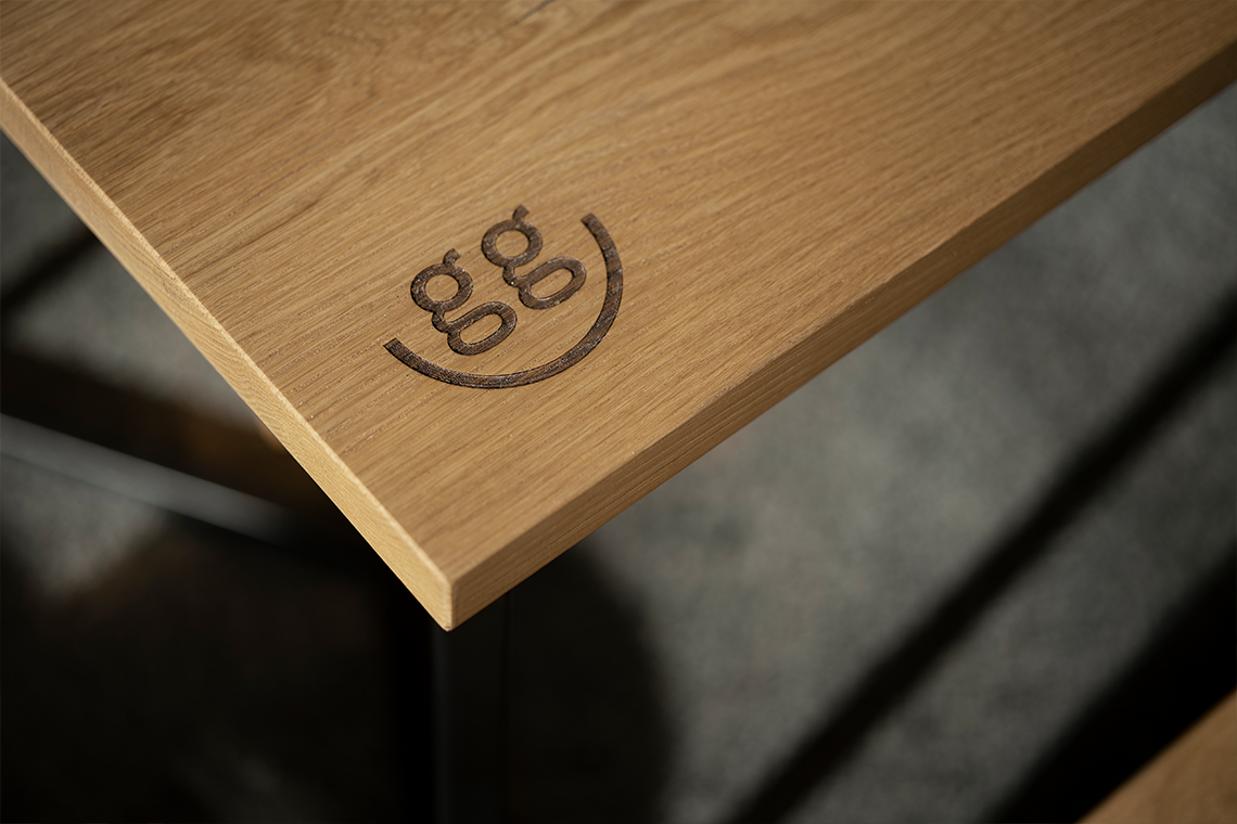
We also designed an icon complementing the brand identity through a friendly, fun and memorable element, inspired by the spirit of positivity and a smile, which also references the bowl, part of the brand's flagship product: salads.
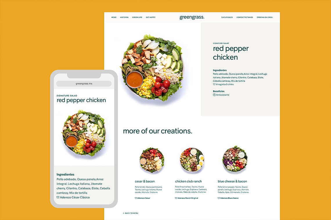
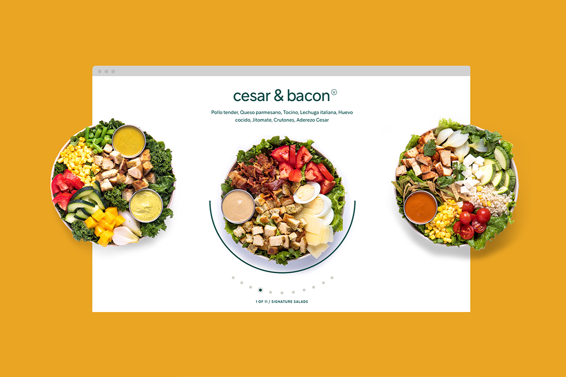
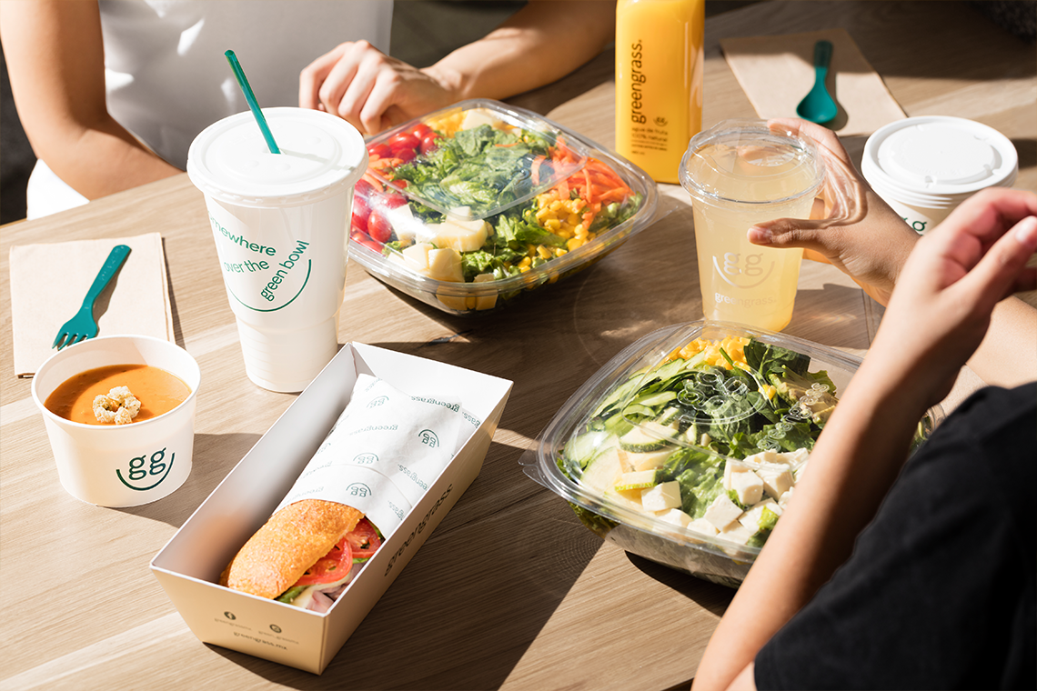
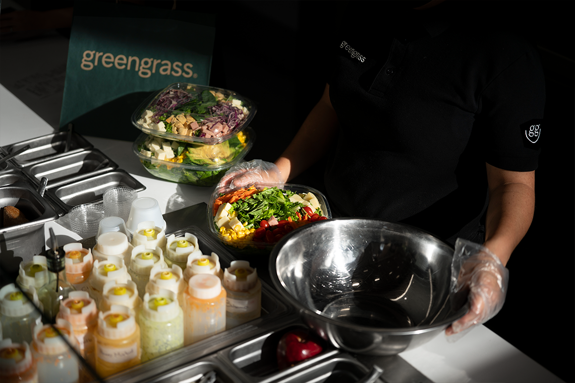
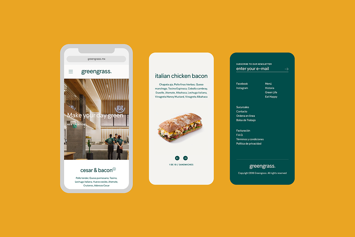
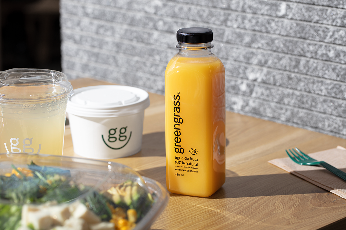
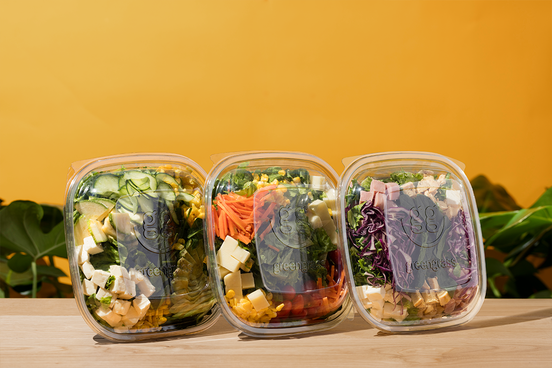
For the visual strategy we defined the brand system implementing behaviour that communicates the values, talks about the origin and history of the products, and about the quality of the ingredients. This system highlights the power of personalizing and assembling your own salad, communicating healthy food as an accessible, and unpretentious option — (A)
This system highlights the power of personalizing and assembling your own salad, communicating healthy food as an accessible, and unpretentious option.
