Bliss Health
BRANDING
The client
Bliss Health is a brand of all-natural cleansing and detoxifying juices that use only organic ingredients and are formulated in a custom step-by-step program for each individual customer.
keywords
Juices /Mexico /Branding /Packaging /Print design
the objective
Create a brand that shows purity and vitality, and help the consumer to easily follow their health program.
the solution
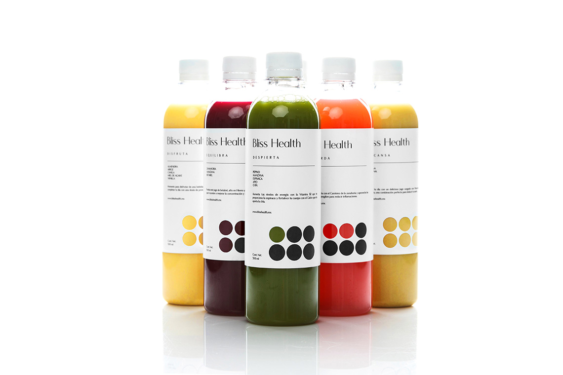
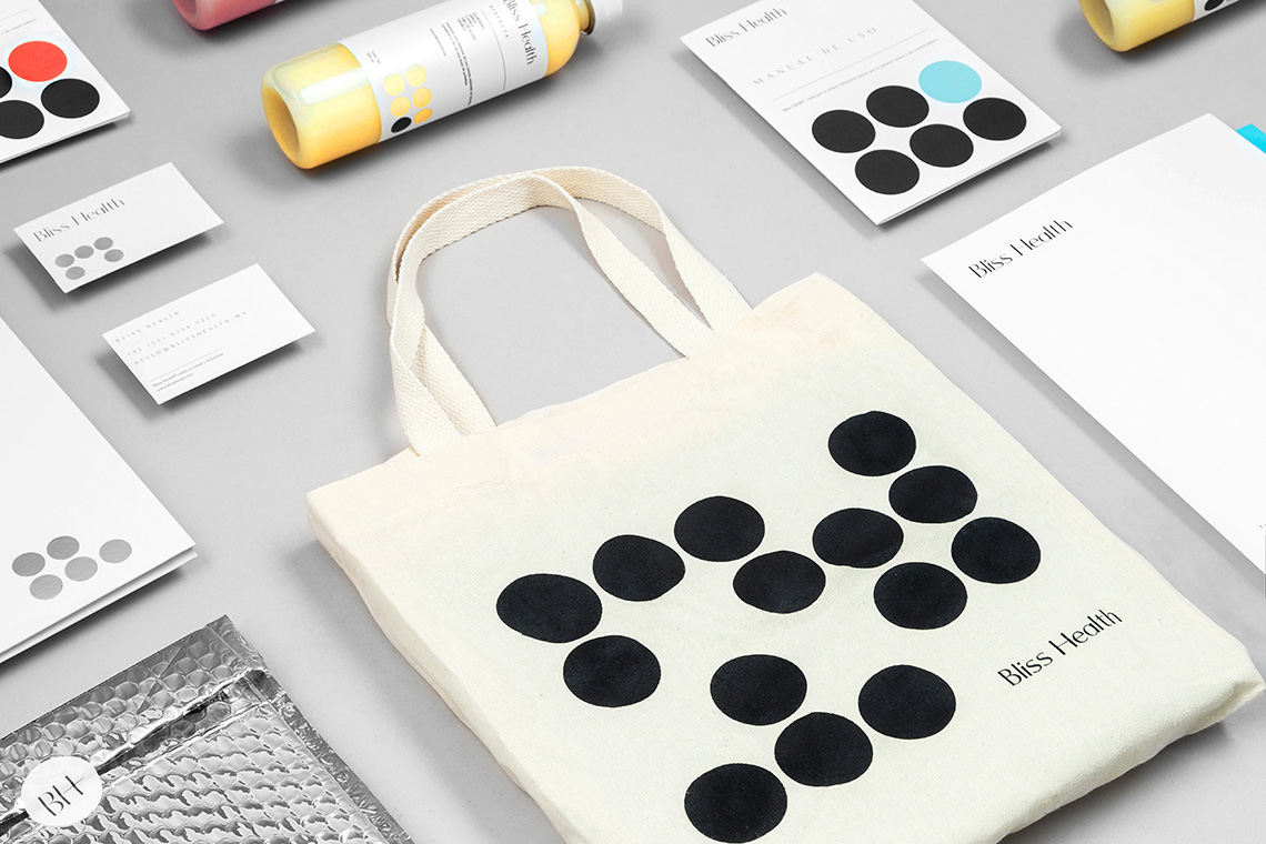
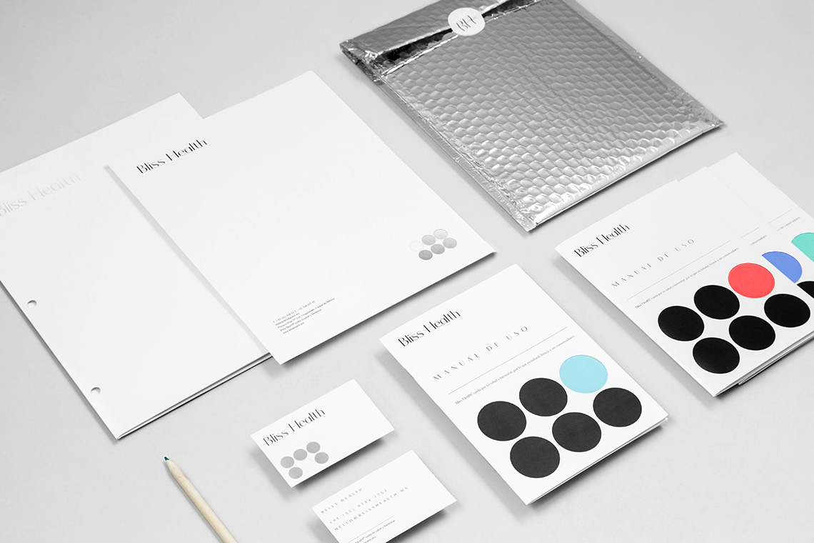
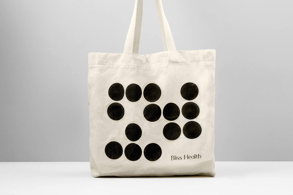
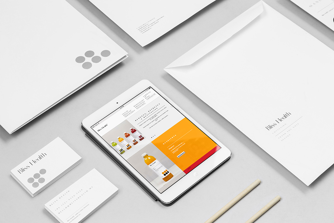
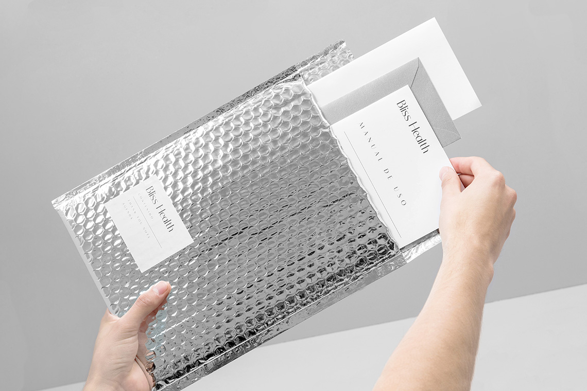
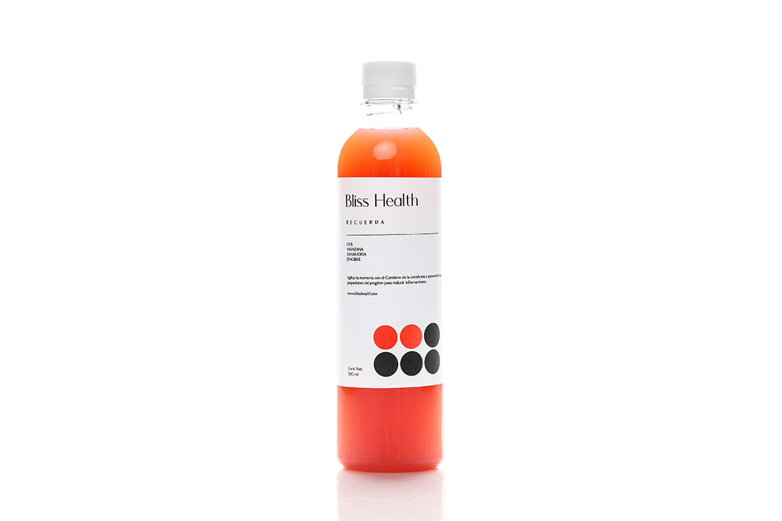
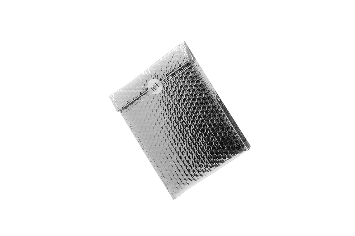
Our design proposal draws inspiration from vintage pharmaceutical labels, using a clear and simple visual language that allows the products' purity and vivid colors to stand out. The use of silver in the logo and packaging is a nod towards Bliss Health's method of cold pressing all of their juices, which is the best way to maintain all their ingredients and nutrients as intact and fresh as possible.
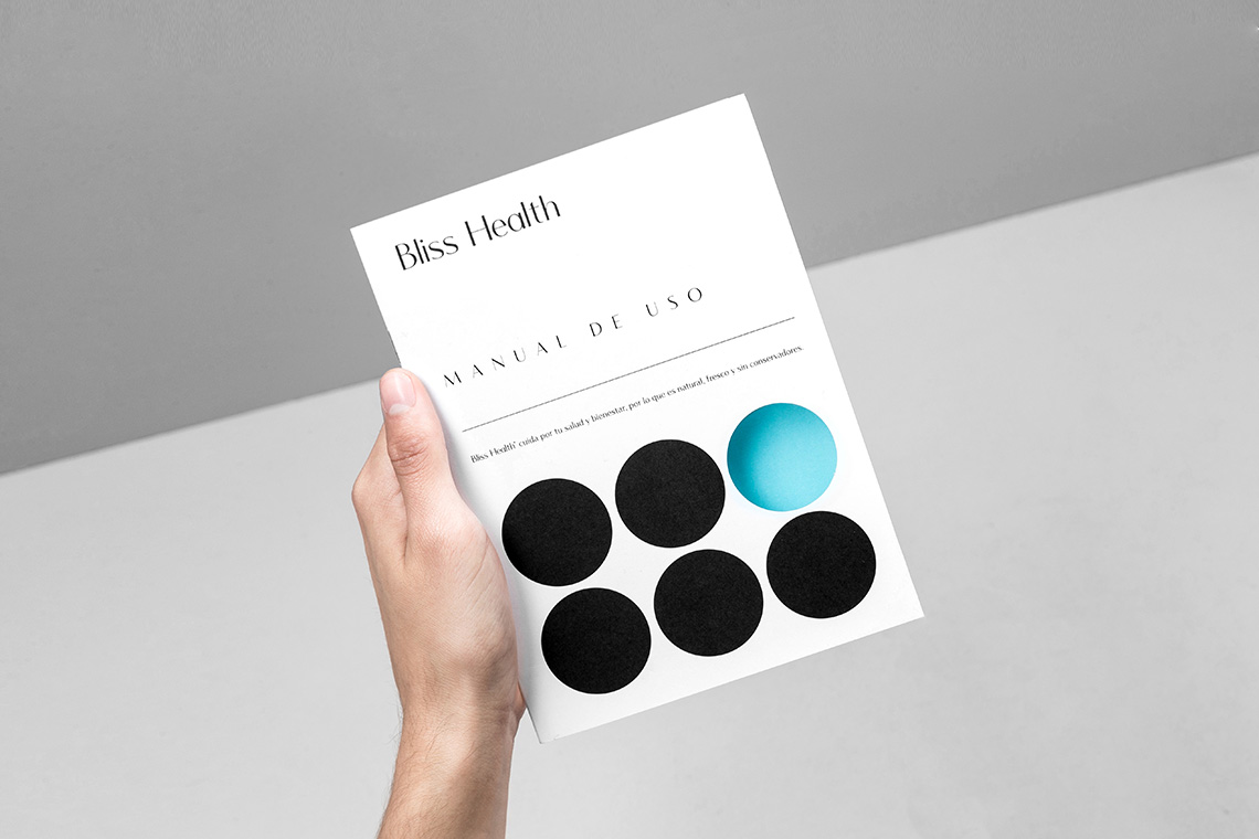
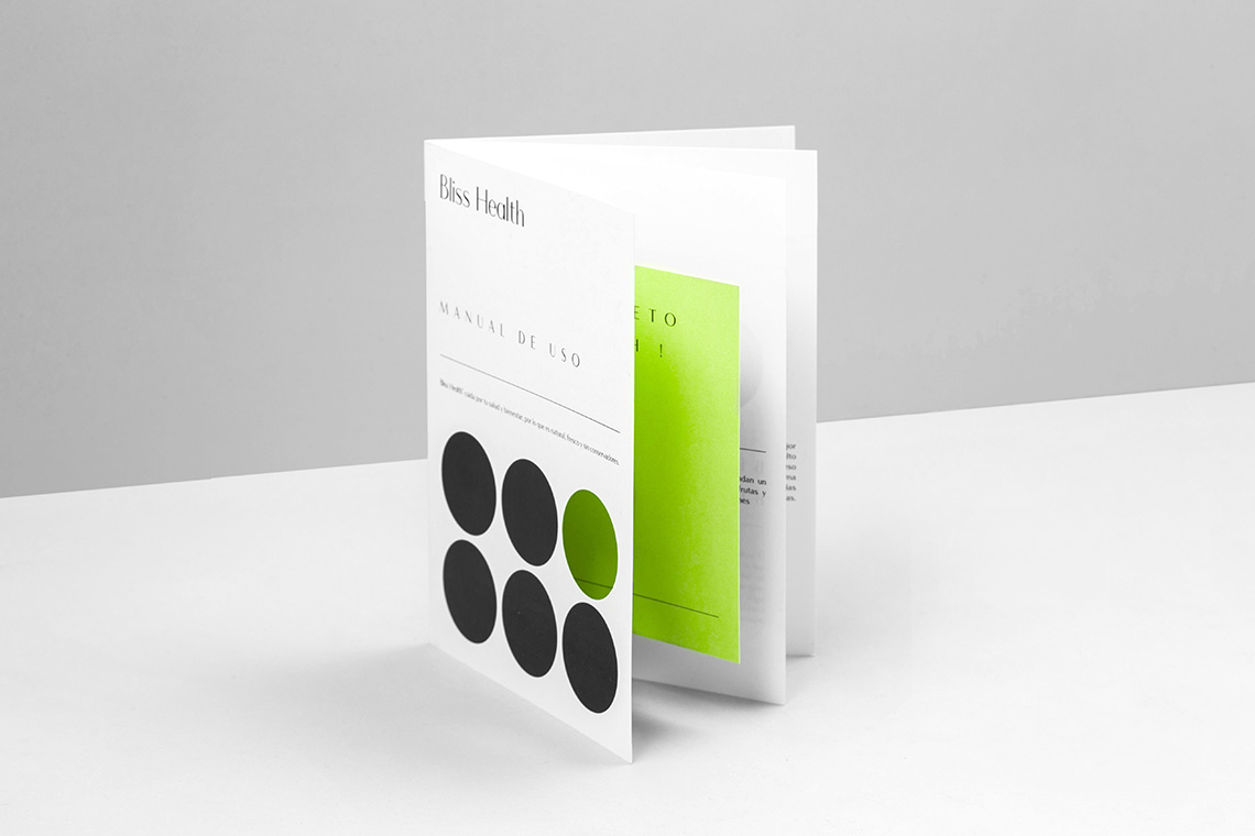
In order for the consumer to easily follow the step-by-step program, we designed a not only beautiful, but functional and very easy system using the brand's dots as numerical visual references. For example, the first bottle in the program is missing one black dot, the second is missing two, the third is missing three, and so on. This way, the customer can easily keep track of his custom detoxifying program thanks to the lively appearance of the juice's colors in the label. — (A)
Inspiration from vintage pharmaceutical labels and a clear and simple visual language
