Boom Bowl
BRANDING
The client
Boom Bowl is a Poke take-out restaurant with a friendly personality.
keywords
Poke/ Take-out/ Restaurant/ Typography/ Icon
the objective
Design a brand differentiating itself from competitors through its attractive and friendly personality.
the solution
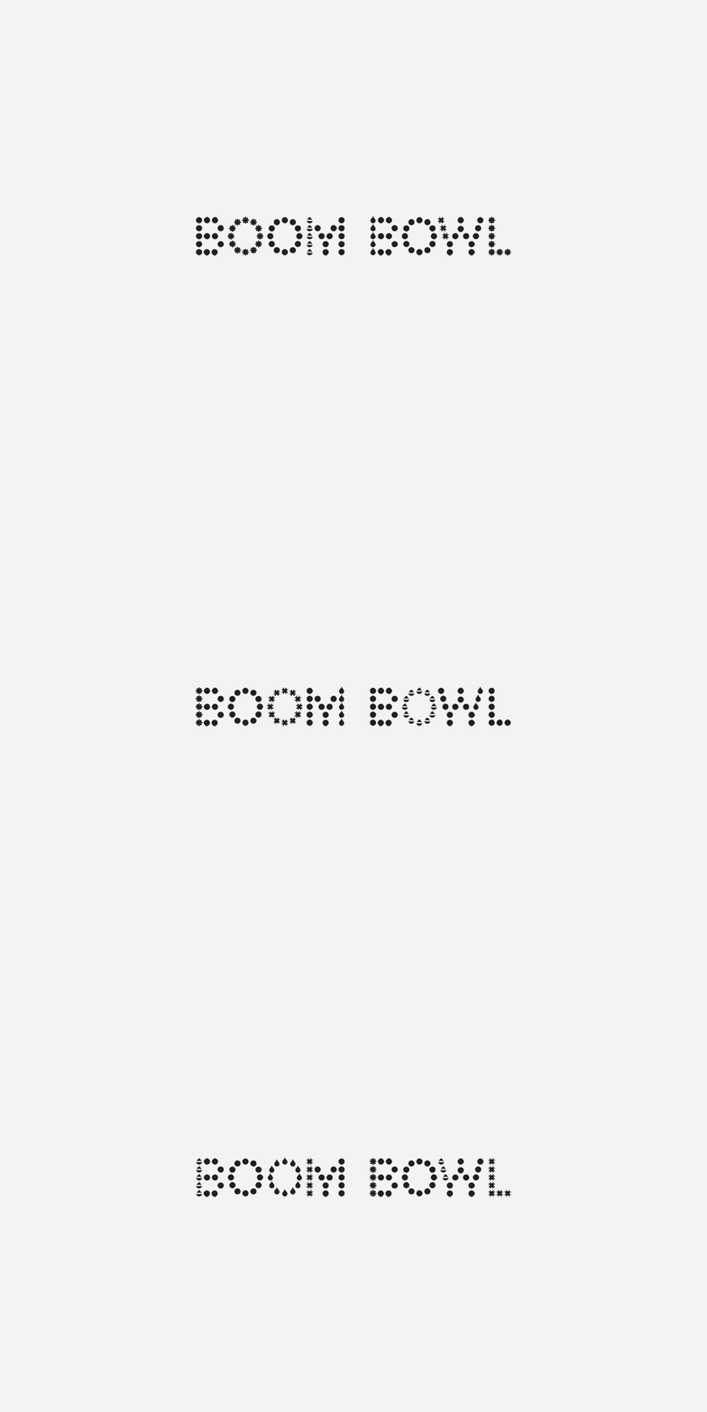
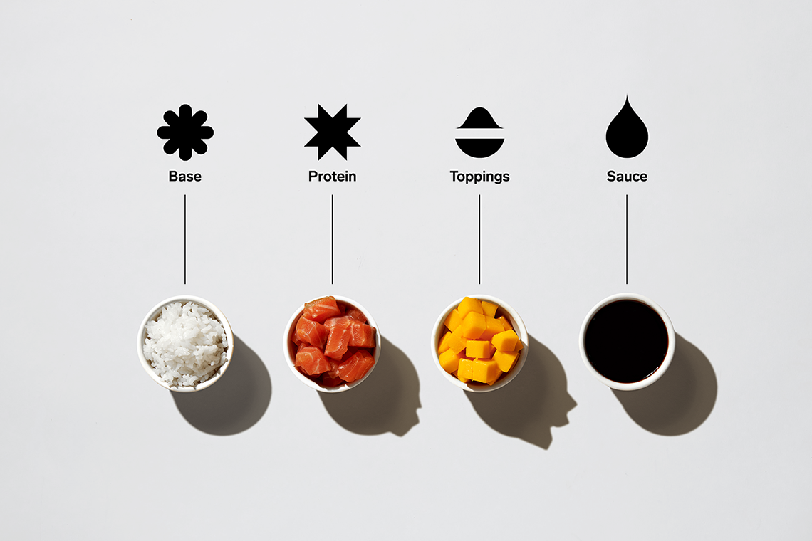
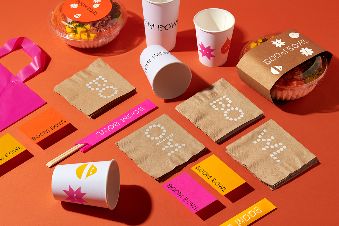
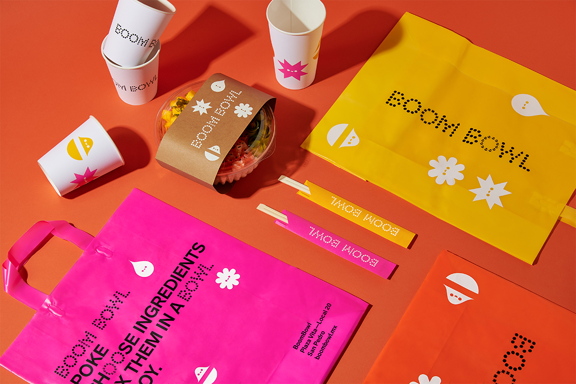
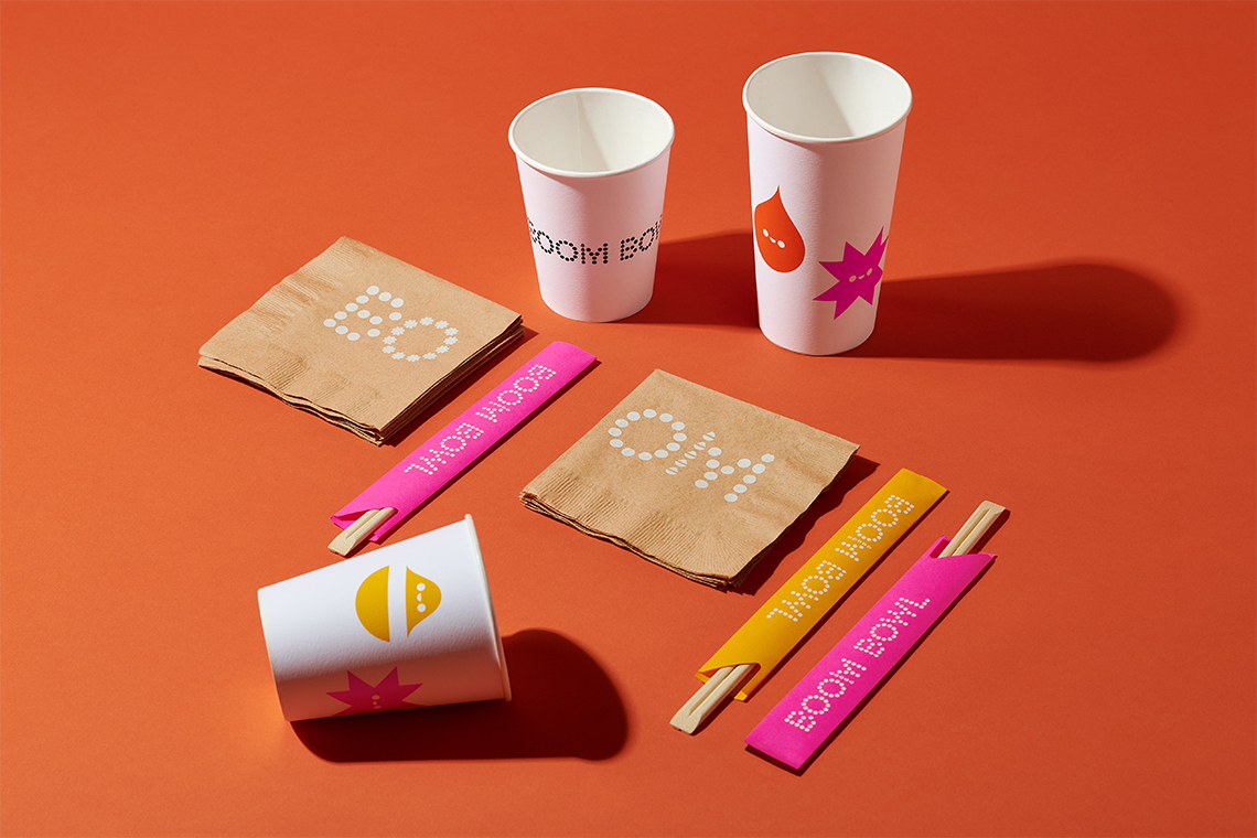
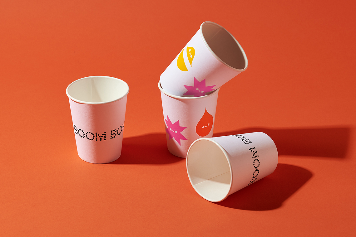
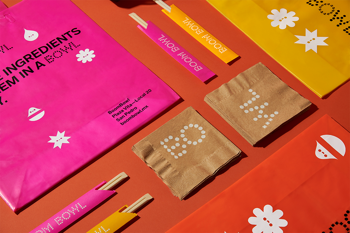
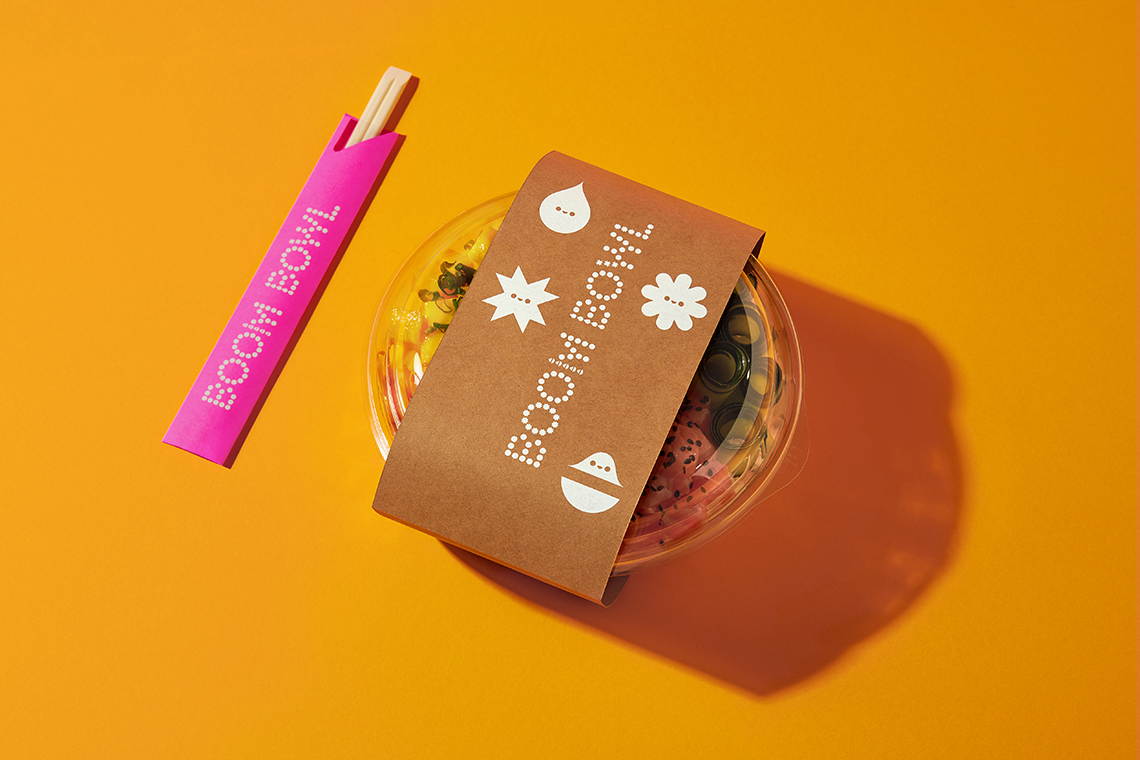
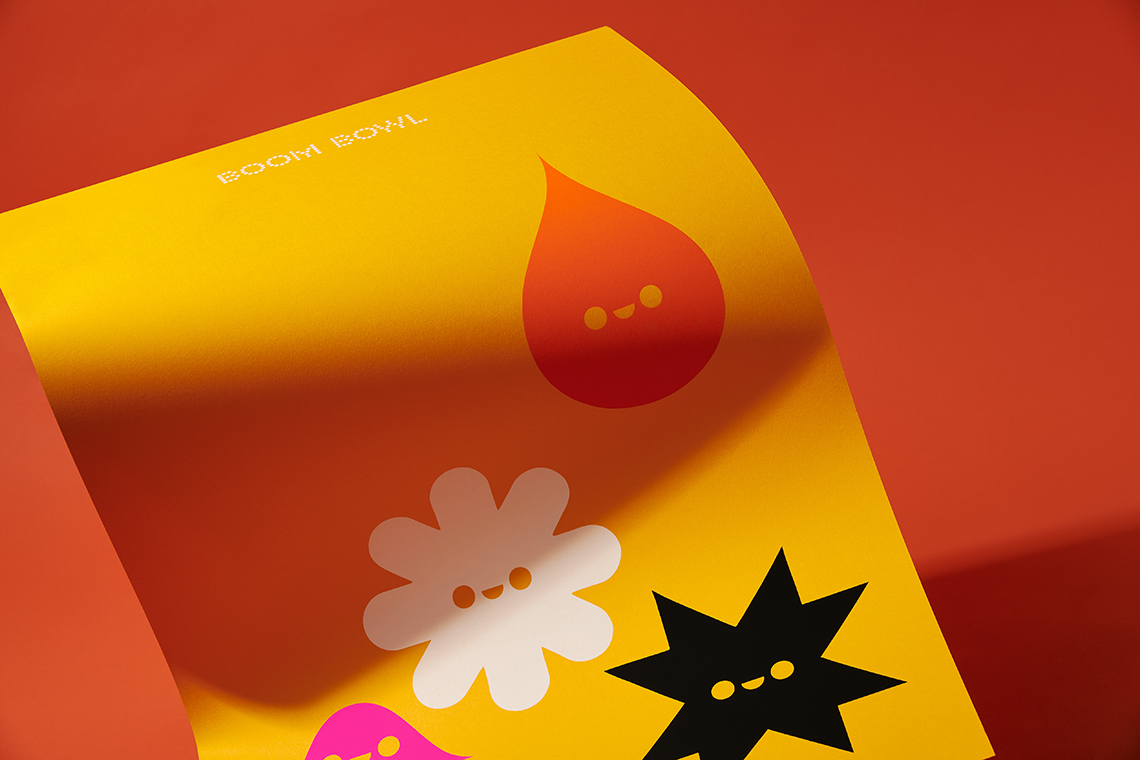
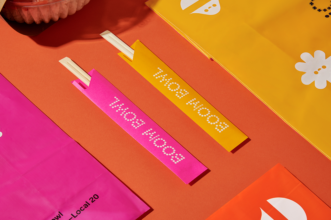
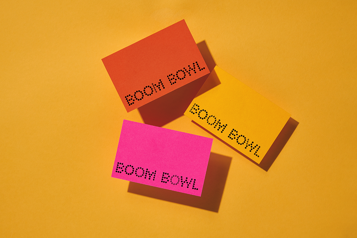
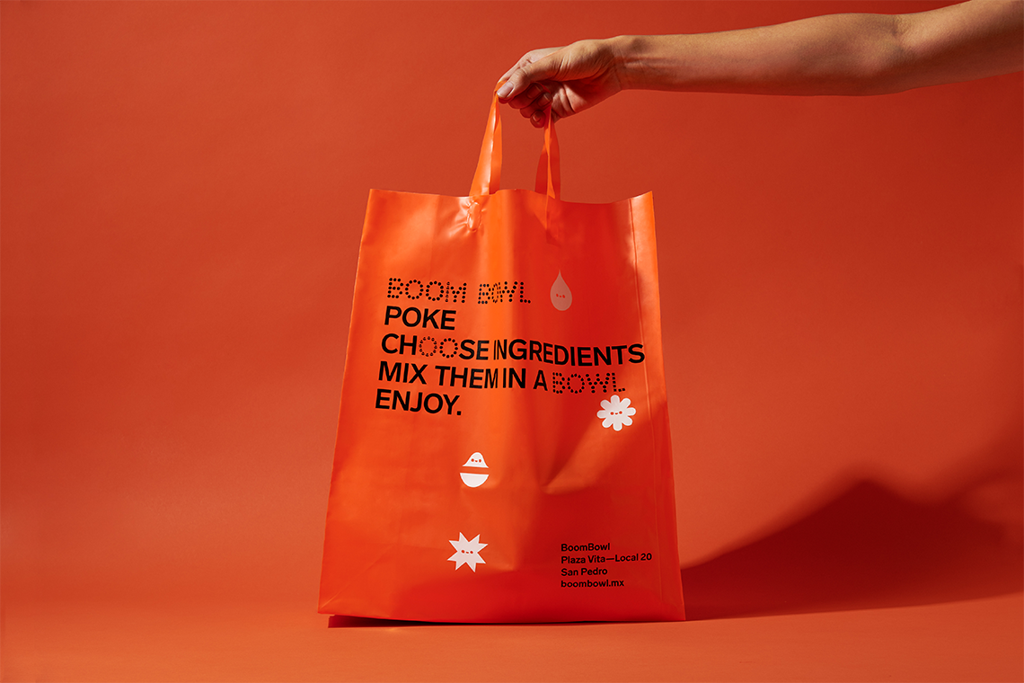
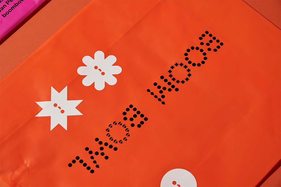
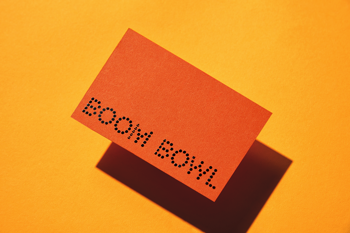
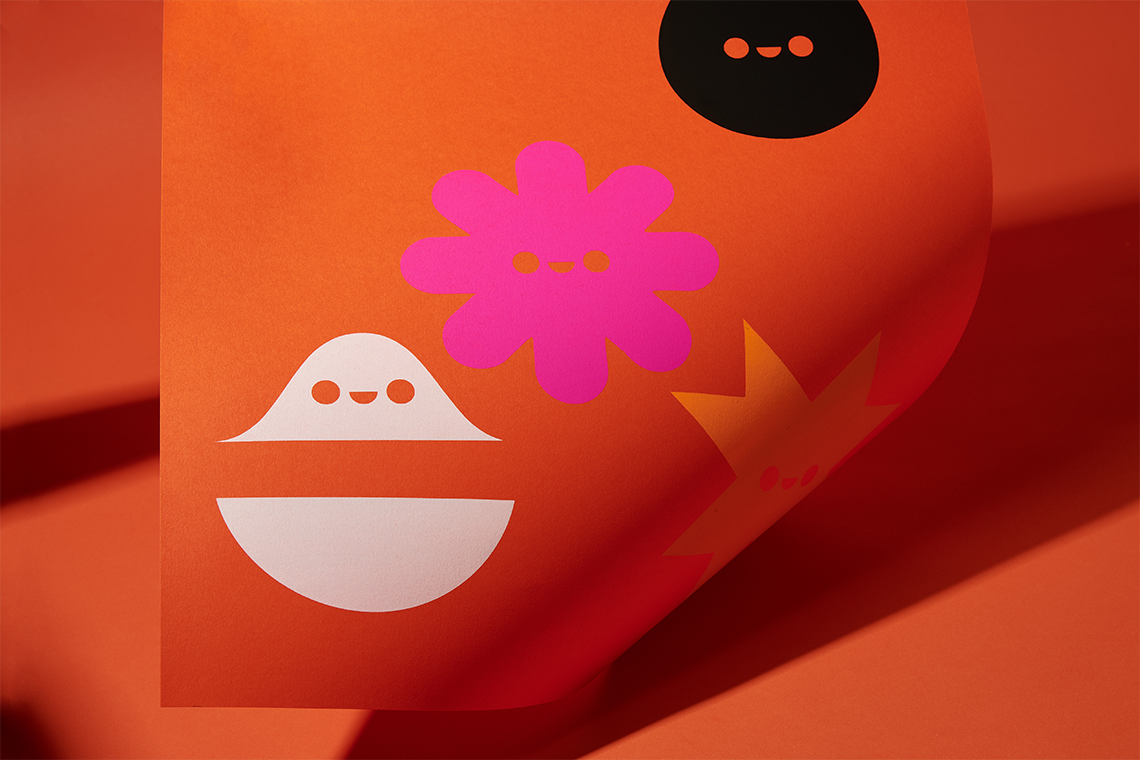
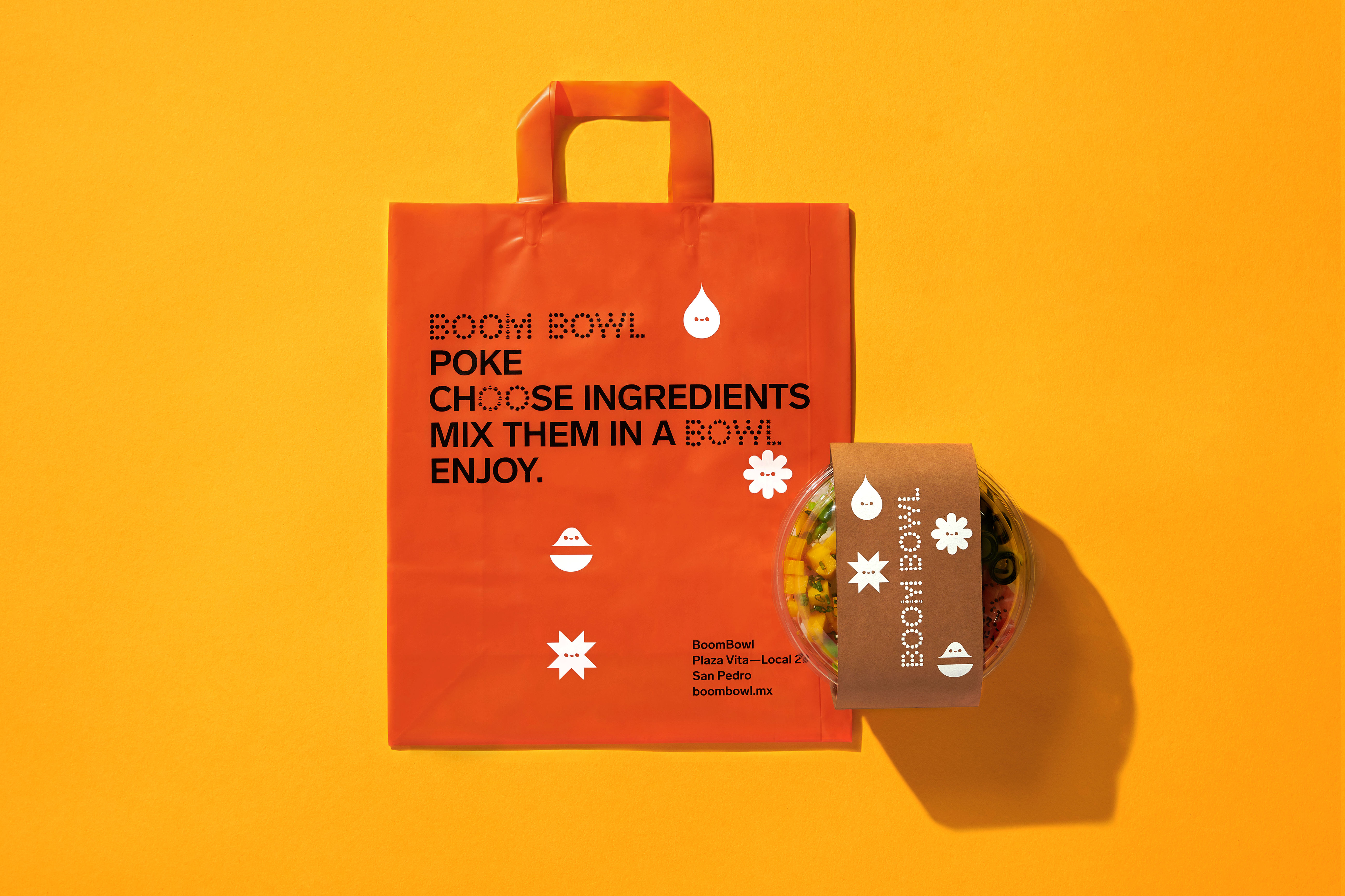
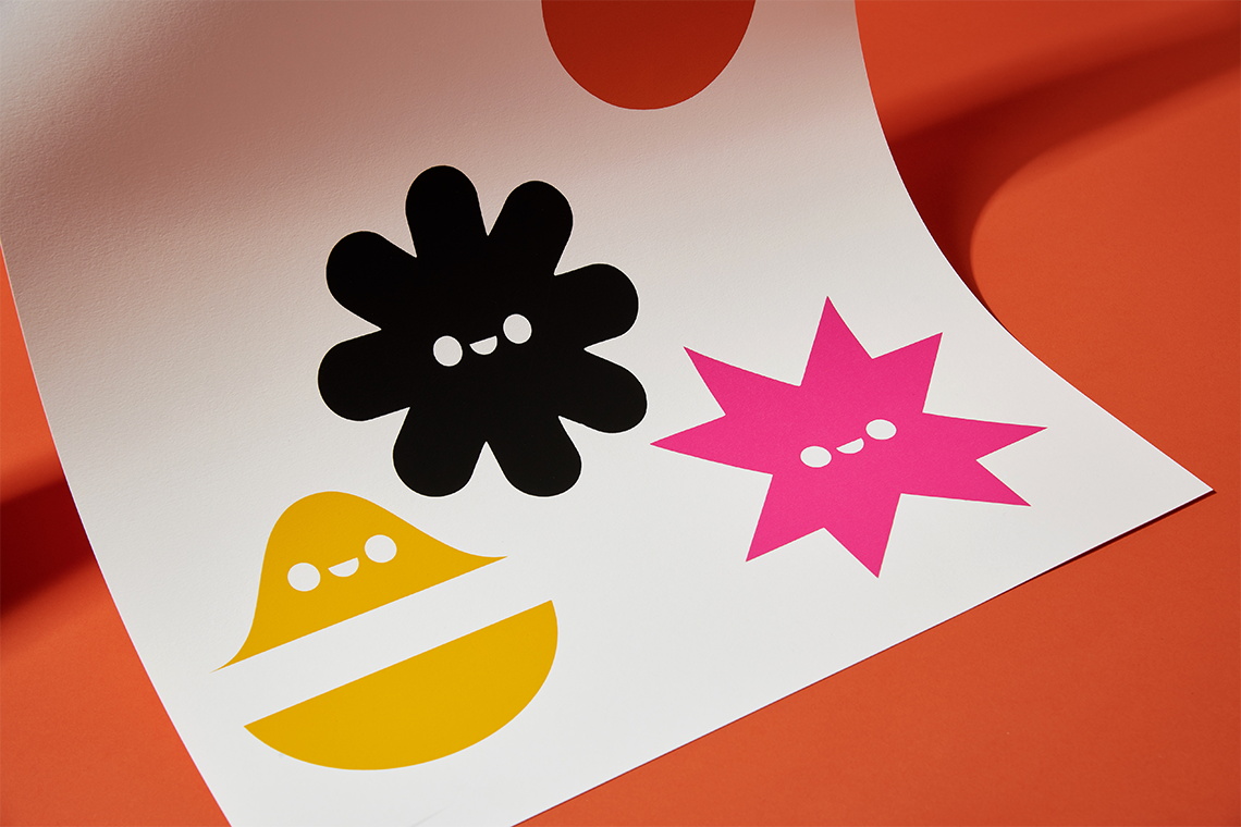
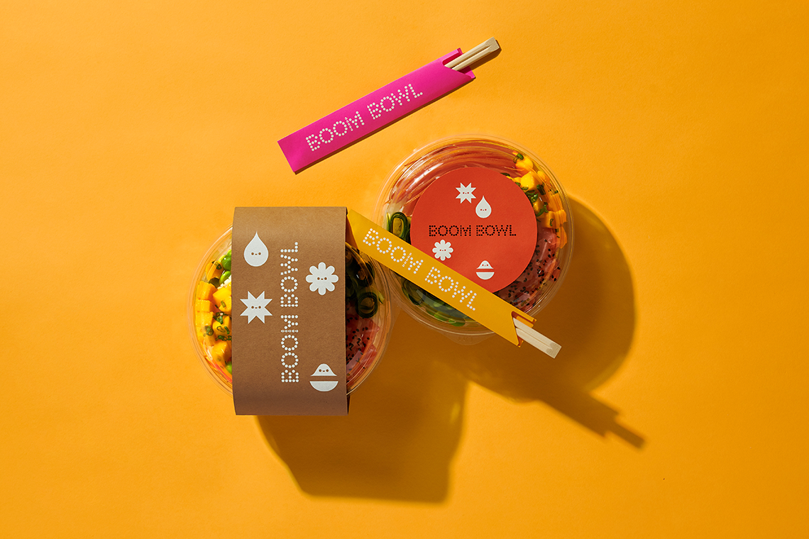
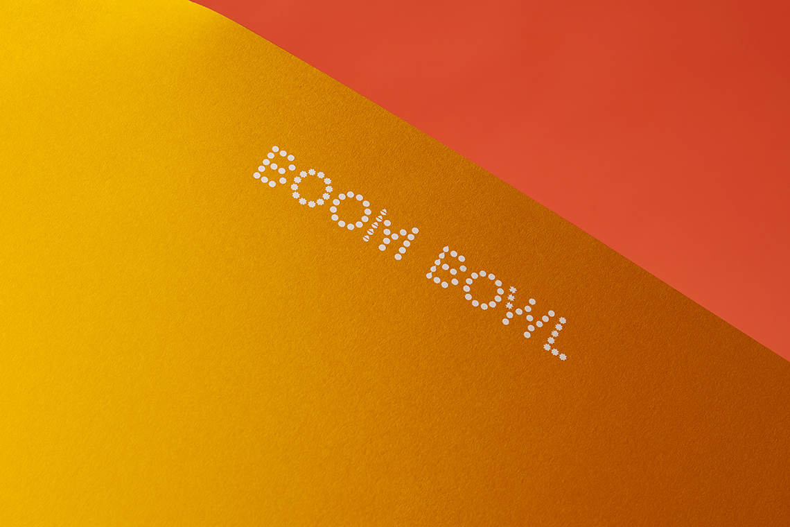
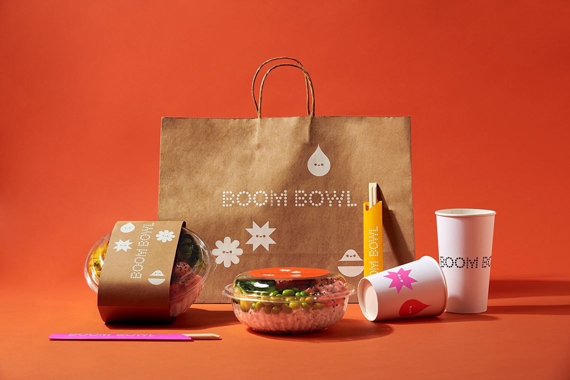
The identity for this project is based on the visual representation of the ingredient-mixing culture, hand in hand with the practicality and personalization of the poke. We created a dynamic typography based on Lab Grotesque by Letters From Sweden with a point based system including four icons working individually and representing the components that constitute the dish: base, protein, toppings, and dressings. The icons' face elements were designed to match with the typographic dot system. The resulting logo generates variants claiming advantage of its typographic versatility. — (A)
Creamos una tipografía dinámica basada en Lab Grotesque de Letters From Sweden con un sistema basado en puntos que incluye cuatro iconos funcionando individualmente y representando los componentes que conforman al platillo: base, proteína, toppings, y ade
