ANTIFINE DINING
BRANDING
The client
Anti Fine Dining is a restaurant located in Mexico City offering contemporary food and a jovial experience to its consumers. Its concept plays the role of a fine dining place, leaving aside false splendor and etiquette, showing its strengths and weaknesses in an authentic way.
keywords
Branding / Restaurant / Packaging / Mexico / Modern
the objective
Design the brand identity of this new restaurant with an innovative and modern concept. Visually communicate the main message: fine dining with a chaotic and real touch, where customers feel attracted by the brand’s personality.
the solution
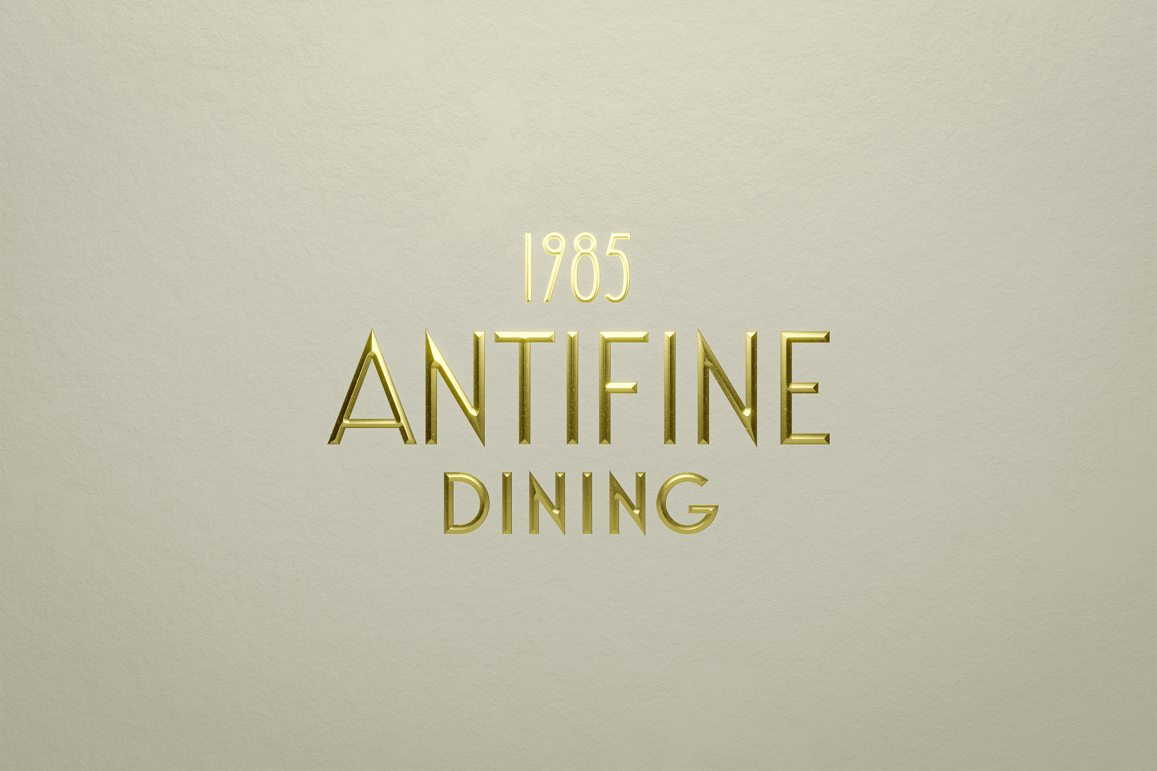
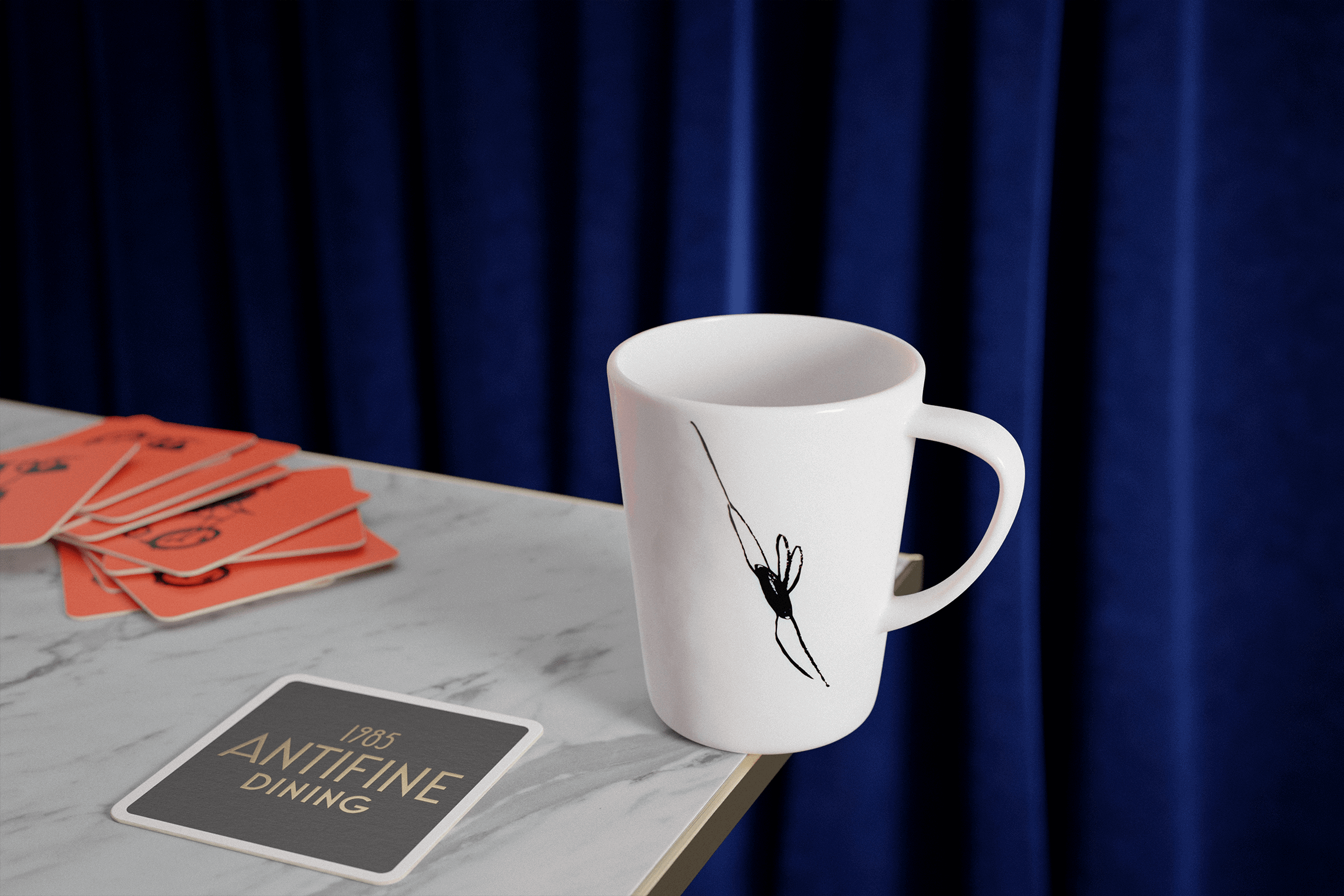
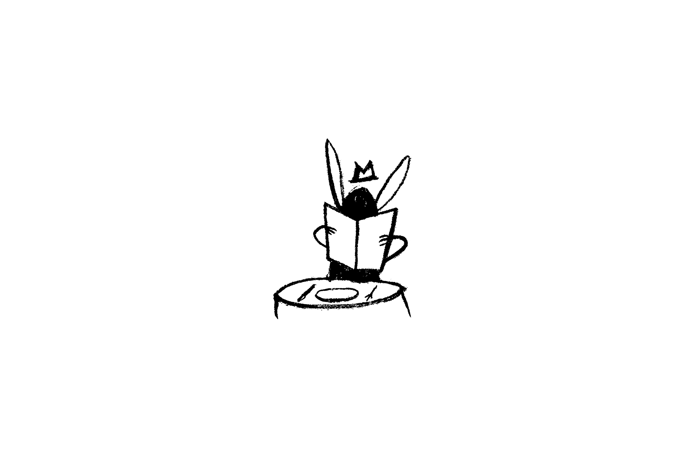
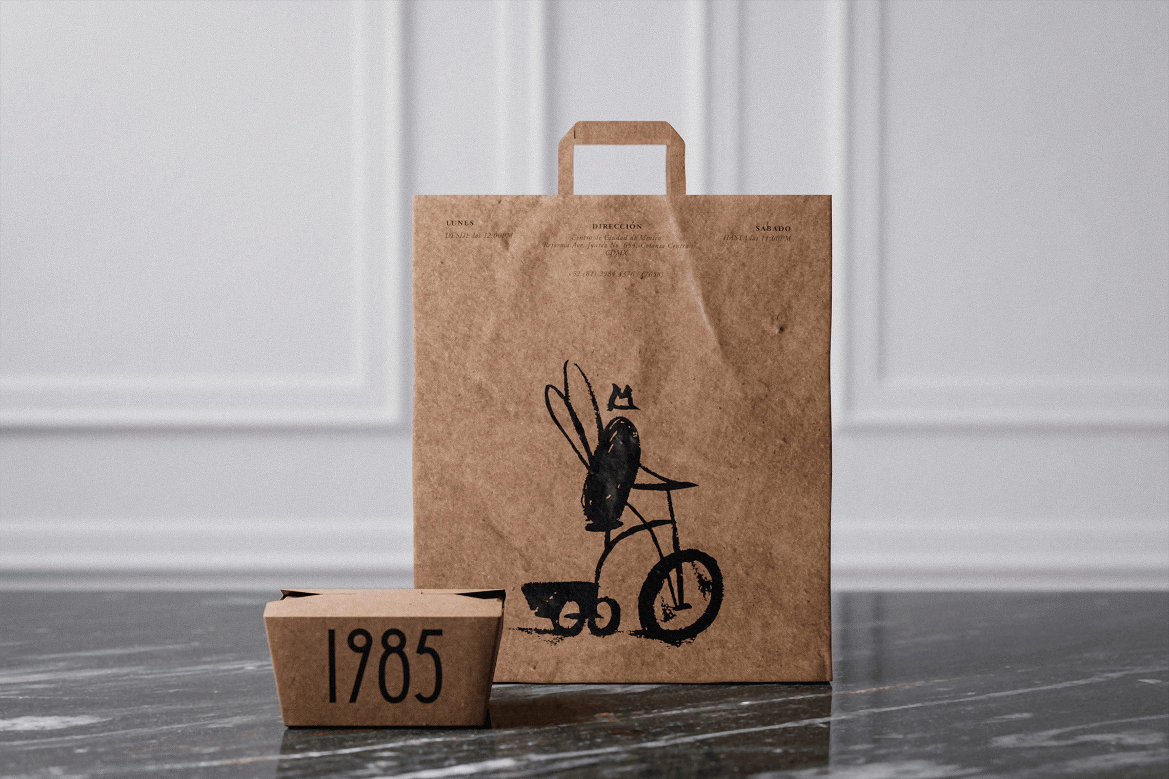
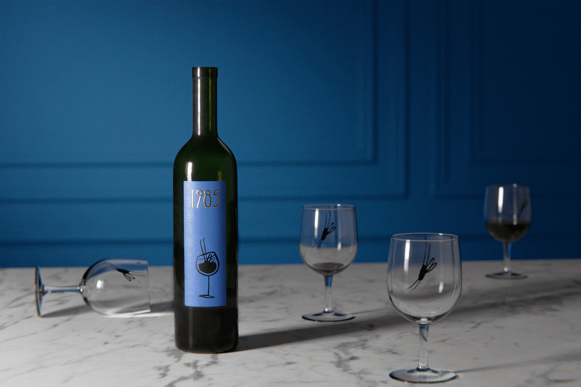
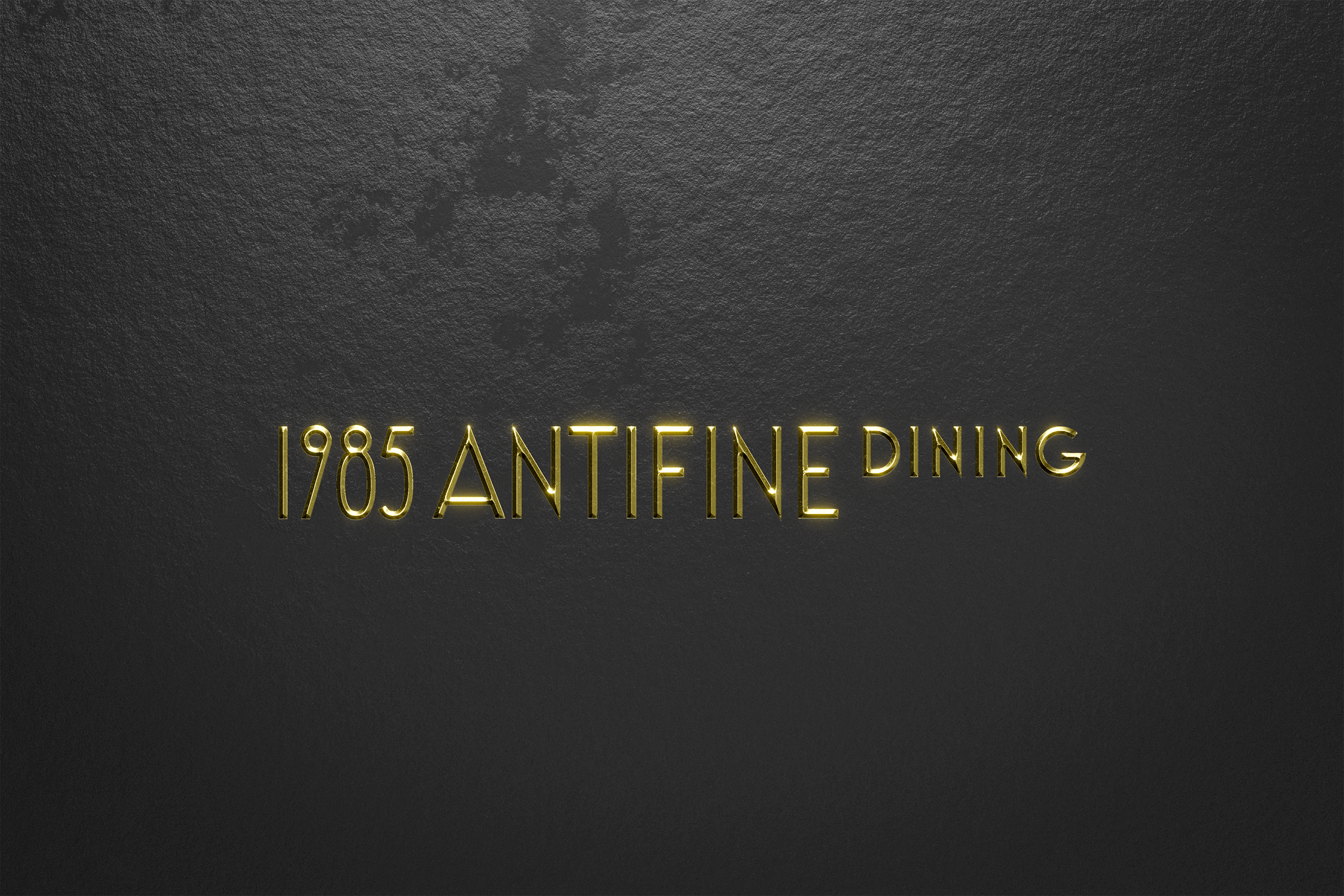
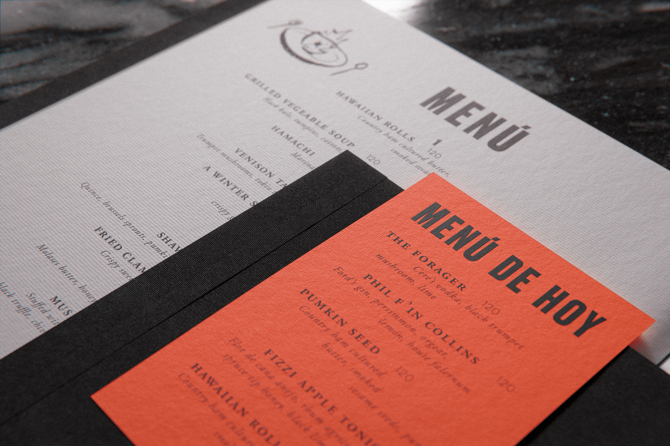
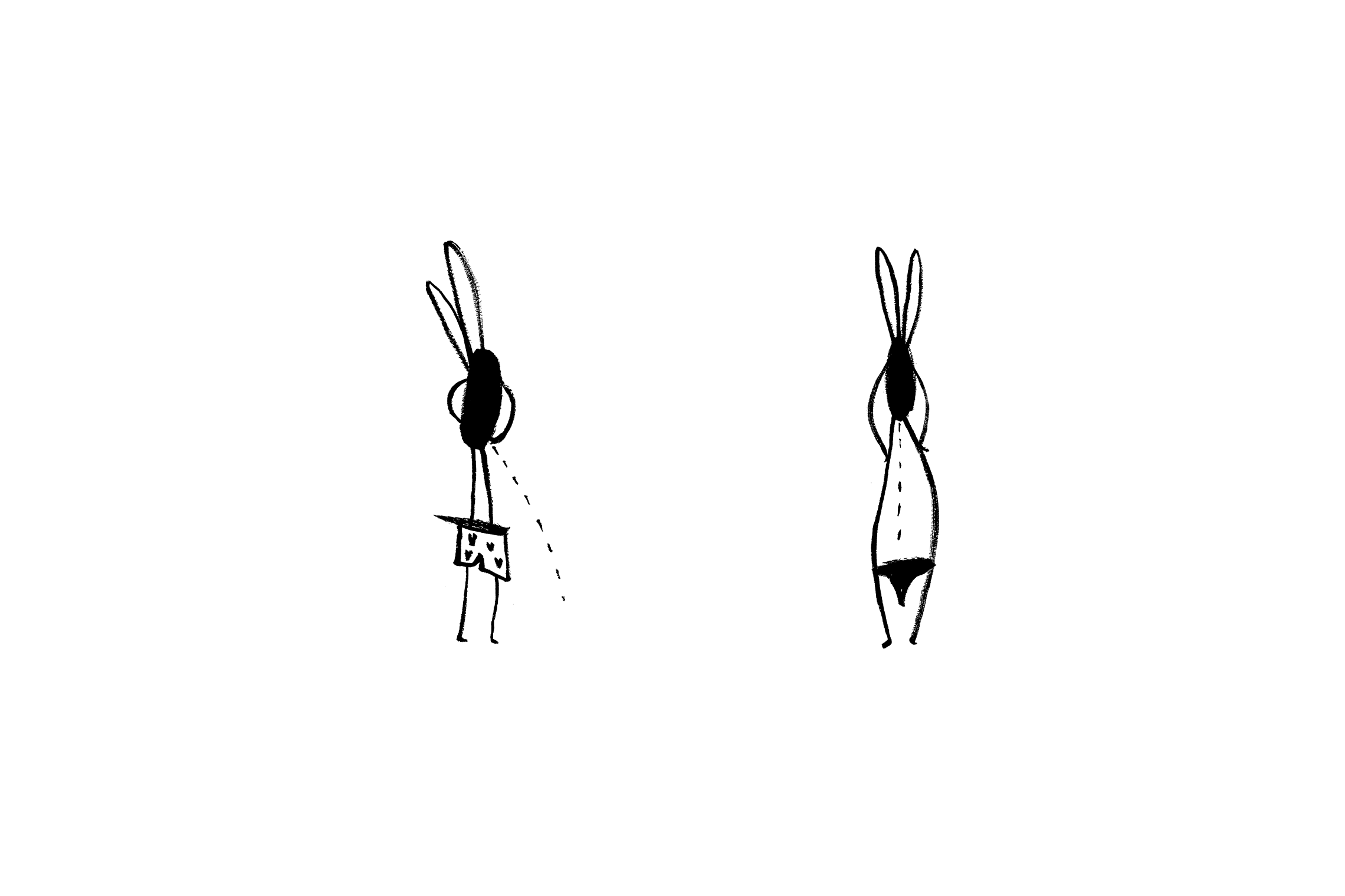
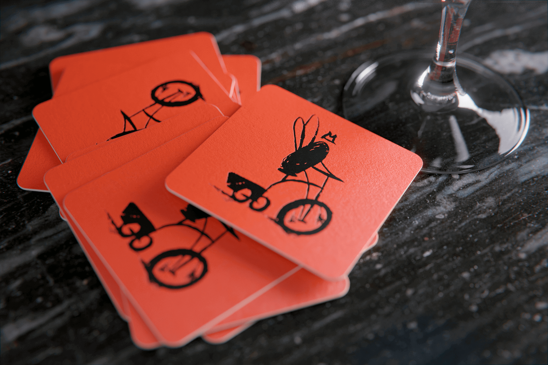
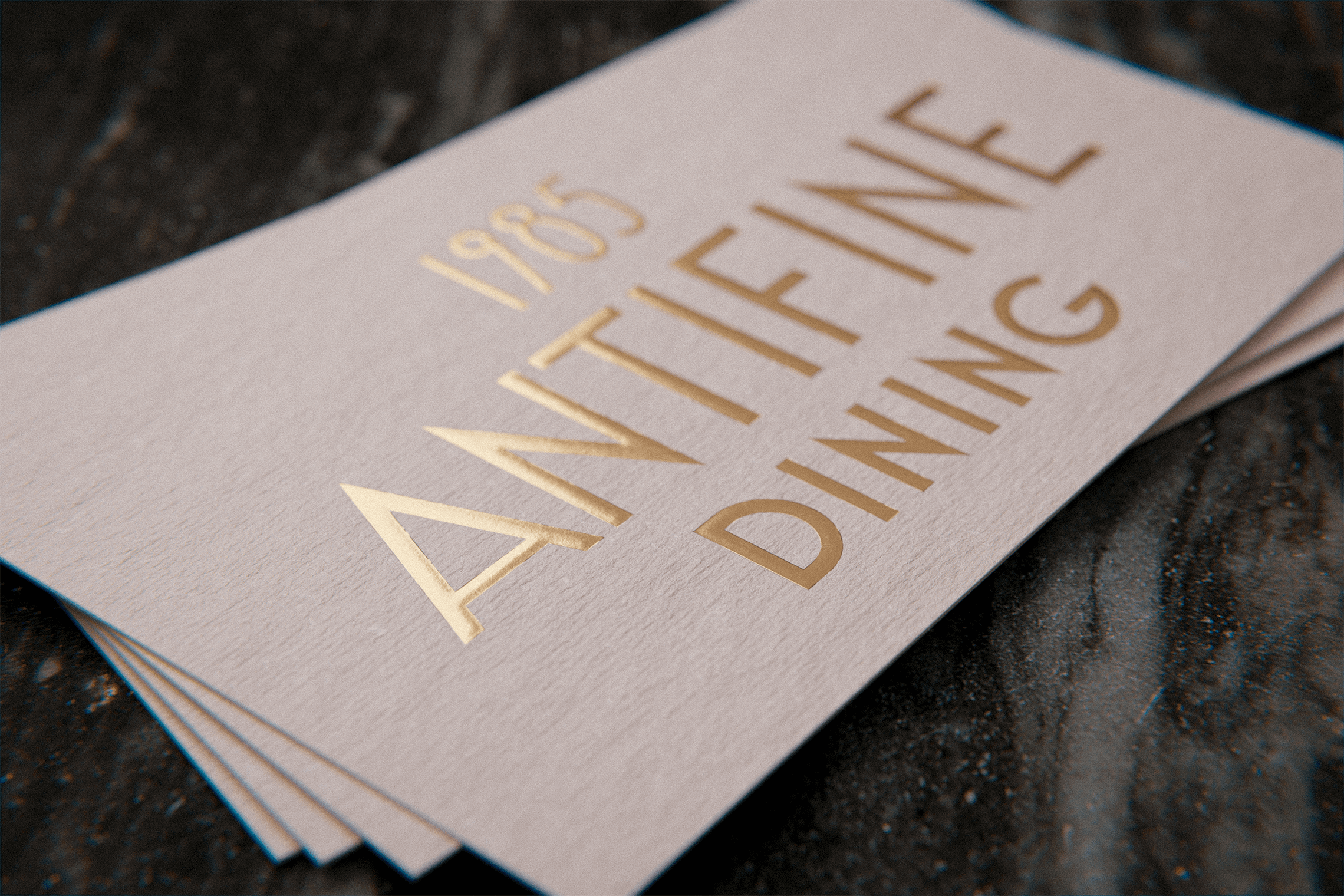
The inspiration for Anti Fine Dining comes from a series of experiences and self-knowledge of the founding chef. An art deco typeface with a classic style was employed, conveying the elegance that fine dining represents. Orange colored accents communicating the joy and chaos that comes with the act of eating were added to the identity. The fly-shaped character design shows an unexpected twist on the project’s image by adding an element of self-mockery. — (A)
