Jim Jams
ARCHITECTURE
The client
JimJams is a brand paying tribute to sports fans. It specializes in garments with designs including sports personalities and recent events in the sports industry.
keywords
Fashion/ Sports/ Branding/ Graphic Design/ Web Design/ UX/ UI/ Architecture/ Interior design
the objective
The interior design project's objective consisted in finding the balance between a functional sales space and one responding to the project's sports-inspired concept.
the solution
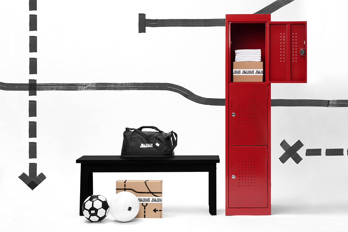
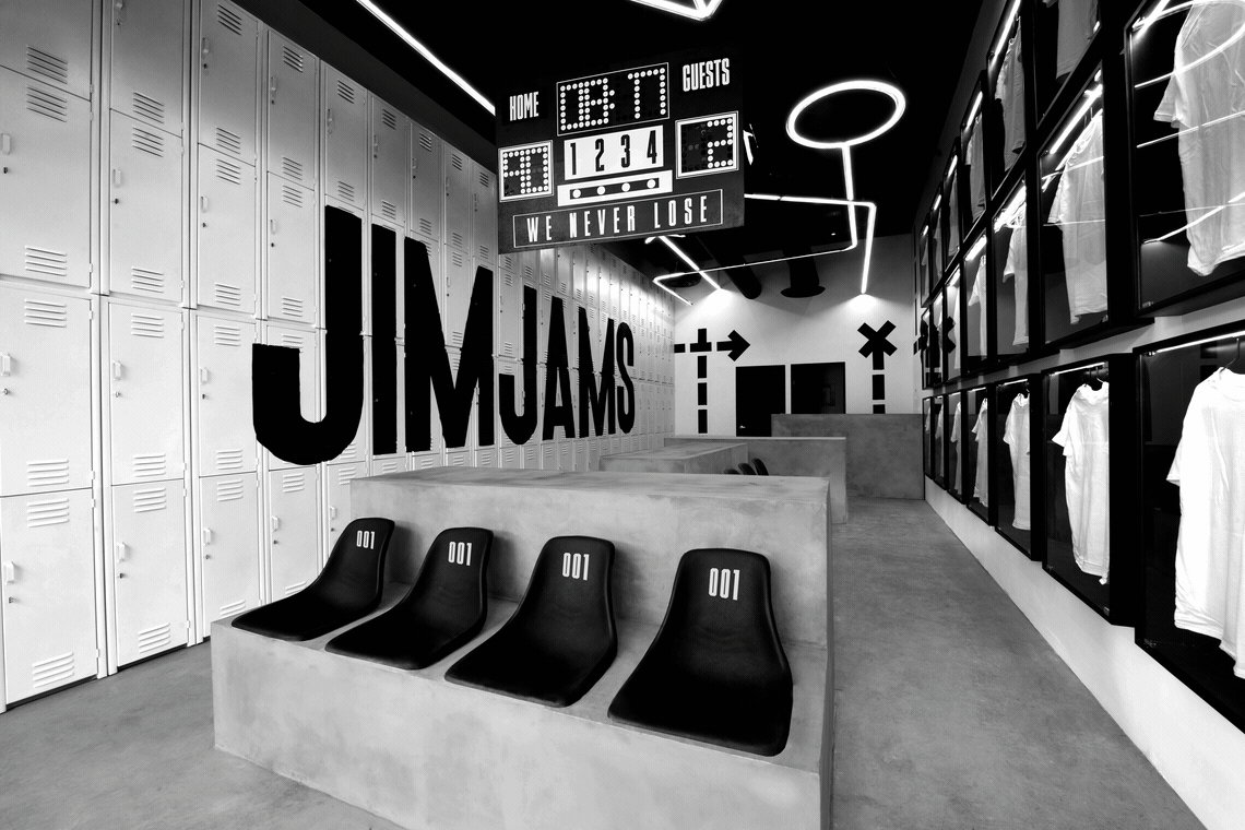
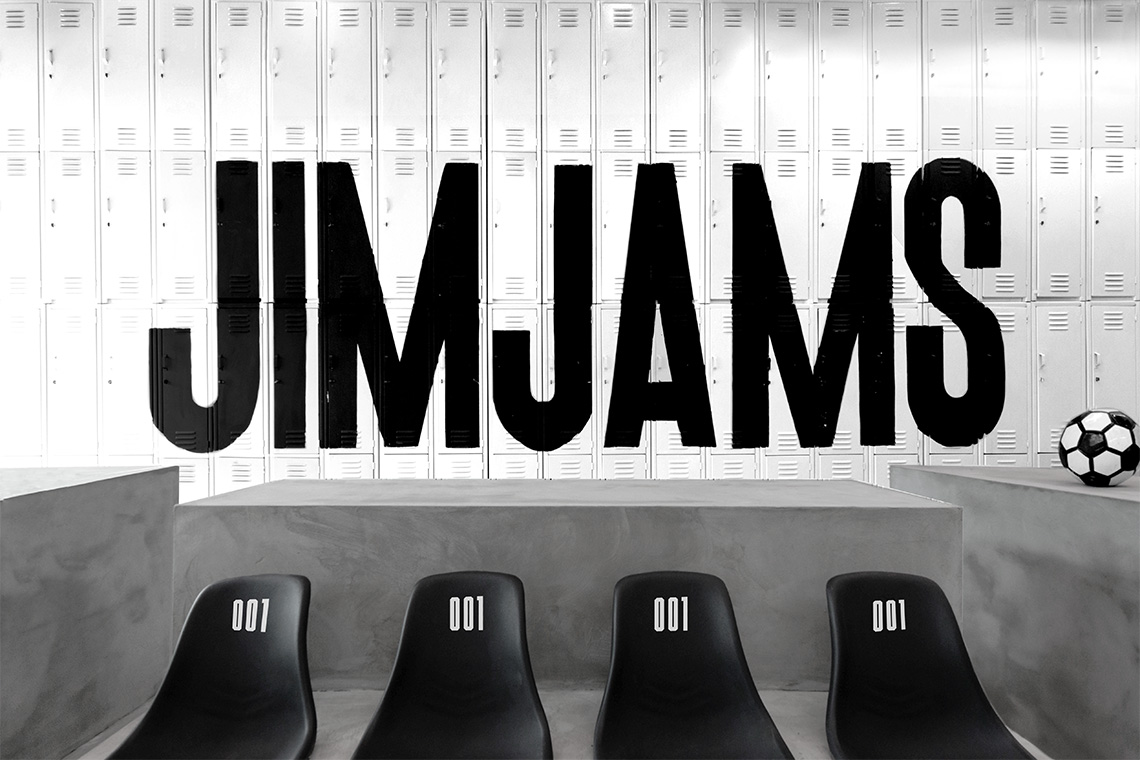
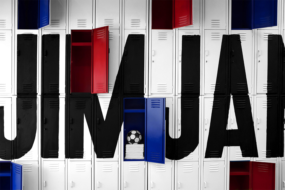
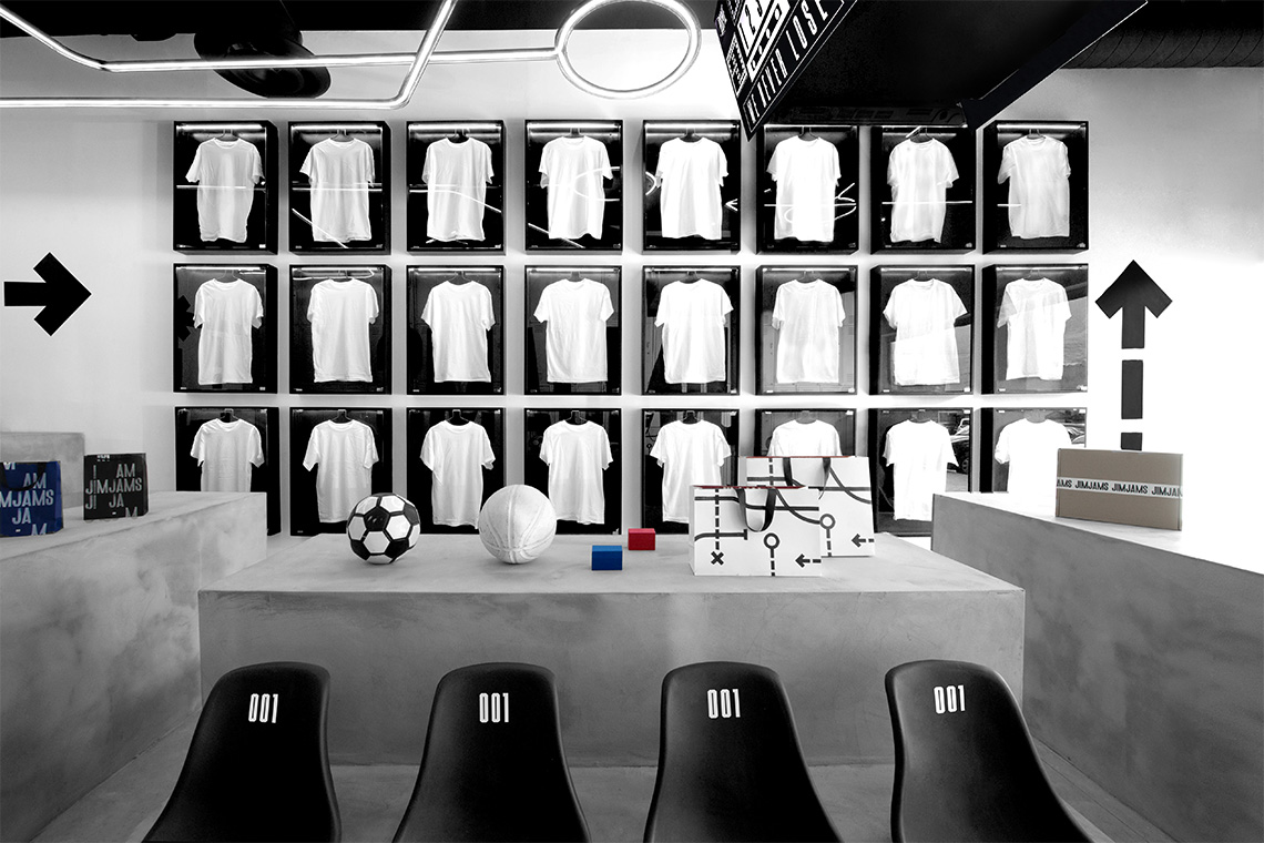
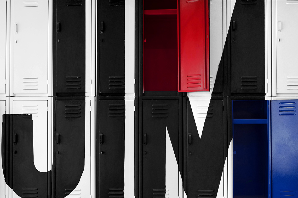
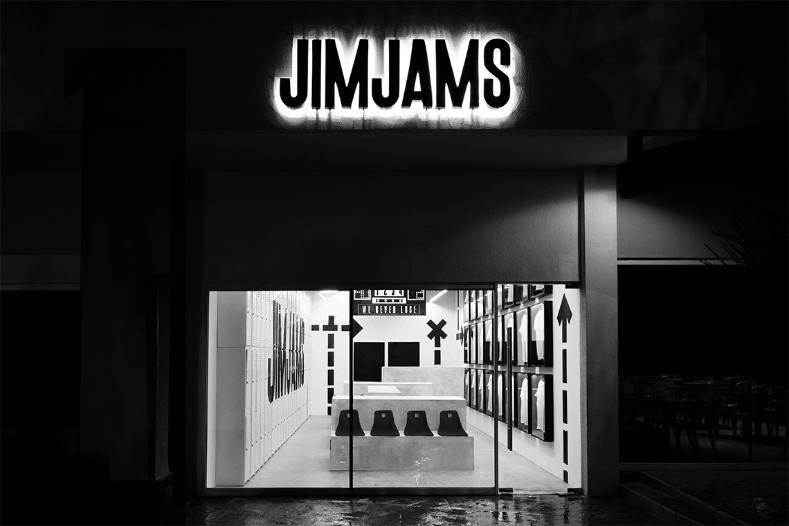
Our team integrated two main components: lockers and stadium seats. The lockers, a recurring element in almost all sports, organize and store the products, claiming advantage of the store's reduced space. The seats acknowledge the ones found in sports stadiums functioning as a waiting area for customers. JimJams garments are displayed in glass cases referencing collectible sport items within the store space.
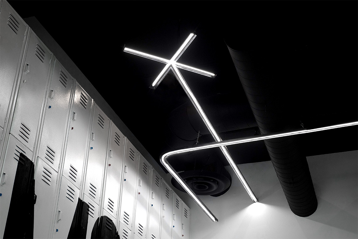
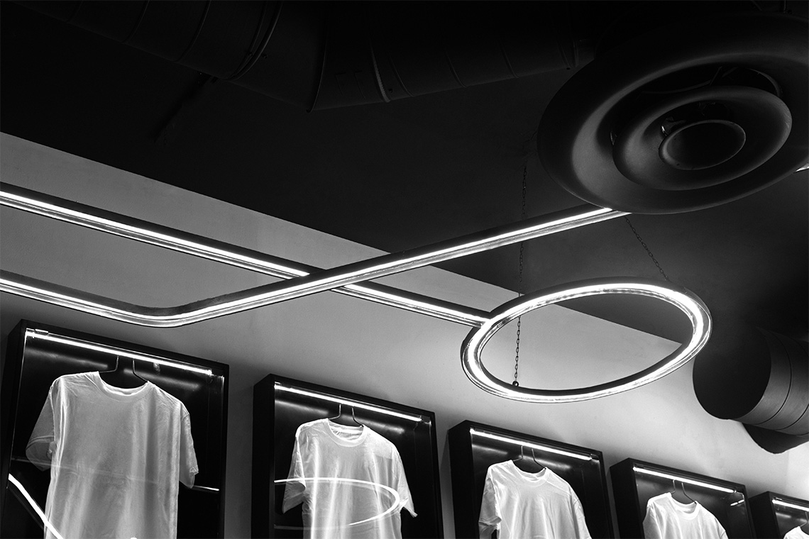
The logo is displayed on the lockers as part of the brand's deployment in the physical space. The brand pattern, referencing strategic play slates employed by coaches, was interpreted and converted into a luminaire on store ceiling. — (A)
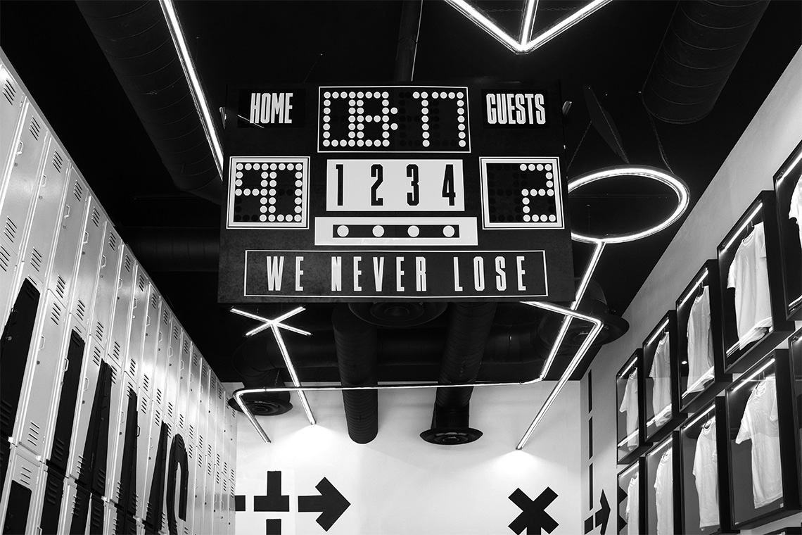
Our team integrated two main components: lockers and stadium seats.
Jim Jams
Interactive
the objective
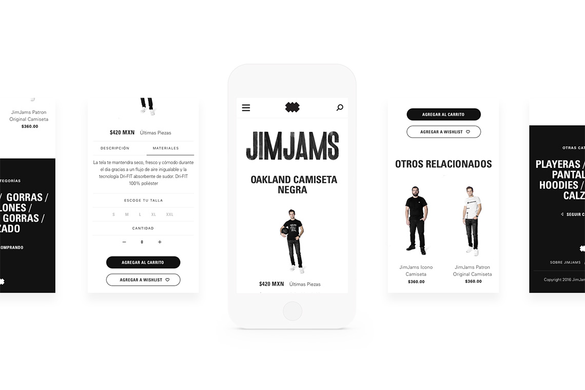
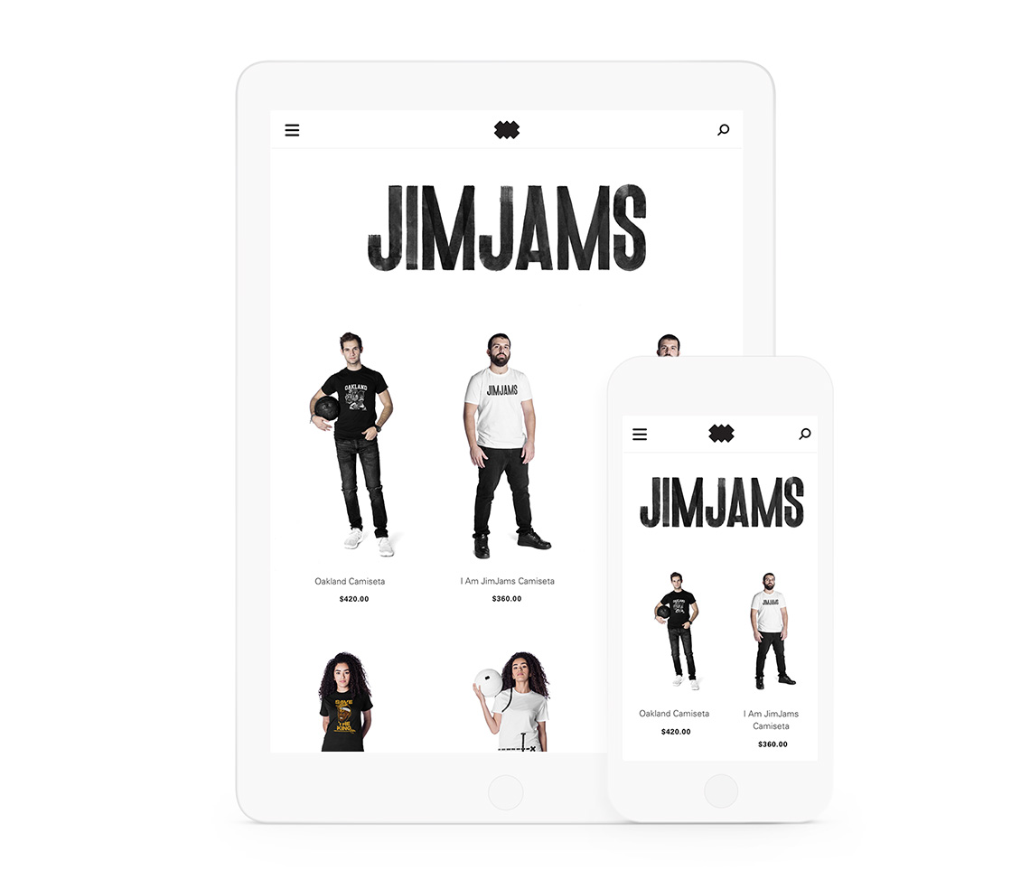
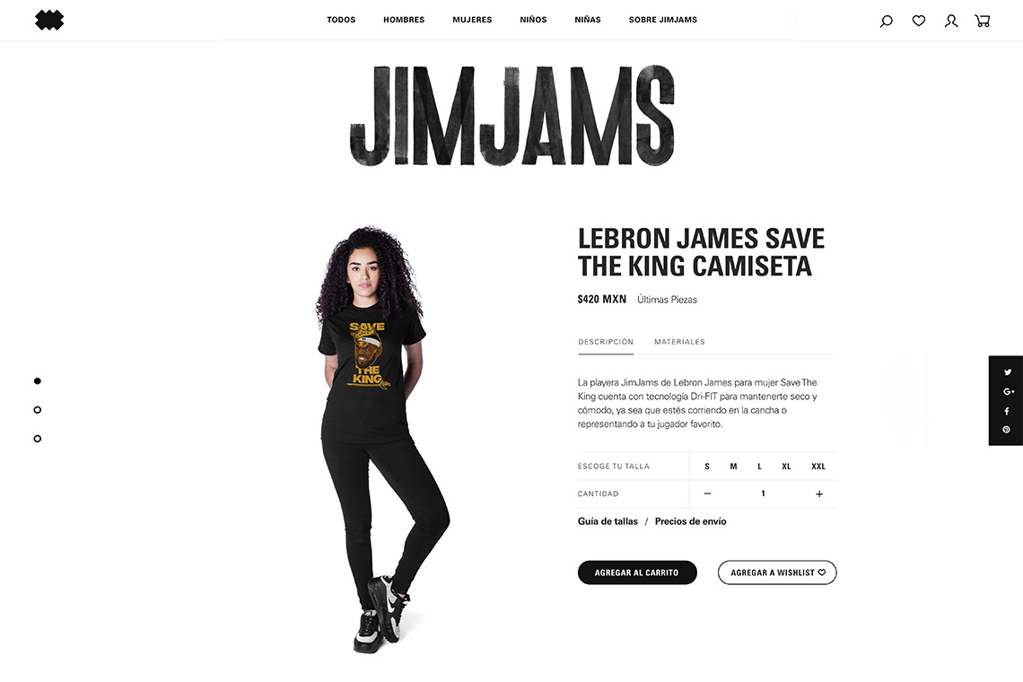
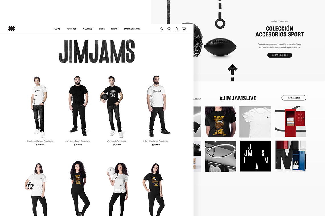
For the website, creating a dynamic shopping experience that would surprise the user without compromising functionality represented our priority.
the solution
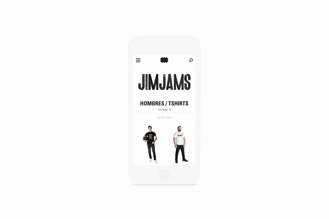
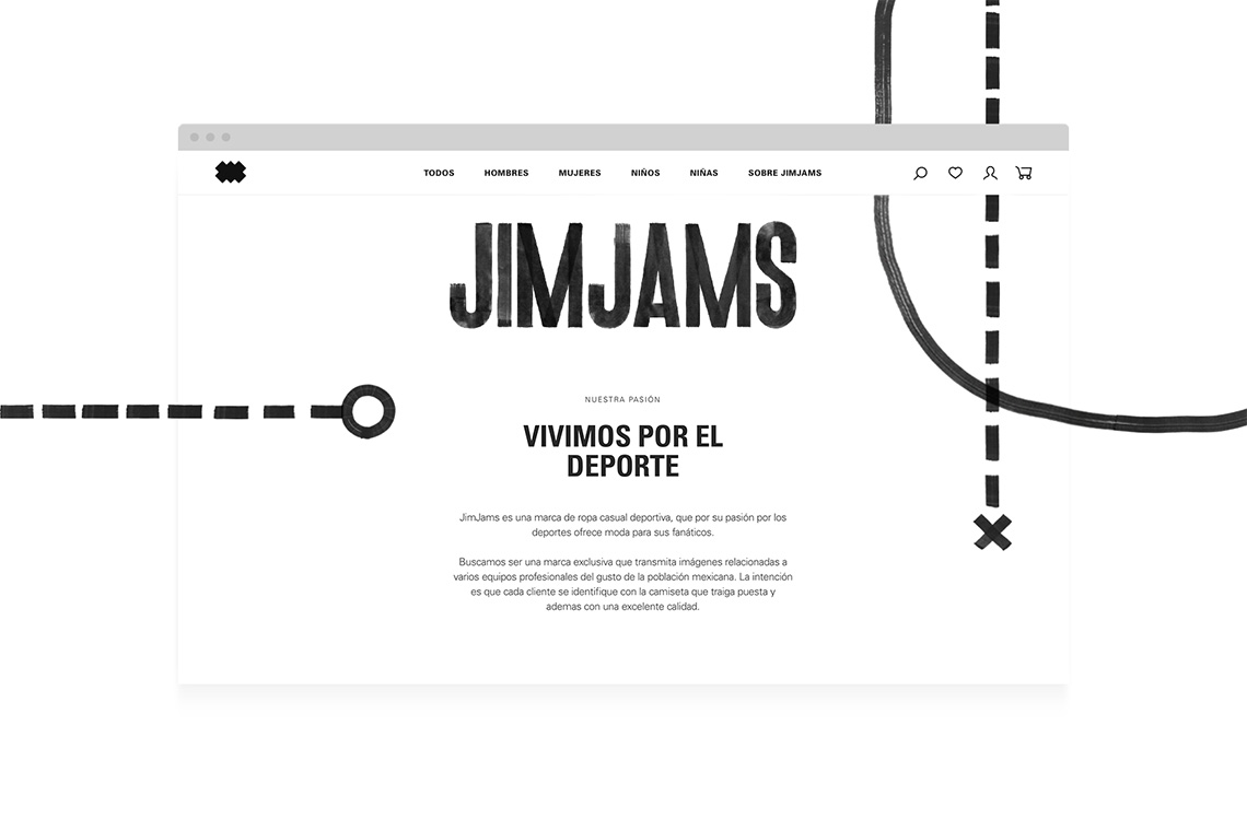
The brand pattern and the JimJams logo were integrated into the website design, managing to capture the brand's graphic behavior in the digital medium. We employed the Univers typography with its different weights and styles generating hierarchies and a dynamism that surprises when prioritizing the website's functionality.
The colors employed in the medium are mostly black and white, allowing the company products to remain as protagonists with their own colors and styles. — (A)

The black and white colors allow the products to remain protagonists.
Jim Jams
BRANDING
the objective
The client's objective was to develop a new brand concept that offers casual fashion inspired by the sports industry. The brand must achieve a dynamic, friendly personality, serve a young market and sports fans.
the solution
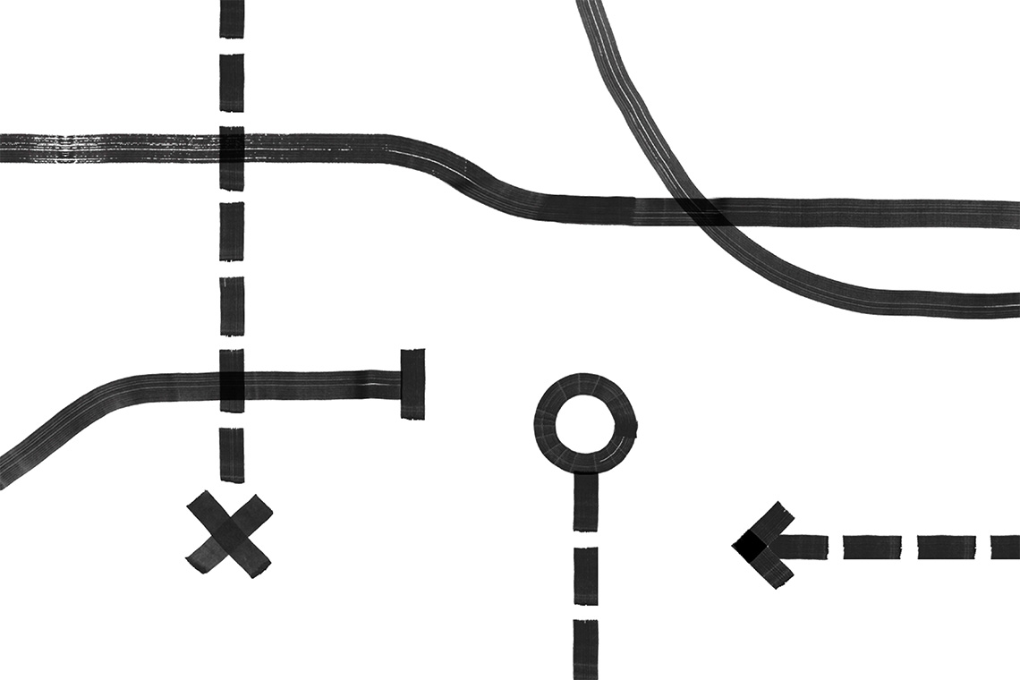
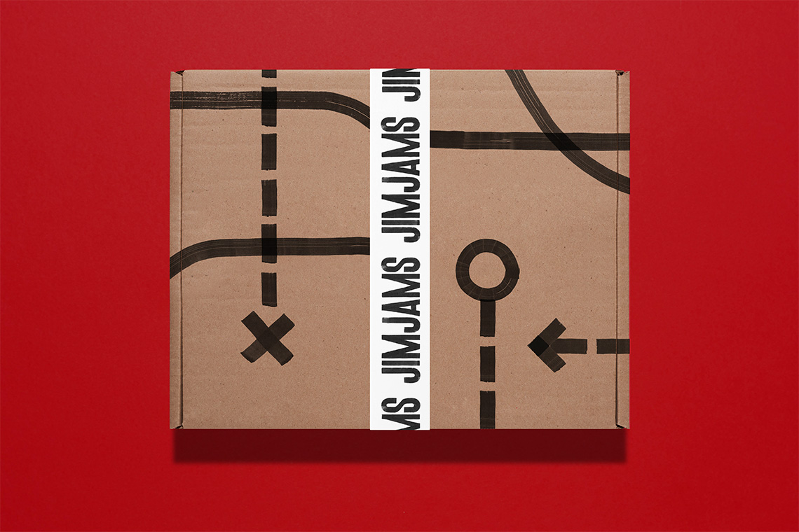
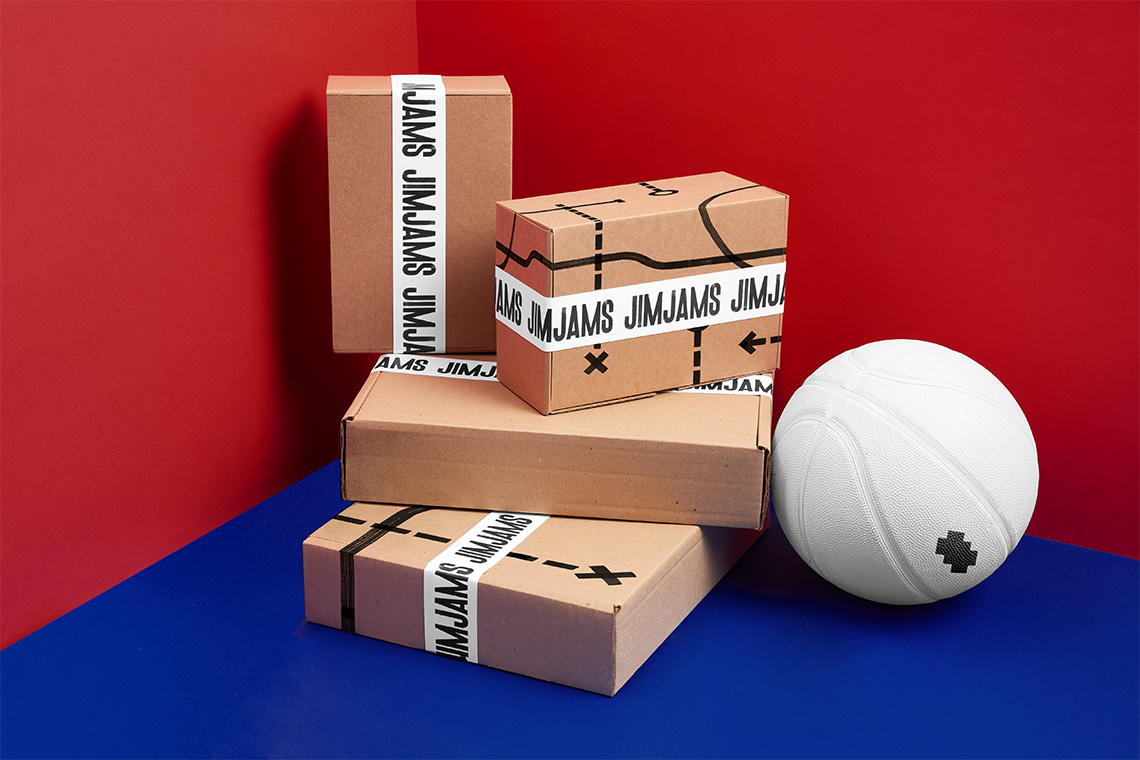
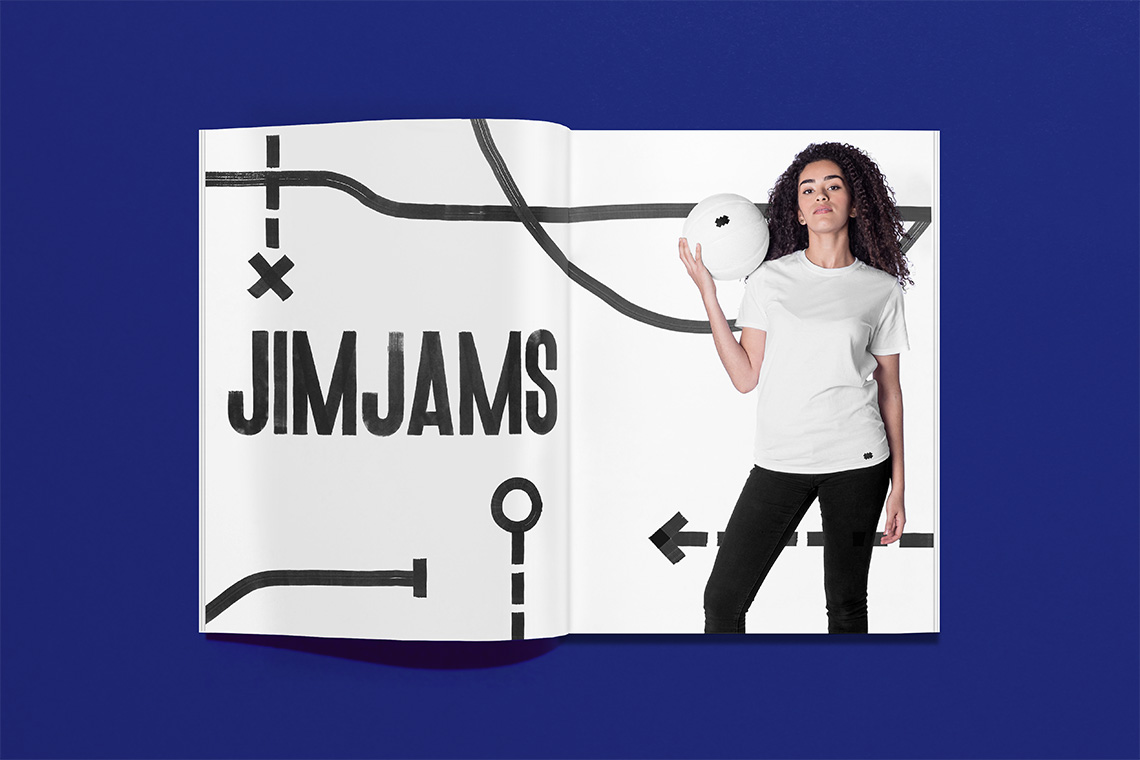
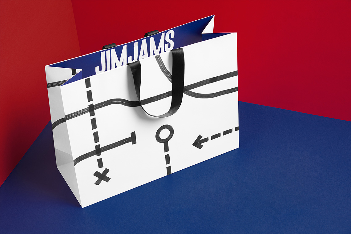
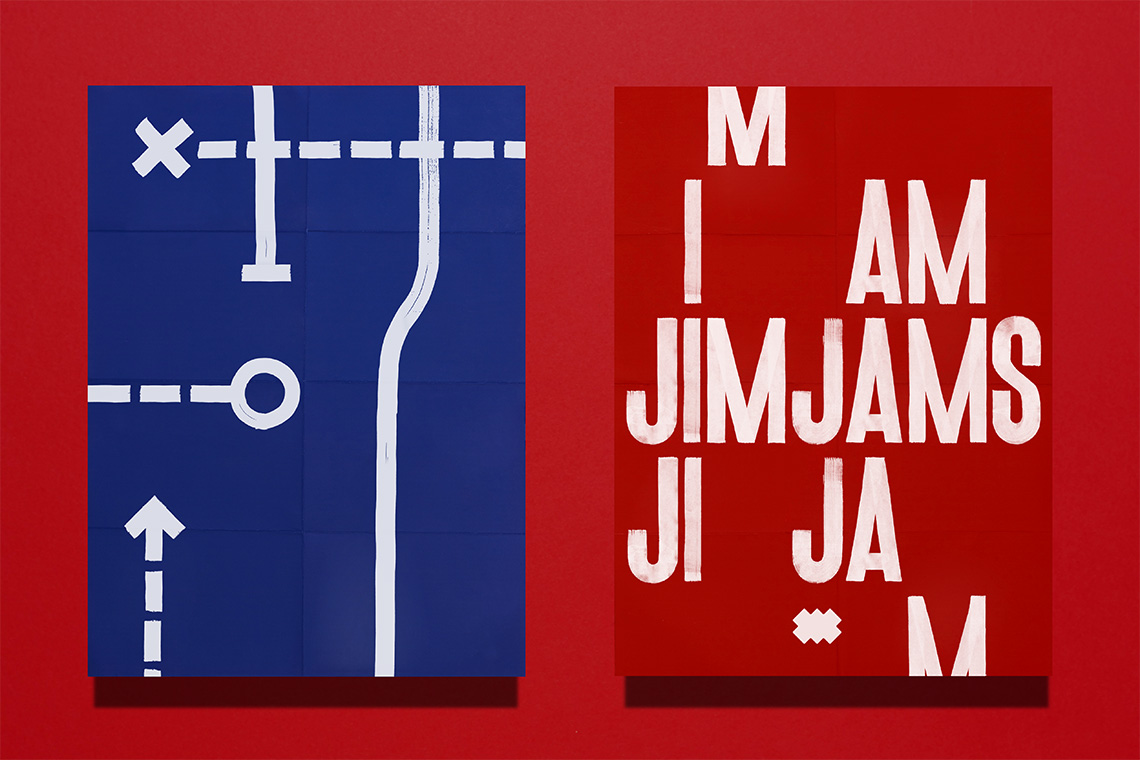
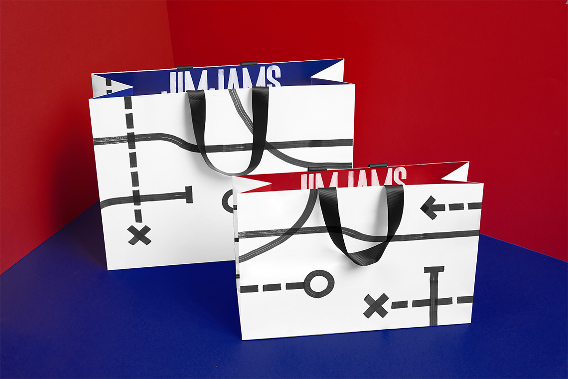
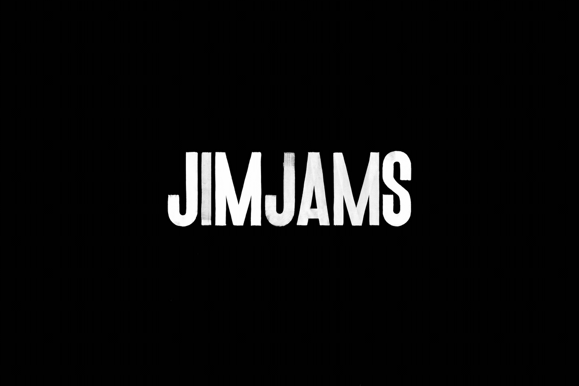
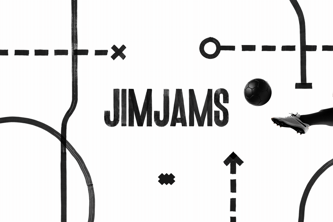
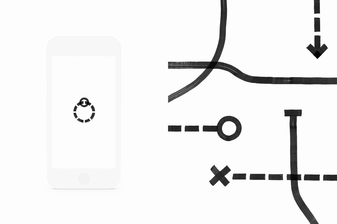
A logo was developed based on strategic play diagrams commonly used by coaches giving the brand a dynamic and cheerful communication style.
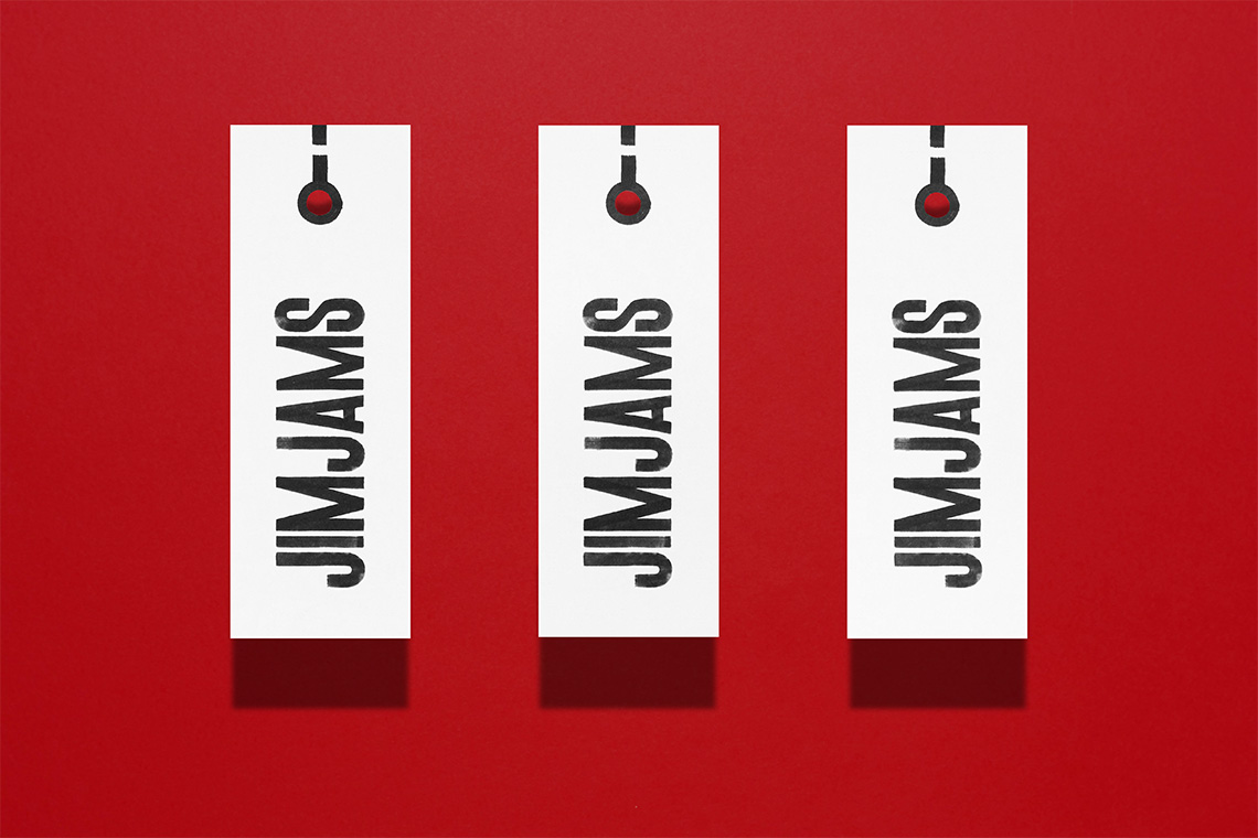
The custom typography is printed with textured strokes establishing a brand personality that plays fairly with the garment designs. The typographic system includes the Effra and Univers LT families employed in text arrangements on the branded peripherals. The JimJams icon is an abstraction of shapes appearing on footballs. This icon was developed to facilitate its embroidered application on textile surfaces and appearing legibly as a small signature in the various brand applications.
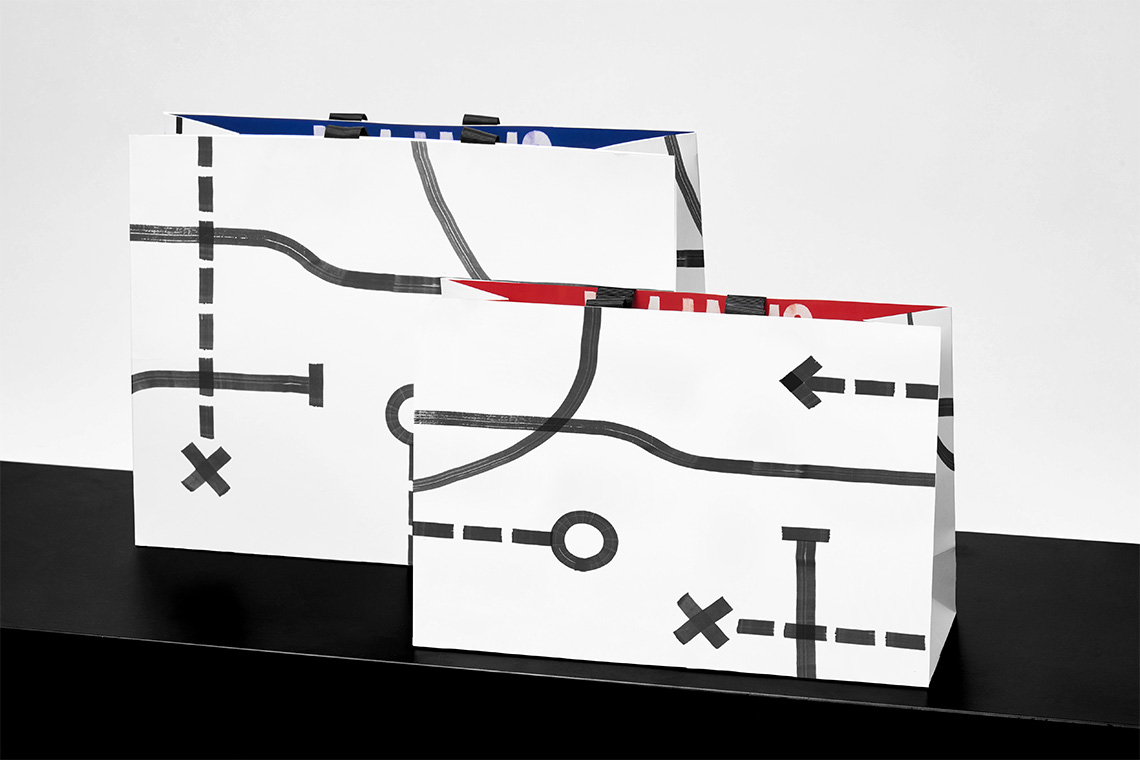
The pattern is a representation of the annotations drawn on strategic play boards. The JimJams pattern reminds us of team sports in a very visual way. The brand pattern and the elements that make up this project aesthetically communicate the guiding concept behind the brand: Sports. — (A)
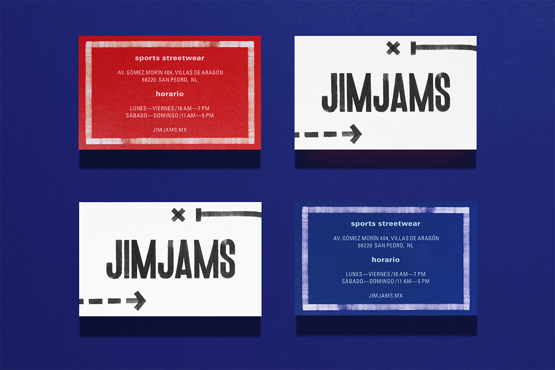
The pattern is a representation of the annotations drawn on strategic play boards.