Imprimerie Du Marais Notebook 2
BRANDING
The client
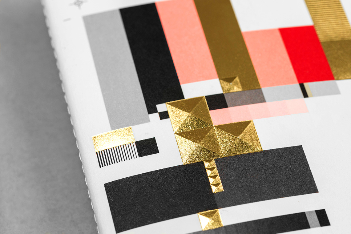
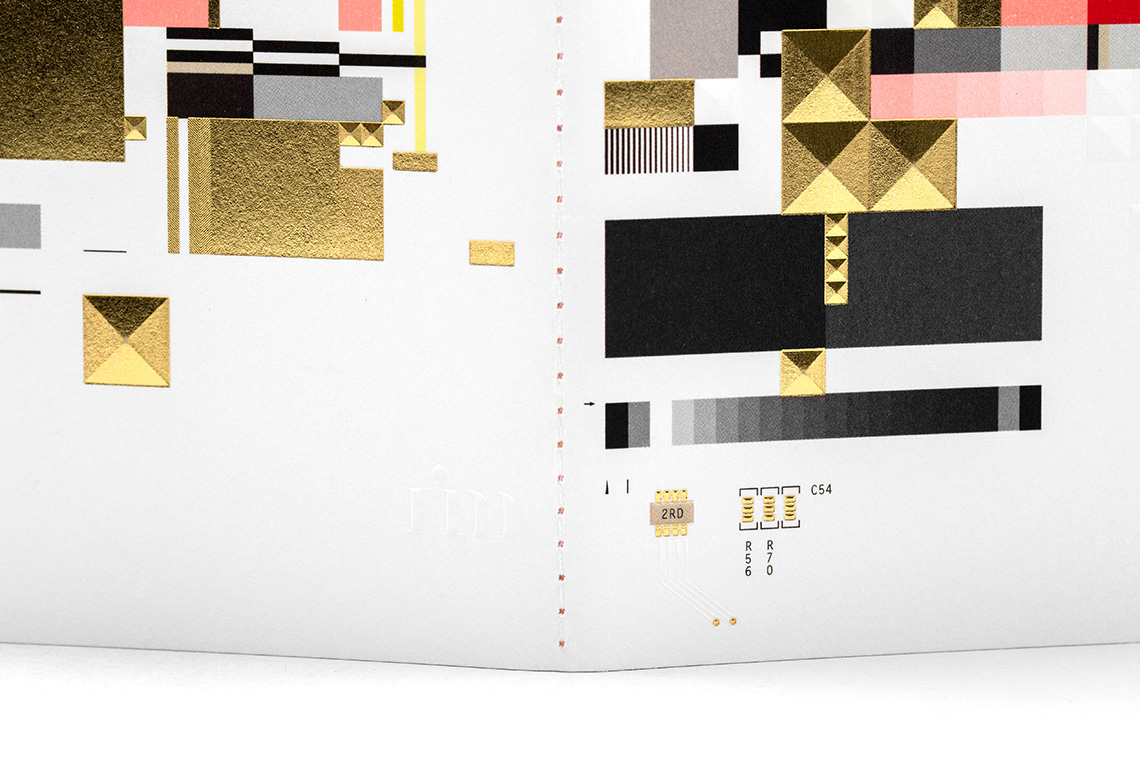
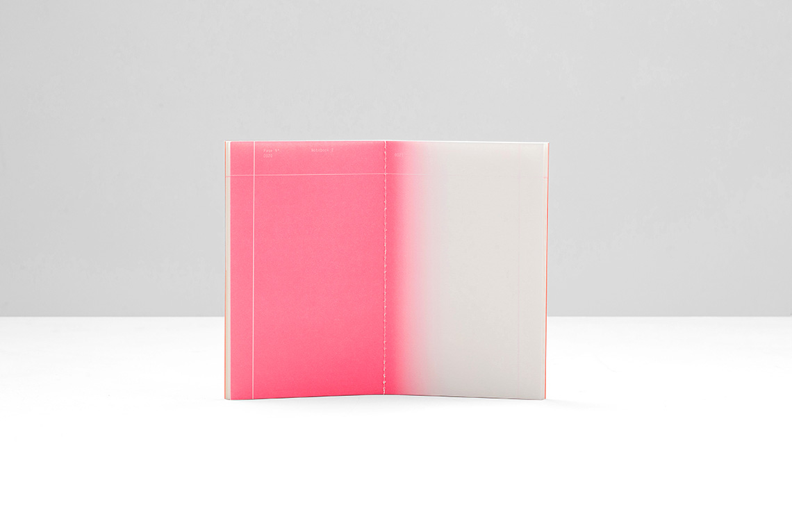
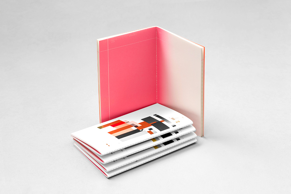
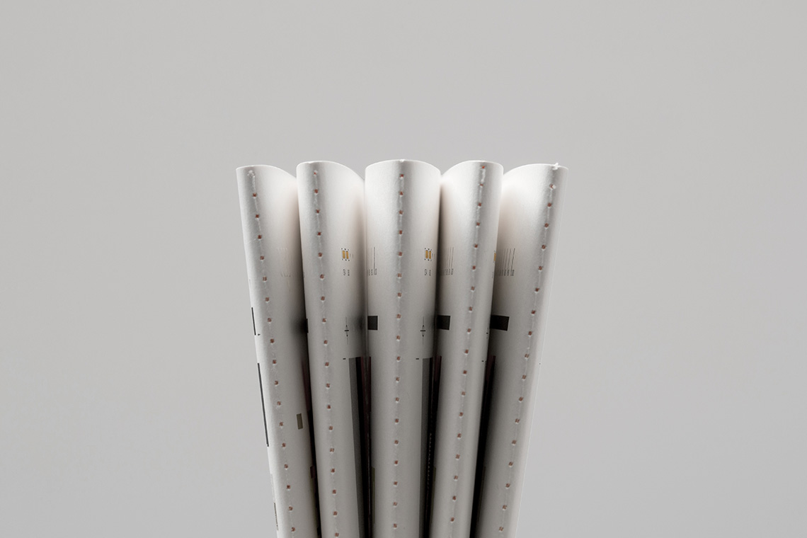
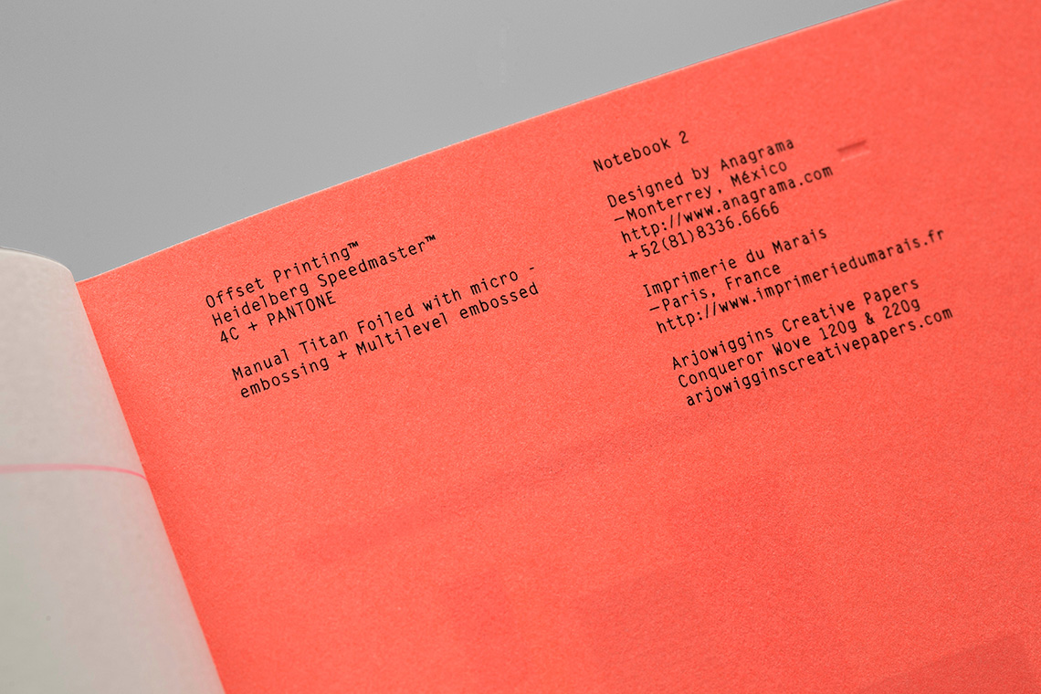
Anagrama was invited to collaborate by Parisian printer Imprimerie du Marais, along with seven acclaimed agencies around the world, on a project to design a second round of notebooks using their vast collection of excellent print effects and techniques, such as hot foil stamping, microembossing, silk screening and sown binding. With the support of Arjowiggins Creative Papers, Imprimerie du Marais launches this project of eight unique notebooks.
keywords
Notebook /Paris /Editorial Design /Product Design /Print Design
the objective
Design a collection notebook using the wide range of effects and techniques of Imprimerie du Marais.
the solution
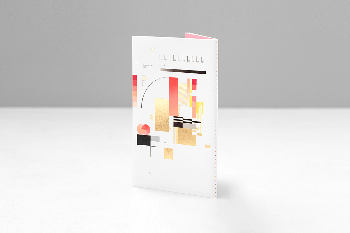
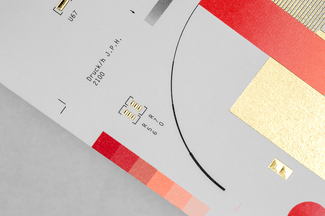
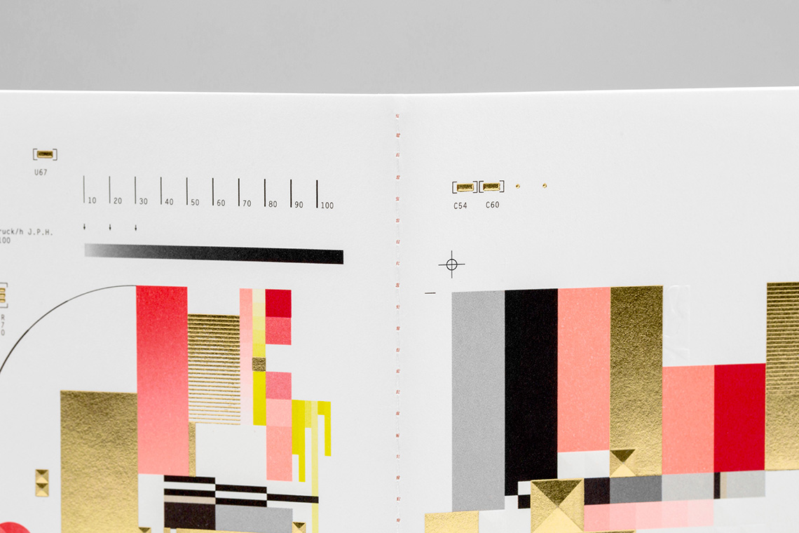
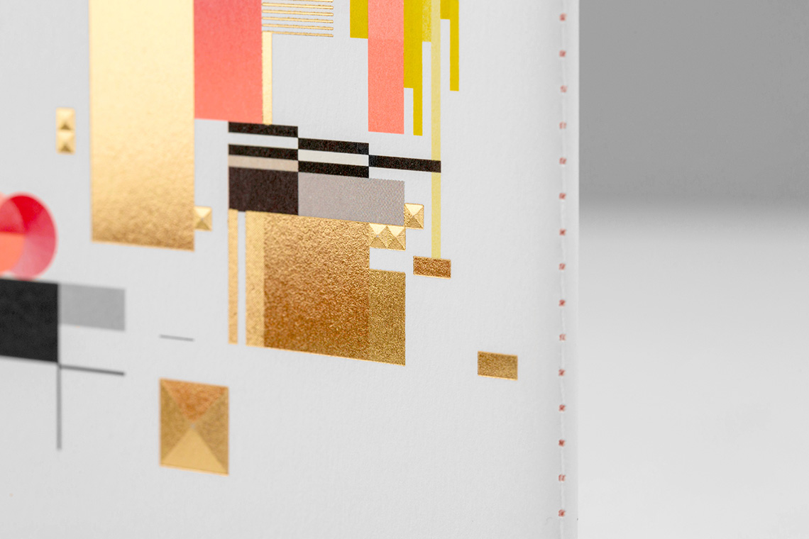
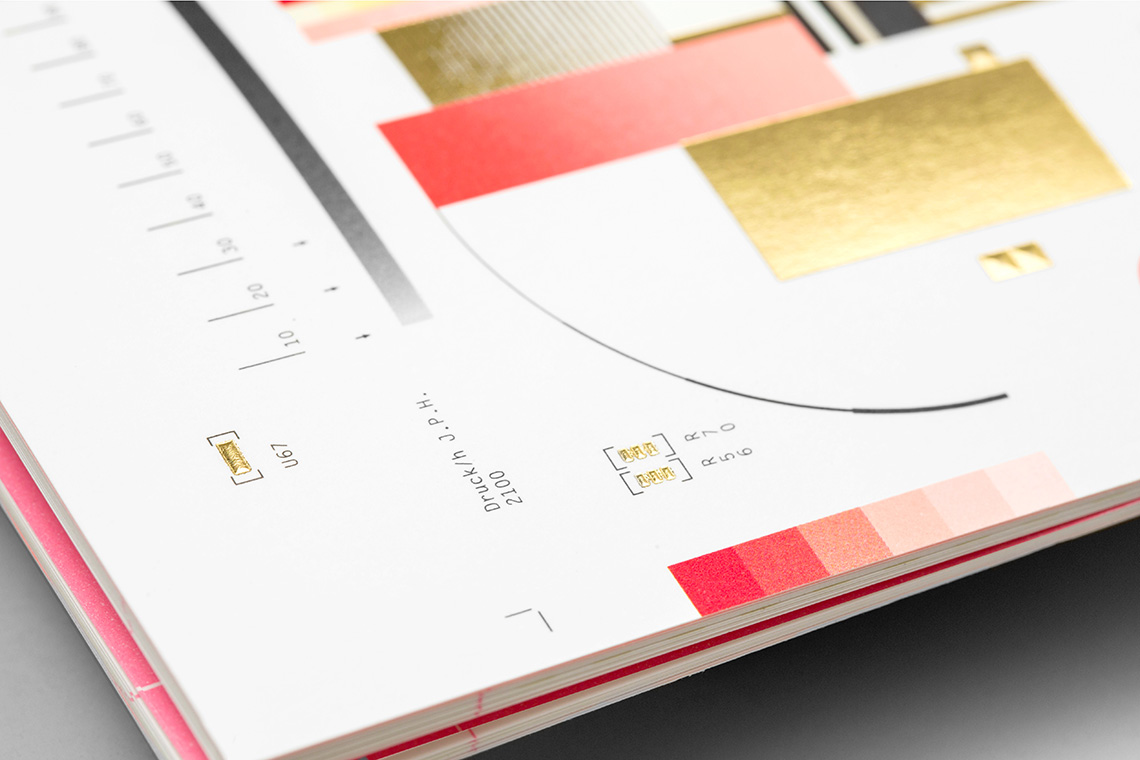
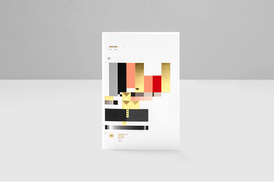
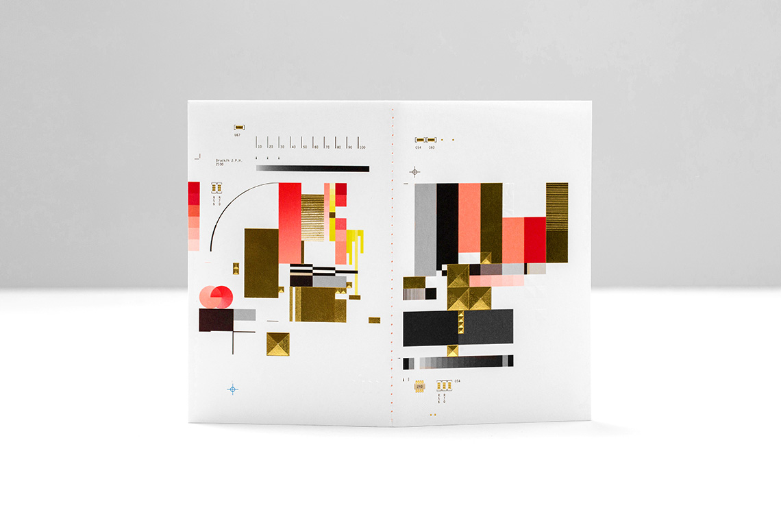
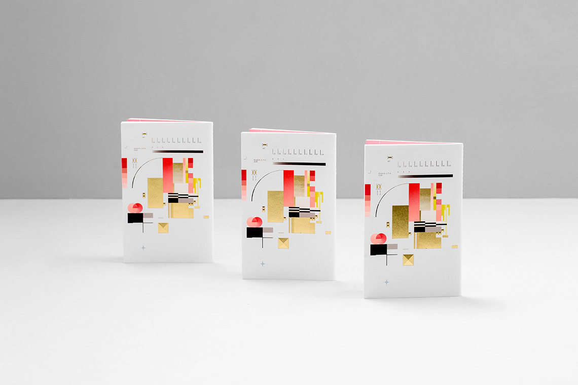
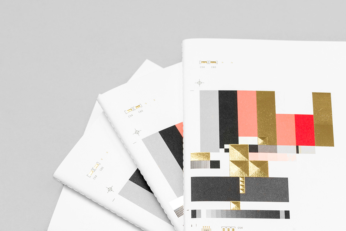
Within our design proposal, we fused two main concepts. One of them is the technical language of printing production, such as small gestures like die cut lines, color and grayscale registration marks, with the purpose of adding value to the general concept. In addition, the idea is fused with the concept of technology and hardware, using a Motherboard as inspiration for its patterns to create forms through the notebook’s cover space.
The design served as a tribute to the complexity and technicality of the printing process, a gesture that pointed to this dying art form's glorious existence. The idea was to take everything to the extremes using every resource offered. The result is a composition reminiscent of an experimental printing test, a printed glitch from a parallel universe, a sudden malfunction, a phenomenon that sometimes creates unintentional but interesting textures with the information a system is using. — (A)
A tribute to the complexity and technicality of the printing process
