Cocoon
BRANDING
The client
Cocoon is a designer jewelry and accessory shop with more than ten years of experience. It's located in Monterrey, Mexico, even though Cocoon indulges American and European audiences as well. The jewelry is carefully designed and distinctively handcrafted using mixed metals, quartzes and other decorative natural stones in their in-house workshop. The results are unique pieces that embrace their Mexican roots and are influenced by geometric forms, nature, astronomy, and alchemy.
keywords
Jewelry /Mexico /Branding /Graphic design /Packaging
the objective
Develop a visual identity that conveys the uniqueness and style of the products offered by the brand.
the solution
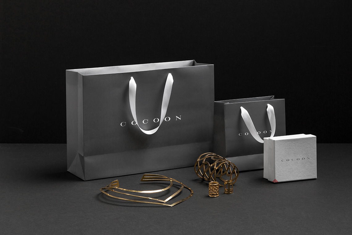
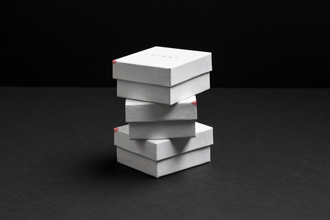
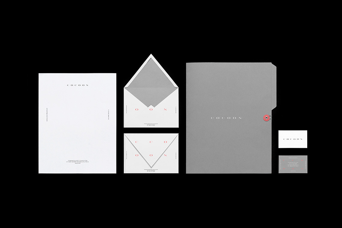
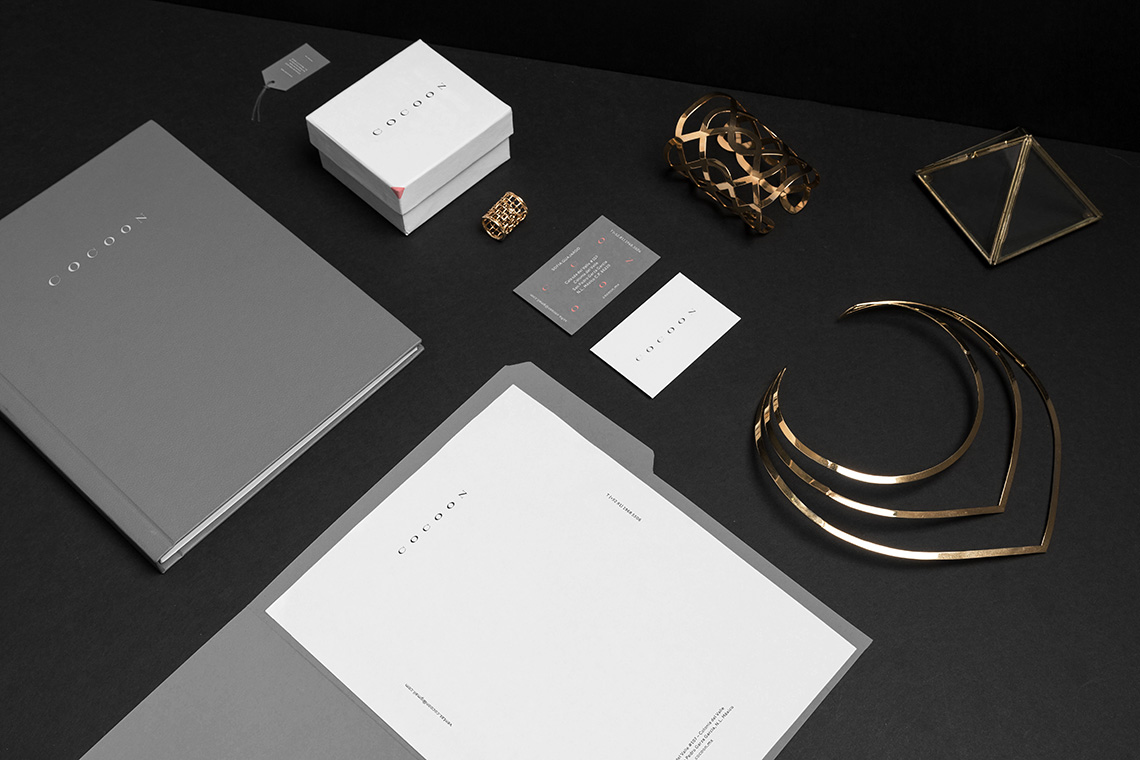
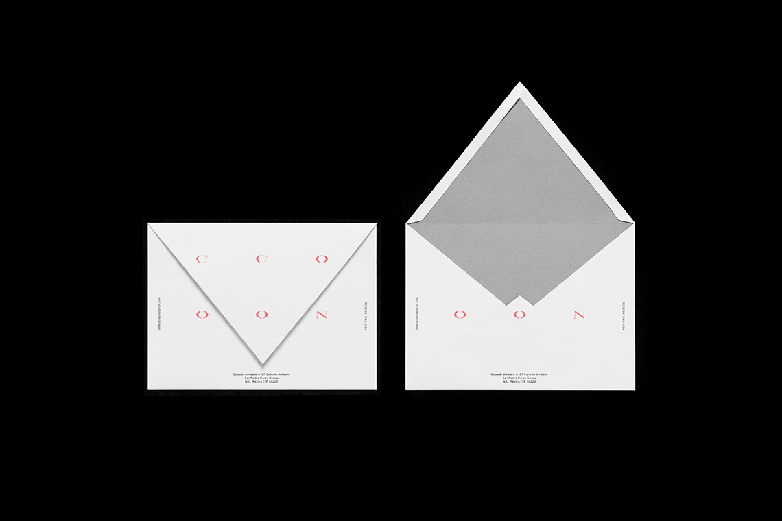
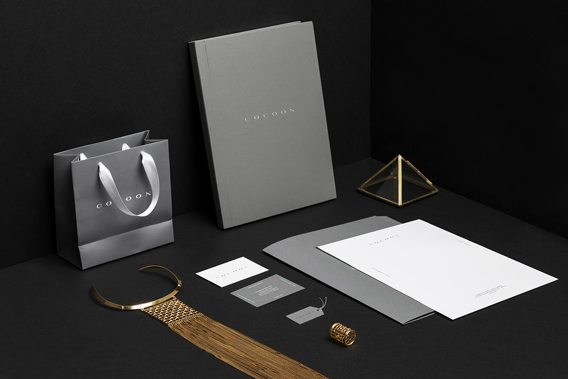
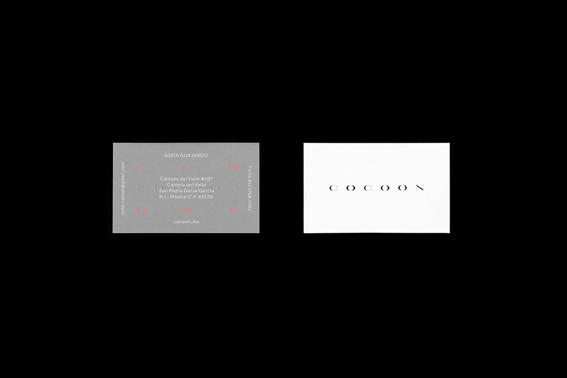
Our branding approach speaks of transformation. Our proposal for naming refers to a woman's metamorphosis from caterpillar to butterfly when she gets ready to go out. She dresses up, puts her make-up on, and finishes up by slipping on her best jewels. Cocoon honors natural, complex, ever-changing beauty, commending it with its delicate custom logotype and its fresh and feminine color palette. The bright coral breaks up the gray monotone much like an elegant piece of jewelry polishes up a look. — (A)
Our branding approach speaks of transformation.
