Galo
BRANDING
The client
Galo Kitchen is an restaurant specialising in French-American inspired comfort cuisine. Its prime focus is breakfast, but it also offers lunch and dinner menus and a cozy atmosphere all day long. Additionally, Galo Kitchen has its own in-house bakery that provides delicious, freshly made, hand-crafted bread and pastries.
keywords
Restaurant /Mexico /Branding /Graphic Design /Packaging
the objective
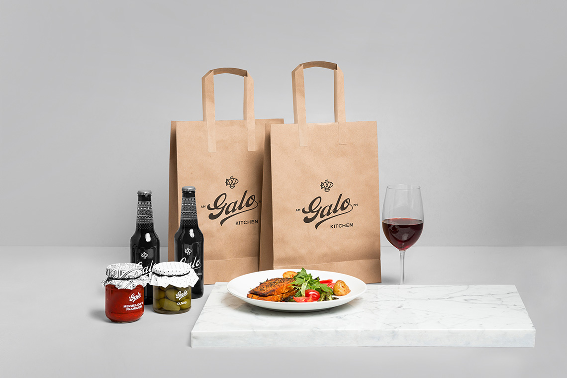
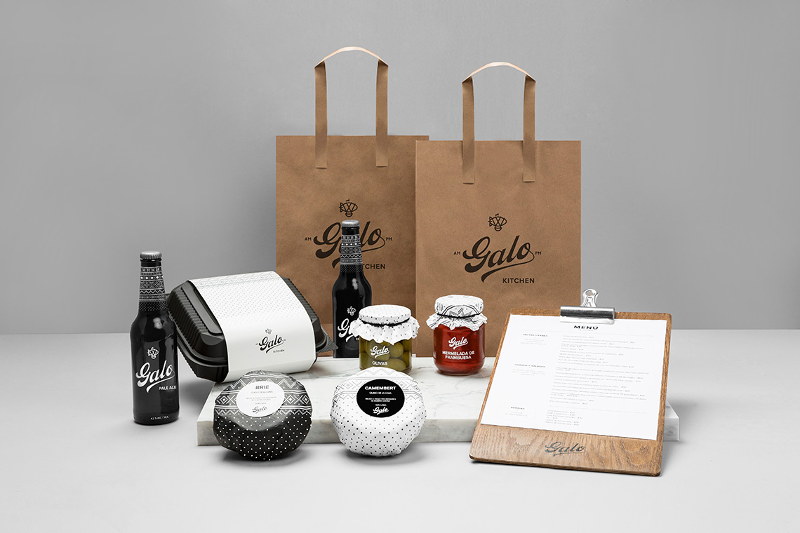
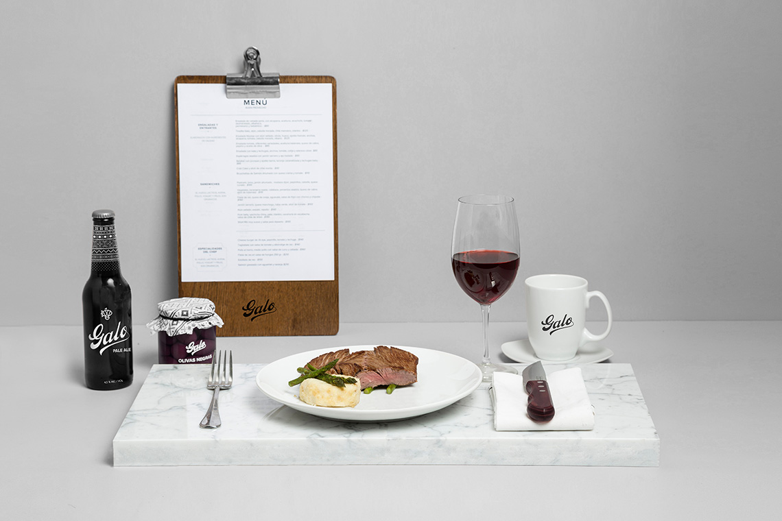
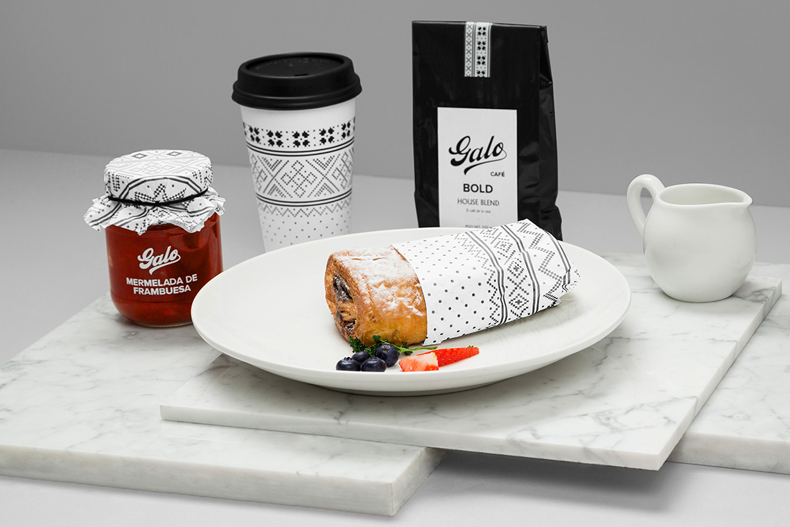
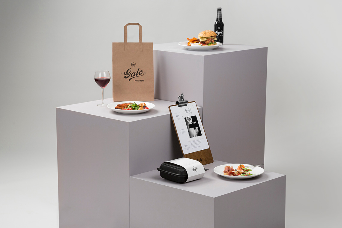
Develop an identity that communicates the restaurant's comfort food proposal and adapts to the different products offered by the brand.
the solution
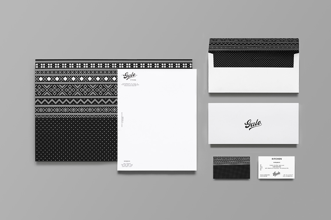
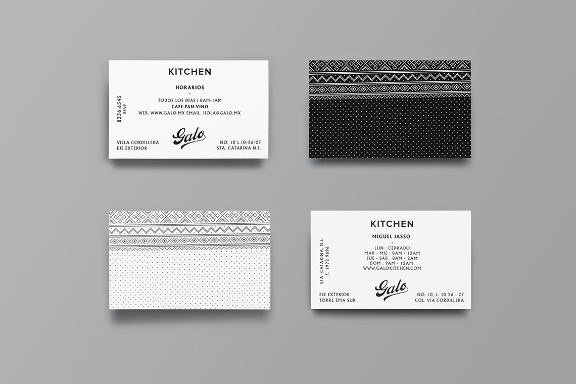
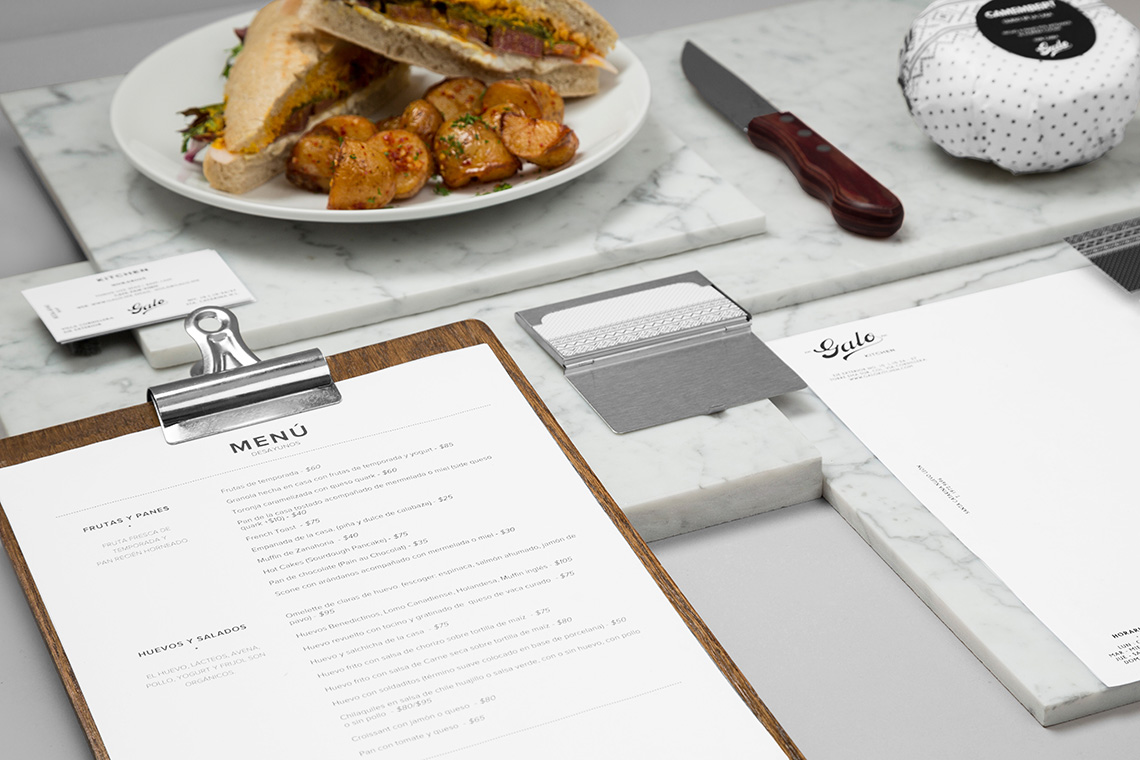
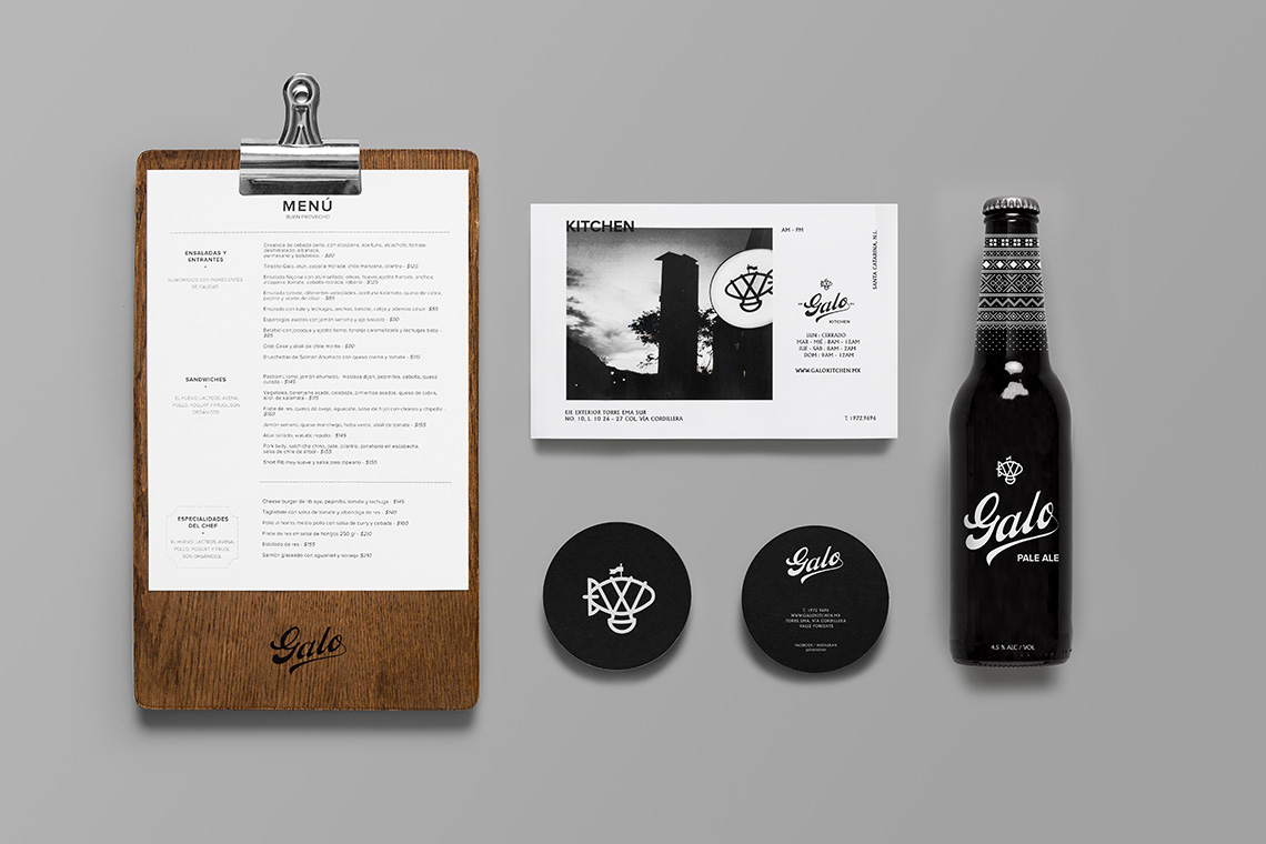
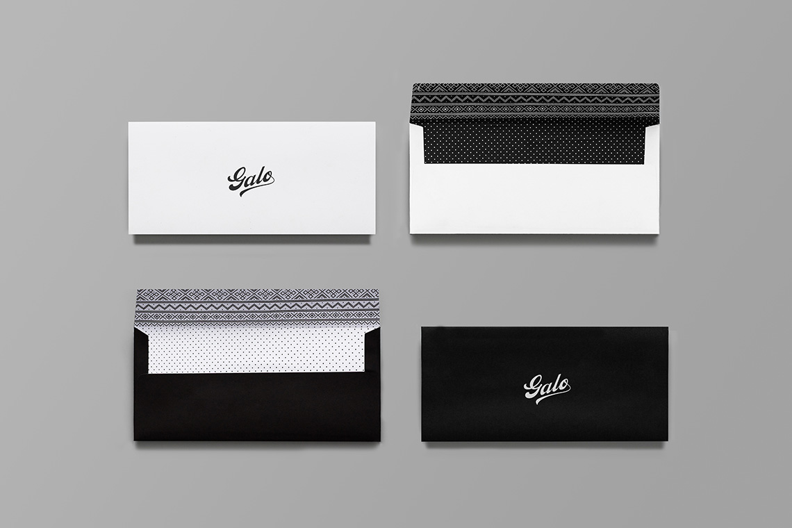
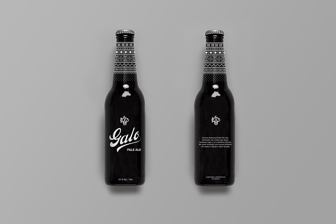
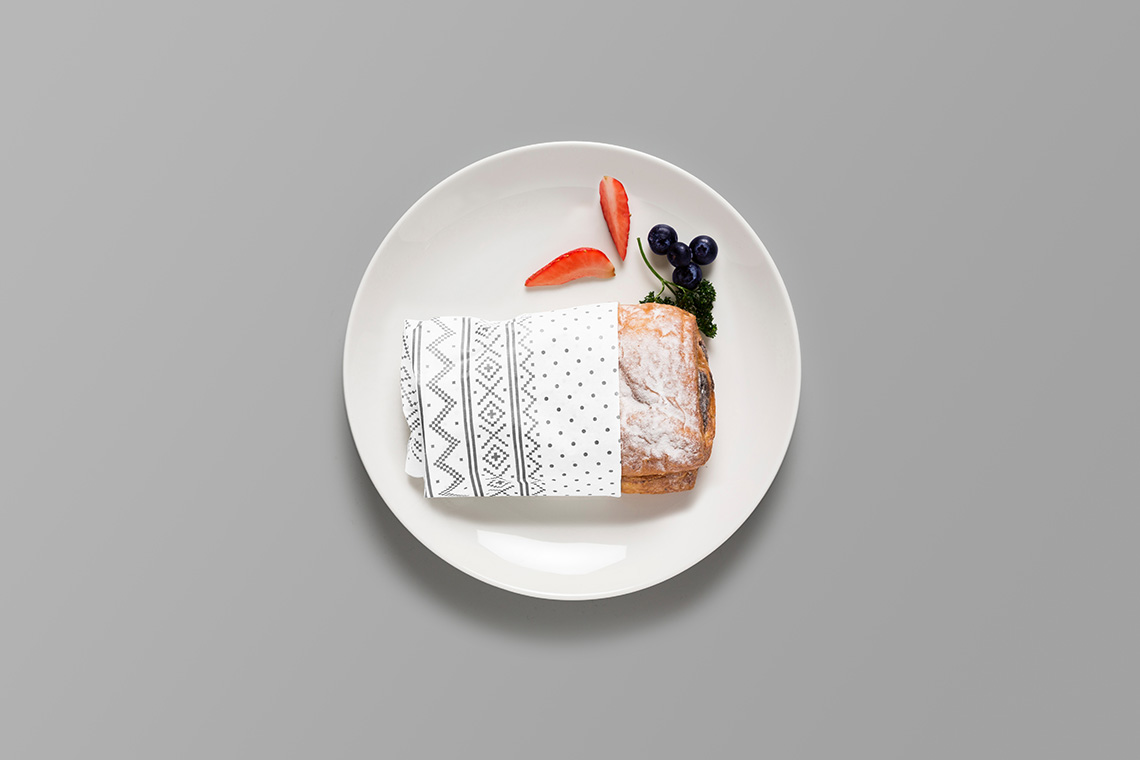
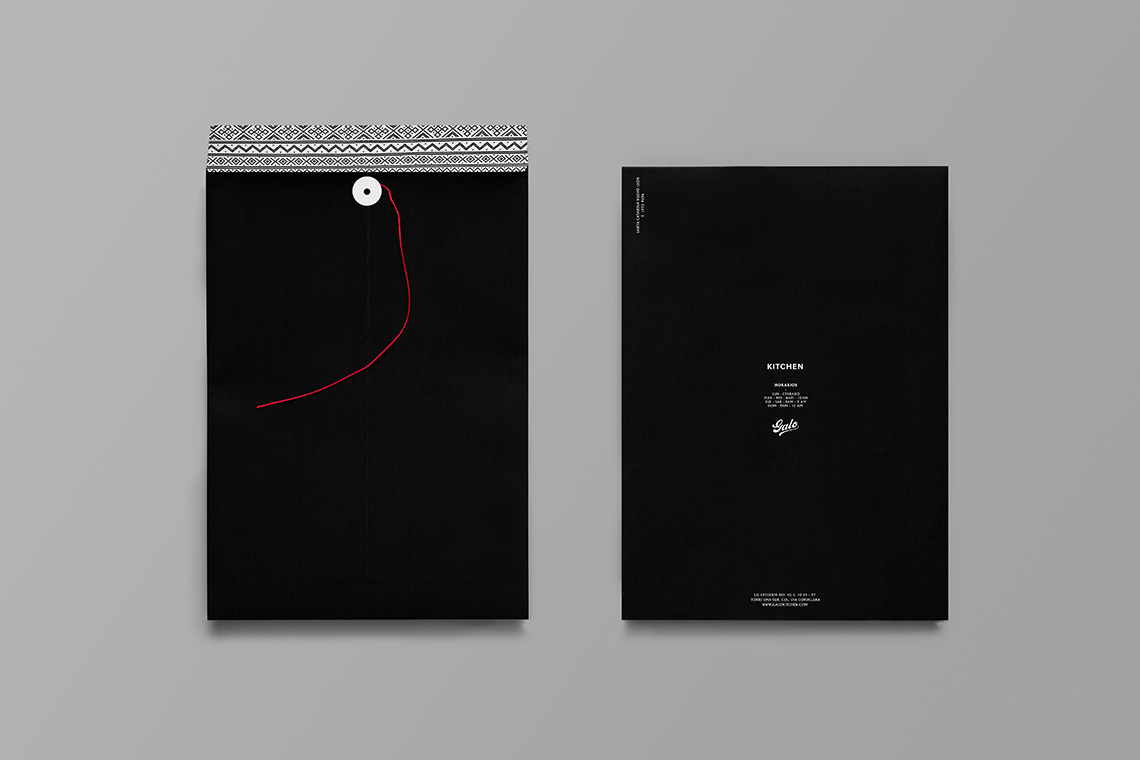
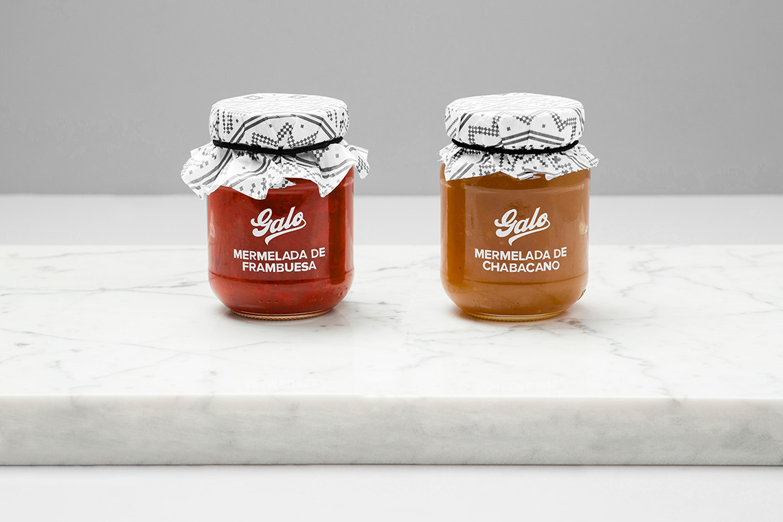
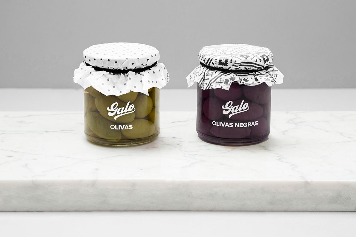
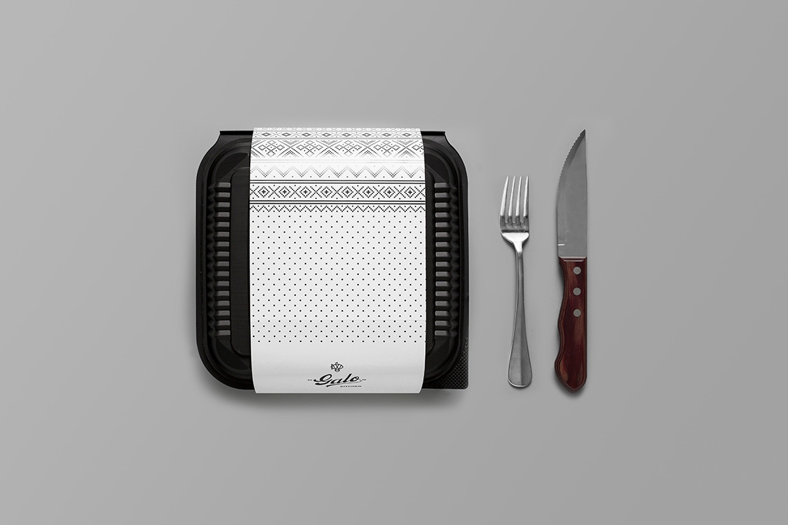
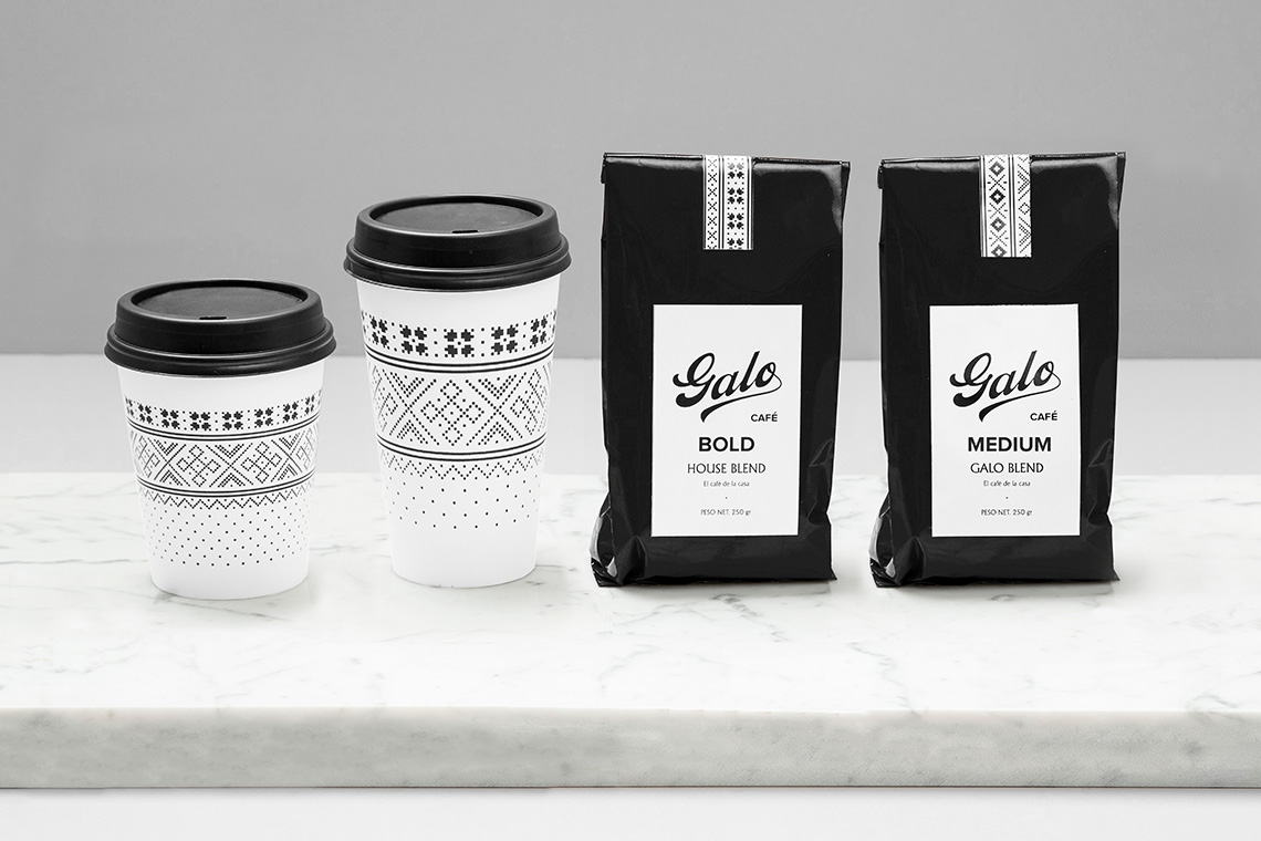
The naming is meant to articulate the French touch present in Galo's lovingly made food. The black and white skewed pattern dresses up the brand as friendly, snug and casual, a feeling supported by the logotype's organic cursive script. The zeppelin icon pays homage to Galo's bakery. Inspired on the airship's general shape, a Zeppelin is a sandwich made with a roll of French bread split widthwise into two pieces and filled with a variety of meats, cheese, vegetables, seasonings and sauces. — (A)
The zeppelin icon pays homage to Galo's bakery.
