Gist
BRANDING
The client
Gist is a lifestyle magazine that reports on many different subjects, from fashion to gadgets, health and tourism. Its naming is a reflection of its multifaceted nature. Its readers can "get the gist" on all the different topics of each issue.
keywords
Magazine /Editorial /Mexico /Branding /Graphic Design
the objective
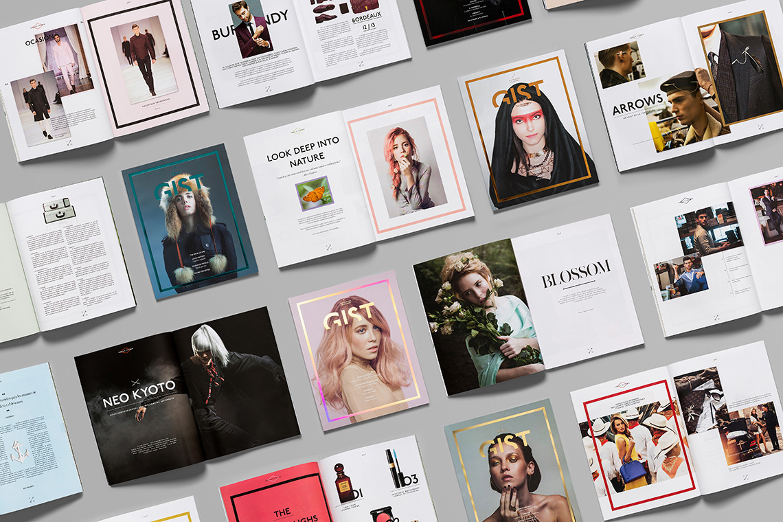
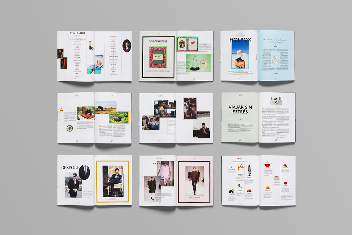
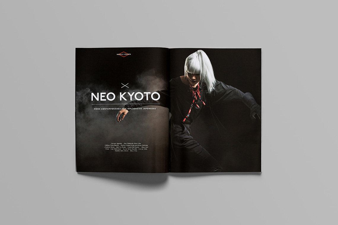
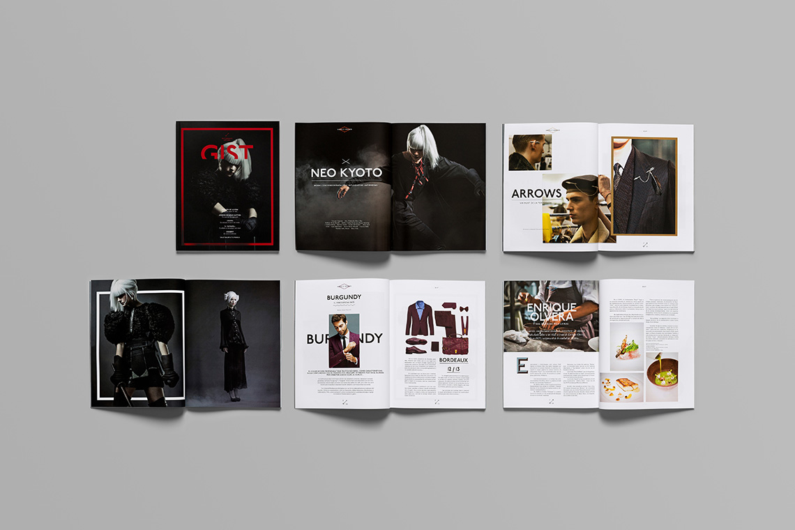
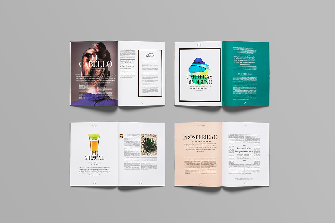
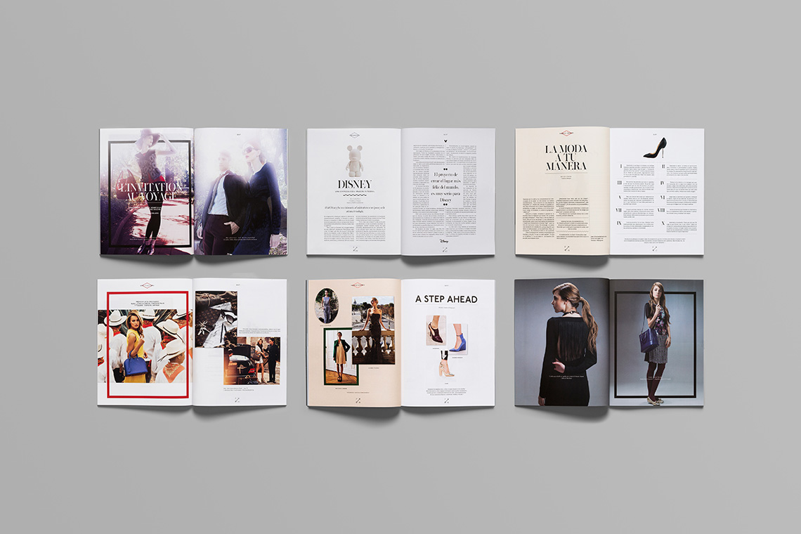
Develop an visual identity and a strong grid system that denotes fashion and trends, that can adapt to versatility of content and images.
the solution
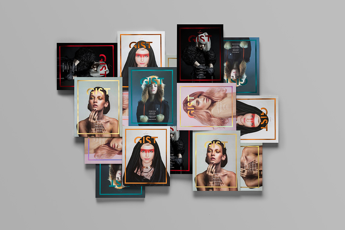
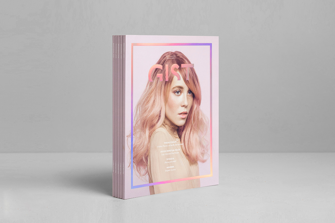
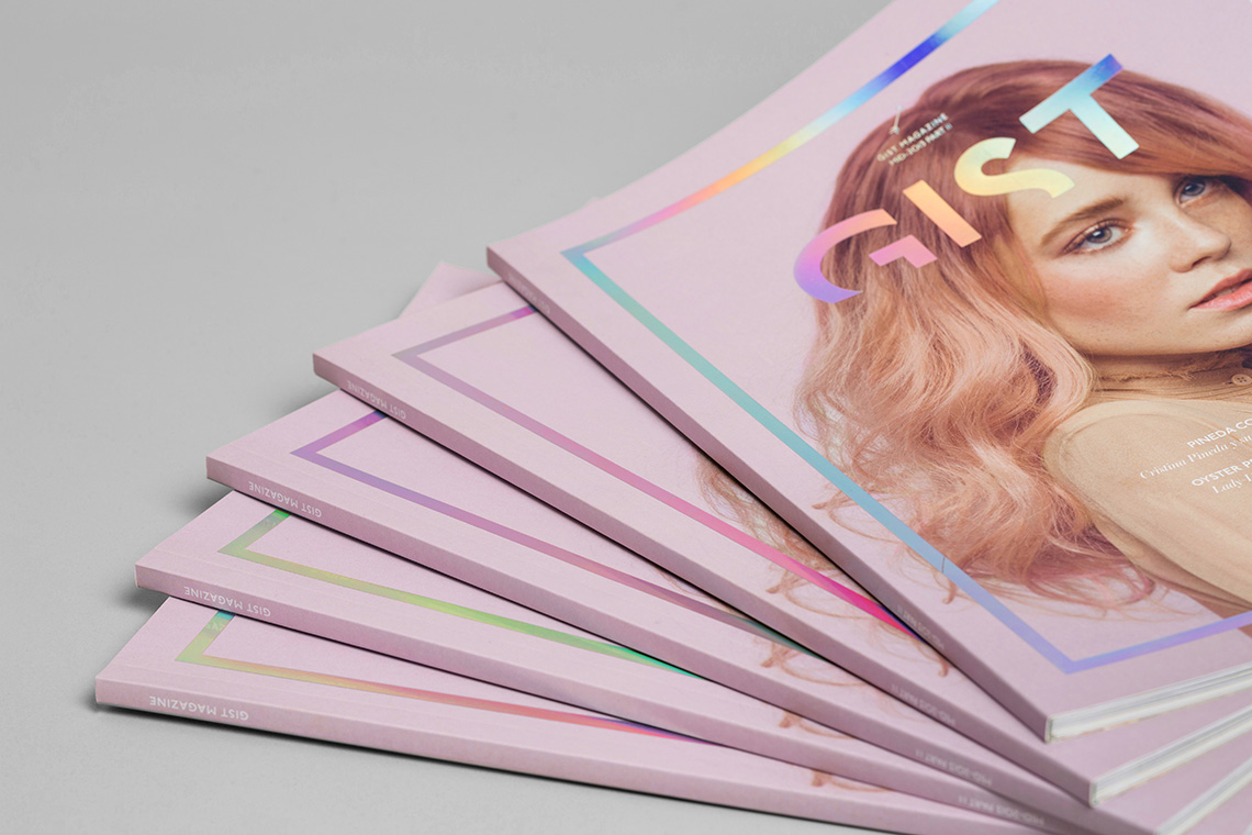
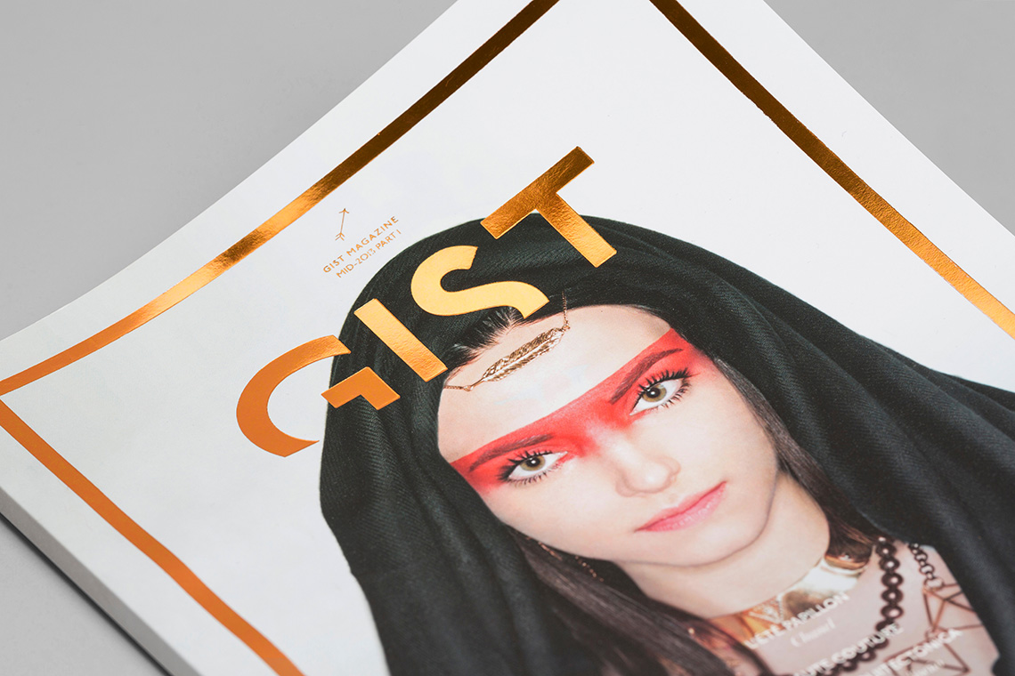
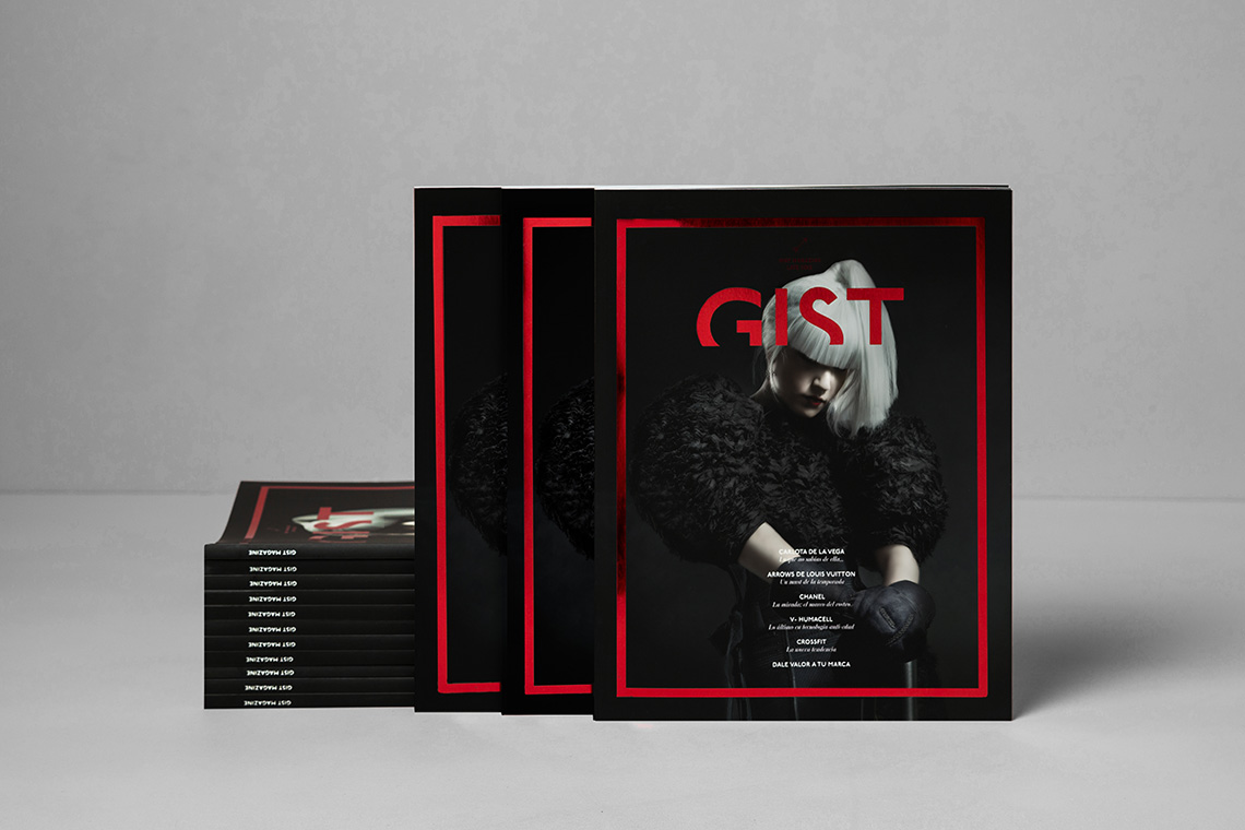
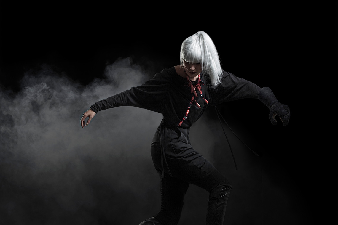
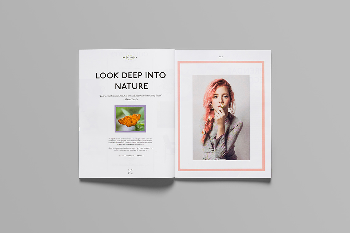
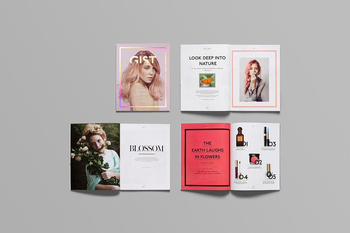
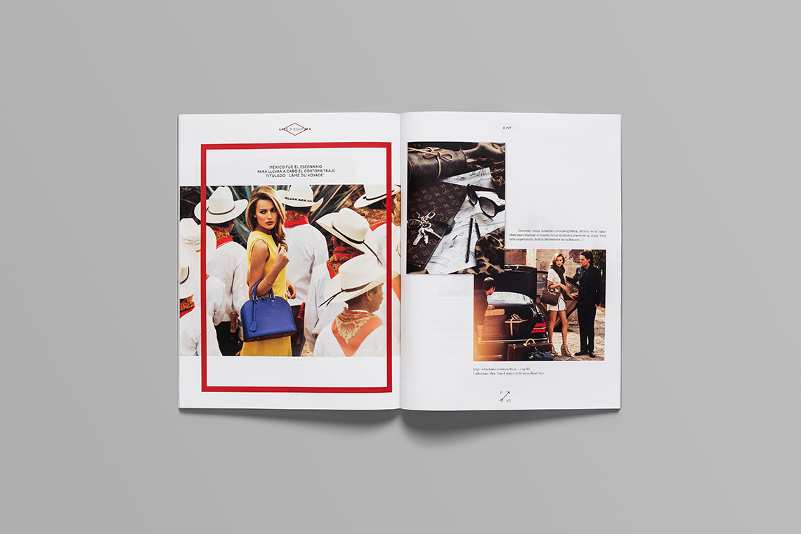
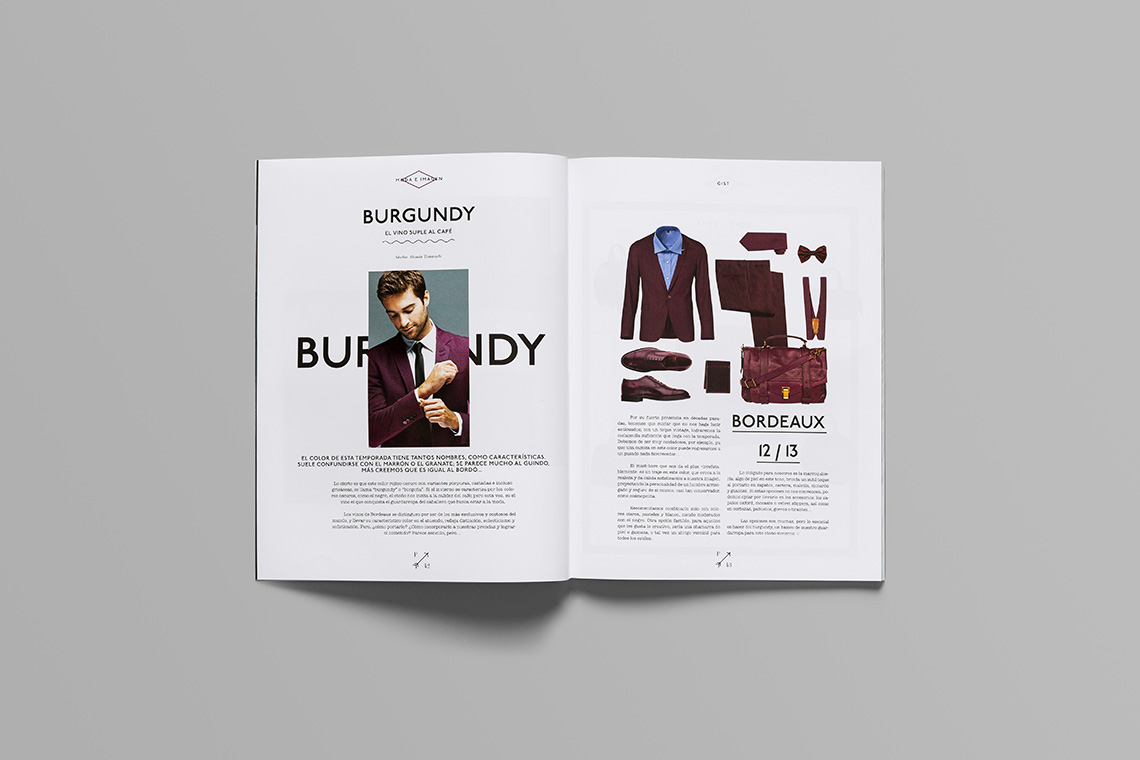
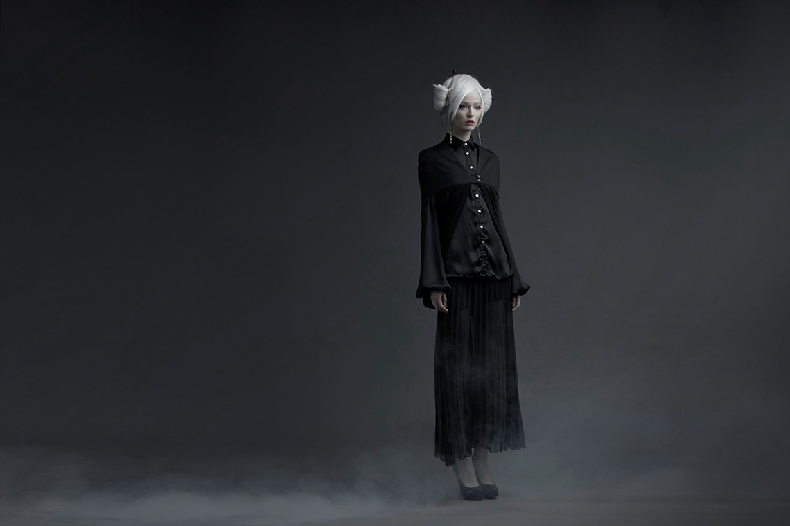
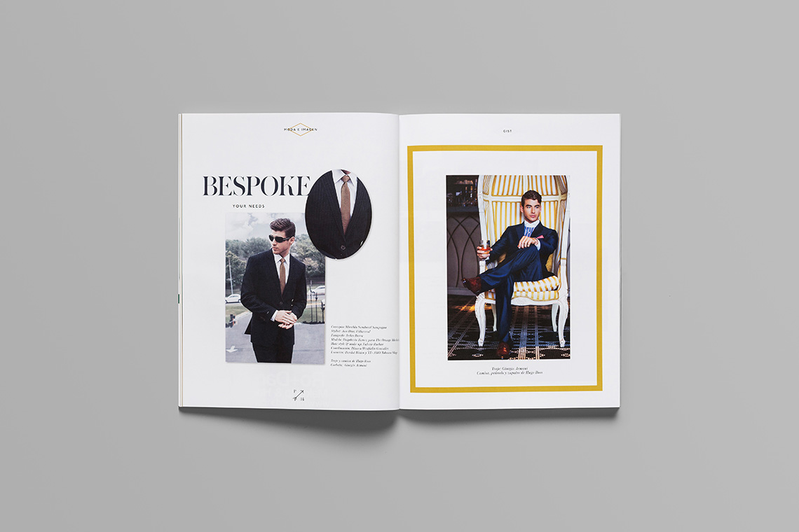
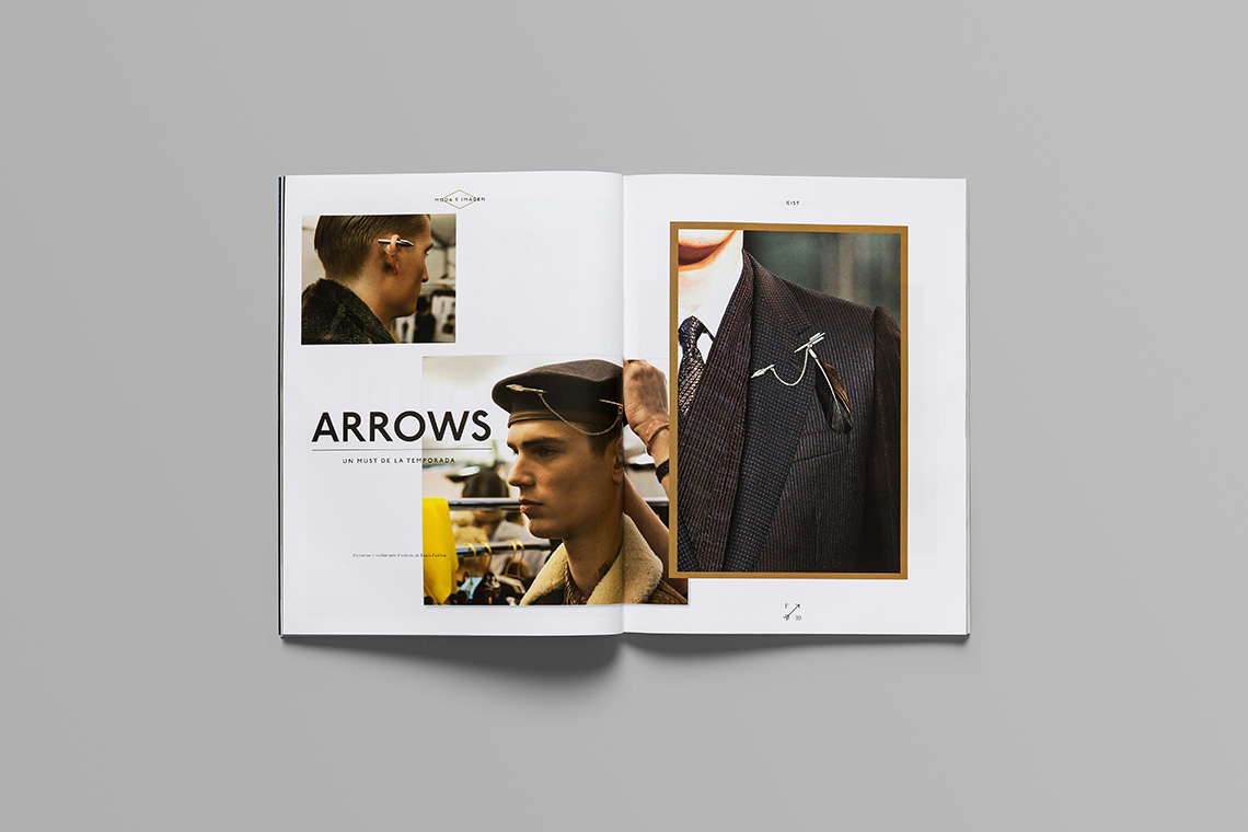
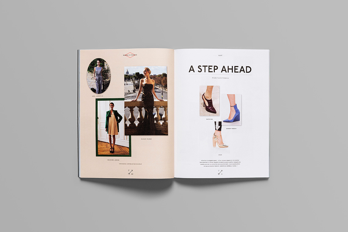
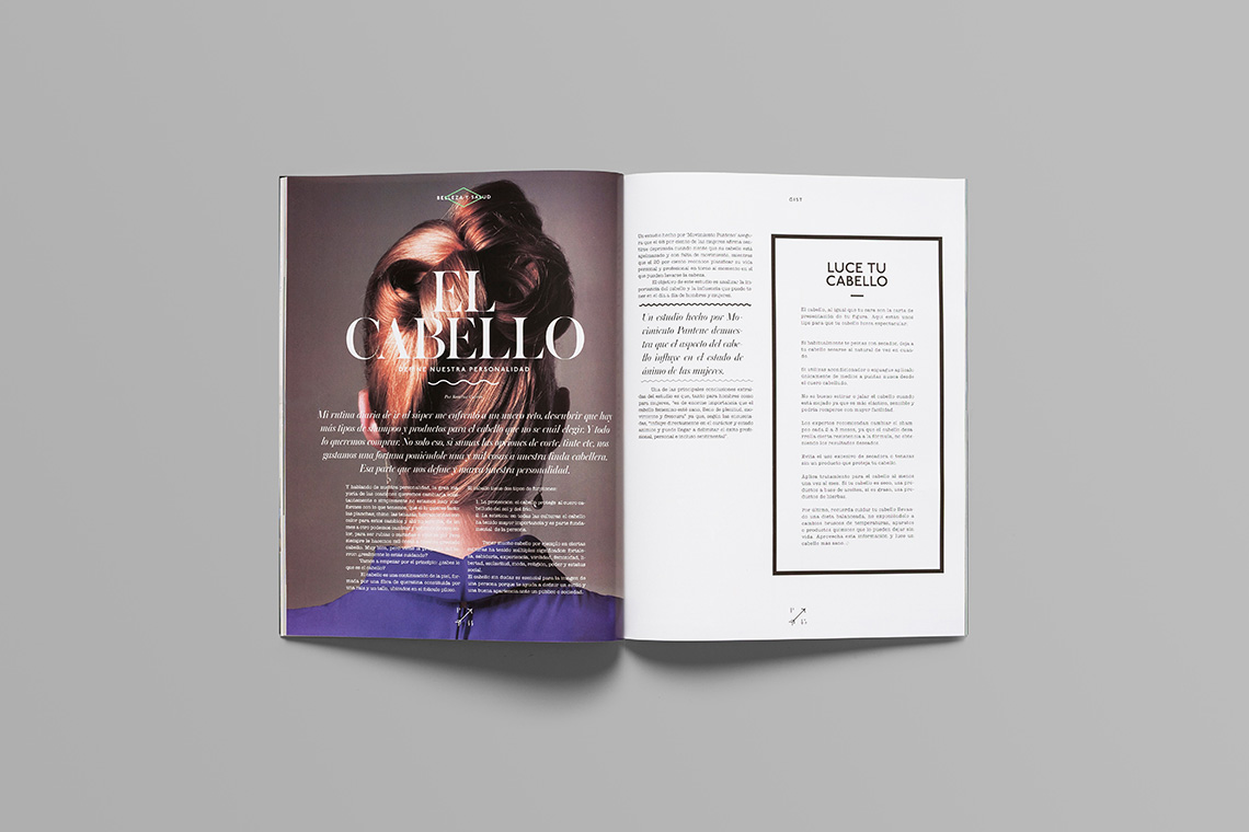
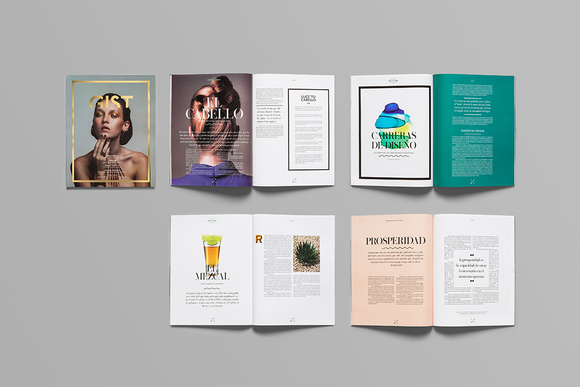
In GIST, the images always appear front and center, so the magazine presents a great opportunity for up-and-coming photographers to show off their work. Our design proposal was a decision to shake things up a little, editorial design-wise. Its quirky, audacious, fresh and current feel is actually based on a simple formula that involves the exaltation of images through the use of thick frames and colored
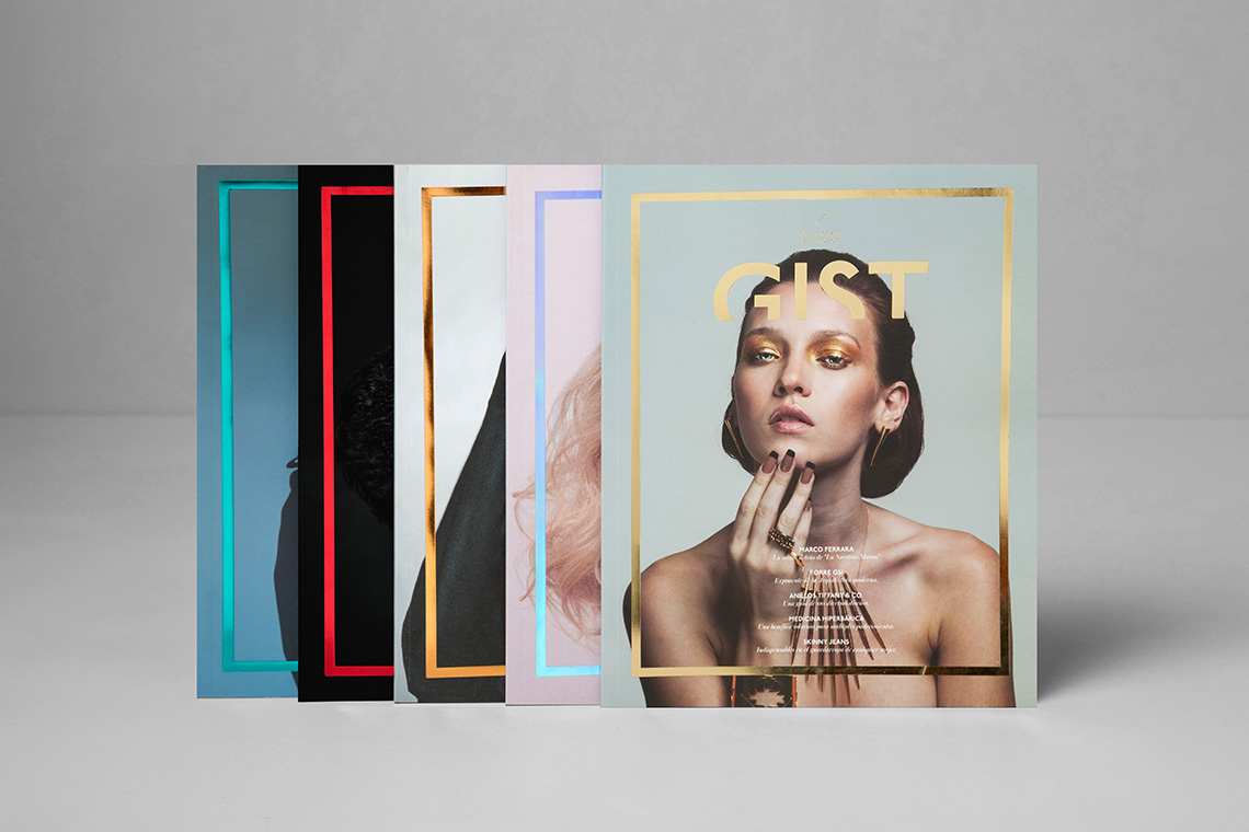
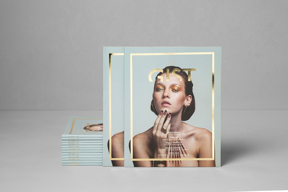
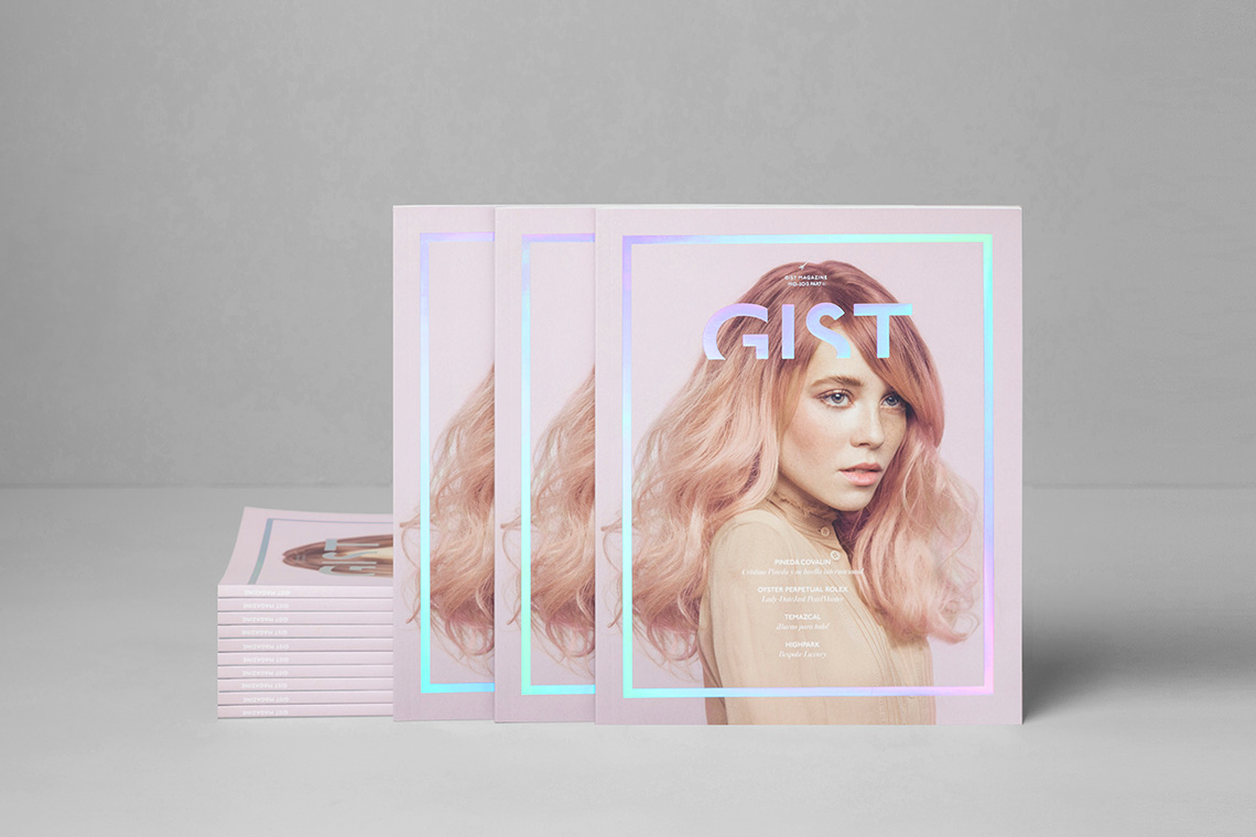
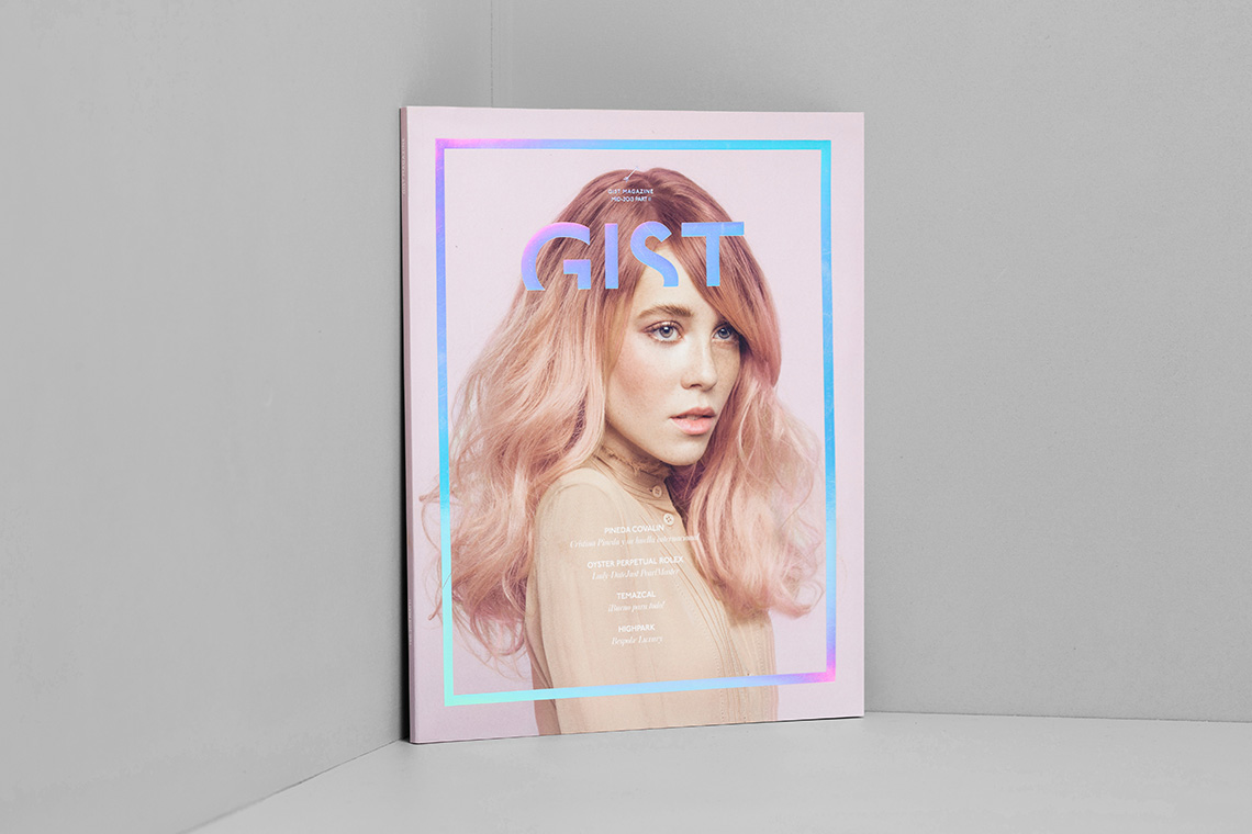
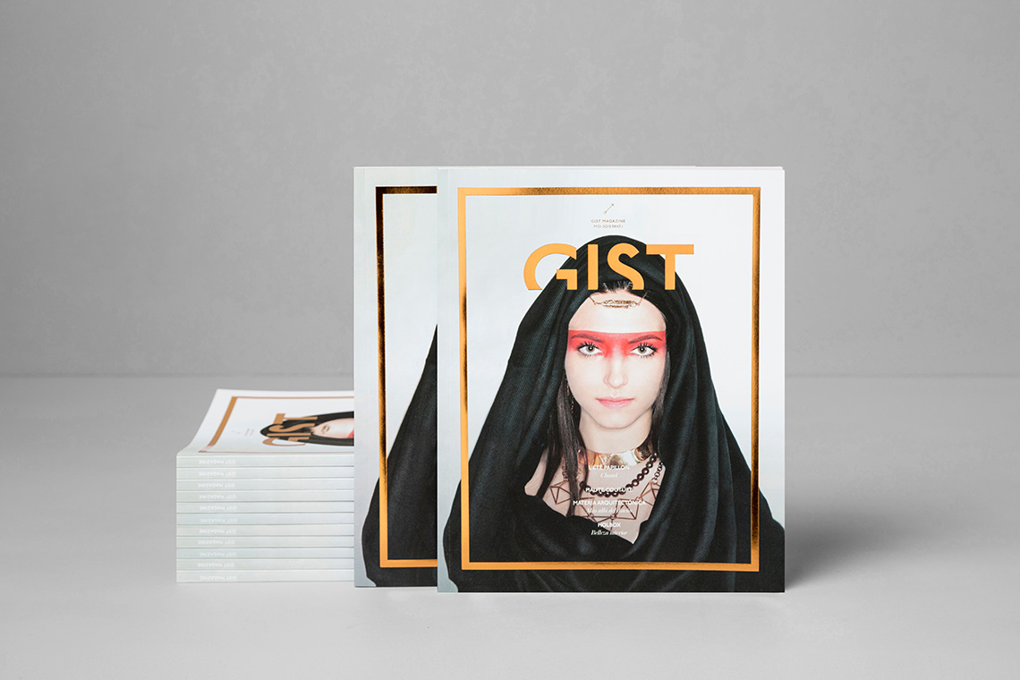
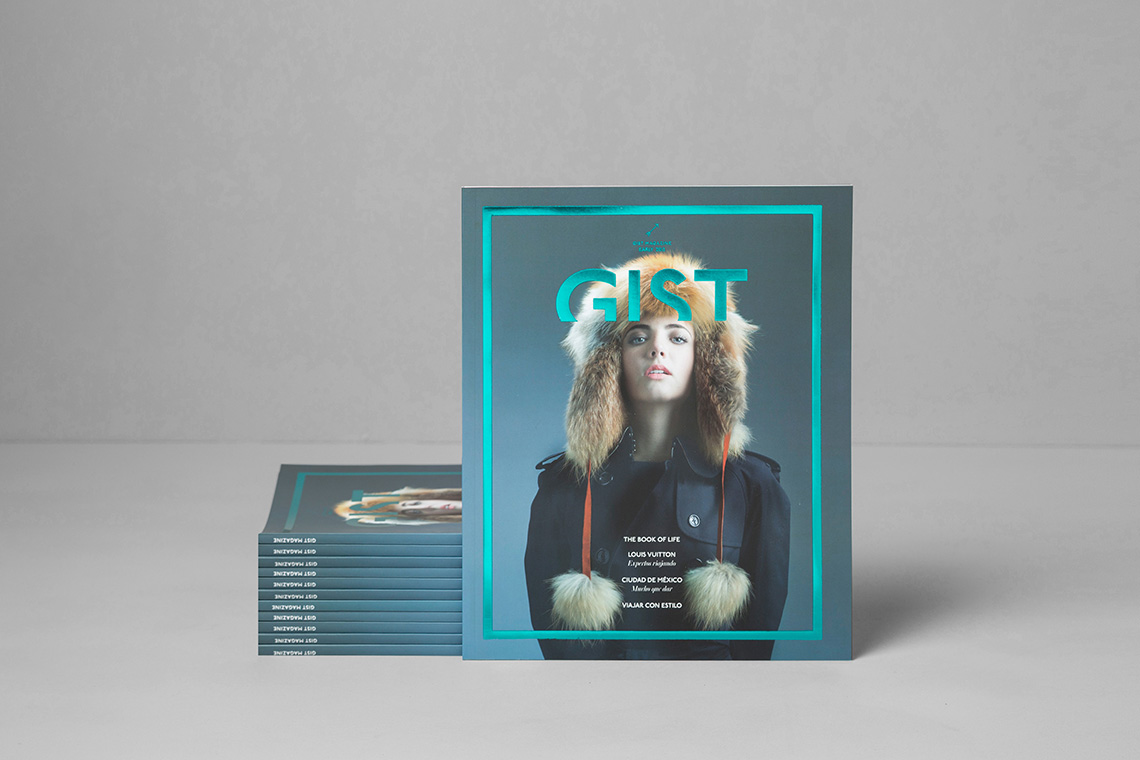
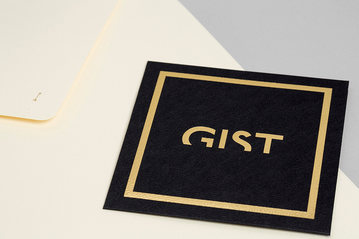
Since GIST's topics are ever-changing and versatile, we decided that it was important to keep the cover constant. It will always feature the portrait of a model superimposed by a frame of gorgeous, shiny foil. — (A)
It will always feature a portrait superimposed by a frame of gorgeous, shiny foil.
