Habibis
BRANDING
The client
Habibis is an Arabic-Mexican fusion taqueria located in San Pedro Garza García, a city enriched by the culinary treats of its third generation Arab immigrants.
keywords
Restaurant /Mexico /Branding /Calligraphy /Interior Design
the objective
Previously a humble taco stand, Habibis approached us with the task of creating a brand that communicated the foods' exceptional mixed background and quality without losing its street-friendly and casual demeanor.
the solution
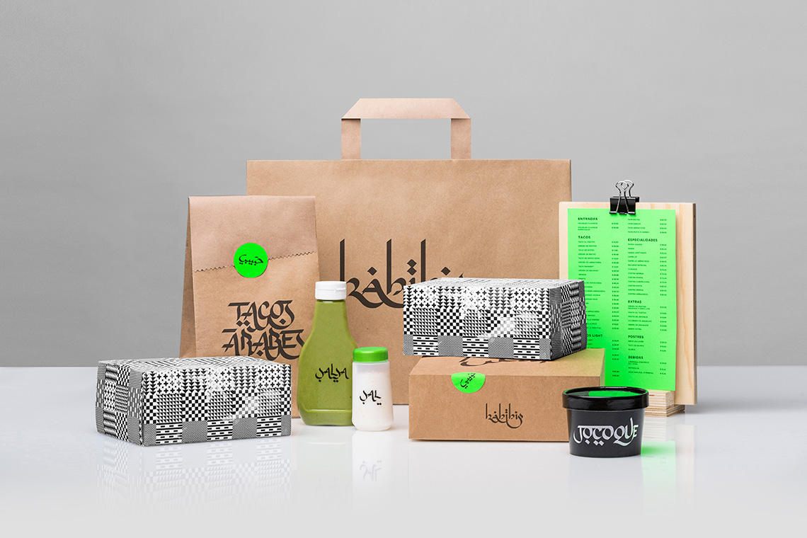
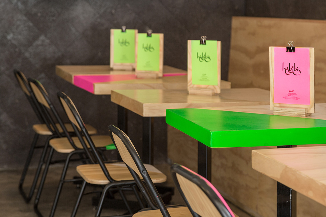
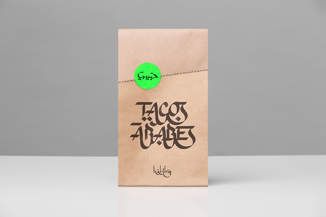
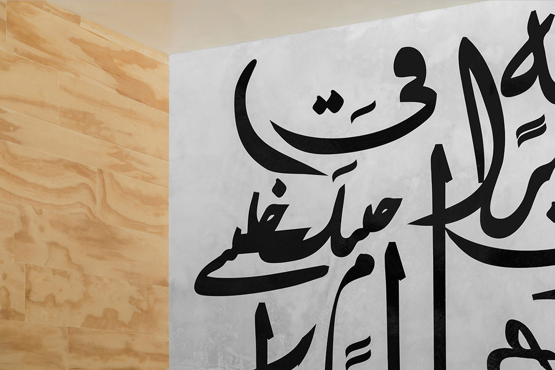
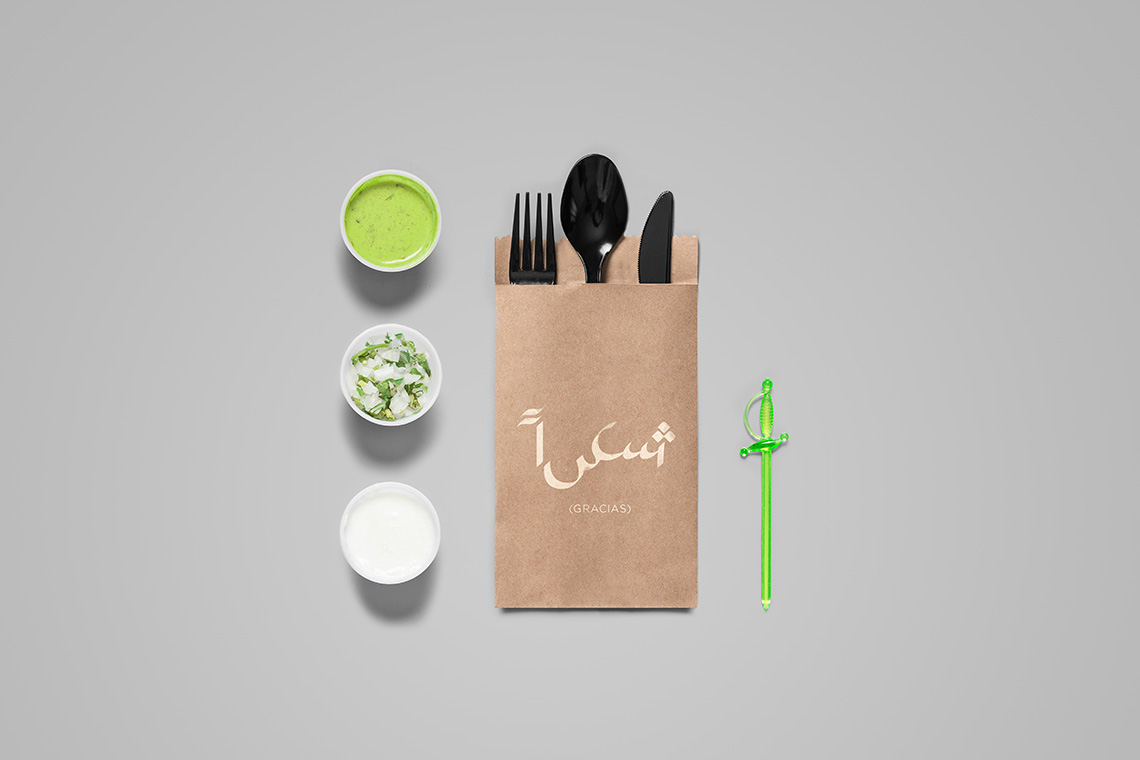
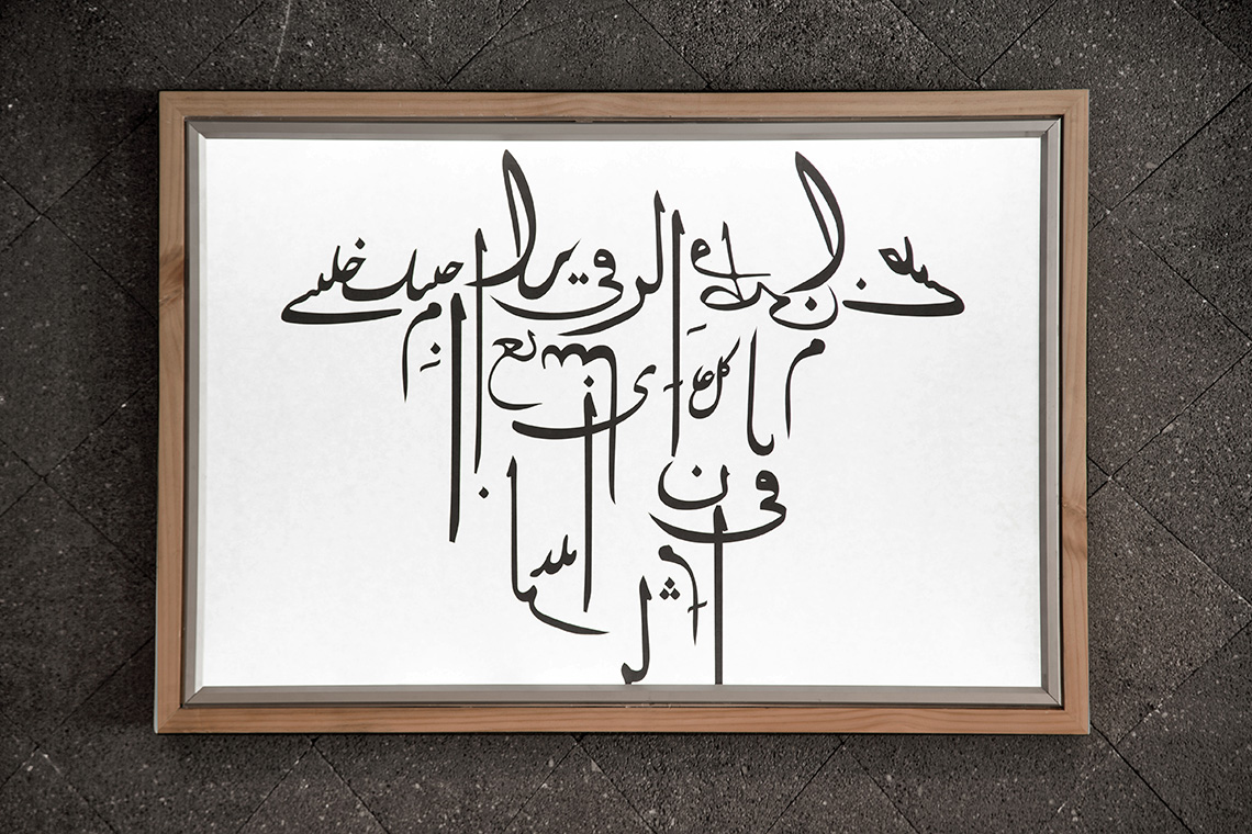
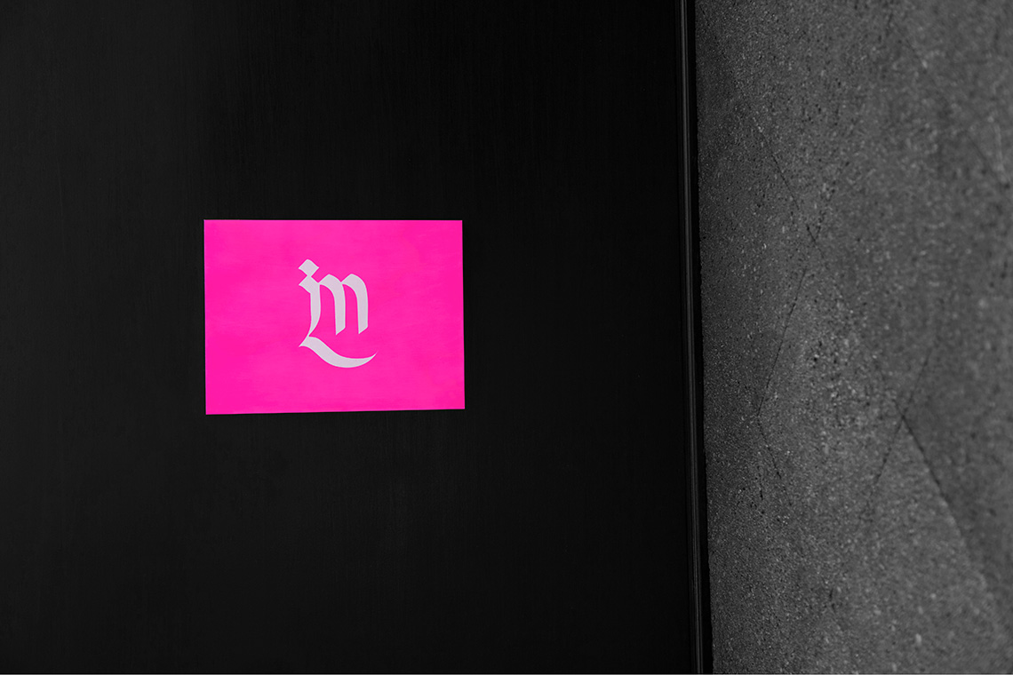
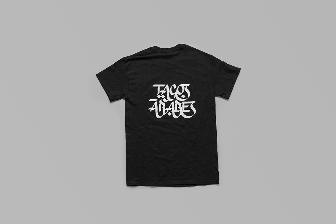
Our proposal is a brand that adapts stylized Arabic calligraphy to a typical Mexican street setting, complete with neon colors and inexpensive materials, like craft paper bags.
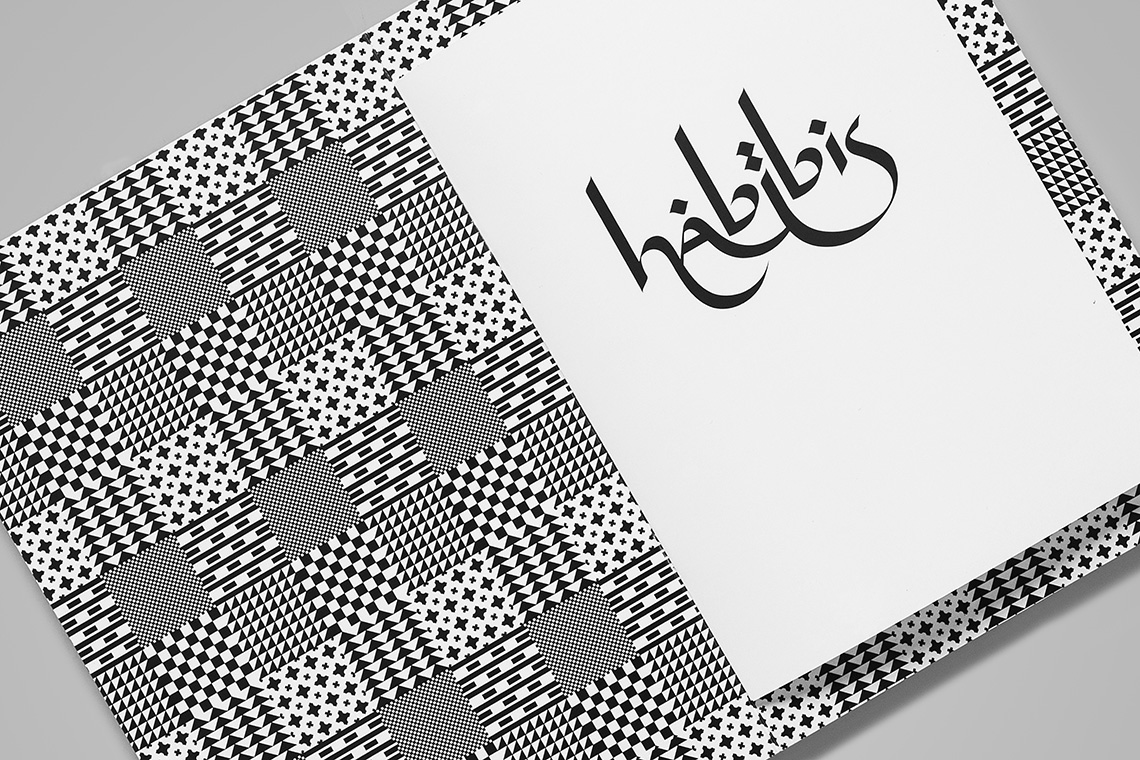
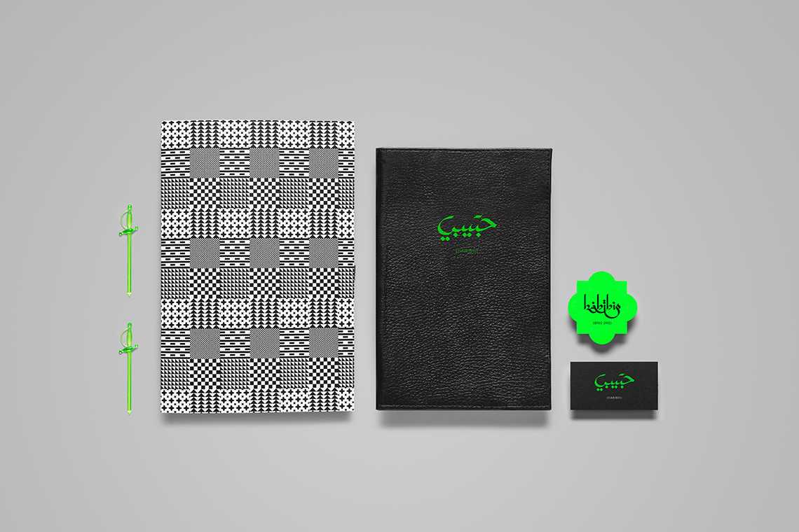
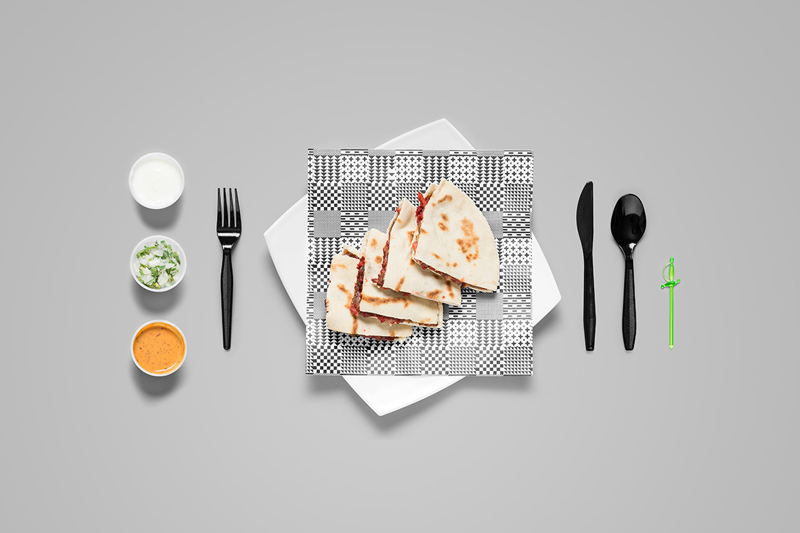
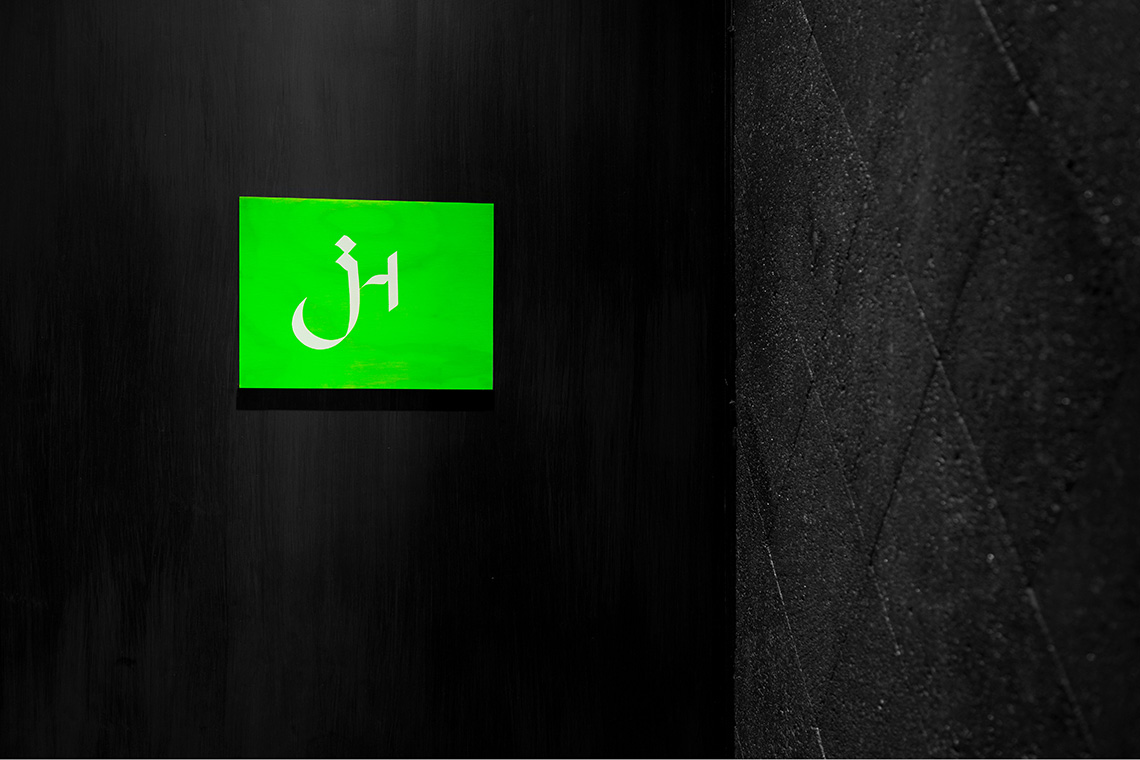
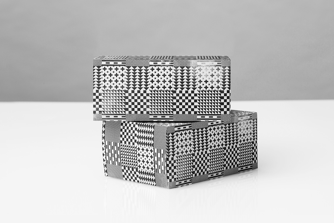
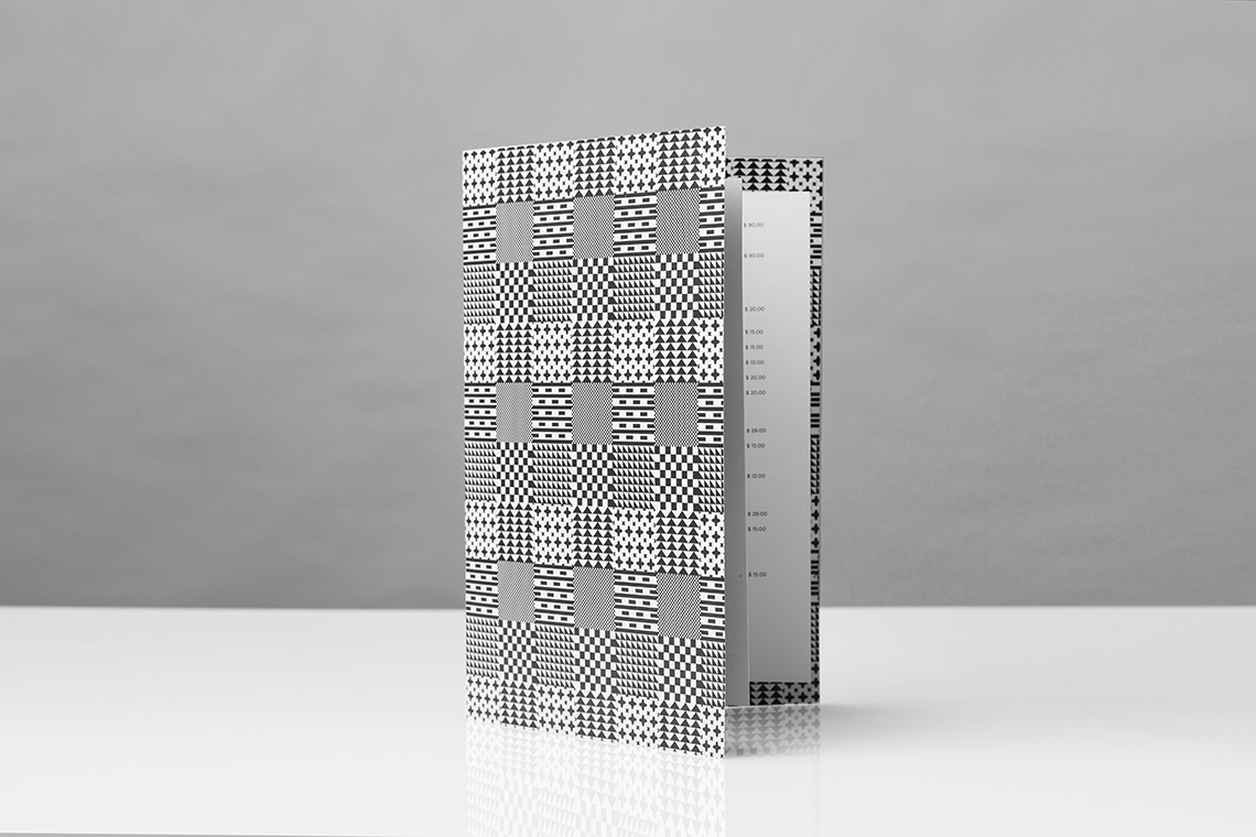
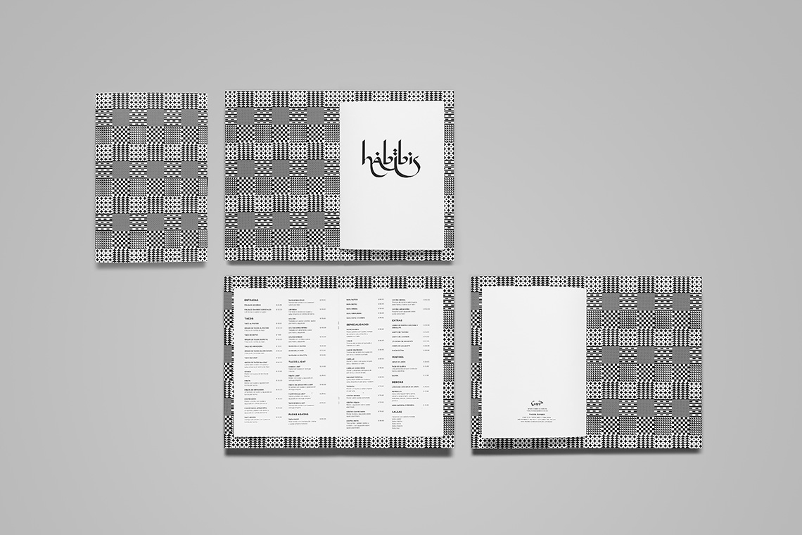
Deep research and careful understanding of the Arabic alphabet was needed to design, using calligraphic pens and special brushes, the various words and signage in both Arabic and Latin. The custom type is accompanied by Gotham, a gentle and neutral typeface that would allow the bespoken logotypes to stand out above everything else. The pattern is based on traditional keffiyeh (a Middle Eastern headdress fashioned from a square scarf) and gorgeously intrinsic mosaic patterns. — (A)
Our proposal adapts Arabic calligraphy to a typical Mexican street setting.
