Micheline
ARCHITECTURE
The client
Micheline is a print-shop boutique dedicated to designing and printing stationery and pieces for social events.
keywords
Print shop /Mexico /Branding /Interior design /Architecture
the objective
The boutique came to us because they needed their brand and store to express uniqueness, elegance, and modernity.
the solution
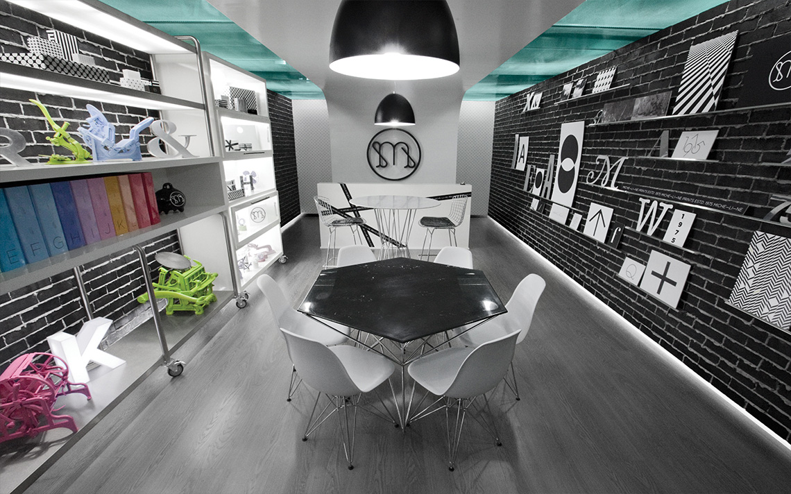
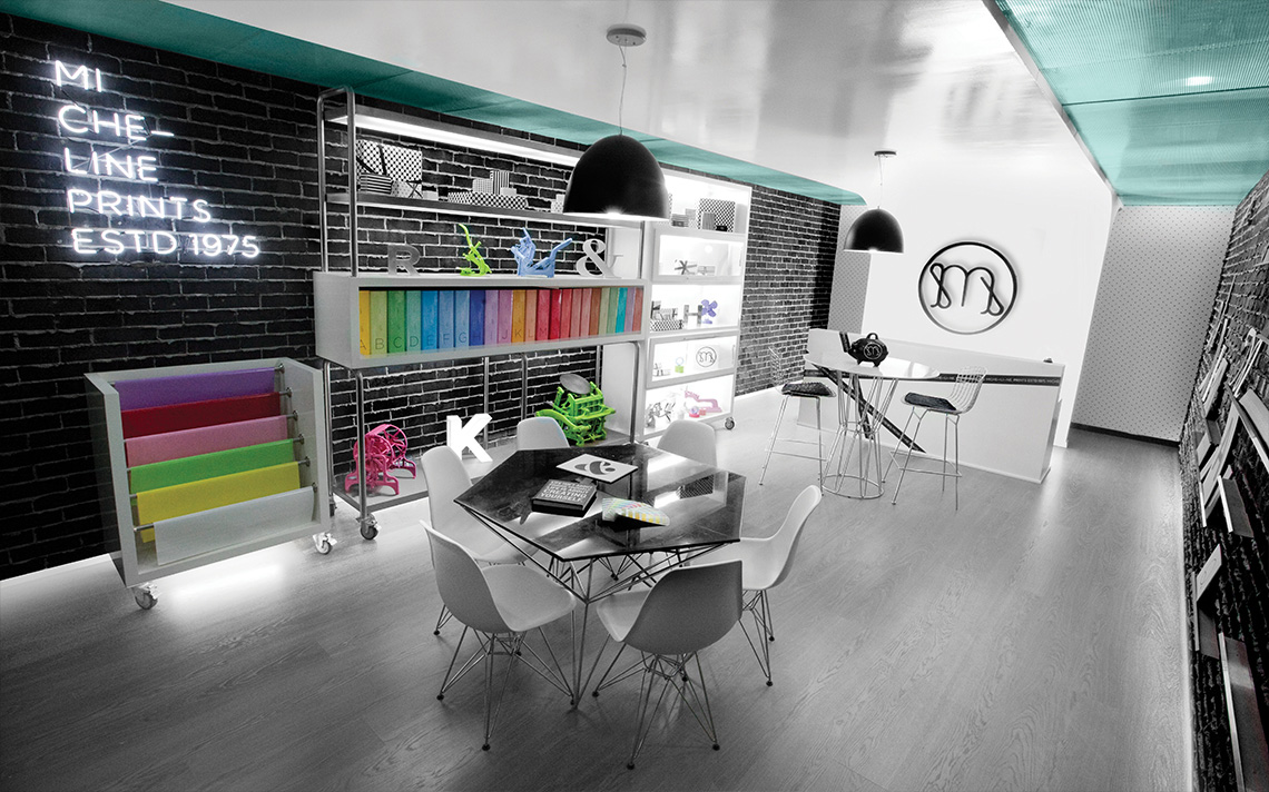
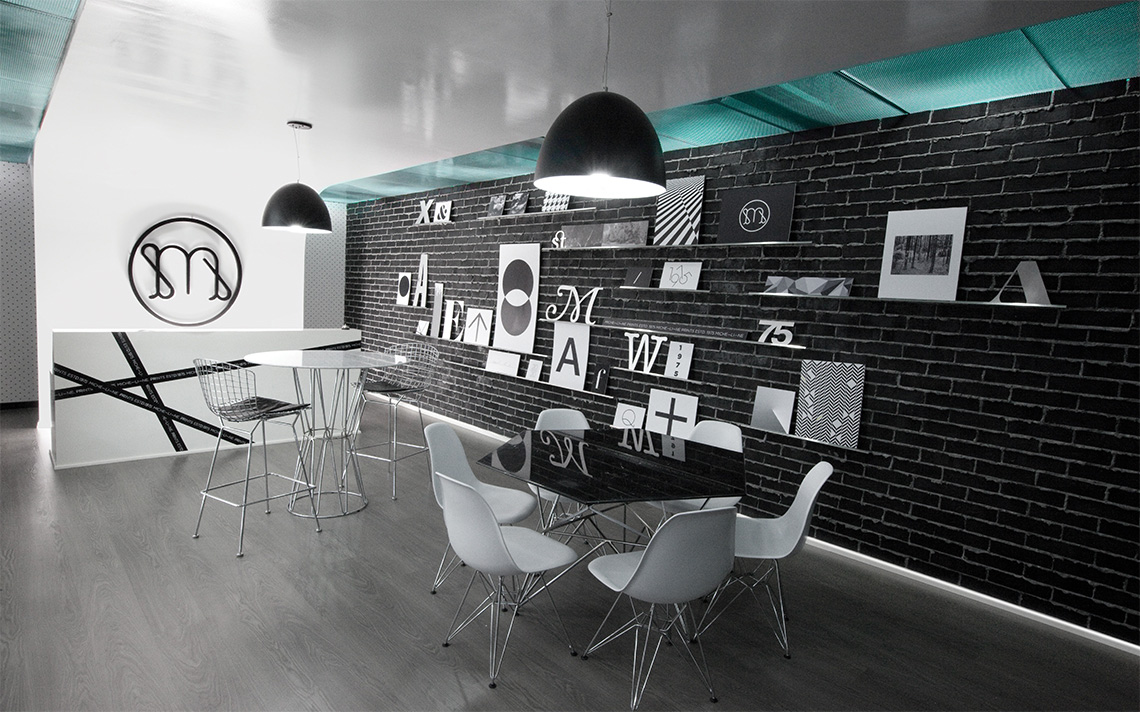
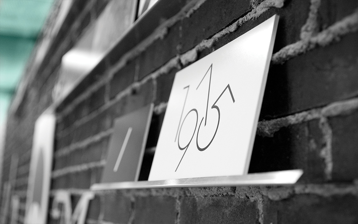
The space is inspired in the ambiance of print-shops in the seventies: it has a few contemporary accents such as the lighting, which gives the interiors a vanguardist atmosphere. We made sure to use a neutral color palette to focus all of the attention on the shelves holding the printing catalogues, as well as to emphasize the brand's presence. This project was developed with the collaboration of our friends German Dehesa and Roberto Treviño. — (A)
The space is inspired in the ambiance of print-shops in the seventies.
Micheline
BRANDING
the objective
Interested in rejuvenating the brand in order to captivate the unexplored segment of young adults, Micheline came to Anagrama.
the solution
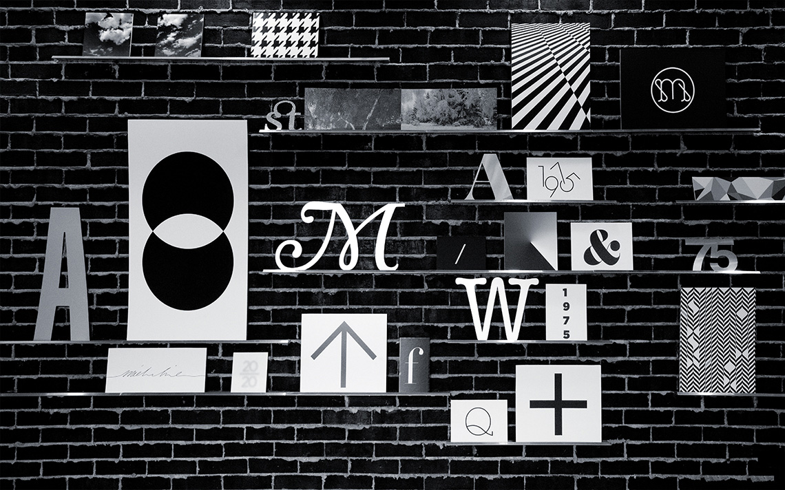
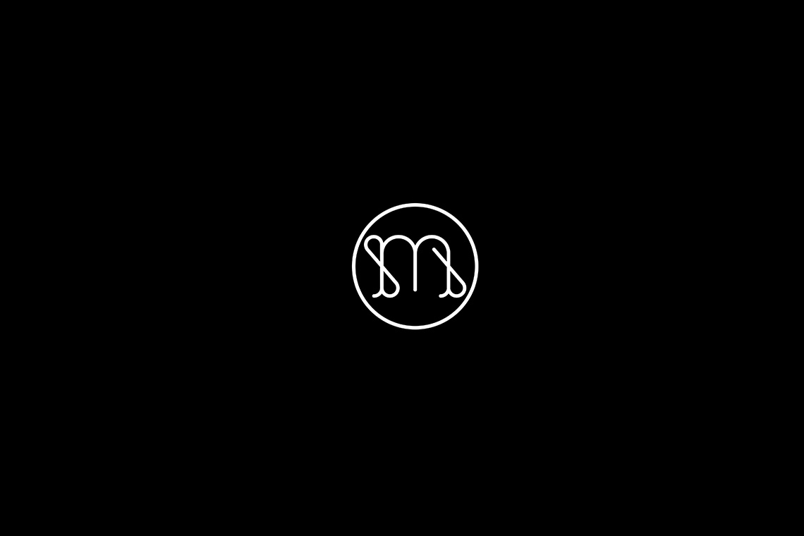
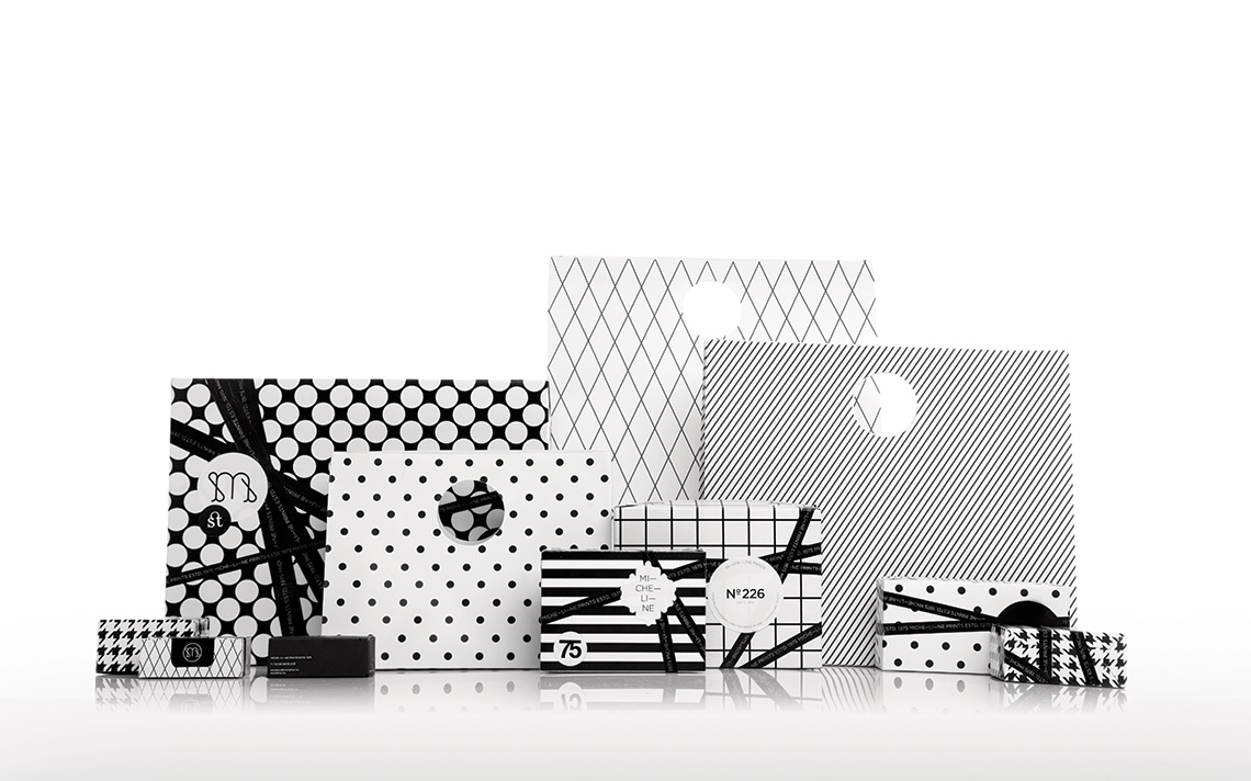
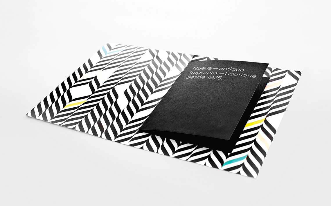
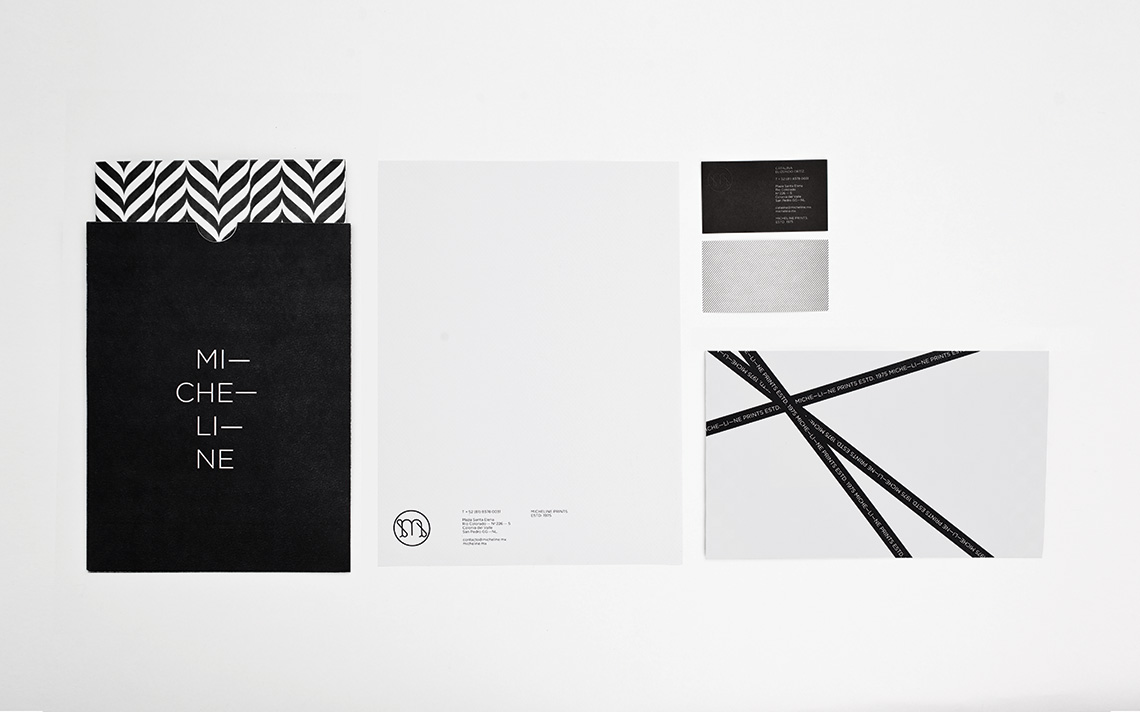
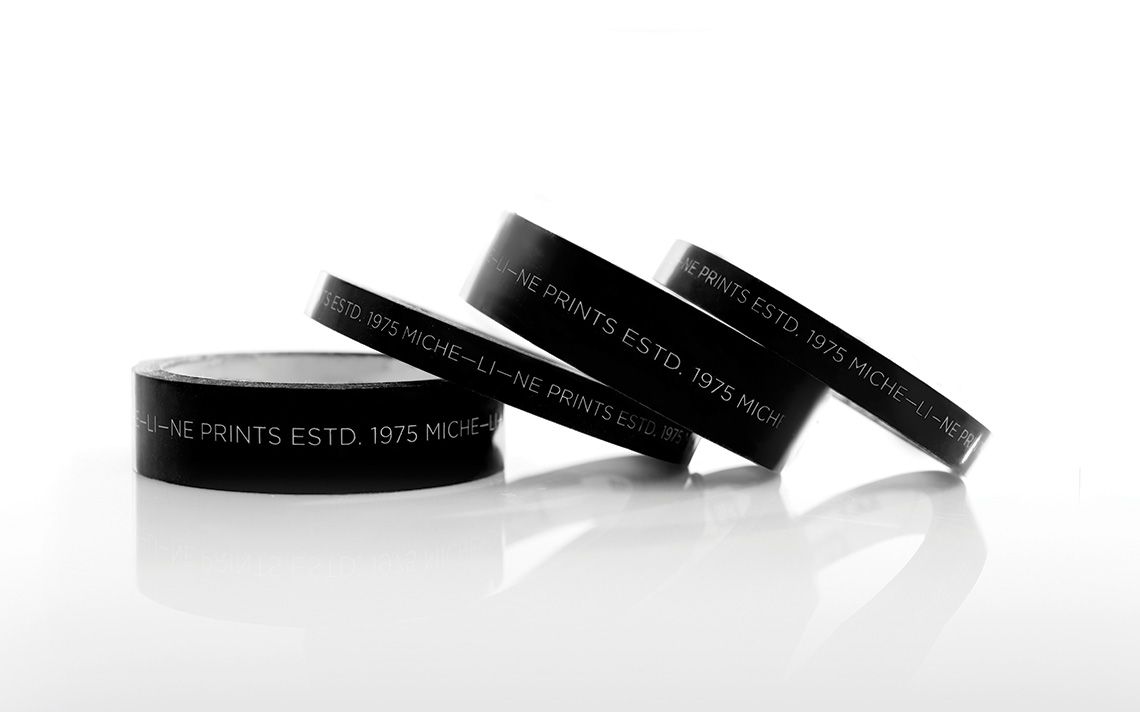
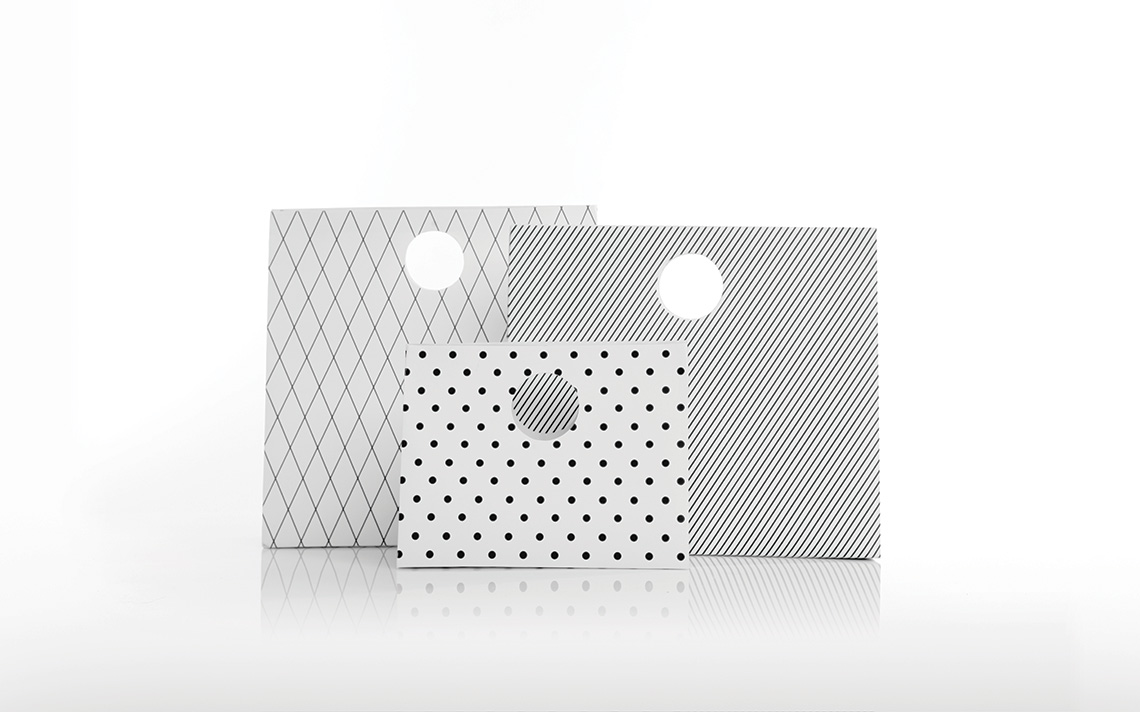
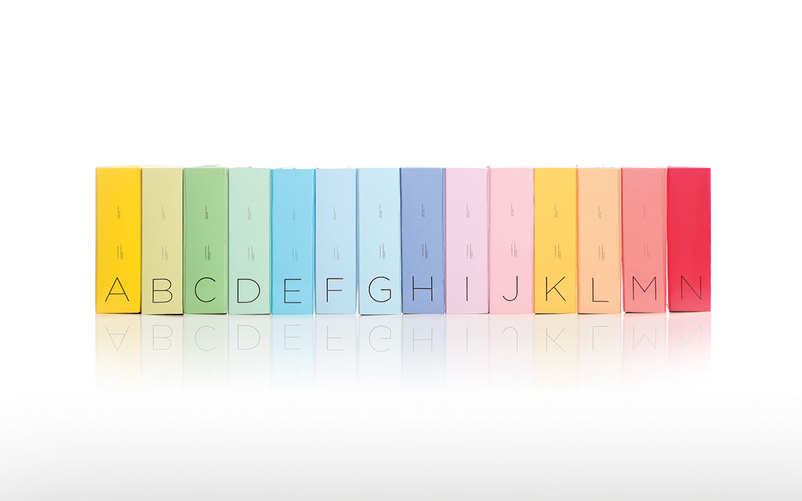
We selected a color palette based mainly on black and white, since all of the printed pieces are very colorful. Also, we designed a monogram that would be easy to reproduce on all of their printed pieces and that would work as a signature for their workshop.
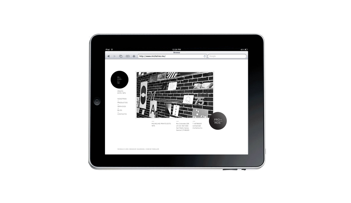
Thanks to our branding strategy, Micheline is now a boutique that shows the highest quality, and welcomes all generations, making them feel comfortable and in their own environment. — (A)
Micheline is now a boutique that shows the highest quality
