Capicúa
BRANDING
The client
“Capicua" is a brand specializing in creating organization tools for any activities that require planning.
keywords
Stationary/ Mexico/ Branding/ Pattern/ Print Design
the objective
Develop a concept that communicates the values that distinguish the project: organization and planning, in a friendly and fun way.
the solution
The naming was inspired by the spanish word describing a palindromic number, referring to a symmetrical number that remains the same when its digits are reversed. Such reference calls upon Capicua’s” diverse assortment of planners, agendas, calendars etc. that can fulfill every personality type’s organization needs.
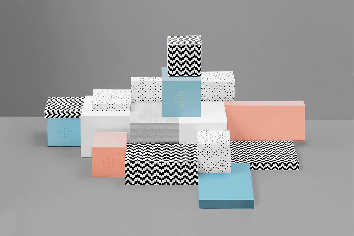
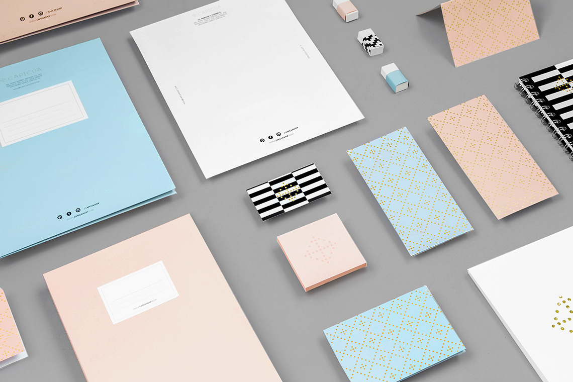
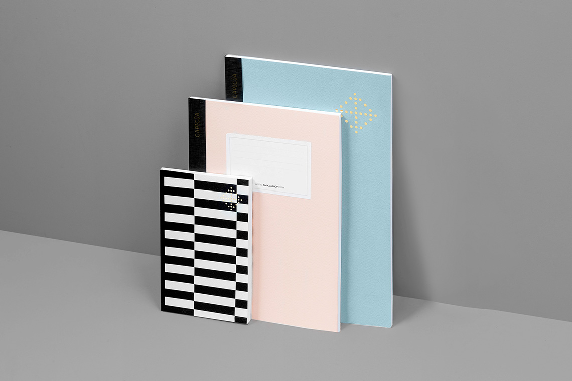
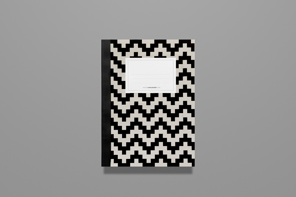
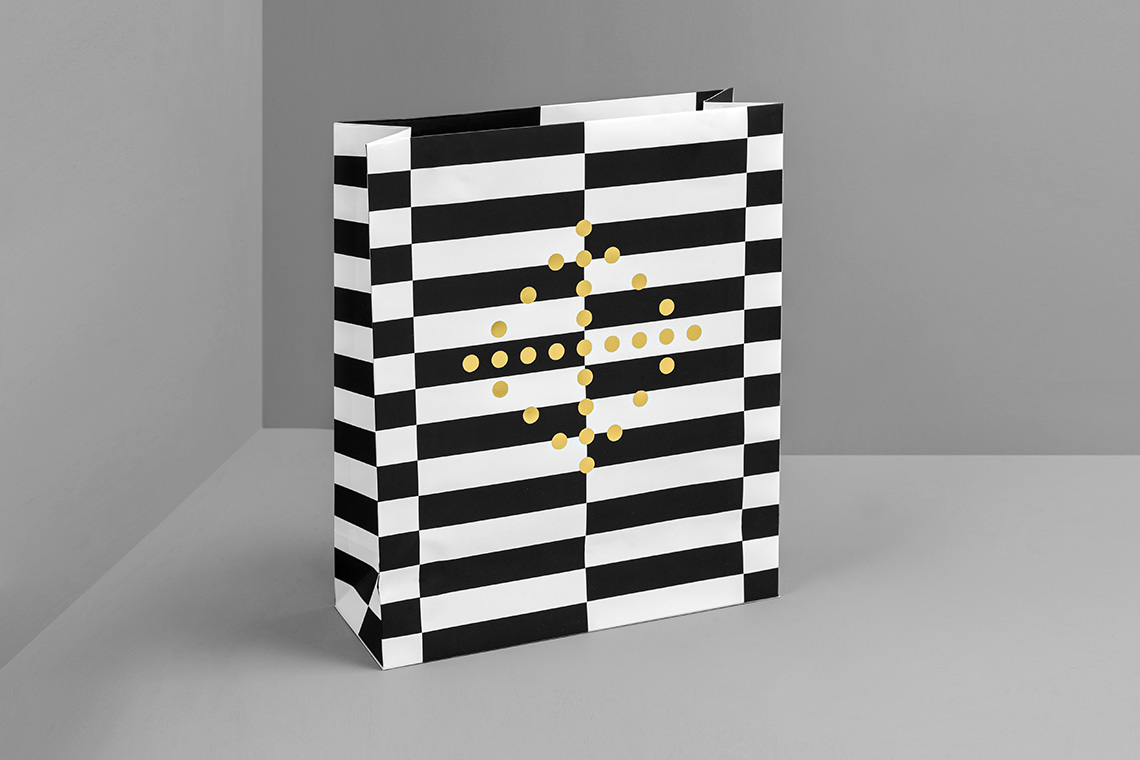
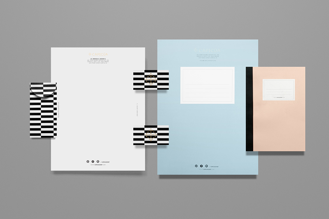
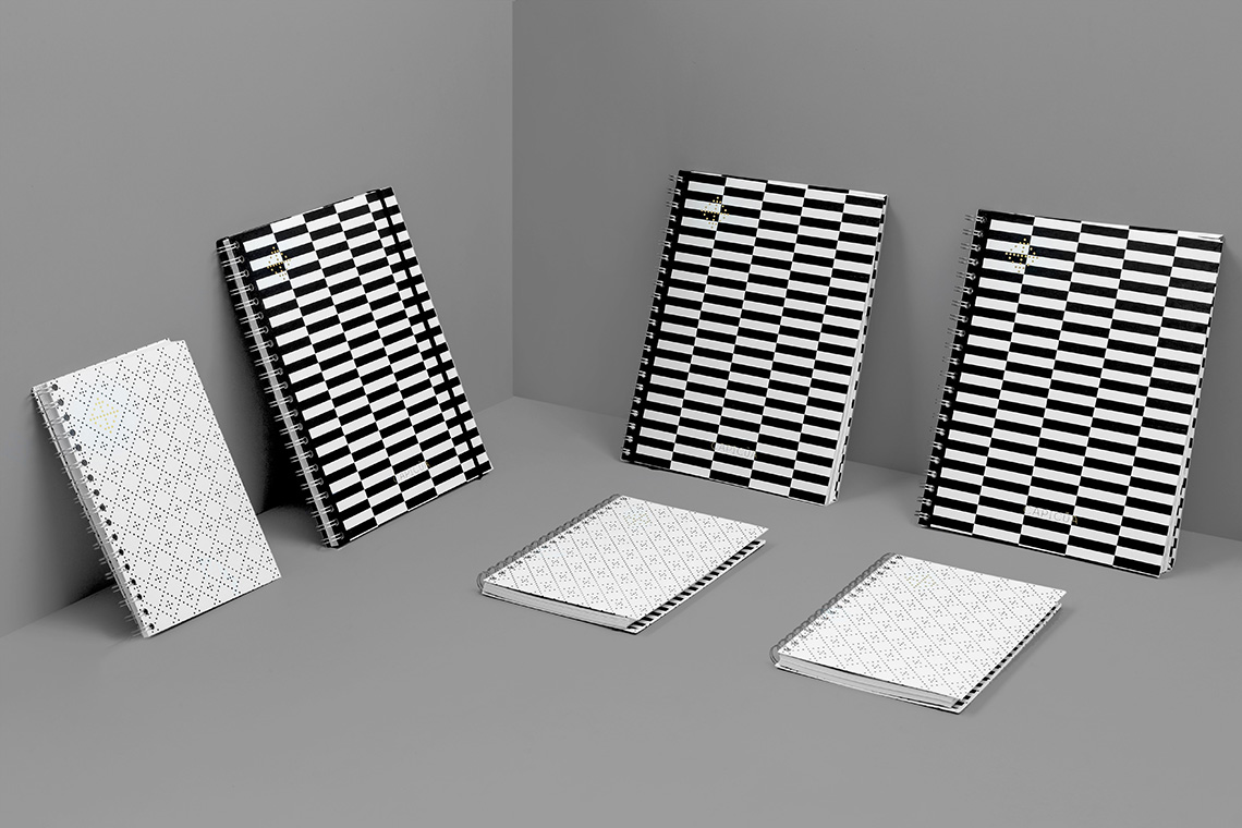
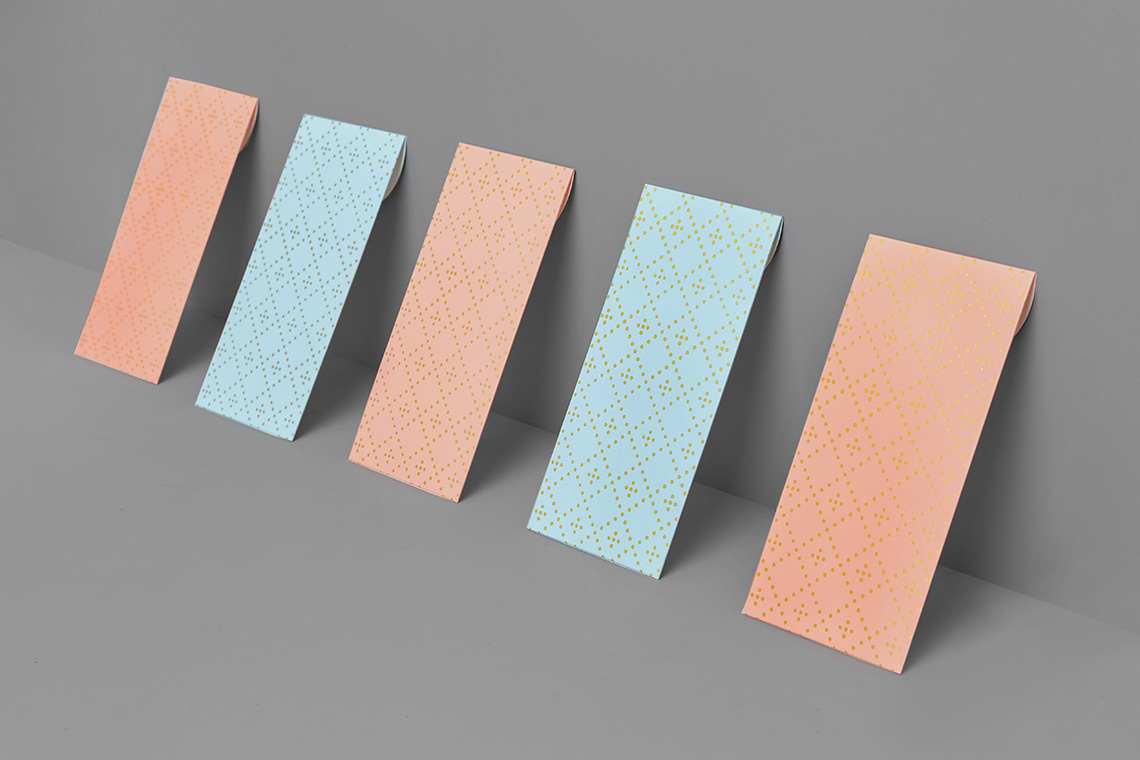
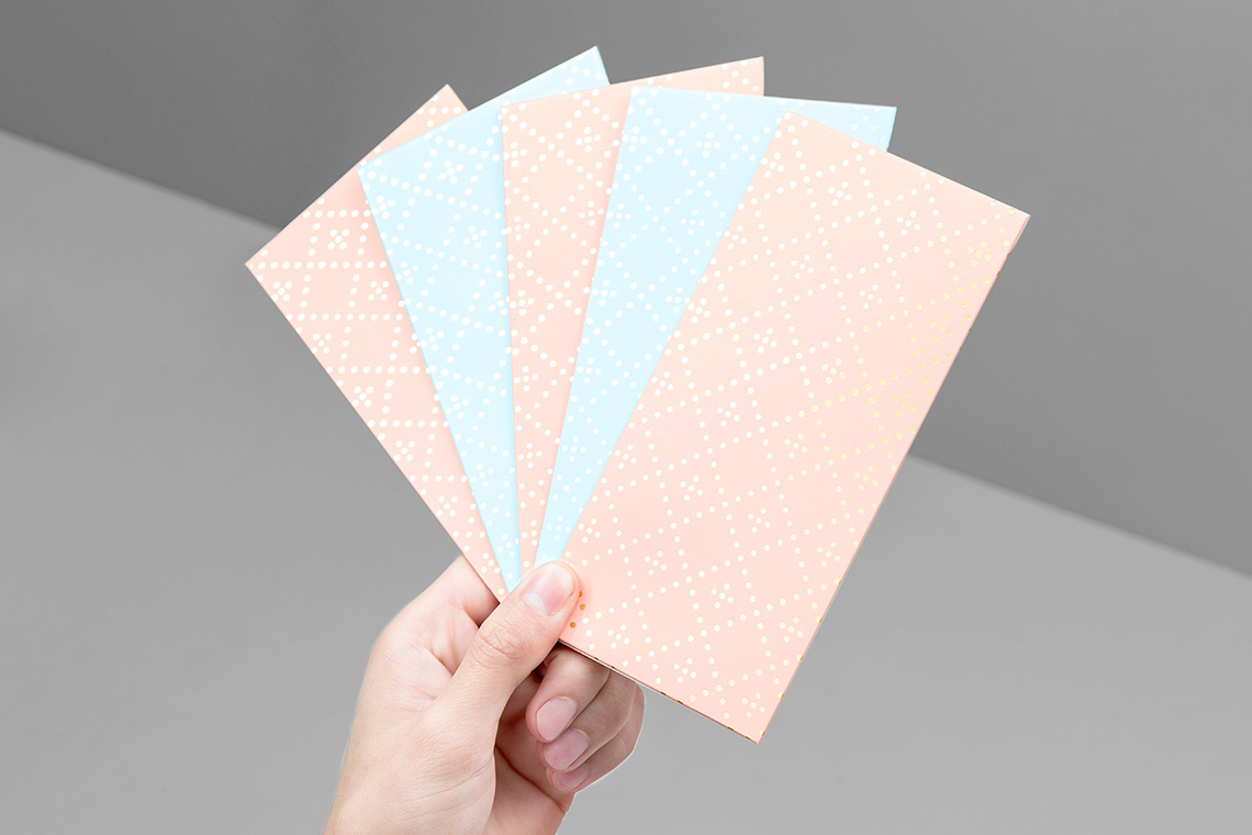
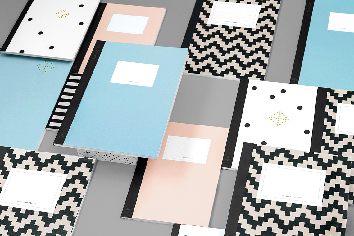
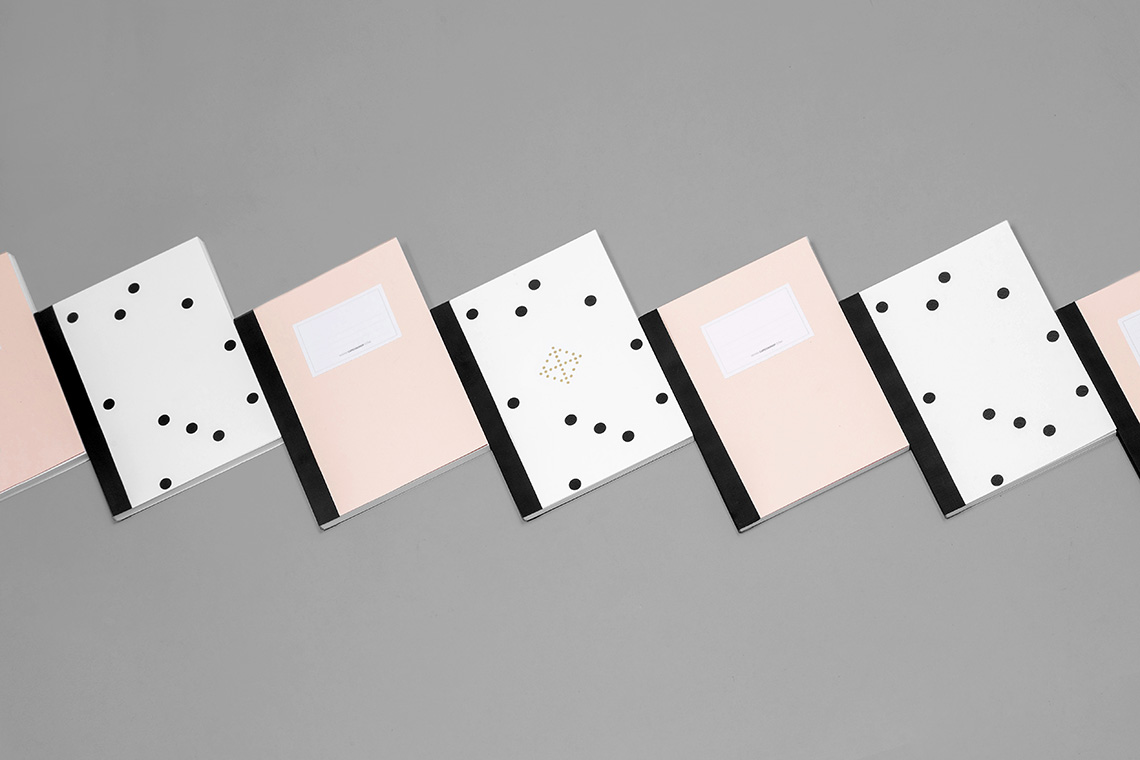
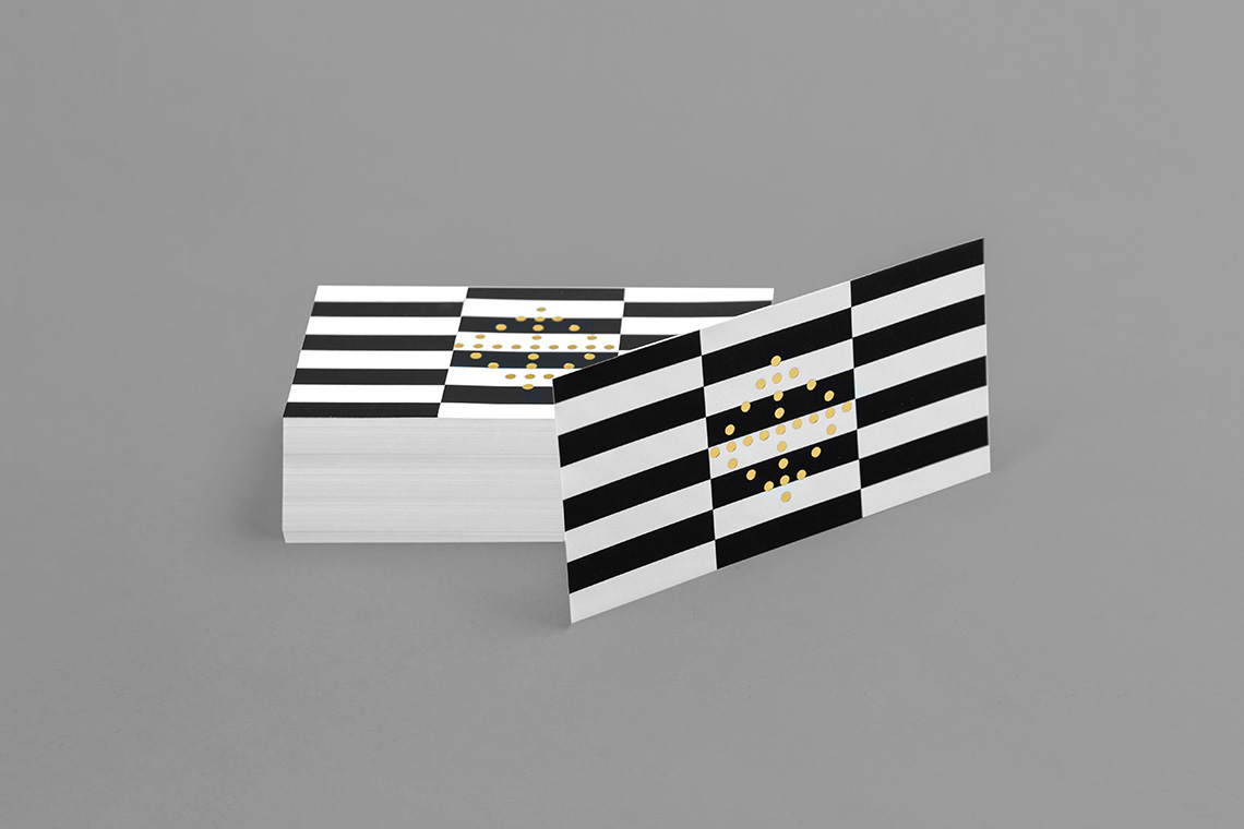
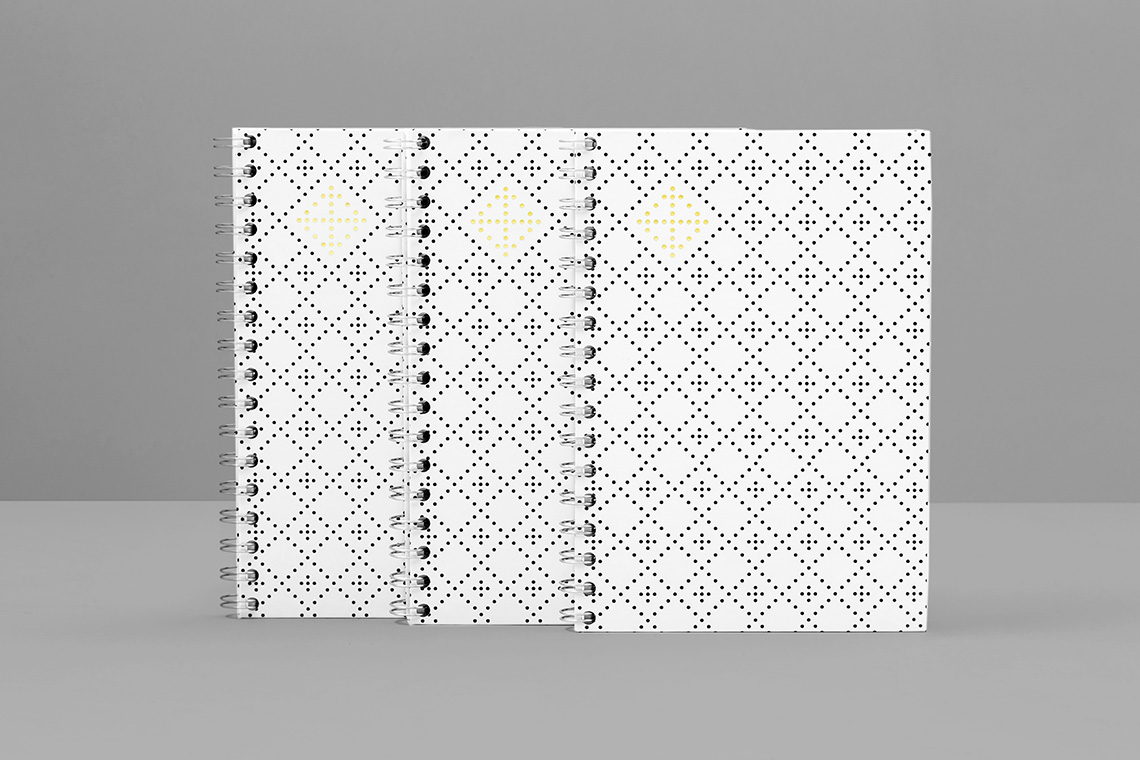
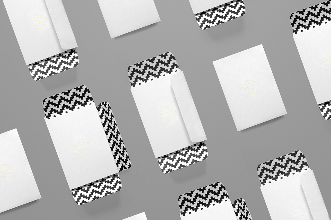
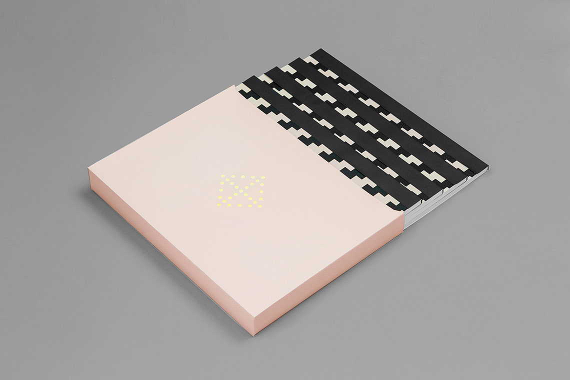
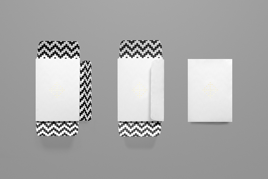
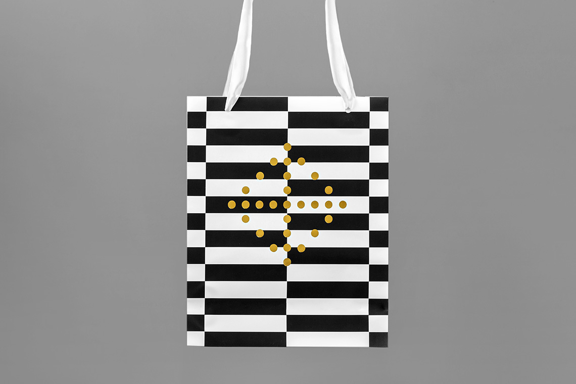
Our branding proposal takes such initiative and visually reflects this in a series of patterns and symmetric forms resulting in a sense of perfect order and cleanliness whose purpose is to combine unique style with organization.
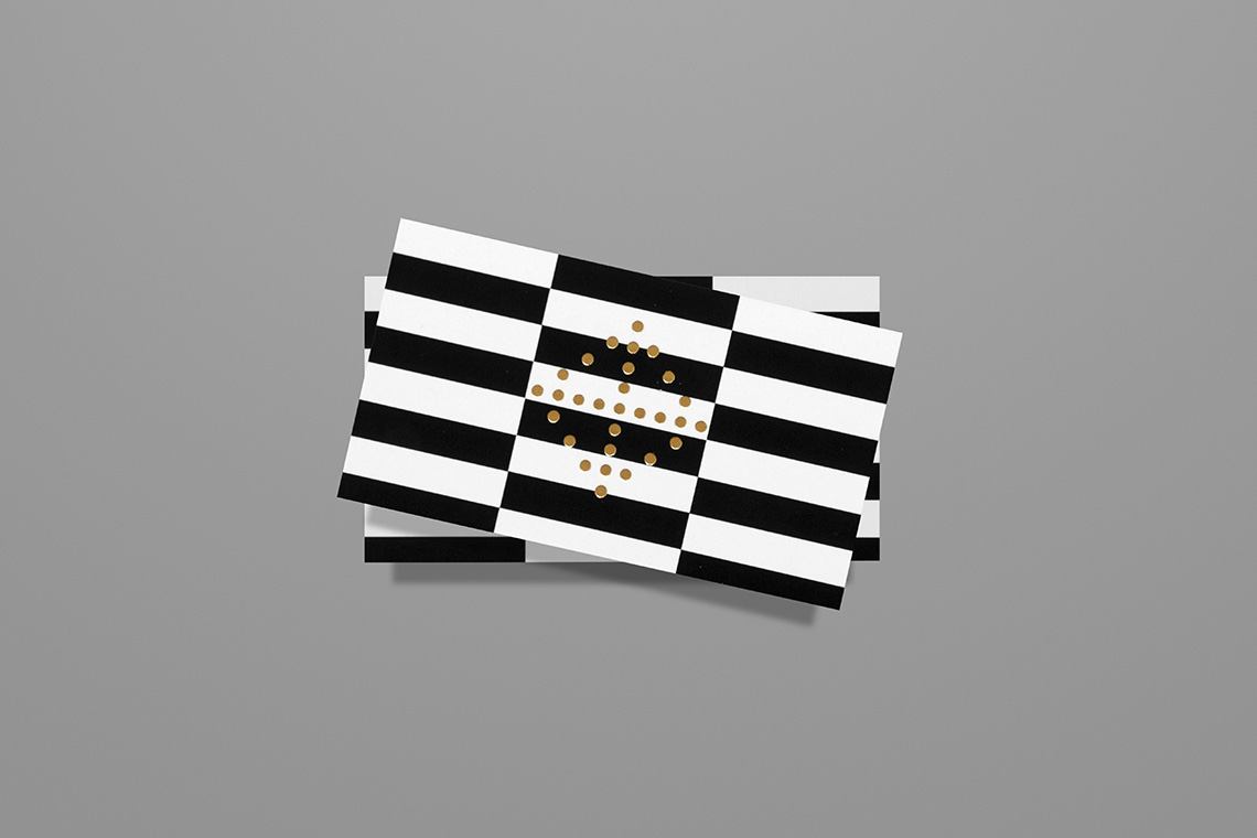
Each piece is distinctive while maintaining its friendly features that play with the assumed monotony of an organized lifestyle. Capicua’s symmetrical icon can be appreciated from any point of view and the subtle use of color complements the brand with an elegance that creates the visual balance that it promise." — (A)
Patterns and symmetric forms resulting in a sense of perfect order
