Borealica
BRANDING
The client
Boreálica is a clinic that specializes in Whole Body Cryotherapy, a treatment that uses extremely low temperatures to decrease inflammation, pain and muscle spasms, and increase cellular survival and muscle relaxation. Boreálica uses specialized cryogenic chambers where the patient is placed for a short duration of maximum three minutes.Patients describe the experience as invigorating and helping them cope with problems such as stress, insomnia, rheumatism, joint pain, itching and psoriasis.
keywords
Cryogenic /Health /Mexico /Branding /Graphic Design /Packaging
the objective
Develop a brand that communicates in a modern and memorable way the attributes of cryotherapy treatment technology.
the solution
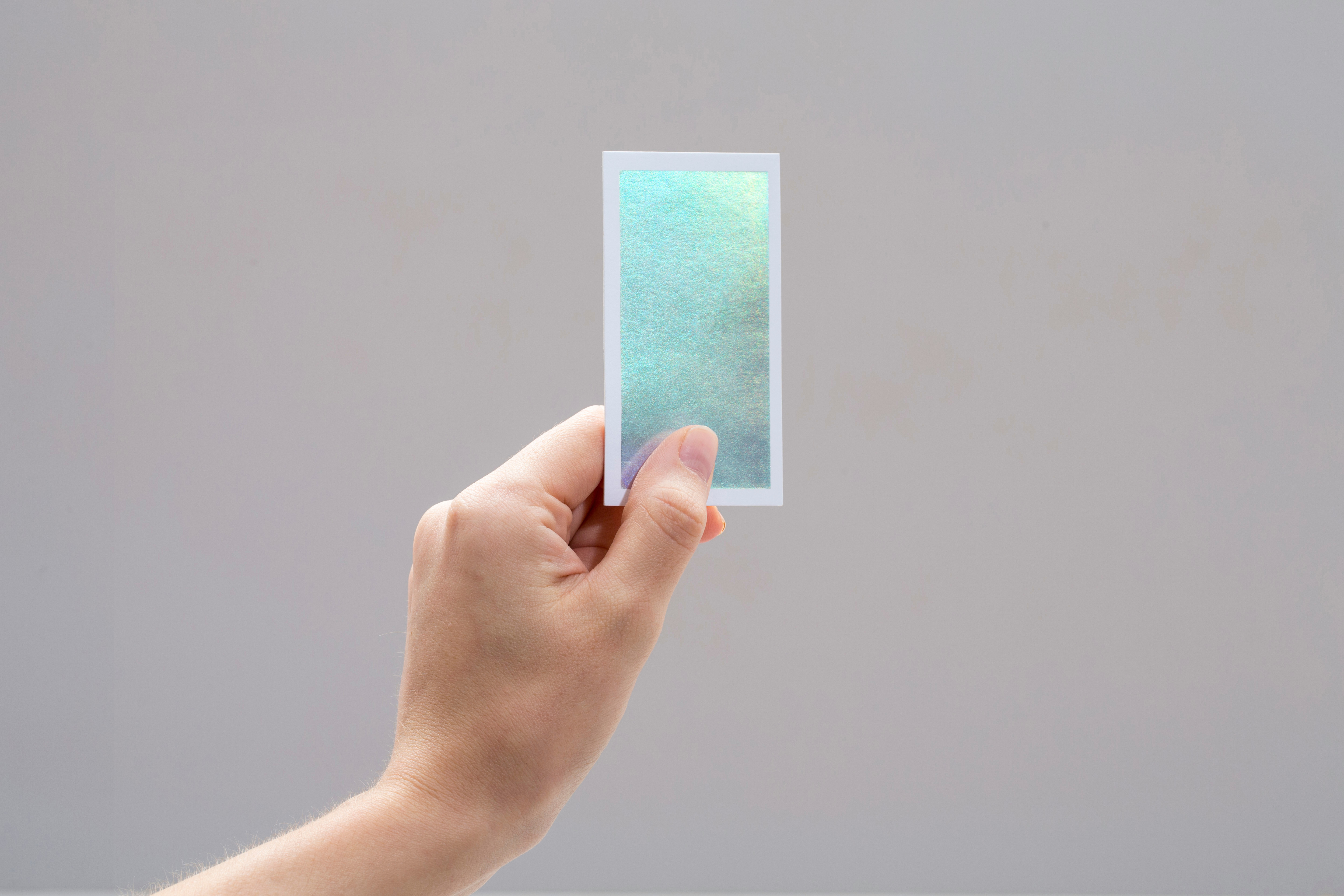
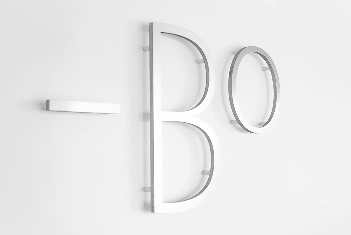
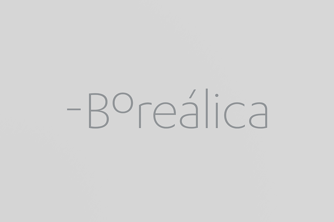
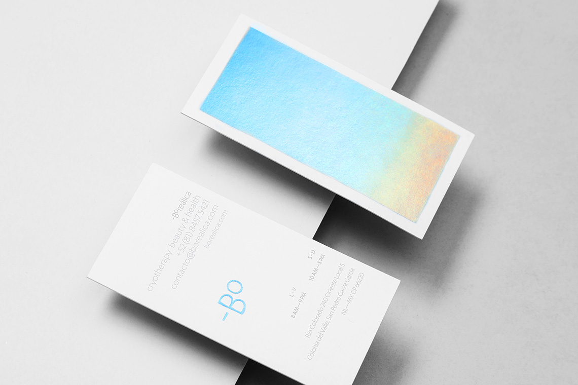
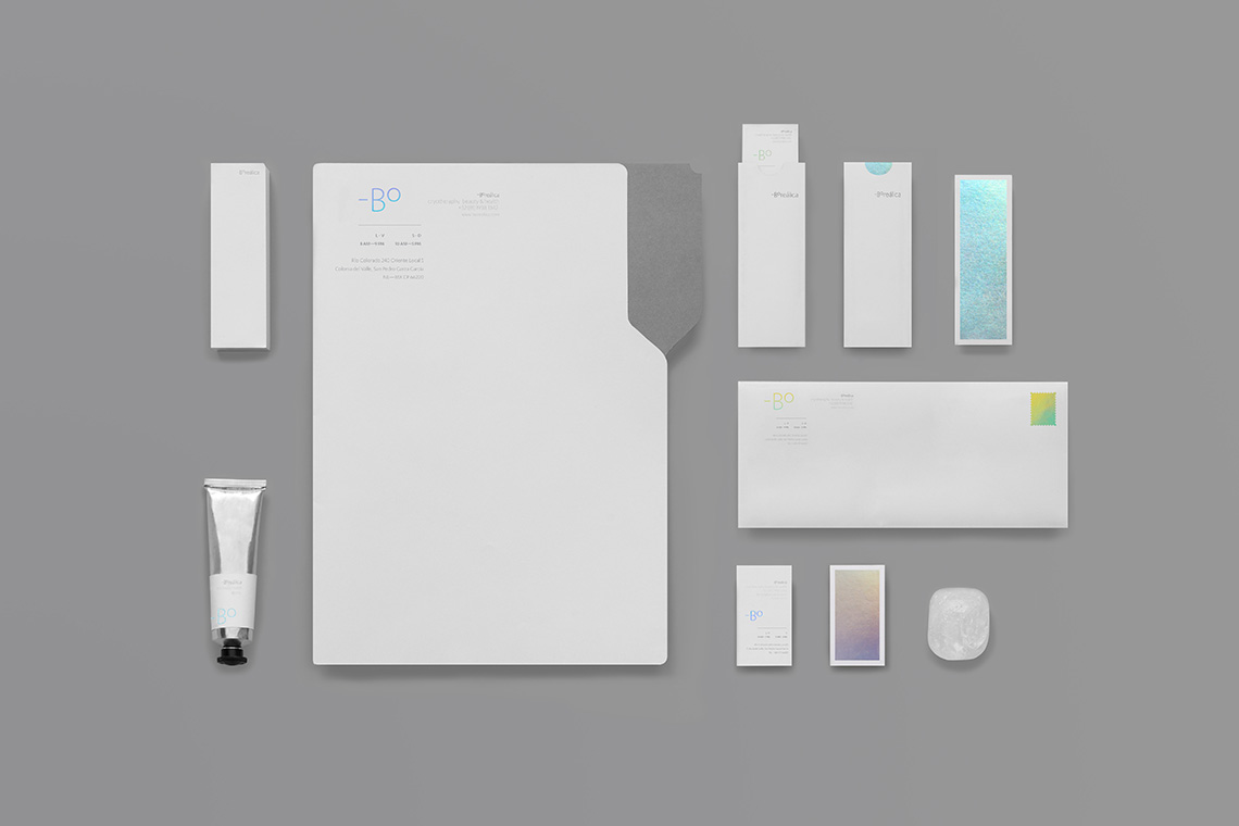
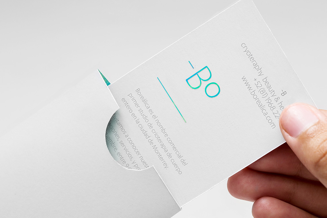
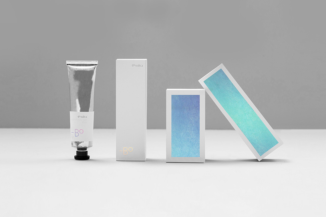
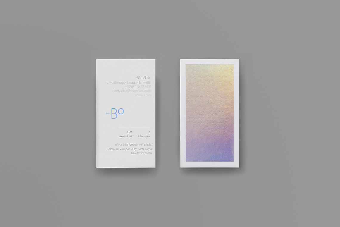
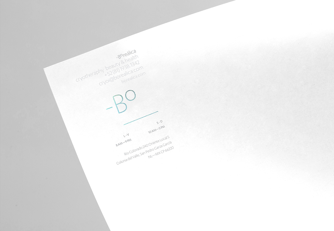
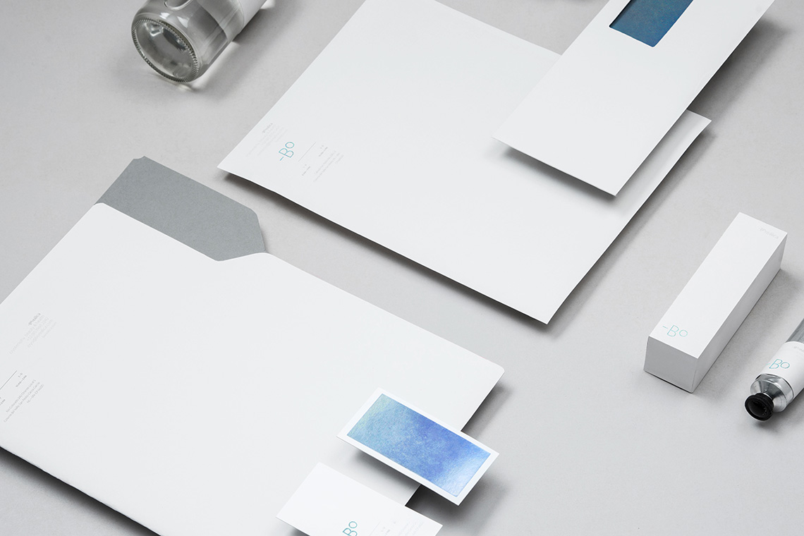
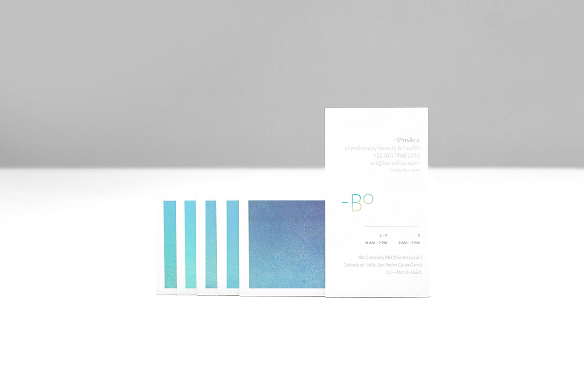
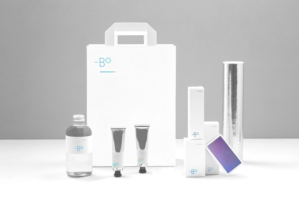
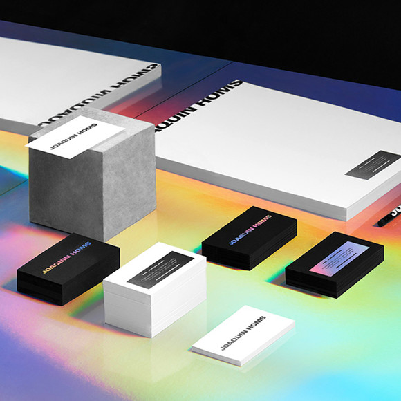
Our proposal draws inspiration from the most frigidly cold places on Earth, the North and South poles. Using a frosty color palette of white, grey and holographic foil we communicate the nature of Boreálica's glacial services. The monogram is designed based on the traditional symbolic representation of temperature, using the signs around Boreálica's "B" to round up the brand's cool factor. — (A)
The monogram is based on the representation of temperature
